Hightekers supports businesses that are recruiting for fixed term contracts by streamlining the onboarding and management process. They provide a smooth hiring process for the business and the perks of full time employment to their contractors.
They had secured great market exposure in France and were ready to strategically increase their global exposure by targeting new European territories. They had ambitious growth targets and challenged us to deliver a brand, website and digital strategy that would help them to achieve their global revenue goals.
- Lead time:
- 20 Weeks
- Sector:
- Recruitment
- Target Type:
- B2B
- Demographic
- IT Consultants, Businesses hiring in IT
- Website Goal:
- Increase international market penetration
- Services:
- Branding, Web Design, WordPress, Multilingual, Web Development, Digital Marketing

- Scope
- Brand Strategy
- Customer Persona Development
- Key Messaging Development
- Brand Identity
- SEO Strategy
- Adobe XD Wireframe Prototypes
- Adobe XD Design Prototypes
- WordPress Development
- Multilingual Website
- Copywriting
- Resource
- 2 x Marketing Strategists
- 1 x Digital Strategist
- 1 x Brand Designer
- 1 x Website Designer
- 1 x Website Developer
- 1 x Quality Assurance Tester
- 1 x Project Manager
- 1 x Copywriter

Brand strategy
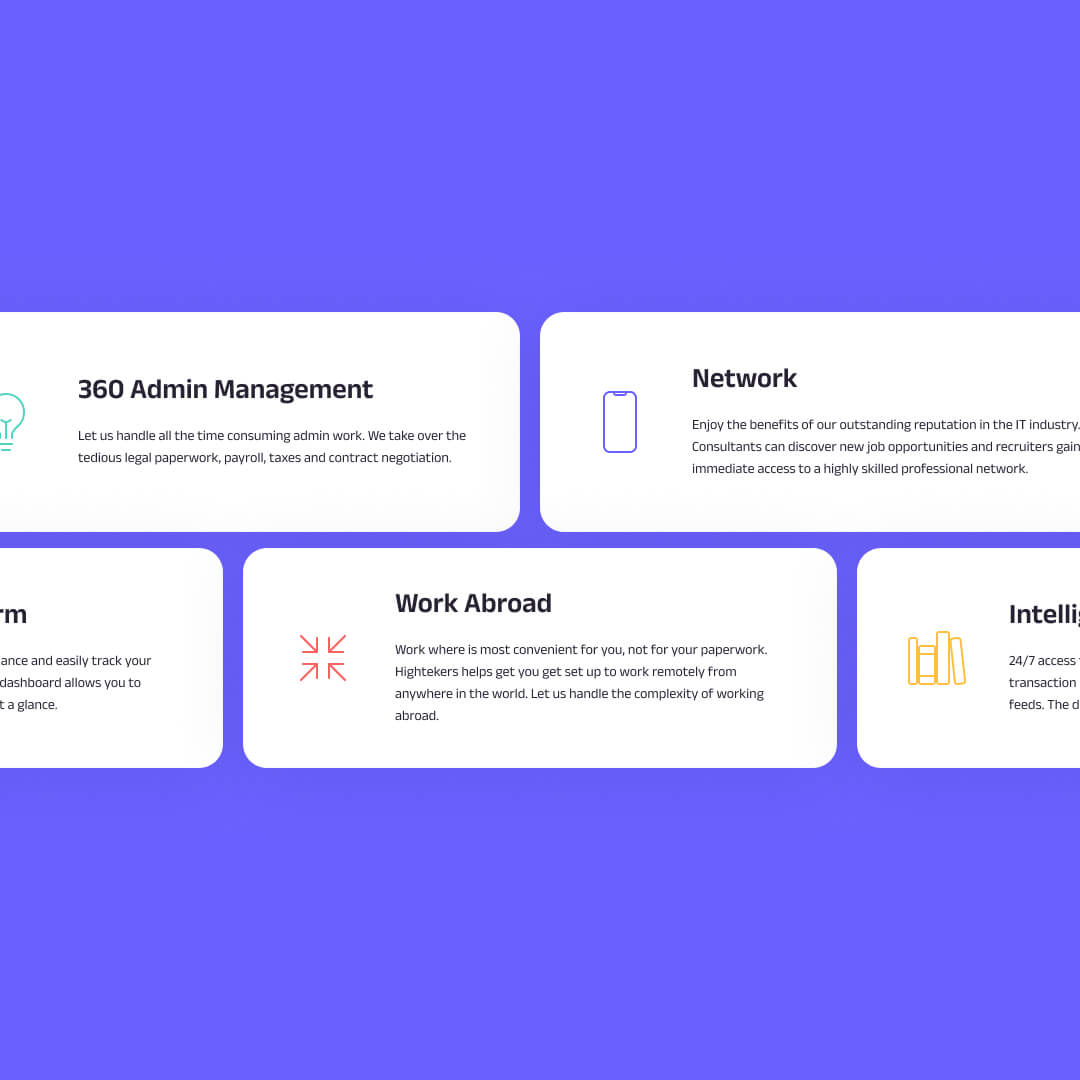
The brand process kicked off with a number of brand workshops that were led by our marketing team. We utilised the customer and business insights gained during this process to build a new brand framework for Hightekers.
In collaboration with their marketing team, we developed a new value proposition and defined their target audience personas and archetypes. This enabled us to curate an aligned messaging framework for each archetype, tapping into their motivators and pain points.
The brand strategy formed the backbone of the project, guiding the design direction and messaging, and enabling the Highteker’s team to produce consistent and effective marketing materials.
Brand identity
Drawing on the brand strategy, we evolved Highteker’s brand identity to create a fresh visual design system with the flexibility to be utilised across Hightekers’ business ecosystem.
The existing brand had some good components but was dated and missing depth and consistency. We implemented a new colour palette including a secondary set of colours to provide additional dexterity with soft and bold colour options. We also drew inspiration from the logo to introduce a new brand pattern. The pattern brings energy and direction to the brand and adds depth and visual interest.
The key to the success of the Hightekers brand is the way that the different brand elements including imagery, typography, colour, shape and form are combined in a way that is distinctly theirs. The outcome is a unique and vibrant brand that enables Hightekers to be bold and stand out.
The website
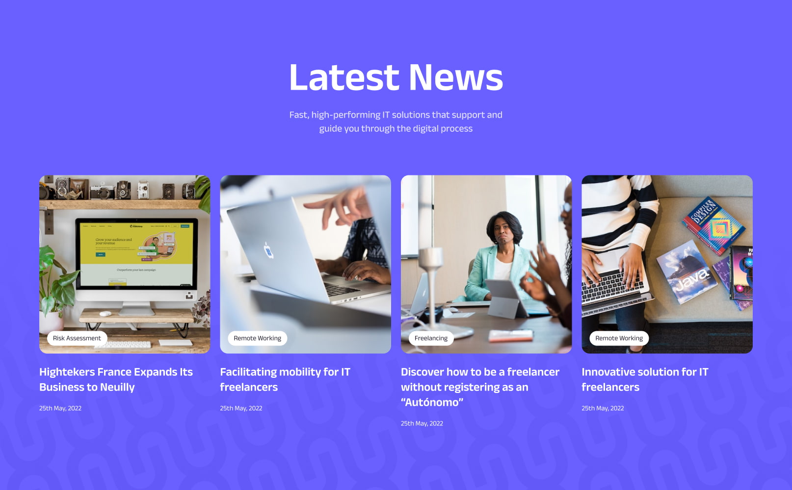
We delivered an international website with 7 different territories and 5 languages.
To effectively target Hightekers’ new territories, we created a global website that enables Hightekers to deliver regional content in different languages to their target markets. This approach means that each new territory benefits from the already established French domain, giving them a head start upon launch.
Market exposure was critical to the success of the project which is why our team delivered an SEO strategy that was designed to grow Hightekers’ organic rankings in search engines and enable the website team to create an optimised website structure.
SEO strategy
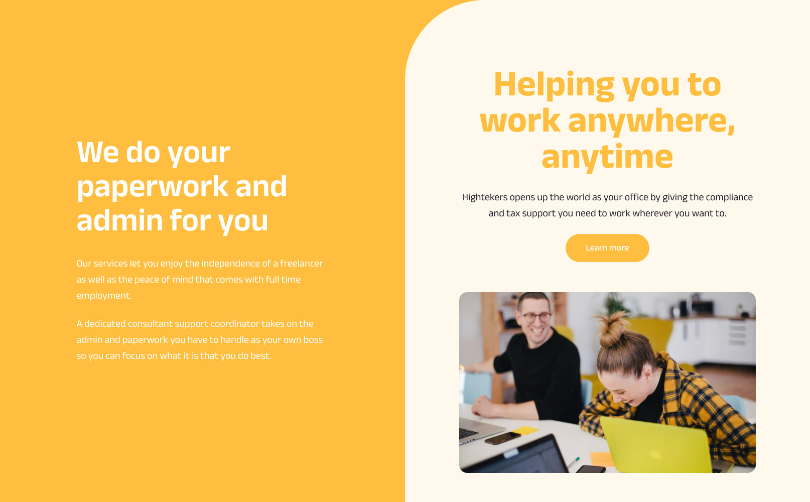
The new website was designed and built in line with SEO and user experience best practice. Our strategic marketing team created an SEO strategy that would enable Hightekers to leverage their new website rank more effectively in regional search engines.
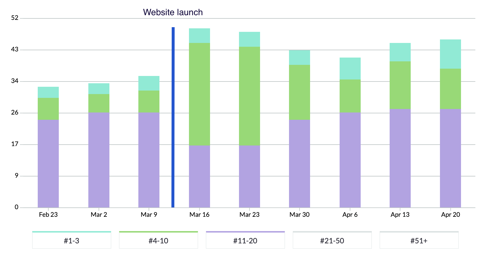
In the chart above, blue bars represent positions 1-3 in Google, green represents rankings on the rest of page 1, and purple represents page 2 rankings.
Following the launch of the new website, Hightekers began to secure new page 1 search engine rankings. They have almost tripled the number of keywords in the top 3 positions and they continue to climb.
“Plug & Play immediately understood what we were looking to achieve with the project and we were impressed by their knowledge of best practice for international websites and their ability to demonstrate performance outcomes.
We really enjoyed the process and seeing our new brand come to life through the website, which has been really exciting!
Upon launch, we very quickly saw an increase in search engine visibility and our keyword rankings are continuing to climb. The team at Plug & Play have been lovely to work with, with quick turnarounds and high quality design and development. If you’re looking for a new brand and website, we’d recommend partnering with Plug & Play.”
Related work
Bond Global is an embedded recruitment agency that works with innovative CleanTech, DeepTech, BioTech and Enterprise organisations to transform the planet with new technology. Their unique subscription model for recruitment provides scaling businesses rapid access to the best talent.
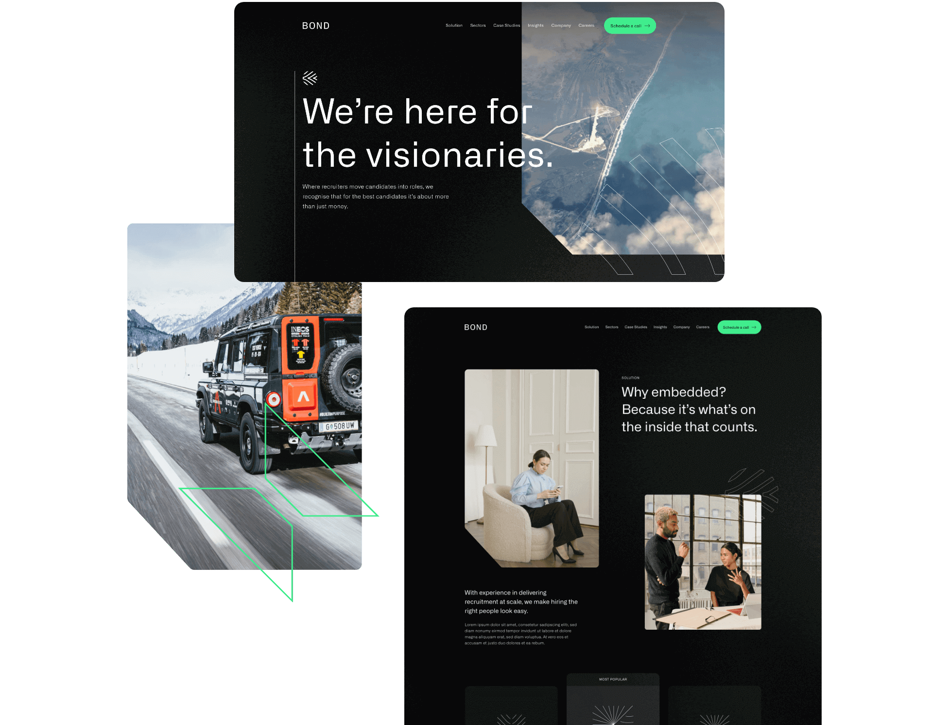
They challenged us to deliver a new brand strategy and identity, and create a slick new website to attract new business.
- Lead time:
- 20 Weeks
- Sector:
- Recruitment
- Target Type:
- B2B & B2C
- Website Goal:
- Reposition the business & attract new clients
- Services:
- Branding, Web Design, Web Development, Marketing Strategy, SEO, Copywriting
- Scope
- Brand Strategy
- Customer Persona Development
- Key Messaging Development
- Brand Identity
- SEO Strategy
- Adobe XD Wireframe Prototypes
- Adobe XD Design Prototypes
- WordPress CMS
- Copywriting
- Resource
- 2 x Marketing Strategists
- 1 x Digital Strategist
- 1 x Brand Designer
- 1 x Website Designer
- 1 x Website Developer
- 1 x Quality Assurance Tester
- 1 x Project Manager
- 1 x Copywriter

The challenge
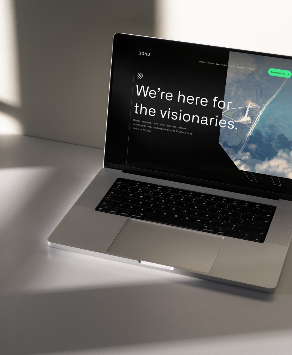
Bond Global is a dynamic and innovative recruitment agency that works with some of the best global talent, however this wasn’t reflected in their existing brand or website. They challenged us to update their recruitment website design and messaging to resonate with their target clients. They were ready to reposition themselves in their market and set themselves apart from other recruitment agencies.
Alongside their rebrand and website redesign, they commissioned us to deliver an SEO strategy that would improve their rankings in search engines and enable new clients to discover them organically.

The brand strategy
Using insights from stakeholders in the business, we created a brand strategy that is faithful to Bond’s values and attracts highly aligned clients. Their new strategy provides the central thread that connects the reason that Bond exists and the reason that their client companies exist. For example, Bond’s new key messages include bold statements like “We’re here for the visionaries” and “There’s no planet B”. These statements speak directly to their clients who work in renewables, clean energy and environmentally positive technology companies that are innovating to clean up the planet.
Bond’s refreshed messaging aligns with their target clients, reflects their USPs and provides their team with a framework of how to speak about the business and communicate in their marketing.

The brand identity
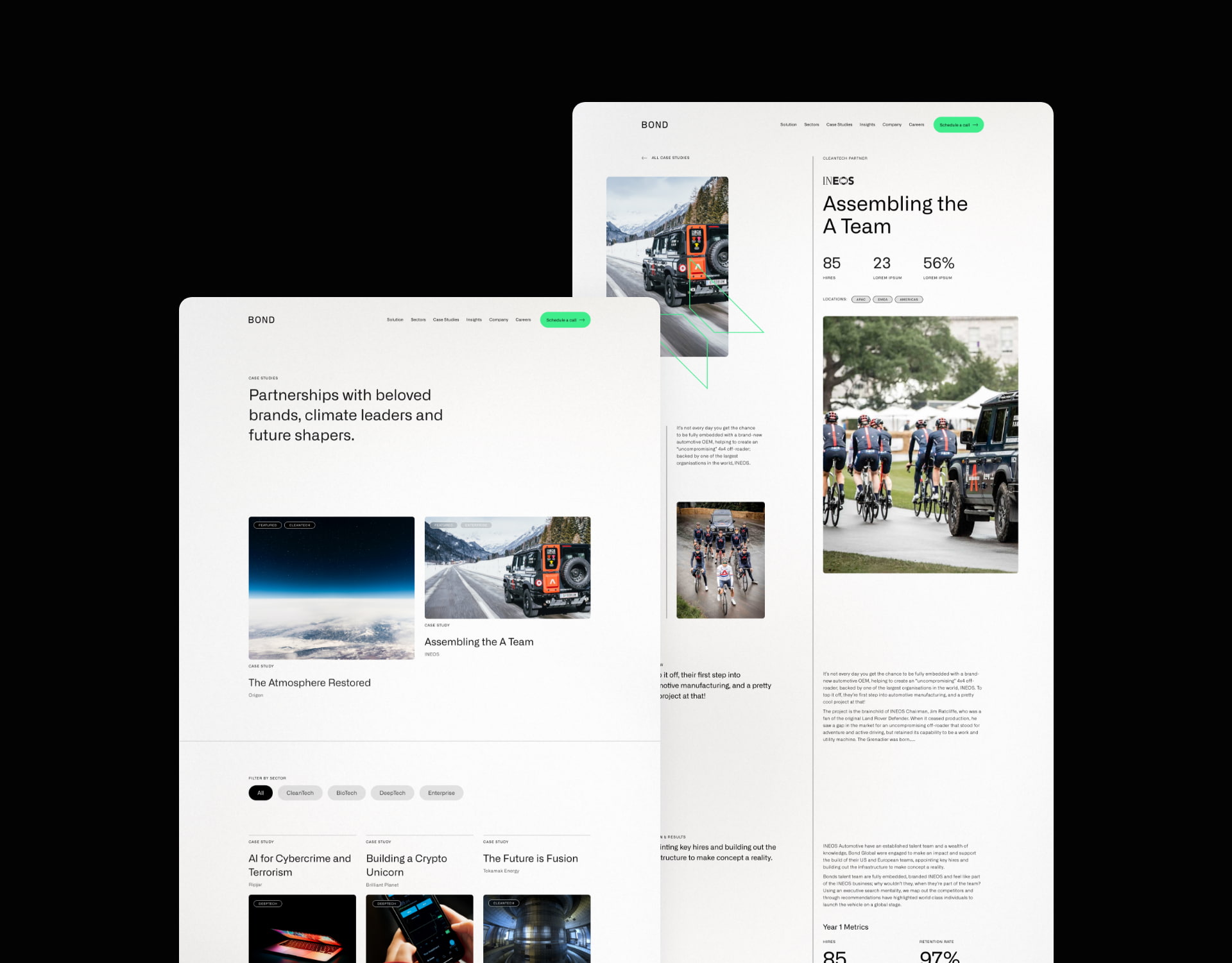
We evolved Bond’s existing brand identity in line with the new strategy and the businesses that they wanted to attract. The use of dark base colours with vibrant pops of colour represent their key brand themes – technology, futuristic, environmental, big picture mindset.
The final visual brand achieves a technical and futuristic feel that resonates with Bond’s clients and the work they do.
The website
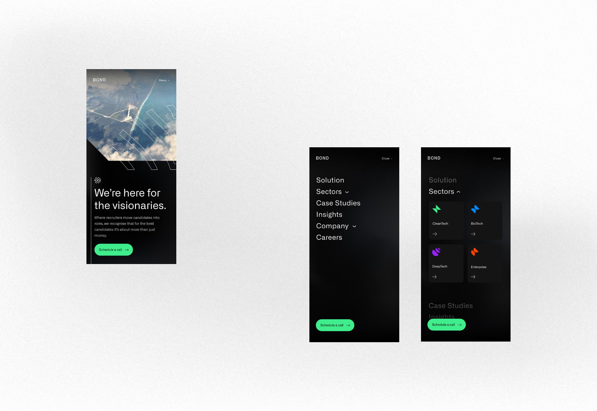
Our website team created a fresh new website design that incorporated the new brand and messaging. The primary goal of the website is to attract and convert new clients, opening up a new channel of lead generation for the business.
Our digital marketing specialists created an SEO strategy that focused on increasing Bond’s search engine visibility for high value search terms, enabling them to be found by businesses looking for their services. We built and optimised the site around the SEO strategy, laying the foundations for continued growth and visibility.
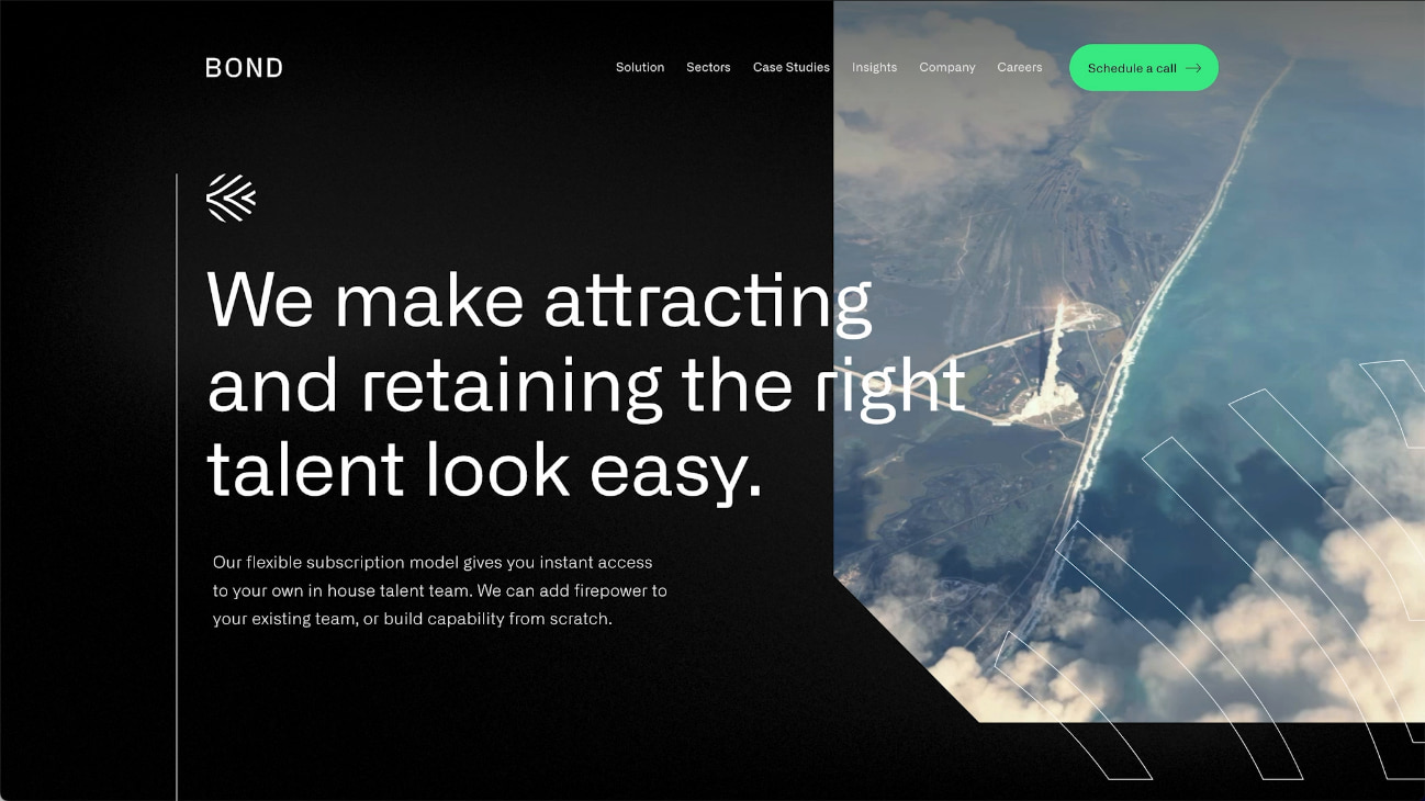
Bond’s new brand identity combines colour, typography, shape, form and imagery to deliver an impactful and unique experience.
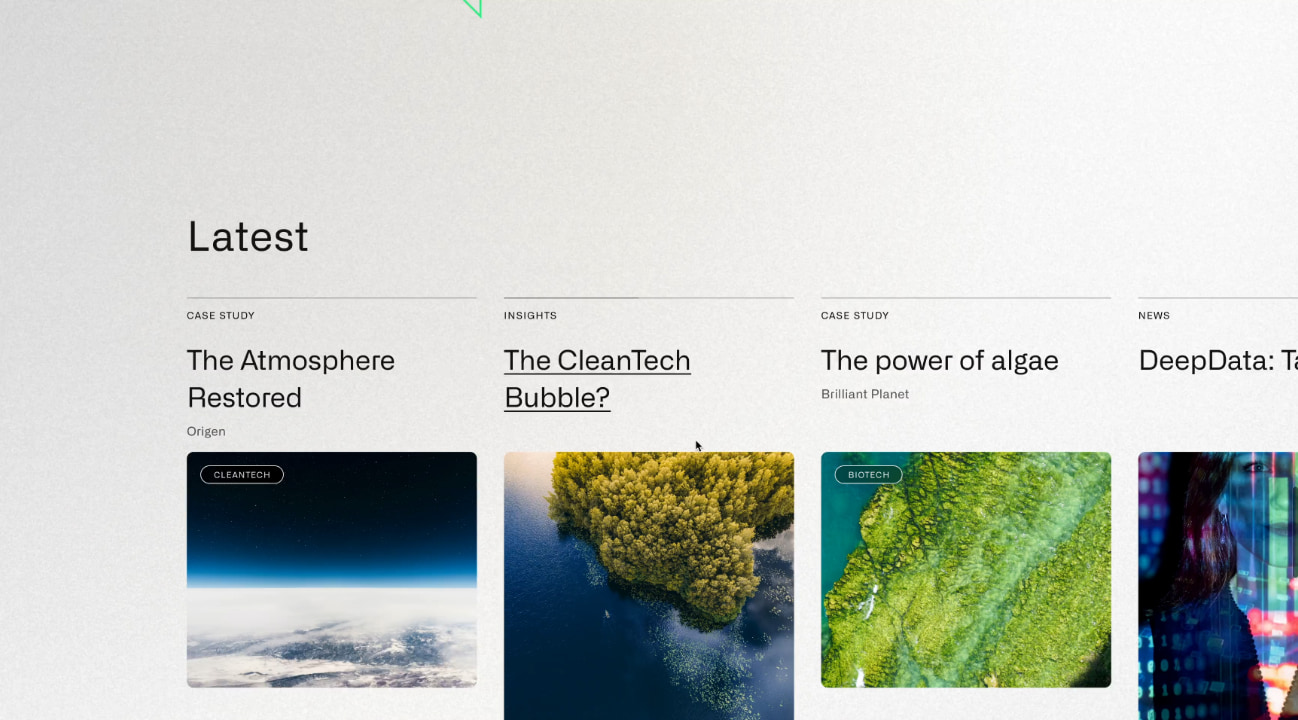
The new website design is fresh and utilises white space to heighten the impact of copy.
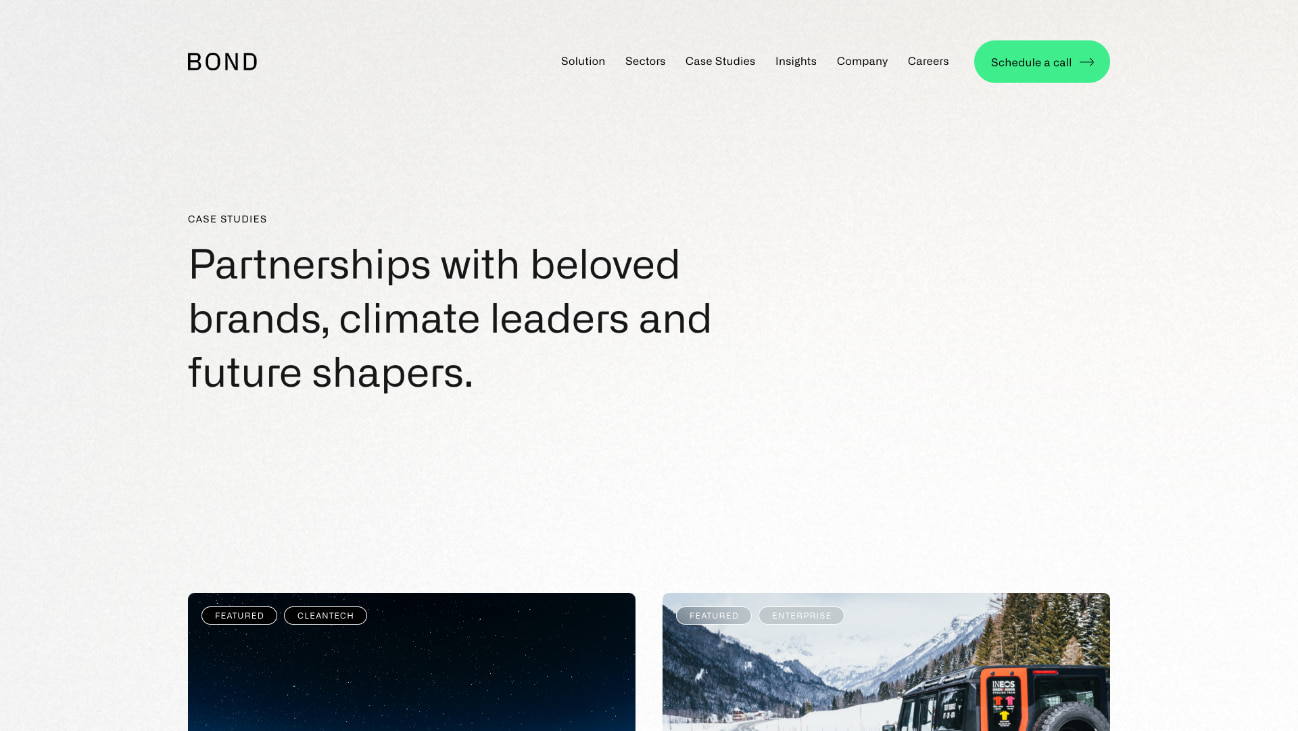
Bond’s new messaging framework sets them apart in their market with a clear and emotive style.
SEO strategy
Prior to the new website launch, the only keywords that the website ranked for in Google were very specific brand terms and a couple of broad terms that were buried deep into page 4 of the search results.
We focused on specific areas of Bond’s recruitment offering to secure new rankings for highly aligned keywords. This enabled them to gain greater visibility for specific terms that would generate new business without wasting resource chasing after competitive and less relevant broad terms.
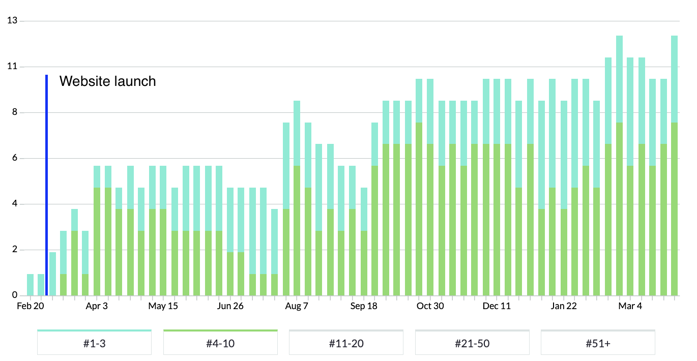
In the chart above, blue bars represent positions 1-3 in Google and green bars represent rankings on the rest of page 1.
You can see that rankings immediately rose in the week following launch and that page 1 rankings continued to grow over time.
“We worked with P&P to rebrand and build a website from scratch. We have been inundated with positive feedback on the look and feel of the Bond brand. The project management side of things and communication was first class. P&P are able to respond to passionate involvement from a client”
Related work
Delcon specialises in the construction of luxury residential, retail and commercial properties. They challenged us to deliver a new brand and website that reflected the quality of their work.
- Lead time:
- 12 weeks
- Sector:
- Construction
- Target Type:
- B2B & B2C
- Services:
- Brand Identity & Website
The challenge
The Delcon team identified that their customers were using the appearance of their website and brand to infer the quality of their construction work. With a dated website design and user experience that didn’t reflect their high quality and precise work, Delcon was ready to invest in their site to connect with their customers and reflect their position in the market.
Our approach
Delcon wanted to retain their reputation as an exclusive business that operated almost exclusively on referrals. Their new website needed to reflect their quality and exclusivity while converting referrals into enquires.
As per the brief, we took an image-led approach to the website design and used imagery to reflect Delcon’s design style. The design pairs raw construction elements with refined finishes, focusing on small and detailed touch points such as sleek loading animations and interactive elements.
Dynamic design
We created a website design with subtle movement and interaction that produces a premium feel. These interactions include parallax animations where elements on the page scroll at slightly different speeds. We also created an expansion and narrowing effect on the screen as the user interacts with the page. This directs the user’s attention and signposts the user journey.
We introduced ambient video footage into the design to create depth and visual interest.
The development
We developed the website using WordPress to provide a flexible content management system for the Delcon marketing team. The new site gives them a high level of customisation while also enforcing their new brand guidelines.
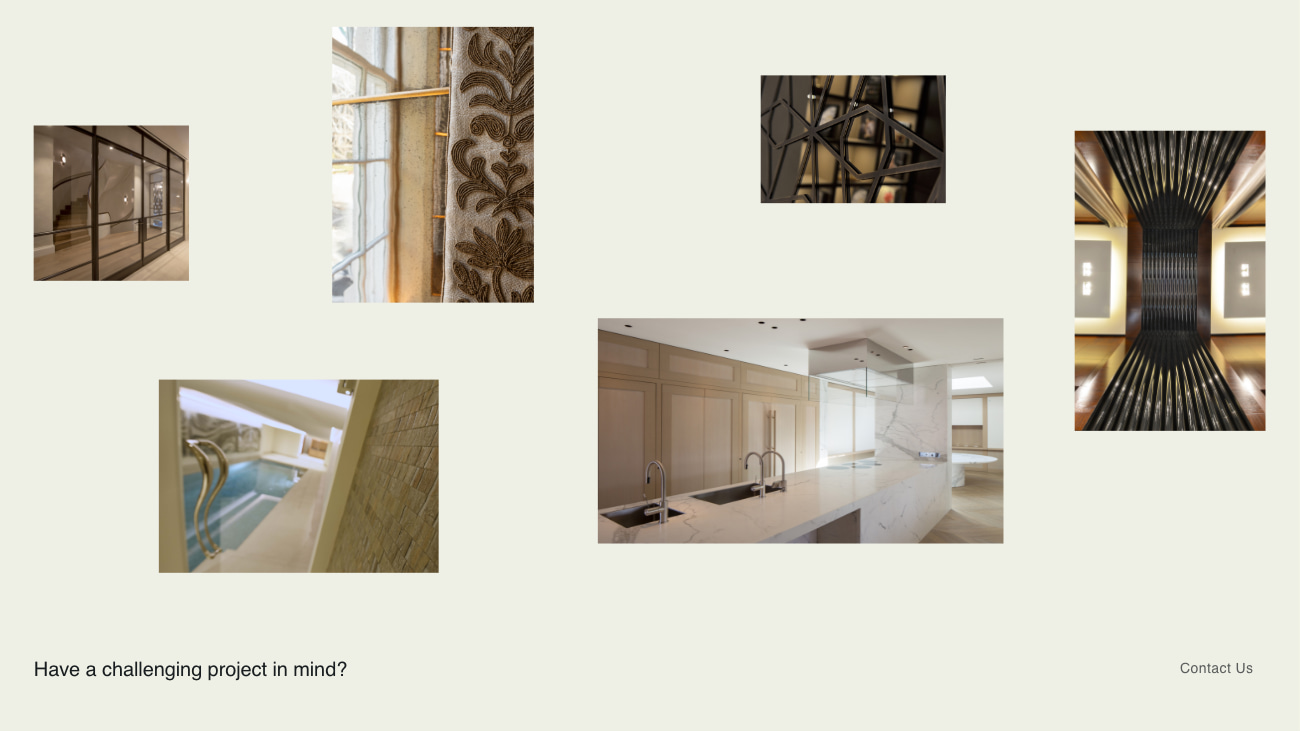
Image showcase
The site is designed to show glimpses of Delcon’s work and materials, while maintaining client confidentiality which is required on the majority of Delcon’s projects.
Team
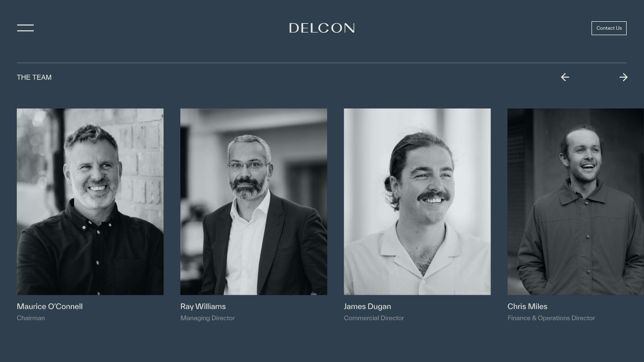
An interactive component was created to showcase the Delcon team.
Balance
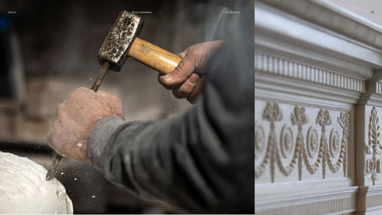
The new website harnesses the balance between form & function, and between raw & refined. These concepts are at the heart of Decon’s brand.
The brand
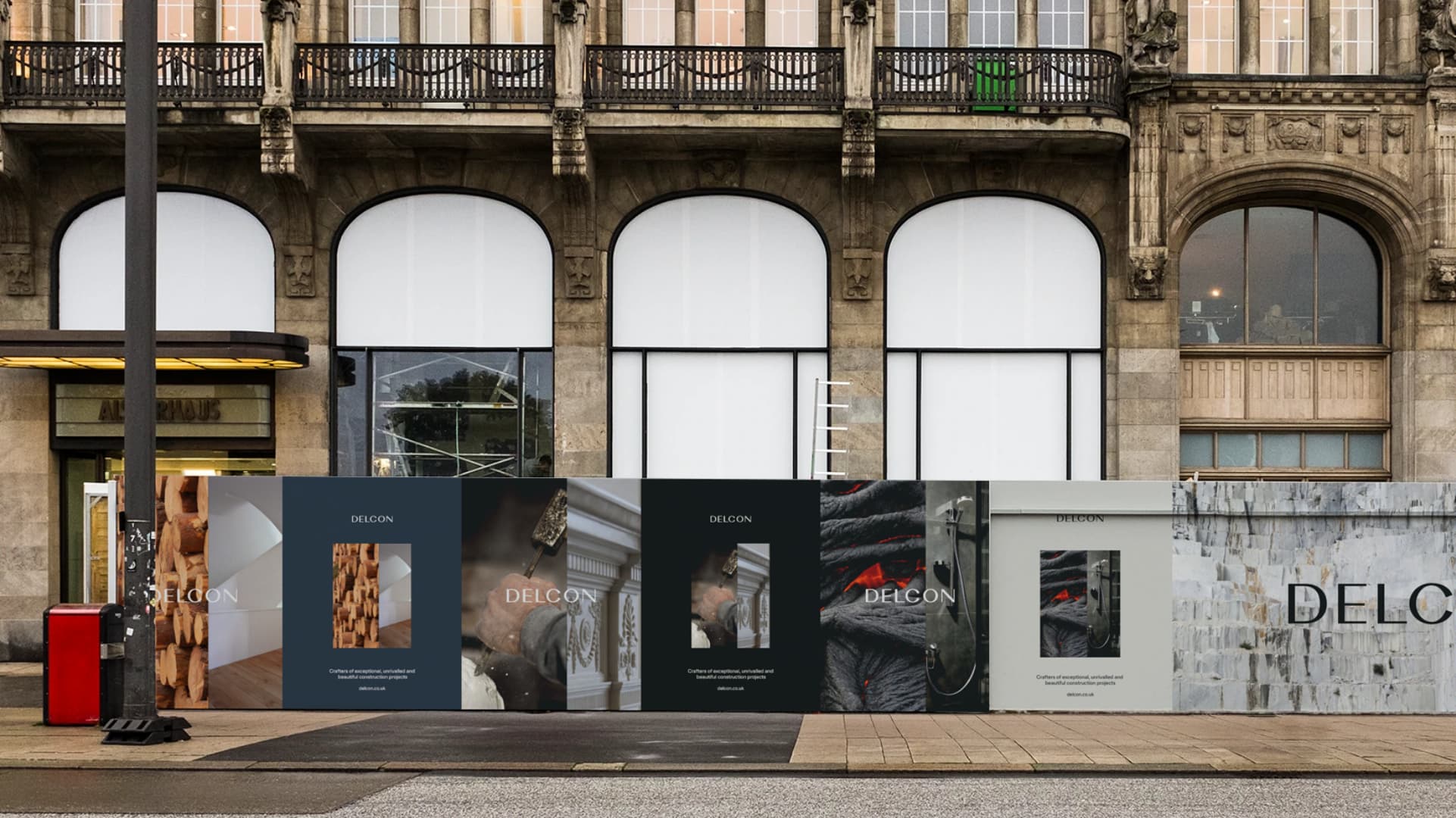
We evolved the Delcon brand, creating a new colour palette, typography and image guidelines. The brand was rolled out to the new website and portfolio ‘look book’ and was prepared to be implemented on hoardings and on-site materials.
Related work
Delcon is a high-end construction company that specialises in luxury retail and residential properties. They needed a new brand identity to attract new customers and elevate themselves above the competition. They wanted to be the construction company of choice for exclusive construction projects.
- Lead time:
- 8 weeks
- Sector:
- Construction
- Target Type:
- B2B & B2C
- Services:
- Brand Identity & Website
The challenge
Delcon’s existing brand was dated and didn’t represent the quality of work that they delivered. They challenged us to refresh their visual identity and align their brand with their target customers.
The new brand needed to help prospective customers self-identify as a good fit by highlighting Delcon’s attention to detail and quality of work. Delcon wanted to take a minimalist image-led approach, showing their customers what they do rather than telling them.

Imagery
Delcon’s imagery balances form & function, and raw & refined, using raw and finished materials in contrast with each other. For example, marble walls and lava-stone showers.
Typography
To select the typography, we assessed a number of high fashion brands such as Prada, Yves Saint Laurent and Rolls Royce. These brands use simple and delicate lettering that create a luxury and understated feeling to the copy. We replicated this style, selecting a simplistic but impactful combination of fonts to reflect the Delcon brand.
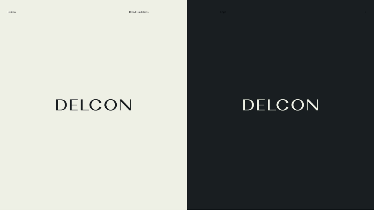
Logo
We created a bold and authoritative logo that reflects a confident and established business. The carefully constructed letter forms balance boldness with intricacy.
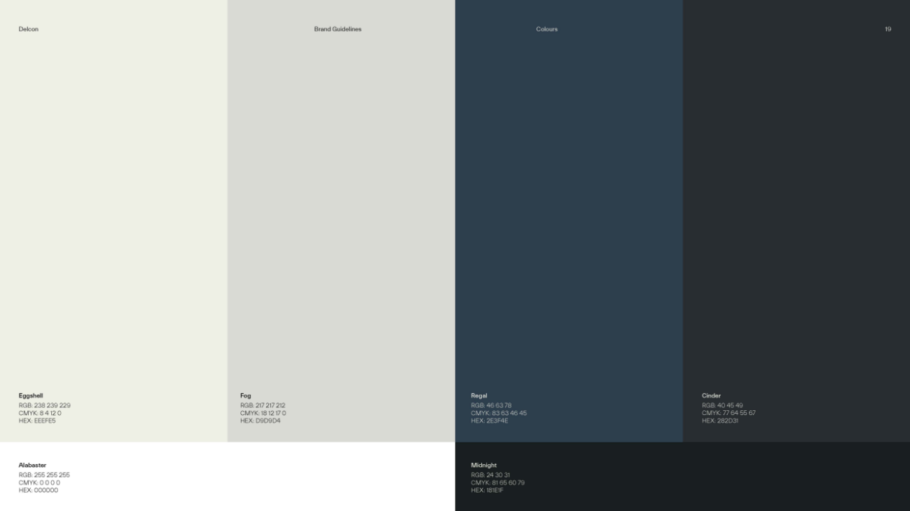
Colour palette
The Delcon colour palette is subtle and understated to enable the imagery to stand out.

Raw and Refined
Raw and refined imagery is used side by side to showcase the craftsmanship of Delcon’s work.
The website
Following the rebrand, we collaborated with Delcon to create a fresh new website design. We delivered an interactive design that engages users and directs users through to conversion. The website uses best practice code, loads quickly and incorporates sleek animations.
Related work
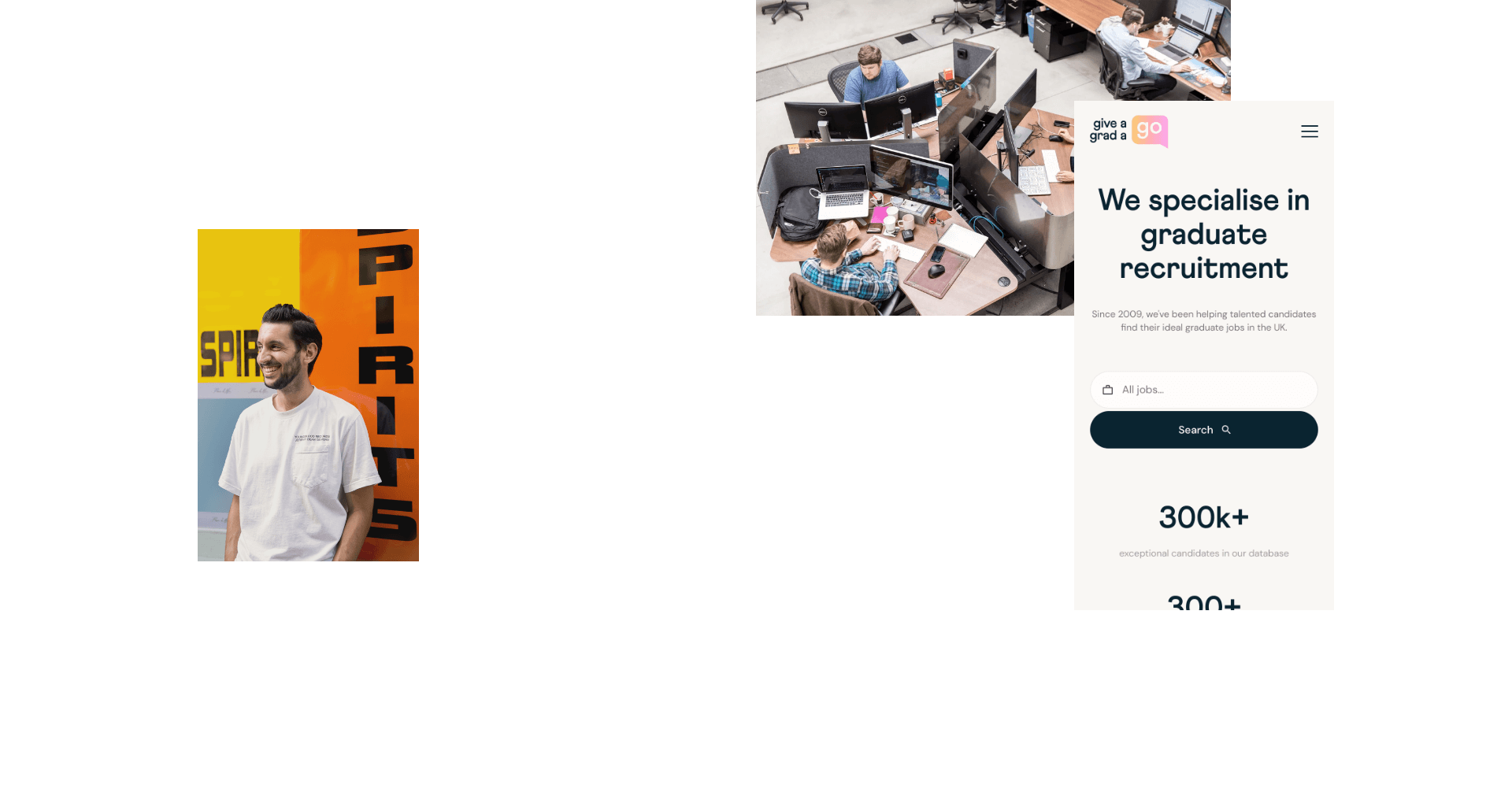
Give A Grad A Go is a global graduate recruitment agency that challenged our team to completely overhaul their digital infrastructure and marketing. They needed help to enable their team, expand their market share and elevate their customer experience.
We delivered a new brand, website and marketing strategy, as well as a custom self-service jobs portal.
- Lead time:
- 28 weeks
- Sector:
- Recruitment
- Target Type:
- B2B & B2C
- Demographic
- Employers & Graduate Candidates
- Website Goal:
- Increase pool of employers and graduates, improve Google rankings, enable marketing team
- Services:
- Digital Transformation, Branding, Digital Marketing, Web Design, Web Development, eCommerce, Jobs Portal, WordPress, Laravel
“We’ve had a brilliant experience working with Plug & Play — I wouldn’t have trusted this project to any other of the agencies we initially spoke to.”
The challenge
Give A Grad had ambitious growth targets and were ready to rethink their customer experience and utilise beautiful design and high performance technology to achieve their objectives.
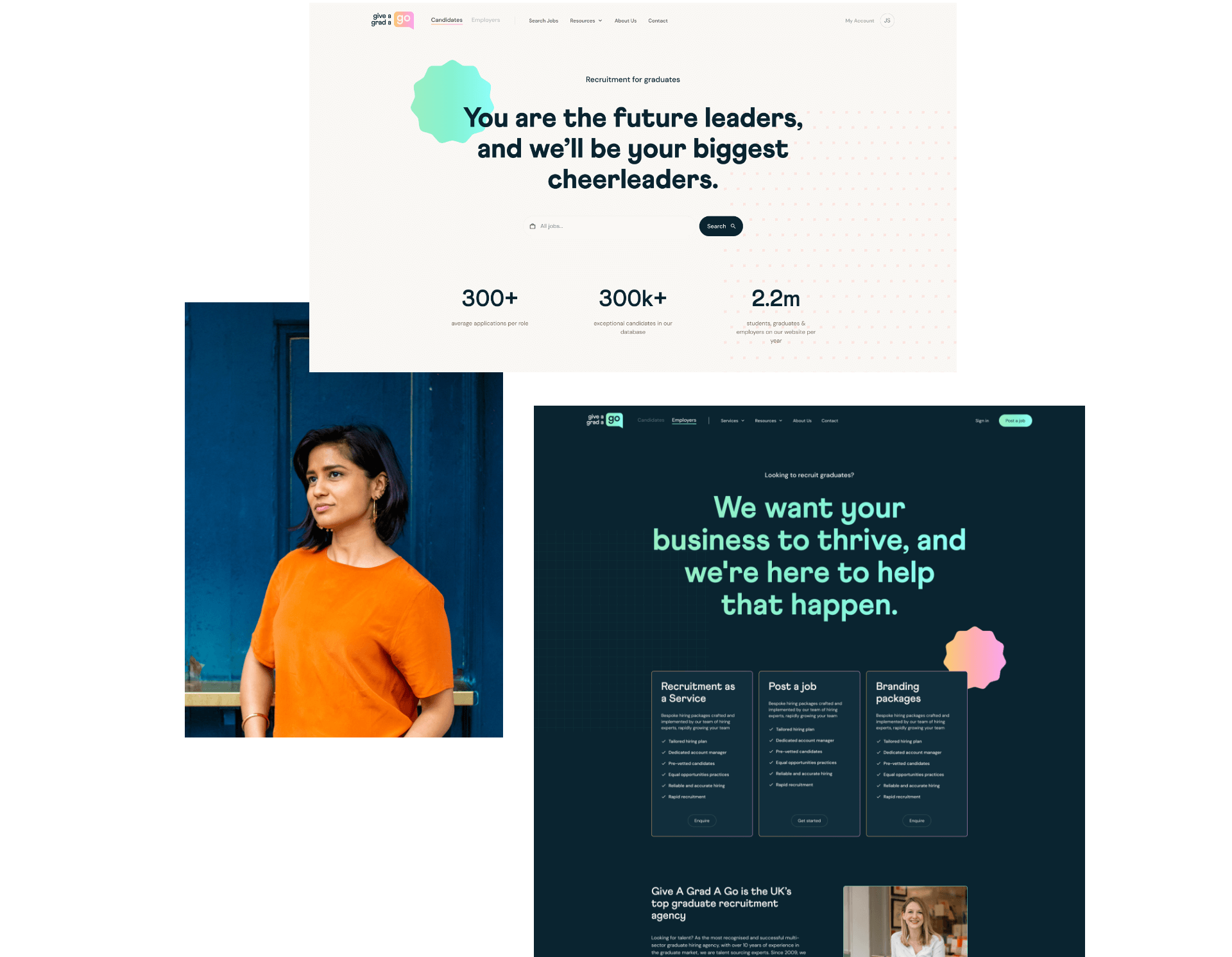
They challenged us to create a new brand identity and launch a sector leading recruitment website that would showcase their offering and attract graduate employers and job seekers with an effective marketing strategy.
Give A Grad also partnered with us to deliver a self-service jobs portal that would enable them to tap into a new part of the recruitment market. The website and jobs portal needed to integrate seamlessly to deliver the best user experience to job seekers.
- Scope
- UX & UI Design
- Adobe XD Wireframe Prototypes
- Adobe XD Design Prototypes
- UX Design
- WordPress Development
- Laravel Development
- WordPress Website
- Multi-territory
- Jobs Portal
- International SEO Strategy
- Brand Identity
- Digital Transformation
- Resource
- 1 x Lead Designer
- 1 x UX Designer
- 1 x Brand Designer
- 1 x Technical Lead
- 1 x Laravel Developer
- 1 x WordPress Developer
- 1 x Digital Marketing Specialist
- 1 x Quality Assurance Tester
- 1 x Project Manager

Digital transformation
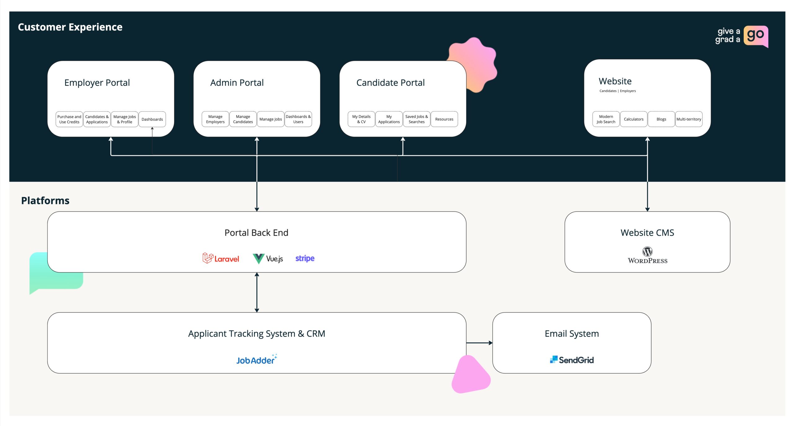
The project involved a number of interfaces and required a complete overhaul of Give A Grad’s technology. Our team created a digital transformation roadmap and strategically selected technology to meet the current and future needs of the business.
SEO
Give a Grad A Go already had an established digital footprint in the UK and Australia and ranked for a variety of high value keywords. Our team delivered an SEO strategy that would take their search engine rankings to the next level by growing existing rankings and expanding their keywords targets.
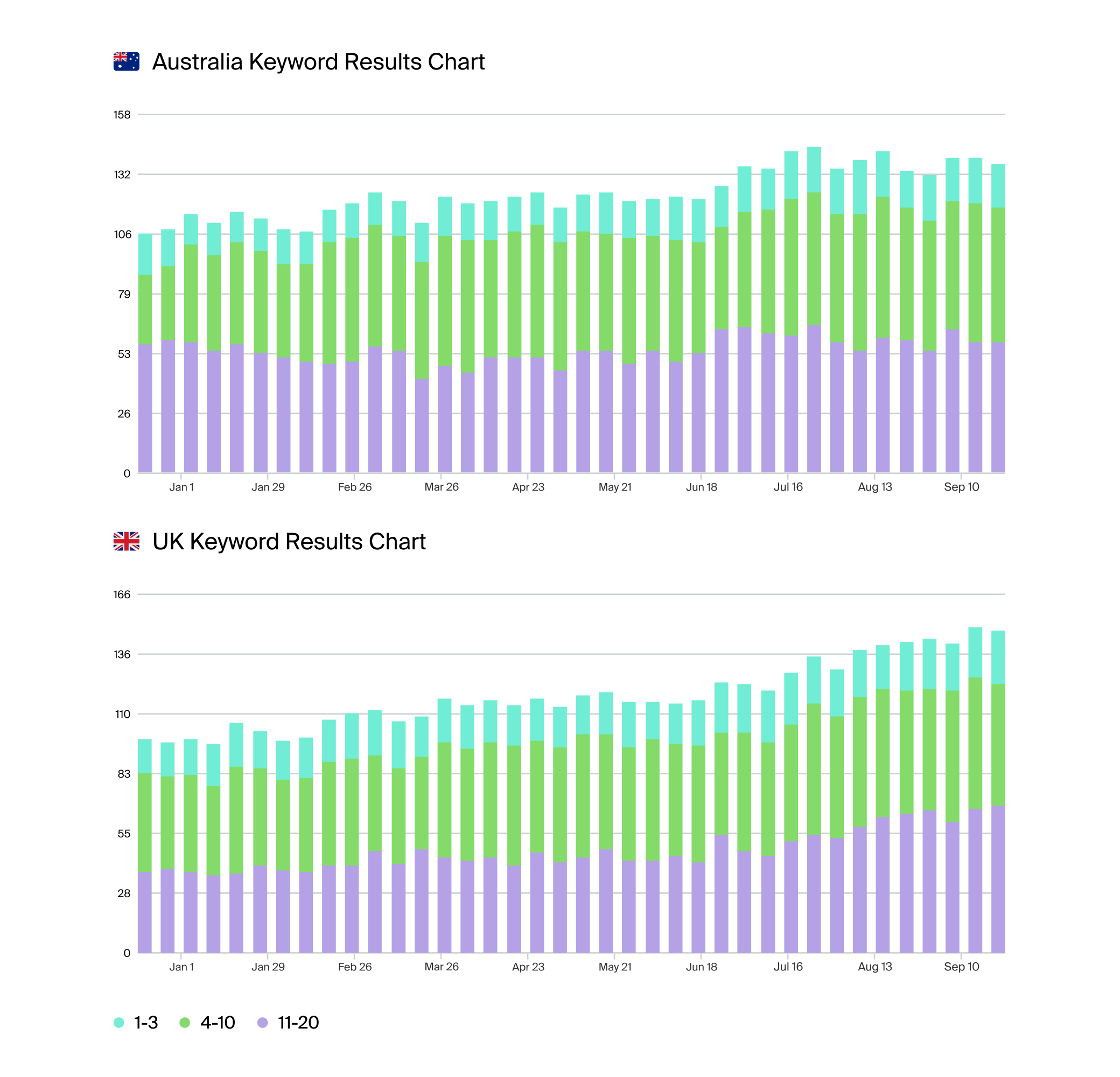
The charts above show Give A Grad A Go’s keyword rankings following the new website launch. The blue bars represent positions 1-3 in Google, green bars represent rankings on the rest of page 1, and purple bars represent page 2 rankings.
The international website
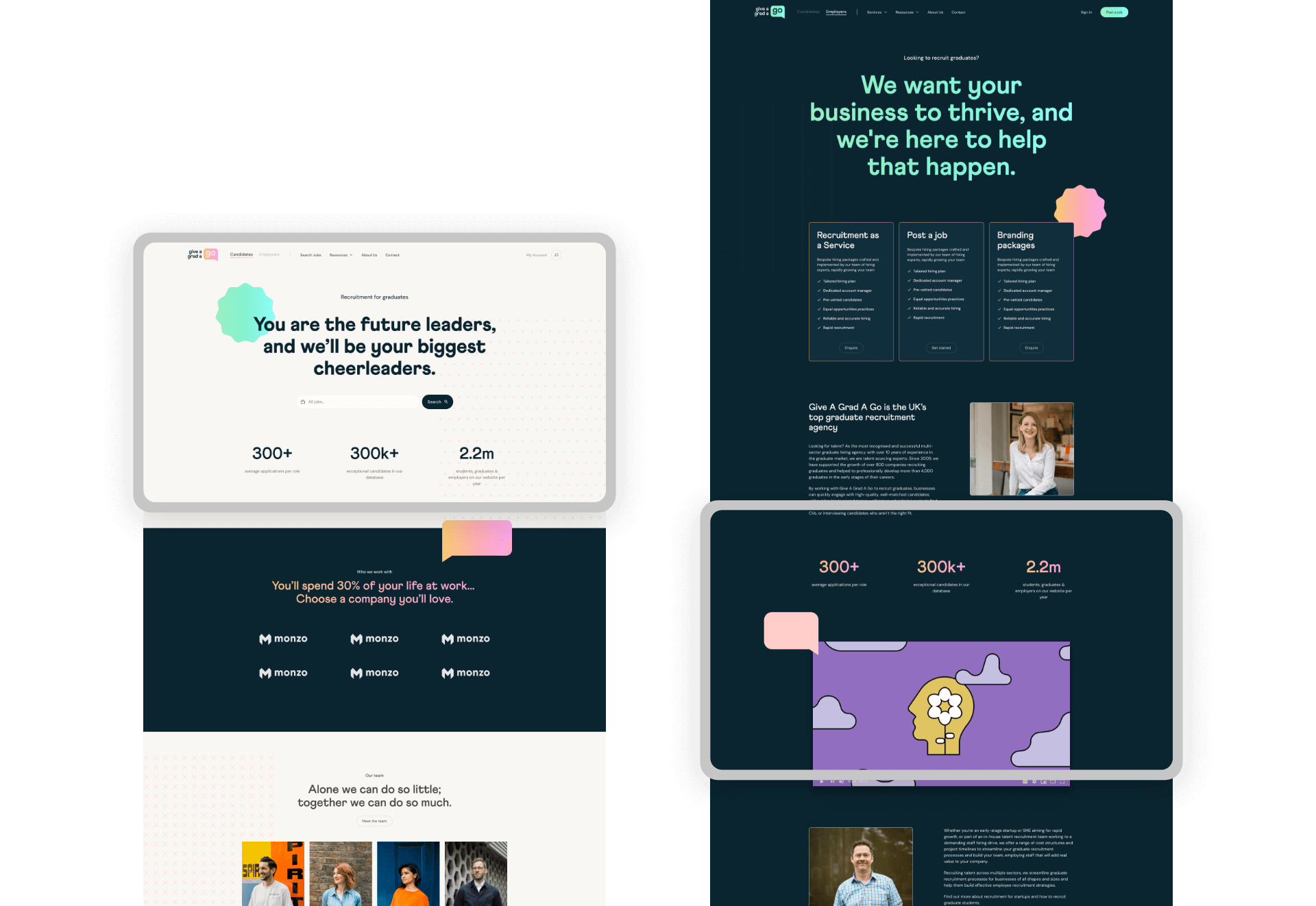
The new website design specifically targets graduates, utilising the new brand identity to create a playful and fun design that aligns with Give A Grad’s target audience.
We developed the website in WordPress with 2 territories to target the UK and Australia. Each territory has optimised regional messaging and a regional SEO strategy to maximise reach, discoverability and conversion rate.
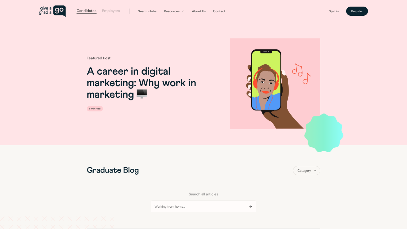
Resource hub
We grouped articles into user friendly guides that provide a continuous user journey that encourages content consumption and keeps users on the site.
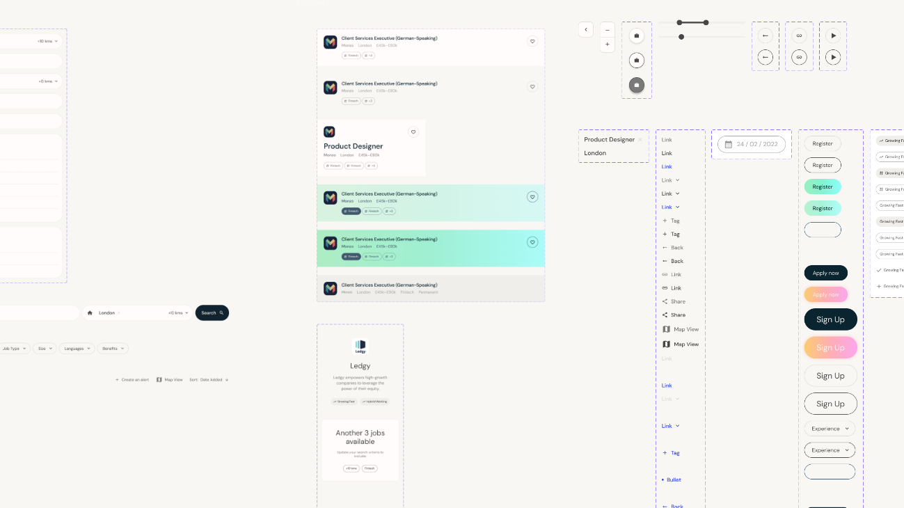
Design style
We created a playful website design that would appeal to Give A Grad’s target demographic.
Job search
As the powerhouse of the new website, the job search needed to be fast, intuitive and deliver high quality results. We introduced a number of new features to provide a seamless and engaging user experience.
- A split screen view for easy job searching
- An optimised text layout for job post skim-ability
- A tagging structure to highlight job benefits
- A map view to visually represent locations
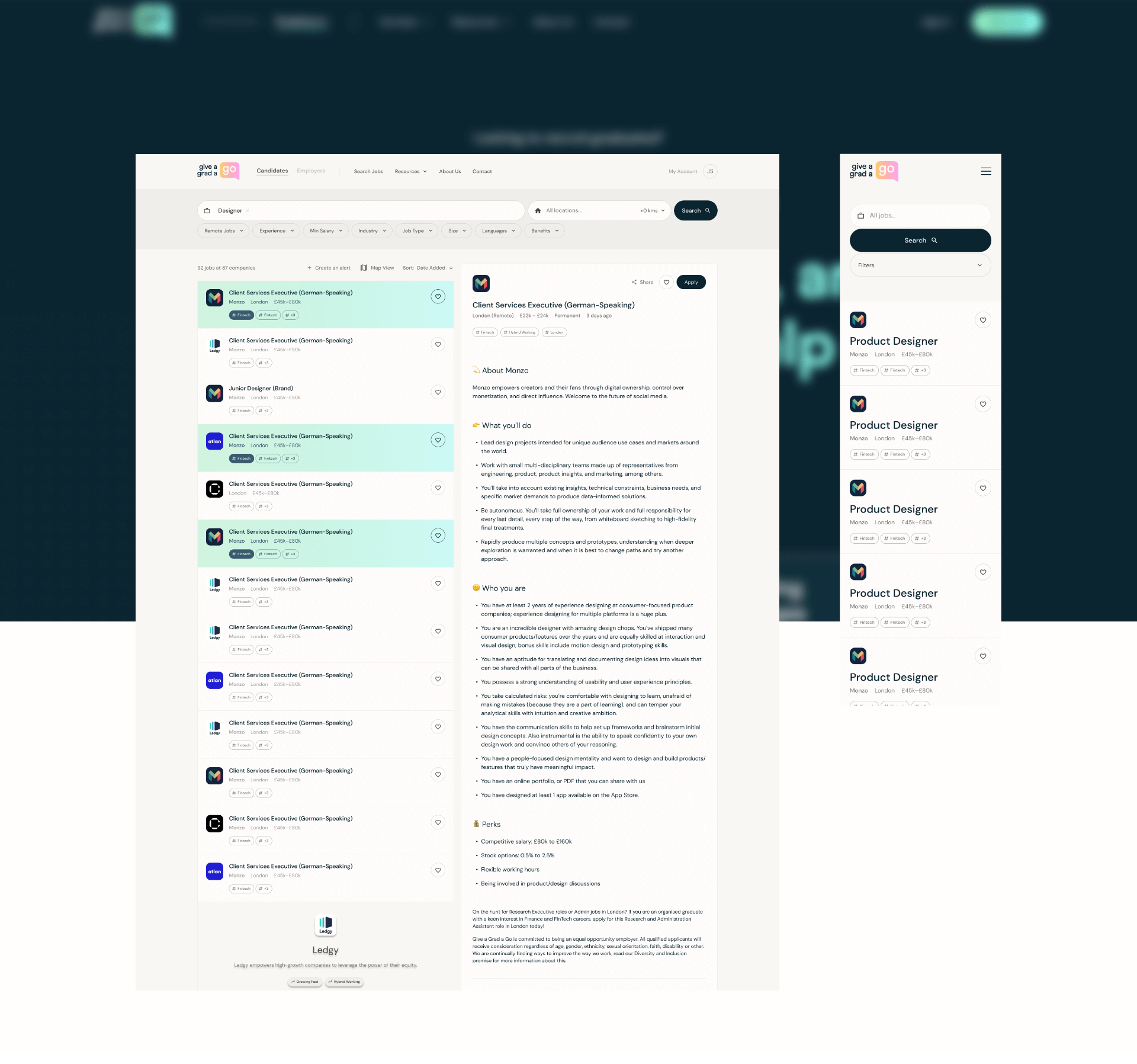
Jobs portal
We launched a new self-service jobs portal that enables Give A Grad to capture a greater percentage of the recruitment market. The portal enables employers and candidates to manage job ads and applications and seamlessly integrates with the website.
Our UX design team constructed optimised UX designs and user flows to deliver a portal that is intuitive, fast and engaging. Our developers coded the portal using Laravel which provides Give A Grad with a flexible framework that can be expanded as the business need grows.
Developing the brand
Give A Grad’s old brand was dated and no longer reflected the business size and position in the market. They needed a new brand identity that would provide greater flexibility and could grow with the business.
We created a playful and bold brand that targeted graduates and appeared professional and trustworthy to employers. Balancing the two main audience types was critical to producing a successful brand.
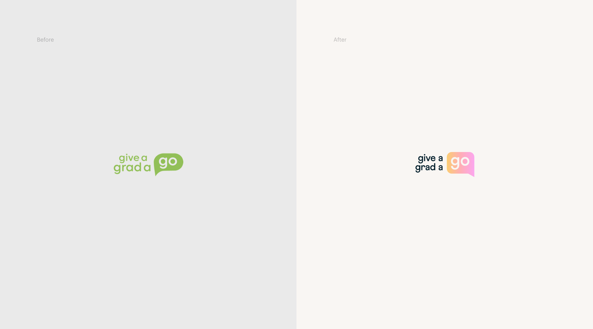
Logo
Drawing on inspiration from brands such as Whatsapp, the speech bubble represents approachability and the ‘keeping in touch’ culture.
The use of lowercase letters in the logo creates a personable feel in contrast to the corporate image presented by many competitor brands.
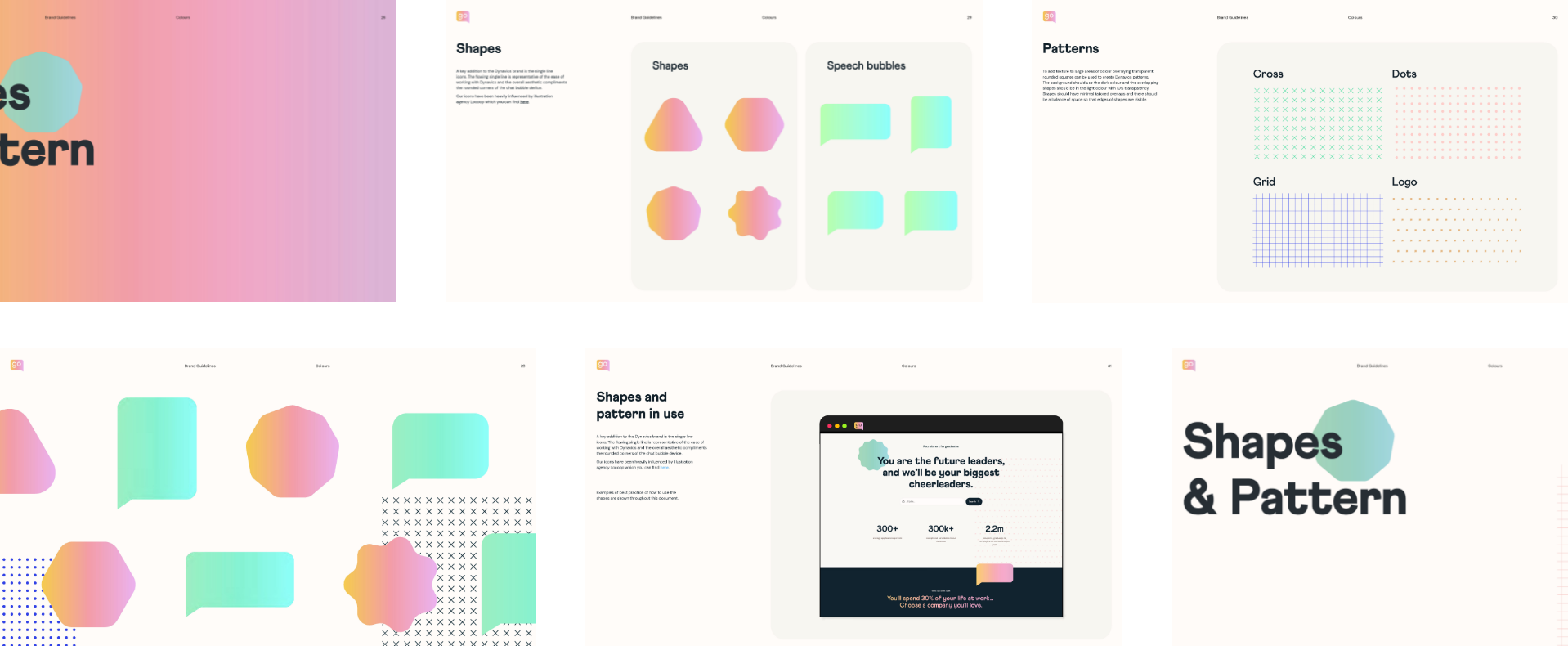
Shape & form
We created a series of fun shapes to compliment the new logo. The shapes act like physical stickers and can be overlapped to break up layouts and create depth.

Patterns
We created 4 core brand patterns that are a nod to sketchbook aesthetics. They add texture to large areas and elevate simple content into something fresh and interesting.
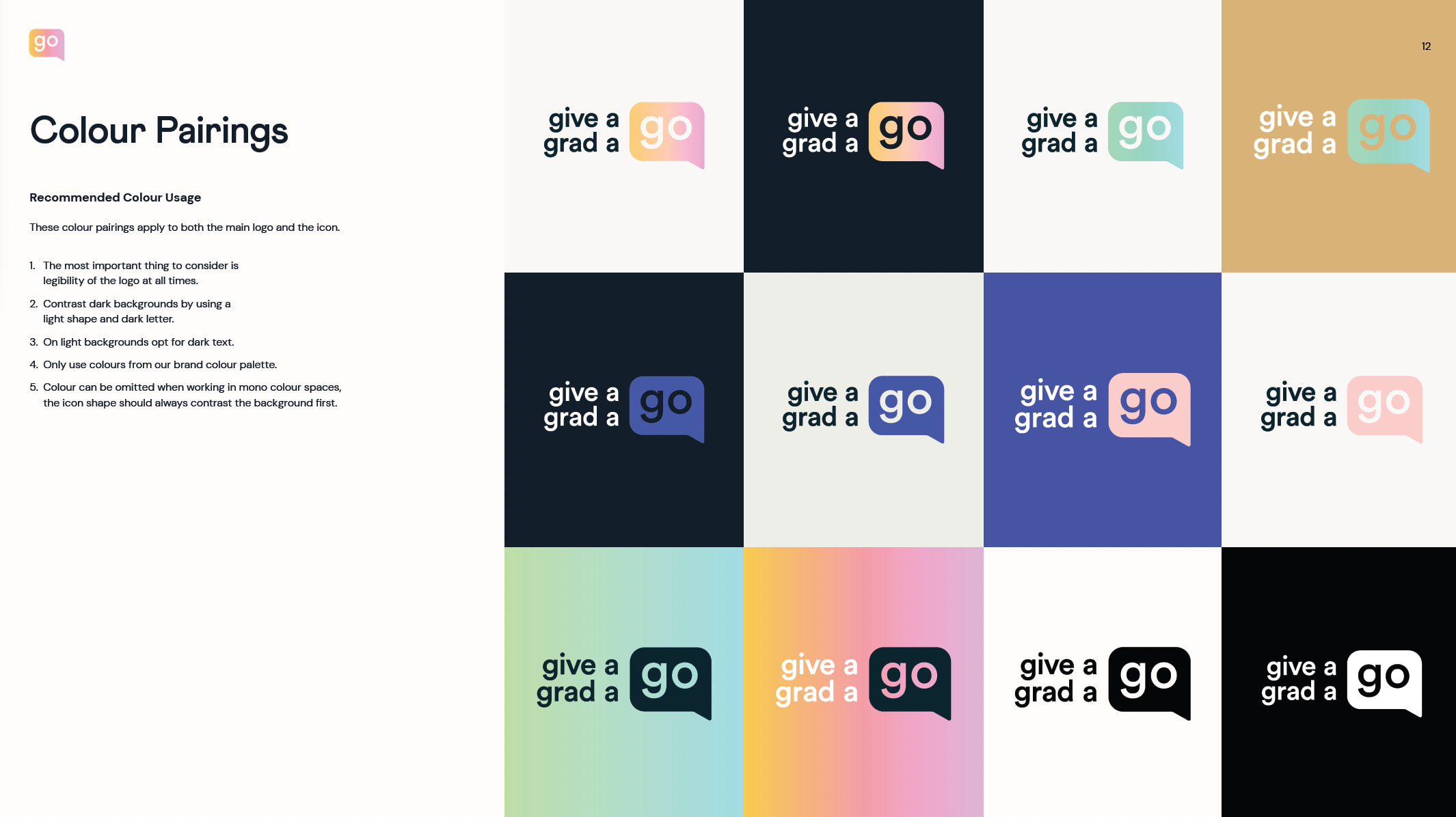
Colour & gradients
The new colour palette combines vibrant dark and light colours that can also be utilised as gradients. We established colour pairing guidelines to enable the Give A Grad team to consistently apply the brand colours.
Related work
Dynavics is a Microsoft implementation partner that helps with the design, development and support of Microsoft Dynamics 365 Business Central.
Aware that their dated brand was holding them back, the Dynavics team challenged us to create a new brand identity. The brand needed to align with their target customers and stand out against competitors.
- Lead time:
- 3 weeks
- Sector:
- Technology
- Target Type:
- B2B
- Services:
- Brand Identity & Website
The brief
Clients choose Dynavics over their competitors because of their high level of customer service and their passion for what they do. It was important for the new brand identity to capture the spirit and approachability of the team while also representing a market leading tech business.
The existing Dynavics brand included a limited number of colours and assets which made it difficult for the marketing team to effectively create new materials. We needed to expand the brand to provide a broader visual toolkit that could still be easily implemented by the team.
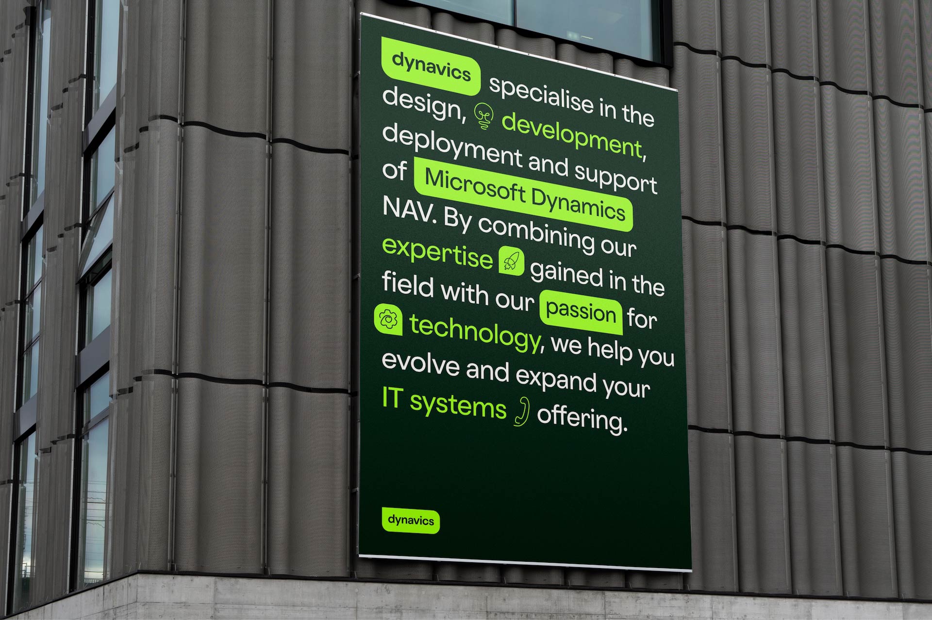
Imagery
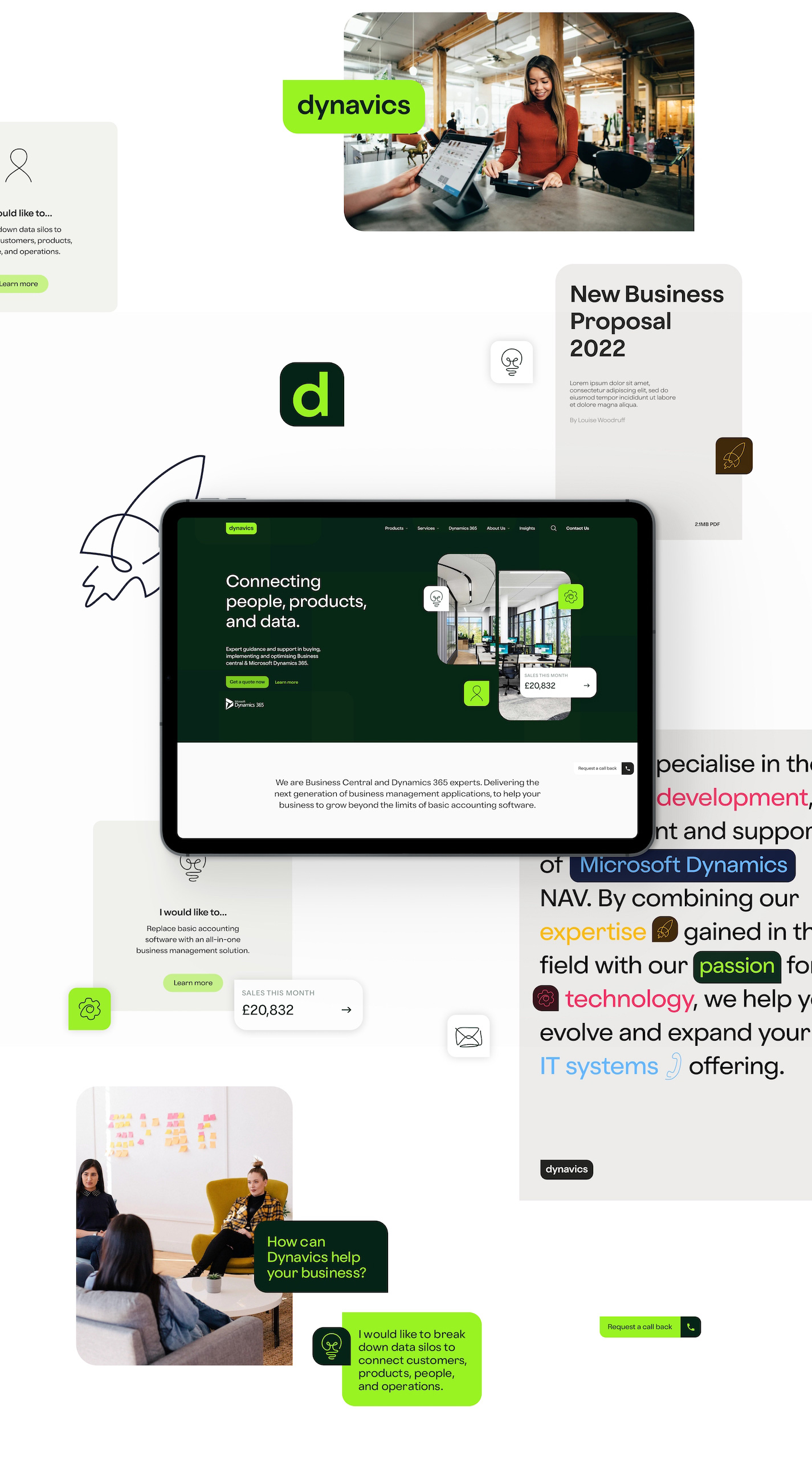
We created branded assets to showcase the Business Central systems that Dynavics deliver. The assets used a combination of screenshots, photography and brand shapes, and included animation options to transform the imagery into dynamic assets.
Icons
To produce a warm and approachable feel to the brand, we created hand drawn icons. The icons were animated for digital use which adds depth and visual interest to the page.
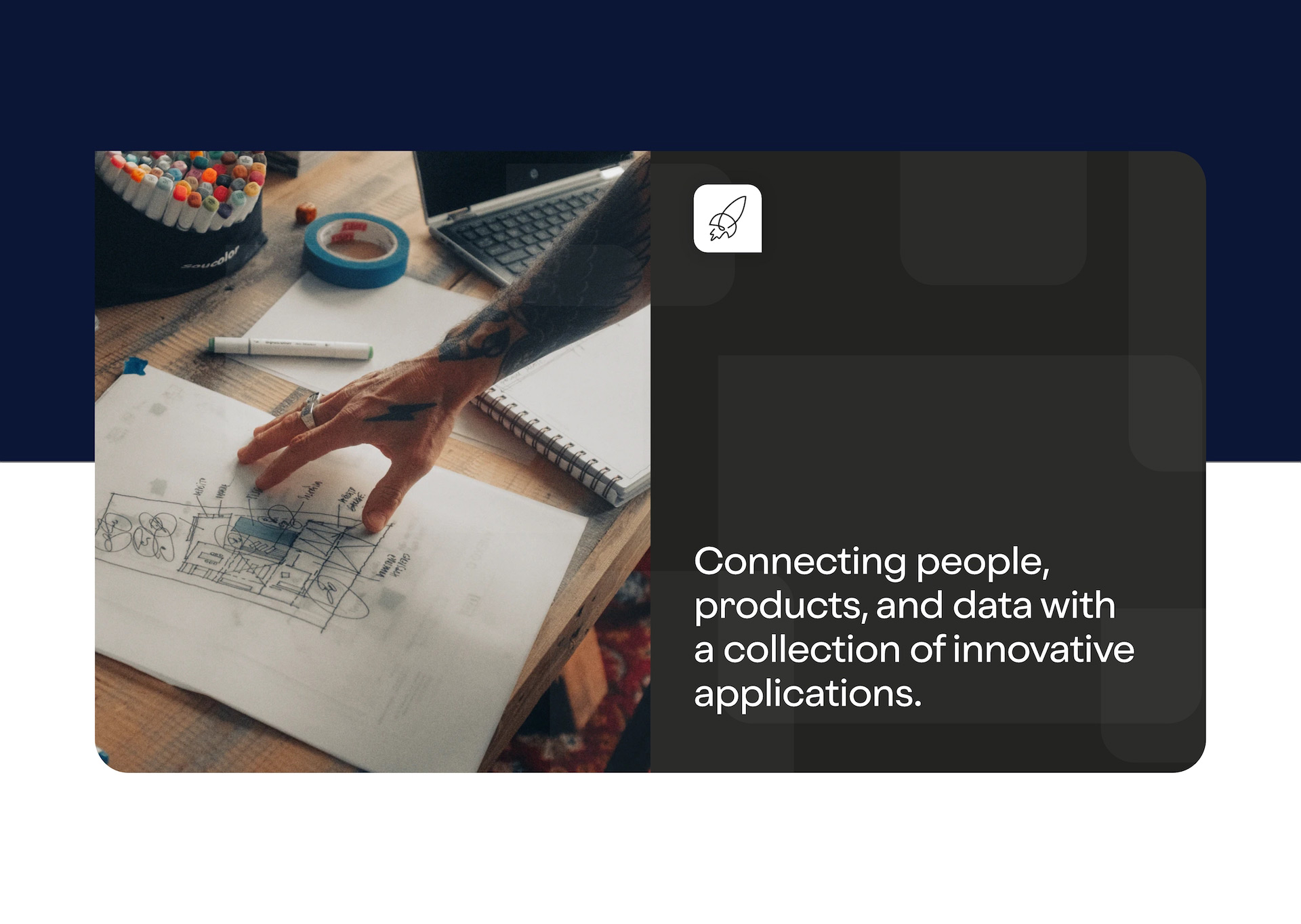
Typography
We selected typefaces that strike a good balance between the straightness and roundness of characters. This delivers a friendly digital feel and aligns Dynavics with businesses such as Google that use font in a similar way.
Brand guidelines
We delivered a set of brand guidelines to outline how the new visual brand should be applied online and offline. The guidelines tie the various brand elements together to ensure that the Dynavics team are able to flexibly and consistently use the new brand identity.
Logo
We created a vibrant new logo that would stand out against competitors. The simple nature of the logo provides the flexibility to use it in a variety of contexts. It is responsive and can be adapted to a monochrome colour palette.
Colour palette
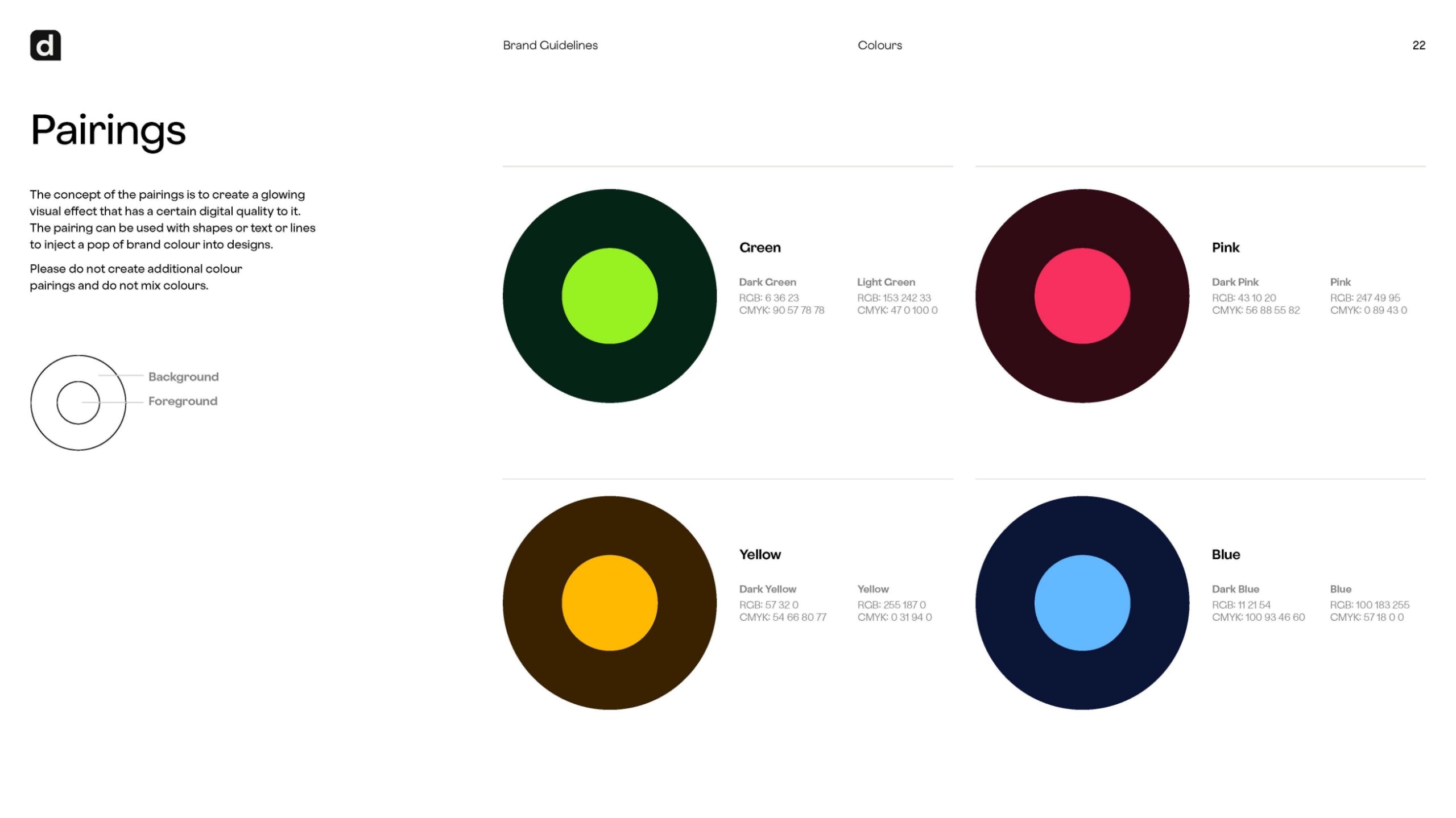
We broadened the brand colour palette to provide a greater level of flexibility and enable Dynavics to assign colours to their different business offerings. We paired the colours to simplify usage for the team.
Shape and form
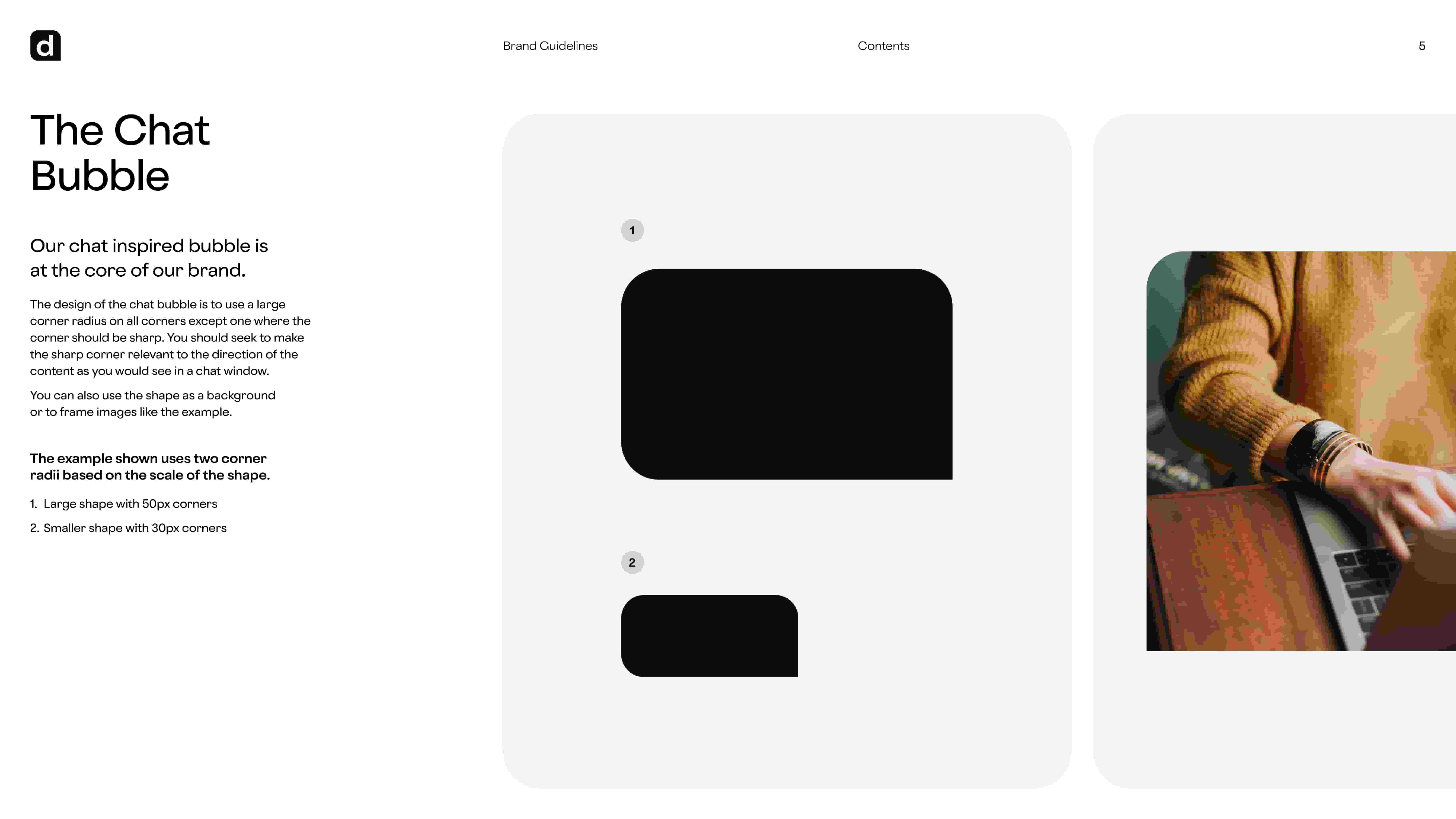
We developed a chat box shape to give the brand depth and form. This shape is used within the logo, background patterns and image masks and portals, and ties the range of brand assets together in a unique way that is distinct to Dynavics.
The website
Following the rebrand, we worked with Dynavics to redesign and build their website, implementing the new brand and providing the Dynavics marketing team with the dexterity to manage their content and brand independently.
Our new website design focused on appealing to Dynavics’ target audience and improving conversion rate. We also created an SEO strategy to generate a greater amount of high quality organic traffic to the website.
“Their team delivered an outstanding project from start to finish and have provided amazing ongoing support ever since.
We’ve seen a significant boost in lead quality and received great feedback on our distinct branding and logo, this has really helped us stand out against competitors.”
Related work
Tring Park is a performing arts school and college covering a wide age range from prep through to sixth form. They challenged us to modernise their website and brand, and increase new admissions enquiries from prospective students.
- Lead time:
- 14 Weeks
- Sector:
- Education
- Target Type:
- Students, parents and the local community
- Website Goal:
- Create a market leading website design, increase new admissions enquiries
- Services:
- Web Design, Web Development, Branding, Digital Strategy, Digital Marketing
- Scope
- Adobe XD Wireframe Prototypes
- Adobe XD Design Prototypes
- WordPress Development
- Full Brand Identity
- SEO Strategy
- Multilingual Functionality
- Spektrix Integration
- Resource
- 1x Brand Designer
- 1x Web Designer
- 1x Frontend Developer
- 1x Backend Developer
- 1x Marketing Strategist
- 1x Digital Marketing Specialist
- 1x Quality Assurance Tester
- 1x Project Manager
The challenge
Tring Park School’s website was beginning to look dated and didn’t effectively communicate their offering. With the old website holding them back, Tring were ready to launch a dynamic new brand and website that would stand out in their market and make them the performing arts school of choice.
They sought to improve the number of prospective students finding them in search engines by investing in search engine optimisation, while also improving their conversion rate by revamping their web design and user experience.
Post-launch website results
We significantly improved keyword positions, search engine visibility and organic traffic within the first 6 months of launching the site.
Our approach
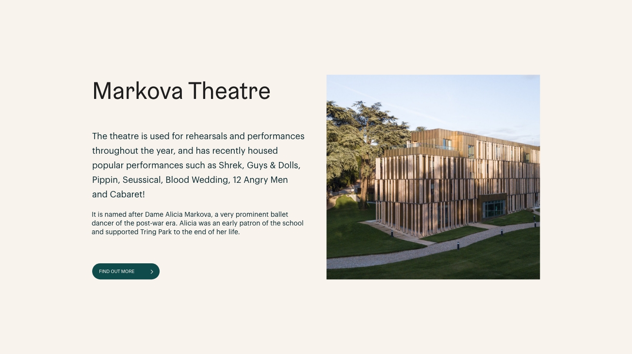
We created a modern new website that can be easily edited. We built the website with reusable modules, providing the Tring Park Marketing Team with the flexibility to manage their content, create new pages, and have full autonomy over their page layouts, menus and components.
The new website needed to be multilingual to appeal to international audiences. We implemented multilingual functionality using Google’s translate plugin which is available to UK charities.
Spektrix Integration
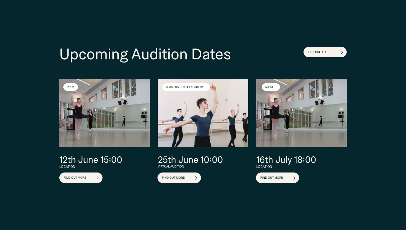
We integrated the website with Spektrix, Tring’s event management and booking platform.
Flexible content management
We designed the website using flexible branded components that give Tring’s marketing team the flexibility to create new page layouts and manage their content.

Alumni showcase
We showcase Tring’s previous graduates to build trust and demonstrate the success of Tring Park students.
Digital strategy
Tring Park school is funded through fees. As such, it’s important that the school can demonstrate its qualities to prospective students and parents. As a not-for-profit organisation the school doesn’t exist to turn a profit, however it does need a sound underlying business case.
To put the school on the right digital footing we undertook a digital strategy that would guide the process as to how the school would deliver a return on investment for the website and branding project.
The digital strategy outlined how Tring Park could play to its strengths and how it could increase its market penetration and conversion rates. The goal was to drive more engagement in the pre-visit phase of the new pupil experience, creating awareness and desirability for Tring Park.
With the data clearly outlining how young people are looking for their prospective schools, and representing that Tring Park had a great opportunity to increase its attendance, the website was commissioned in line with the recommendations in the digital strategy.

Brand
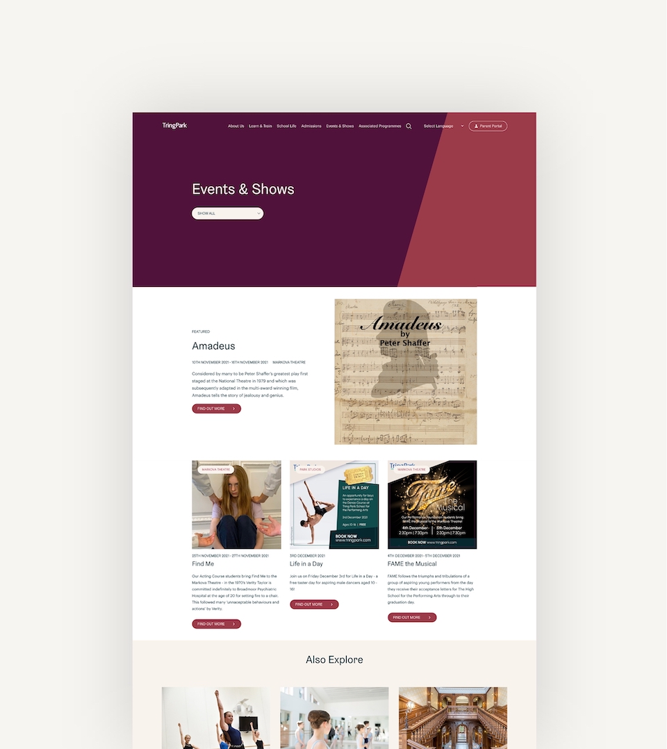
We delivered a new brand identity for Tring Park by focusing on their audience and key values. We led the client through a branding process, focusing on their key values and the existing cornerstones of their visual identity. By collaborating with their marketing team, senior team and school governors, we were able to create and deliver an impactful brand that stands out against competitors.
We created a brand design system that provides visual dexterity and enables the marketing team to flexibly use the brand across their online and offline marketing materials. A particular area of focus was creating brand shapes and patterns that could be interlocked with Tring’s photography to produce a unique style that is highly engaging and distinctly Tring’s.
“We worked with Plug & Play to deliver a new website and brand that ranks highly in search engines and generates new enquiries for the school. As the UK’s leading performing arts and academic school, we needed our new website to effectively showcase our offering and make us the school of choice for talented students.
We’re absolutely thrilled with the results and the Plug & Play team has been a great support. They made strategic recommendations based on our goals, and their creative team was brimming with ideas for the site design. The team are always on hand for not only technical support, but are also happy to help give their professional opinions and ideas in other aspects as well which is invaluable to us. They are patient and take their time to explain things in detail which has made the experience highly enjoyable.
I can’t recommend Plug & Play enough and I look forward to continuing to work together!”
Related work
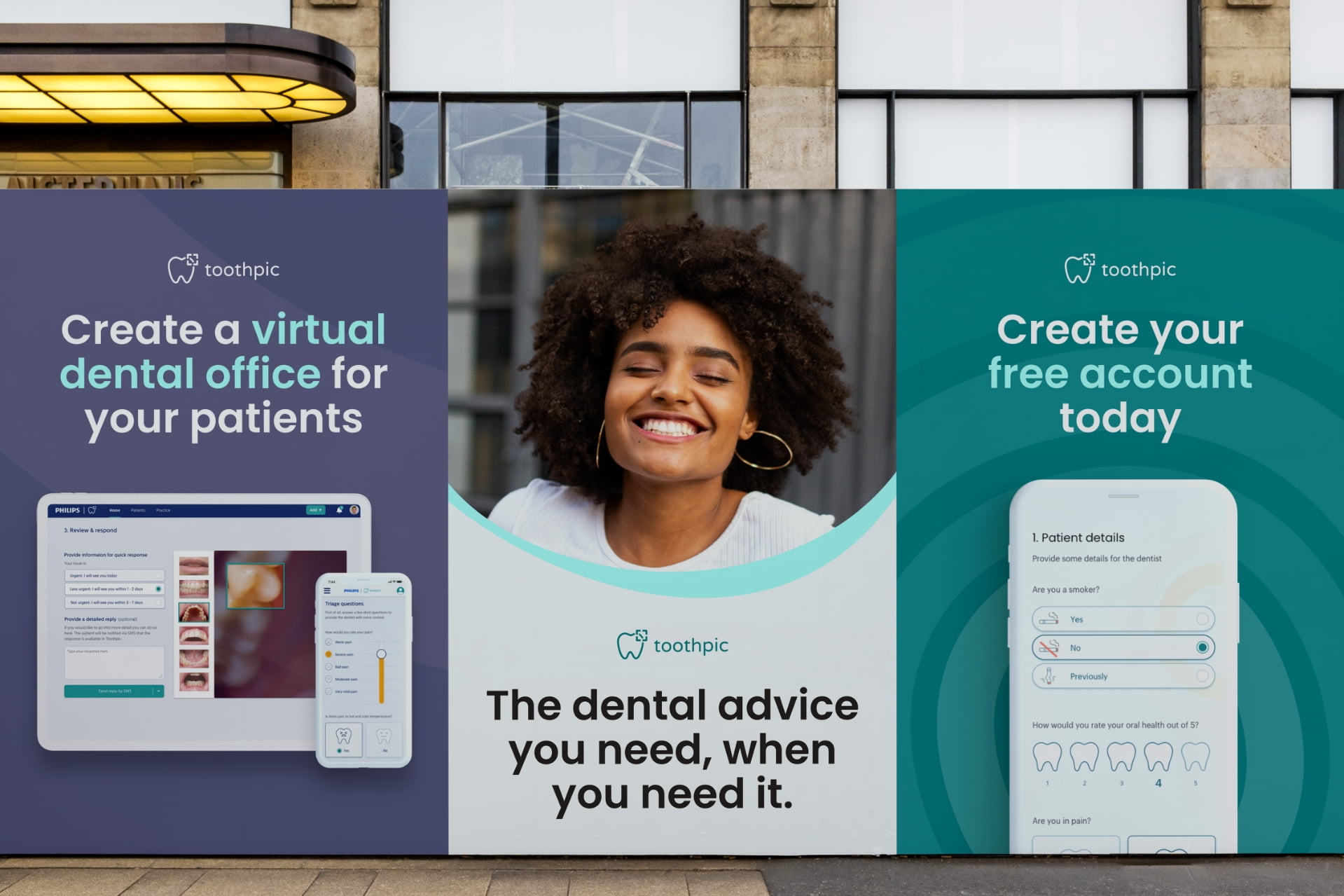
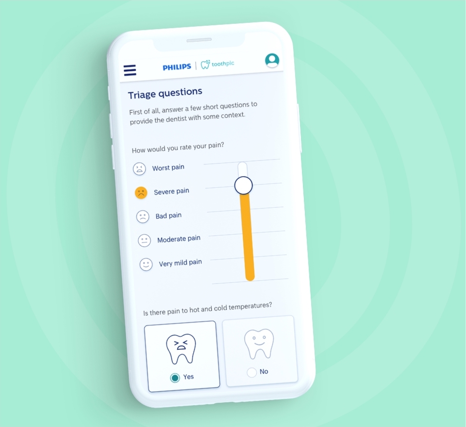
Toothpic is a healthcare business offering tele-dentistry to the US. They work with dentists and insurance providers to triage dental concerns and provide 24/7 support to patients. They offer patients flexible access to a dentist while reducing insurance claims.
- Lead time:
- 4 weeks
- Sector:
- Healthcare
- Target Type:
- B2B and B2C
- Services:
- Brand Identity, Branded Slide Deck & Website
The challenge
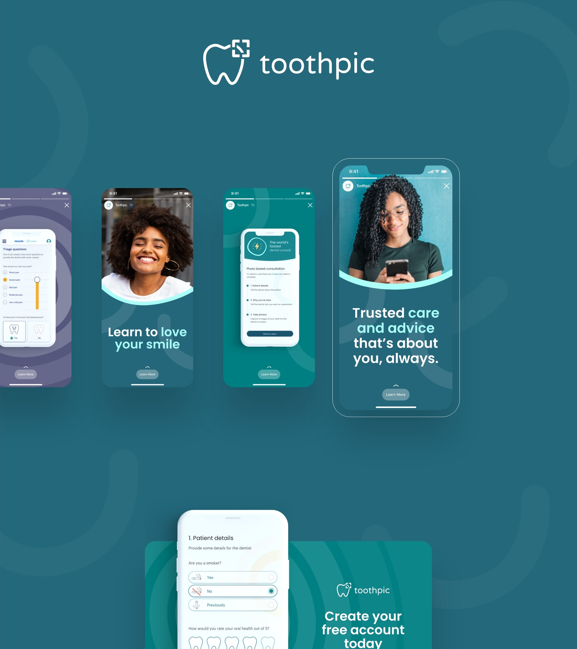
Having undergone a rapid period of business growth, Toothpic challenged us to evolve their brand identity and realign their visual brand with their target audience. The new brand needed to reflect the soft clinical feel of a dental company but also the edginess of a digital product company.
Developing the brand identity
We collaborated with Toothpic’s marketing team to review their brand strategy and create a design and marketing brief for the new brand identity, discussing how their team would need to use the brand in the short and long term.
Our brand designers used the creative brief to create 2 brand concepts, where each represented a different brand design direction. In a raw form, the concepts demonstrated how the typography, logo, colour, shape and form could be used to create Toothpic’s new brand identity.
Toothpic selected their preferred concept to continue to develop and refine into their new brand identity. We created a comprehensive set of brand guidelines and worked closely with Toothpic’s design team to roll the brand out across their digital and offline channels.
The brand deliverables for the project included creating a new set of brand guidelines, an updated accessible logo, broadened colour palette and colour usage guide, brand shapes, patterns, typefaces, image guide, and powerpoint presentation template.
Typography
We selected a number of complimentary typefaces suitable for digital and offline use. Fonts were selected to provide clear and approachable messaging that can be adapted for different material formats. Our team included a font usage guide in the brand book to demonstrate how the various fonts can be used to highlight key messages in a variety of situations.

Colour palette
We created a new colour palette for Toothpic which included primary and supporting colours. Alongside this, we delivered a number of colour and text lock-ups to demonstrate how the colours should be used to maximise the impact of messaging and maintain a consistent look and feel.
Logo
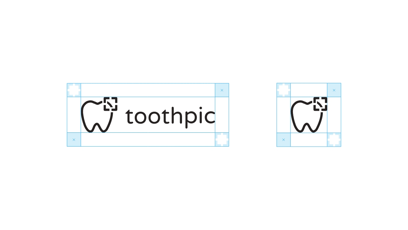
We created a guide for the spacing and alignment of the logo. We adapted the core logo colour to ensure the colour contrast was suitable for digital use.

Image lock ups
We created image lock up guides to make imagery feel distinctly part of Toothpic’s brand.

Shape and form
A collection of brand patterns were created to add depth to the brand. The patterns were designed so they could be used alongside imagery and copy, and can be used in a zoomed in or out format to provide maximum flexibility.
The website
We worked closely with Toothpic to redesign their website, implementing the new brand identity. They needed a flexible website that would provide their team with the autonomy to independently manage their content and campaigns.
Related work
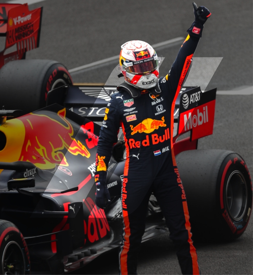
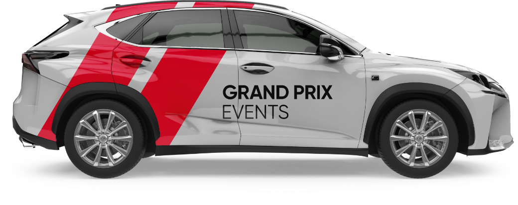
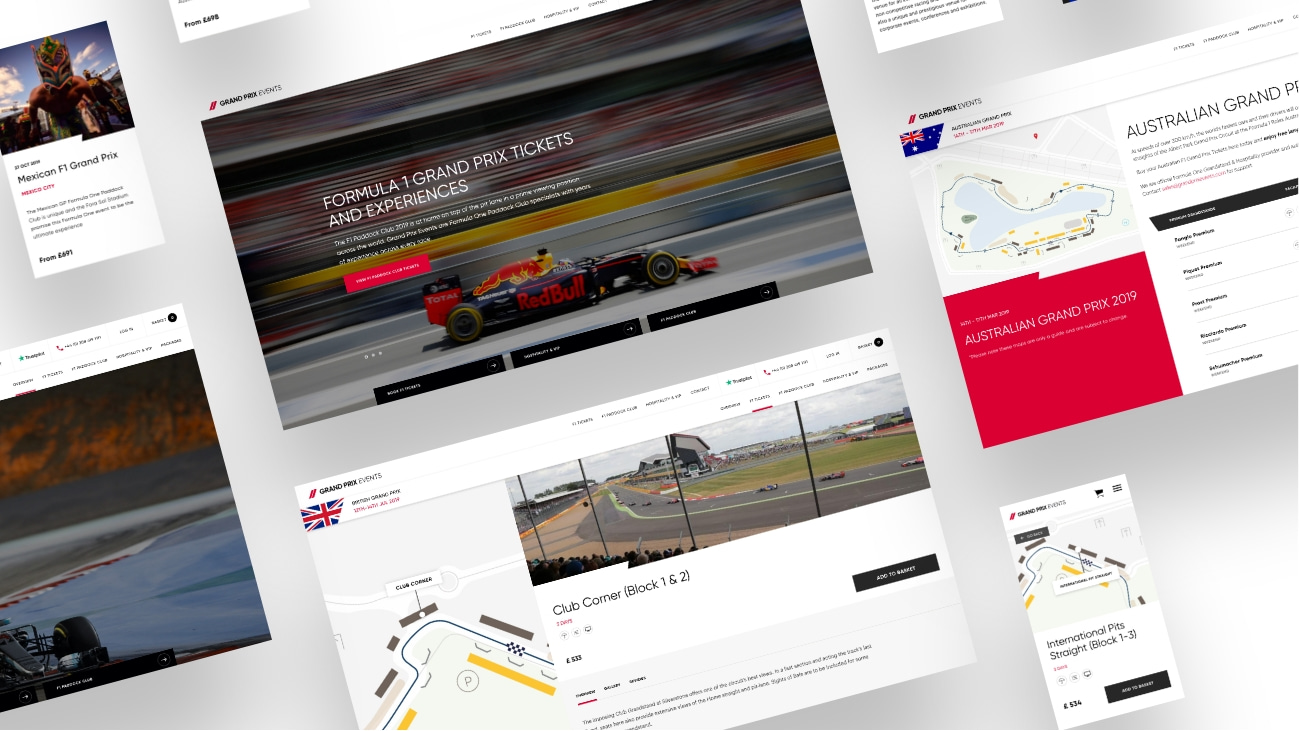
Grand Prix Events is a world leading provider of premium F1 experiences and is the go-to company for Grand Prix race tickets, as well as premium hotels, after parties and behind the scenes access.
- Lead time:
- 4 Weeks
- Sector:
- Sport & Leisure
- Target Type:
- B2C & B2B
- Demographic:
- Affluent Sport Enthusiasts
- Services:
- Brand Identity, eCommerce Website, SEO
The brief
Our brief was to evolve the brand identity, creating a look and feel that would appeal to their target customer.
Having identified an opportunity to diversify into other sports, Grand Prix Events also challenged us to extend the brand so they could enter new sporting markets.

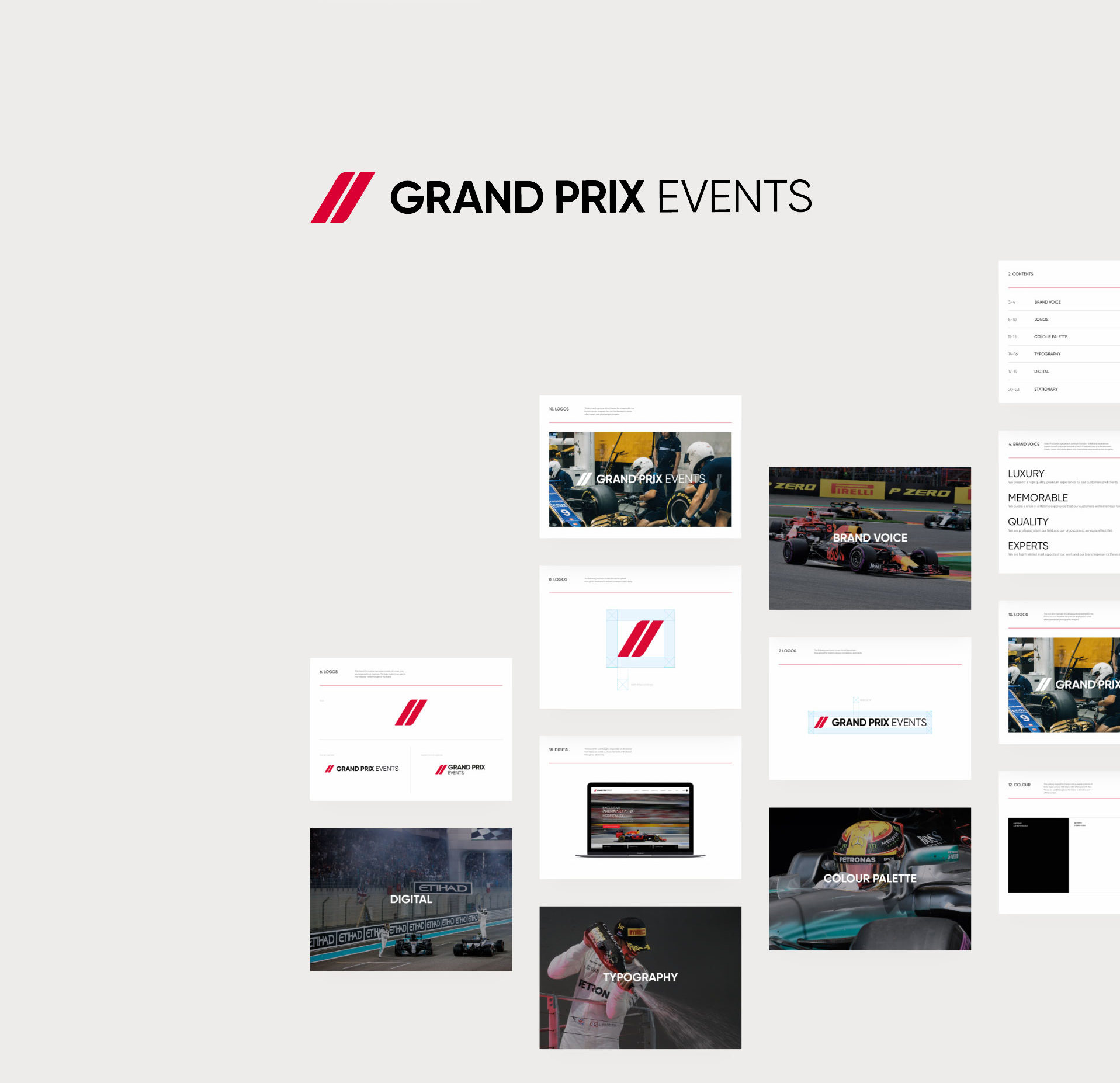
Logo
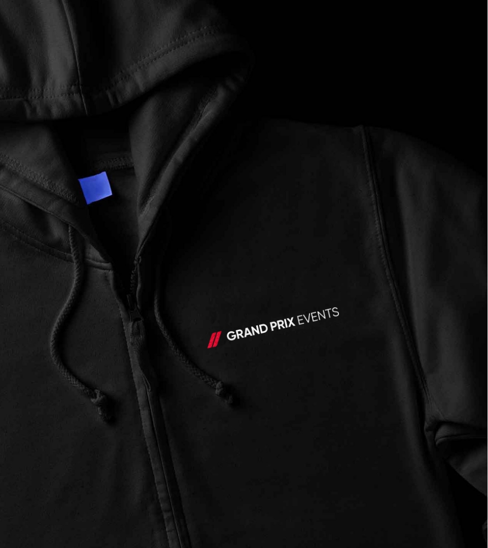
We refreshed the Grand Prix Events logo to create a premium look and feel.
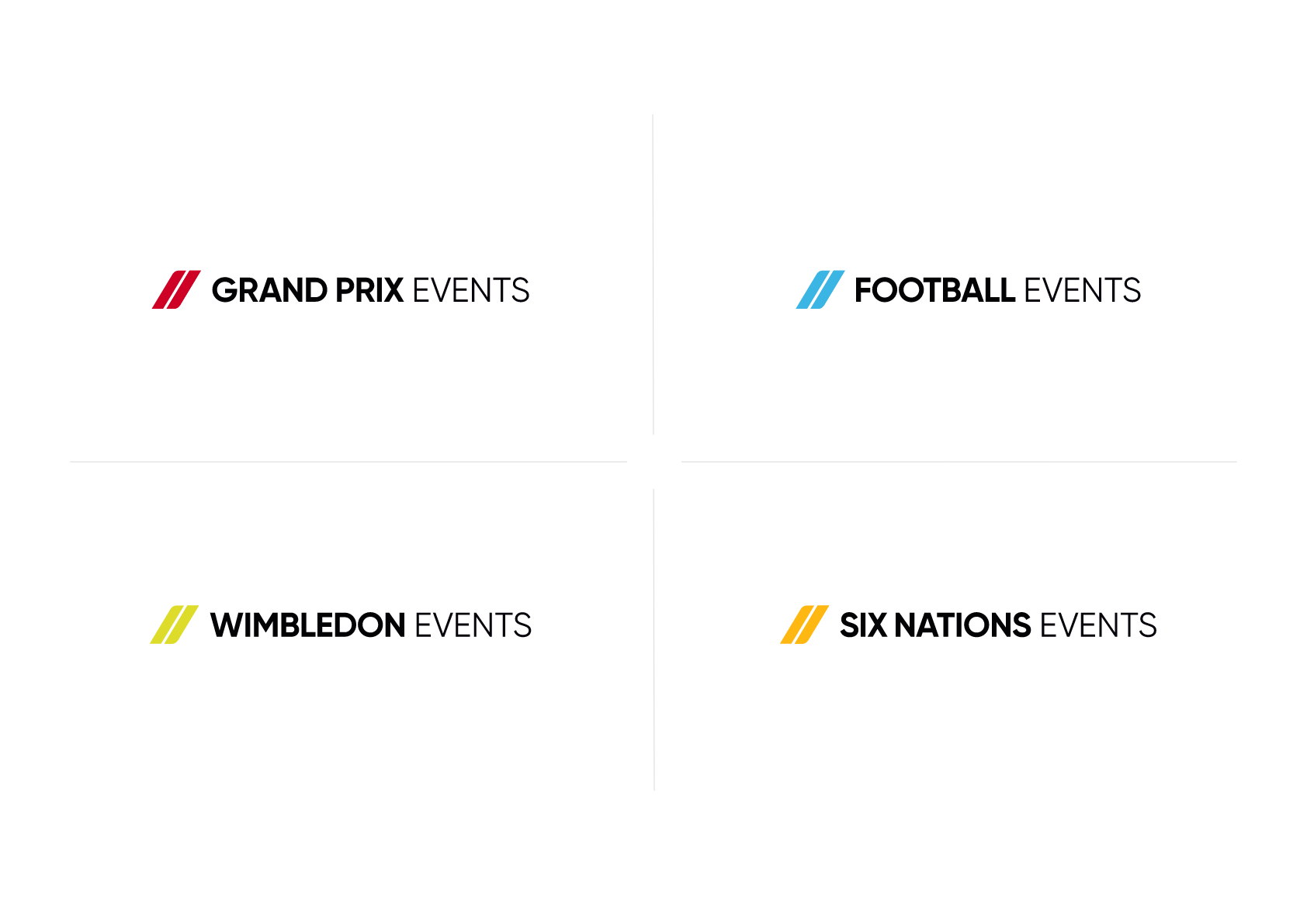
Logo variations
We extended the brand identity to enable Grand Prix Events to target new sporting events.
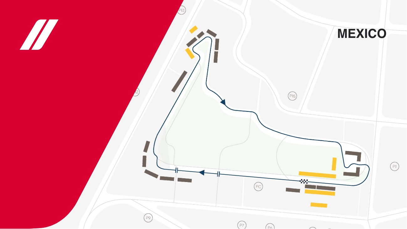
Movement
We created a dynamic brand with animated and interactive elements. The movement elevates the digital brand and reflects the fast pace of Grand Prix Events.
Colour palette
Our team evolved the existing colour palette, introducing new focal colours and supporting palettes. We also selected a new typography and broadened the application of brand patterns and shapes.
“From start to finish Plug & Play were always on hand to support us throughout. Deadlines and the proposed budget were met. I would highly recommend working with the Plug & Play team of experts.”
The website
We redesigned the Grand Prix Events website to showcase the new brand. The goal was to increase sales by generating more traffic and converting more visitors into customers. The website increased conversion rate by 111% and revenue by 22% within the first 6 months after launch.
Related work
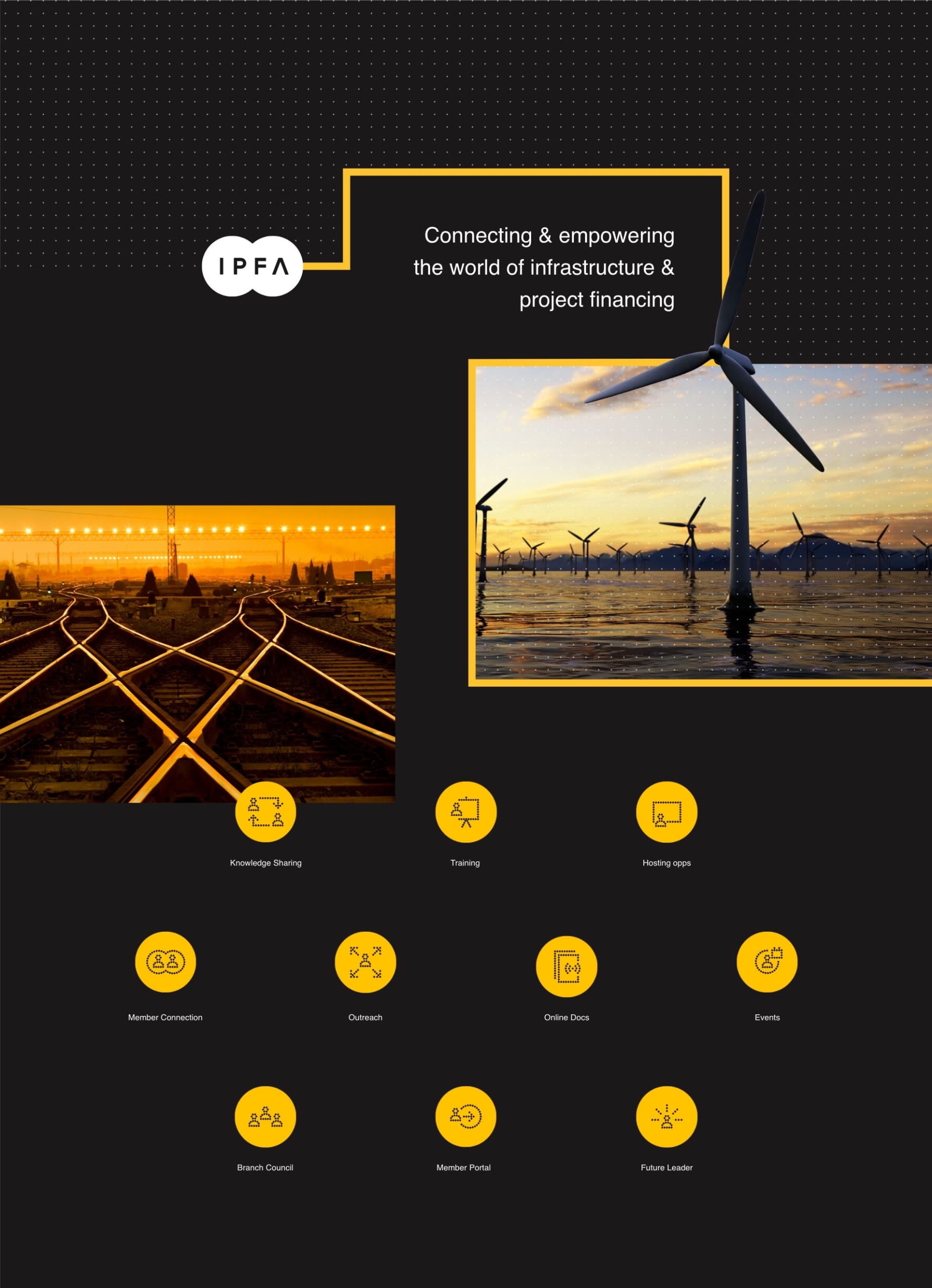
IPFA is a membership organisation that facilitates public and private sector connections. As a not-for-profit organisation, their goal is to improve the delivery of infrastructure and energy projects and encourage best practice in the industry.
We were challenged to create a new brand for IPFA, including a brand strategy, communication strategy and brand identity. IPFA’s new brand needed to identify and target their core audiences and deliver content in a tone of voice and format that would optimise engagement.
- Lead time:
- 8 weeks
- Sector:
- Infrastructure & Energy
- Target Type:
- B2B
- Services:
- Brand Strategy & Brand Identity
The brand strategy
We led a number of workshops with IPFA’s stakeholders to understand their core target audiences and how they engage with the organisation. This enabled us to refine IPFA’s member personas and develop a communications strategy for IPFA’s team to refer to when creating content and marketing materials. We delivered a simplified communication strategy in a battle card format, providing a digestible reference point for the team to create consistent and on-brand copy.
Dynamic brand patterns
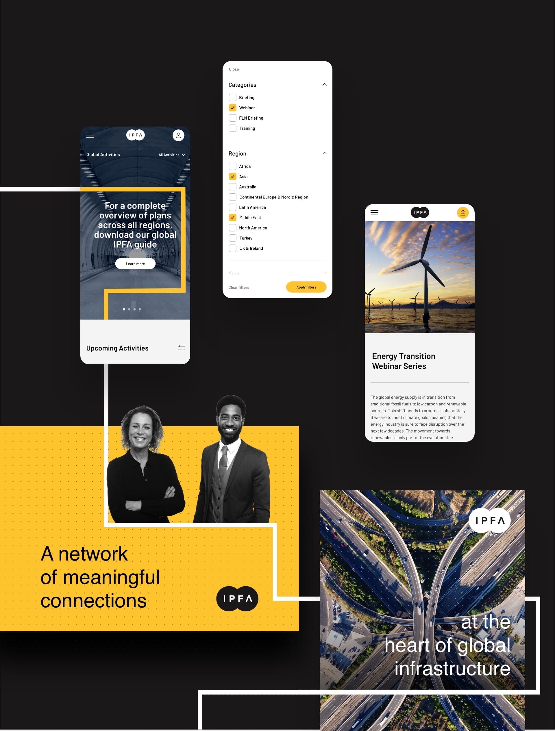
We produced a set of dynamic brand patterns to increase engagement with the new brand. The animated line pattern is used on the new website to add depth and create a more engaging website design.
Logo
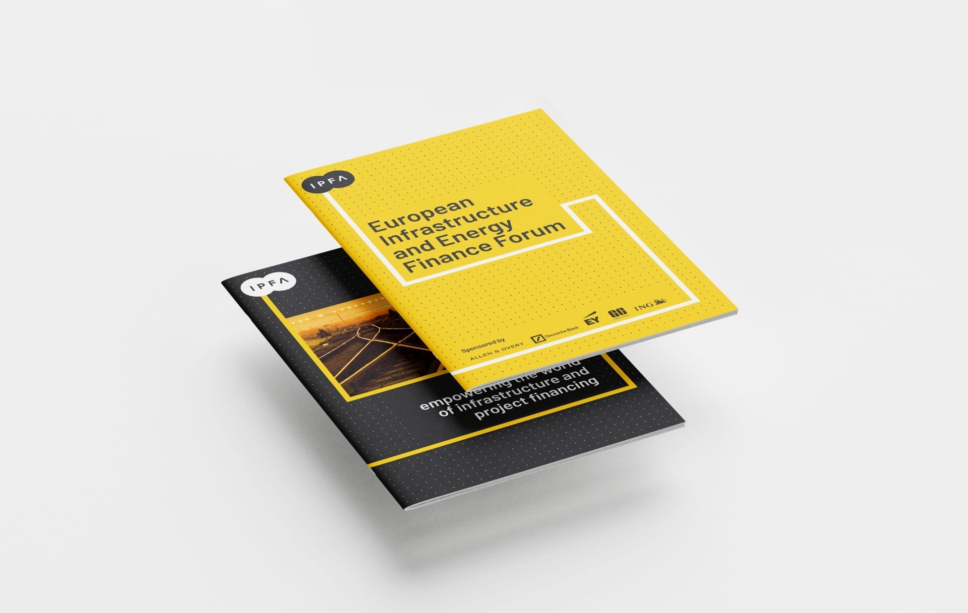
We refreshed IPFA’s logo, giving it a more modern look that would appeal to their target audience.

Colourways
We introduced a completely new colour palette that was designed to stand out in the market and provide a greater level of brand flexibility.
Shape and form
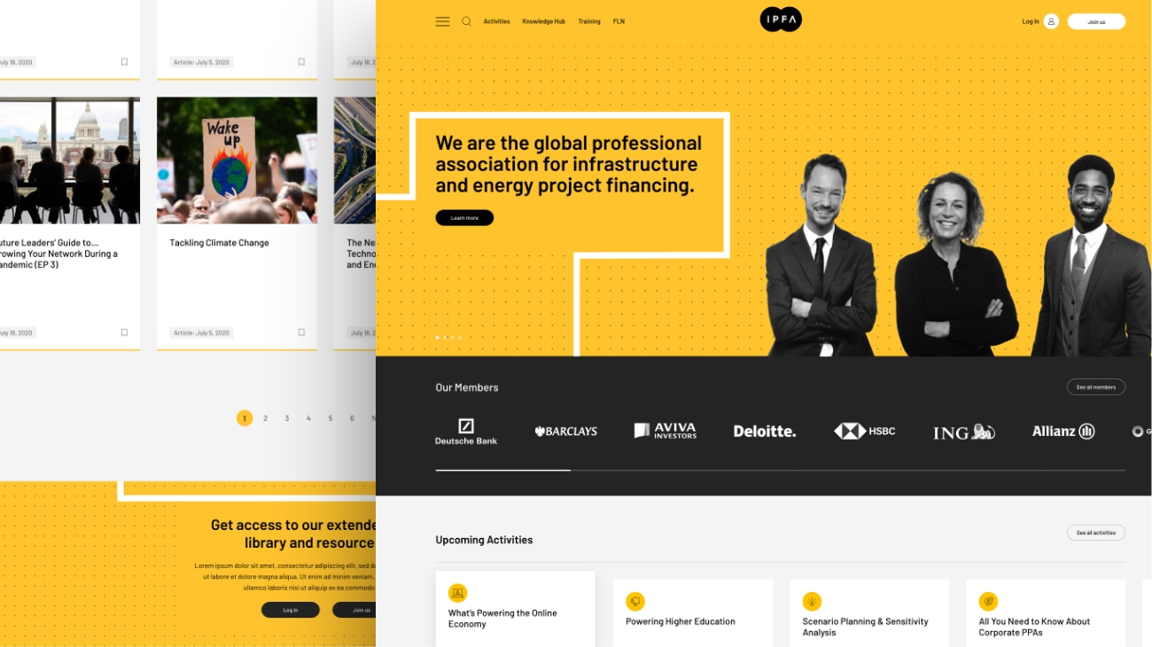
We introduced brand shapes and patterns to add depth and create a distinct look that is unique to IPFA.
The website
Alongside the new brand, IPFA challenged us to redesign their website. They needed a user-centric website that would engage their members and provide access to a broad range of resources including events, webinars, podcasts and white papers. The new website was a huge success, increasing new users by 105% and sessions by 41%.


