Toothpic is a healthcare business offering tele-dentistry to the US. They work with dentists and insurance providers to triage dental concerns and provide 24/7 support to patients. They offer patients flexible access to a dentist while reducing insurance claims.
- Lead time:
- 4 weeks
- Sector:
- Healthcare
- Target Type:
- B2B and B2C
- Services:
- Brand Identity, Branded Slide Deck & Website
The challenge
Having undergone a rapid period of business growth, Toothpic challenged us to evolve their brand identity and realign their visual brand with their target audience. The new brand needed to reflect the soft clinical feel of a dental company but also the edginess of a digital product company.
Developing the brand identity
We collaborated with Toothpic’s marketing team to review their brand strategy and create a design and marketing brief for the new brand identity, discussing how their team would need to use the brand in the short and long term.
Our brand designers used the creative brief to create 2 brand concepts, where each represented a different brand design direction. In a raw form, the concepts demonstrated how the typography, logo, colour, shape and form could be used to create Toothpic’s new brand identity.
Toothpic selected their preferred concept to continue to develop and refine into their new brand identity. We created a comprehensive set of brand guidelines and worked closely with Toothpic’s design team to roll the brand out across their digital and offline channels.
The brand deliverables for the project included creating a new set of brand guidelines, an updated accessible logo, broadened colour palette and colour usage guide, brand shapes, patterns, typefaces, image guide, and powerpoint presentation template.
Typography
We selected a number of complimentary typefaces suitable for digital and offline use. Fonts were selected to provide clear and approachable messaging that can be adapted for different material formats. Our team included a font usage guide in the brand book to demonstrate how the various fonts can be used to highlight key messages in a variety of situations.

Colour palette
We created a new colour palette for Toothpic which included primary and supporting colours. Alongside this, we delivered a number of colour and text lock-ups to demonstrate how the colours should be used to maximise the impact of messaging and maintain a consistent look and feel.
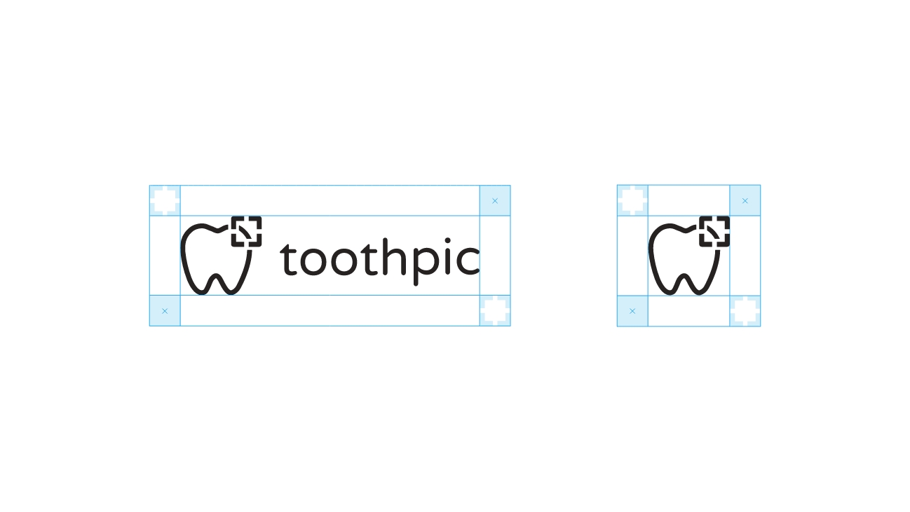
Logo
We created a guide for the spacing and alignment of the logo. We adapted the core logo colour to ensure the colour contrast was suitable for digital use.

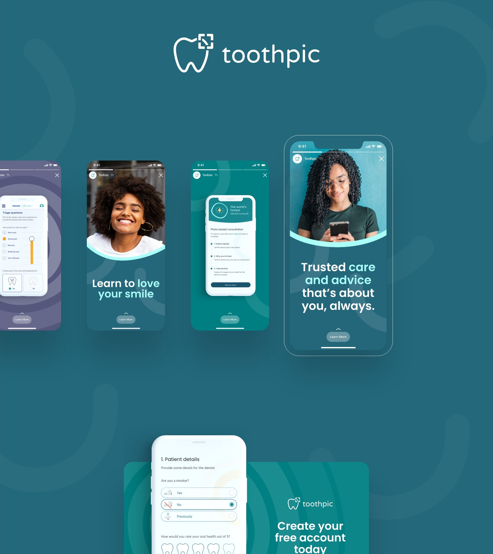
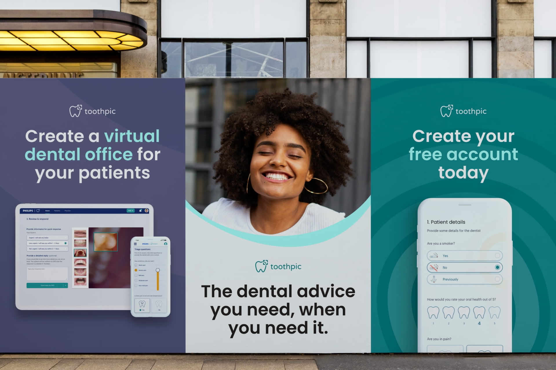
Image lock ups
We created image lock up guides to make imagery feel distinctly part of Toothpic’s brand.

Shape and form
A collection of brand patterns were created to add depth to the brand. The patterns were designed so they could be used alongside imagery and copy, and can be used in a zoomed in or out format to provide maximum flexibility.
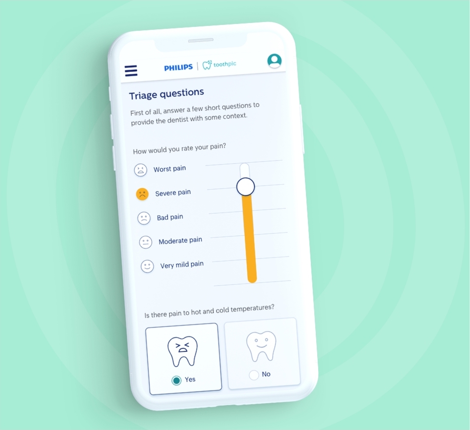
The website
We worked closely with Toothpic to redesign their website, implementing the new brand identity. They needed a flexible website that would provide their team with the autonomy to independently manage their content and campaigns.