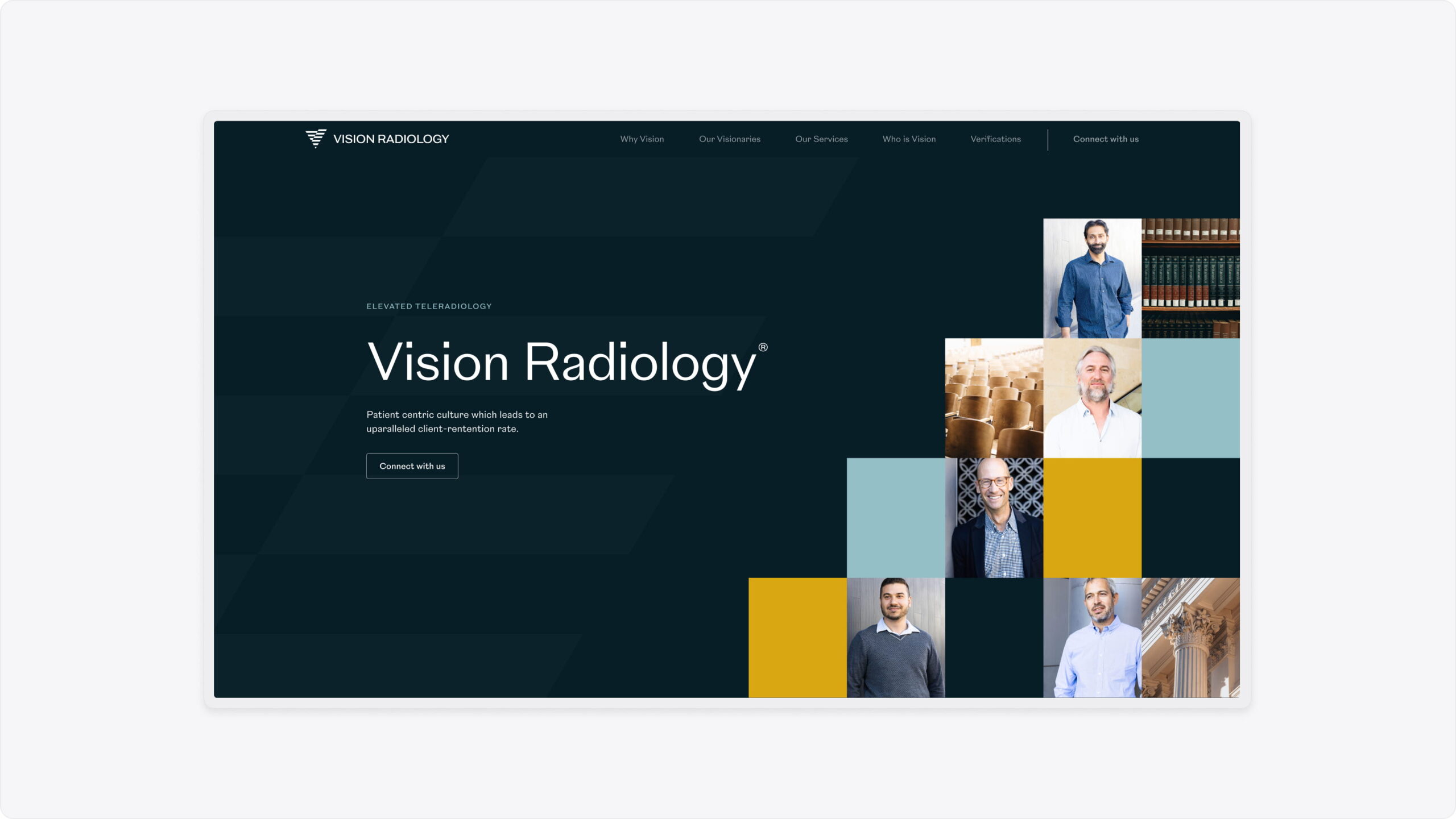
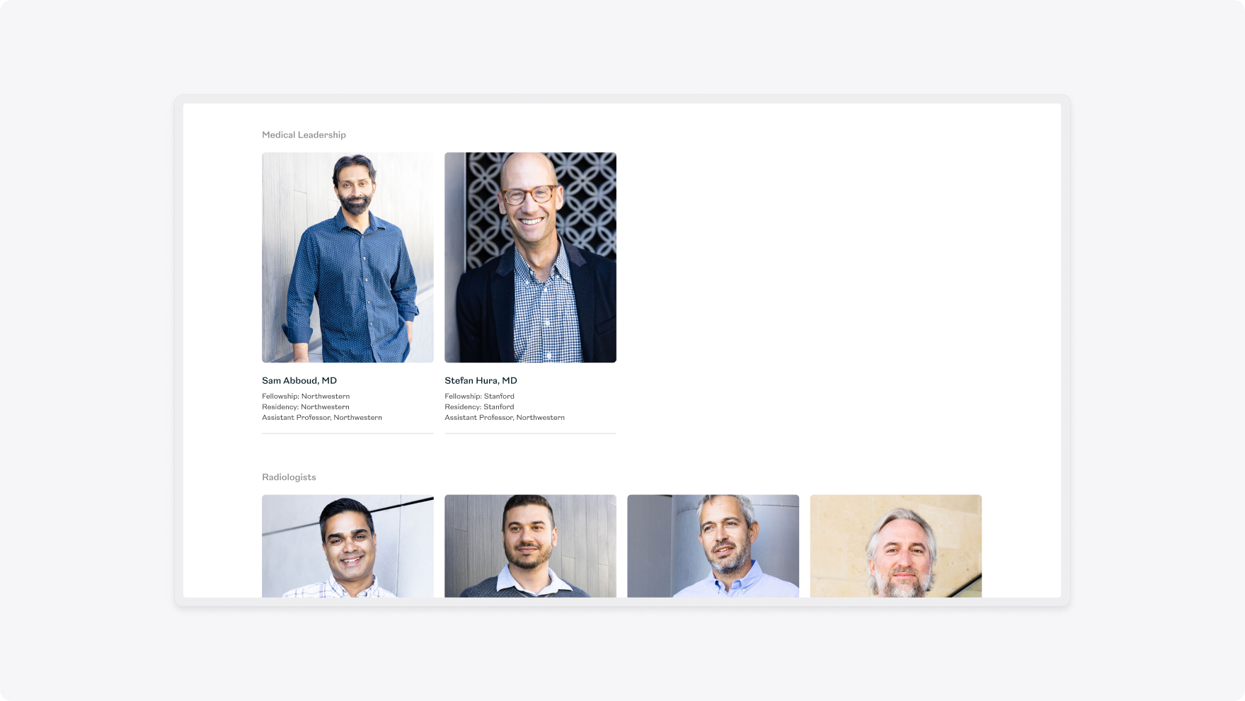
Vision Radiology is a tele-radiography practice that leverages timezones to rapidly increase turnaround times for scan interpretations and consultations.
They wanted to increase their visibility to get in front of more prospective clients and employees.
- Lead time:
- 4 Months
- Sector:
- Healthcare
- Target Type:
- B2B & B2C
- Website Goal:
- Increase visibility & Modernise the website
- Services:
- Branding, Web Design, Web Development, Digital Marketing


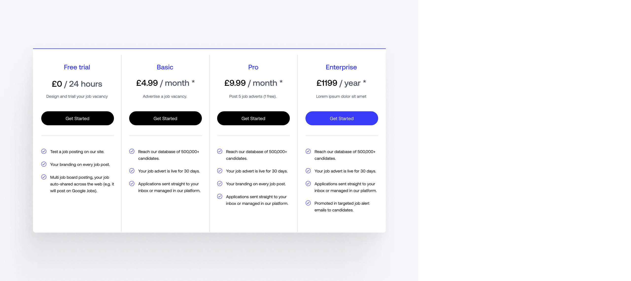
- Scope
- Adobe XD Wireframe Prototypes
- Adobe XD Design Prototypes
- Brand Identity
- SEO Strategy
- WordPress CMS
- Salesforce Integration
- Resource
- 1 x Brand Designer
- 1 x Digital Strategist
- 1 x Website Designer
- 1 x Website Developer
- 1 x Quality Assurance Tester
- 1 x Project Manager
The challenge
Vision Radiology’s previous website and brand were dated and didn’t reflect the practice. Their Marketing team was struggling to make simple changes and lacked a consistent brand to produce new assets.
They challenged us to deliver a flexible new website that would enable them to manage their content, move quickly, and appeal to their target audience.
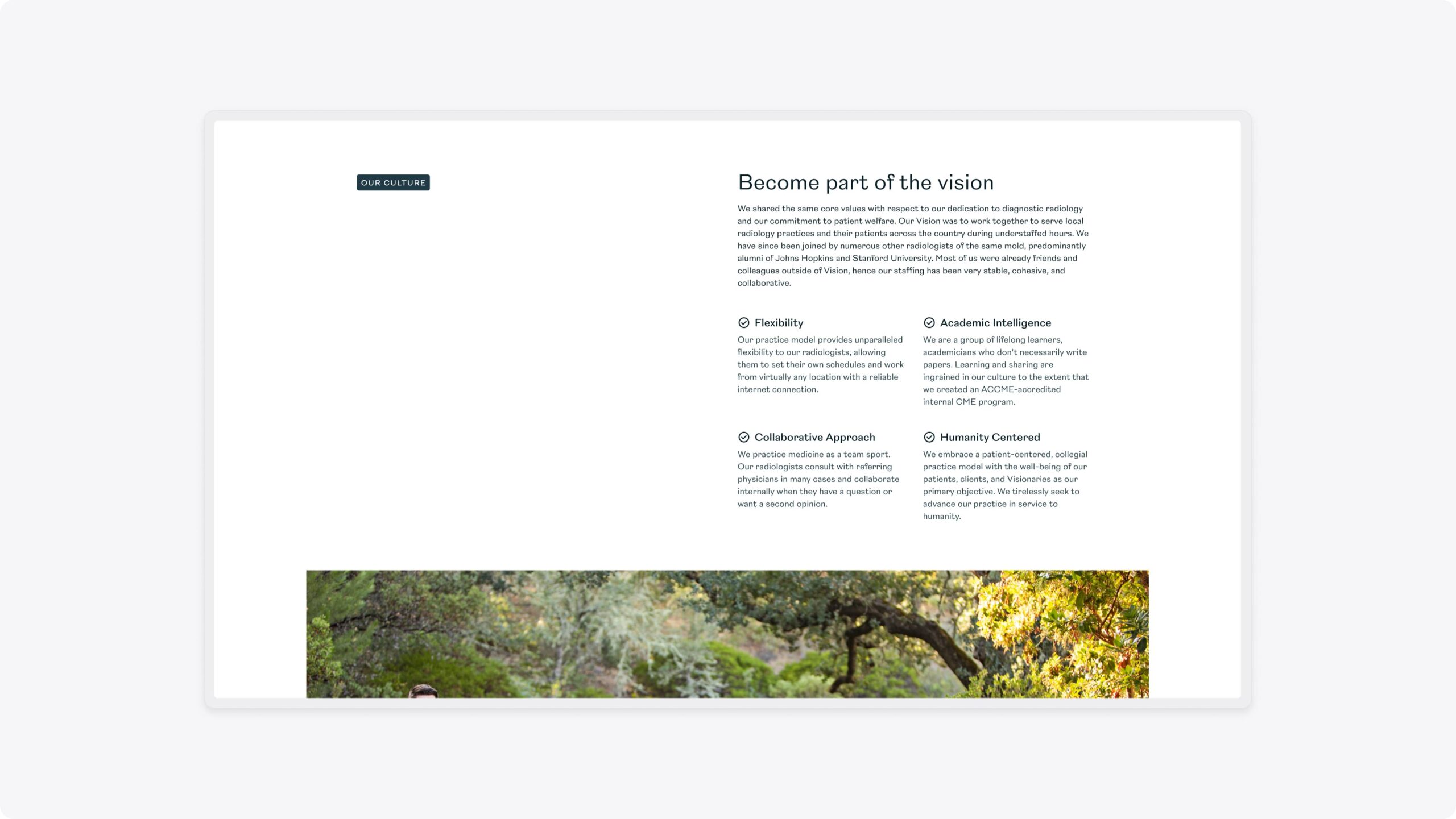
To achieve their objectives, they recognised that they needed a new brand, website and digital strategy.
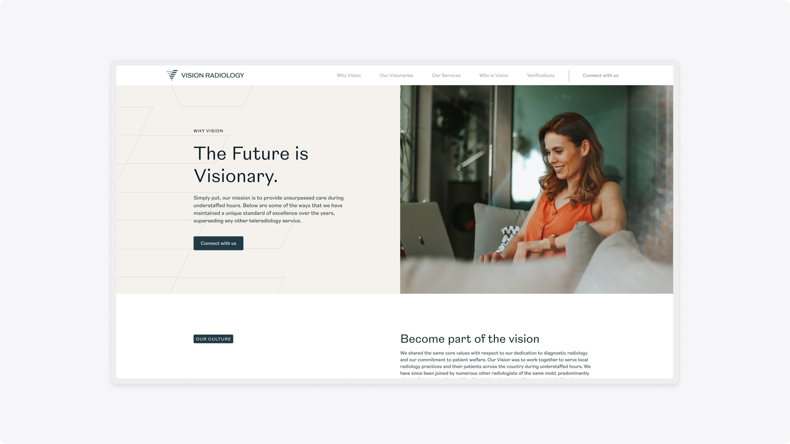
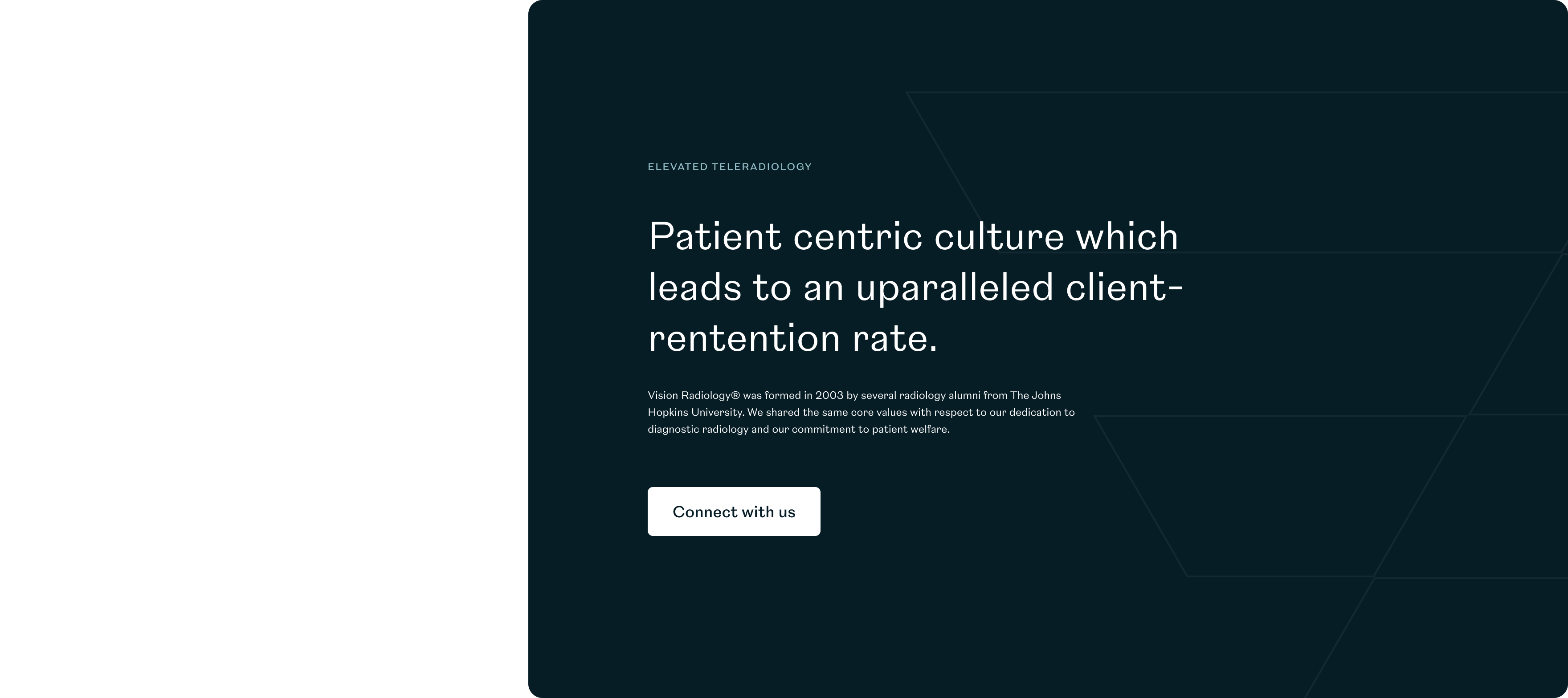
The brand
When Vision Radiology first approached us, they had a basic brand that lacked depth and overused stock photography. The nature of having a remote team meant that they had very little photography to use which was limiting their design capabilities.
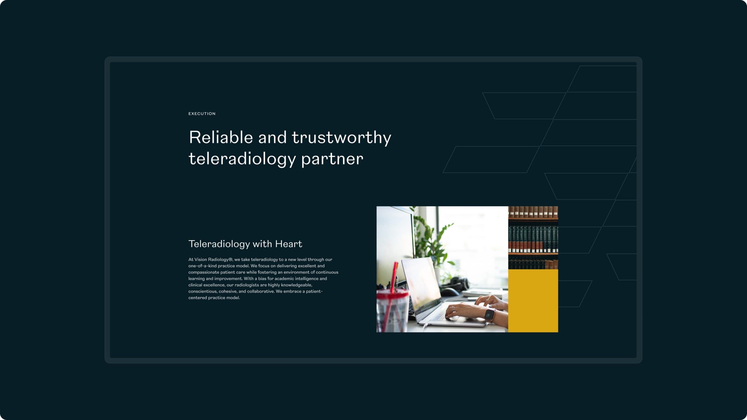
We delivered a flexible brand identity that incorporated a broader colour palette with primary and secondary colours. We introduced new shape and form into the brand, creating depth and providing visual interest in place of imagery. This approach also enabled Vision to use stock photography in a way that was on-brand and didn’t look like stock imagery.
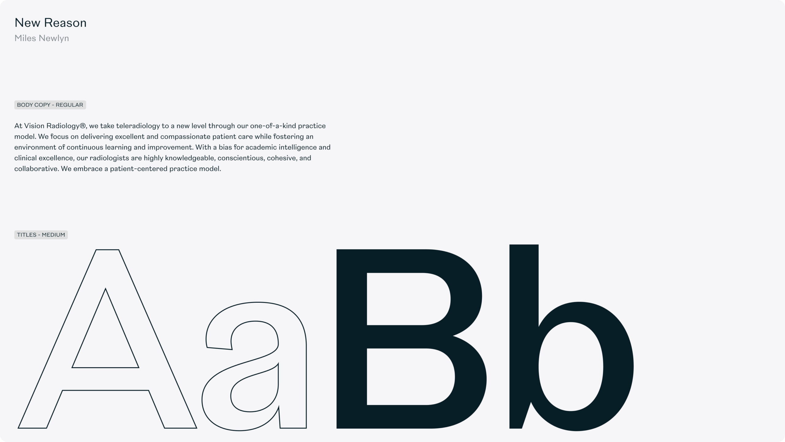
In addition to the colour palette and imagery, we also evolved the logo and typography.


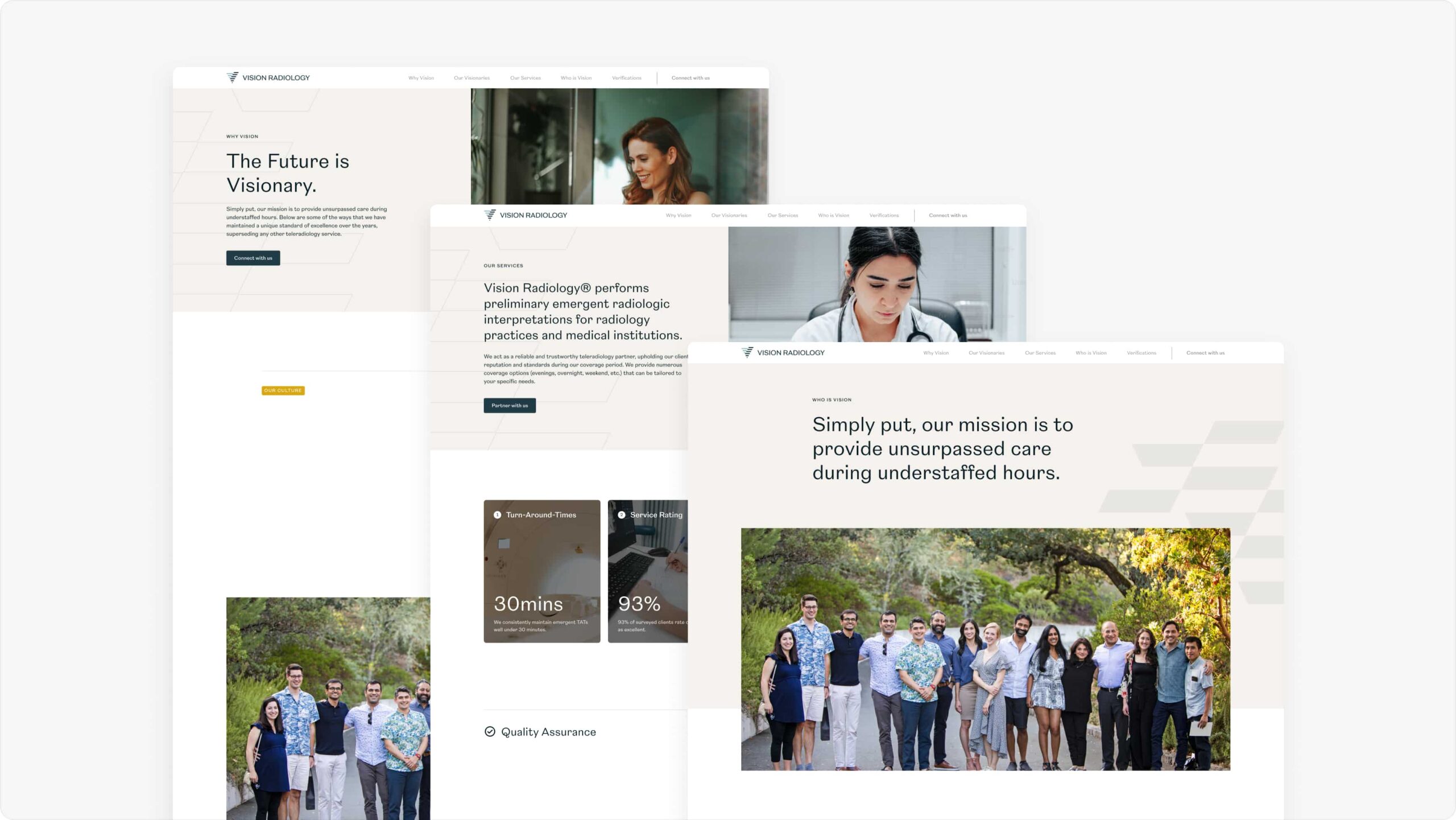
The website
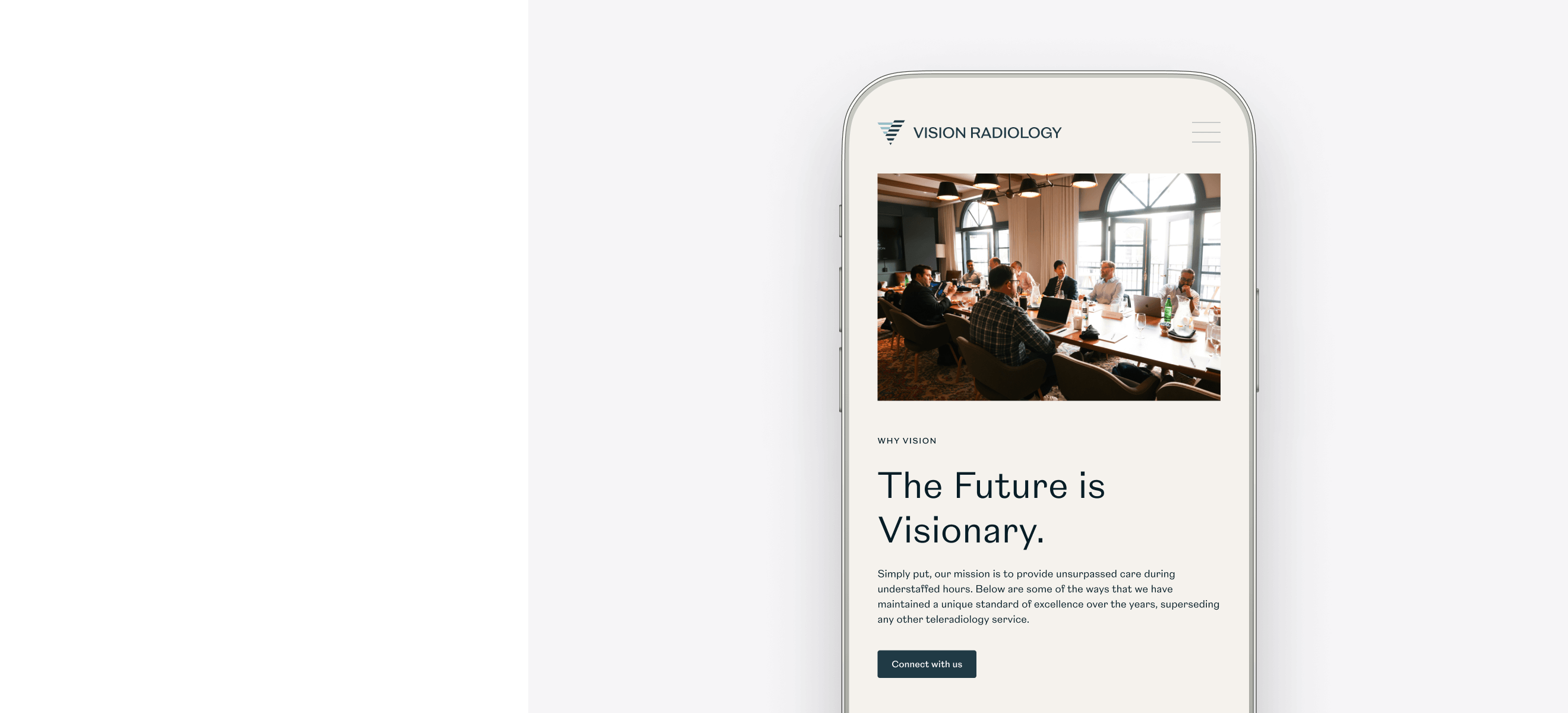
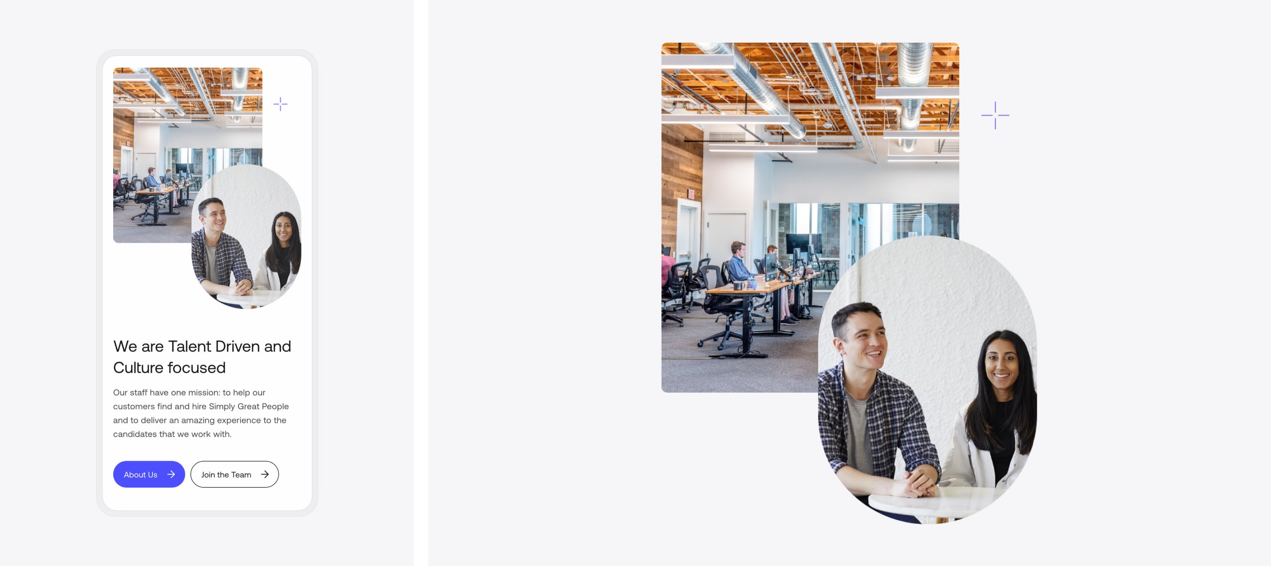
We utilised the updated brand to create a modern new website design that represented Vision Radiology to prospective clients and employees. Our designers placed people at the centre of the design to visually represent the approachable and personable qualities of Vision Radiology.
We delivered the new website in WordPress to to provide easy content management and a high quality code base for future growth.
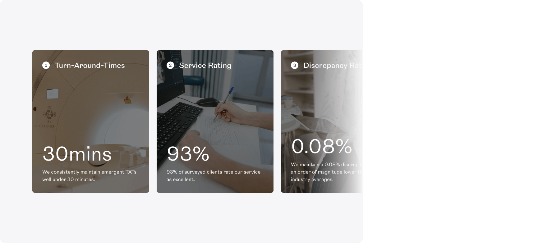
SEO strategy
Our Marketing team undertook keyword research and selected target keywords that Vision Radiology could compete and rank for in search engines. We optimised the website in line with the new strategy and trained Vision’s Marketing team how to optimise new website content.
Our SEO strategy enabled Vision Radiology to increase their visibility in search engines and be found by more prospective clients and employees.

“Working with Plug & Play was a great experience. I came into the project after it started, and they quickly got me up to speed. The website looks great, and they were instrumental in completing this project on time. I would highly recommend Plug & Play.”

Related work
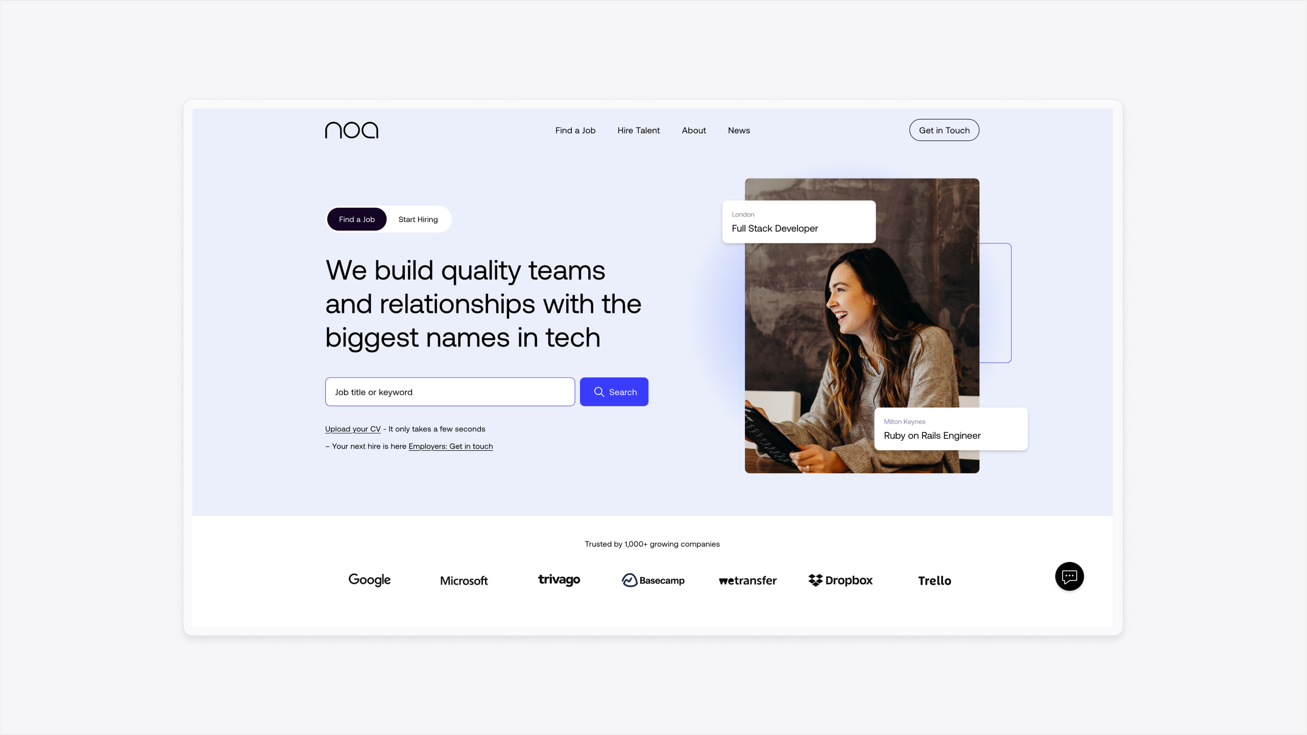
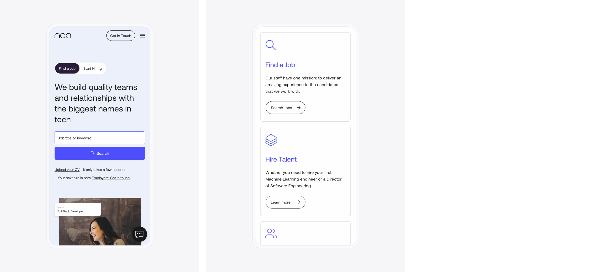
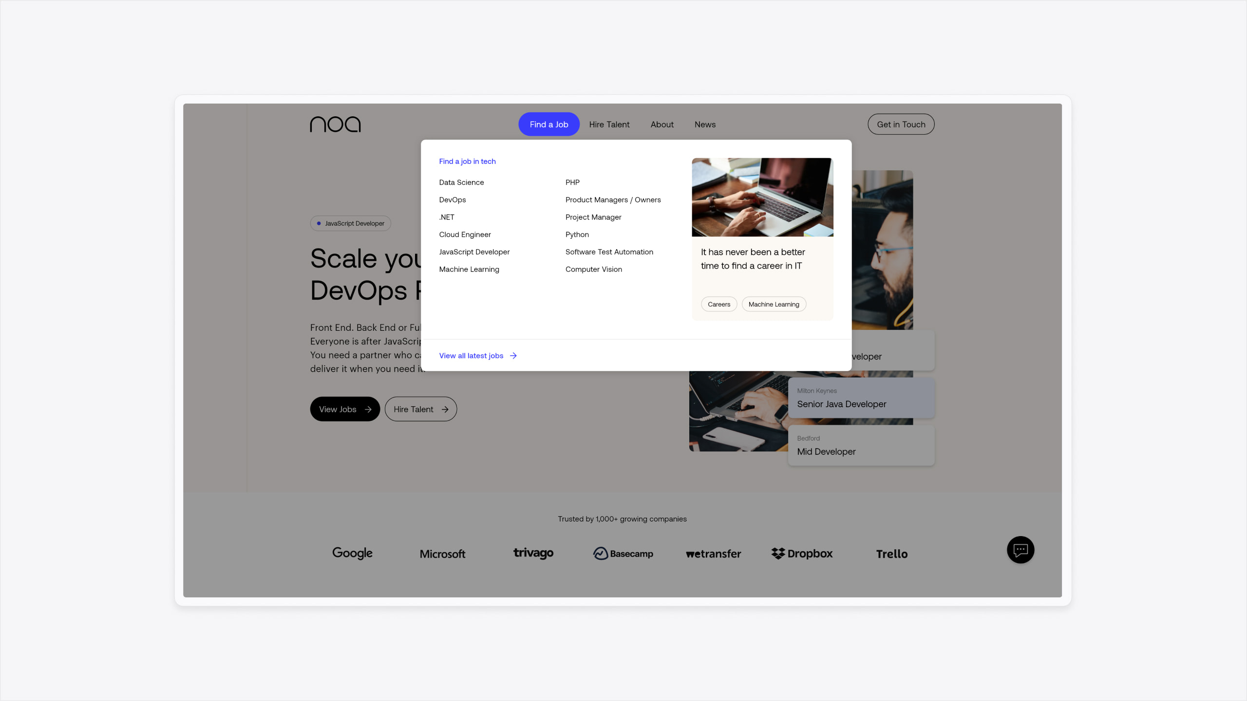
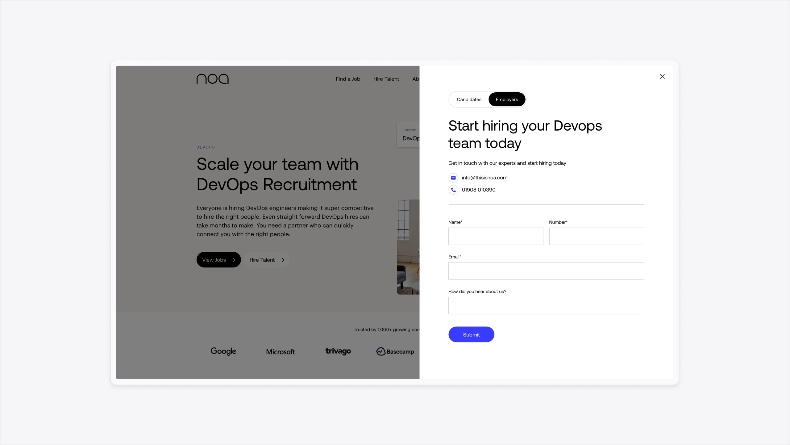
Noa is a recruitment agency that specialises in the technology sector. They needed a new website to increase their online visibility and attract new clients and candidates.
- Lead time:
- 3 Months
- Sector:
- Recruitment
- Target Type:
- B2B & B2C
- Website Goal:
- Create an elevated design, increase visibility & attract new clients and candidates
- Services:
- Brand, Web Design, Web Development, Digital Marketing
- Scope
- Brand Identity
- SEO Strategy
- Figma Wireframe Prototypes
- Figma Design Prototypes
- WordPress CMS
- Logic Melon Integration
- Resource
- 1 x Digital Strategist
- 1 x Website Designer
- 1 x WordPress Developer
- 1 x Quality Assurance Tester
- 1 x Project Manager
The challenge
Noa were ready to step up their marketing efforts and needed a new brand, website and marketing strategy to deliver on their objectives. Their existing recruitment website was dated, clunky and didn’t appeal to their target audience. Our challenge was to evolve their brand and create a high performance website that appealed to their clients and candidates. The website needed to be flexible and able to scale with the business.
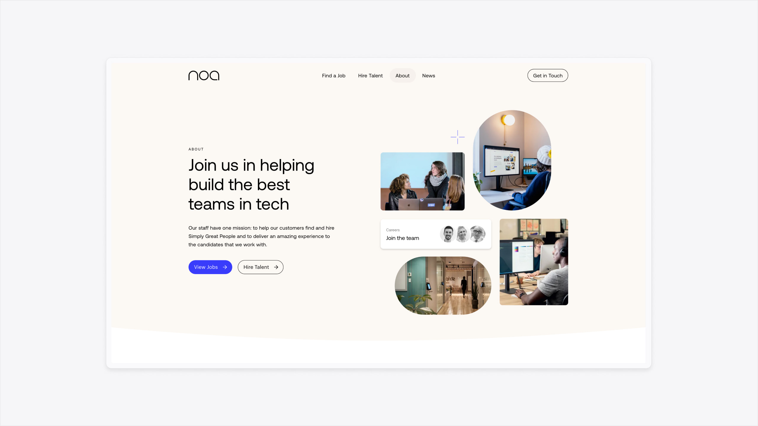
The brand
Noa’s previous brand was dated and lacked the flexibility to facilitate a high quality digital design. We evolved the brand identity and introduced new colours, typography, shape and imagery. The new brand was implemented within the new website to create a modern and dynamic interface that uses interactive elements and assets to engage users.
Our design team created branded assets for the website design, making use of multi-layered components that combine dynamic brand elements and imagery to support the user journey.
The website
We delivered a high performance website that is built to be fast, engage users and drive conversions. Our designers curated the website structure in line with a digital strategy created by our marketing team. This approach ensures that the website structure supports the SEO objectives and enables users to intuitively navigate.
Our team developed the website in WordPress to provide maximum content dexterity while ensuring that the brand guidelines are easy for Noa to implement as they continue to produce new pages and content on the website.
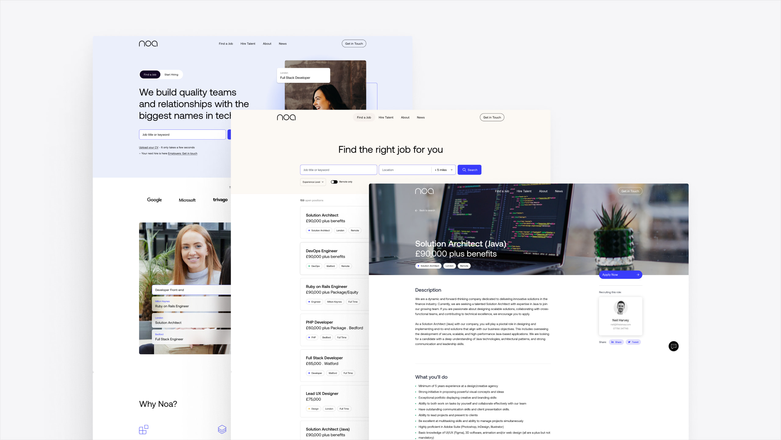
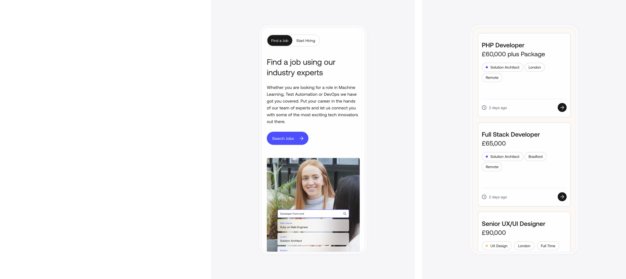
2 main audiences
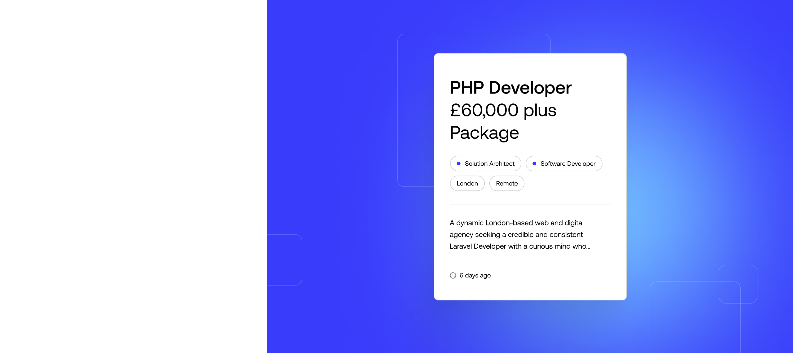
The website is structured to target 2 core audiences: clients and candidates.
Website assets
Our design team created dynamic branded assets that combine stock photography and Noa’s new brand. The outcome is a website design that feels unique and engaging.
Logic Melon Integration
We integrated the website with Logic Melon to pull through Noa’s job posts and track candidate engagement.
Signposting
We colour coded job categories to provide visual cues on job posts.
SEO strategy
As a small recruitment agency with a relatively low competitive position in search engines, Noa needed to be strategic to secure new keyword rankings. We focused on specific job roles and locations to create optimised landing pages that could be found by prospective clients and candidates in search engines. Being specific in this way means that Noa could carve their niche in the market without competing with the huge recruitment agencies with much stronger competitive metrics.
Our strategy provides scope for Noa to continually review their keyword targets and increase their reach as their competitive position grows.
+
1
659
%
Increase in search engine visibility since launch

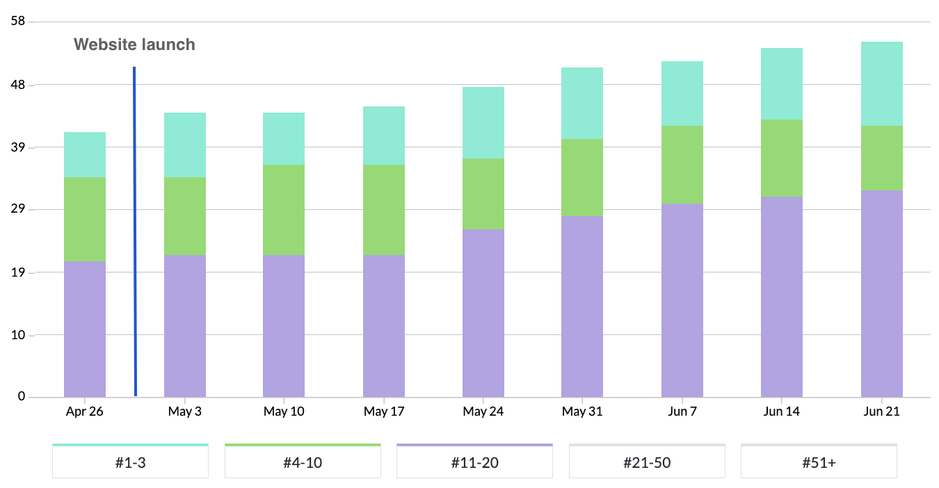
In the chart above, blue bars represent positions 1-3 in Google and green bars represents rankings on the rest of page 1.
You can see that rankings immediately began to climb following the new website launch. Assessing Noa’s competitive position and selecting specific keywords that are aligned to their offering has enabled them to outperform larger recruitment agencies in search engines.
“We’re proud to announce that we’ve now launched our brand-new website! 😍
If you’ve used our website before then you’ll know just how much of an improvement we’ve made.”

Related work
Bond Global
173% increase in search engine visibility for a recruitment agency looking to attract high quality new clients
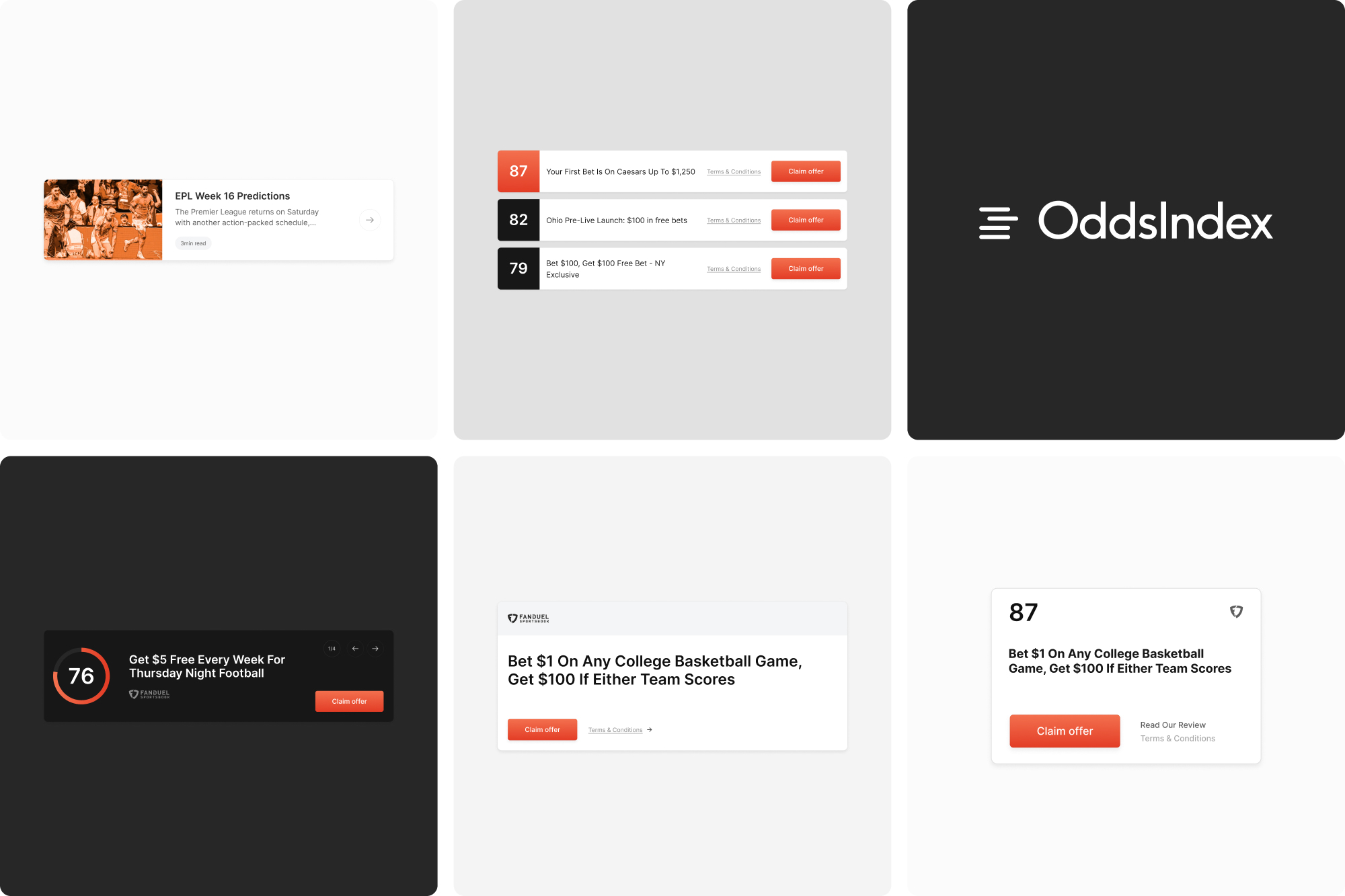
OddsIndex is a US based betting platform that enables its customers to find and compare the best odds from market leading betting providers.
We created a new brand, website design and user experience for the business.
- Lead time:
- 6 Weeks
- Sector:
- Sports & Betting
- Target Type:
- B2C
- Website Goal:
- Create a market leading user experience
- Services:
- UX Design, Web Design, Branding
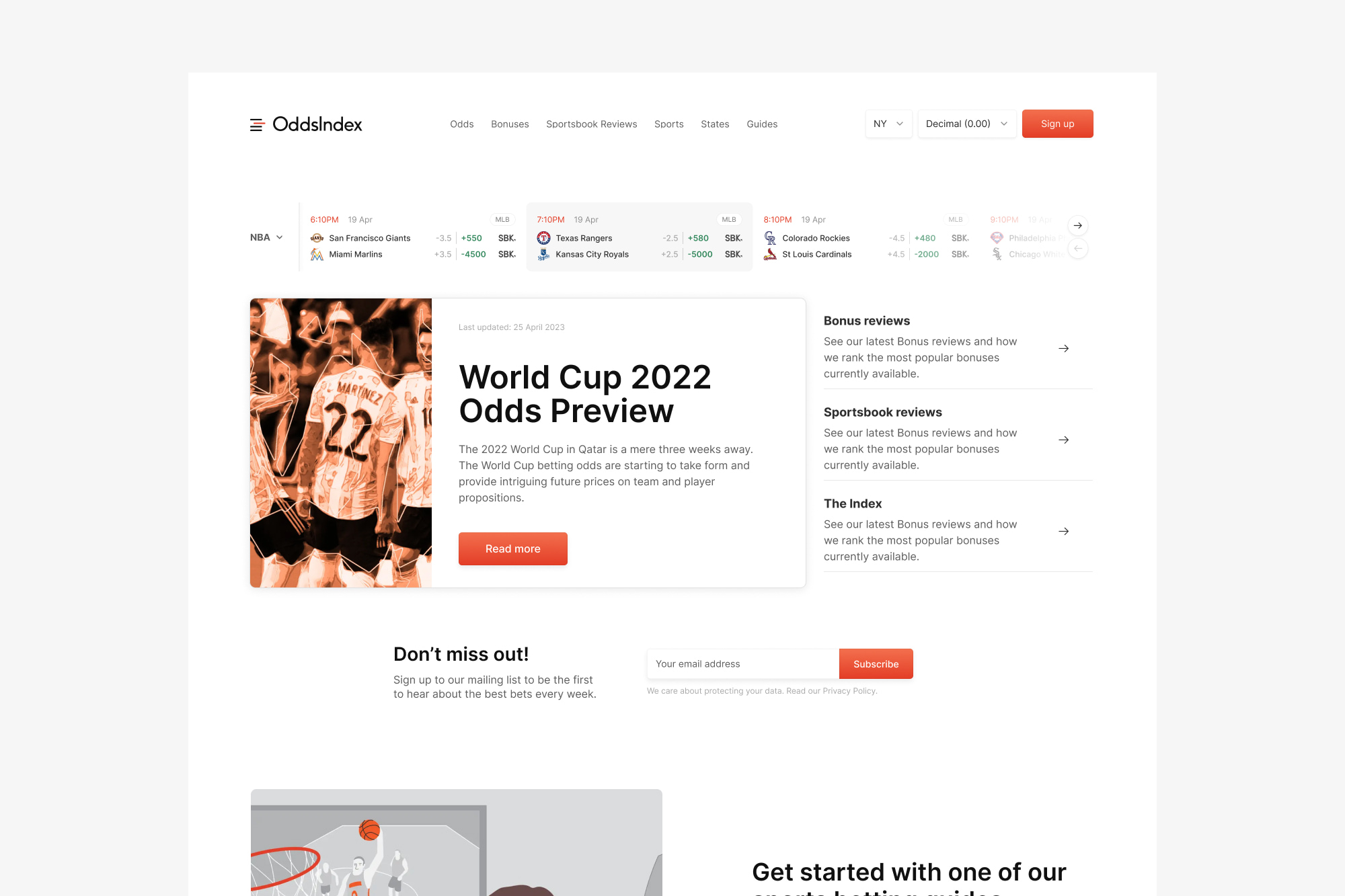
The challenge
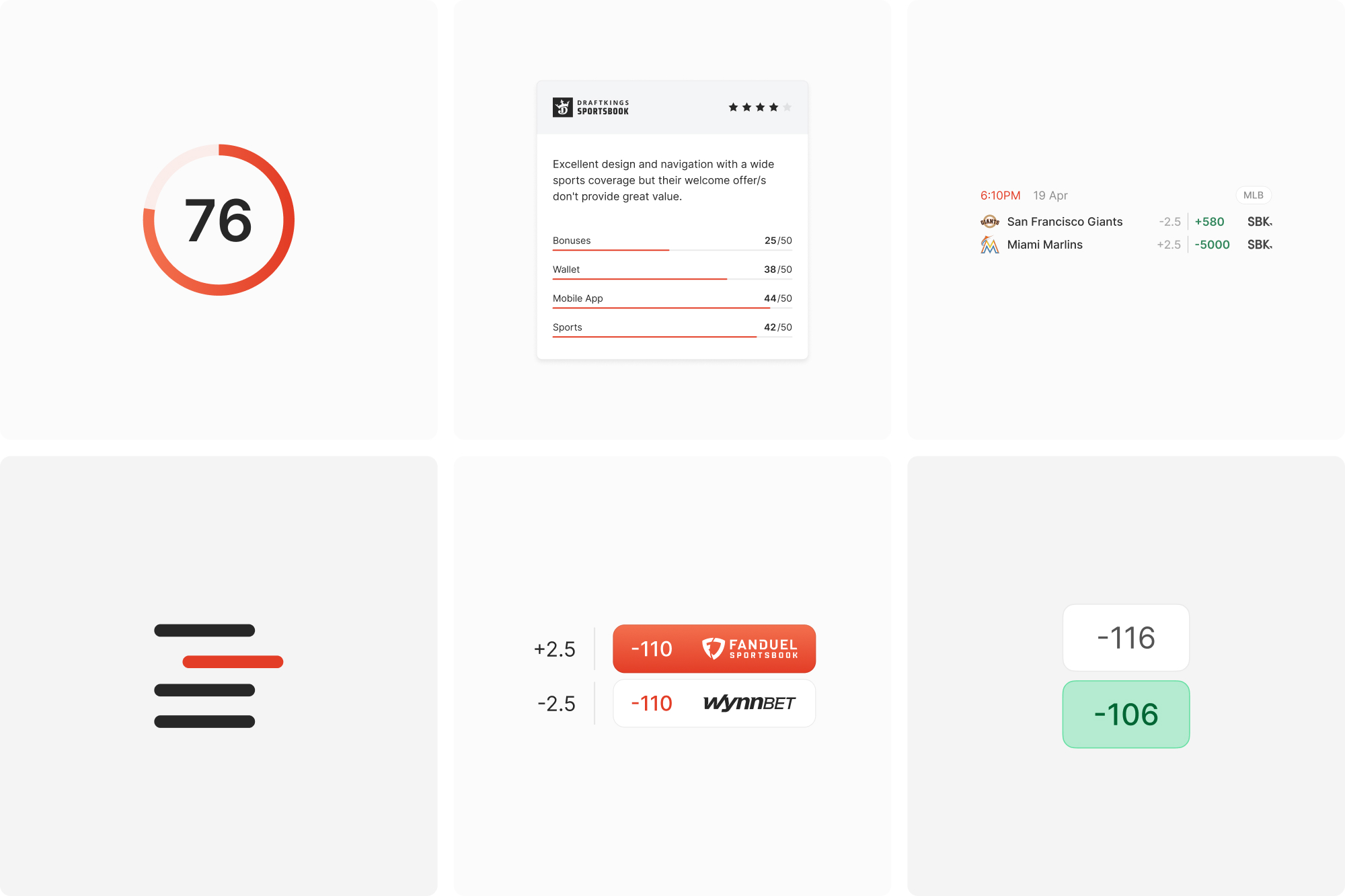
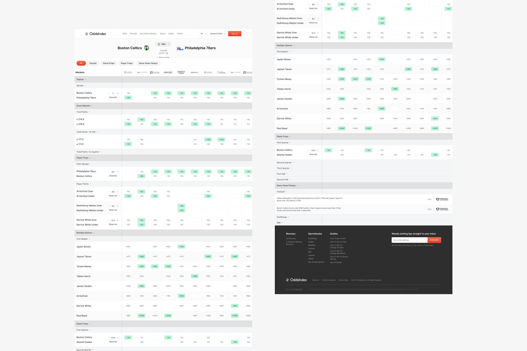
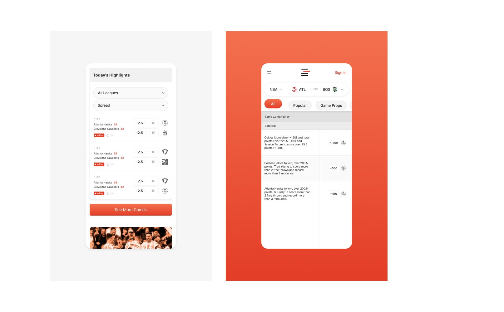
Sports betting can be complex and involves the management of a huge amount of data. Our challenge was to create a seamless and engaging user experience that utilises data in a way that can be consumed by visitors.
From a visual design perspective, we needed to create a brand and website design with limited imagery. We needed to display information and comparison tables in an appealing way that maintained the integrity of the data.
The brand
We created a new brand identity for OddsIndex, including a new logo, typography, colour palette and design system. The brand needed to be vibrant and flexible while achieving a high quality design finish.
We created 3 brand concepts for the betting company, approaching the brief from a few different directions. Our designers worked closely with the client to build a brand and design system that reflects the business and their customers.
The website
Our design team created the new website, using OddsIndex’s new brand identity to elevate the look and feel of the interface. The user journeys are optimised to create a streamlined conversion path that enables users to find the best betting odds and bonuses.
OddsIndex have an ambitious in-house marketing team that were managing the SEO of the website. We collaborated throughout the web design process to ensure that the new design supported their SEO strategy and enabled them to continually improve their search engine visibility.
- Scope
- User Journey Mapping
- Adobe XD Wireframe Prototypes
- Adobe XD Prototypes
- Brand Identity
- Resource
- 1 x Brand Designer
- 1 x UX Designer
- 1 x Website Designer
- 1 x Project Manager
Related work
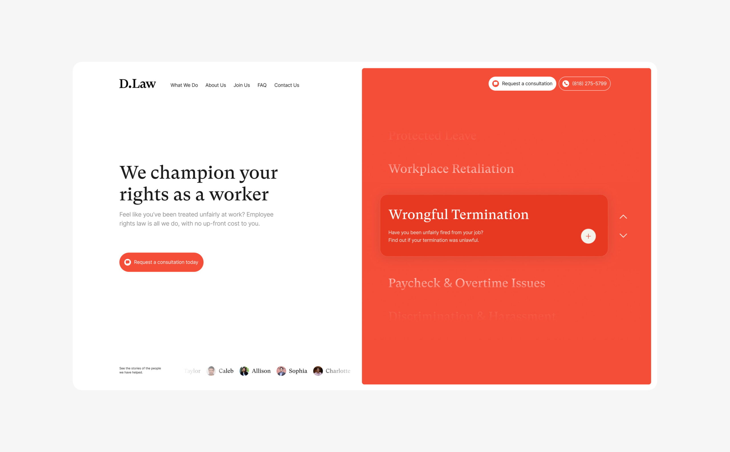
D.Law is a California based law firm that specialises in employment law.
Having recognised that the legal sector digitally lags behind other industries, they challenged us to combine professional legal services and marketing in a way that hadn’t been done before. Their team asked us to overhaul their brand, website and digital footprint.
- Lead time:
- 5 Months
- Sector:
- Law
- Target Type:
- B2C
- Website Goal:
- Reposition visual brand, Generate new enquiries
- Services:
- Branding, Web Design, WordPress, Web Development, Digital Marketing
- Scope
- Brand Identity
- Figma Wireframe Prototypes
- Figma Design Prototypes
- WordPress Development
- SEO Strategy
- Resource
- 1 x Brand Designer
- 1 x Website Designer
- 1 x WordPress Developer
- 1 x Quality Assurance Tester
- 1 x Project Manager
- 1 x SEO Strategist
The challenge
Having identified an opportunity to lead their market by combining their established reputation with great marketing, D.Law commissioned us to transform their visual brand and website.
Outwardly, they looked like every other corporate law firm, with no clear point of difference or visual alignment with the clients that they wanted to attract. They challenged us to draw inspiration from forward-thinking disruptors in industries such as insurance and banking that are leading in-industry change.
D.Law is authoritative, approachable and empathetic, and that needed to be reflected in the new designs. They wanted to utilise video content within their site and increase new enquiries by growing their search engine rankings and organic traffic.
The brand
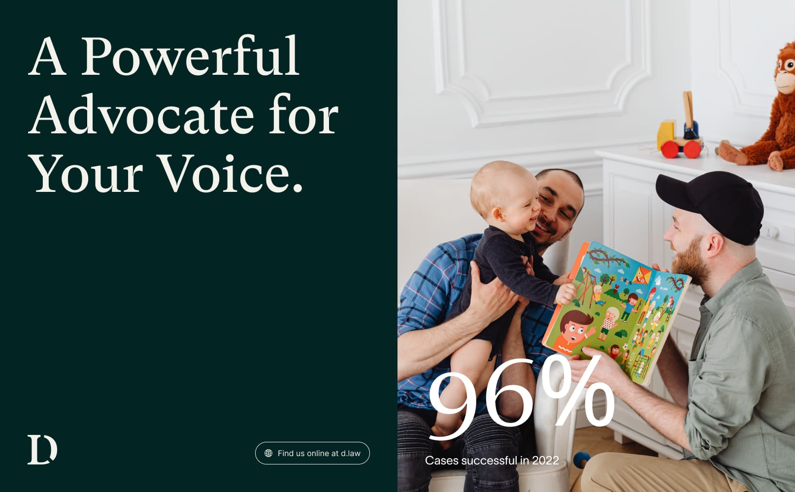
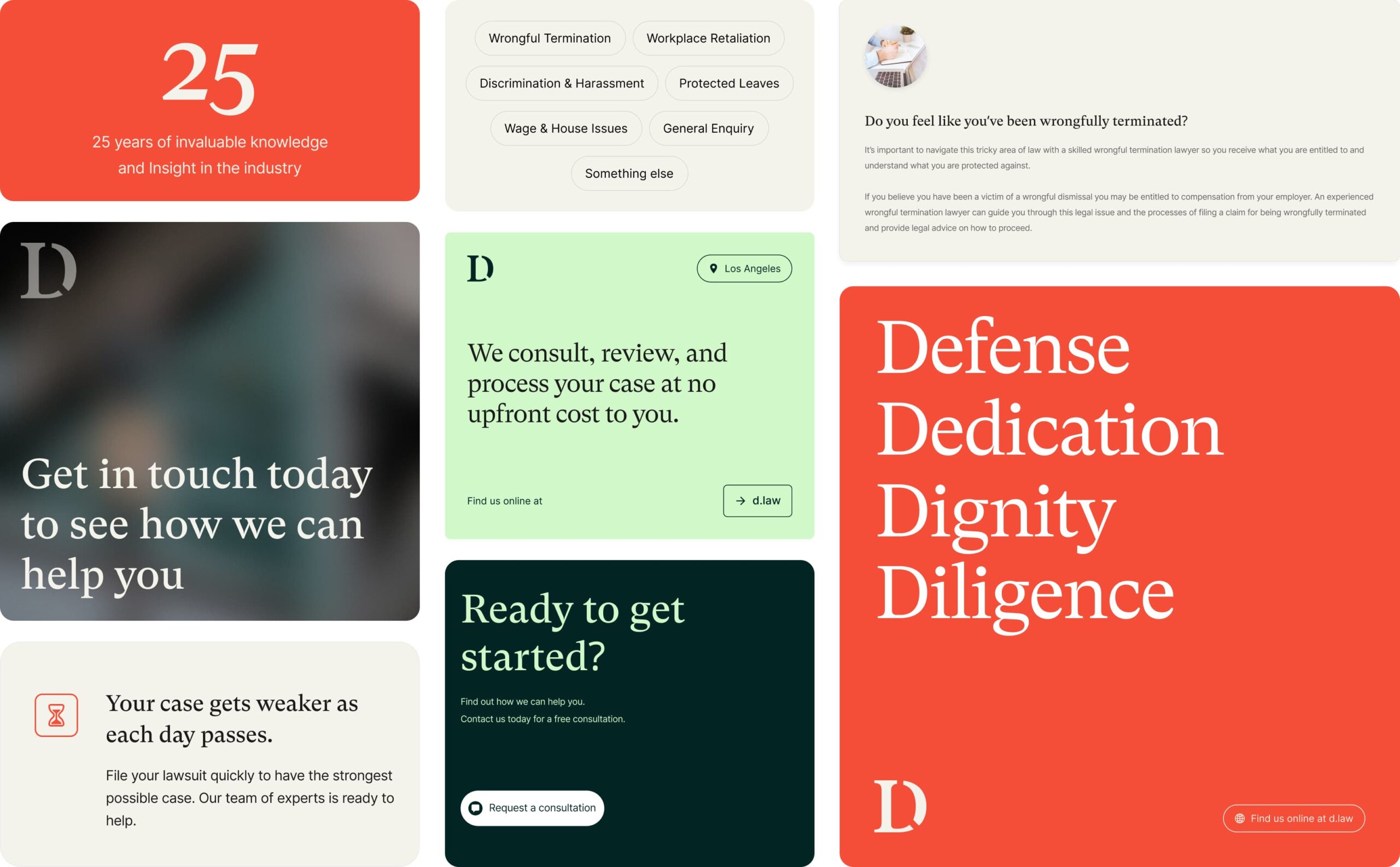
D.Law offer an at-need service and many of their clients find them during a period of distress in the workplace. They wanted to create a feeling of safety for prospective clients where they felt understood and trusted that D.Law had the ability to win their case.
We created an approachable and professional brand by overhauling their colour palette, logo, typography, shape and form, and imagery.
The new brand delivers a high level of flexibility, giving D.Law’s marketing team the ability to create new brand assets seamlessly
Brand concept creation
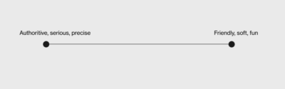
D.Law’s brief was that they wanted to be authoritative while also fun, cool and approachable. Our first step was to calibrate these traits and understand the balance – were D.Law more serious and authoritative or were they fun and soft?
Our brand concept phase explored 2 different visual expressions of the brief in a mood boarding process. One concept was a more serious expression of the brief and the other was a softer approach.
This visual calibration enabled us to better understand the brief and client vision for the brand.
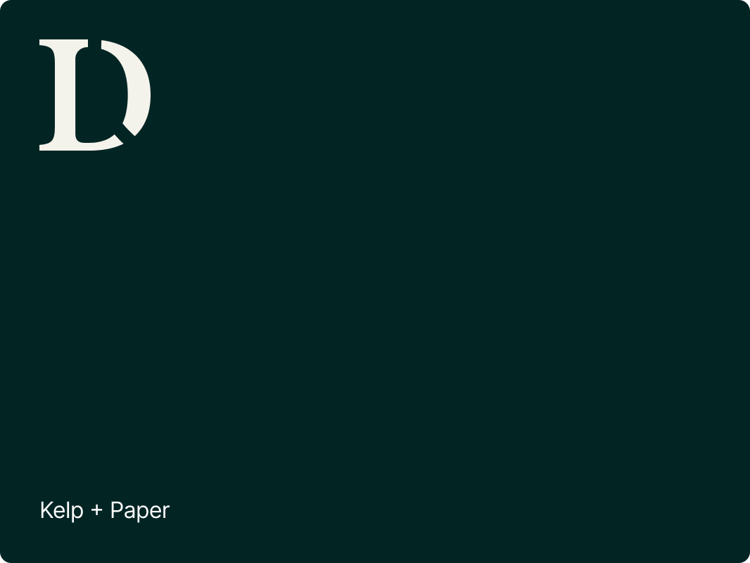
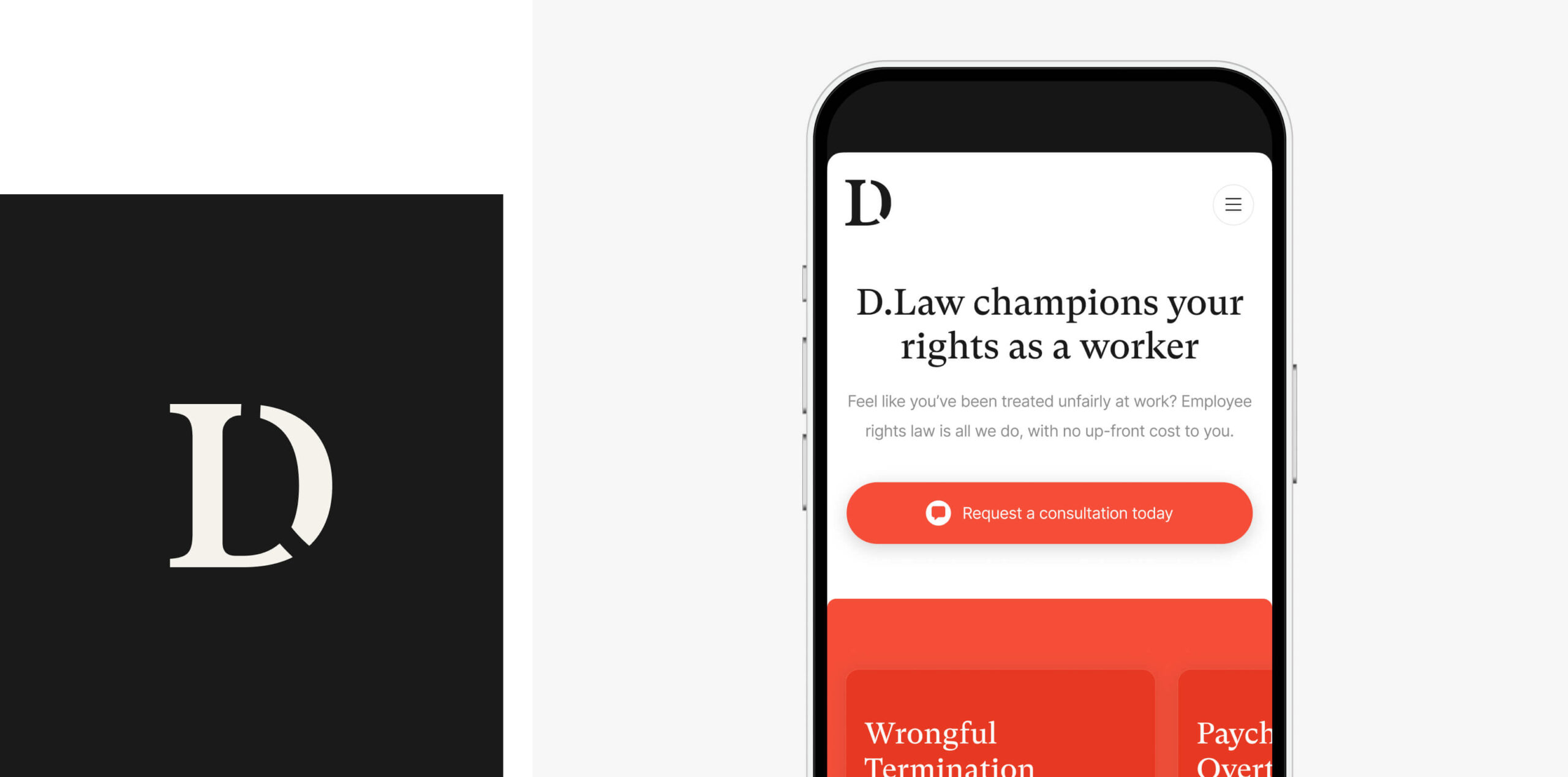
The logo
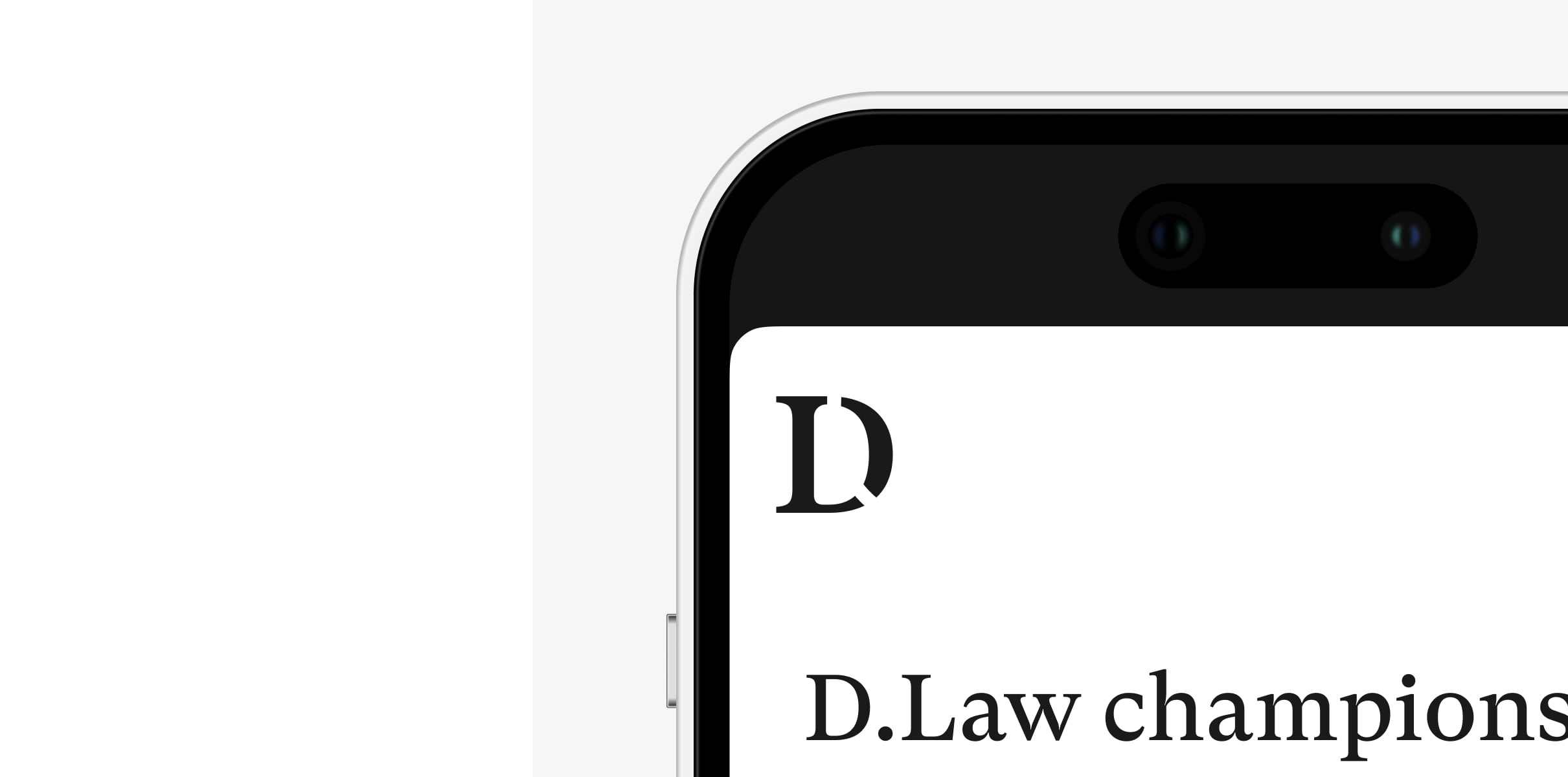
We delivered a new responsive logo that can be simplified to a ‘D’ icon on smaller screens and social media.
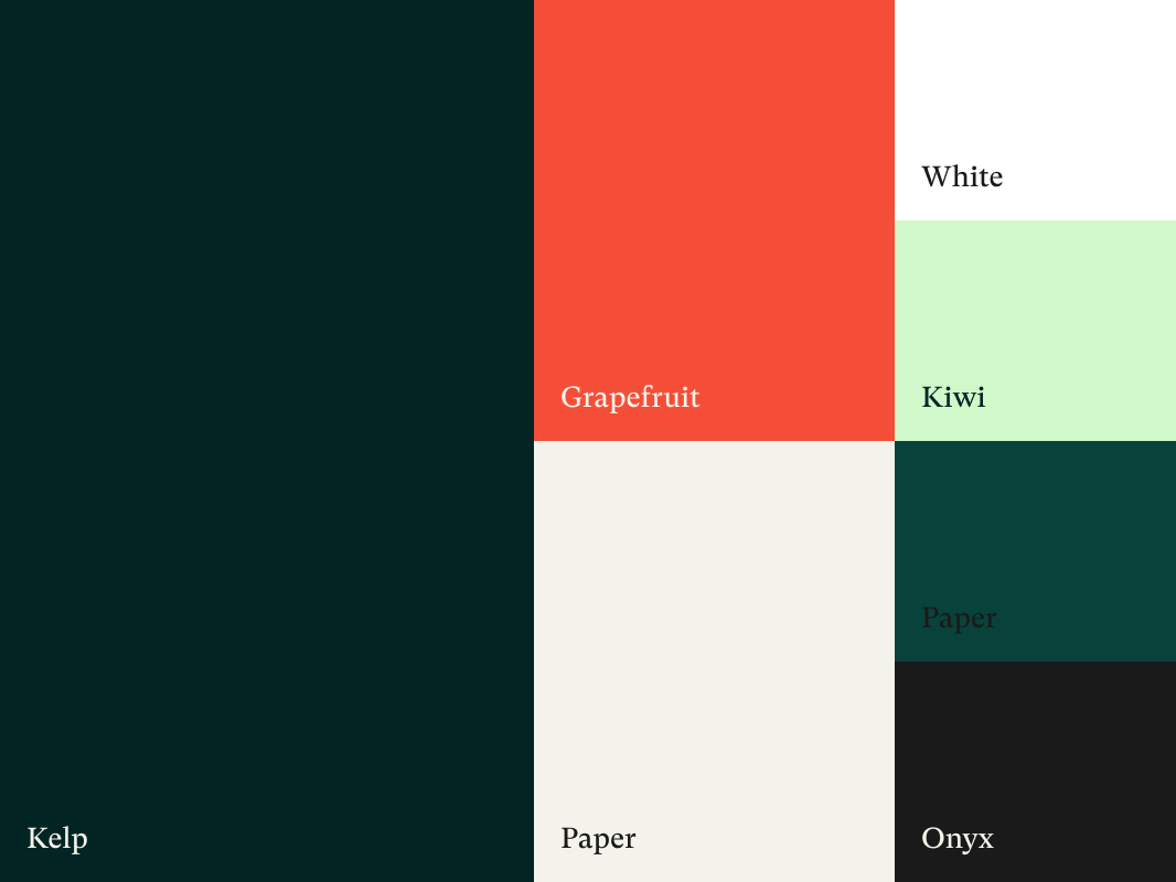
Colour palette
We selected an approachable colour palette of greens and earth tones that can be accented by a bold grapefruit colour.
Typography
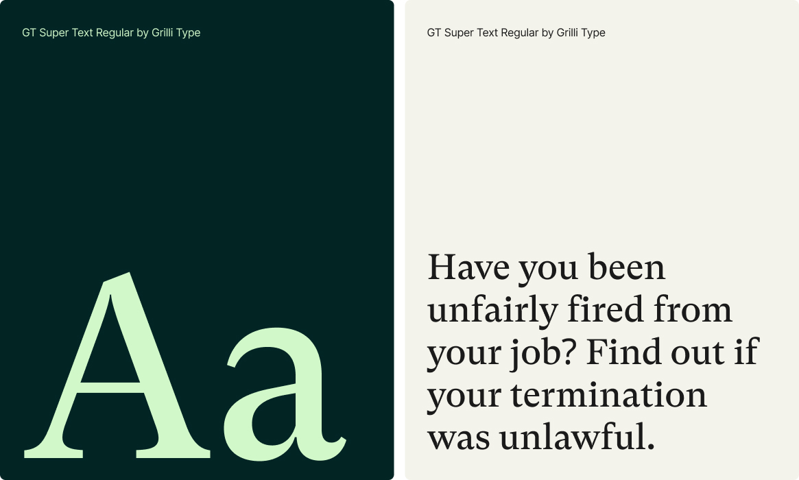
We selected a serifed font as a nod to the traditional roots of the legal sector and to convey authority and confidence.
Imagery
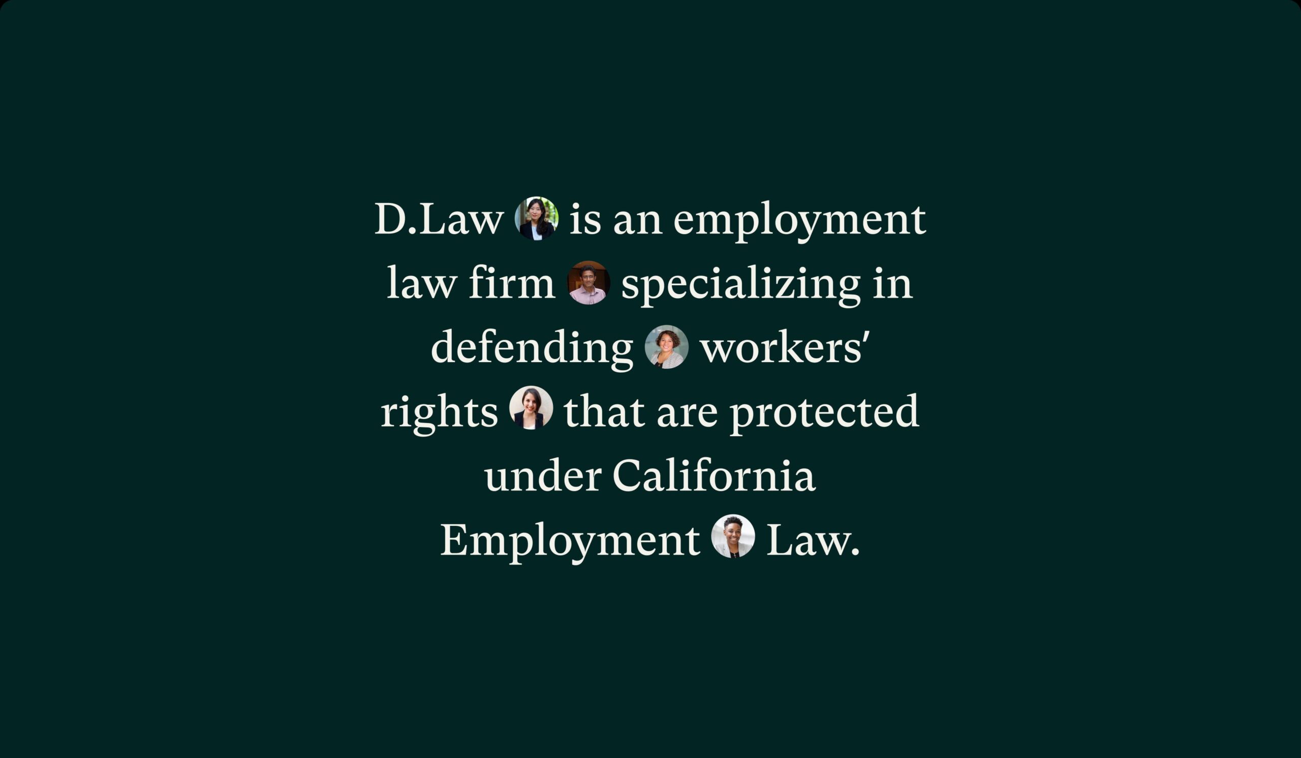
We selected authentic imagery that showcases the real people that D.Law serves. The imagery is clean, simple and positive.
Shape & form
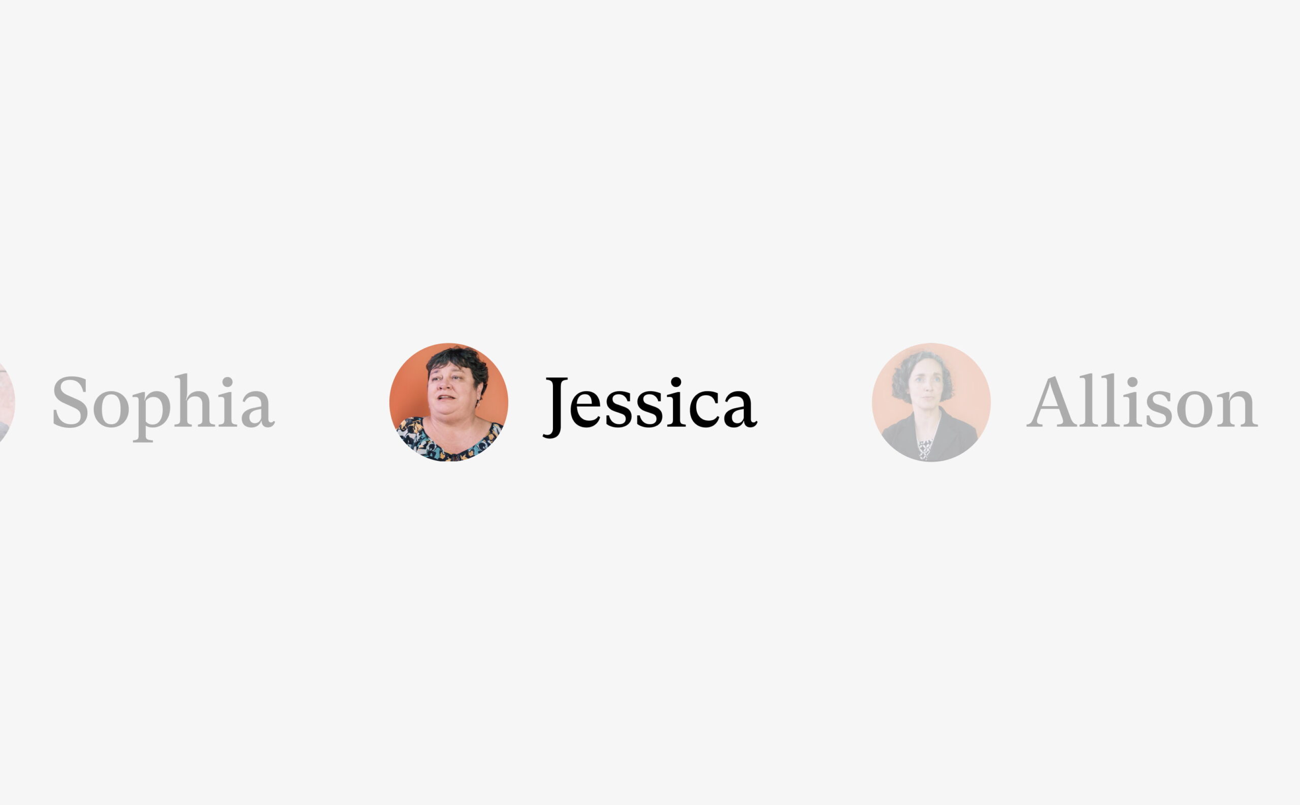
We drew inspiration from the new logo to develop brand devices that create design depth. The . from the logo is used as an image device that holds mini profile pictures. These are accompanied by names and stand for representation and impact.
The hard and soft lines of the font feed into the slightly rounded boxes that are used throughout the site. These shapes break up content, highlight text and create a sense of togetherness within the content and design framework.
The website
D.Law’s new website needed to increase their search engine visibility and generate new business for the law firm.
To achieve this, we delivered a new website around a digital strategy that combined keyword research with website structure, landing page recommendations and entry and exit point reviews.
The website design utilises the new brand and incorporates video content to achieve an approachable feel while demonstrating knowledge and communicating key messages.
We developed the website in WordPress, providing the D.Law team with a flexible CMS that they can use to continue managing and editing their website content.

The SEO strategy
D.Law had domain metrics that could be competitive for a number of keywords. They were competing against some very well established businesses with extremely competitive positioning. Our job was to assess the keyword battles that D.Law had a statistical chance of success with, focusing their resources on strategic targets.
The new website was designed and built with SEO best practice at it’s centre, feeding into every touch point of the design and development.
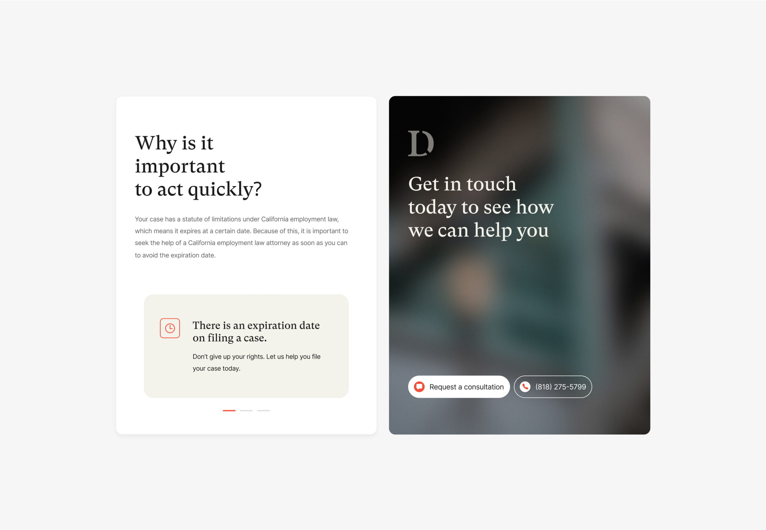
Domain migration
D.Law made the business decision to change their domain name as part of their rebrand. Changing domain can be a risky process if incorrectly managed and it’s important that an experienced team handles the process.
Our marketing team managed the domain migration, ensuring that a best practice process was followed and that the client’s domain metrics and competitive position were seamlessly transferred with the launch of the new site.

“I wouldn’t hesitate to recommend Plug & Play. They delivered a sector-leading brand, website and marketing strategy for us, capturing the empathetic nature of our business while also producing something bold and authoritative.
Their team is outcomes driven (like us) and they immediately understood what we were looking to achieve. I’d definitely work with them again in the future.”

Related work
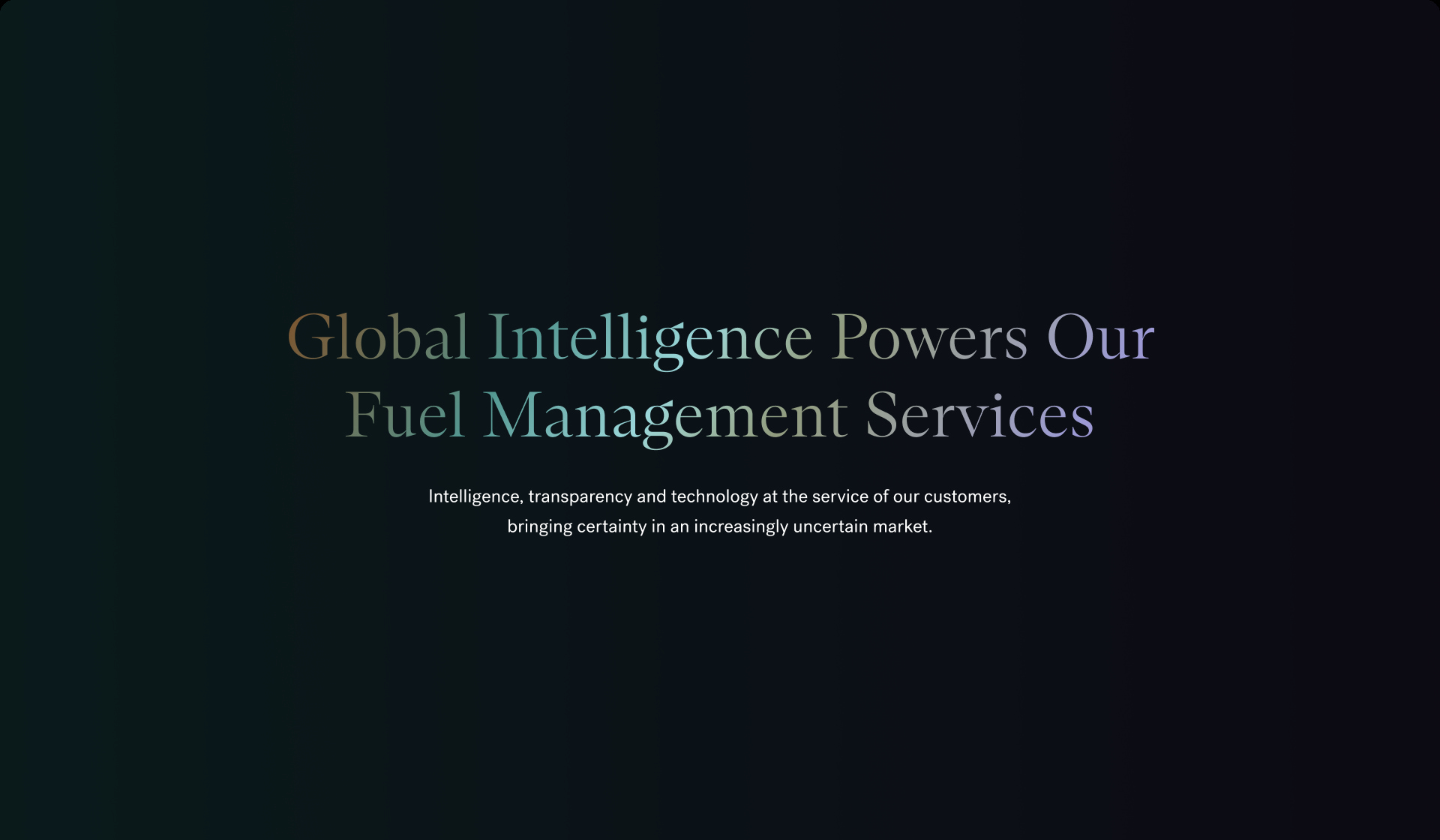
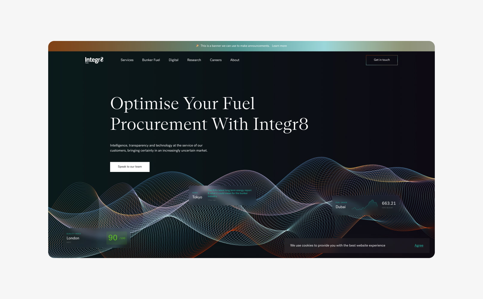
Integr8 is an internationally recognised bunker fuel management provider that is transforming fuel procurement for the shipping industry. They needed a new brand identity, SEO strategy and website to stand out as the market leader.
- Lead time:
- 16 Weeks
- Sector:
- Shipping & Finance
- Target Type:
- B2B
- Demographic
- Senior Operations & Procurement Mangers
- Website Goal:
- Reflect position in market & improve SEO
- Services:
- Branding, Web Design, WordPress, Web Development, Digital Marketing
- Scope
- Brand Identity
- SEO Strategy
- Adobe XD Wireframe Prototypes
- Adobe XD Design Prototypes
- WordPress Development
- Hubspot Integration
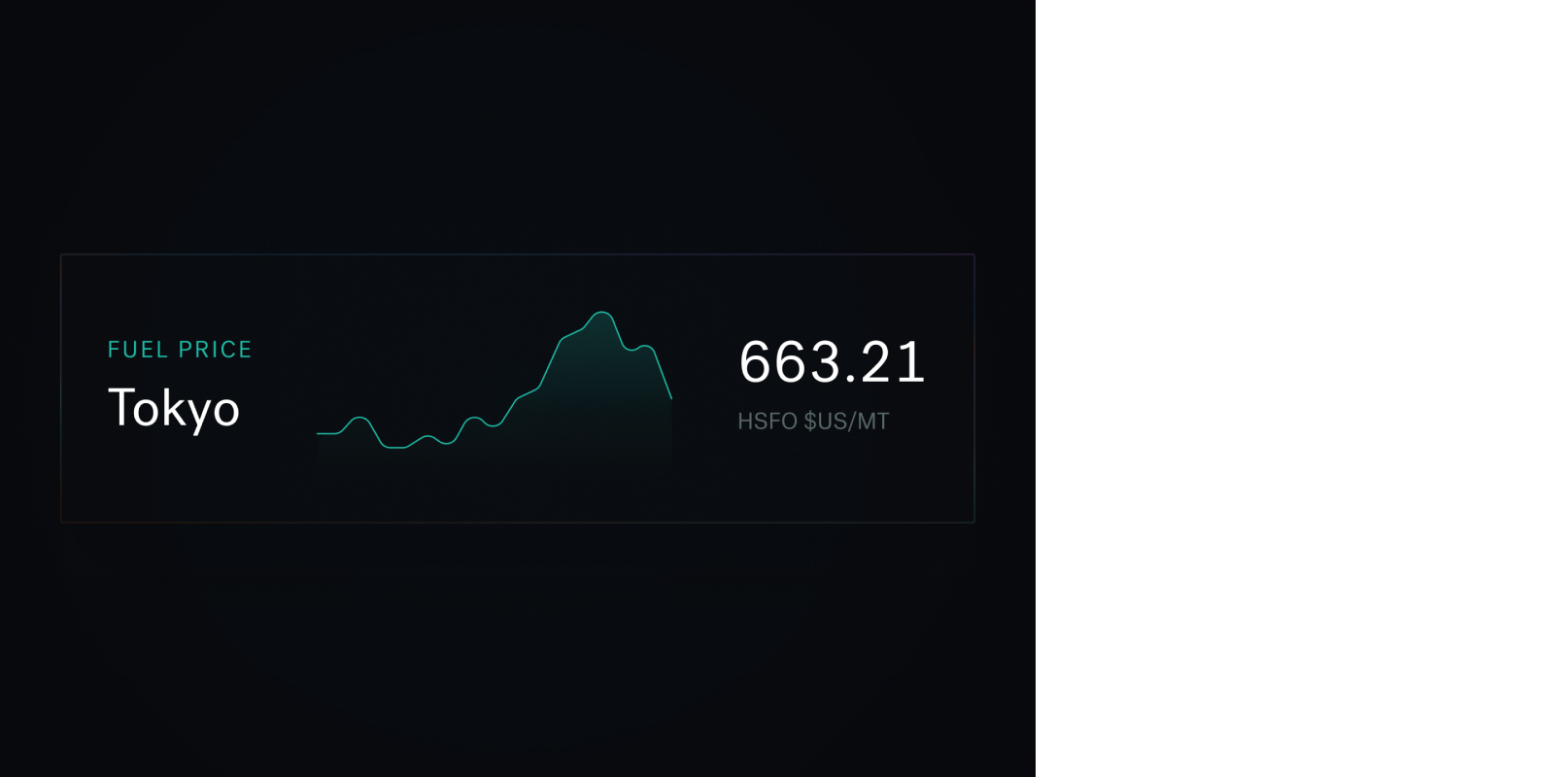
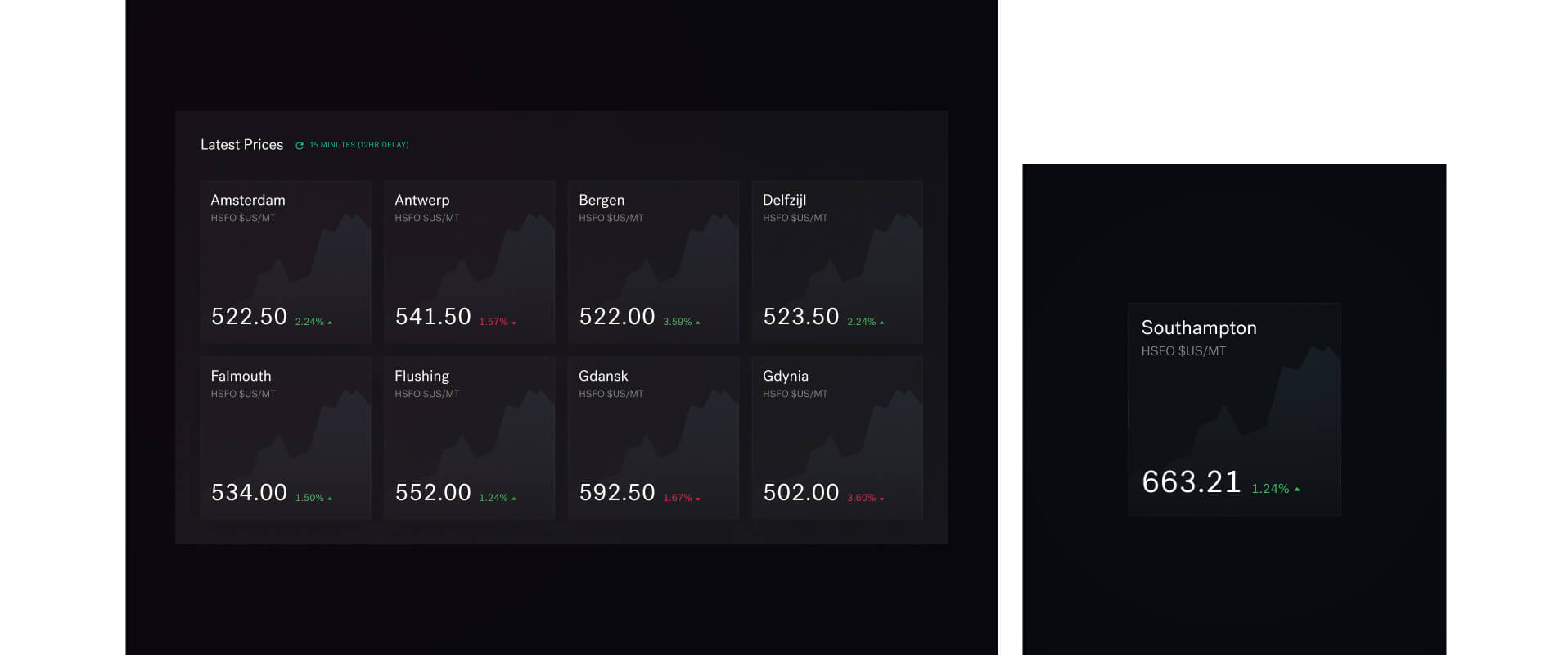
- Integration with engine.online for fuel grading and pricing data
- Resource
- 1 x SEO Strategist
- 1 x Brand Designer
- 1 x Website Designer
- 1 x WordPress Developer
- 1 x Quality Assurance Tester
- 1 x Project Manager
The challenge
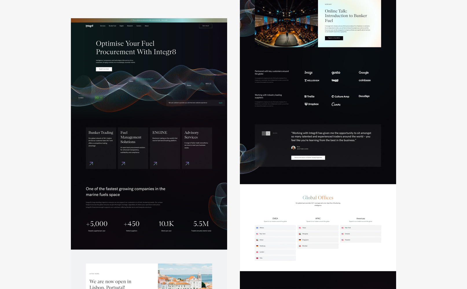
As leaders in their market, Integr8 recognised that their website was holding them back. They wanted to stand out in their market and move away from the stereotypical shipping industry branding of blue colour palettes and pictures of the sea and ships.
The site needed to represent their company traits, which were innovative, tech-enabled, data/results-driven, forward-thinking and client-focused
Their goals were to establish a unique brand, outrank their competitors in search engines and deliver key messages as part of optimised user journeys.

The brand
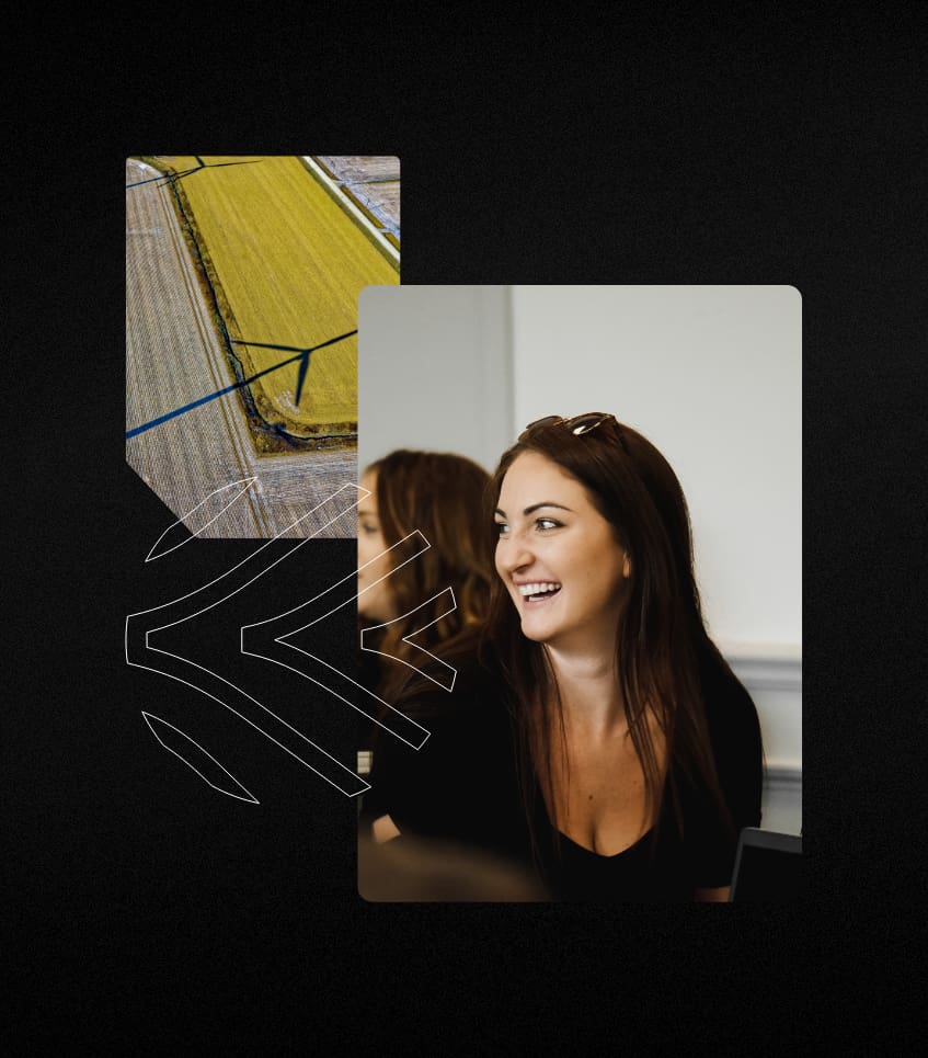
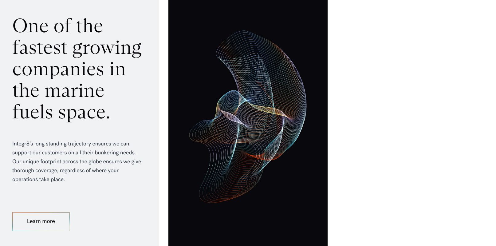
We created a modern, engaging brand that would set Integr8 apart from competitors. The client was ready for a complete brand overhaul, retaining only the basic shape and typography of the logo. Using a dark theme at the base of the brand, we introduced a new colour palette, including gradients to achieve depth.
We created a set of brand shapes including a primary wave shape with a number of supporting graphics. These could be used in a dynamic or still form to achieve a slick and high impact visual.
We introduced a new set of typographies to provide a flexible set of fonts to deliver key messages of the business.
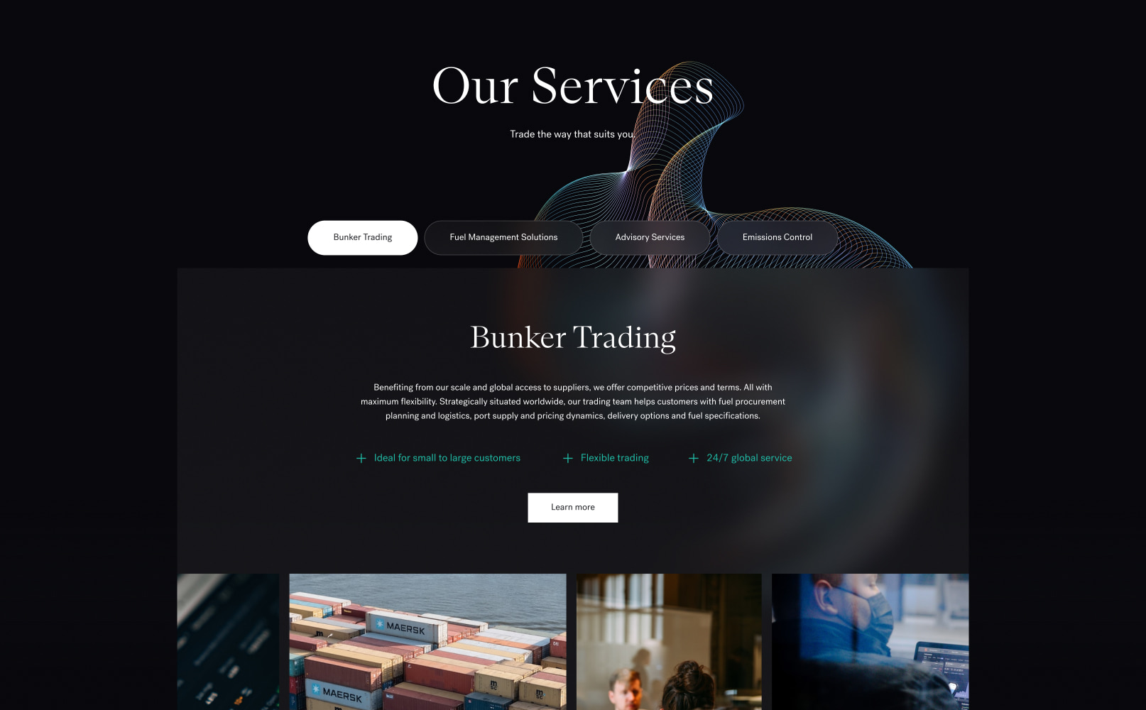
The website
The goal of Integr8’s new website was to position themselves as the market leader in the bunker fuel industry. They wanted an engaging website that was visually different to their competitors.
The shipping industry can be traditional and our challenge was to push the boundaries of the industry, while keeping the design simple, engaging and clear.
We utilised the new brand work to establish a flexible design system for the new website design. The design system combined the brand assets to produce a distinct eye catching design that also provided the Integr8 team with the flexibility to manage and edit their content.
Our developers built the website in WordPress, using a component based approach to provide the best content management. The components were codified with the new brand guidelines, ensuring that internal teams could continue to implement the brand consistently.
The SEO strategy
Integr8 operate within a low volume, high value industry. Search volumes of their target keywords are typically low compared to other markets, however they are highly specific and extremely valuable. In markets like these, capturing opportunities by ranking well and effectively converting traffic into new business is critical to success.
Our SEO team assessed hundreds of keywords to identify the keywords that Integr8 had the best statistical chance of ranking for, and were most likely to generate high quality traffic for the business. Once the keywords had been selected, the website was optimised to enable the website to begin climbing the rankings.
Integr8’s SEO strategy feeds into all elements of the project and interlocked with the design and development processes. To maximise their search engine rankings, it was important that the SEO strategy was completed at the start of the project so a holistic approach could be taken to the implementation.
+
1
1279
%
Increase in search engine visibility since launch
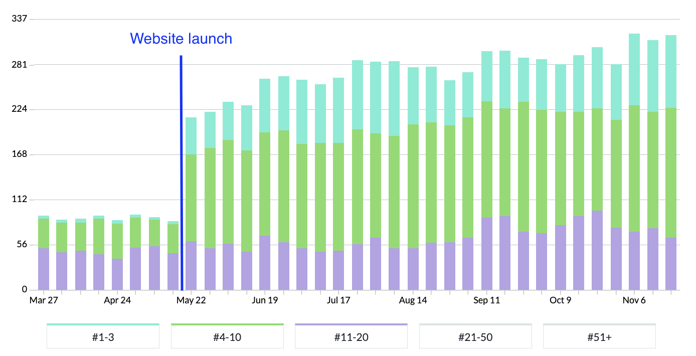
In the chart above, blue bars represent positions 1-3 in Google, green represents rankings on the rest of page 1 and purple represents page 2 rankings.
You can see that rankings immediately rose following launch and have continued to climb, generating huge increases in visibility and organic traffic for Integr8.
Related work
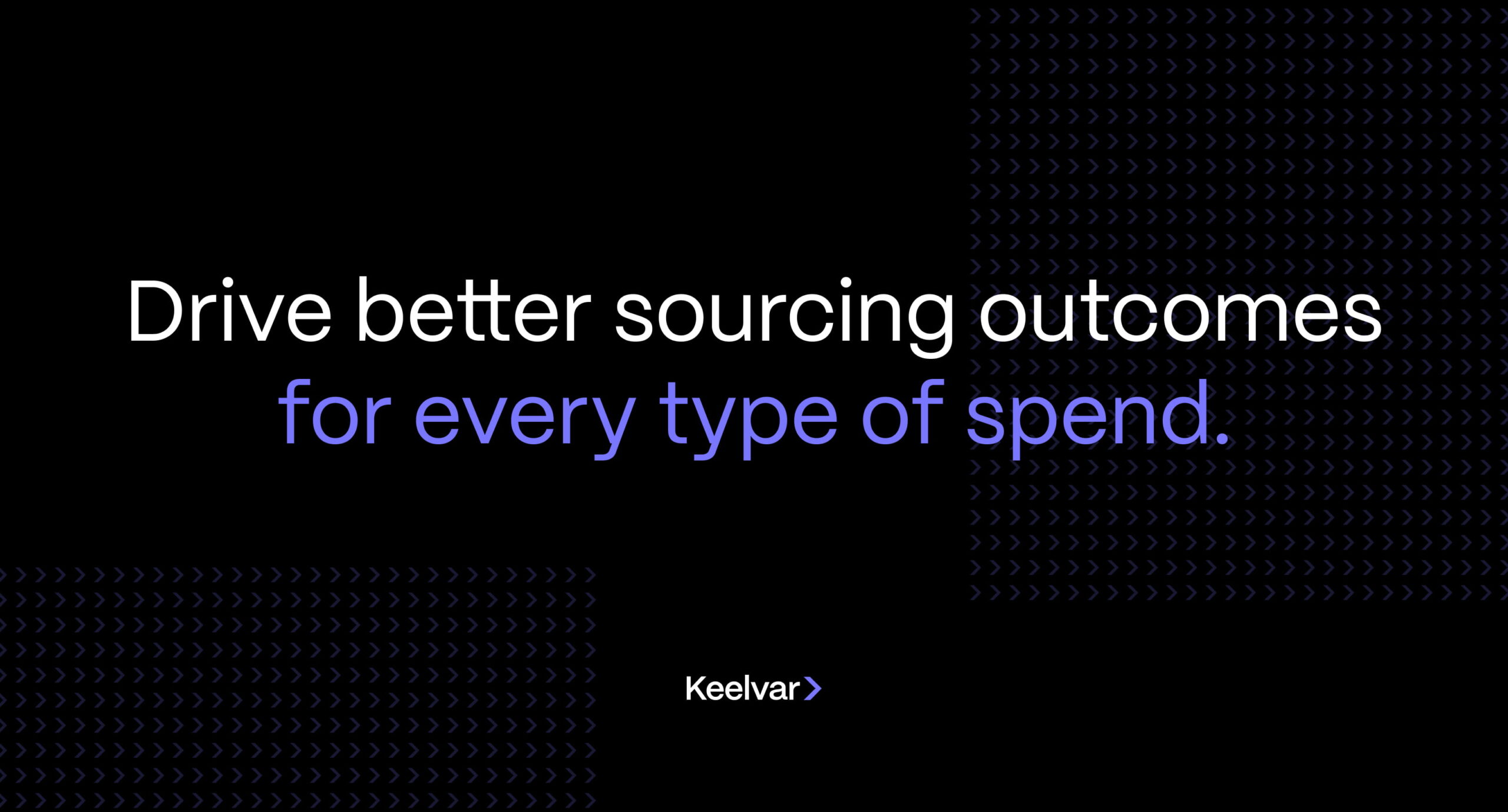
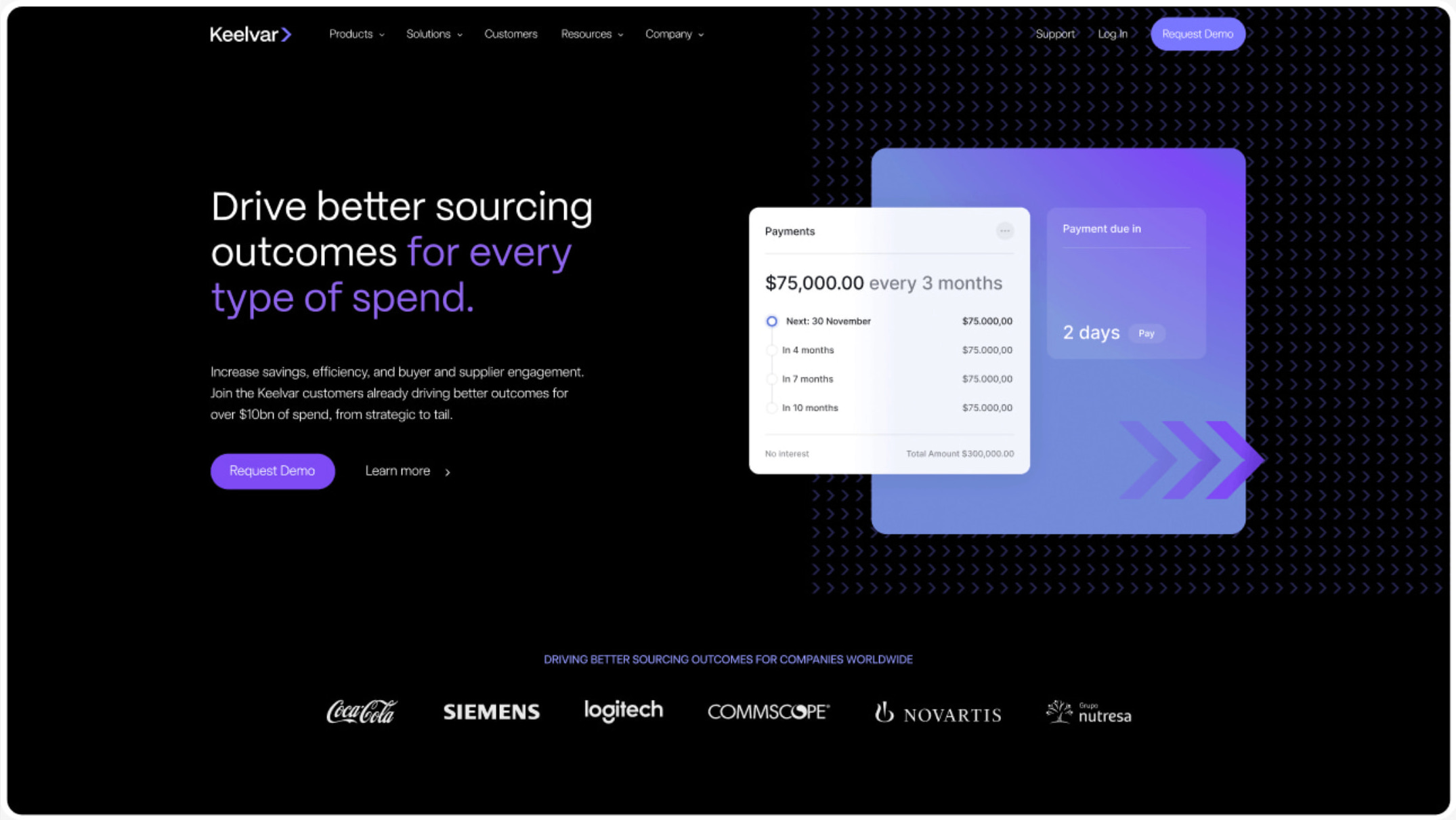
Keelvar provides market leading procurement software to enterprise organisations, helping them to source at scale. Their combination of groundbreaking technology and an agile business approach has positioned them as disruptors in their market.
They needed a new brand and website to differentiate them from competitors and enable their marketing team to move quickly.
- Lead time:
- 16 Weeks
- Sector:
- Technology
- Target Type:
- B2B
- Demographic
- Procurement Managers in Enterprise Organisations
- Website Goal:
- Reflect position in market & increase enquiries
- Services:
- Branding, Web Design, Webflow, Web Development, Digital Marketing
- Scope
- Brand Identity
- SEO Strategy
- Adobe XD Wireframe Prototypes
- Adobe XD Design Prototypes
- Webflow Development
- Resource
- 1 x SEO Strategist
- 1 x Brand Designer
- 1 x Website Designer
- 1 x Webflow Developer
- 1 x Quality Assurance Tester
- 1 x Project Manager
The challenge
As disruptors in their industry, Keelvar pushes the boundary of what has been done before in their market. Where their competitors are slow-moving and corporate, they are modern, flexible and able to move quickly. They needed a new brand and website to reflect their market position and to visually set them apart.
The new website needed to enable their marketing team with a flexible CMS that could be used to independently create and manage content. Their goal was to drive business performance by increasing search engine rankings and converting more visitors into enquiries.
The brand
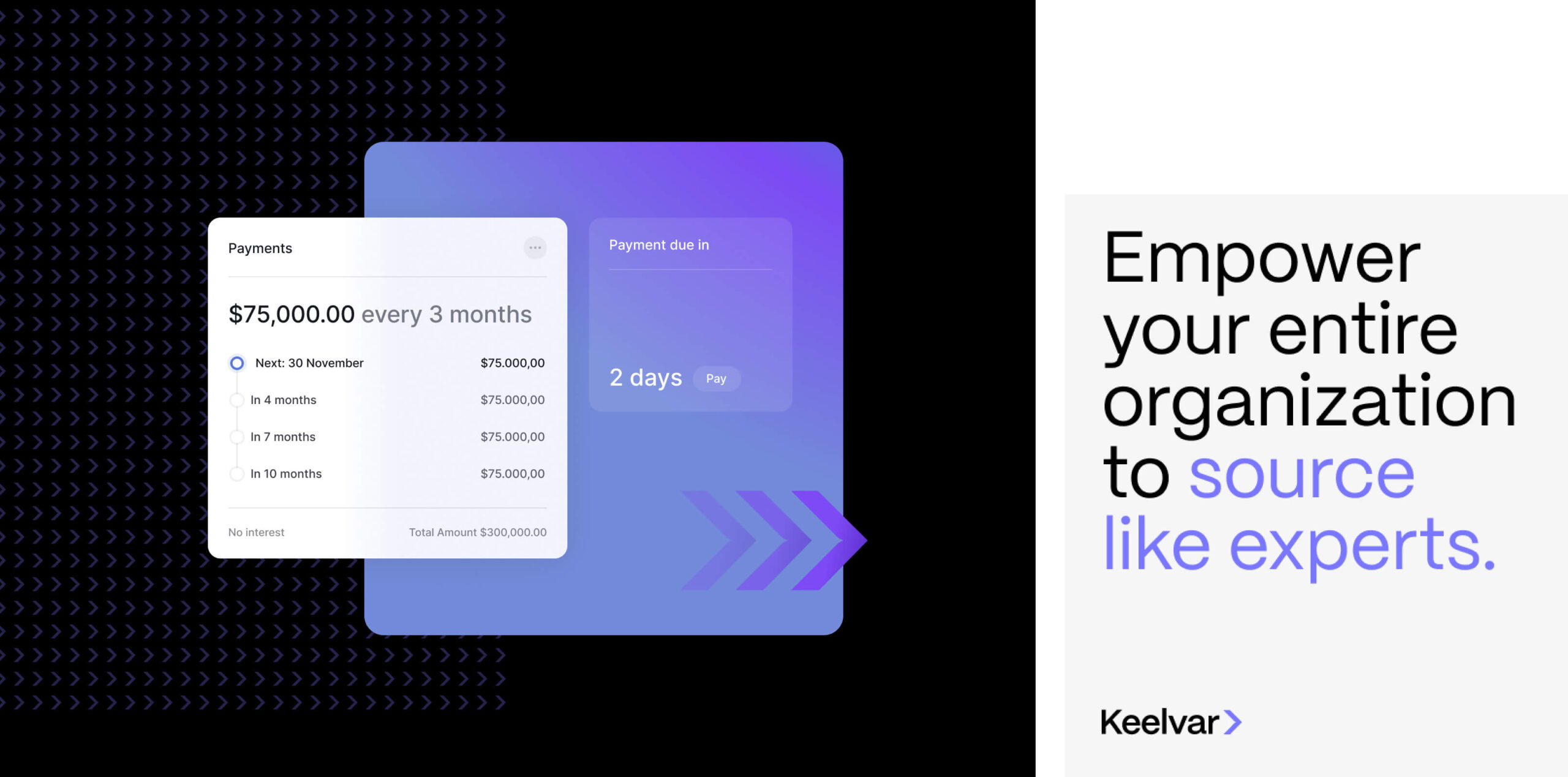
We developed a unique and vibrant brand that reflects the high tech nature of the business and the products they offer. Their offering is groundbreaking in their field and the brand needed to showcase the same innovative, forward-thinking and modern themes.
The new brand identity combines new typography, colours, shape and form, and imagery to produce a polished, trustworthy feel that is consistent and flexible.
Our team drew inspiration from technology companies and the fintech industry to deliver a bold result that represents the business.
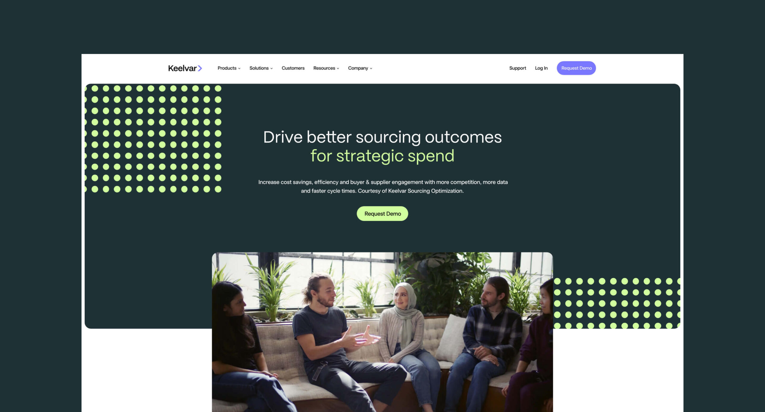
The website
Keelvar’s new website needed to generate new enquiries for the business by increasing search engine rankings, increasing organic traffic, and by improving the website conversion rate.
To deliver this, we created a digital strategy that highlighted key opportunities to increase search engine visibility and optimise the website. We combined the digital strategy outcomes with conversion design best practice to produce a high performance website that Keelvar’s marketing team could leverage as part of their broader marketing ecosystem.
The new brand was utilised within the new website design and was brought to life using dynamic assets and animations.
We developed the website in Webflow which enables easy content management for the marketing team.
The SEO strategy
Keelvar had good domain metrics which gave them a fantastic start point to improve their organic rankings. They had a lot of potential but their existing website wasn’t developed and optimised in a way that encouraged rankings.
Our team delivered an SEO strategy that assessed a huge number of keywords that were relevant to the business. We selected high value and high intent keywords that Keelvar has a statistical chance of ranking for, to invest in as part of the optimisation process, delivering the greatest return for the business.
In the chart above, blue bars represent positions 1-3 in Google, green represents rankings on the rest of page 1, purple represents page 2 rankings and orange shows pages 3-5.
You can see that rankings immediately rose in the month following launch. We’ll be continuing to track the website results over the coming months.

“This is my second time working with Plug and Play on a company rebrand and website redesign project and I was again thrilled with the outcome. They are a pleasure to work with, very organized, super creative and work to an extremely high standard. Clear communication and a transparent process ensures all stakeholders are aligned, we keep on track to deadlines and the project runs smoothly. They also listen carefully to our goals and objectives and take on feedback very effectively.
Its often hard to make the case internally to justify projects like these especially outsourcing to a third party that is unknown to internal decision makers. Each time I’ve worked with Plug & Play all stakeholders have been blown away and have said after the project that Plug and Play surpassed expectations.
I will continue to work with them again and again on future projects.”

Related work
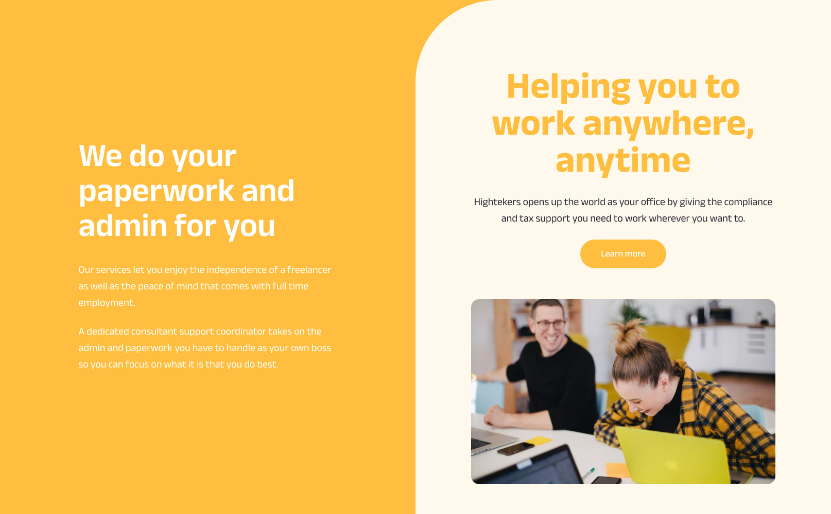
Hightekers supports businesses that are recruiting for fixed term contracts by streamlining the onboarding and management process. They provide a smooth hiring process for the business and the perks of full time employment to their contractors.
They had secured great market exposure in France and were ready to strategically increase their global exposure by targeting new European territories. They had ambitious growth targets and challenged us to deliver a brand, website and digital strategy that would help them to achieve their global revenue goals.
- Lead time:
- 20 Weeks
- Sector:
- Recruitment
- Target Type:
- B2B
- Demographic
- IT Consultants, Businesses hiring in IT
- Website Goal:
- Increase international market penetration
- Services:
- Branding, Web Design, WordPress, Multilingual, Web Development, Digital Marketing

- Scope
- Brand Strategy
- Customer Persona Development
- Key Messaging Development
- Brand Identity
- SEO Strategy
- Adobe XD Wireframe Prototypes
- Adobe XD Design Prototypes
- WordPress Development
- Multilingual Website
- Copywriting
- Resource
- 2 x Marketing Strategists
- 1 x Digital Strategist
- 1 x Brand Designer
- 1 x Website Designer
- 1 x Website Developer
- 1 x Quality Assurance Tester
- 1 x Project Manager
- 1 x Copywriter
Brand strategy
The brand process kicked off with a number of brand workshops that were led by our marketing team. We utilised the customer and business insights gained during this process to build a new brand framework for Hightekers.
In collaboration with their marketing team, we developed a new value proposition and defined their target audience personas and archetypes. This enabled us to curate an aligned messaging framework for each archetype, tapping into their motivators and pain points.
The brand strategy formed the backbone of the project, guiding the design direction and messaging, and enabling the Highteker’s team to produce consistent and effective marketing materials.
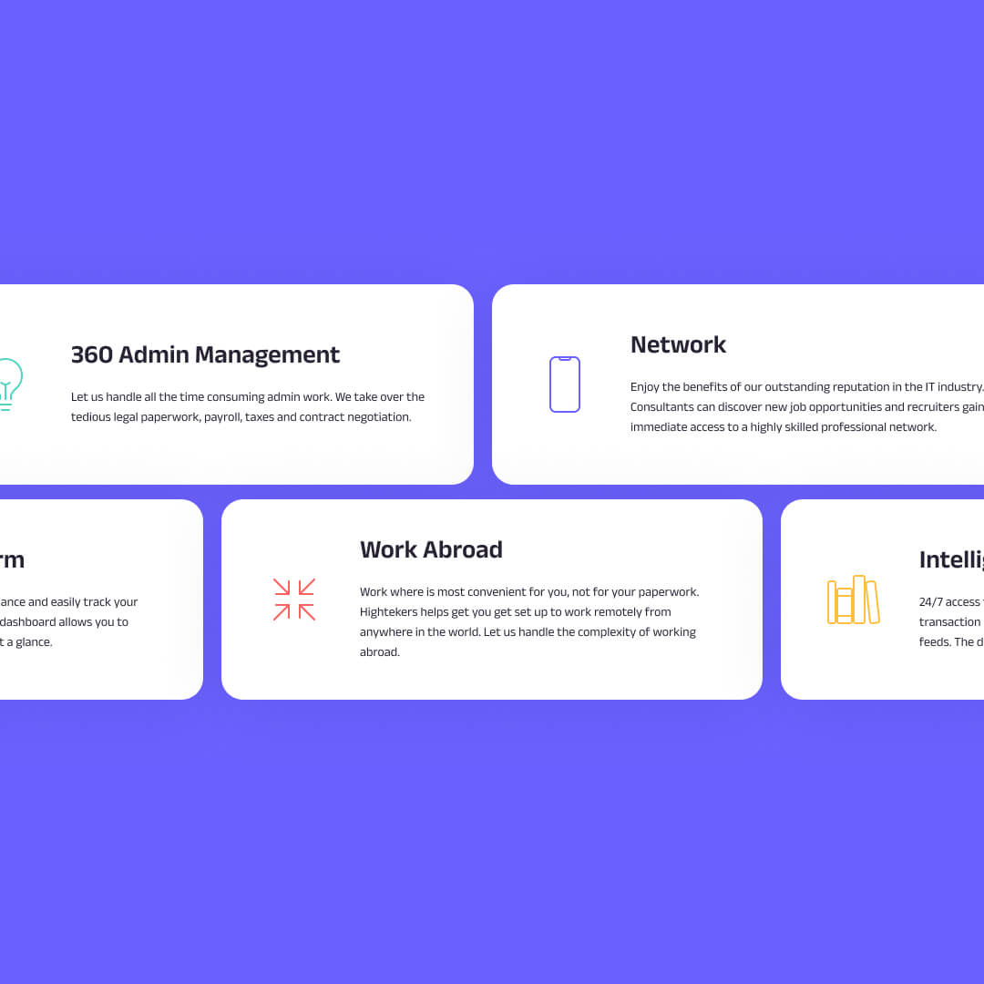
Brand identity
Drawing on the brand strategy, we evolved Highteker’s brand identity to create a fresh visual design system with the flexibility to be utilised across Hightekers’ business ecosystem.
The existing brand had some good components but was dated and missing depth and consistency. We implemented a new colour palette including a secondary set of colours to provide additional dexterity with soft and bold colour options. We also drew inspiration from the logo to introduce a new brand pattern. The pattern brings energy and direction to the brand and adds depth and visual interest.
The key to the success of the Hightekers brand is the way that the different brand elements including imagery, typography, colour, shape and form are combined in a way that is distinctly theirs. The outcome is a unique and vibrant brand that enables Hightekers to be bold and stand out.
The website
We delivered an international website with 7 different territories and 5 languages.
To effectively target Hightekers’ new territories, we created a global website that enables Hightekers to deliver regional content in different languages to their target markets. This approach means that each new territory benefits from the already established French domain, giving them a head start upon launch.
Market exposure was critical to the success of the project which is why our team delivered an SEO strategy that was designed to grow Hightekers’ organic rankings in search engines and enable the website team to create an optimised website structure.
SEO strategy
The new website was designed and built in line with SEO and user experience best practice. Our strategic marketing team created an SEO strategy that would enable Hightekers to leverage their new website rank more effectively in regional search engines.
+
1
126
%
Increase in search engine visibility since launch
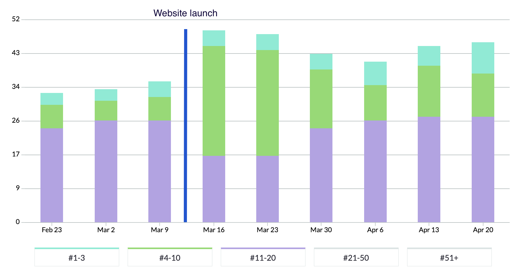
In the chart above, blue bars represent positions 1-3 in Google, green represents rankings on the rest of page 1, and purple represents page 2 rankings.
Following the launch of the new website, Hightekers began to secure new page 1 search engine rankings. They have almost tripled the number of keywords in the top 3 positions and they continue to climb.

“Plug & Play immediately understood what we were looking to achieve with the project and we were impressed by their knowledge of best practice for international websites and their ability to demonstrate performance outcomes.
We really enjoyed the process and seeing our new brand come to life through the website, which has been really exciting!
Upon launch, we very quickly saw an increase in search engine visibility and our keyword rankings are continuing to climb. The team at Plug & Play have been lovely to work with, with quick turnarounds and high quality design and development. If you’re looking for a new brand and website, we’d recommend partnering with Plug & Play.”

Related work
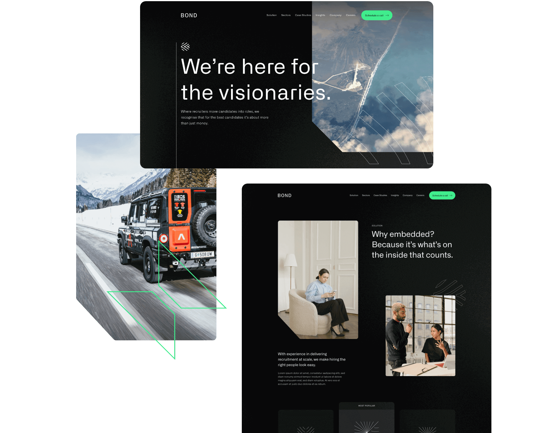
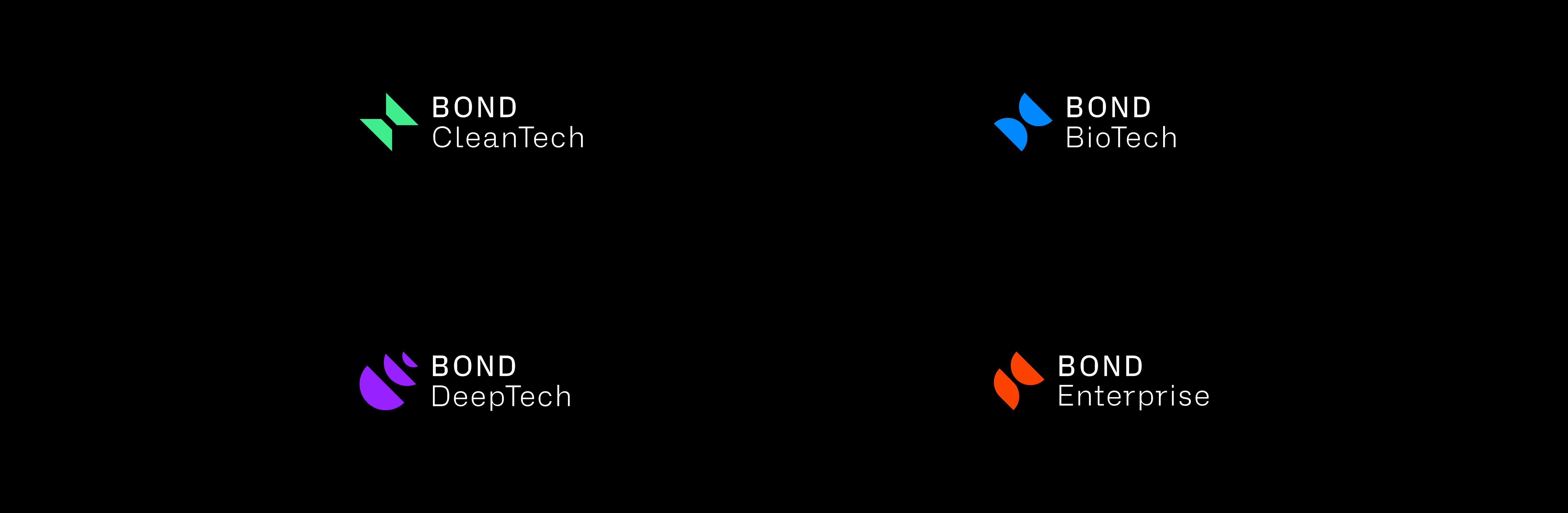
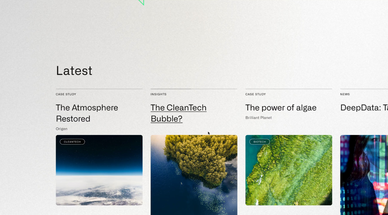
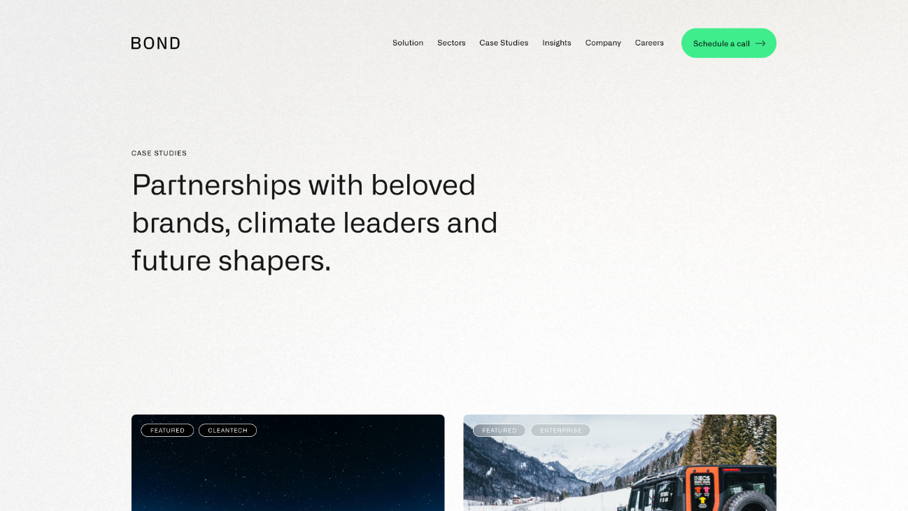
Bond Global is an embedded recruitment agency that works with innovative CleanTech, DeepTech, BioTech and Enterprise organisations to transform the planet with new technology. Their unique subscription model for recruitment provides scaling businesses rapid access to the best talent.
They challenged us to deliver a new brand strategy and identity, and create a slick new website to attract new business.
- Lead time:
- 20 Weeks
- Sector:
- Recruitment
- Target Type:
- B2B & B2C
- Website Goal:
- Reposition the business & attract new clients
- Services:
- Branding, Web Design, Web Development, Marketing Strategy, SEO, Copywriting
- Scope
- Brand Strategy
- Customer Persona Development
- Key Messaging Development
- Brand Identity
- SEO Strategy
- Adobe XD Wireframe Prototypes
- Adobe XD Design Prototypes
- WordPress CMS
- Copywriting
- Resource
- 2 x Marketing Strategists
- 1 x Digital Strategist
- 1 x Brand Designer
- 1 x Website Designer
- 1 x Website Developer
- 1 x Quality Assurance Tester
- 1 x Project Manager
- 1 x Copywriter

The challenge
Bond Global is a dynamic and innovative recruitment agency that works with some of the best global talent, however this wasn’t reflected in their existing brand or website. They challenged us to update their recruitment website design and messaging to resonate with their target clients. They were ready to reposition themselves in their market and set themselves apart from other recruitment agencies.
Alongside their rebrand and website redesign, they commissioned us to deliver an SEO strategy that would improve their rankings in search engines and enable new clients to discover them organically.

The brand strategy
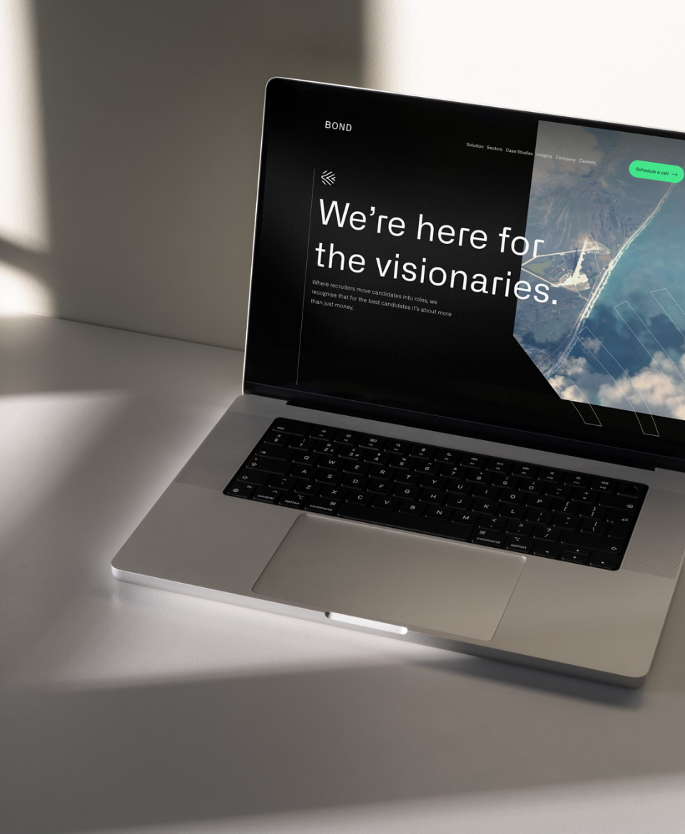
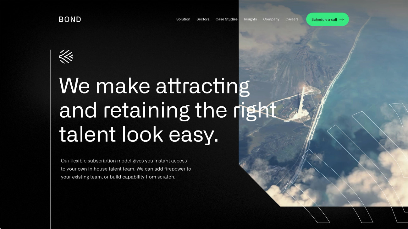
Using insights from stakeholders in the business, we created a brand strategy that is faithful to Bond’s values and attracts highly aligned clients. Their new strategy provides the central thread that connects the reason that Bond exists and the reason that their client companies exist. For example, Bond’s new key messages include bold statements like “We’re here for the visionaries” and “There’s no planet B”. These statements speak directly to their clients who work in renewables, clean energy and environmentally positive technology companies that are innovating to clean up the planet.
Bond’s refreshed messaging aligns with their target clients, reflects their USPs and provides their team with a framework of how to speak about the business and communicate in their marketing.
The brand identity
We evolved Bond’s existing brand identity in line with the new strategy and the businesses that they wanted to attract. The use of dark base colours with vibrant pops of colour represent their key brand themes – technology, futuristic, environmental, big picture mindset.
The final visual brand achieves a technical and futuristic feel that resonates with Bond’s clients and the work they do.
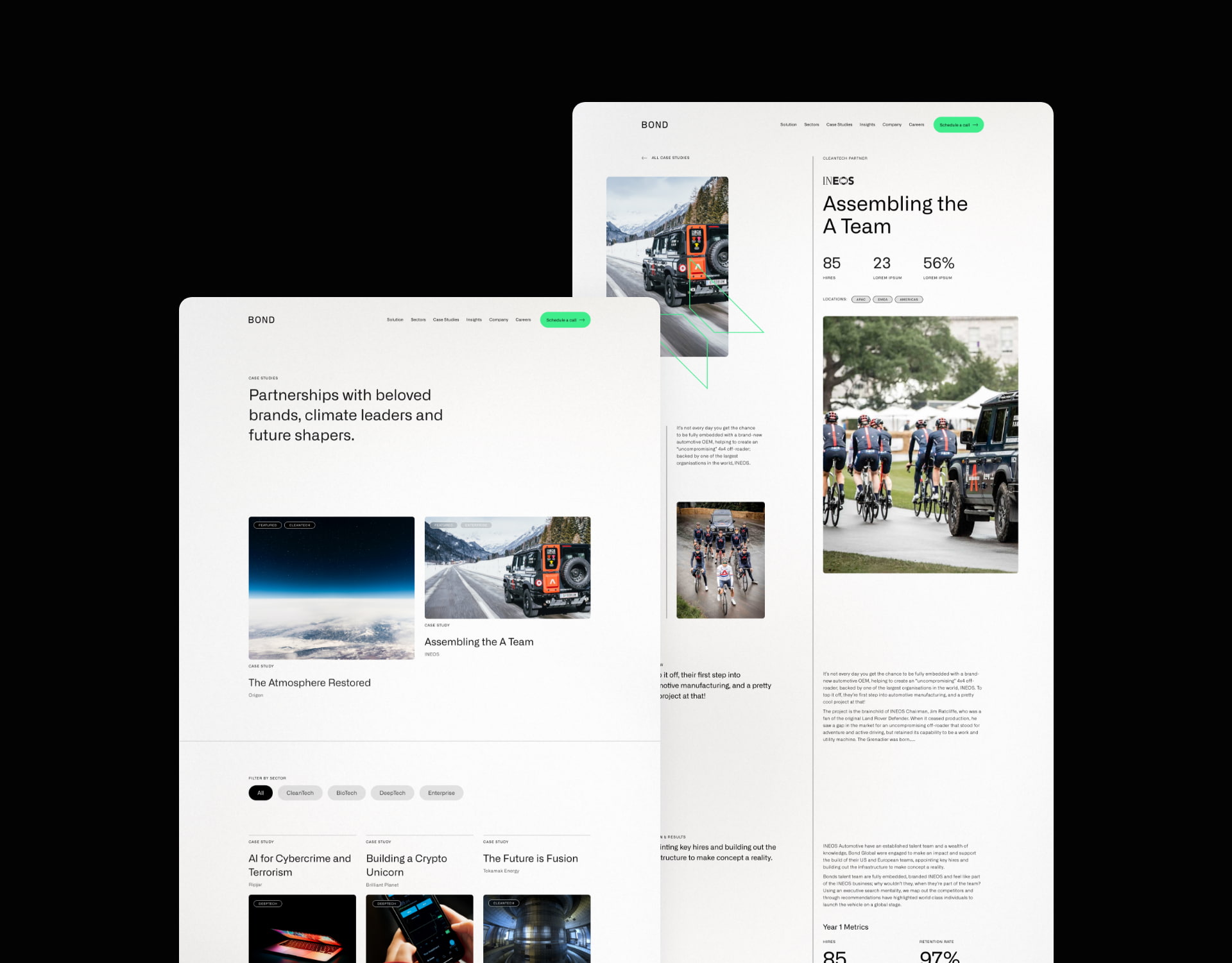
The website
Our website team created a fresh new website design that incorporated the new brand and messaging. The primary goal of the website is to attract and convert new clients, opening up a new channel of lead generation for the business.
Our digital marketing specialists created an SEO strategy that focused on increasing Bond’s search engine visibility for high value search terms, enabling them to be found by businesses looking for their services. We built and optimised the site around the SEO strategy, laying the foundations for continued growth and visibility.
Bond’s new brand identity combines colour, typography, shape, form and imagery to deliver an impactful and unique experience.
The new website design is fresh and utilises white space to heighten the impact of copy.
Bond’s new messaging framework sets them apart in their market with a clear and emotive style.
SEO strategy
Prior to the new website launch, the only keywords that the website ranked for in Google were very specific brand terms and a couple of broad terms that were buried deep into page 4 of the search results.
We focused on specific areas of Bond’s recruitment offering to secure new rankings for highly aligned keywords. This enabled them to gain greater visibility for specific terms that would generate new business without wasting resource chasing after competitive and less relevant broad terms.
+
1
425
%
Increase in search engine visibility since launch
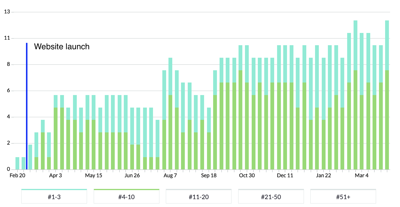
In the chart above, blue bars represent positions 1-3 in Google and green bars represent rankings on the rest of page 1.
You can see that rankings immediately rose in the week following launch and that page 1 rankings continued to grow over time.
“We worked with P&P to rebrand and build a website from scratch. We have been inundated with positive feedback on the look and feel of the Bond brand. The project management side of things and communication was first class. P&P are able to respond to passionate involvement from a client”

Related work
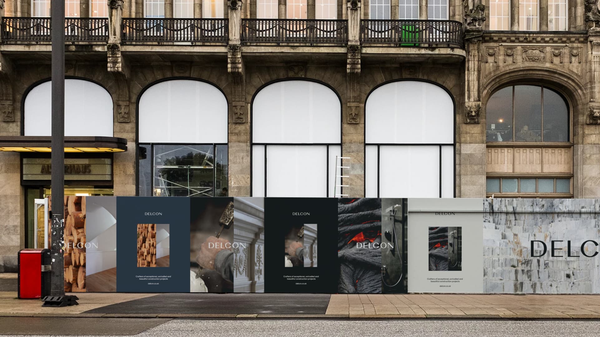
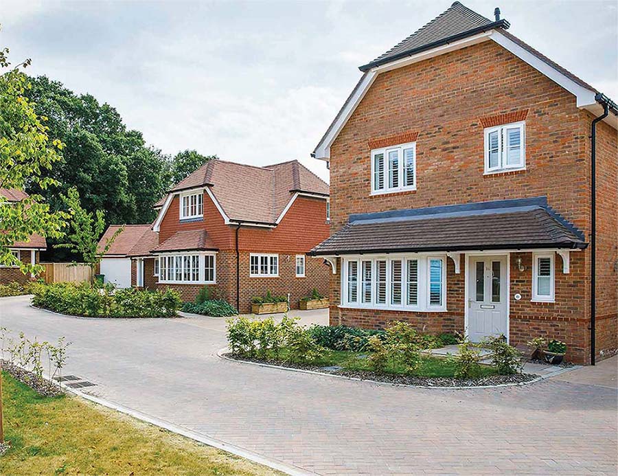
Delcon specialises in the construction of luxury residential, retail and commercial properties. They challenged us to deliver a new brand and website that reflected the quality of their work.
- Lead time:
- 12 weeks
- Sector:
- Construction
- Target Type:
- B2B & B2C
- Services:
- Brand Identity & Website

The challenge
The Delcon team identified that their customers were using the appearance of their website and brand to infer the quality of their construction work. With a dated website design and user experience that didn’t reflect their high quality and precise work, Delcon was ready to invest in their site to connect with their customers and reflect their position in the market.
Our approach
Delcon wanted to retain their reputation as an exclusive business that operated almost exclusively on referrals. Their new website needed to reflect their quality and exclusivity while converting referrals into enquires.
As per the brief, we took an image-led approach to the website design and used imagery to reflect Delcon’s design style. The design pairs raw construction elements with refined finishes, focusing on small and detailed touch points such as sleek loading animations and interactive elements.
Dynamic design
We created a website design with subtle movement and interaction that produces a premium feel. These interactions include parallax animations where elements on the page scroll at slightly different speeds. We also created an expansion and narrowing effect on the screen as the user interacts with the page. This directs the user’s attention and signposts the user journey.
We introduced ambient video footage into the design to create depth and visual interest.
The development
We developed the website using WordPress to provide a flexible content management system for the Delcon marketing team. The new site gives them a high level of customisation while also enforcing their new brand guidelines.
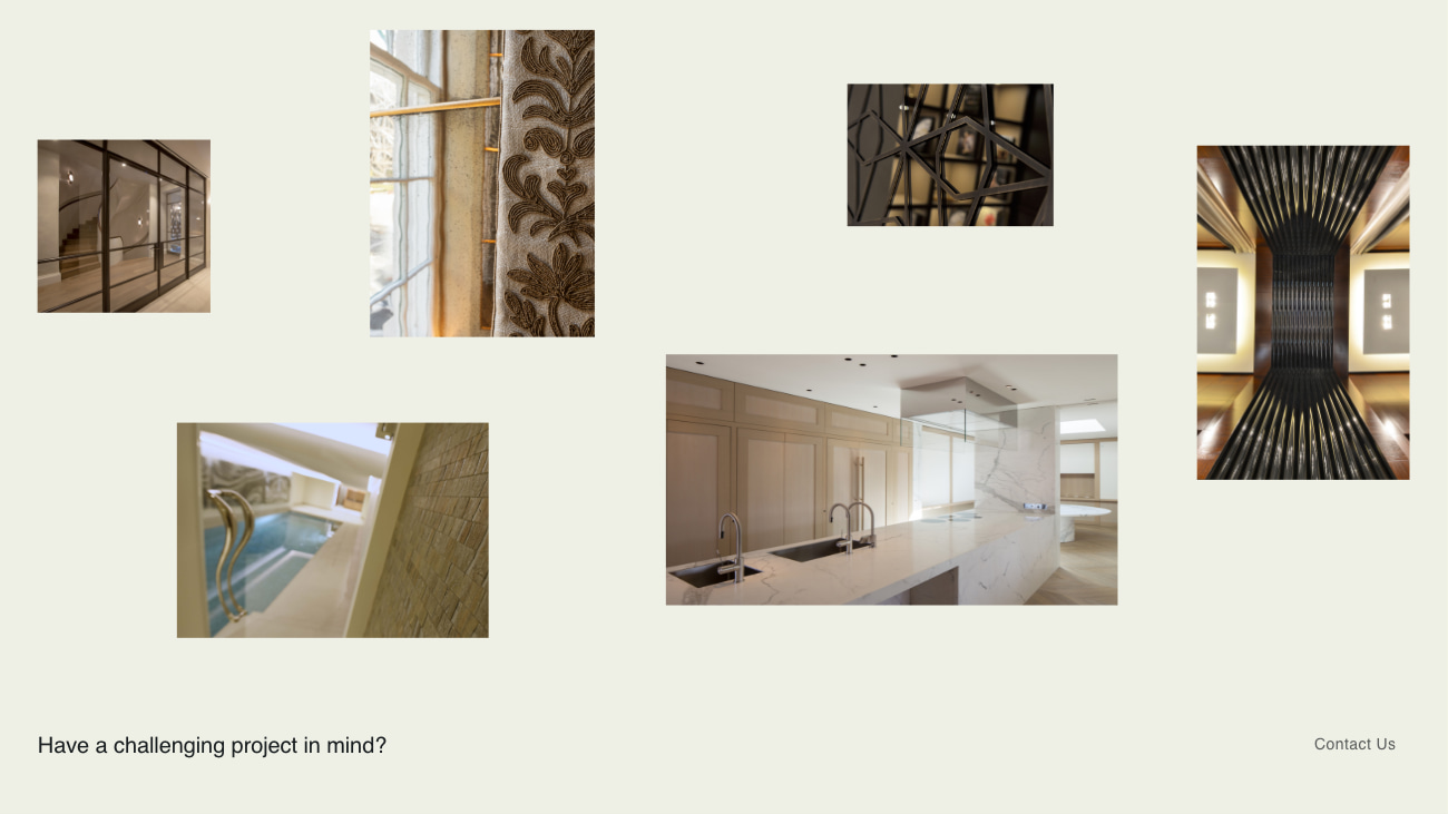
Image showcase
The site is designed to show glimpses of Delcon’s work and materials, while maintaining client confidentiality which is required on the majority of Delcon’s projects.
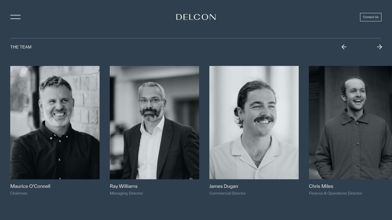
Team
An interactive component was created to showcase the Delcon team.
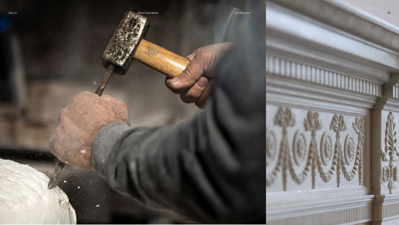
Balance
The new website harnesses the balance between form & function, and between raw & refined. These concepts are at the heart of Decon’s brand.
The brand
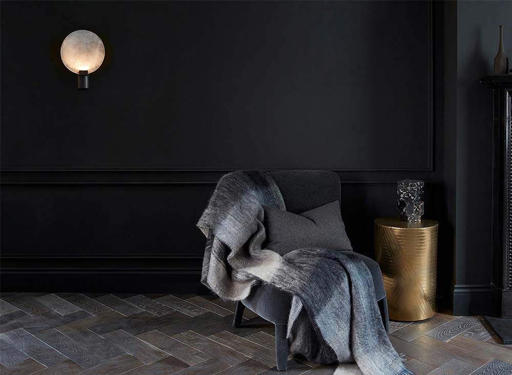
We evolved the Delcon brand, creating a new colour palette, typography and image guidelines. The brand was rolled out to the new website and portfolio ‘look book’ and was prepared to be implemented on hoardings and on-site materials.
Related work
Delcon is a high-end construction company that specialises in luxury retail and residential properties. They needed a new brand identity to attract new customers and elevate themselves above the competition. They wanted to be the construction company of choice for exclusive construction projects.
- Lead time:
- 8 weeks
- Sector:
- Construction
- Target Type:
- B2B & B2C
- Services:
- Brand Identity & Website
The challenge
Delcon’s existing brand was dated and didn’t represent the quality of work that they delivered. They challenged us to refresh their visual identity and align their brand with their target customers.
The new brand needed to help prospective customers self-identify as a good fit by highlighting Delcon’s attention to detail and quality of work. Delcon wanted to take a minimalist image-led approach, showing their customers what they do rather than telling them.
Imagery
Delcon’s imagery balances form & function, and raw & refined, using raw and finished materials in contrast with each other. For example, marble walls and lava-stone showers.
Typography
To select the typography, we assessed a number of high fashion brands such as Prada, Yves Saint Laurent and Rolls Royce. These brands use simple and delicate lettering that create a luxury and understated feeling to the copy. We replicated this style, selecting a simplistic but impactful combination of fonts to reflect the Delcon brand.
Logo
We created a bold and authoritative logo that reflects a confident and established business. The carefully constructed letter forms balance boldness with intricacy.
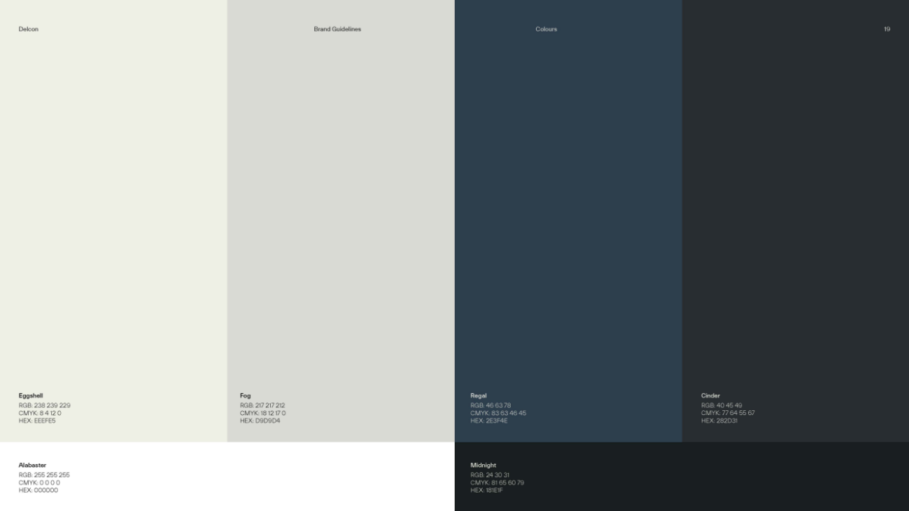
Colour palette
The Delcon colour palette is subtle and understated to enable the imagery to stand out.
Raw and Refined
Raw and refined imagery is used side by side to showcase the craftsmanship of Delcon’s work.
The website
Following the rebrand, we collaborated with Delcon to create a fresh new website design. We delivered an interactive design that engages users and directs users through to conversion. The website uses best practice code, loads quickly and incorporates sleek animations.