Compass Carter Osborne (previously Compass Executives) is an executive search recruitment agency that headhunts candidates for senior positions.
Having just merged with another recruitment agency, they were renaming and challenged us to create a new brand and website, and transition their digital presence to represent their next chapter.
- Lead time:
- 3 Months
- Sector:
- Recruitment
- Target Type:
- B2C & B2B
- Website Goal:
- Rebrand, Retain Search Engine Rankings, Represent the new business
- Services:
- Brand Identity, Web Design, Web Development, Digital Marketing
The challenge
Compass Carter Osborne challenged us to deliver a new brand identity and website to elevate their presence in the marketplace. Targeting high level Executives, they needed a professional and corporate look and feel, that would build trust and showcase their expertise.
- Scope
- Brand Identity
- Website Design
- WordPress
- SEO Strategy
- Domain Migration
- International Targeting (UK and US)
- Resource
- 1 x Brand Designer
- 1 x Website Designer
- 1 x WordPress Developer
- 1 x Project Manager
- 1 x SEO Strategist
- 1 x Quality Assurance Tester
The brand
Ahead of the launch of the renamed Compass Carter Osborne, the client challenged us to deliver a professional brand that is authoritative, trustworthy and approachable. It needed to appeal to Executives and command a presence on marketing materials.
At its heart, Compass Carter Osborne stands for diligence, empathy and intelligence. They prioritise accessibility and authenticity and needed the brand to demonstrate these values.
The brand identity project included a new logo, colour palette, typography, imagery, shape and form.

Logo
We created a new adaptive logo with a unique icon and a bold and modern font. In combination, they embody the luxury and authoritative tone of the brand.
The adaptive nature of the logo provides flexibility online and offline.
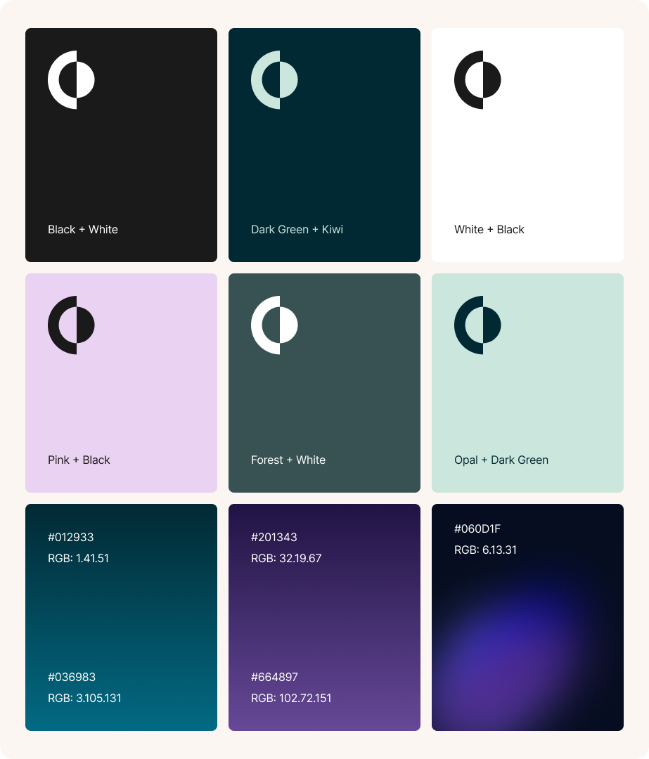
Colour palette
We created a fresh colour palette that combines dark and light colours for maximum flexibility. Our designers created colour pairings and a set of gradients to be used within the brand.
Typography
Our designers selected a clear font style that represents Compass’ brand goals and can be used flexibility in a number of different ways.

Shape & Form
The deconstruction of the logo icon creates a versatile graphic device that enables design elements to be layered and patterned to enhance visual depth and interest.

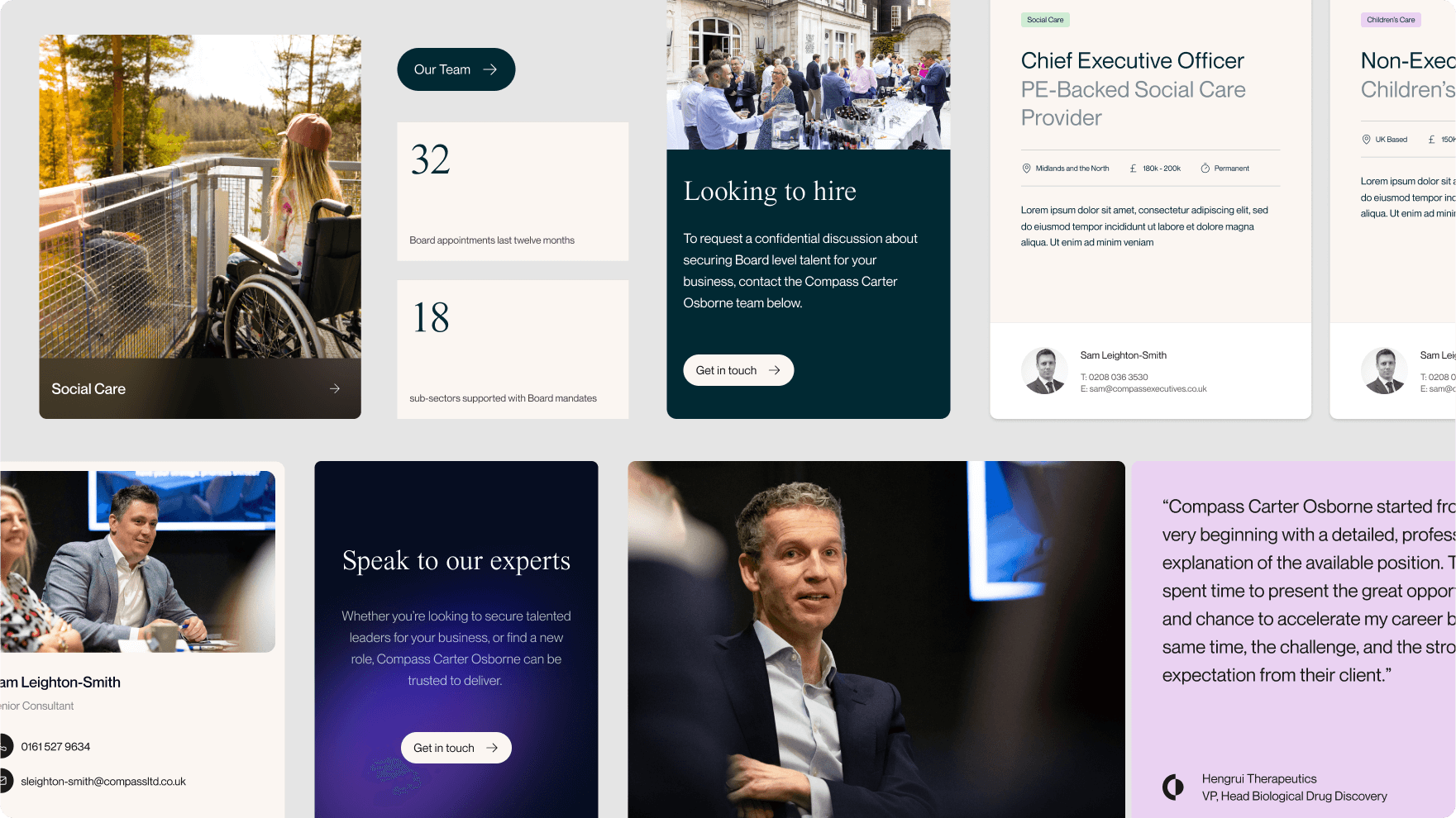
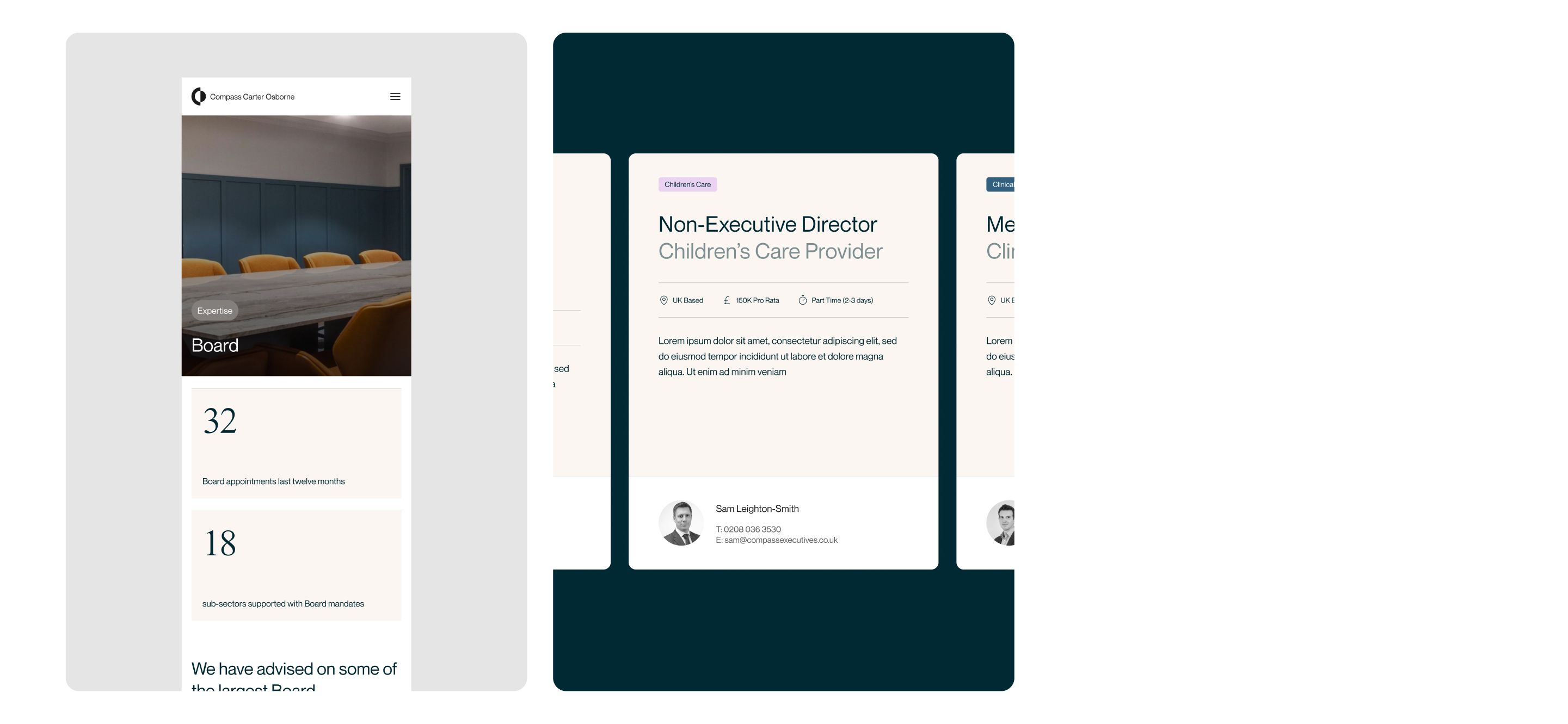
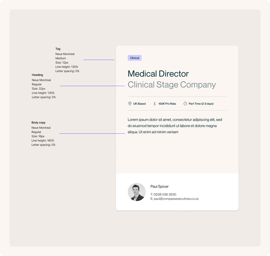
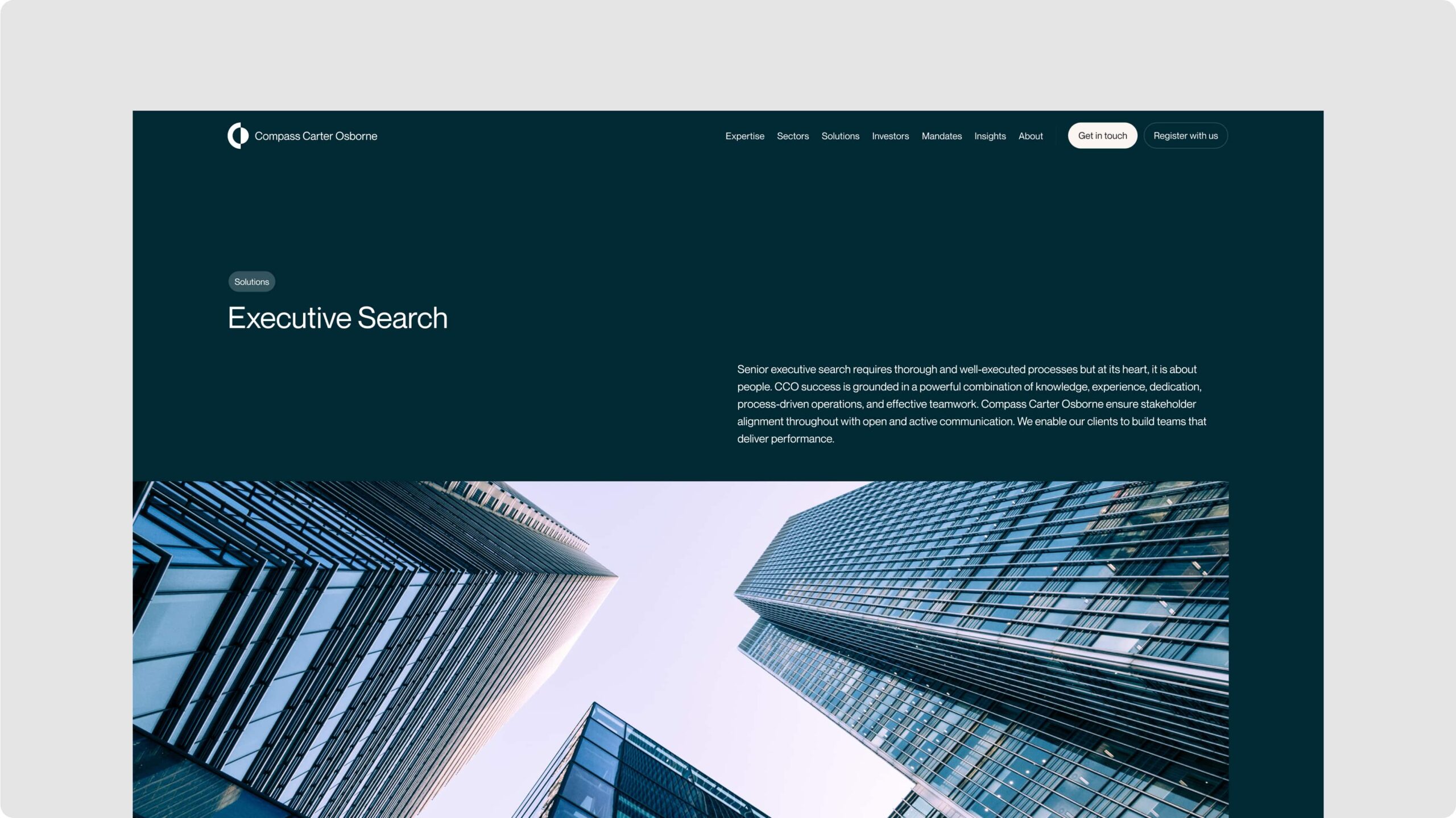
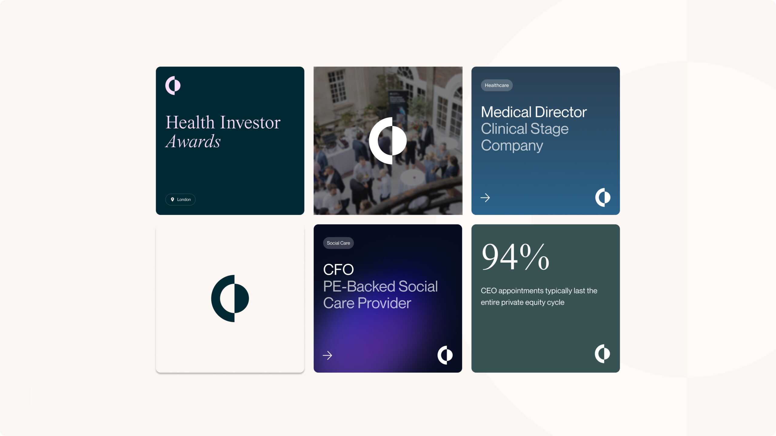
Website
Our design team created a beautiful and elevated website design that showcases Compass Carter Osborne’s services and thought leadership, as well as representing their values. Starting with a wireframing process, our team built optimised user journeys for the best user experience.
The use of the new brand provides a deep and rich design that is engaging, professional and approachable.
We developed the new website with WordPress to provide a high level of content management flexibility to the client team.
SEO strategy
Following intense keyword research and analysing hundreds of keywords, our SEO agency team delivered an SEO strategy to secure greater visibility for the client in search engines. Our team delivered best practice technical SEO and on-page optimisation to harness the opportunity for Compass Carter Osborne to be discovered by new clients and candidates.
Domain migration
Our strategists planned and delivered a domain migration, seamlessly transitioning the client from their old brand name and domain to their new domain name. The migration involved a series of steps including a 301 redirect strategy and informing search engines of the move.
Related work
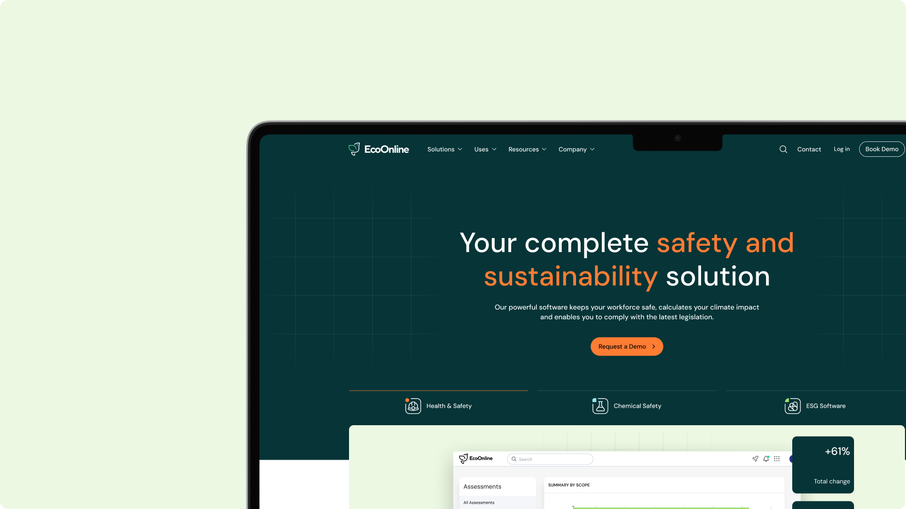
Eco Online is a global SaaS leader that is at the forefront of innovation in workplace health, safety, and sustainability.
We rapidly delivered a large new SaaS website for Eco Online to improve market penetration, conversions and lead generation.
Following a number of business acquisitions, Eco Online needed to invest in their digital marketing and digital ecosystem to harmonise their user experience and improve their marketing performance.
- Lead Time:
- 5 Months
- Sector:
- SaaS
- Target Type:
- B2B
- Website Goal:
- Deliver a market-leading design, Improve lead generation
- Services:
- Web Design, Web Development, International Targeting, WordPress, Digital Strategy, UX Design, Content Architecture, Asset Creation, Content Entry
The challenge
Eco Online had an ambitious project timeline and needed our team to take the lead, leverage their internal resources, and implement best practice to achieve their business objectives and meet their launch date.
Our team took a performance-first approach to the project, delivering Digital Strategy, UX Design, Content Architecture and Asset Creation as part of the website project to maximise the impact.
The Website
A high performance website to win new customers across 9 international territories.
The new website design is underpinned by user experience design and a Digital Strategy to ensure that it not only looks great, but performs well too. Our design team incorporated Eco Online’s new brand to create a fresh and dynamic design that places their product as the centre of the user journeys.
We developed the website with WordPress and leveraged WPML to deliver content in 6 different languages. Our developers wrote optimised code to deliver high load speeds and a smooth user experience.
- Scope
- Figma Wireframe & Design Prototypes
- UX Design
- Content Architecture
- WordPress Development
- Multi-lingual & Multi-territory
- Hubspot Integration
- SEO Strategy
- Asset Creation, Content Entry & Migration
- Resource
- 1 x UX & UI Designer
- 2 x Website Designer
- 1 x WordPress Developer
- 1 x Backend Developer
- 1 x Quality Assurance Tester
- 1 x Project Manager
- 1 x Marketing Strategist
- 1 x SEO Strategist
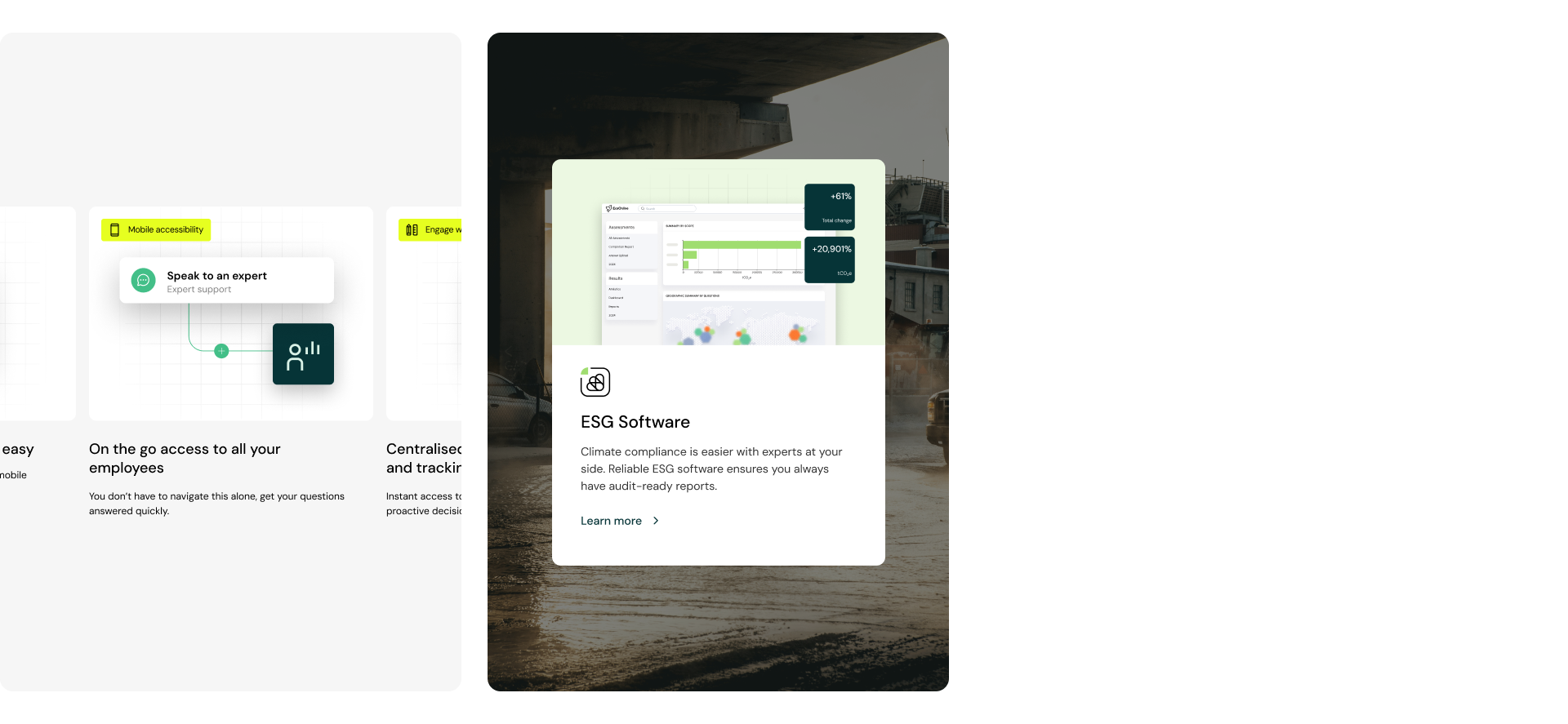
Content architecture
Eco Online’s messaging had become disconnected and there was an opportunity to have a greater impact on prospective customers to drive demo requests and leads.
Our Marketing Strategists and UX Designers collaborated to create clear user journeys that delivered Eco Online’s key messages in the best way. We created an asset brief to maximise the impact of visual imagery and showcase the product throughout the website.
Showcasing the product in this way would reduce friction in the buying cycle and narrow the gap between learning about the product and booking a demo, ultimately boosting Eco Online’s conversion rate.
In collaboration with Eco Online’s internal resource, we rolled out the asset briefs to create dynamic and effective assets to be used throughout the website.
SEO strategy
A deep SEO strategy to increase visibility and attract new business.
We undertook an in-depth SEO strategy to identify how Eco Online could grow their visibility and rankings online.
As an established business, our team needed to protect Eco’s existing rankings while harnessing new opportunities. The strategy involved researching hundreds of keywords and identifying which keywords Eco Online had a statistical chance of improving their organic rankings.
The result has been Eco Online recording their highest organic rankings to date.
International Website with domain consolidation
We delivered a multi-territory WordPress website that enables Eco Online to deliver regional content and messaging, and targeted regional SEO strategies to deliver the best user experiences and performance outcomes for the website.
We utilised our extensive experience in international websites as well as domain consolidation to improve marketing performance as well as marketing team efficiency, consolidating 9 domains and 9 territories into a 3,000+ page website.
Related work
One Trading is a trading venue that provides customers with a new way of trading, including access to trades that were previously only accessible to professionals.
In preparation for launch and a fundraising round, One Trading commissioned us to deliver a new Fintech and Crypto Brand Strategy and Fintech and Crypto Brand Identity for the business. They also needed an engaging, eye-catching website design, and support with the implementation of their new brand.
- Lead time:
- 3 Months
- Sector:
- Crypto & Finance
- Target Type:
- B2C & B2B
- Website Goal:
- Launch a new Cryptocurrency offering
- Services:
- Brand Strategy, Brand Identity, Web Design
The challenge
One Trading came to us for help in finding and aligning with their audience. They needed a compelling brand narrative, accompanying visual brand, and a new website to capture the attention of traders and build trust in their platform.
- Scope
- Brand Strategy
- Brand Identity
- Website Design
- Asset Creation
- Copywriting
- Resource
- 2 x Brand Designers
- 1 x Website Designer
- 1 x Project Manager
- 1 x Marketing Strategist
- 1 x Copywriter
Fintech and Crypto Brand Strategy
Operating in a saturated and unregulated market, One Trading wanted to do things differently. They needed a brand & messaging strategy that would enable them to stand out in their market, attract prospective customers, and secure buy-in from investors.
We led a series of brand workshops where we collaborated to establish One Trading’s target audience. We developed 5 core personas including their wants, needs, and pain points. This enabled us to identify how they would interact with One Trading and create aligned messaging for each persona.
Our marketing team developed One Trading’s new vision, mission, values and value proposition, and worked with internal stakeholders to secure the approvals needed from their Senior Leadership Team and Board.
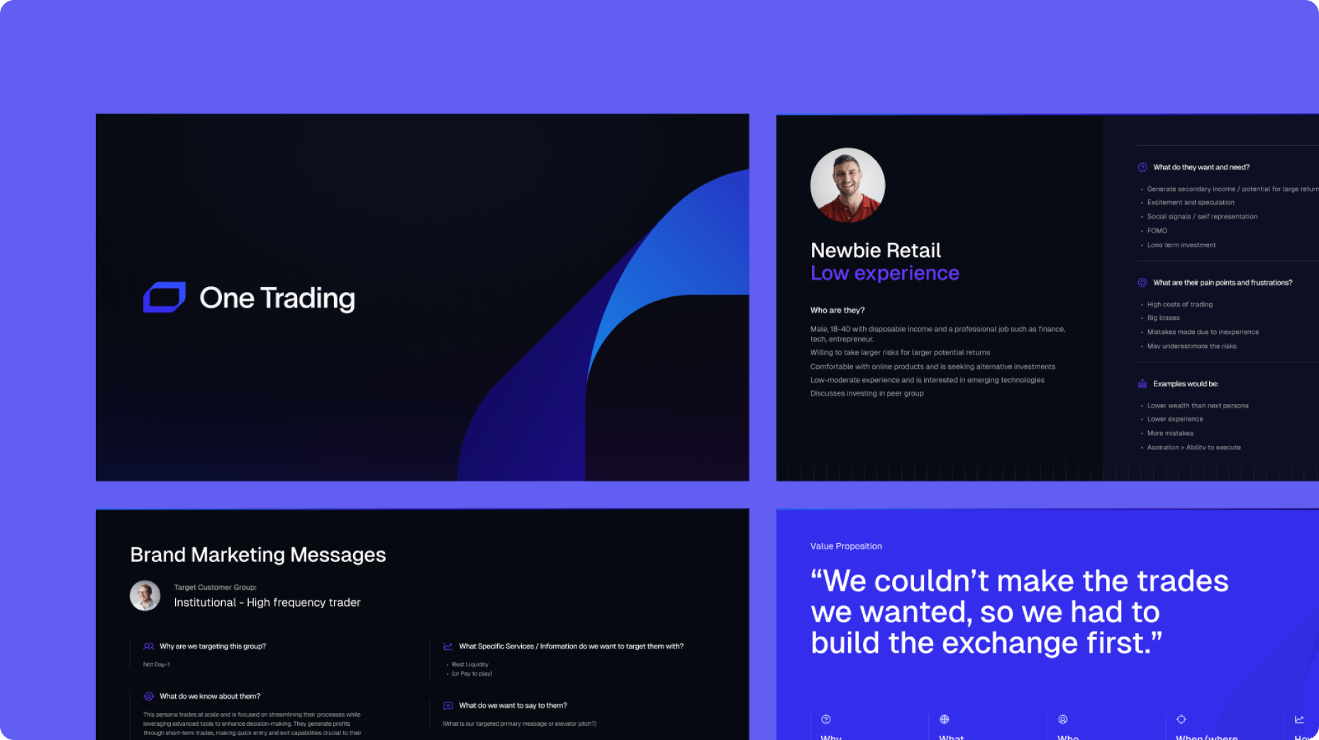
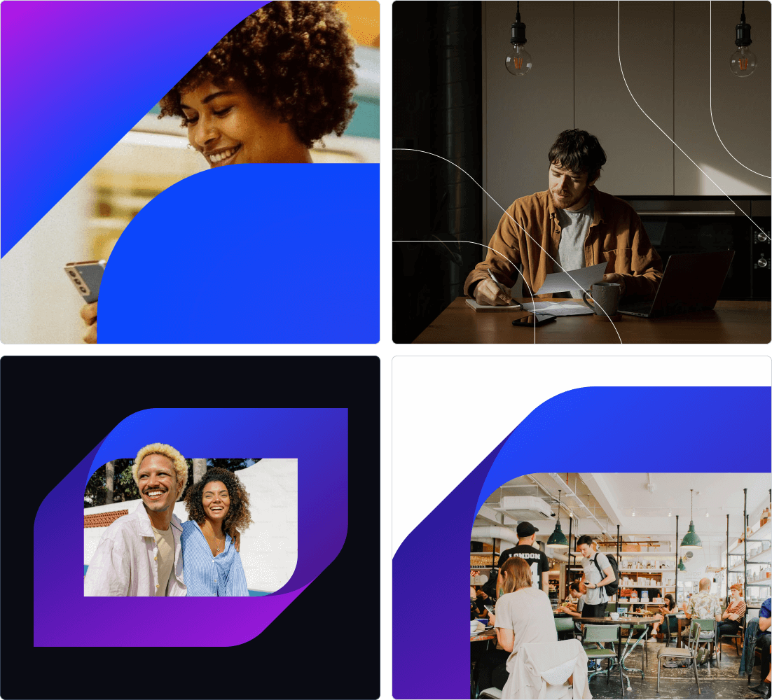
Fintech and Crypto Brand Identity
With the brand strategy in place, our design team harnessed the target audience and messaging insights and created a number of brand concepts for One Trading’s visual brand. The brand identity needed to include a new logo, colour palette, typography, imagery, shape and form, and assets (including dynamic assets, still imagery, and image lock ups). This would all be brought together in a set of brand guidelines for the business.
Our team brought the client’s vision to life, creating a brand identity to represent a financial disruptor operating in the cryptocurrency market. Key brand themes were Technology, Innovation, Disruption and Dynamism.
We developed a number of brand concepts to explore these themes and worked closely with One Trading to develop a visual brand that represented their direction.
Logo
We created the brand icon from the ‘O’ of One Trading. A key differentiator for One Trading was their exclusive Perpetual Futures offering, which is by nature ‘infinite’. We introduced the Mobius strip, a powerful symbol of infinity as well as providing a dynamic and versatile foundation for a engaging design system.
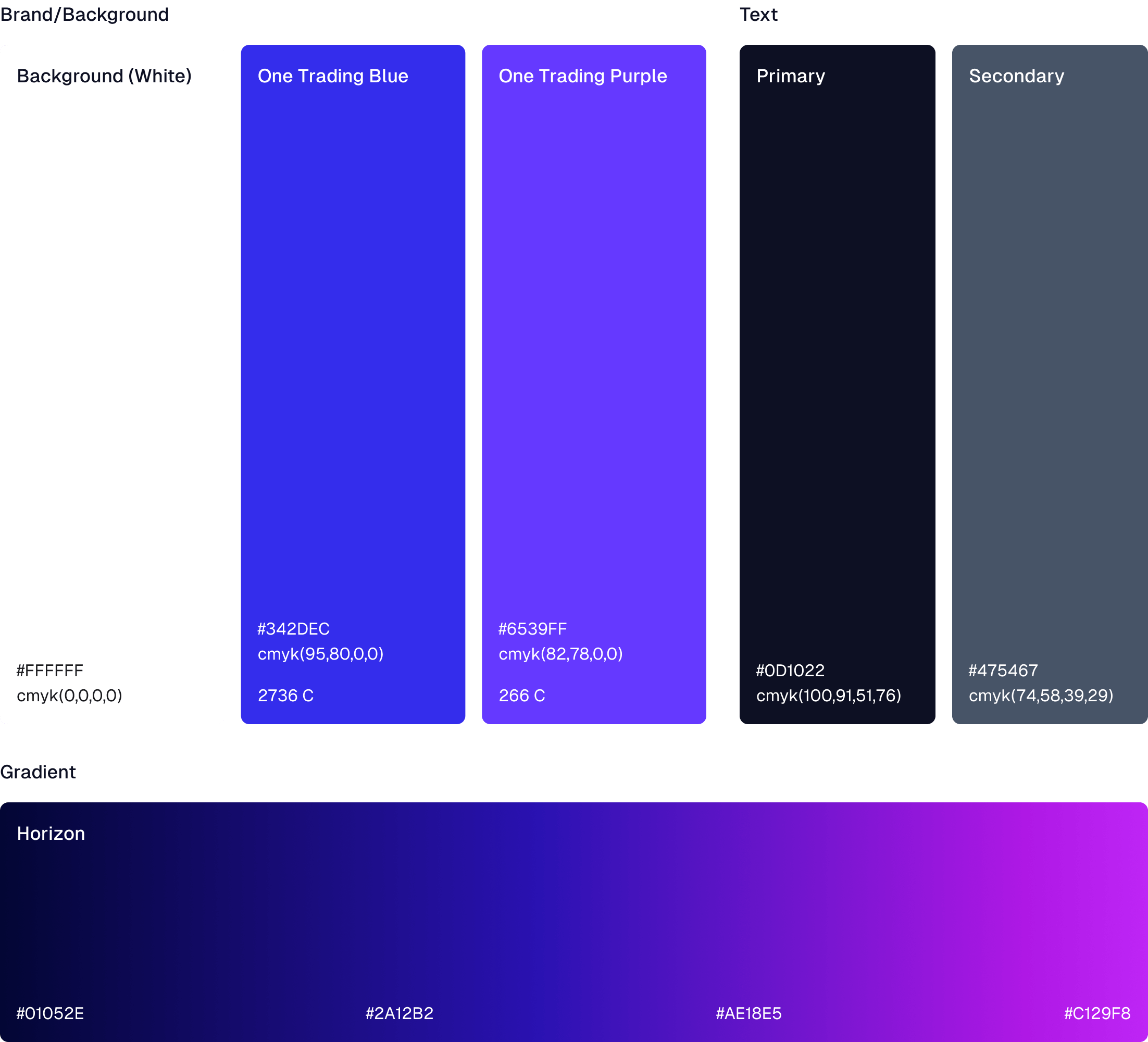
Colour palette
We created a dynamic blue and purple colour palette which is perfectly suited for the cutting-edge world of crypto and digital services. The richness of the blue creates a natural harmony in UI design, with darker tones offering depth and sophistication.
Typography
We selected a number of fonts and styles to provide a high level of flexibility across the brand and design application.
Shape & Form
Our designers leveraged the shape of the icon to create unique patterns and textures that could be used as cut outs, overlays and background patterns.
Bringing it together
We brought together each element of the brand to create an impactful and cohesive brand. The brand guidelines provide a flexible brand system that can be implemented to a high quality by One Trading.
Roll out
We worked with the One Trading team to roll out the implementation of their new brand with a number of assets and templates:
- Slide deck
- Social media posts
- Email signatures & footers
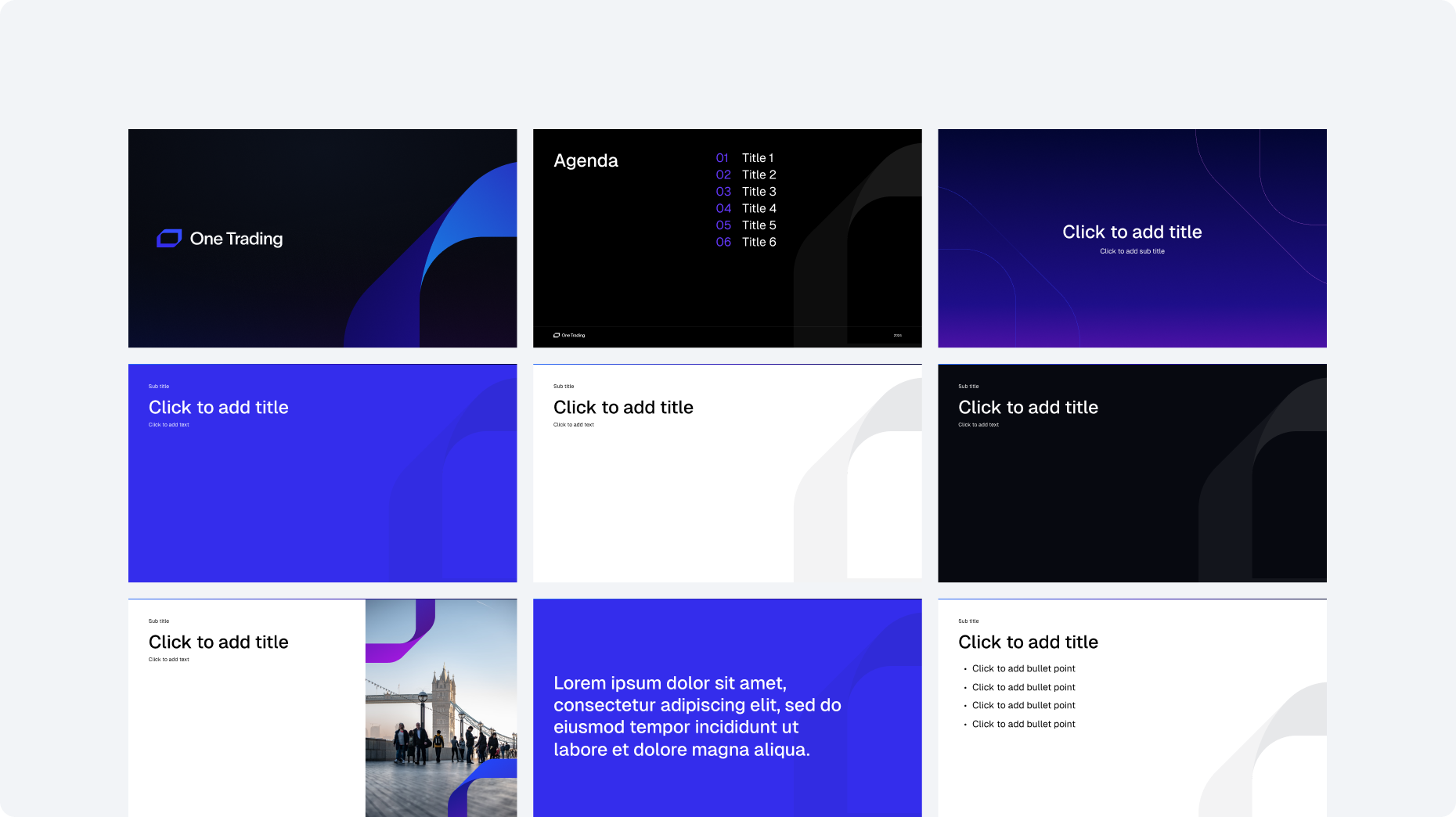

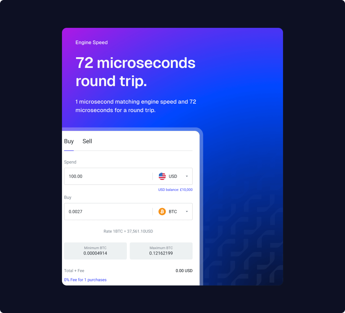
The website
One Trading were planning a high profile outbound launch strategy and needed an engaging website that would successfully capture and convert visitors.
Our Marketing Strategists and UX Designers collaborated to craft a high-performing website structure designed to effectively communicate key messages to target audiences. The website structure was developed to guide users through the conversion funnel by strategically aligning content, qualifying prospects, and offering reassurance and social proof at critical points in the user journey.
We utilised the new brand identity to create a beautiful and engaging website design that leveraged dynamic assets to create visual interest and visually communicate core messages to target audiences. Our copywriters created impactful content for the website to drive optimal marketing performance.

Related work
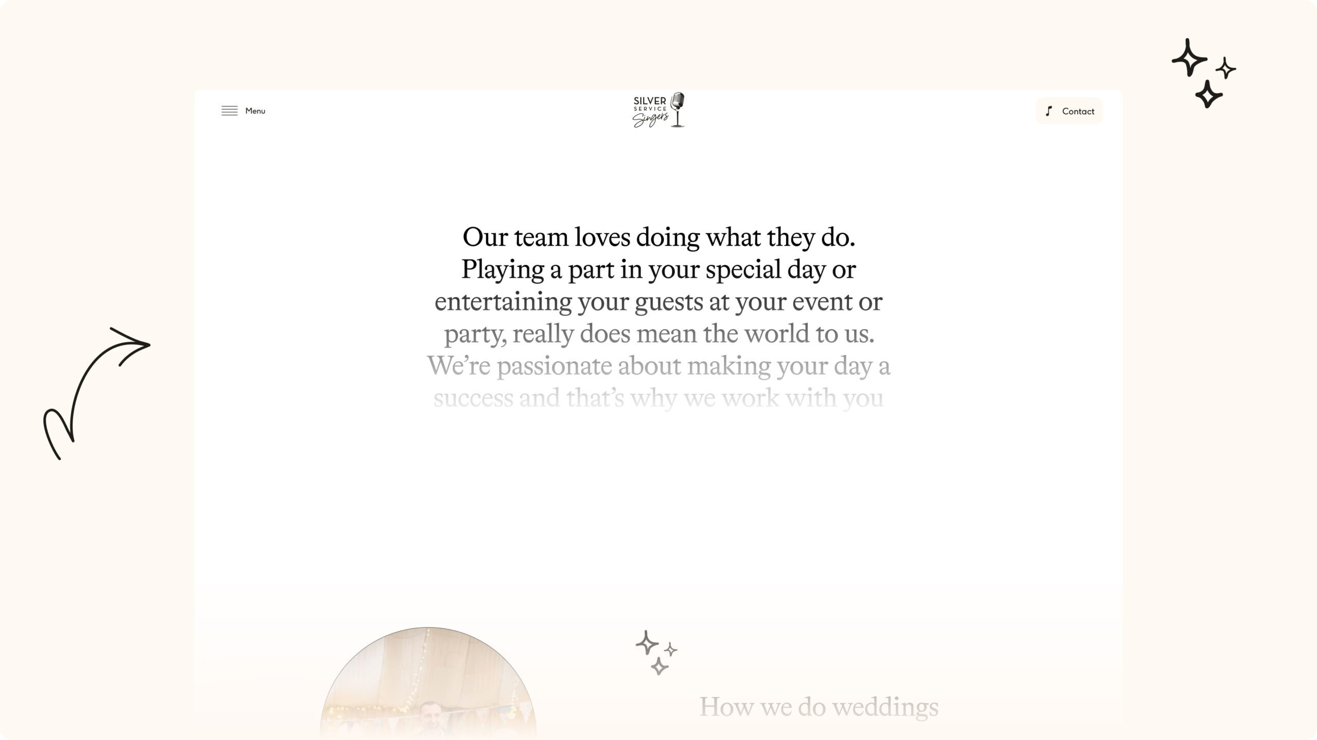
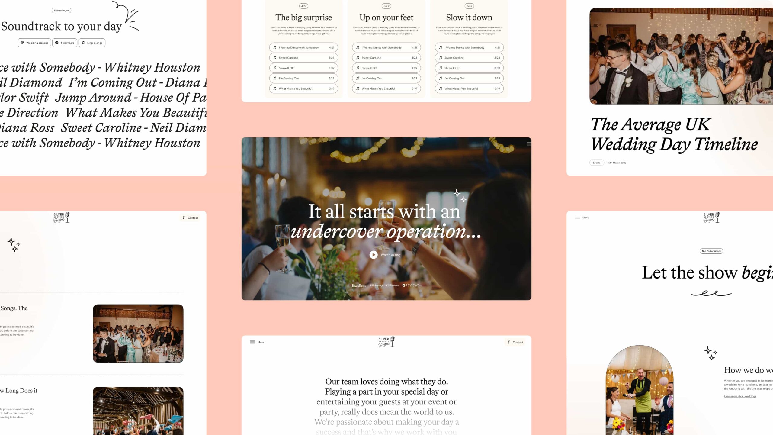
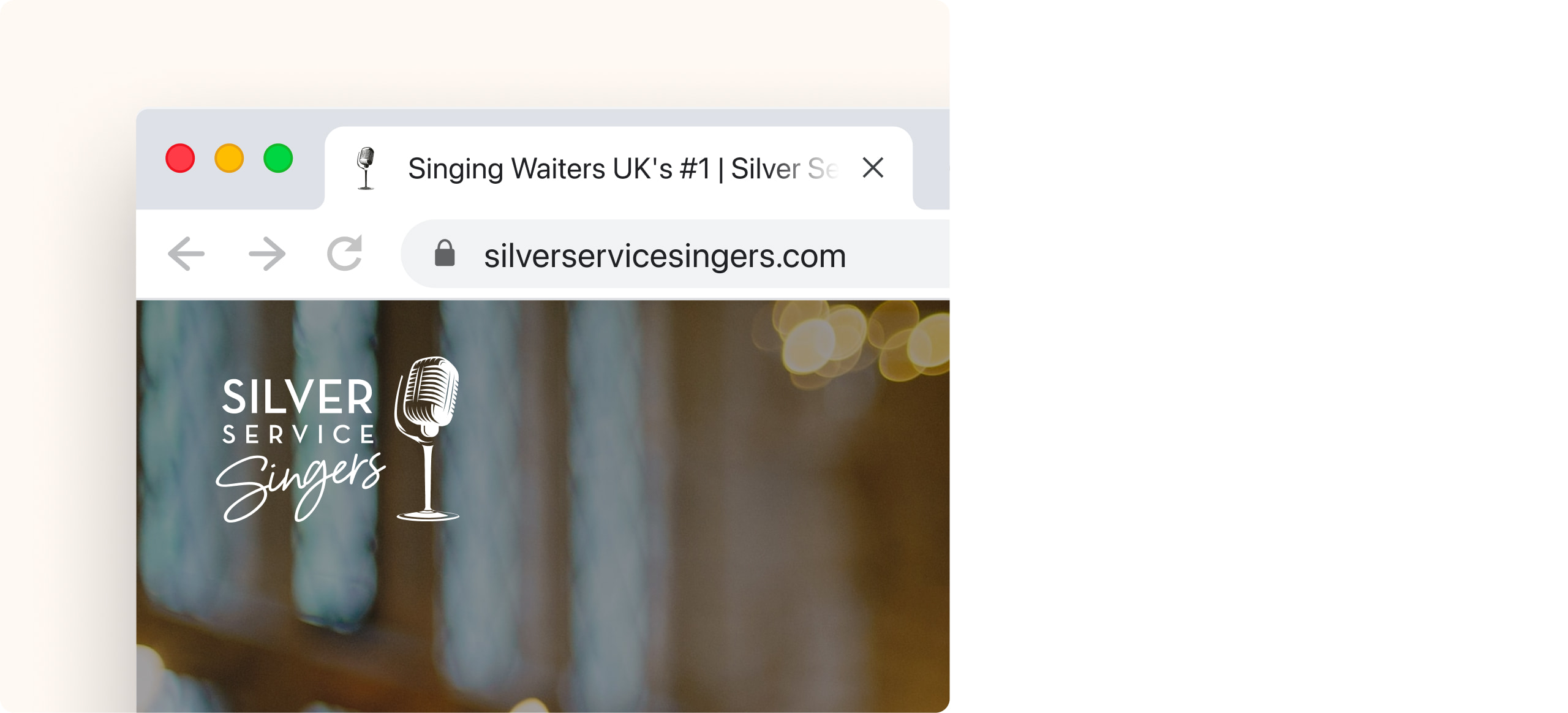
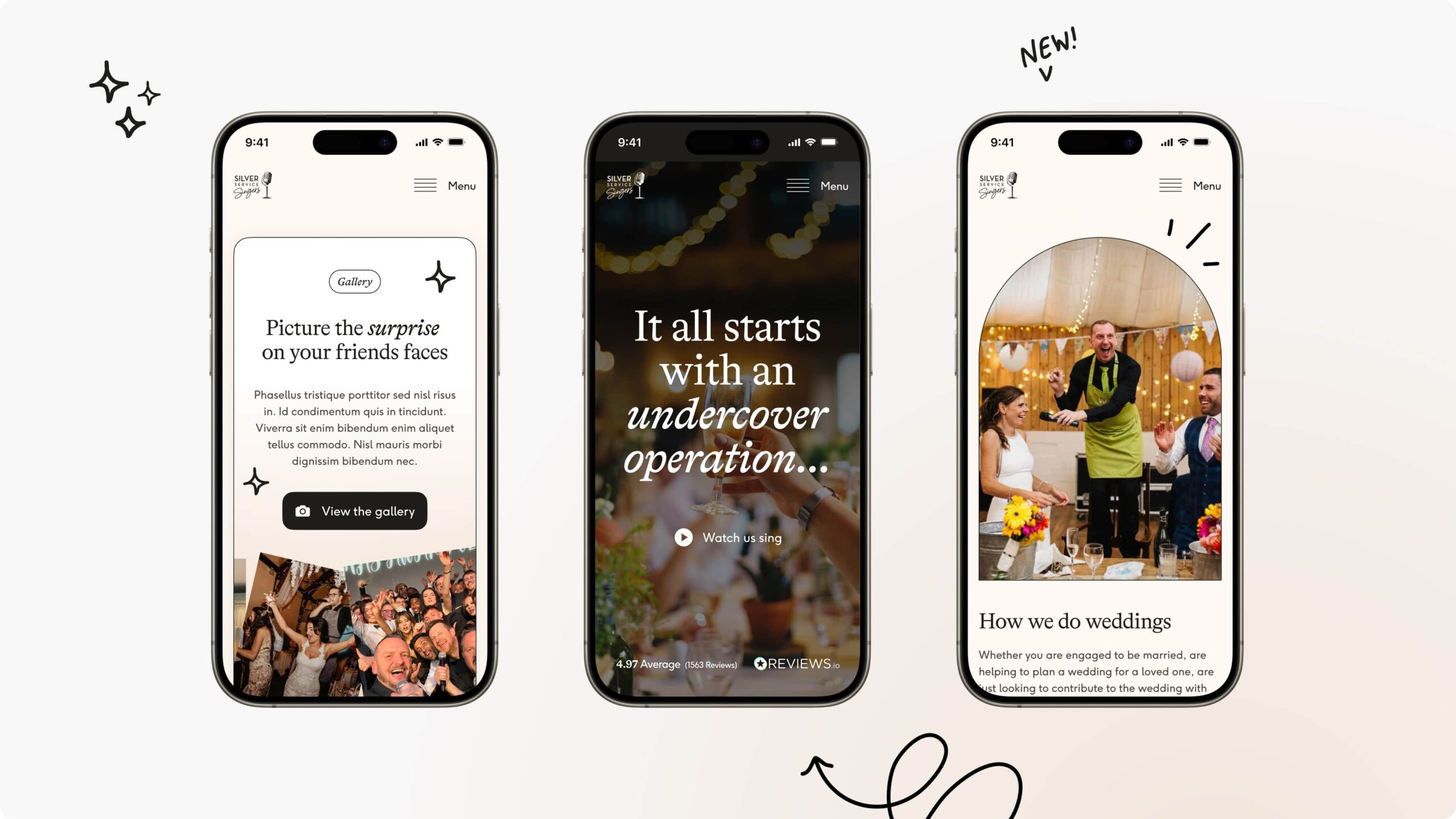
Silver Service Singers creates memorable moments at special events with surprise singing waiters. Having grown the business, they needed an elevated website to attract new customers and generate leads.
We partnered with Silver Service Singers to evolve their brand and deliver a flexible new website that would enable their team and convert more visitors into customers. The website was delivered in line with a digital strategy for the business to increase their visibility and rankings in search engines.
- Lead time:
- 14 Weeks
- Sector:
- Entertainment
- Target Type:
- B2B & B2C
- Target Demographic
- General Public & Event Planners
- Website Goal:
- Generate New Leads & Create An Elevated Design
- Services:
- Web Design, Web Development, WordPress, Digital Marketing, Branding
- Scope
-
- Brand Identity
- Figma Wireframe Prototypes
- Figma Design Prototypes
- WordPress Development
- Nutshell Integration
- SEO Strategy
-
- Resource
- 1 x Website Designer
- 1 x WordPress Developer
- 1 x Backend Developer
- 1 x Quality Assurance Tester
- 1 x Project Manager
- 1 x SEO Strategist
The challenge
Silver Service Singers were ready to create a fresh new website design that utilised their photography and captured the energy they bring to events. It needed to be engaging, dynamic and playful.
With a number of competitors in the market, they challenged us to deliver a website that would help them stand out, build trust and make them the business of choice to their customers.
The brand
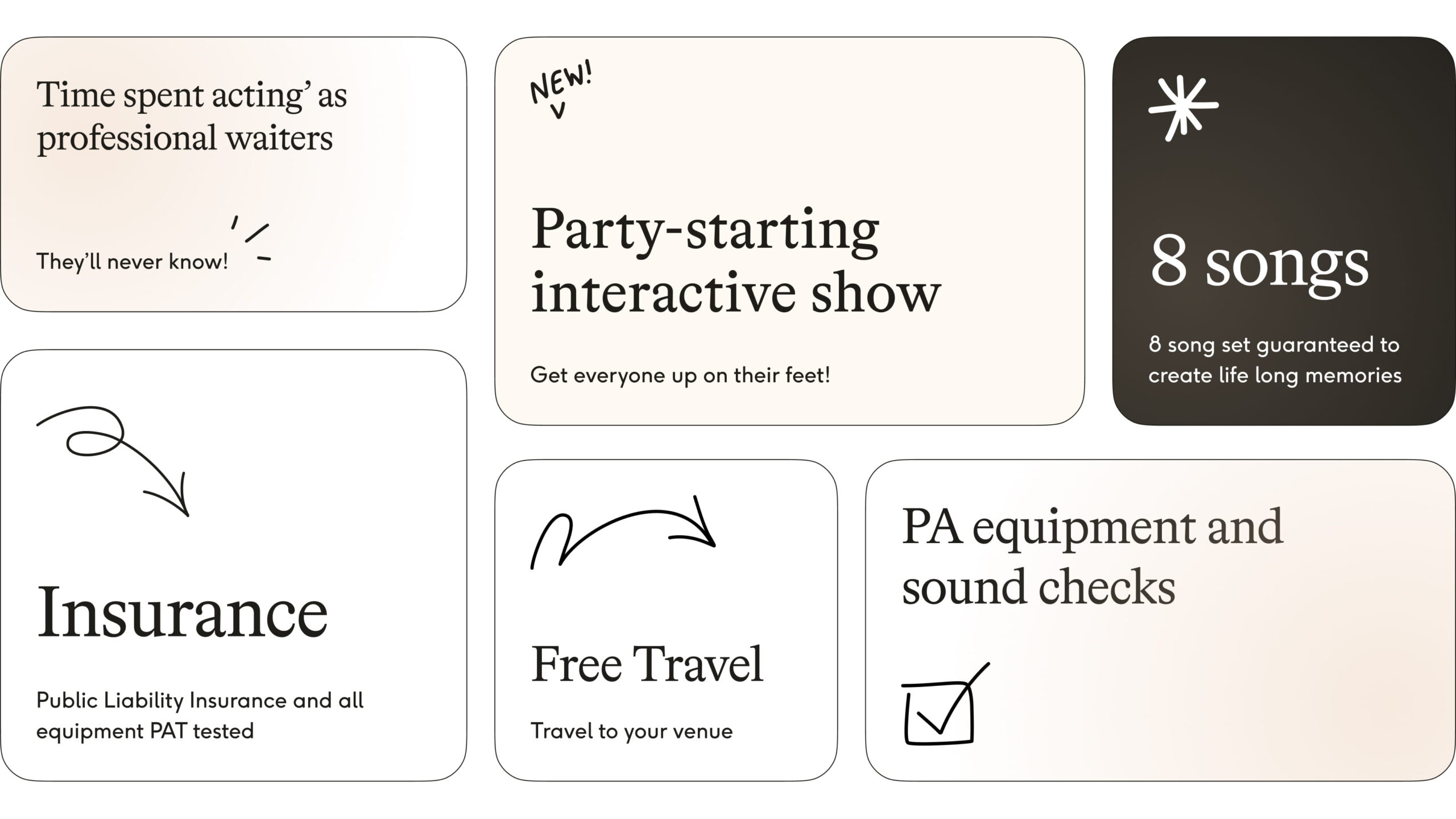
Silver Service Singers’ existing brand was sparse and didn’t provide the flexibility to create the design and user experience they needed. We designed the new brand around their existing logo and introduced a new colour palette, font, shape and form.
Shape & form
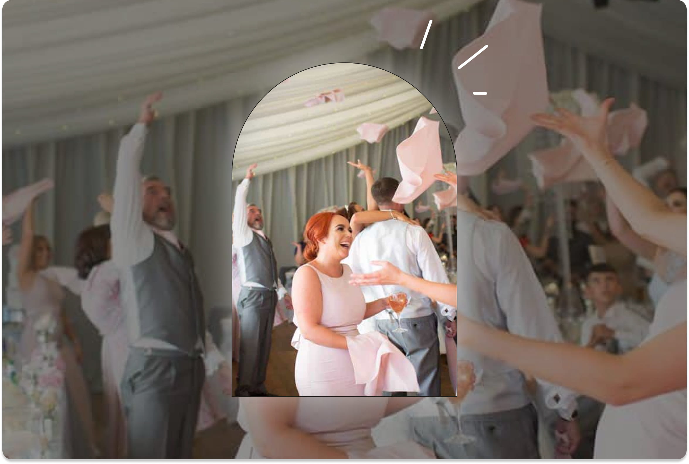
Our brand designers introduced an arch shape to be used as a portal, mask or cut out for the client’s photography. Not only is the shape a nod to the wedding market, it also draws the eye and creates depth to the website design.
We introduced playful hand drawn shapes including stars, a ‘shine’ effect, arrows, and squiggles. These bring the website design together by guiding the user down the page and breaking up white space.

Colour palette
We introduced a neutral colour palette to compliment the photography. Working mostly at weddings, the colour palette needed to be bridal and sophisticated.
Typography
We introduced a new header font that injects some fun into the new website design.
The website
We created a dynamic WordPress website that captured the high energy and good vibes of Silver Service Singers. The website incorporates a number of interactions and animations that create a playful and exciting feeling.
Our designers created a story-telling component that reveals copy on scroll and enables the client to build suspense as part of an engaging user journey.
Delivered in WordPress, the client has full control over their content and imagery and can continue to evolve the website and create new content.
Reassurance by design
A large percentage of Silver Service Singers’ performances are at weddings and are purchased as gifts for the bride and groom. At a mid-high price-point, the website design needed to reassure parents and grandparents and convert them into enquiries.
To achieve this feeling of trust, we feature review embeds, testimonials, awards and photography which removes barriers to purchase and increases conversion rates.
Digital strategy
Our SEO strategists created an SEO strategy to guide the website project and enable Silver Service Singers to grow their visibility in search engines and attract new organic customers.
Our team researched keywords that prospective customers used to find Singing Waiters and selected the keywords that would drive success for the client. We utilised the strategy to optimise the website for SEO and establish key landing pages.
Related work
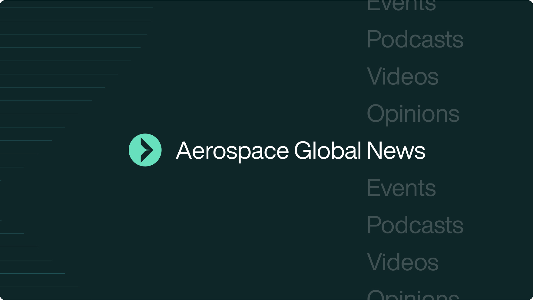
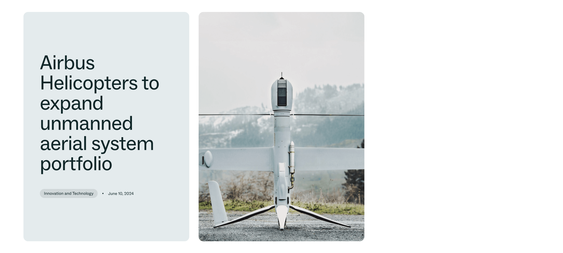
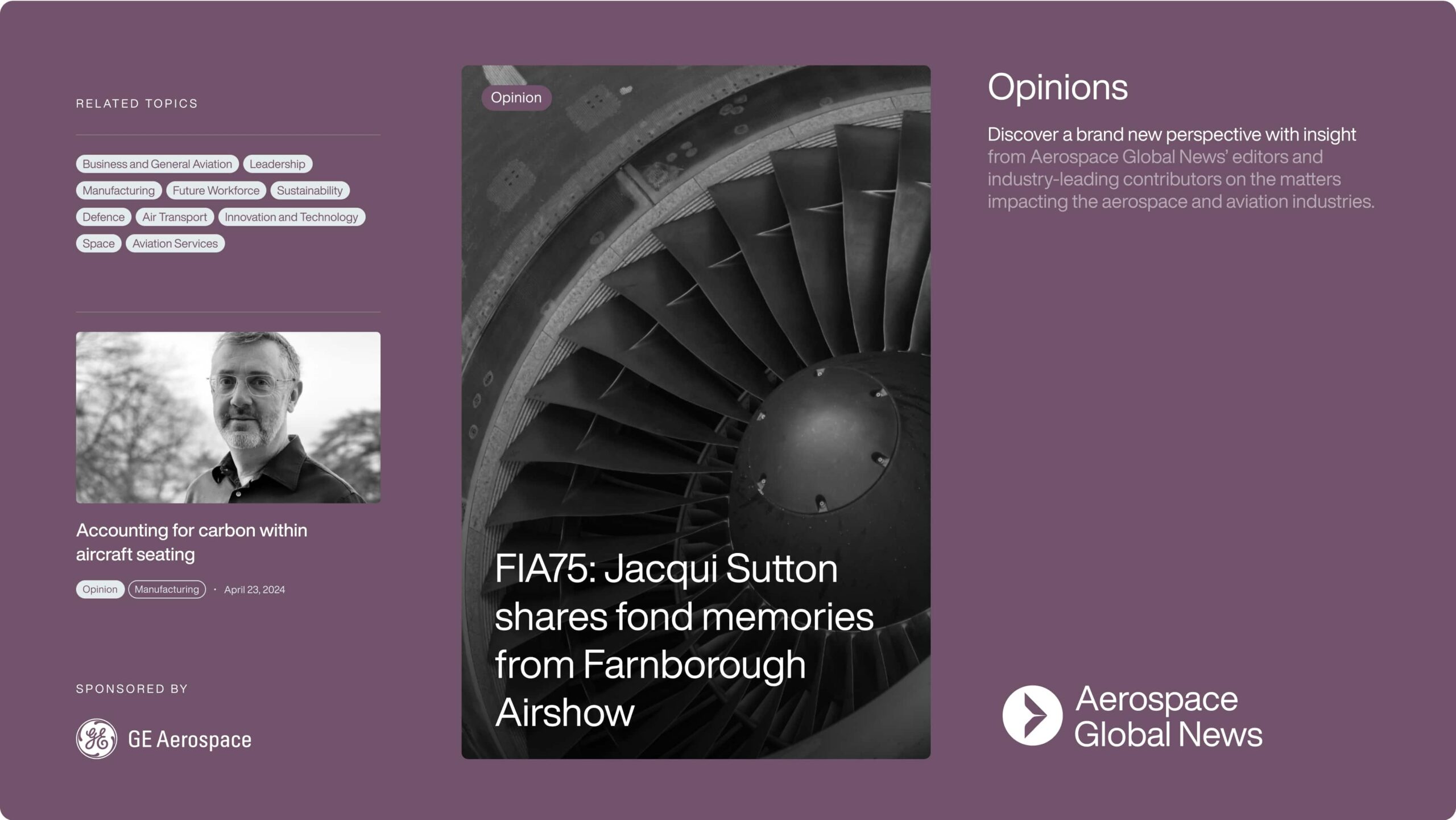
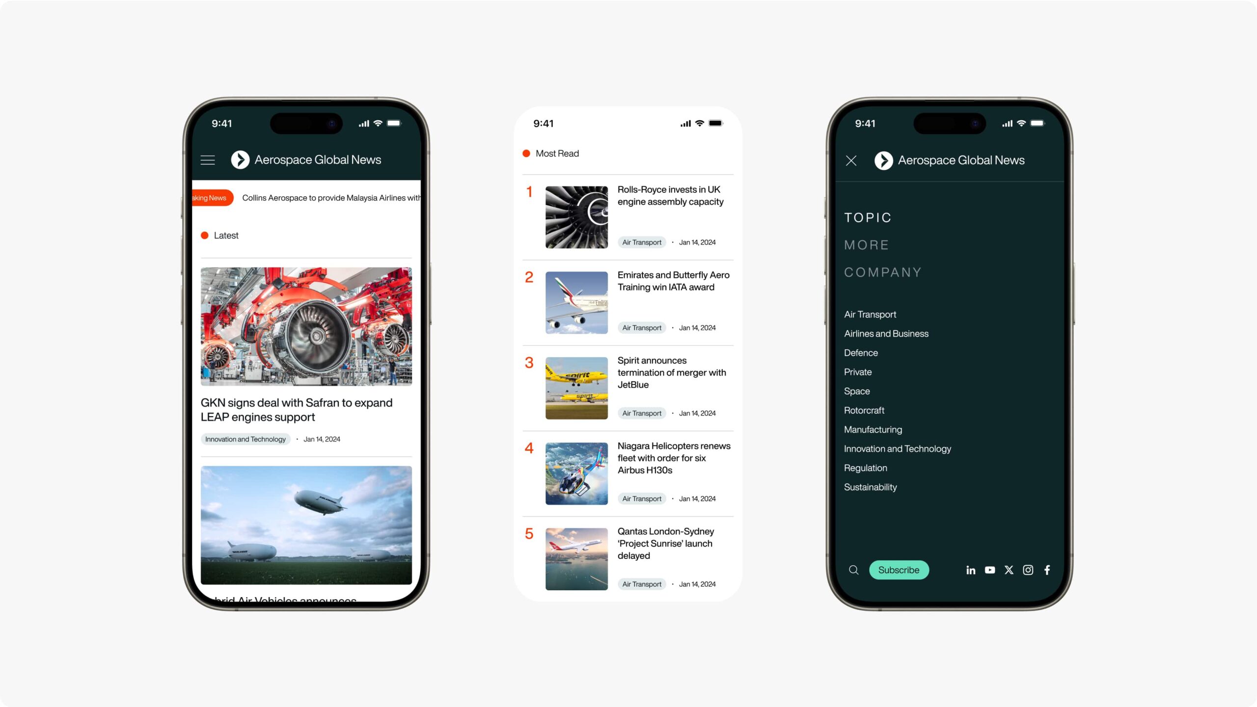
Aerospace Global News (formerly Farnborough International News Network) is a digital hub that provides news and events to the aerospace community.
Having grown significantly since their inception, they needed a new brand and digital presence to embody their international standing and reach.
- Lead time:
- 5 Months
- Sector:
- News & Aerospace
- Target Type:
- B2B & B2C
- Website Goal:
- Create an International Brand, Grow Market Penetration, Improve UX
- Services:
- Branding, Web Design, Web Development, WordPress, Digital Marketing
The challenge
Aerospace Global News challenged us to create a new brand identity and website that would increase their reach and enable them to engage a greater number of people in the aerospace community.
- Scope
- Brand Identity
- Website Design
- WordPress Development
- Engage CRM Integration
- SEO Strategy
- Domain Migration
- Content Migration
- Resource
- 1 x Website Designer
- 1 x WordPress Developer
- 1 x Quality Assurance Tester
- 1 x Project Manager
- 1 x SEO Strategist
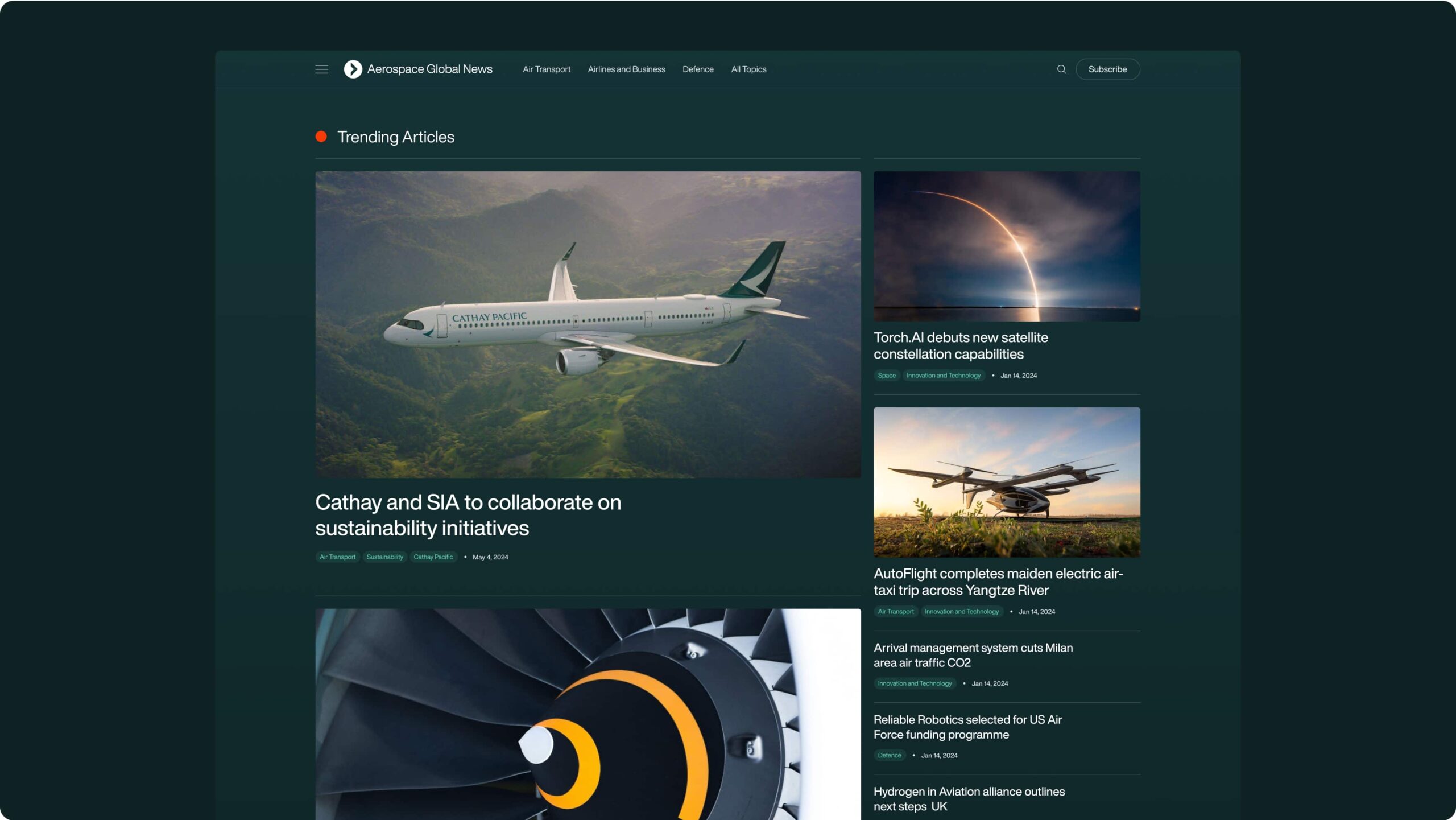
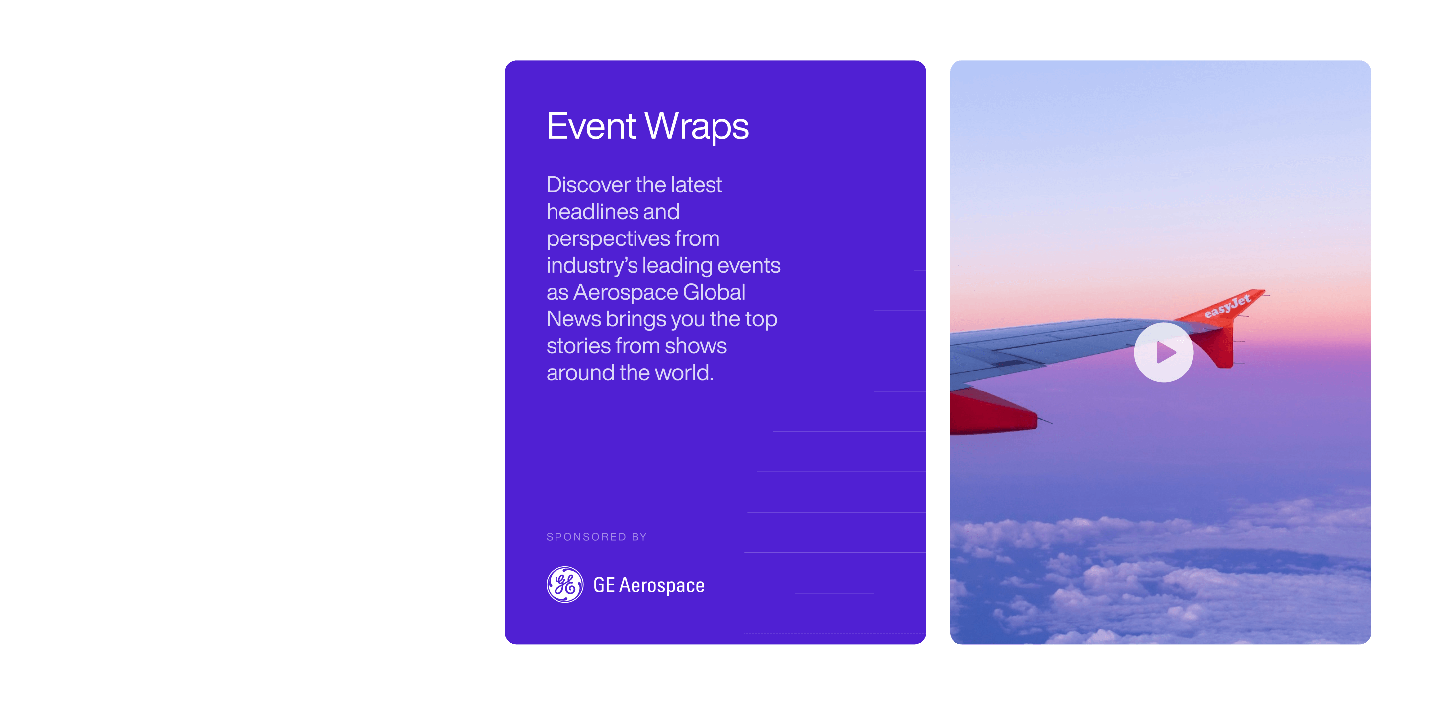
The website
We delivered a modern news website with WordPress that utilises white space, video and sticky components to provide a clear and engaging user experience.
Our developers integrated the website with Engage, the client’s CRM, and implemented static publishing for speed and security. Aerospace Global News provides a live stream of the Farnborough airshow each year which attracts thousands of visitors to their website. Static publishing enables the website to handle large traffic surges without disruption.
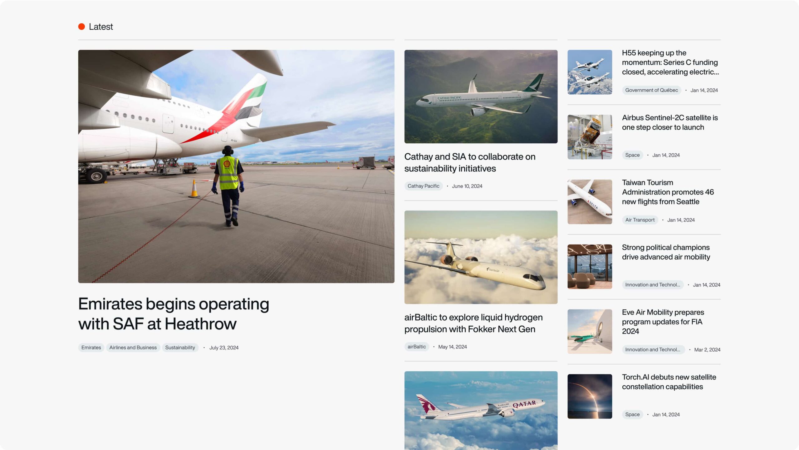
Advertising placements
The website design accommodates paid advertising placements that create a new revenue stream for the client.
Domain migration
We launched the new website on a brand new domain, implementing best practice processes to seamlessly transition the website URLs, visitors and keyword rankings to the equivalent new pages.
Our process included a comprehensive 301 strategy and redirects, a keyword strategy and critical actions in Search Console.
The brand
The client made the decision to rebrand from Farnborough International News Network to Global Aerospace News and required a new logo and supporting brand identity to assist the transition. They new brand needed to represent their global standing and reputation, and bring them in line with other leading news outlets.
Logo
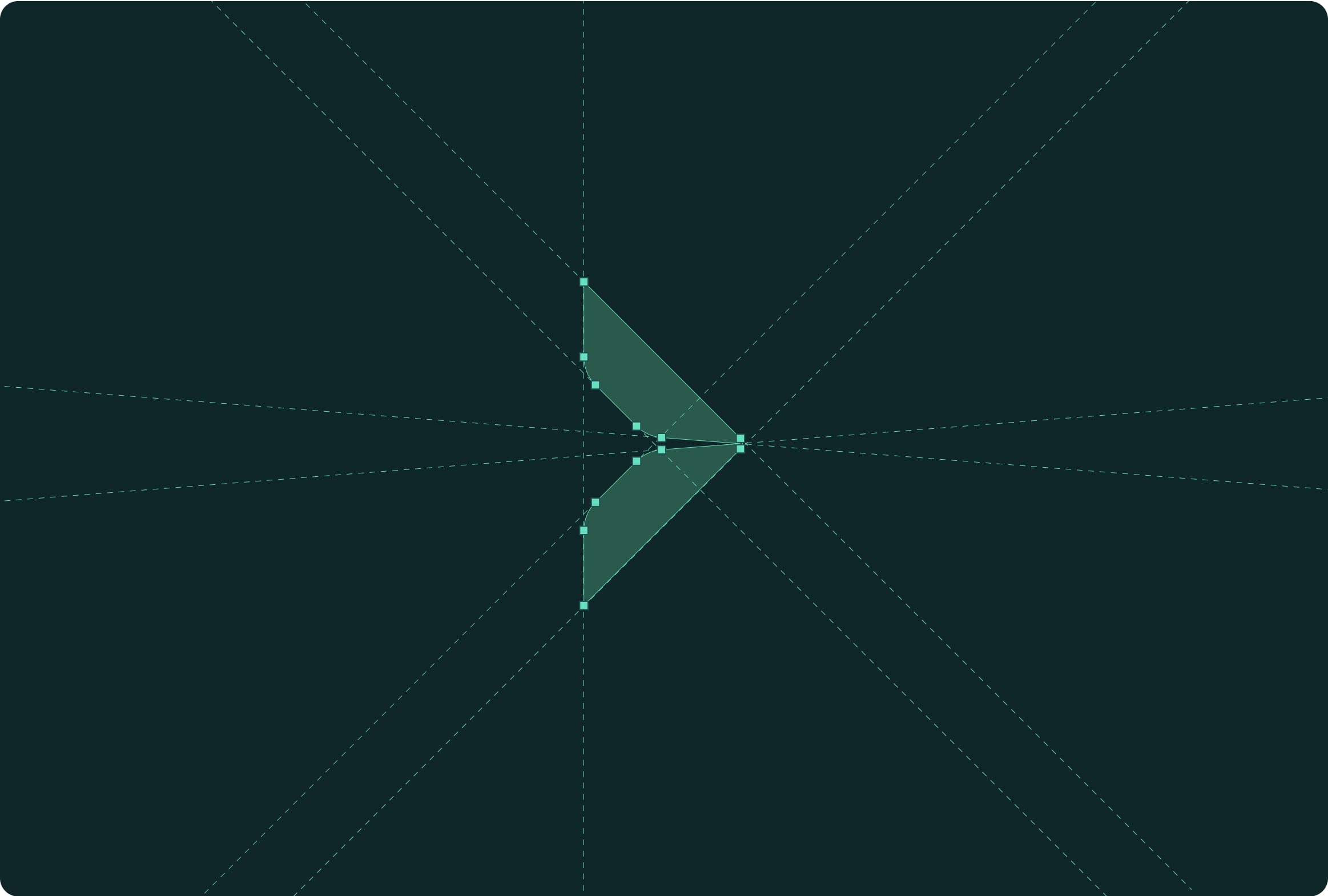
Our team created a new icon for the logo, taking inspiration from triangular shape of the previous logo.
Patternation
We introduced a line pattern within the brand that creates design depth and can be used in place of imagery to elevate visuals.
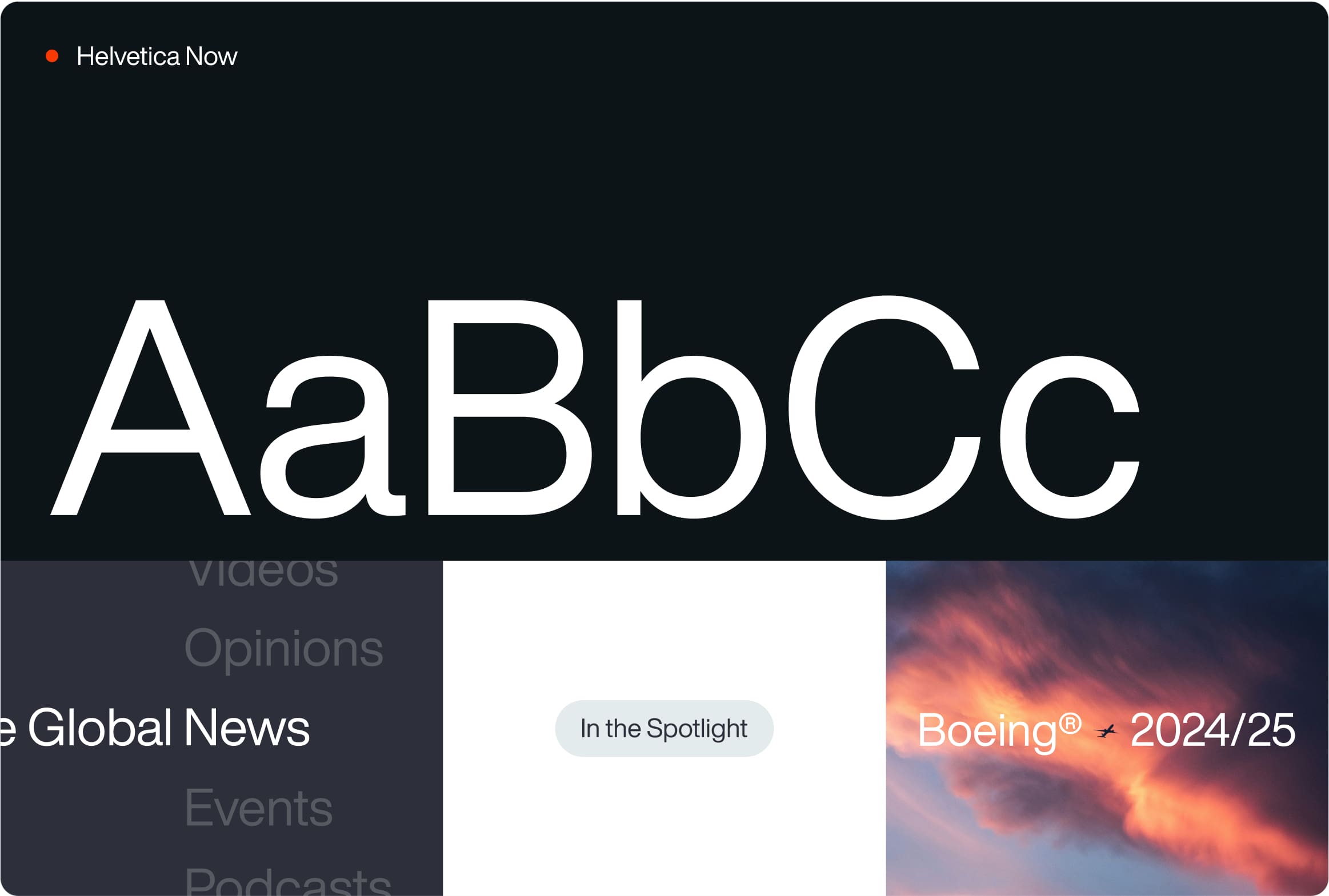
Typography
We selected typographies that were clean, professional and aligned with the style of leading global news websites.
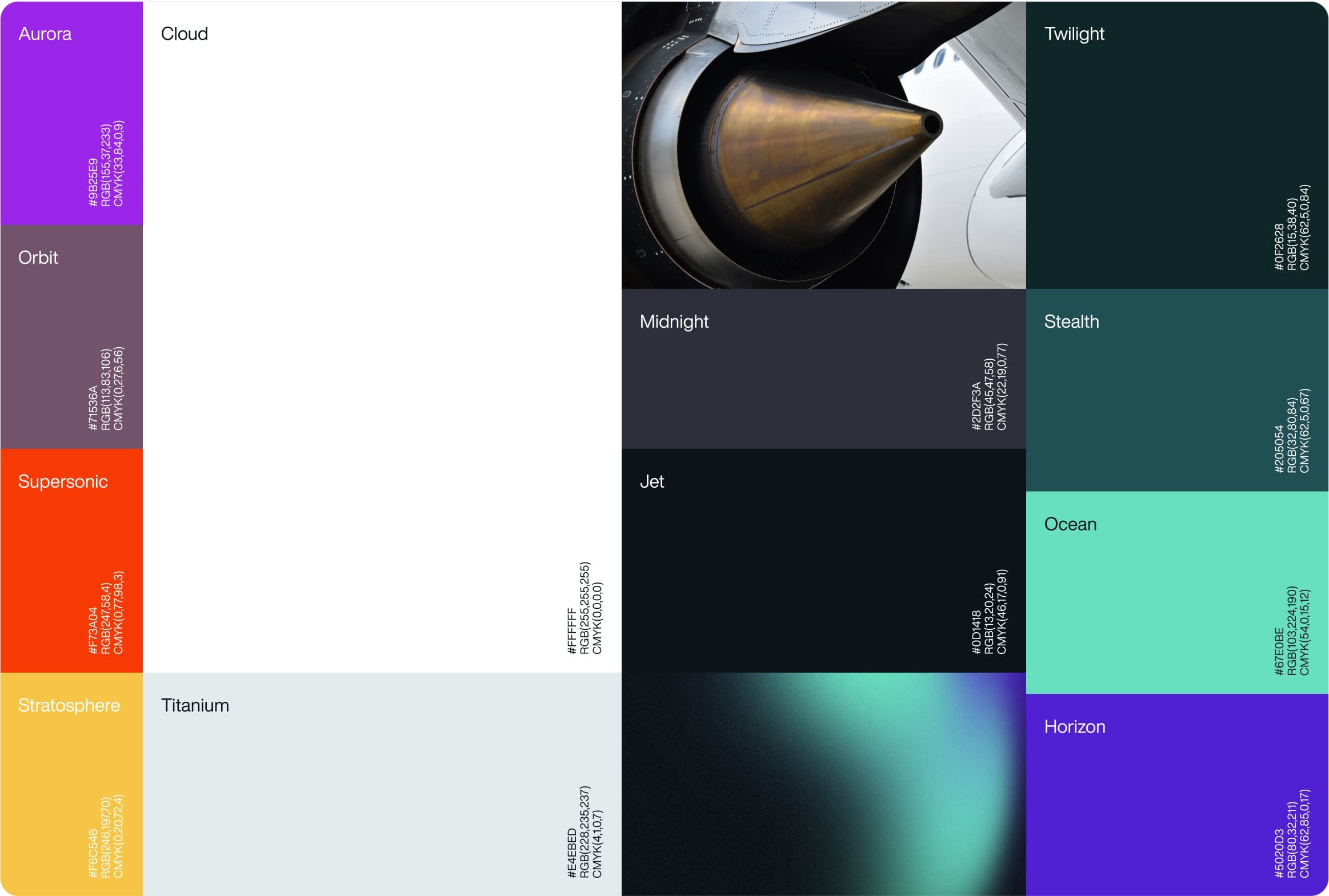
Colour
We introduced a new colour palette that reflects the professional and forward-thinking nature of the business.
SEO strategy
Our SEO strategy assessed hundreds of potential keywords for the new website and selected the keywords that the client had a statistical chance of success achieving.
Our team created optimised category pages that act as key navigation pages and as entry points to the website from search engines when users search for aerospace news.
+
1
243
%
Increase in search engine visibility
+
1
222
%
Increase in page 1 keyword rankings
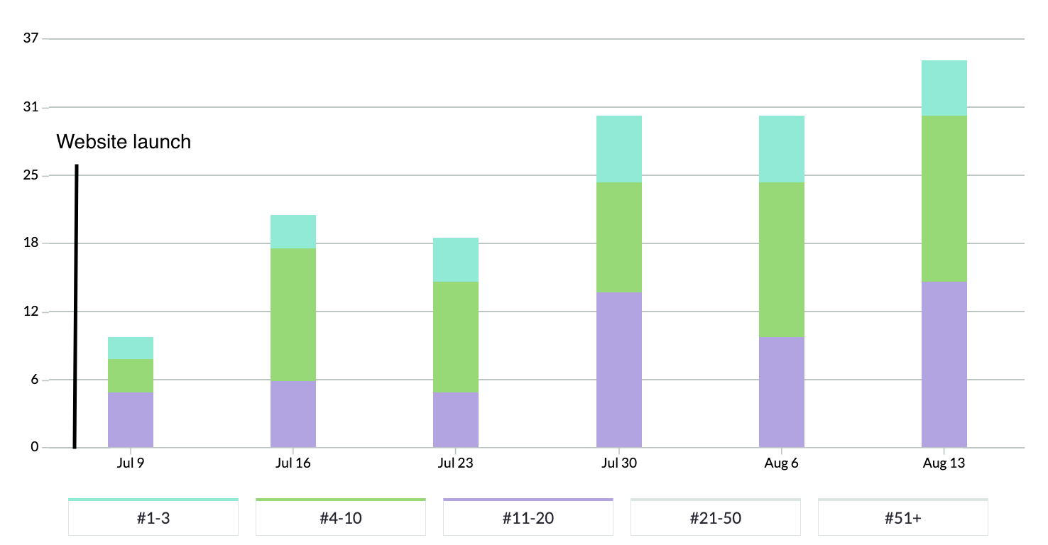
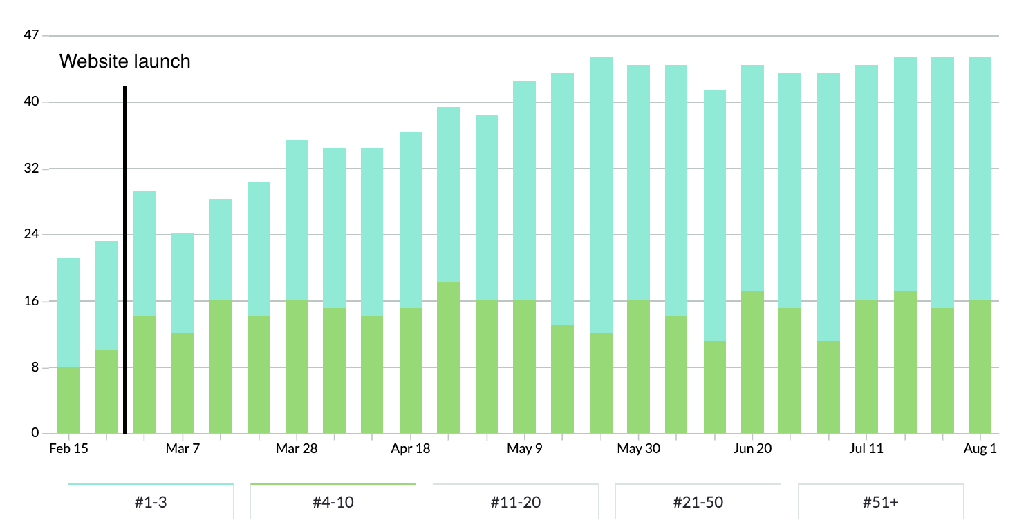
In the chart above, blue bars represent positions 1-3 in Google, green represents rankings on the rest of page 1, and purple represents page 2 rankings.
You can see that rankings immediately began to climb following the launch of the new website.

Related work
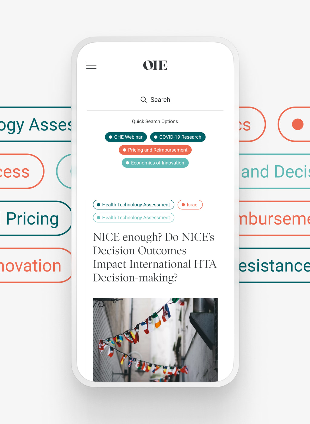
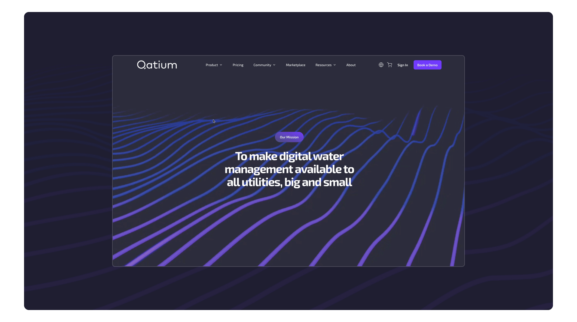
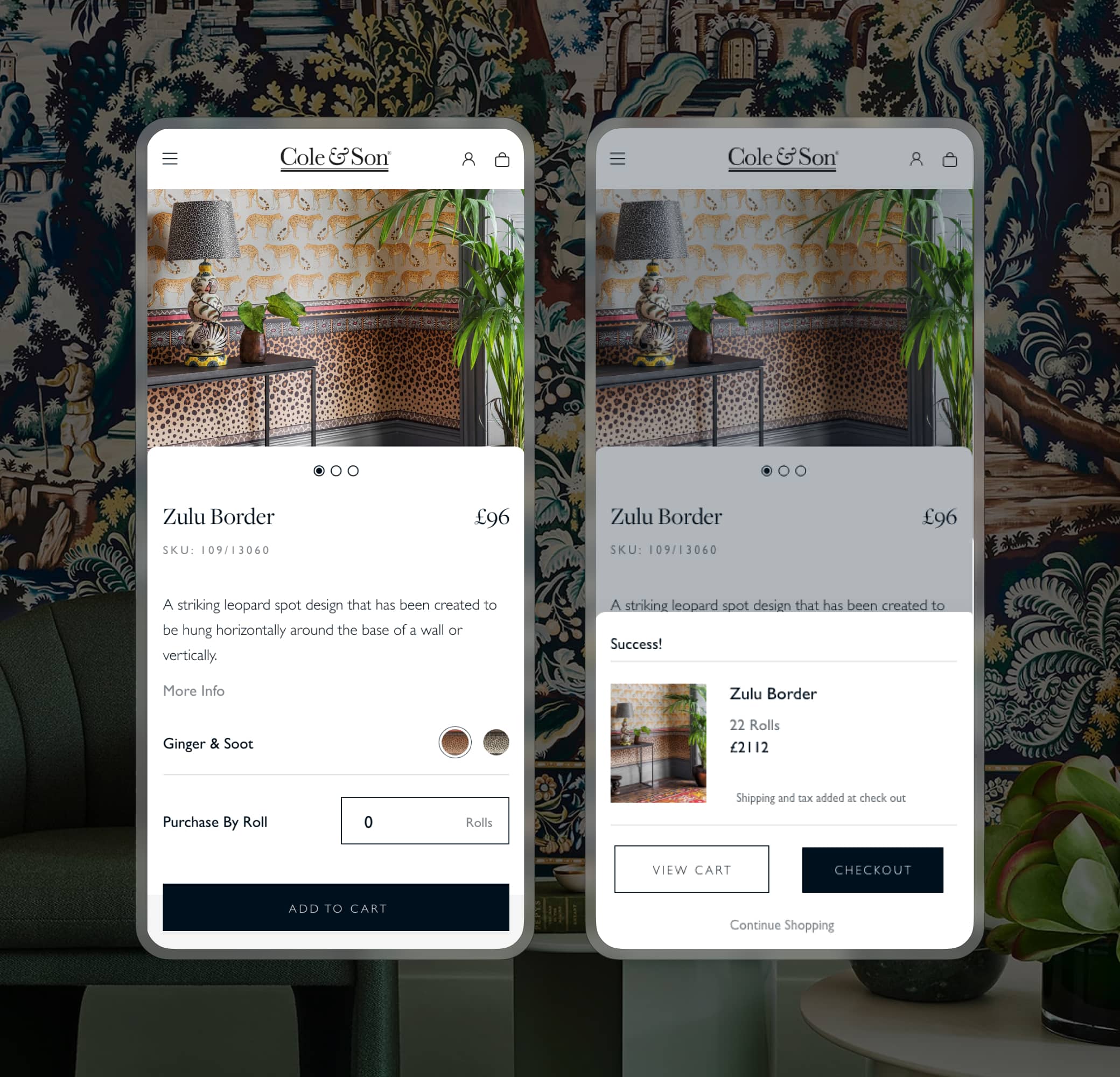
Qatium provides water management software to help water management companies transform their operations and planning with the assistance of digital tools.
They challenged us to deliver a headless eCommerce website that would enable them to target 3 global territories in 3 different languages.
- Lead time:
- 4 Months
- Sector:
- Utilities
- Target Type:
- B2B
- Website Goal:
- Improve the UX & establish eCommerce functionality
- Services:
- Web Design, Web Development, Headless eCommerce, International Targeting, WordPress, Shopify Digital Marketing

The challenge
Qatium challenged us to overhaul their digital user experience and deliver a market leading website experience to their customers.
They were ready to deliver a headless eCommerce website that would provide greater payment dexterity and the ability to set up subscription payments.
- Scope
- Figma Wireframe Prototypes
- Figma Design Prototypes
- UX Design
- WordPress Development
- Multi-lingual & Multi-territory
- Headless Shopify
- Subscription Payments
- Auth0 Integration
- Hubspot Integration
- SEO Strategy
- Content Entry & Migration
- Resource
- 1 x UX & UI Designer
- 1 x Website Designer
- 1 x WordPress Developer
- 1 x Backend Developer
- 1 x Quality Assurance Tester
- 1 x Project Manager
- 1 x SEO Strategist
The website
We delivered a headless Shopify website with a WordPress head that enabled Qatium to set up monthly subscriptions and sell add ons to their packages.
Qatium had an established brand and website design, and wanted to focus on overhauling the user experience design to improve the performance and user flows on their site.

Flexible payments
The client can accept a variety of payment types including single payments, subscriptions, and add ons.
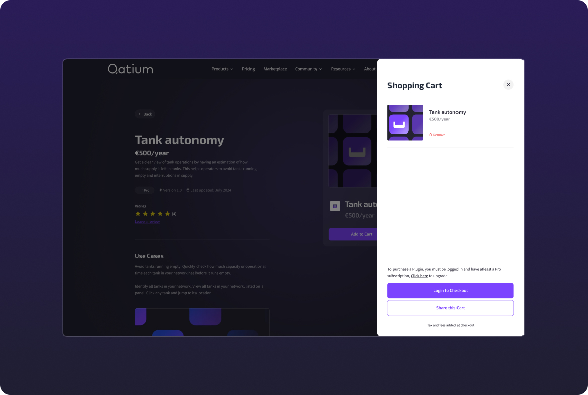
Optimised Checkout
The website leverages Shopify’s checkout process for maximum conversions.
UX Design
Our design work transformed the user experience, increasing conversions and engagement rates.

International targeting
Our team created a multi-territory website that targets 3 European regions in 3 languages. Qatium is able to tailor their messaging, SEO strategy and packages by region and sell in the local currency.
+
1
3
target territories
Website integrations
Our developers integrated with Auth0, Hubspot and Shopify to deliver the new infrastructure. Hubspot is the master of Qatium’s data and data is passed between systems to ensure that all customer, order and contact form data is unified in one system.
Auth0 is used to determine which products customers have clearance to purchase based on their subscription level. The integration checks the customer record data in Hubspot to approve or disapprove purchases, and then passes completed order data back into Hubspot.
SEO strategy
We delivered an SEO strategy to grow Qatium’s keyword rankings and enable them to be found in search engines by more prospective clients. By focusing on strategic keyword targets that Qatium has a significant opportunity of achieving, they were able to grow their organic market penetration.
+
1
71
%
Increase in search engine visibility since launch
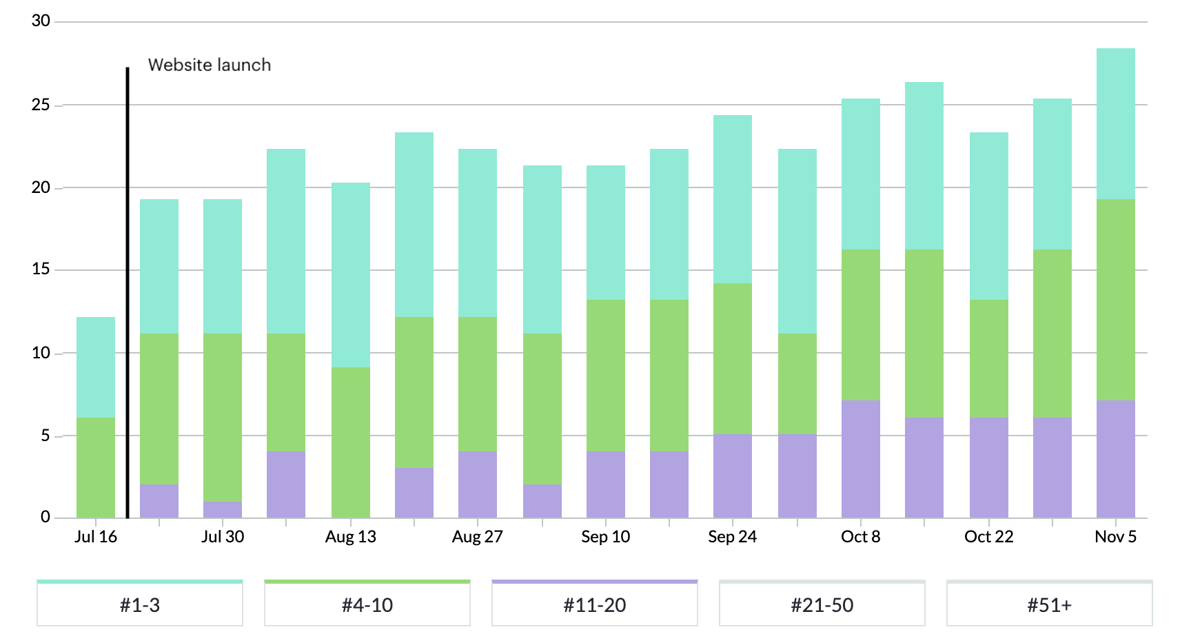
In the chart above, blue bars represent positions 1-3 in Google, green represents rankings on the rest of page 1, purple represents page 2 rankings and orange shows pages 3-5.
You can see that rankings rose immediately after the new website launch.

Related work
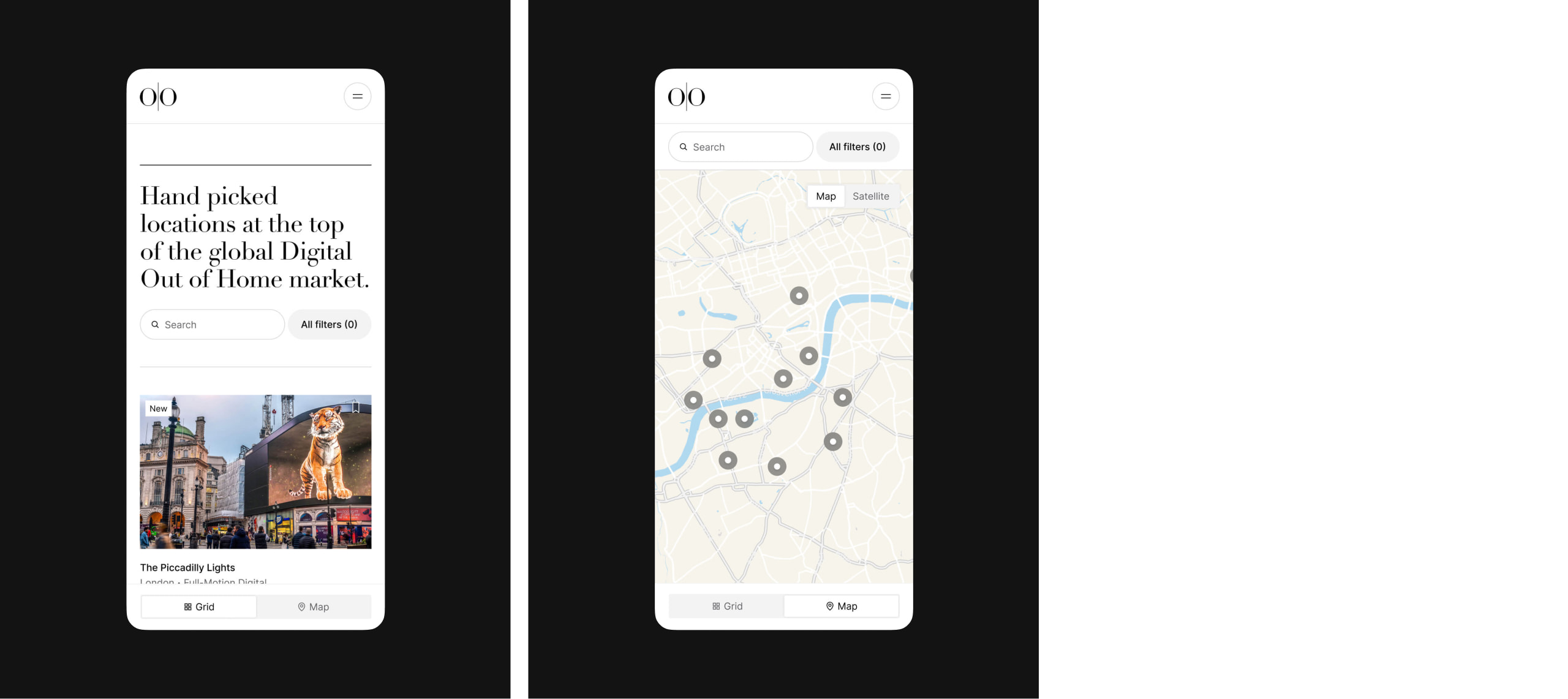
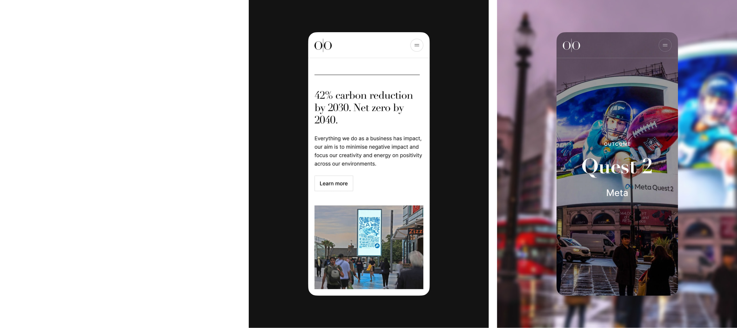
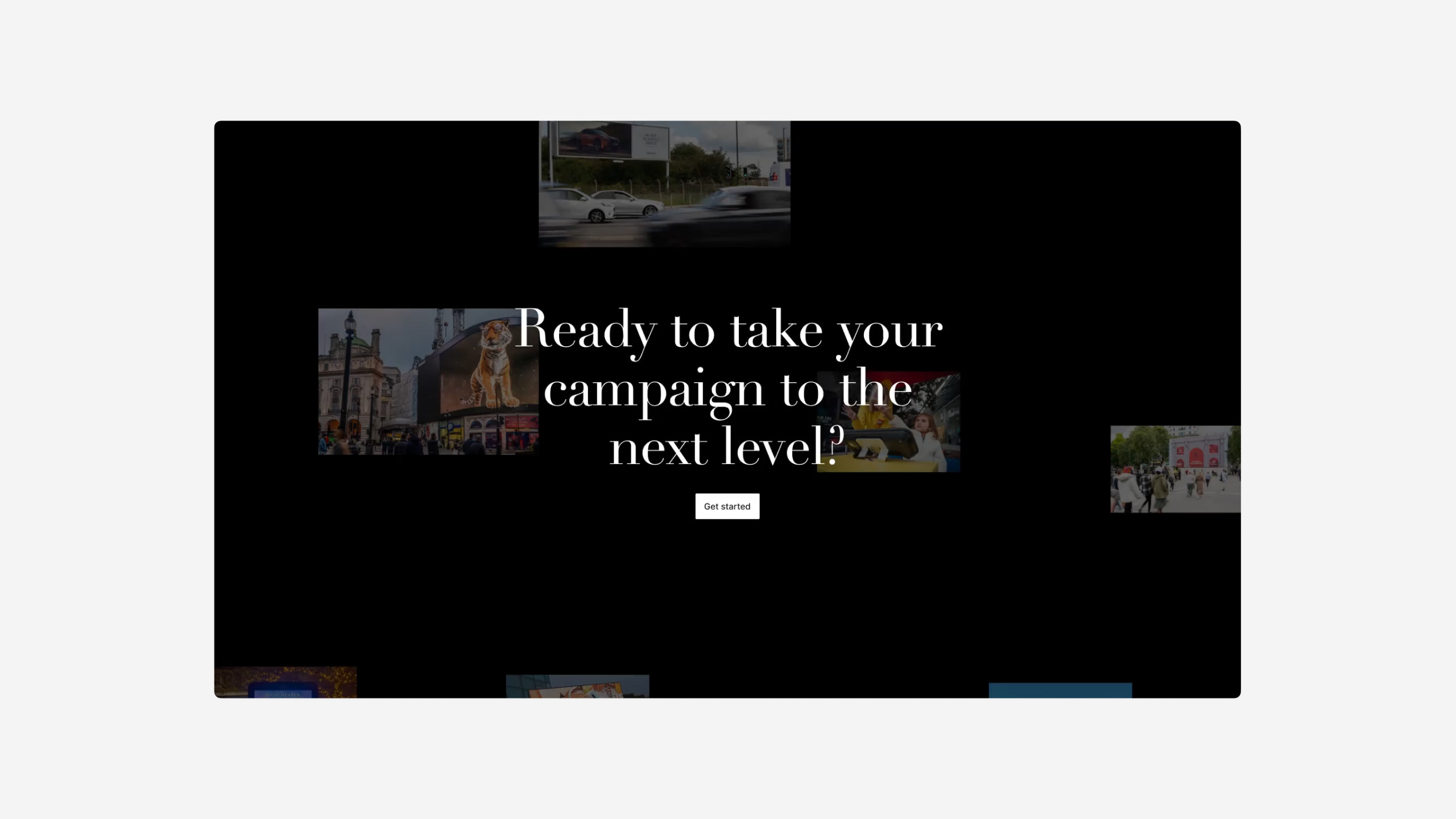
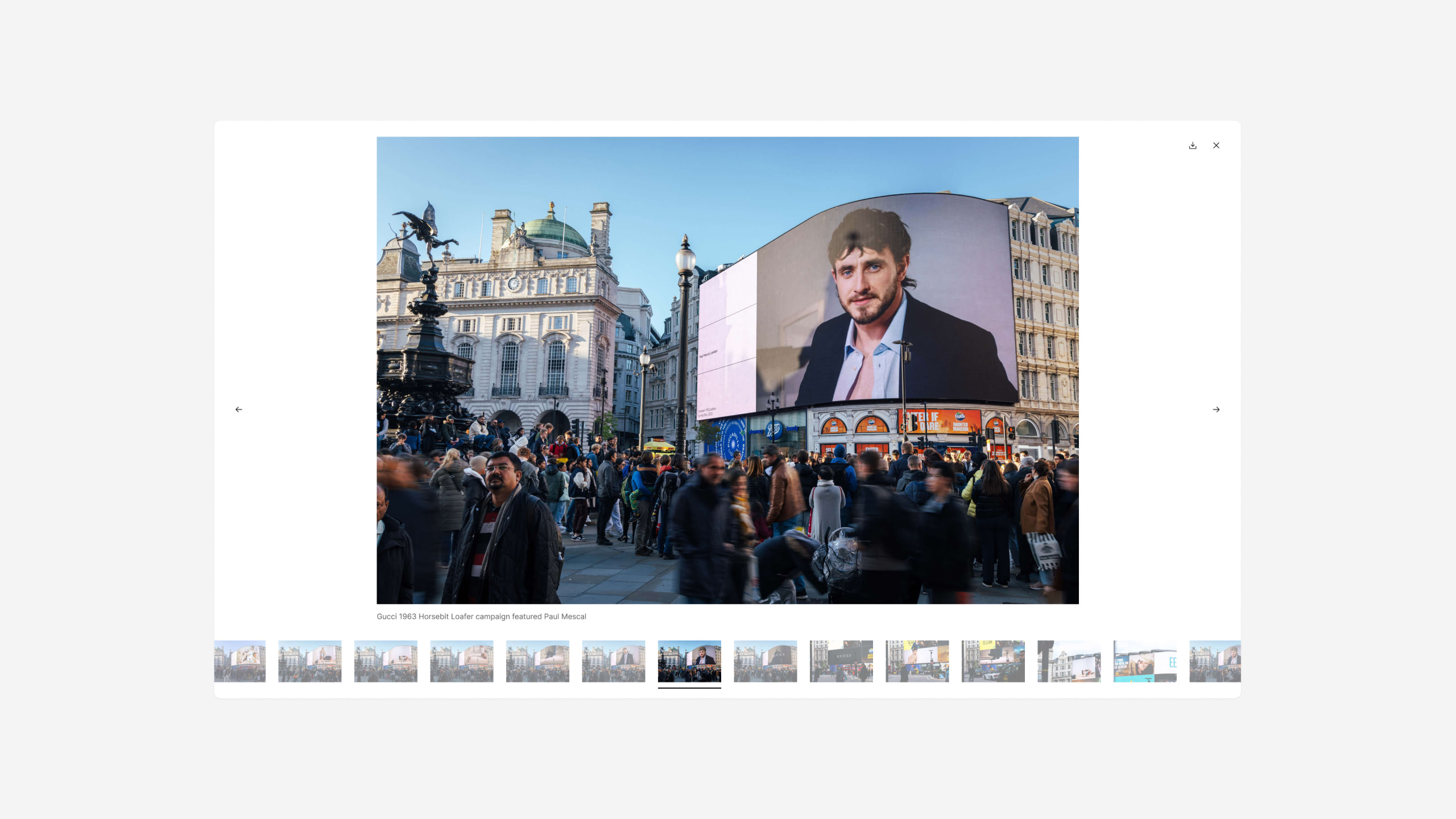
Ocean Outdoor is a specialist media company that manages global billboard and digital screen real estate. They manage some of the most iconic landmark advertising locations worldwide.
They needed an international website that would enable their clients to build their own advertising packages in 7 different locations and languages.
- Lead time:
- 9 Months
- Sector:
- Advertising
- Target Type:
- B2B
- Website Goal:
- Create a flexible platform for growth that will enable the Ocean Team and deliver a new look & feel
- Services:
- Web Design, Web Development, International Targeting, WordPress, Digital Marketing, Content Entry & Migration

The challenge
Ocean Outdoor challenged us to deliver a modern new website that provided a clean interface for their clients to browse advertising spaces and build Collections.
The client needed a website that would enable their large team to consistently create content with an intuitive CMS. The website needed to be flexible, scalable and enable their marketing team.
- Scope
- Figma Wireframe Prototypes
- Figma Design Prototypes
- UX Design
- WordPress Development
- Multi-lingual & Multi-territory
- Advertising Location List-builder
- Wishlist Functionality
- SEO Strategy
- 3D Google Map Experiences
- Content Entry & Migration
- Resource
- 1 x UX & UI Designer
- 1 x Website Designer
- 1 x WordPress Developer
- 1 x Backend Developer
- 1 x Quality Assurance Tester
- 1 x Project Manager
- 1 x SEO Strategist
The website
The client was looking for an elegant website design that was effortlessly beautiful and high quality. Our designers created a clean design that enabled Ocean’s products and services to shine through.
To simplify the complex user flows on Ocean’s website, our UX design team mapped out new user journeys and page structures to deliver a quality user experience that enabled Ocean’s customers to self-serve and explore advertising spaces.
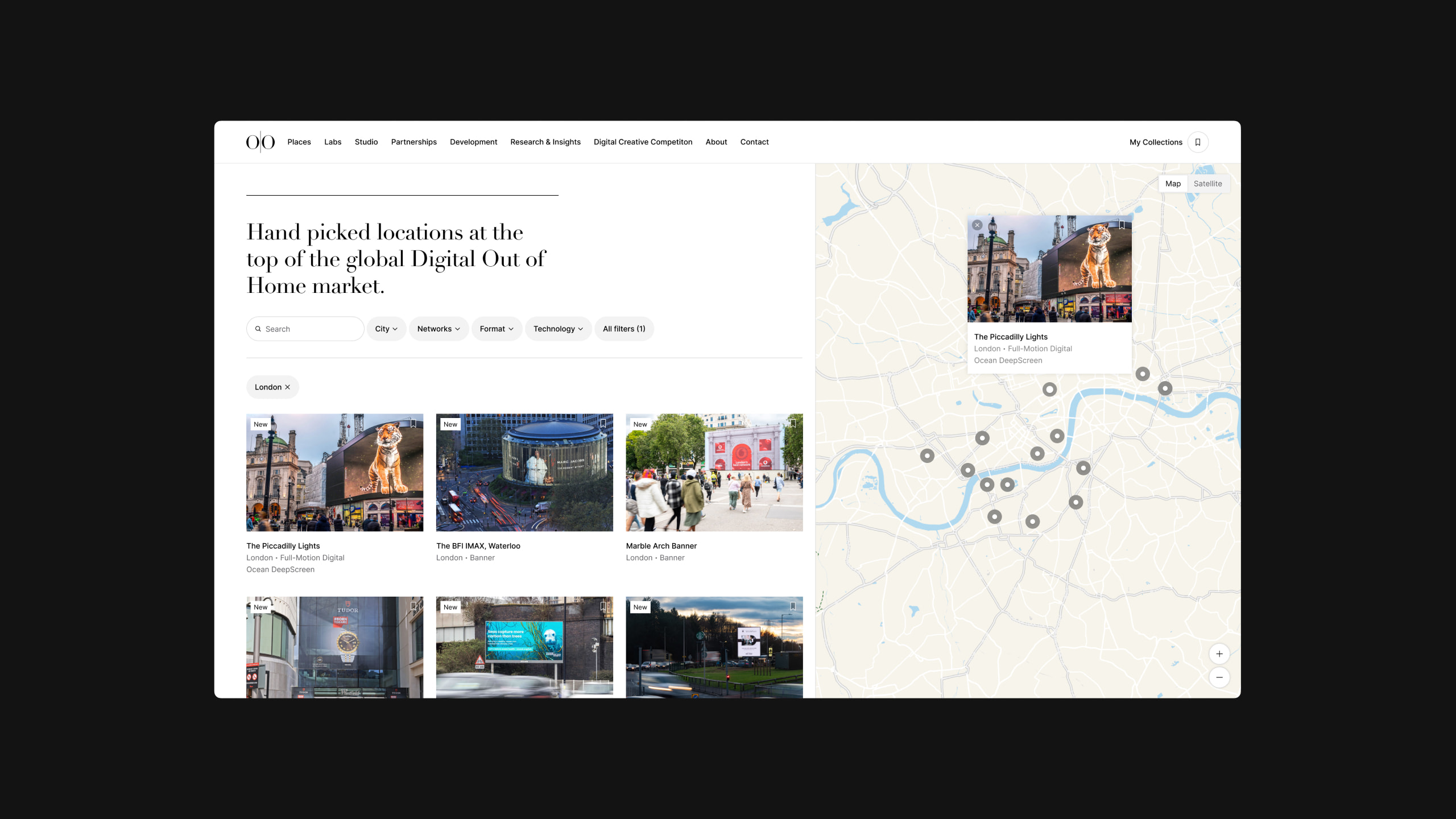
International targeting
We delivered a multi-territory WordPress website that enables Ocean to deliver regional content and messaging, and targeted regional SEO strategies to deliver the best user experiences and performance outcomes for the website. The website targets 7 global territories in multiple languages.
+
1
7
target territories
Collections builder
Ocean’s clients can browse millions of advertising locations on the website and build them into Collections. Collections work similarly to a wish list where users can save advertising locations into different Collections lists and share their lists with colleagues and clients. Users can also browse networks of locations that are frequently bought together.
Ocean Outdoor receives a copy of each Collection that is created and the associated contact details to help provide a high level of customer service to prospective customers.
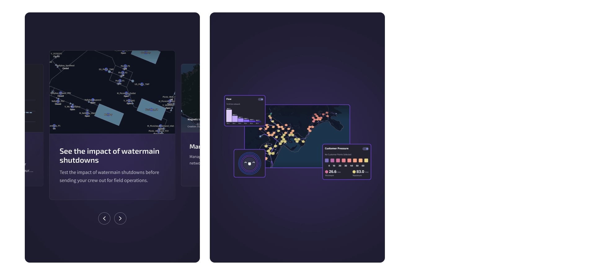
Data visualisations
We delivered an engaging way to visualise data and charts to showcase the demographic data of Ocean’s advertising locations and the people who walk by the locations. Our developers integrated with Columbus, Ocean Outdoor’s custom API, to retrieve the data and display it in a beautiful way online.
SEO strategy
Having never previously explored SEO as a marketing channel for the business, opening up an organic traffic channel was a huge opportunity for Ocean.
We worked with Ocean’s marketing team to deliver a strategy that was tailored to their business and offering. Our goal was to attract prospective new clients from search engines by increasing Ocean’s rankings and making them more discoverable for non-branded search terms.
+
1
179
%
Increase in page 1 rankings since launch
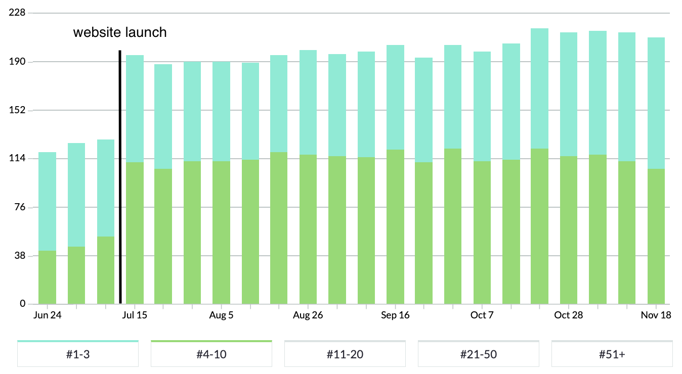
In the keyword chart above, blue bars represent positions 1-3 in Google and green represents rankings on the rest of page 1.
Following launch, Ocean Outdoor have experienced an immediate rise in keyword rankings, particularly keywords ranking on page 1 of Google.
Related work
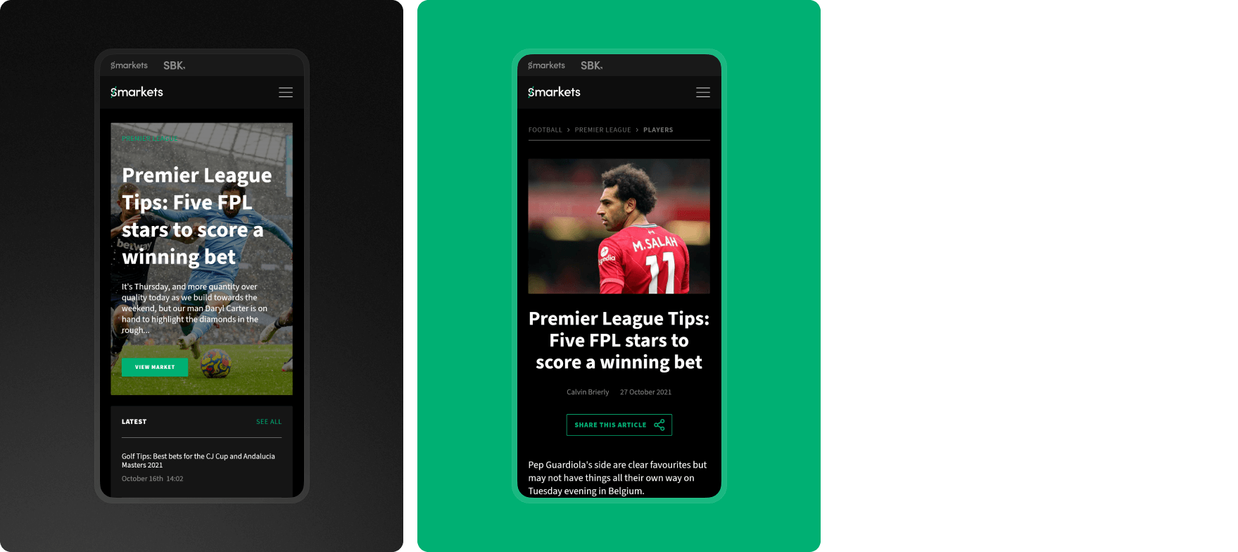
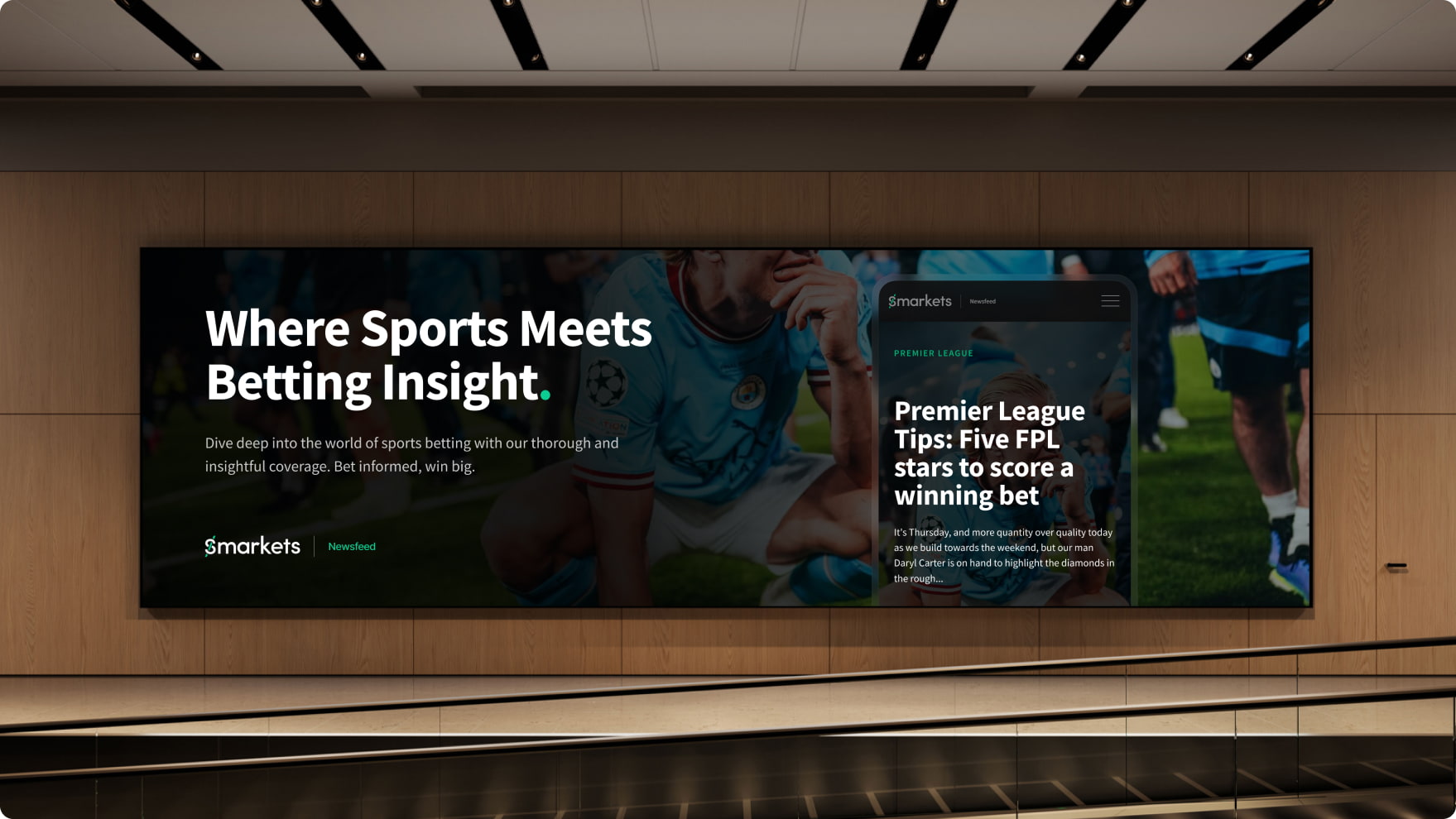
Smarkets is a betting exchange that specialises in sports. They were ready to launch a sports news platform to engage customers and attract new visitors.
- Lead time:
- 12 Weeks
- Sector:
- Betting
- Target Type:
- B2C
- Website Goal:
- Launch a content focused website to attract and engage their audience
- Services:
- Web Design, Web Development, Headless Website, Digital Marketing
“They’re one of the better agencies I’ve ever worked with. So far, our website traffic is up and continues to grow considerably. Their team has exceeded our expectations.”

The challenge
Smarkets challenged us to deliver a secure news platform where they could publish large amounts of content. The goal of the platform was to attract and engage their audience and improve brand awareness.
SEO was a huge focus for Smarkets and they wanted to generate high levels of organic traffic with the new website. As a brand new website, we needed to collaborate with Smarkets to implement a marketing strategy that would enable the site to build authority, increase their domain authority (ability to rank) and generate organic and social traffic.
- Scope
- UX & UI Design
- Figma Wireframe Prototypes
- Figma Design Prototypes
- Custom CMS
- Headless Website
- Static Publishing
- SEO Strategy
- Resource
- 1 x Website Designer
- 1 x Website Developer
- 1 x Quality Assurance Tester
- 1 x Project Manager
- 1 x SEO Strategist
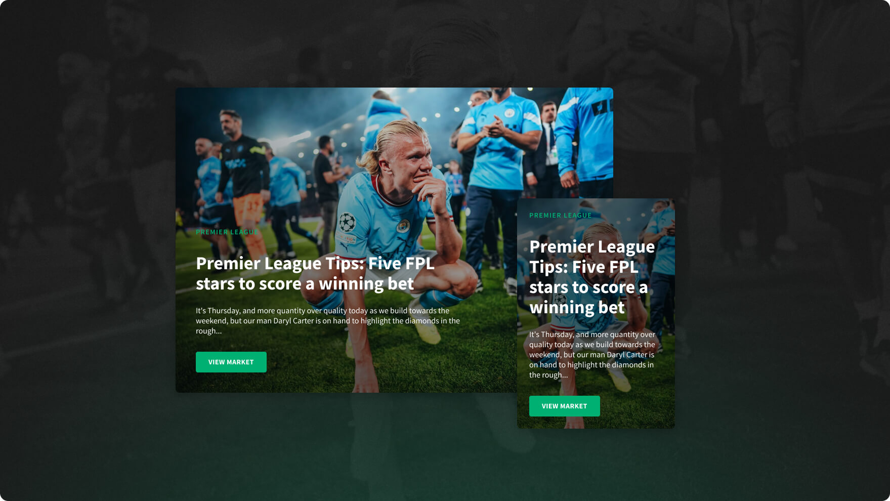
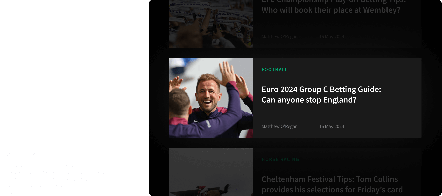
The website
We delivered a high performance headless website for Smarkets that statically publishes content to achieve the best speed, security and cross-device user experiences. This means that the front-end interface of the website that visitors see is a static version of the site that is entirely separate to the CMS.
We leveraged Smarket’s custom CMS platform to create a content platform that the Marketing team could use to connect with their audience.

SEO strategy
Starting from scratch with a new website and domain, Smarkets had a challenge ahead of them to build their repetitional metrics, begin ranking in search engines and generate inbound traffic.
We delivered an SEO strategy that defined content pillars and categories that could be optimised across the website to attract and grow organic traffic. Our strategy dovetailed with Smarkets’ content strategy and ensured that both the work streams supported the other rather than competed.
The architecture
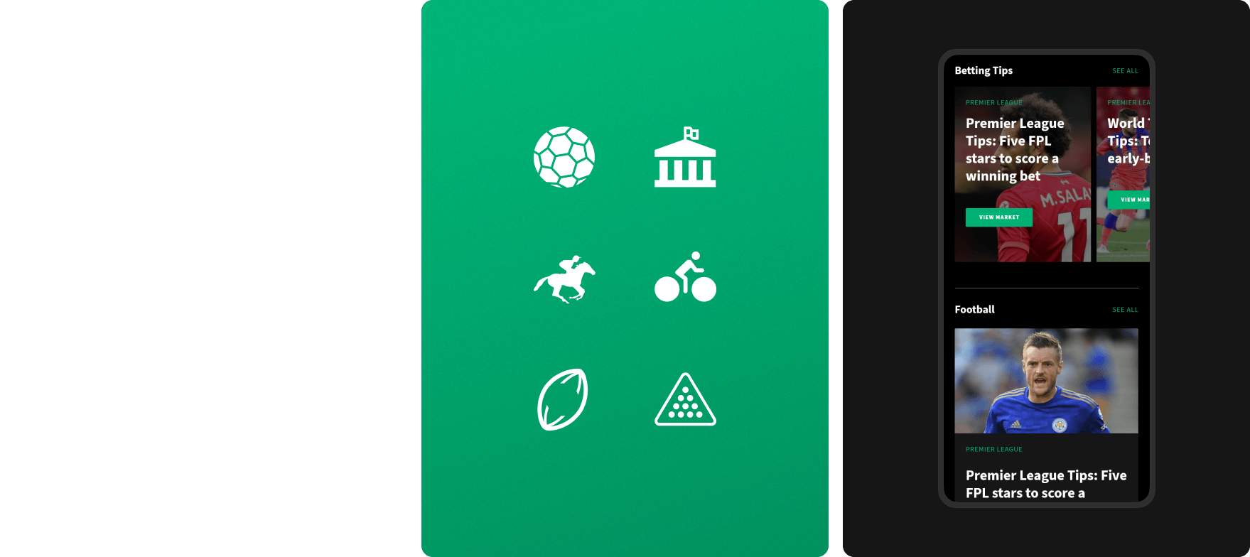
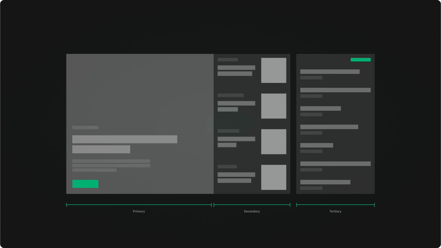
Before any design work had been undertaken, our UX designers created wireframe layouts of the website to plan the content structure and user flows throughout the site. We created article hierarchies and featured article components to direct the user journeys and enable Smarkets to promote popular content.
Calculators
Our team produced a set of online calculators to help users calculate betting odds and convert bets. The calculators linked to Smarket’s betting platform and to relevant articles throughout the site. These became popular resources that attracted users to the site.
Publishing workflows
To enable Smarkets to efficiently produce and publish content, we collaborated with their team to implement a publishing workflow in the CMS. We created custom user roles to cover the users within their system, including content writers, journalists, editors, guest editors, publishers and so on, to provide the right users with the right permissions level for Smarket’s content approval process.
Trusted Smarkets partners
In addition to the work delivered on the Smarkets website, we have also collaborated with the Smarkets team on 2 of their other brands: OddsIndex and SBK.
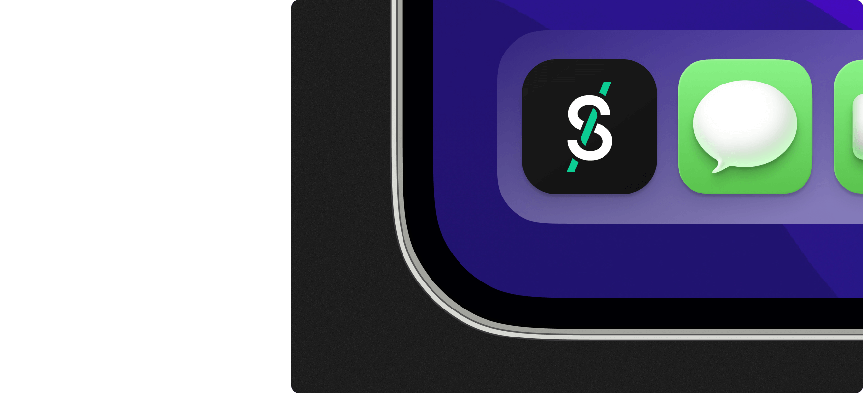
OddsIndex
OddsIndex is a US based betting platform that enables its customers to find and compare the best odds from market leading betting providers.
We created a new brand, website design and user experience for the business.
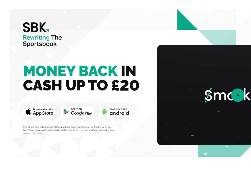
SBK
SBK is a sports betting app that offers the best odds on the biggest sport events.
We delivered a new brand, content hub and landing page campaign for the business.
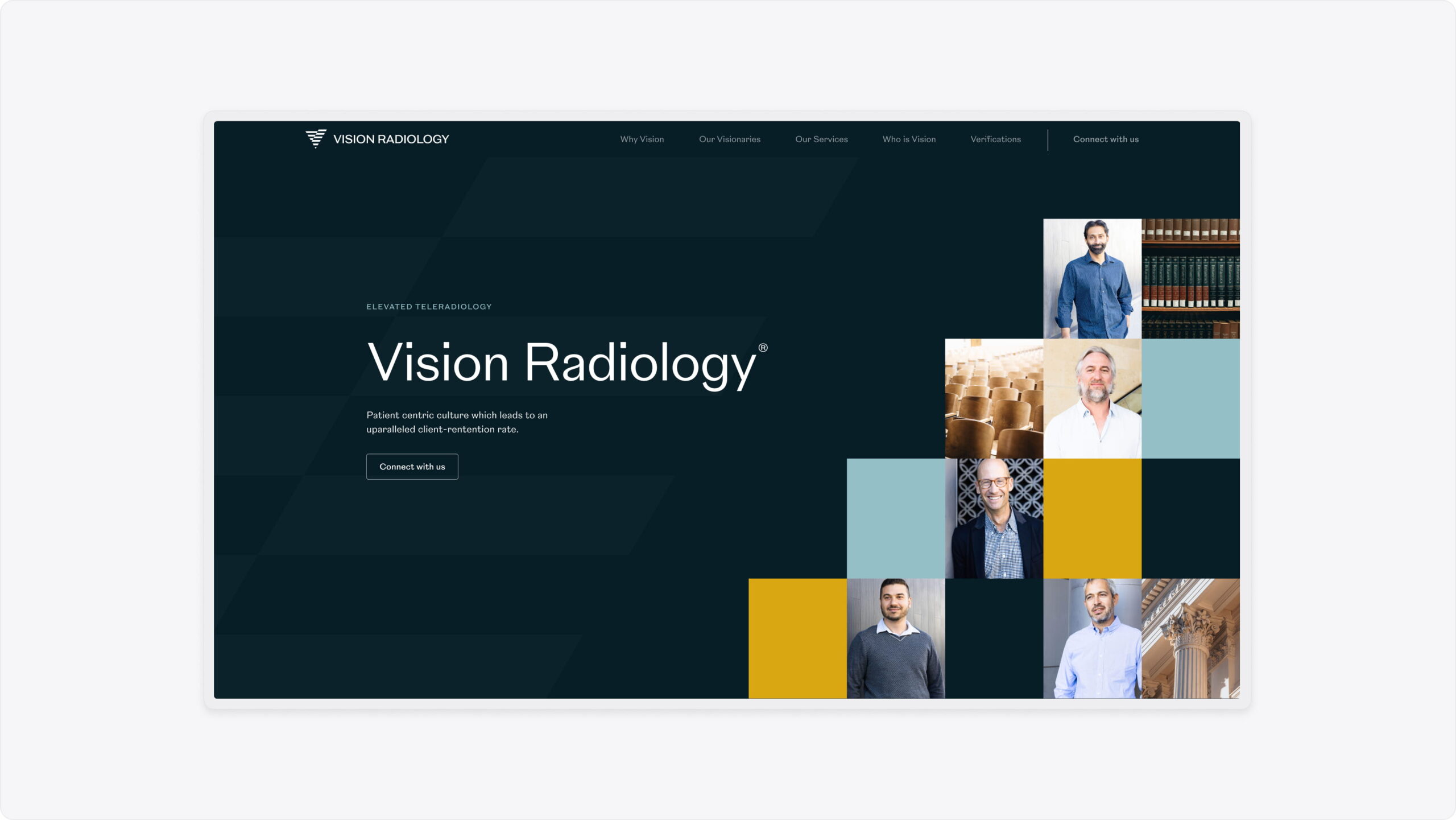
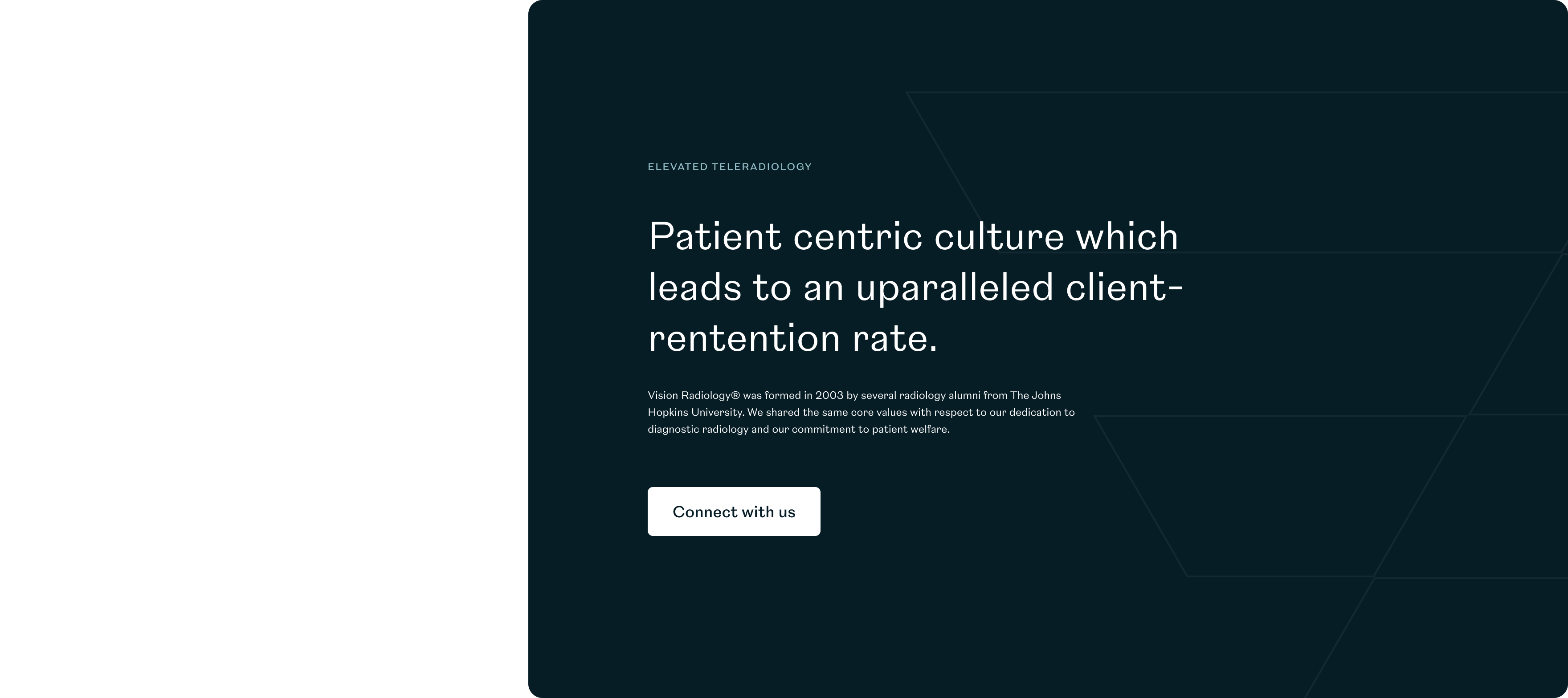
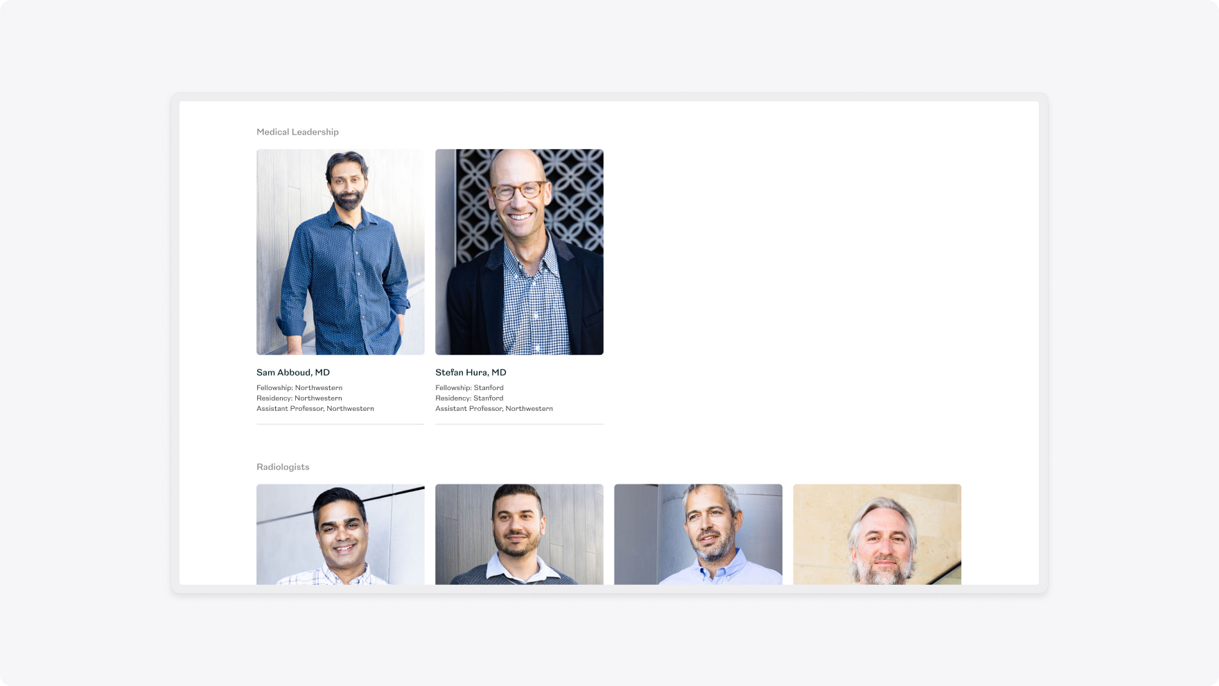
Vision Radiology is a tele-radiography practice that leverages timezones to rapidly increase turnaround times for scan interpretations and consultations.
They wanted to increase their visibility to get in front of more prospective clients and employees.
- Lead time:
- 4 Months
- Sector:
- Healthcare
- Target Type:
- B2B & B2C
- Website Goal:
- Increase visibility & Modernise the website
- Services:
- Branding, Web Design, Web Development, Digital Marketing


- Scope
- Adobe XD Wireframe Prototypes
- Adobe XD Design Prototypes
- Brand Identity
- SEO Strategy
- WordPress CMS
- Salesforce Integration
- Resource
- 1 x Brand Designer
- 1 x Digital Strategist
- 1 x Website Designer
- 1 x Website Developer
- 1 x Quality Assurance Tester
- 1 x Project Manager
The challenge
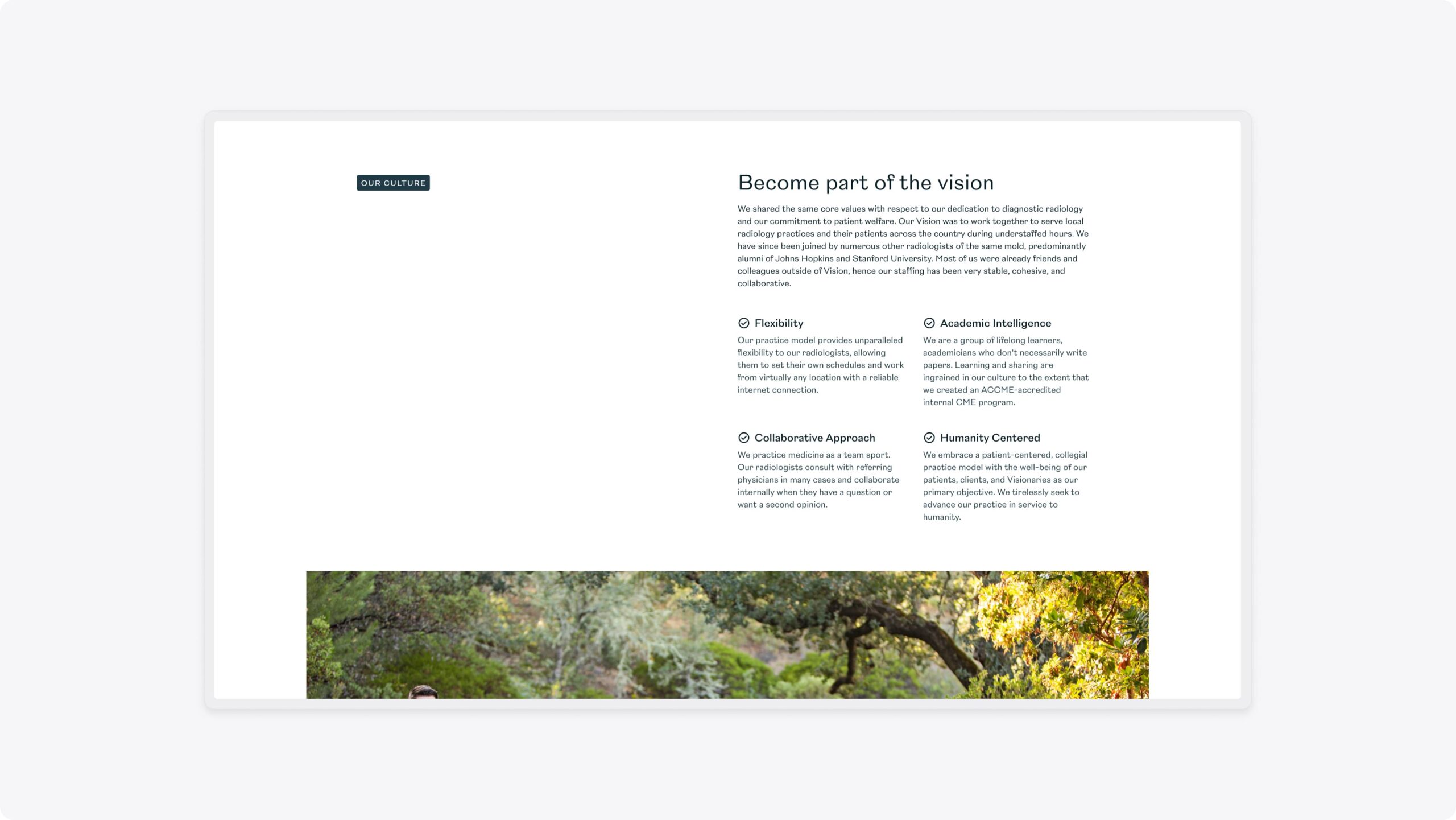
Vision Radiology’s previous website and brand were dated and didn’t reflect the practice. Their Marketing team was struggling to make simple changes and lacked a consistent brand to produce new assets.
They challenged us to deliver a flexible new website that would enable them to manage their content, move quickly, and appeal to their target audience.
To achieve their objectives, they recognised that they needed a new brand, website and digital strategy.
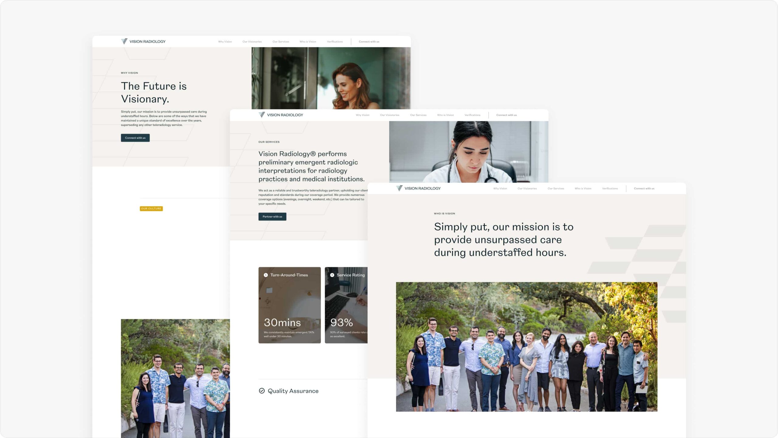
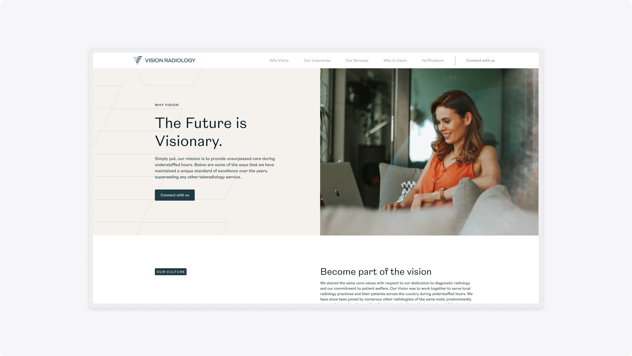
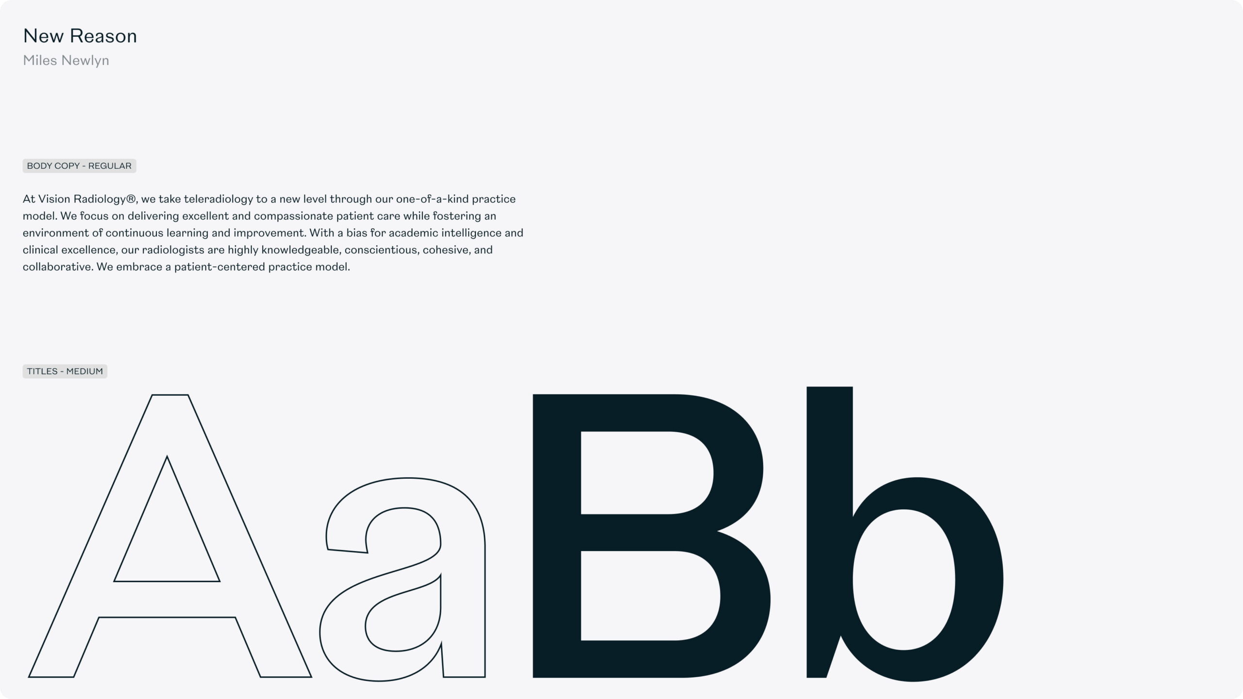
The brand
When Vision Radiology first approached us, they had a basic brand that lacked depth and overused stock photography. The nature of having a remote team meant that they had very little photography to use which was limiting their design capabilities.
We delivered a flexible brand identity that incorporated a broader colour palette with primary and secondary colours. We introduced new shape and form into the brand, creating depth and providing visual interest in place of imagery. This approach also enabled Vision to use stock photography in a way that was on-brand and didn’t look like stock imagery.
In addition to the colour palette and imagery, we also evolved the logo and typography.


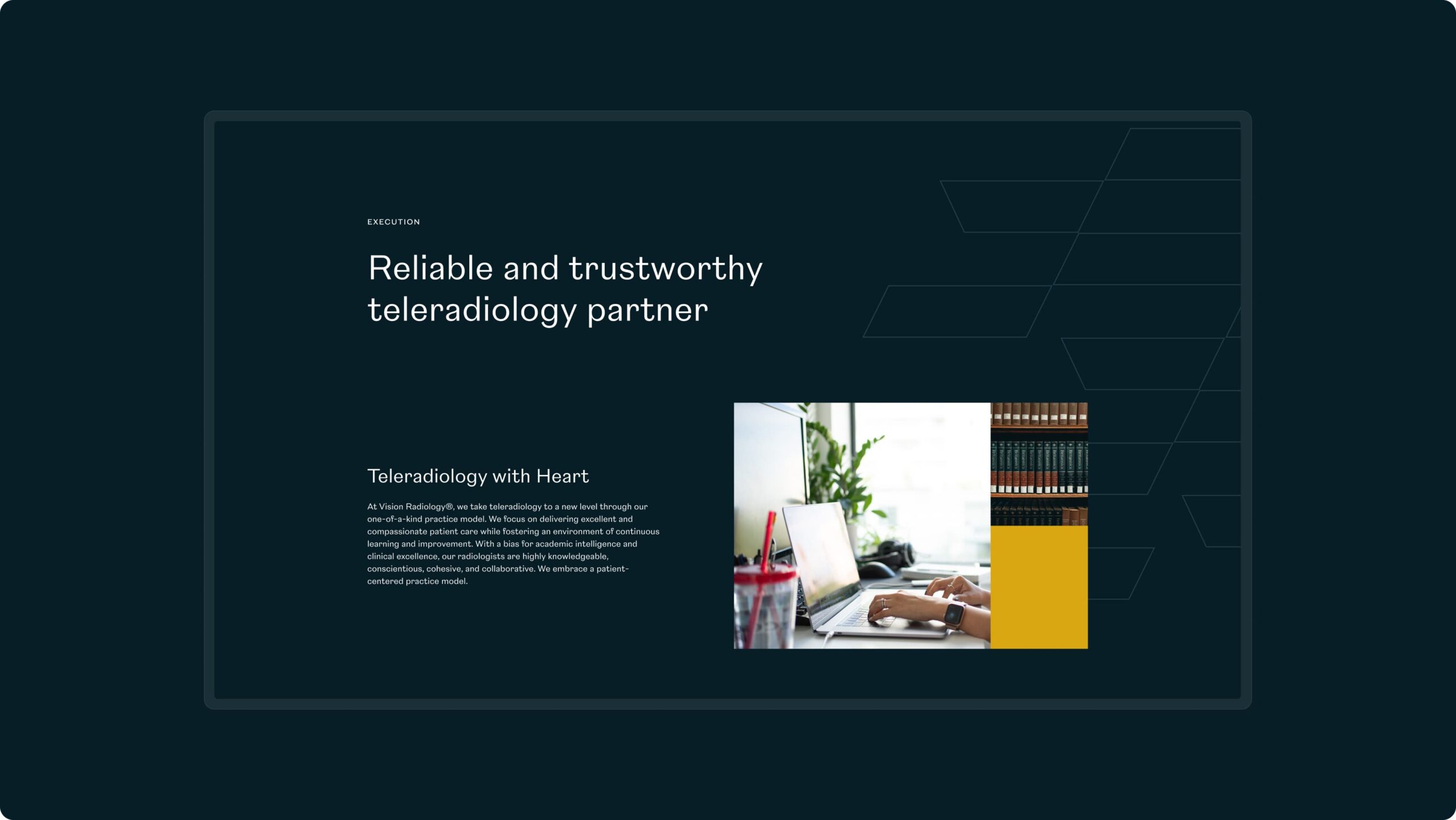
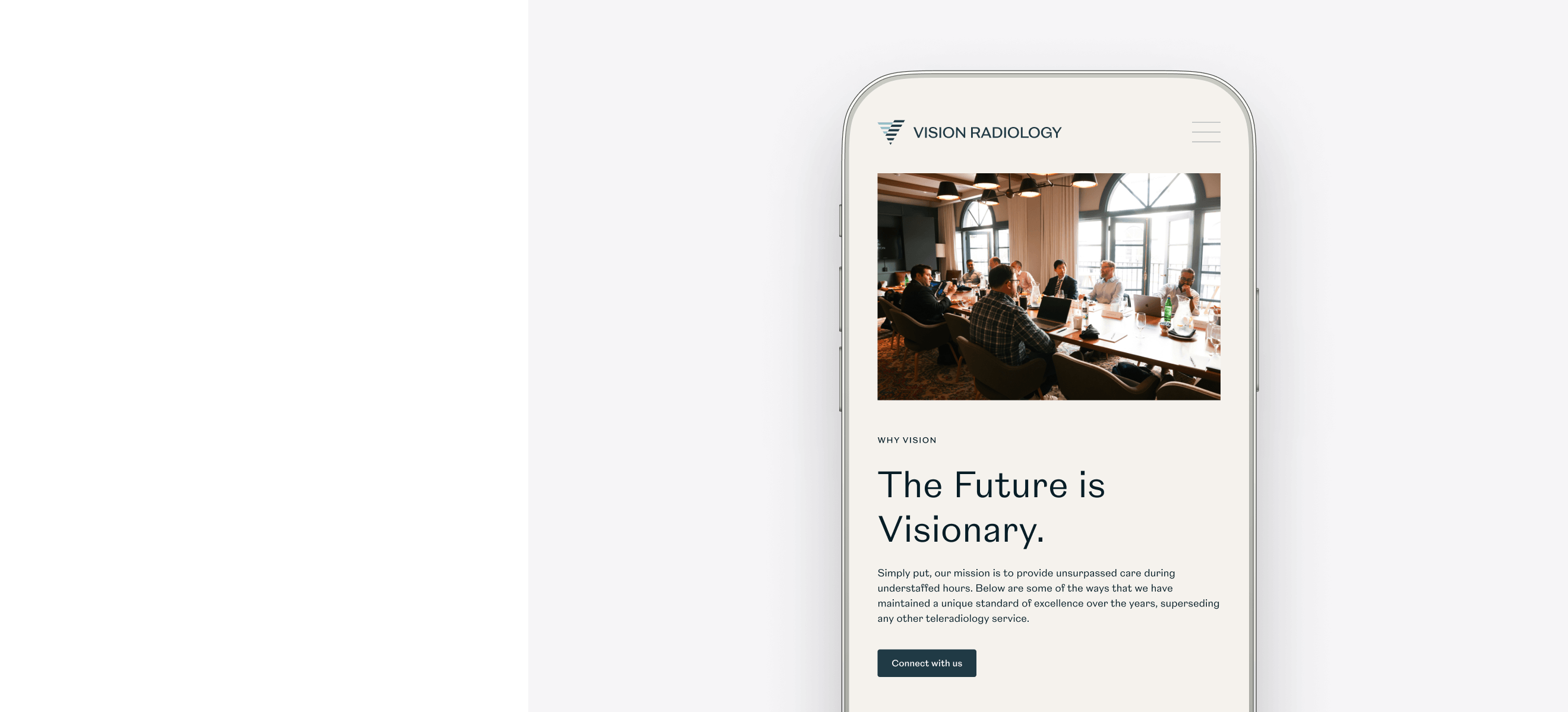
The website
We utilised the updated brand to create a modern new website design that represented Vision Radiology to prospective clients and employees. Our designers placed people at the centre of the design to visually represent the approachable and personable qualities of Vision Radiology.
We delivered the new website in WordPress to provide easy content management and a high quality code base for future growth.
SEO strategy
Our Marketing team undertook keyword research and selected target keywords that Vision Radiology could compete and rank for in search engines. We optimised the website in line with the new strategy and trained Vision’s Marketing team how to optimise new website content.
Our SEO strategy enabled Vision Radiology to increase their visibility in search engines and be found by more prospective clients and employees.

“Working with Plug & Play was a great experience. I came into the project after it started, and they quickly got me up to speed. The website looks great, and they were instrumental in completing this project on time. I would highly recommend Plug & Play.”

Related work
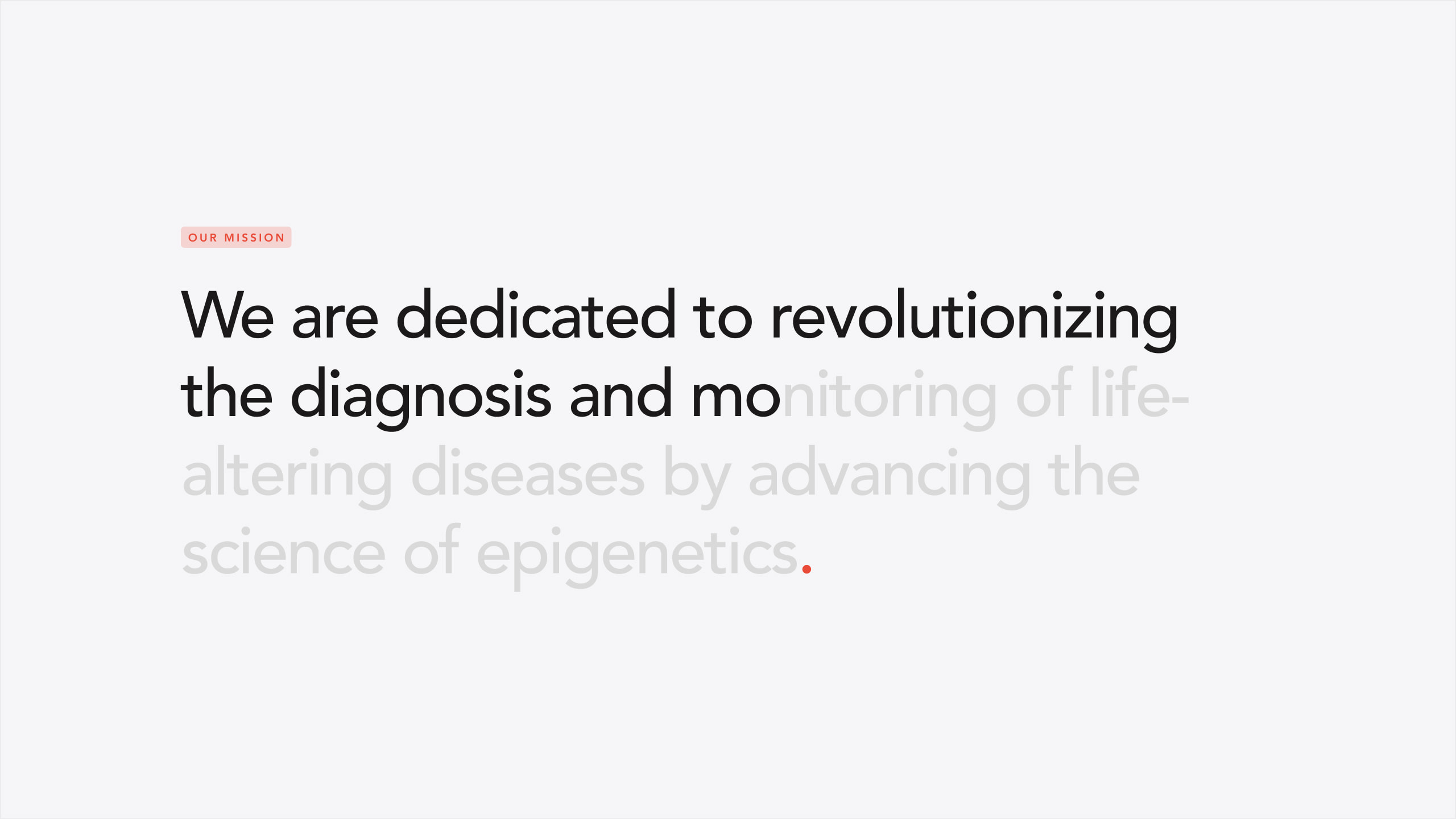
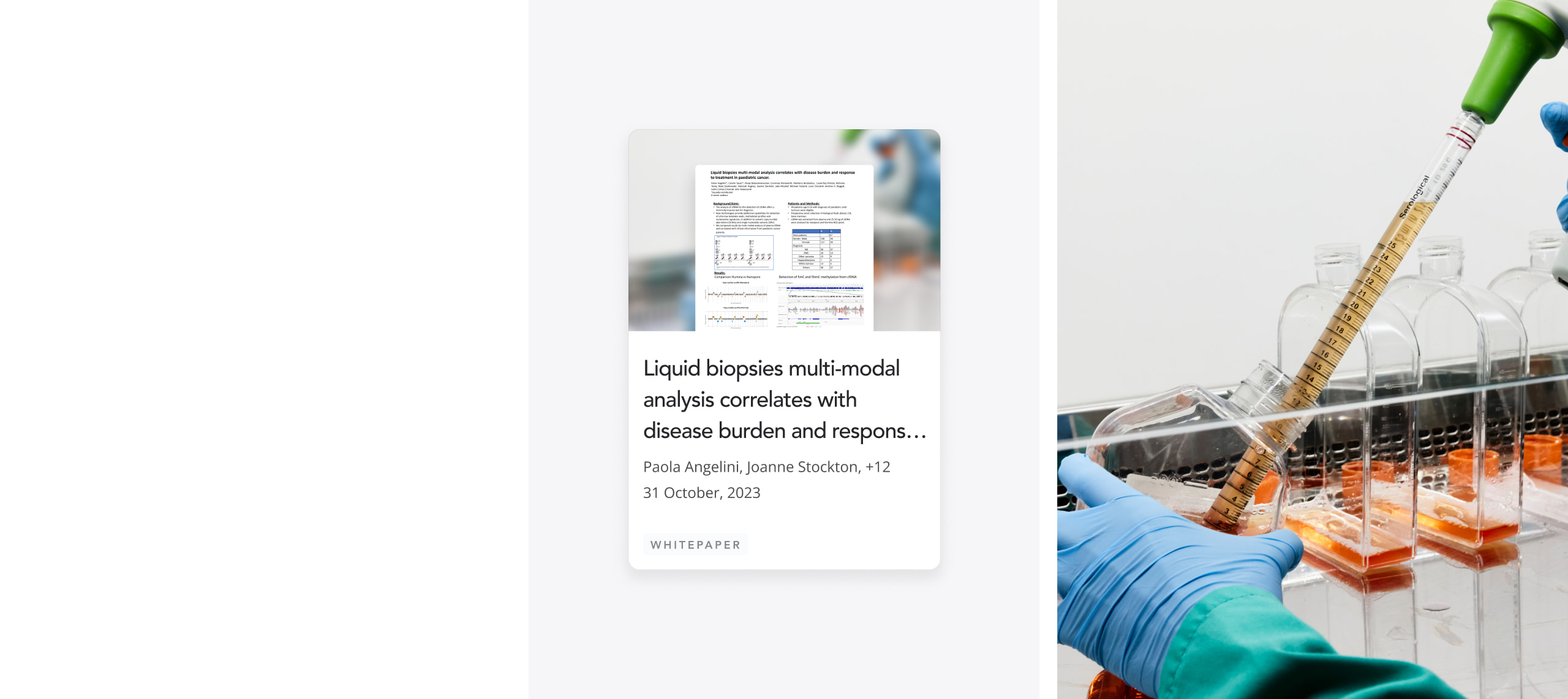
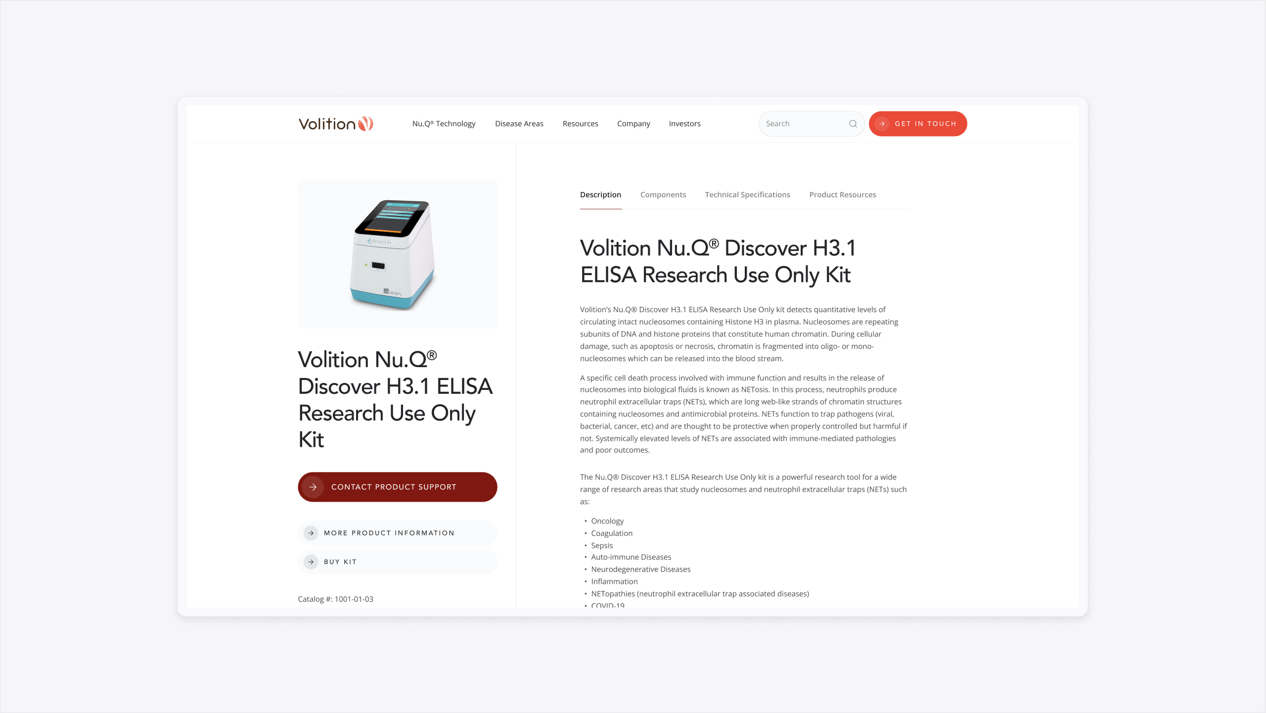
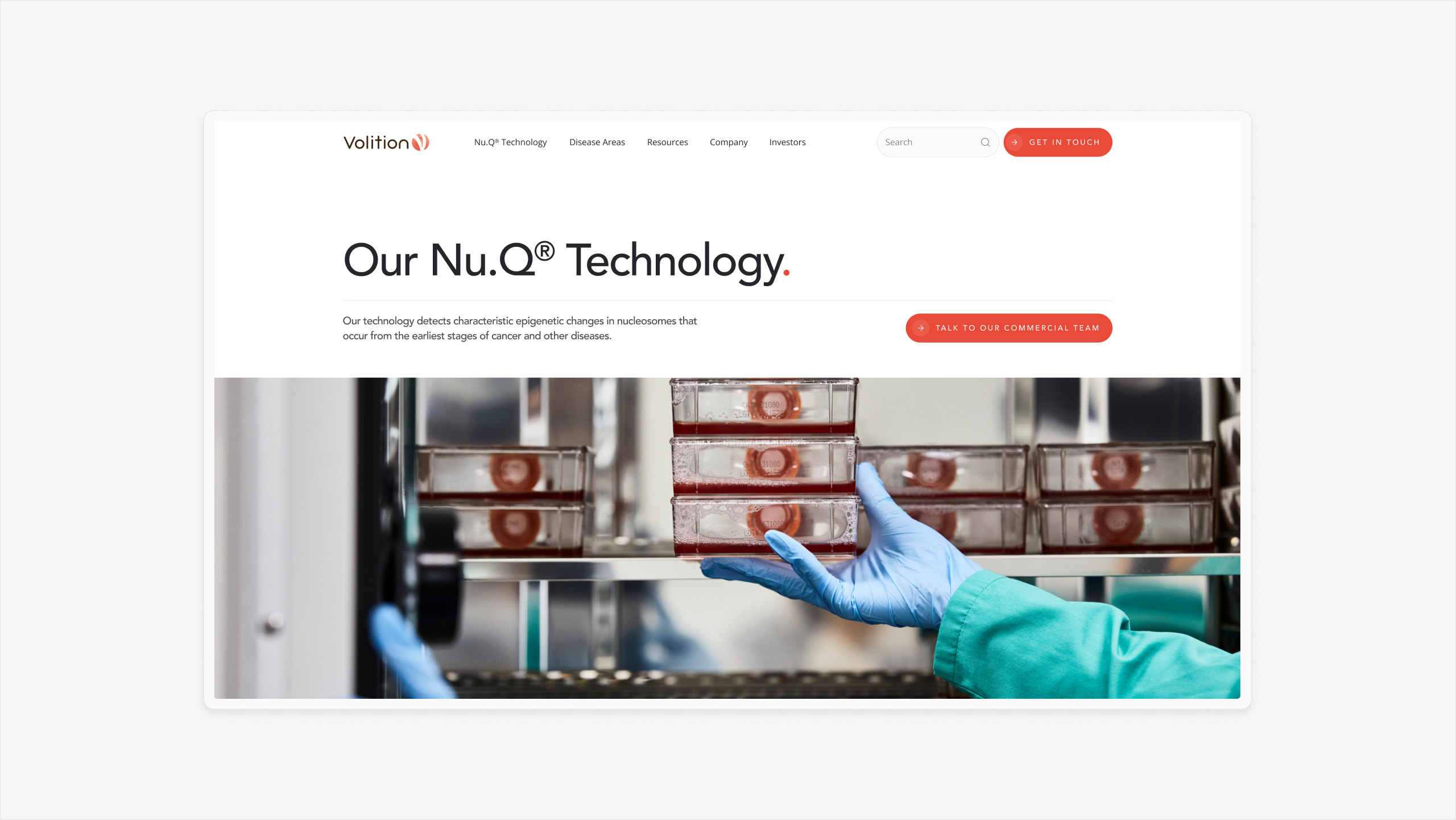
Volition is a multinational life science company that develops technology to diagnose and monitor a range of diseases in humans and animals. Their technology sets them apart as industry leaders, providing kits to a wide spectrum of audiences from medical specialists to individual pet owners.
Our challenge was to deliver a new website that targeted each key audience type, encouraging them to make an enquiry or visit Volition’s distributor sites to purchase their own kits.
- Lead time:
- 4 Months
- Sector:
- Life Sciences
- Target Type:
- B2B & B2C
- Website Goal:
- Increase awareness of their technology & generate new leads
- Services:
- Web Design, Web Development, Digital Marketing

- Scope
- SEO Strategy
- Figma Wireframe Prototypes
- Figma Website Design Prototypes
- WordPress CMS
- Pardot Integration
- Resource
- 1 x Digital Strategist
- 1 x Website Designer
- 1 x Website Developer
- 1 x Quality Assurance Tester
- 1 x Project Manager


The challenge
Volition’s main challenge was how they could engage and educate website visitors in the science behind their technology. They needed their new website to attract new visitors, be more visible, and deliver their key messaging in an engaging way.
The client challenged us to deliver a fresh design that showcased their products and worked as a marketing tool for the business.
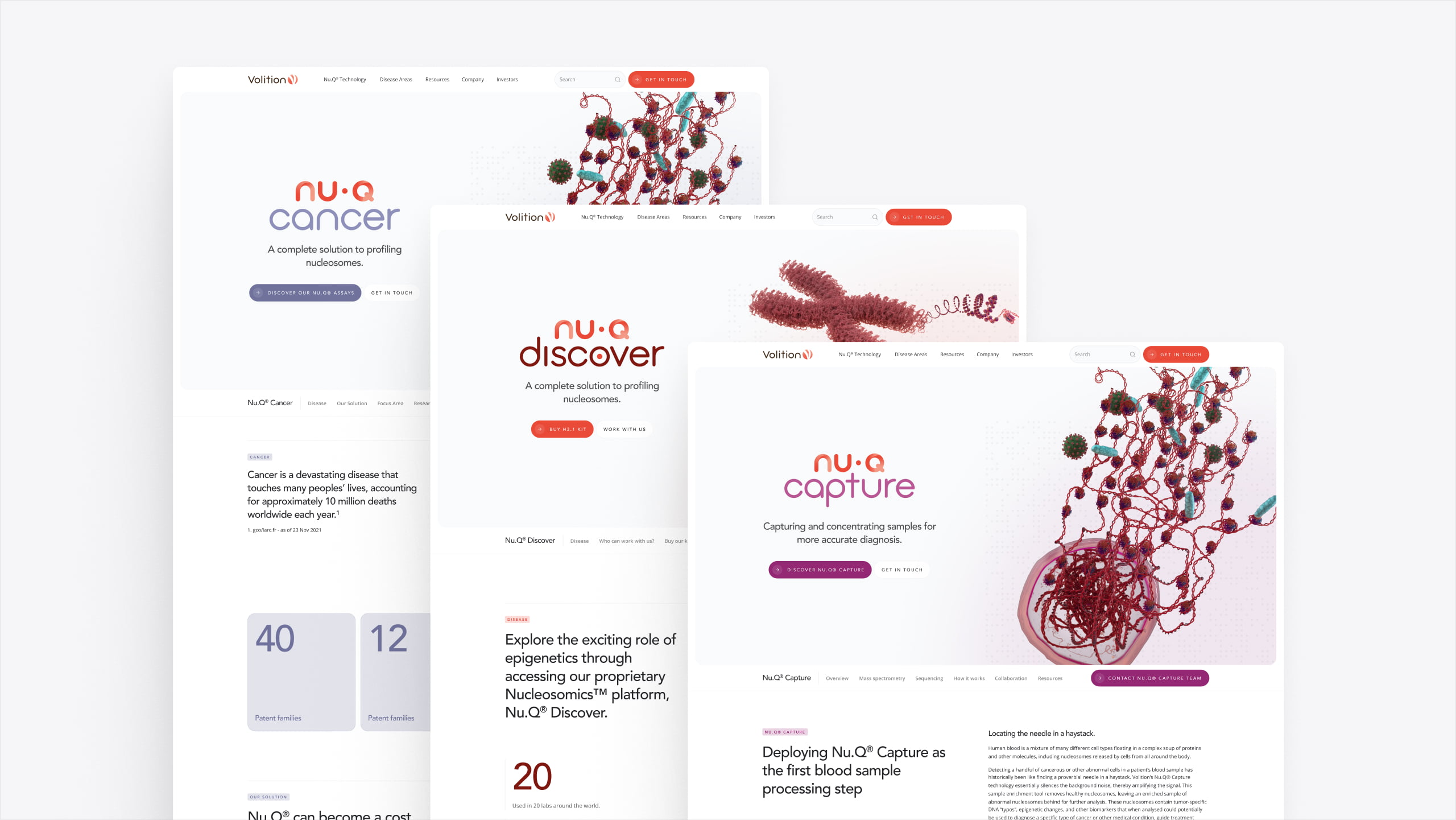
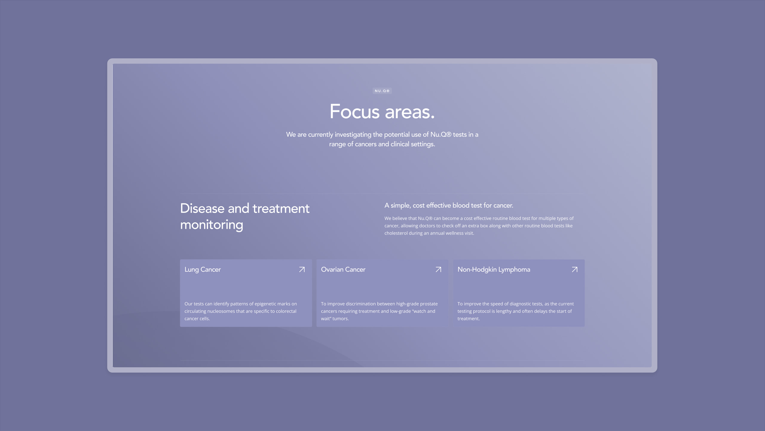


The website
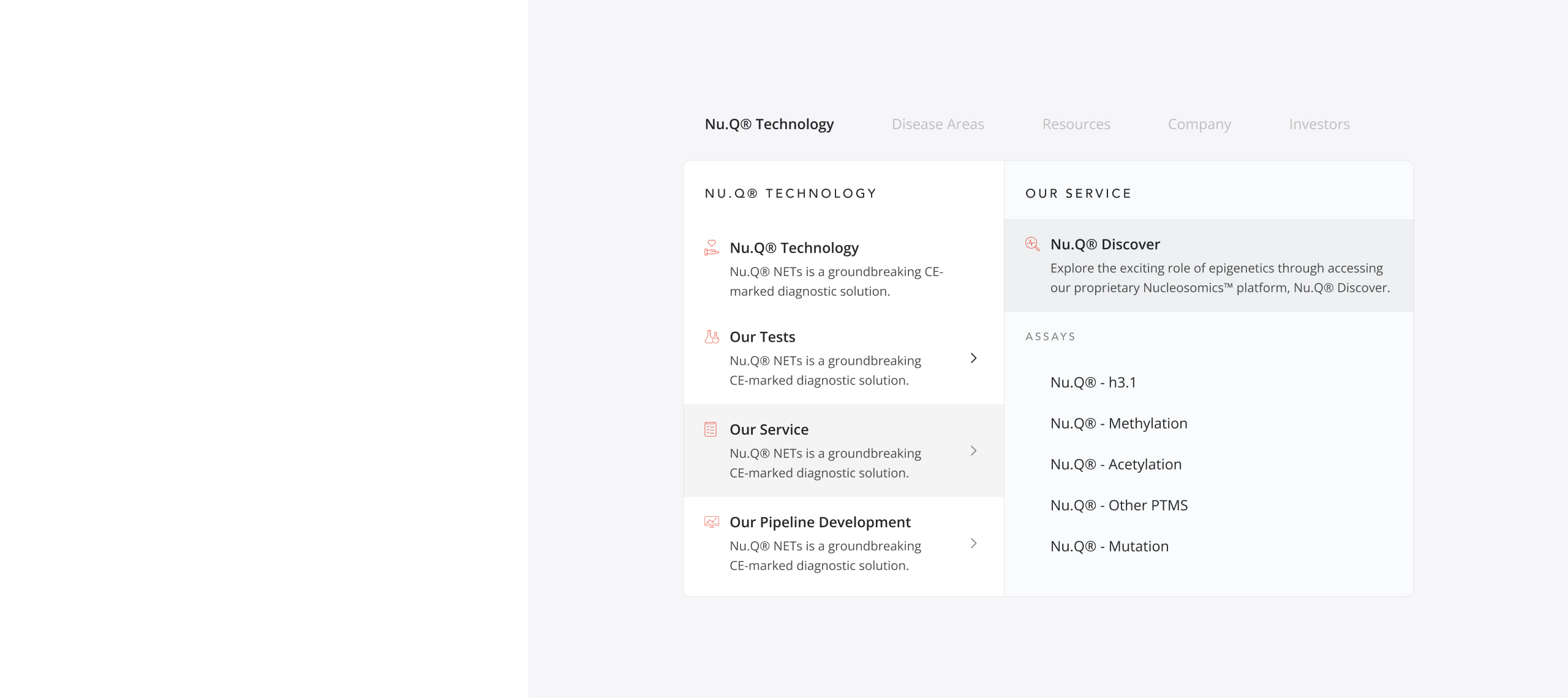
We utilised the digital strategy created by our marketing team to inform the new page hierarchy and landing page structure. By combining UX design and marketing insights, we produced the best user experience and SEO performance for Volition. We implemented a clean and user friendly navigation to ensure that content is accessible and that users are guided through to conversion.
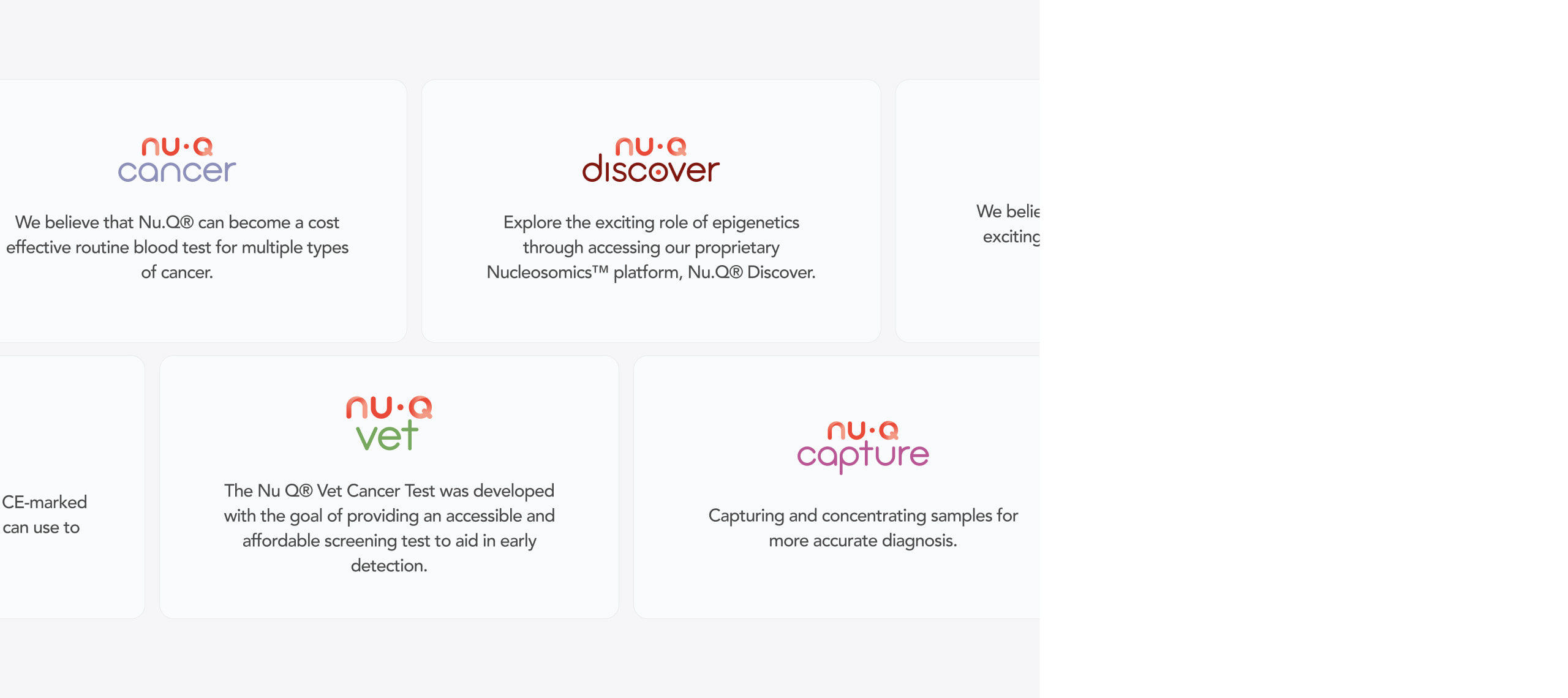
Our designers evolved Volition’s visual brand to create the impact and flexibility required for the new website design. We utilised the bright sub-brand colours to categorise content and designed a clear navigation to encourage users to land on relevant content.
As part of the wider project, we merged 2 domains into 1 new website. We implemented SEO and design best practice during this process to retain and grow keyword rankings from both domains.

Marketing & content hierarchy
One of Volition’s key complaints with their previous website was the high bounce rate. They were losing a huge percentage of the traffic they attracted and couldn’t pinpoint what was driving the issue – was it the website, the keywords they ranked for, or their messaging?
Our Digital Strategist identified that the content on their old website exclusively catered to users who already knew Volition’s product. Therefore, users who had a problem but didn’t know Volition’s product name became lost leads, which was one factor impacting bounce rates across the site.
We recommended taking a solution-focused approach on the new website. We developed a new site structure and keyword groups that were built to support Volition’s wider goals – increasing leads and reducing their high bounce rates.
SEO strategy
Improving keyword rankings and generating higher levels of organic traffic to the website was important to the success of Volition’s project. Therefore, taking a joined up approach with the SEO strategy, on page experience and messaging was critical to ensure that Volition benefited from the full impact of the improved rankings.
For the SEO strategy, our team conducted keyword research and selected keywords that the client had a statistical probability of success growing their rankings. We assigned target keywords to the content throughout the website and recommended new landing pages that would generate traffic to the website.
+
1
110
%
Increase in search engine visibility following launch
In the keyword chart above, blue bars represent positions 1-3 in Google and green bars represent rankings on the rest of page 1.
As you can see, keyword rankings immediately started to climb following the launch of the new website and SEO strategy.

