Bond Global is an embedded recruitment agency that works with innovative CleanTech, DeepTech, BioTech and Enterprise organisations to transform the planet with new technology. Their unique subscription model for recruitment provides scaling businesses rapid access to the best talent.
They challenged us to deliver a new brand strategy and identity, and create a slick new website to attract new business.
- Lead time:
- 20 Weeks
- Sector:
- Recruitment
- Target Type:
- B2B & B2C
- Website Goal:
- Reposition the business & attract new clients
- Services:
- Branding, Web Design, Web Development, Marketing Strategy, SEO, Copywriting
- Scope
- Brand Strategy
- Customer Persona Development
- Key Messaging Development
- Brand Identity
- SEO Strategy
- Adobe XD Wireframe Prototypes
- Adobe XD Design Prototypes
- WordPress CMS
- Copywriting
- Resource
- 2 x Marketing Strategists
- 1 x Digital Strategist
- 1 x Brand Designer
- 1 x Website Designer
- 1 x Website Developer
- 1 x Quality Assurance Tester
- 1 x Project Manager
- 1 x Copywriter

The challenge
Bond Global is a dynamic and innovative recruitment agency that works with some of the best global talent, however this wasn’t reflected in their existing brand or website. They challenged us to update their recruitment website design and messaging to resonate with their target clients. They were ready to reposition themselves in their market and set themselves apart from other recruitment agencies.
Alongside their rebrand and website redesign, they commissioned us to deliver an SEO strategy that would improve their rankings in search engines and enable new clients to discover them organically.

The brand strategy
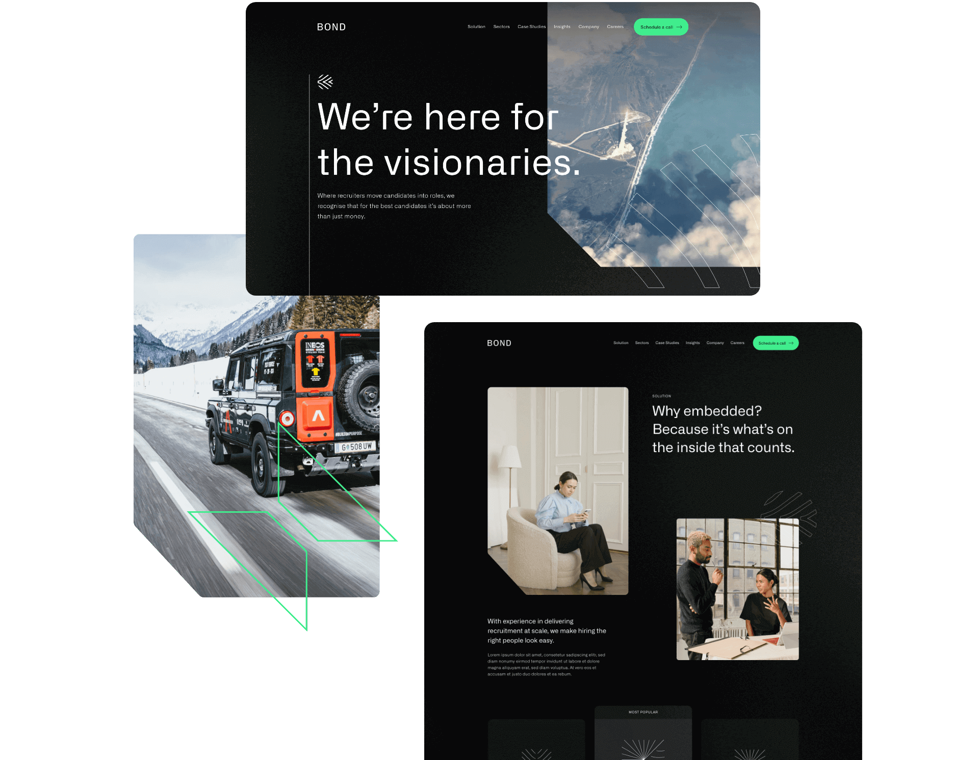
Using insights from stakeholders in the business, we created a brand strategy that is faithful to Bond’s values and attracts highly aligned clients. Their new strategy provides the central thread that connects the reason that Bond exists and the reason that their client companies exist. For example, Bond’s new key messages include bold statements like “We’re here for the visionaries” and “There’s no planet B”. These statements speak directly to their clients who work in renewables, clean energy and environmentally positive technology companies that are innovating to clean up the planet.
Bond’s refreshed messaging aligns with their target clients, reflects their USPs and provides their team with a framework of how to speak about the business and communicate in their marketing.

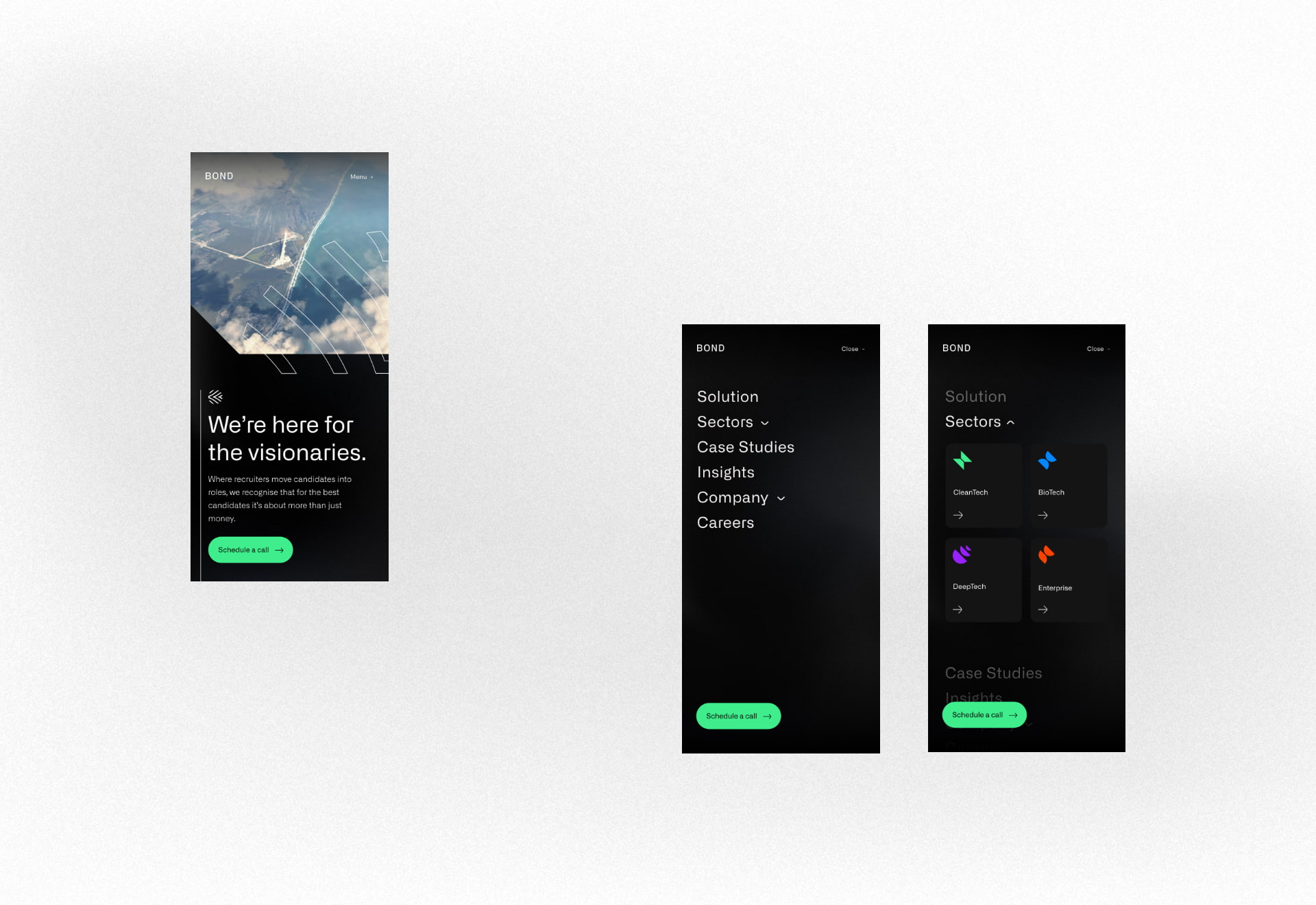
The brand identity
We evolved Bond’s existing brand identity in line with the new strategy and the businesses that they wanted to attract. The use of dark base colours with vibrant pops of colour represent their key brand themes – technology, futuristic, environmental, big picture mindset.
The final visual brand achieves a technical and futuristic feel that resonates with Bond’s clients and the work they do.
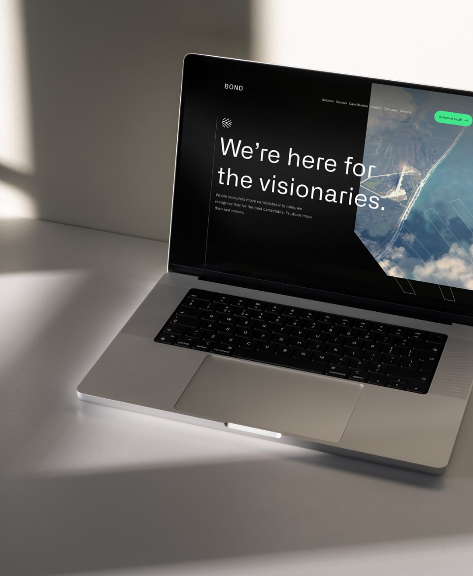
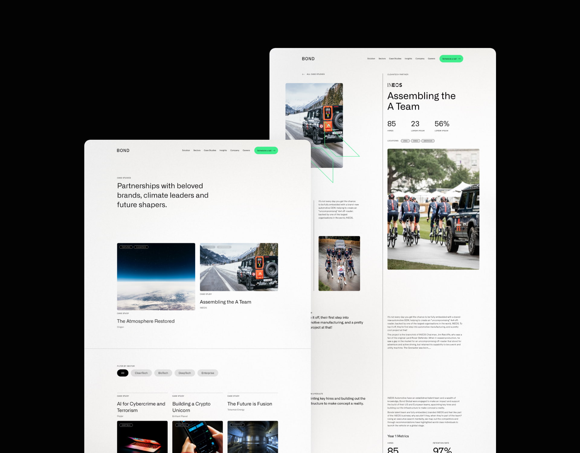
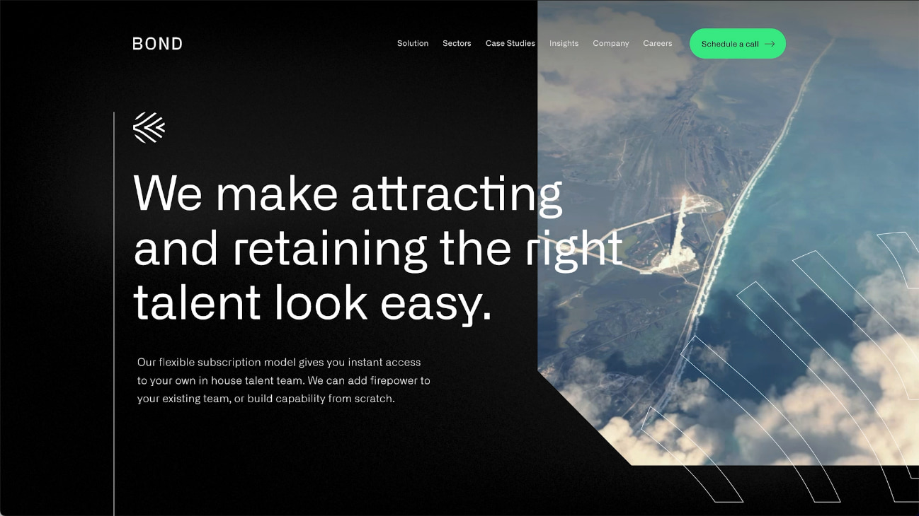
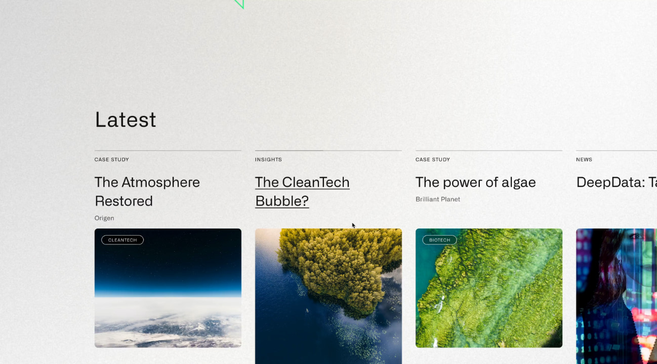
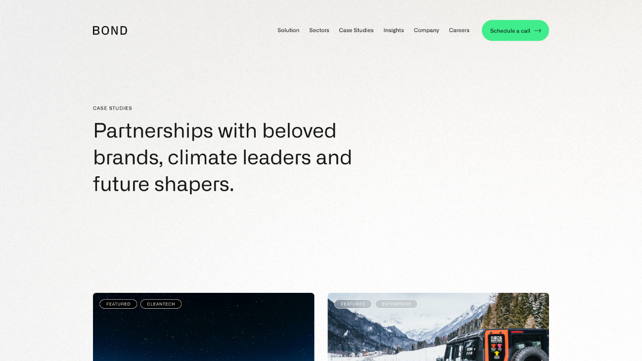
The website
Our website team created a fresh new website design that incorporated the new brand and messaging. The primary goal of the website is to attract and convert new clients, opening up a new channel of lead generation for the business.
Our digital marketing specialists created an SEO strategy that focused on increasing Bond’s search engine visibility for high value search terms, enabling them to be found by businesses looking for their services. We built and optimised the site around the SEO strategy, laying the foundations for continued growth and visibility.
Bond’s new brand identity combines colour, typography, shape, form and imagery to deliver an impactful and unique experience.
The new website design is fresh and utilises white space to heighten the impact of copy.
Bond’s new messaging framework sets them apart in their market with a clear and emotive style.
SEO strategy
Prior to the new website launch, the only keywords that the website ranked for in Google were very specific brand terms and a couple of broad terms that were buried deep into page 4 of the search results.
We focused on specific areas of Bond’s recruitment offering to secure new rankings for highly aligned keywords. This enabled them to gain greater visibility for specific terms that would generate new business without wasting resource chasing after competitive and less relevant broad terms.
+
1
425
%
Increase in search engine visibility since launch
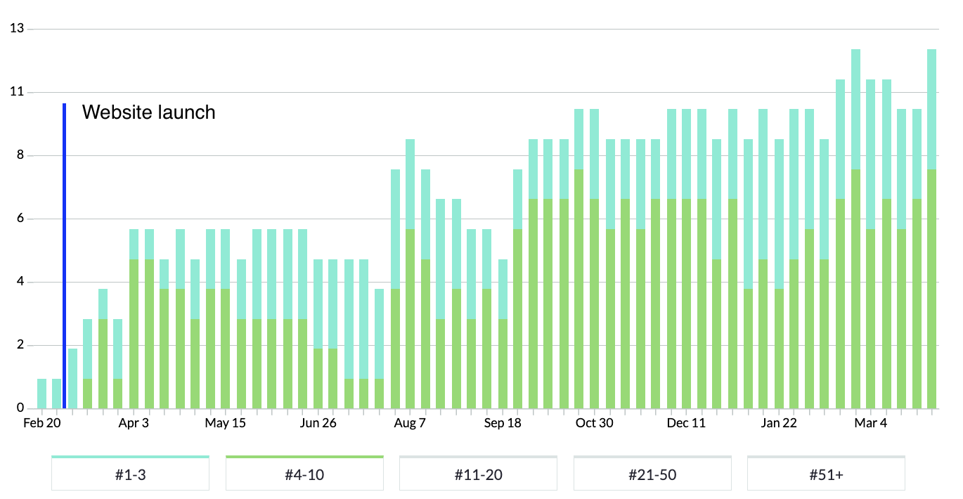
In the chart above, blue bars represent positions 1-3 in Google and green bars represent rankings on the rest of page 1.
You can see that rankings immediately rose in the week following launch and that page 1 rankings continued to grow over time.
“We worked with P&P to rebrand and build a website from scratch. We have been inundated with positive feedback on the look and feel of the Bond brand. The project management side of things and communication was first class. P&P are able to respond to passionate involvement from a client”

Related work
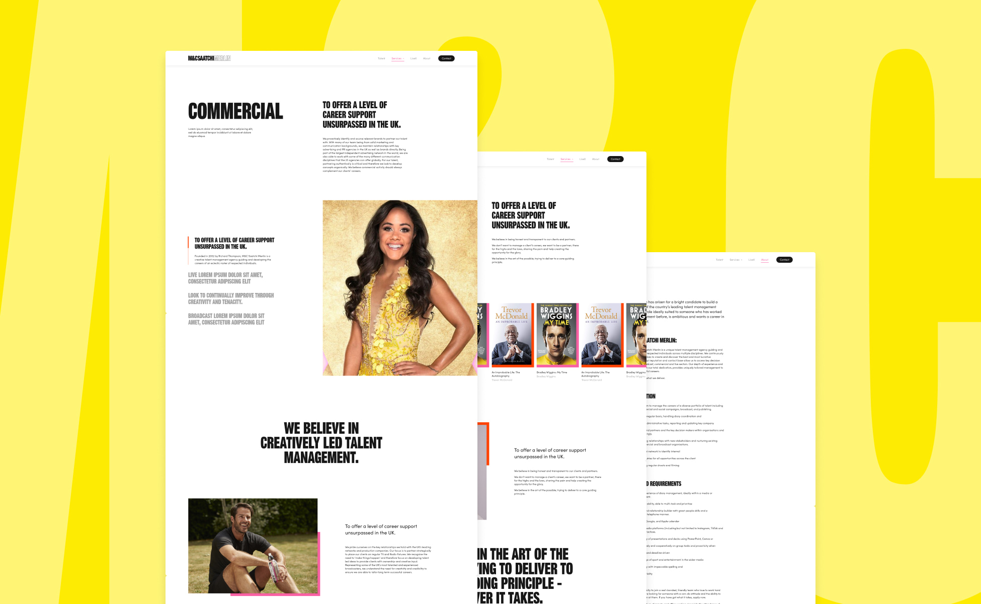
M&C Saatchi Merlin is one of the UK’s top talent management agencies, managing some of the best talent in the industry.
They challenged us to deliver a bold new website that would showcase their offering and provide increased content management flexibility.
- Lead time:
- 12 weeks
- Sector:
- Entertainment & Sport
- Target Type:
- B2B & B2C
- Website Goal:
- Refreshed design & an improved user experience
- Services:
- Digital Marketing, Web Design, Website Development, SEO
- Scope
- Adobe XD Wireframe Prototypes
- Adobe XD Design Prototypes
- Aesthetic Interaction
- WordPress Development
- Digital Strategy
- SEO
- Resource
- 1 x Website Designer
- 1 x WordPress Developer
- 1 x Digital Marketing Specialist
- 1 x Quality Assurance Tester
- 1 x Project Manager
The challenge
Saatchi were looking for a dynamic new website design that reflected the high energy and momentum of the agency. They wanted their new website to include movement and vibrant use of their brand.
The Saatchi team needed increased control over content in the CMS and the ability to quickly create new pages and pivot content based on the campaigns and events that were topic for their clients.
Our approach
We delivered a powerful new website design that used dynamic animations and interaction aesthetic to elevate the website and provide an engaging user experience. The design style encourages users to explore site content and guides the user journey through to conversion, highlighting call to actions for the user.
Our developers coded the site using WordPress to provide the high level of content control that the team needed. We coded custom designed components that would load quickly and provide a high quality feel when using the website.
SEO
We delivered an SEO strategy to guide the website structure and improve search engine rankings for high value non-branded keywords. By selecting keywords that Saatchi have the best statistical chance of ranking highly, we helped Saatchi to generate valuable new website traffic and new enquiries.

5 Stars for their professionalism, quality and responsiveness.

Related work
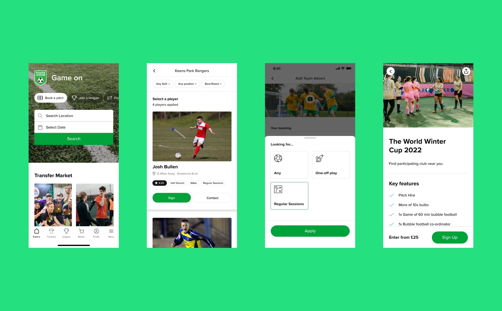
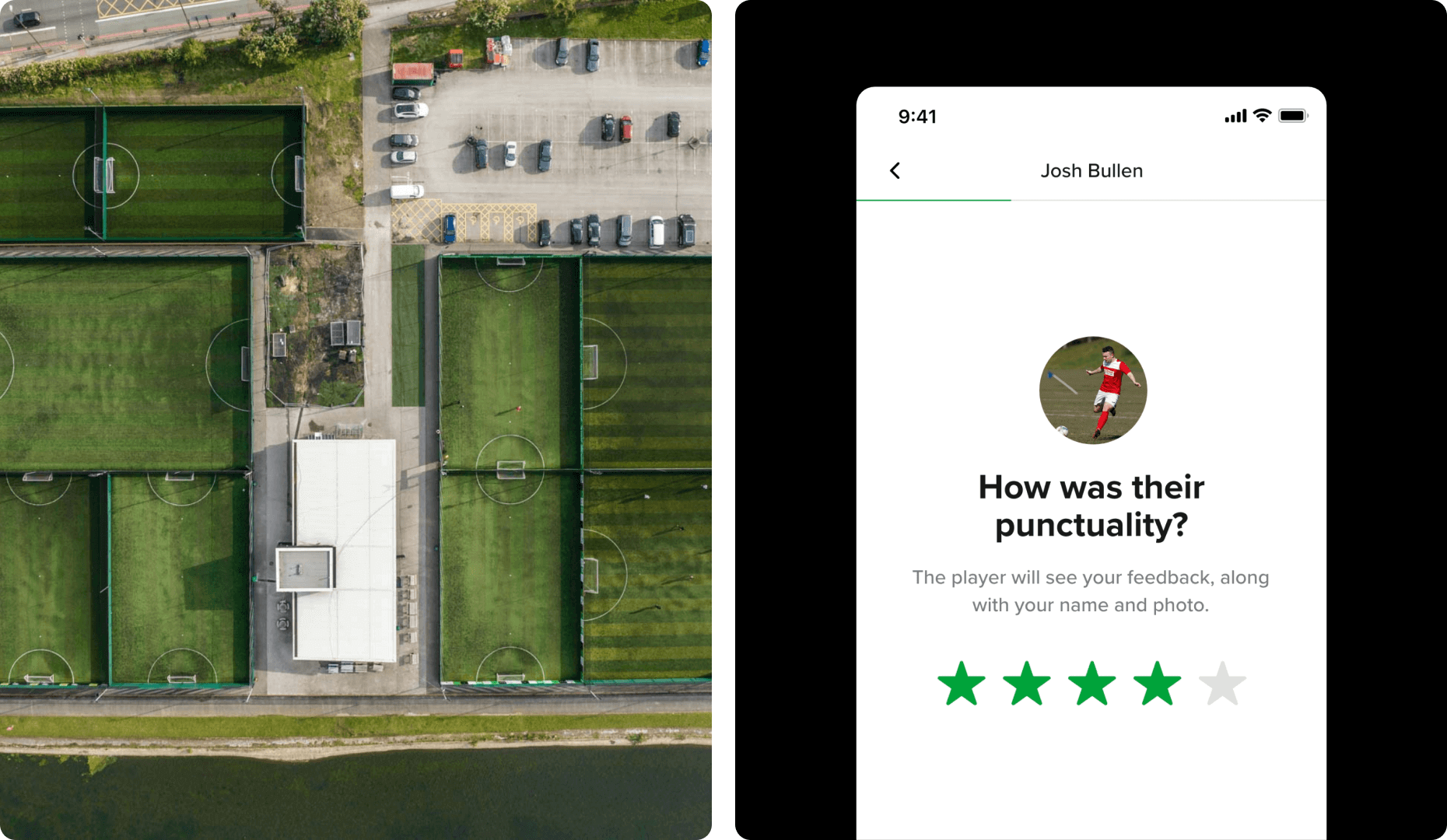
Powerleague is the UK’s largest booking platforms for sports pitches. Their focus has primarily been football pitches, however they also provide other facilities, pitches and courts, as well as venue hire, parties and events.
They were ready to take their business to the next level and invest in their digital customer experience by undertaking a digital transformation process.
- Lead time:
- 10 Months
- Sector:
- Sport & Leisure
- Target Type:
- B2B & B2C
- Demographic
- Sport Players, Parents & Corporate
- Website Goal:
- Increase Bookings & Consolidate Business
- Services:
- Digital Transformation, UX & UI Design, Mobile App Development, Web Design, Web Development, WordPress, Digital Marketing
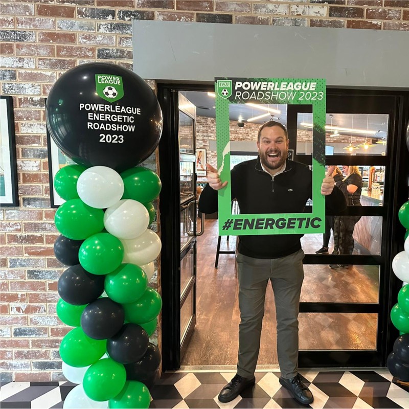
“1st big leap forward in terms of digital transformation at Powerleague with many more steps to come. Exciting times and of course all about making our customers lives easier and giving them quick and easy bookings with a host of leading edge enhancements to follow. ⚽️⚽️⚽️”
The challenge
Powerleague had grown beyond the capabilities of their existing digital infrastructure. They challenged us to assess their technology requirements and deliver a new digital ecosystem that provided a seamless omni-channel user experience to their customers. It needed to be innovative, secure and scalable.
The client had an aggressive growth strategy, with plans to rapidly expand to new clubs and territories. They recognised the need for digital scalability in their UX & UI, integrations and technology.
We were hired to deliver the digital transformation of Powerleague’s technical infrastructure including their international customer-facing website, booking flow, mobile app, and the complex integrations that passed data between systems.
- Scope
- Digital Transformation
- Adobe XD Wireframe Prototypes
- Adobe XD Design Prototypes
- UX Design
- WordPress Development
- React Native Development
- API Consultation & Mapping
- Complex API Integrations
- Website & Booking Flow
- Mobile App
- Multi-territory & Multilingual
- SEO Strategy
- Resource
- 1 x Creative Director
- 2 x UX / UI Designers
- 1 x Technical Lead
- 2 x WordPress Developers
- 2 x Backend Developers
- 3 x React Native Developers
- 1 x Digital Marketing Specialist
- 2 x Quality Assurance Testers
- 1 x Technical Project Manager
Discovery and technical review
With tens of thousands of customers each month and millions of pounds in revenue passing through the website and app, Powerleague needed a robust technical solution that would also fulfil their marketing requirements. We assessed Powerleague’s existing technology and made technical recommendations based on the objectives of their business, as well as the scalability and longevity of prospective solutions.
Our technical team selected WordPress as the website CMS for the customer-facing website. React Native was selected to deliver an Android and IOS mobile app, and Powerleague retained their existing custom eCommerce platform. Each of these systems were delivered as part of a headless architecture that leveraged Powerleague’s backend database to feed the interfaces with consistent live data.
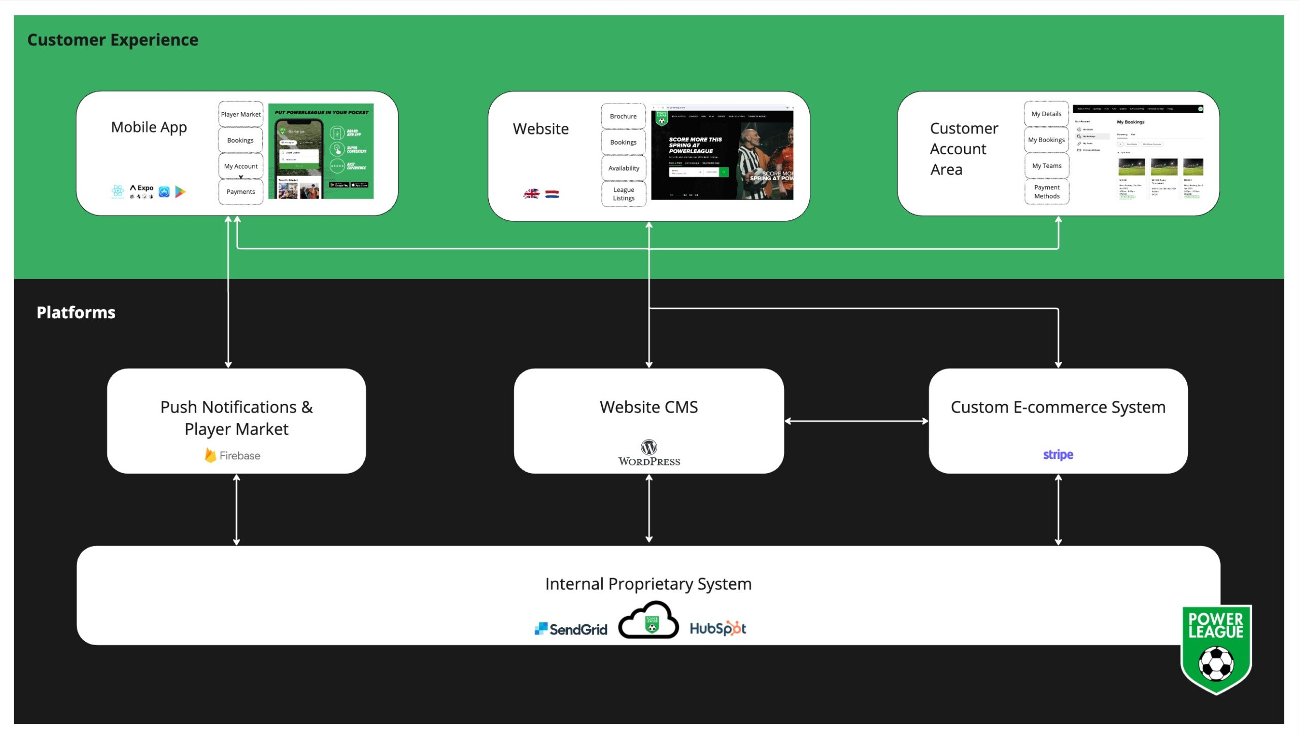
The setup was designed to automate as much as possible by integrating with Powerleague’s backend database. The website and mobile app dynamically pull information from the booking system based on the user’s search, keeping load speeds high while streamlining the user experience. This approach enabled us to offer dynamic search results where users only see results that are available for booking, reducing the cognitive burden and increasing conversion rates.
Interface research and UX
We started the UX design process with a research phase where our UX team explored complex booking flows within and outside of Powerleague’s industry. We focused on flows that had complex search and booking requirements and managed large amounts of data.
Using these insights, we created a comprehensive set of website and mobile app designs. Our team transformed the designs into clickable prototypes for the client to test and review.
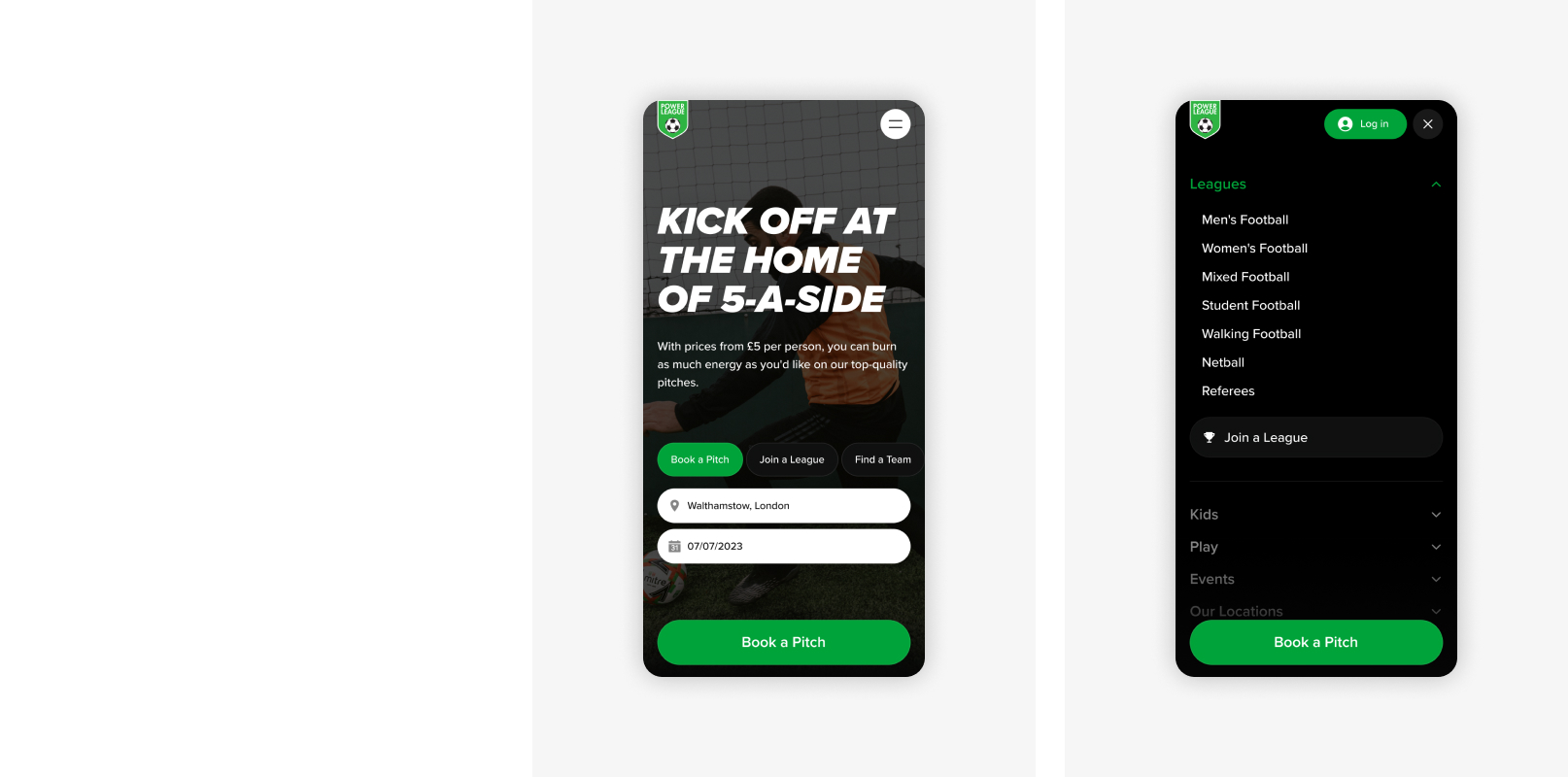
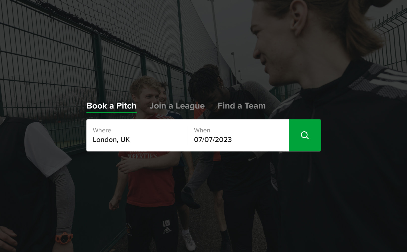
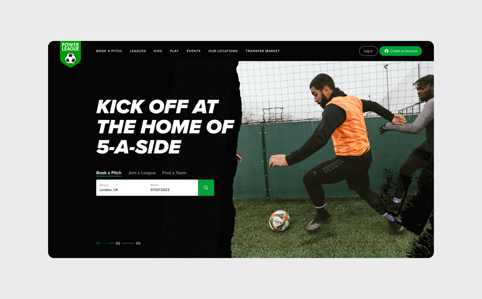
The website designs consolidated 2 websites into a single site, making Powerleague the largest pitch booking website in the UK. The new design improved the accessibility of information and the overall user experience, reducing the number of clicks between search and purchase. The new website focused on scalability, automation, and driving performance improvements – increasing the number of bookings and delivering a market leading design.

The search
The new search function uses IP detection to search for pitch booking venues near the user, reducing the steps required to find a pitch. It automatically pulls the 2 most similar venues alongside any selected venue, enabling users to compare within a single booking flow window.
Powerleague has a different booking flow and available booking horizon for each type of booking and location. The website and app incorporate these tailored flows, guiding users through the requirements and availability for their booking. For example, Powerleague only accepts football pitch bookings up to 10 days ahead and this is reflected on the football booking flow and calendar view.

Managing the data
Powerleague’s website needed to manage a colossal amount of data, with millions of potential combinations of venues, pitches and time slots.
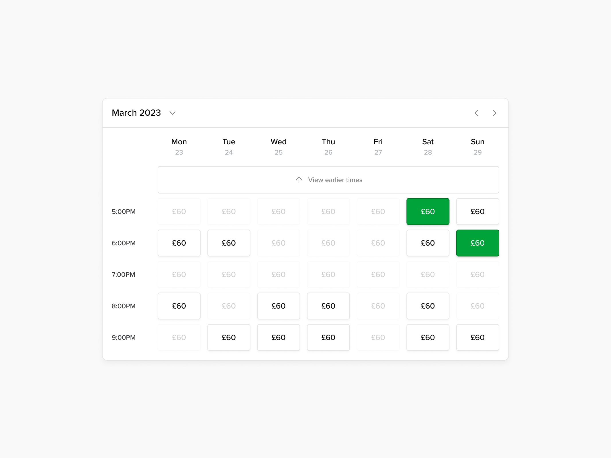
Finding the best time slot
Customers can easily compare time slots, availability and pricing.
The booking flow
We display pricing in a calendar view that enables users to see the cost of different time slots and select the best deal for them. The majority of bookings are made for peak time slots so we automatically show these first.
To encourage repeat business, users are able to block book during the checkout, increasing the value of the booking for Powerleague and simplifying the booking process for users.
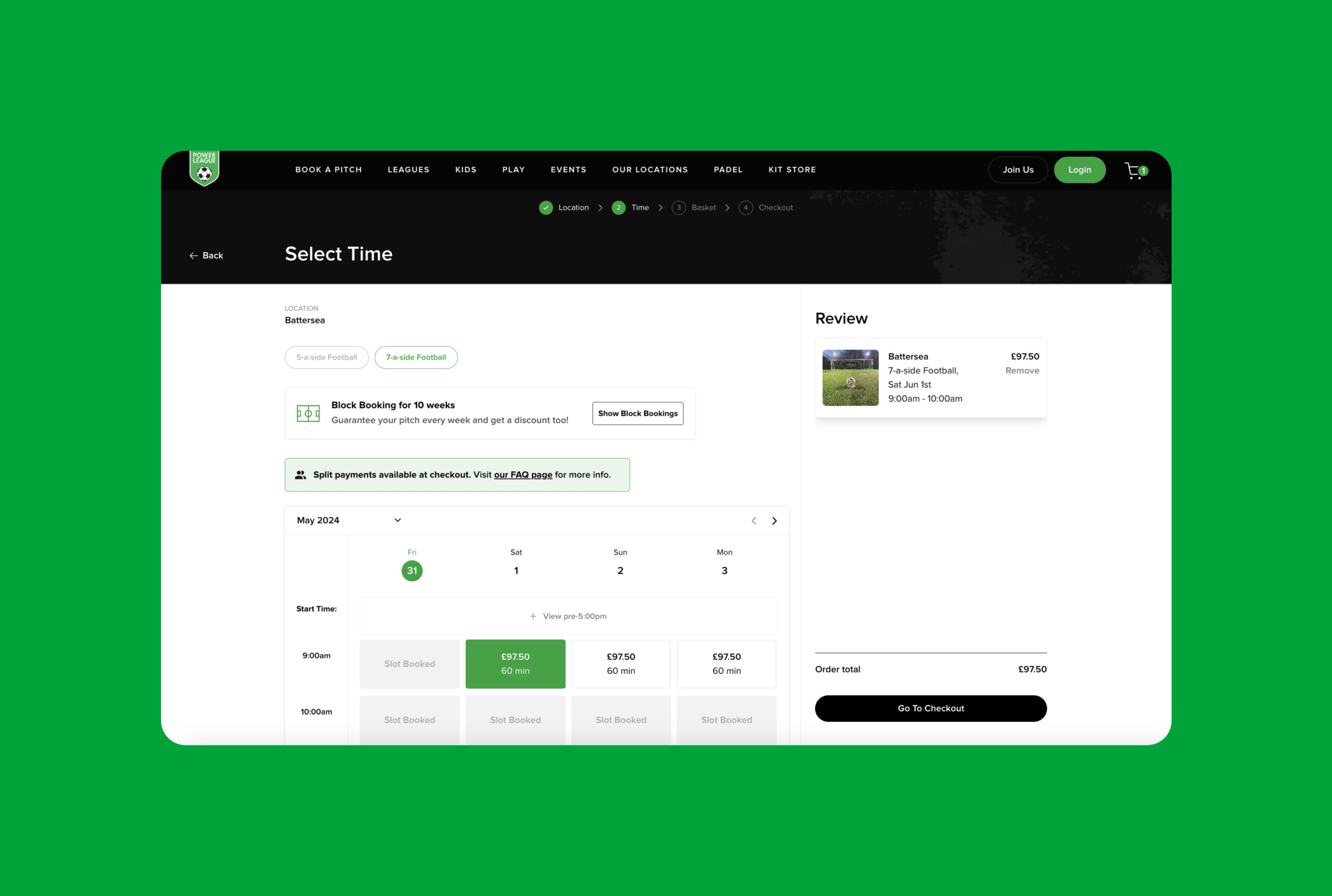
Split payments
The majority of Powerleague’s bookings are made by an individual on behalf of their team and Powerleague were aware of the offline booking friction that resulted from the organiser chasing teammates for money. Our team introduced a split payments function that enables the payment to be divided between teammates at the checkout – taking the financial pressure off a single individual.


API consultation & integration
To deliver the strongest user journeys, the booking software API needed to be customised. We planned the website functionality and created a brief outlining the endpoints that needed to be delivered by the booking software team.
We collaborated with Powerleague’s software team to develop new endpoints and ensure that information was seamlessly passed in both directions between the app, website and booking system.
The brand
We extended the brand for digital use, creating shape form and animations that can be used across the site.
API & cache
The website is cached to deliver fast results and the cache is updated every 2 hours to ensure data is current.

The menu
The mega-menu was structured to combine the key content from both websites, ensuring that the user journey is smooth and content is accessible.

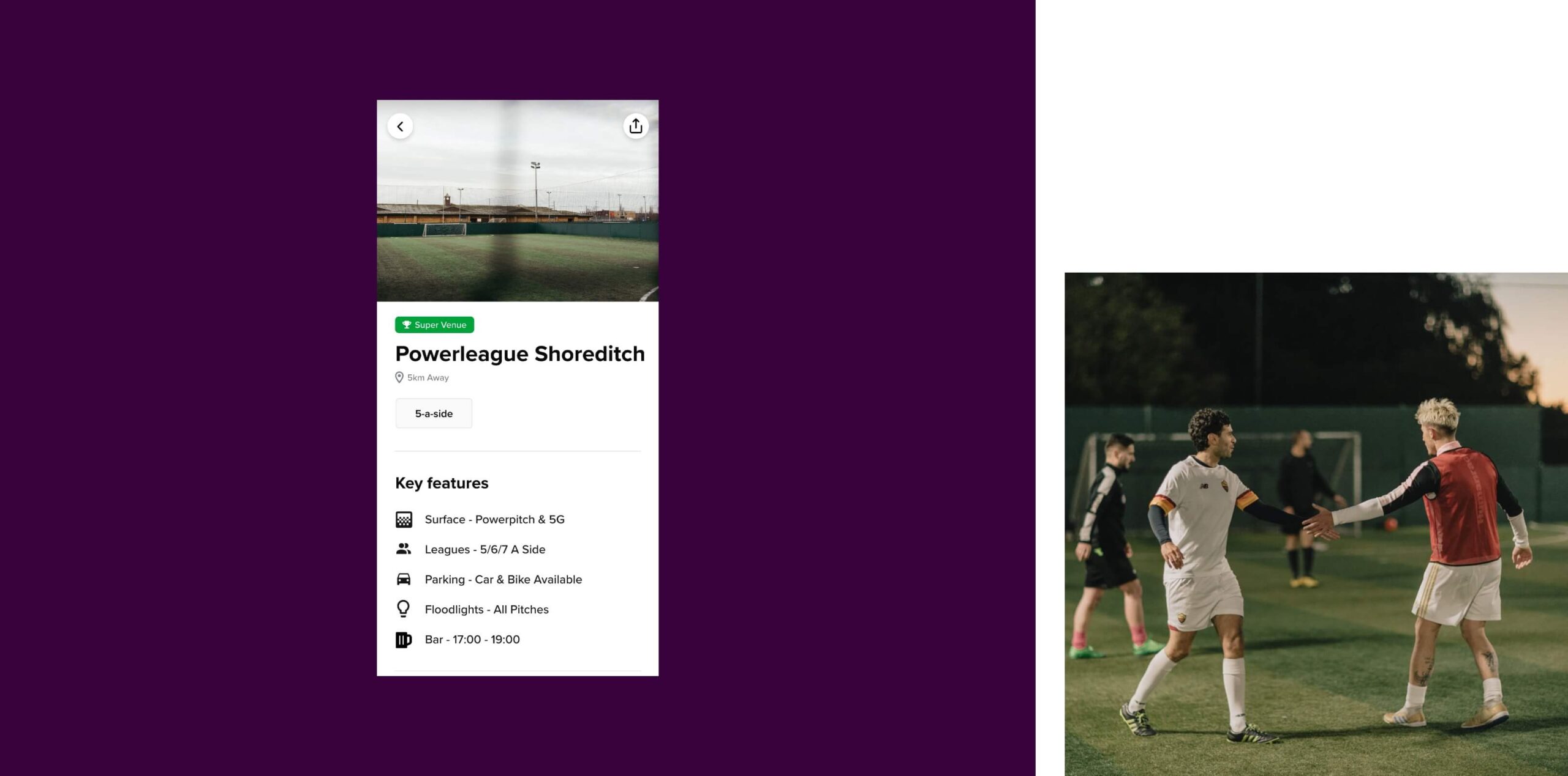
Map view
Visitors can use the map search to find a venue near them.
Going Headless
We delivered Powerleague’s project using a headless approach. We utilised their backend booking system as the backend engine for the site data and WordPress as the ‘head’. WordPress gives Powerleague a very high level of customisation and content management while the backend booking system enables us to effectively manage data and bookings.
This approach moves Powerleague towards an omni-channel offering, where the mobile app and website have distinct user journeys, functionality and user interfaces but pull data from a consistent data source. This enables users to have a consistent experience across devices while benefiting from different interfaces.
The headless solution enables us to maintain rapid load speeds and a high level of security, despite the large amount of data being handled.
Multi-territory
The new website includes content for 2 territories, the UK and the Netherlands, and the website is available in English and Dutch.
Our developers coded IP detection to direct users to the appropriate content based on their location, and our technical SEO team have optimised the website to ensure that the correct website content ranks in regional search engines.
Powerleague have ambitious expansion plans and the new website sets them up for future growth and launches in new territories.

The mobile app
A ginormous amount of data needed to be available to customers via the mobile app, including venue details, availability, variable pricing and event information. Handling this information on a small mobile screen was a challenge. We needed to ensure that the user experience was simple and intuitive, while also delivering the full range of functionality.
In the research phase, we explored complex mobile booking experiences across a range of industries including travel, hospitality and entertainment. We focused our research around search functionality, search results, filters, and content hierarchy, which enabled our design team to combine innovative mobile design with industry best practice to deliver a tremendous amount of data and functionality in an intuitive way for Powerleague’s customers.
Our team developed the app in React Native and integrated with Powerleague’s booking software to present users with the data they needed as part of their booking experience.
New mobile functionality
Powerleague’s new mobile app hosts additional features that are exclusive to the app.
Football Leagues were introduced alongside a Player Marketplace where football players can apply to join teams, and teams can place ads for players then manage applications and rate their performance.


Marketing
Powerleague were keen to move towards a campaign based marketing strategy and needed a website that would provide the dexterity to create new content in line with campaigns. They needed full content control and the ability to move quickly.
We delivered the website on WordPress which enables their team to manage and create new content independently.
SEO
Our team delivered an SEO strategy that was used to create and optimise the new website, setting Powerleague up for keyword growth in search engines.
Related work
Burns Sheehan is a recruitment agency in London that works in the tech industry. They focus on creating value within the tech community, regularly hosting events and providing opportunities to upskill.
The team was ready to take their website to the next level by developing their marketing strategy and undertaking a full redesign process.
- Lead time:
- 10 Weeks
- Sector:
- Recruitment
- Target Type:
- B2B & B2C
- Website Goal:
- Improve user experience & represent brand values
- Services:
- Web Design, Marketing Strategy

- Scope
- Adobe XD Wireframe Prototypes
- Adobe XD Design Prototypes
- Customer Persona Development
- Key Messaging Development
- Design to Development Hand Over
- Resource
- 1 x Website Designer
- 2 x Marketing Strategists
- 1 x Project Manager
The challenge
Burns Sheehan challenged us to redesign their recruitment website by transforming their stakeholder vision into an engaging website with a community feel.
To best serve their audience, Burns Sheehan recognised that they needed to refine their marketing and communication strategy. Collaboratively, we defined their audience personas and created a key messaging strategy for each customer type.
Our approach
We collaborated with the Burns Sheehan team to define their target audience personas and create a key messaging strategy. We used the strategy to guide the new website structure and improve alignment with their target audience.
Our designers created an interactive new website design that positioned Burns Sheehan as the leader in their sector. We handed the completed designs over to Burns Sheehan’s development team, briefing the team on the animations and interactive elements throughout the site.

Marketing strategy
Working closely with the Burns Sheehan team, we created battle cards to represent the goals, challenges and key messages for each customer persona. This enabled Burns Sheehan to consolidate their understanding of their clients and create an effective communication strategy for each customer.
The battle cards act as marketing cheat sheets to facilitate effective and consistent communication across the team when creating and posting content. Burns Sheehan also introduced the battle cards into their onboarding process for new starters to bring them up to speed with their clients and the ways the business helps them achieve their goals.
Job search
We created a dynamic job search that uses a sentence structure to help candidates find job opportunities.
Brand implementation
We worked closely with the Burns Sheehan marketing team to faithfully represent their brand in the new website designs.
Building a community
We created a content hub and event showcase area on the website to support Burns Sheehan’s marketing strategy.

“We came to Plug & Play looking for help designing and rebranding our website at Burns Sheehan. They educated us through every stage of the process from wireframes, to SEO optimisation, to helping us produce audience personas for copywriting. They were always on hand to take on board our feedback and iterations and we’re really pleased with the end result.”
Related work

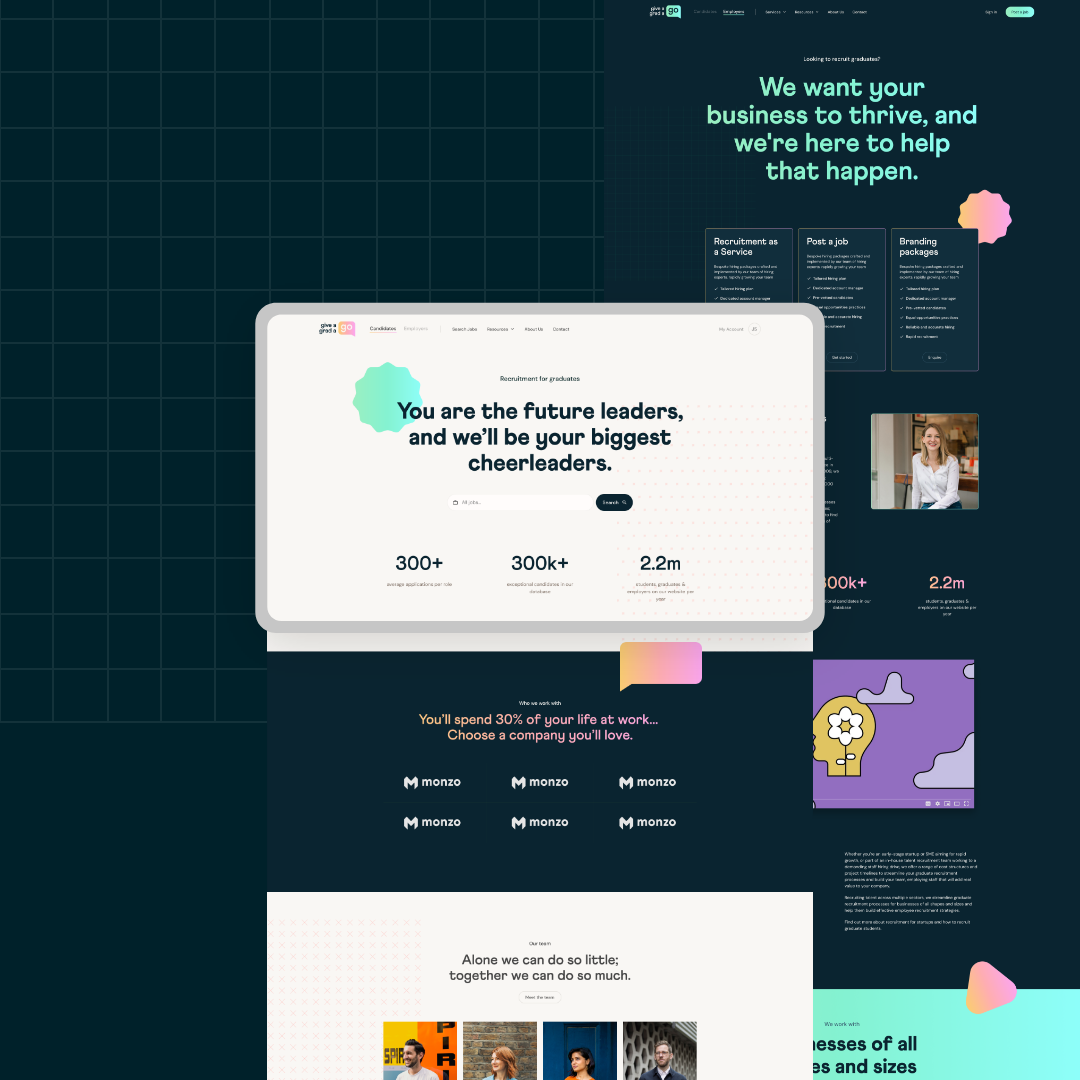
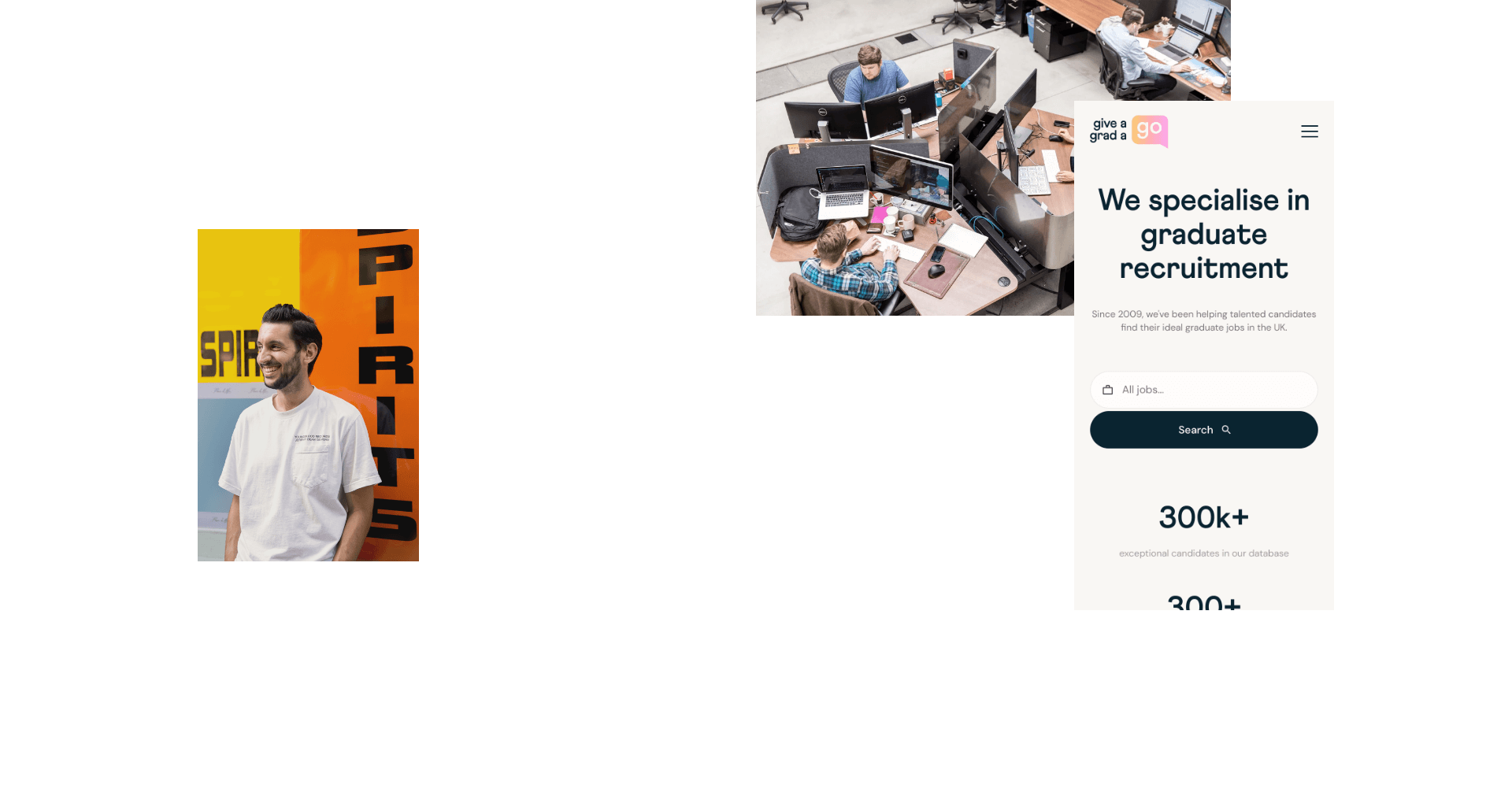
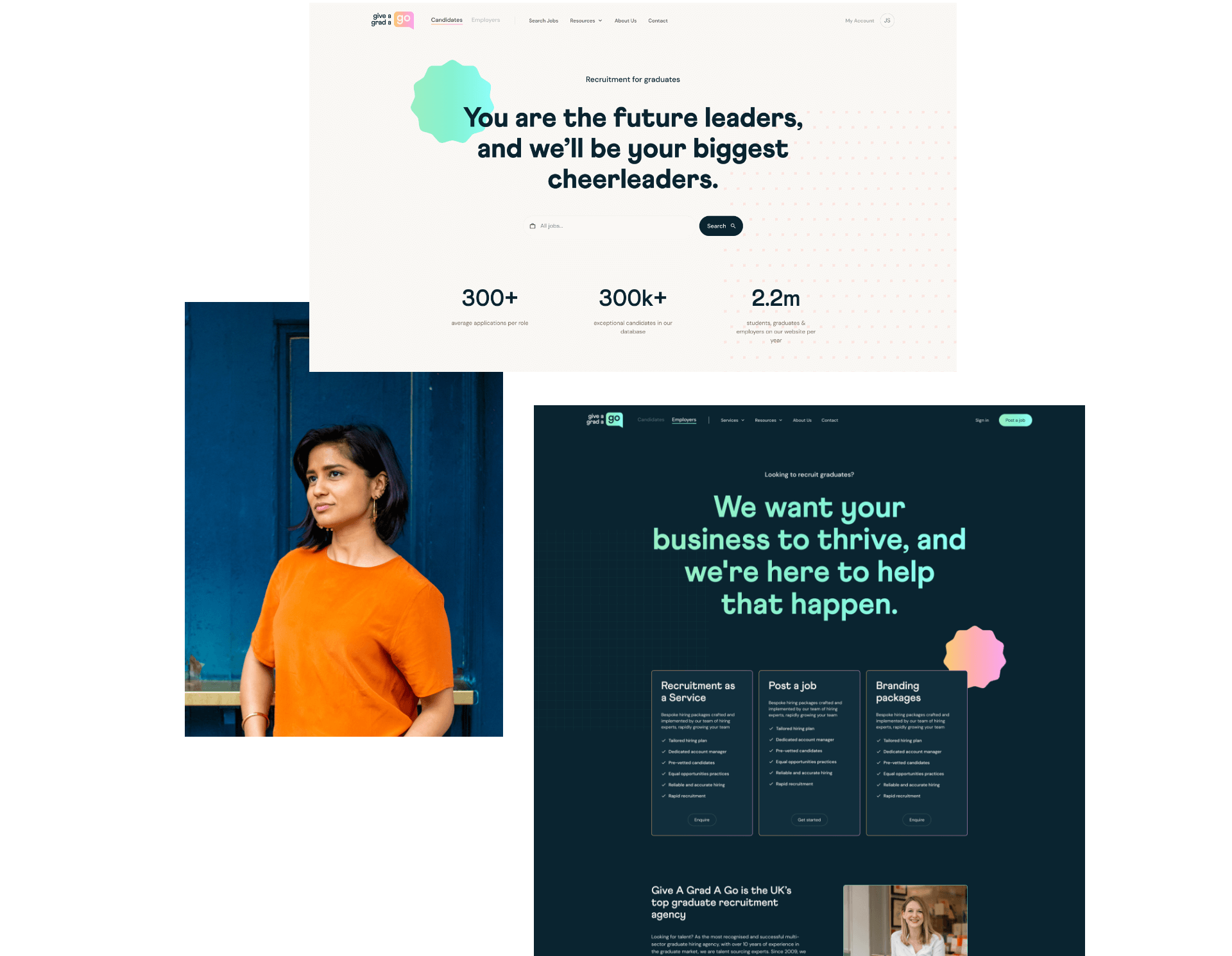
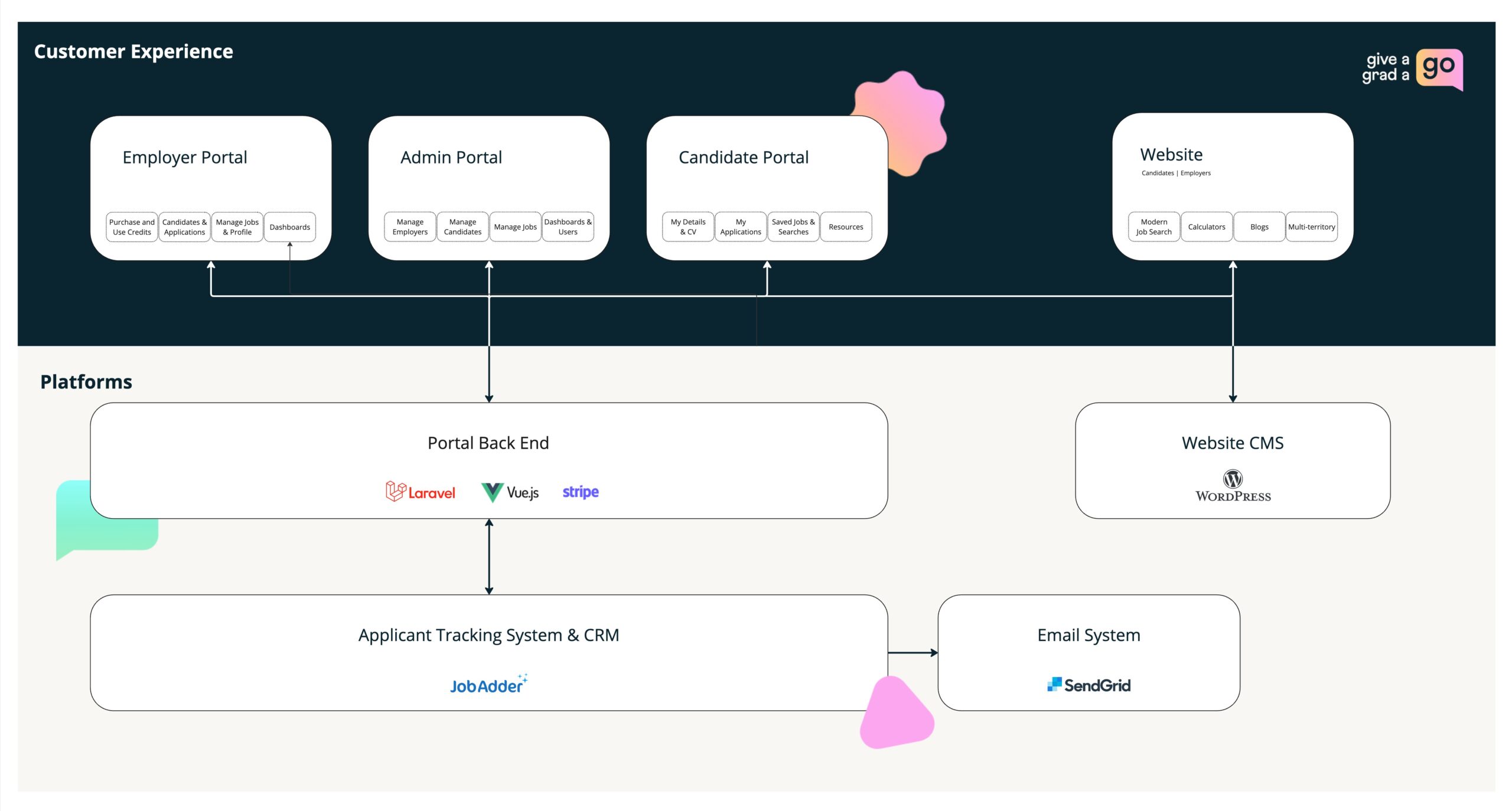
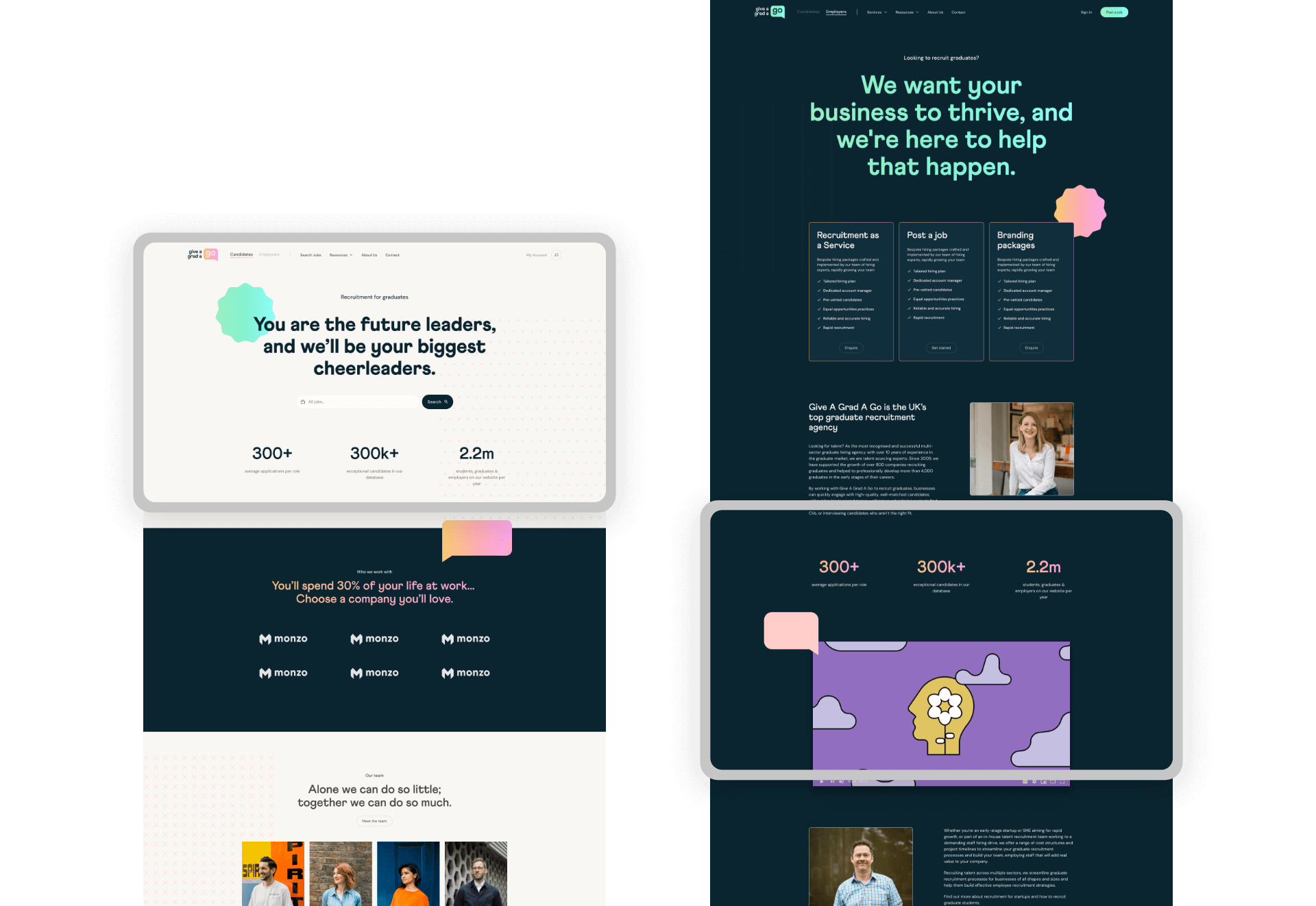
Give A Grad A Go is a global graduate recruitment agency that challenged our team to completely overhaul their digital infrastructure and marketing. They needed help to enable their team, expand their market share and elevate their customer experience.
We delivered a new brand, website and marketing strategy, as well as a custom self-service jobs portal.
- Lead time:
- 28 weeks
- Sector:
- Recruitment
- Target Type:
- B2B & B2C
- Demographic
- Employers & Graduate Candidates
- Website Goal:
- Increase pool of employers and graduates, improve Google rankings, enable marketing team
- Services:
- Digital Transformation, Branding, Digital Marketing, Web Design, Web Development, eCommerce, Jobs Portal, WordPress, Laravel

“We’ve had a brilliant experience working with Plug & Play — I wouldn’t have trusted this project to any other of the agencies we initially spoke to.”

The challenge
Give A Grad had ambitious growth targets and were ready to rethink their customer experience and utilise beautiful design and high performance technology to achieve their objectives.
They challenged us to create a new brand identity and launch a sector leading recruitment website that would showcase their offering and attract graduate employers and job seekers with an effective marketing strategy.
Give A Grad also partnered with us to deliver a self-service jobs portal that would enable them to tap into a new part of the recruitment market. The website and jobs portal needed to integrate seamlessly to deliver the best user experience to job seekers.
- Scope
- UX & UI Design
- Adobe XD Wireframe Prototypes
- Adobe XD Design Prototypes
- UX Design
- WordPress Development
- Laravel Development
- WordPress Website
- Multi-territory
- Jobs Portal
- International SEO Strategy
- Brand Identity
- Digital Transformation
- Resource
- 1 x Lead Designer
- 1 x UX Designer
- 1 x Brand Designer
- 1 x Technical Lead
- 1 x Laravel Developer
- 1 x WordPress Developer
- 1 x Digital Marketing Specialist
- 1 x Quality Assurance Tester
- 1 x Project Manager

Digital transformation
The project involved a number of interfaces and required a complete overhaul of Give A Grad’s technology. Our team created a digital transformation roadmap and strategically selected technology to meet the current and future needs of the business.
SEO
Give a Grad A Go already had an established digital footprint in the UK and Australia and ranked for a variety of high value keywords. Our team delivered an SEO strategy that would take their search engine rankings to the next level by growing existing rankings and expanding their keywords targets.
+
1
51
%
Increase in UK search engine visibility following launch
+
1
42
%
Increase in Australian search engine visibility following launch
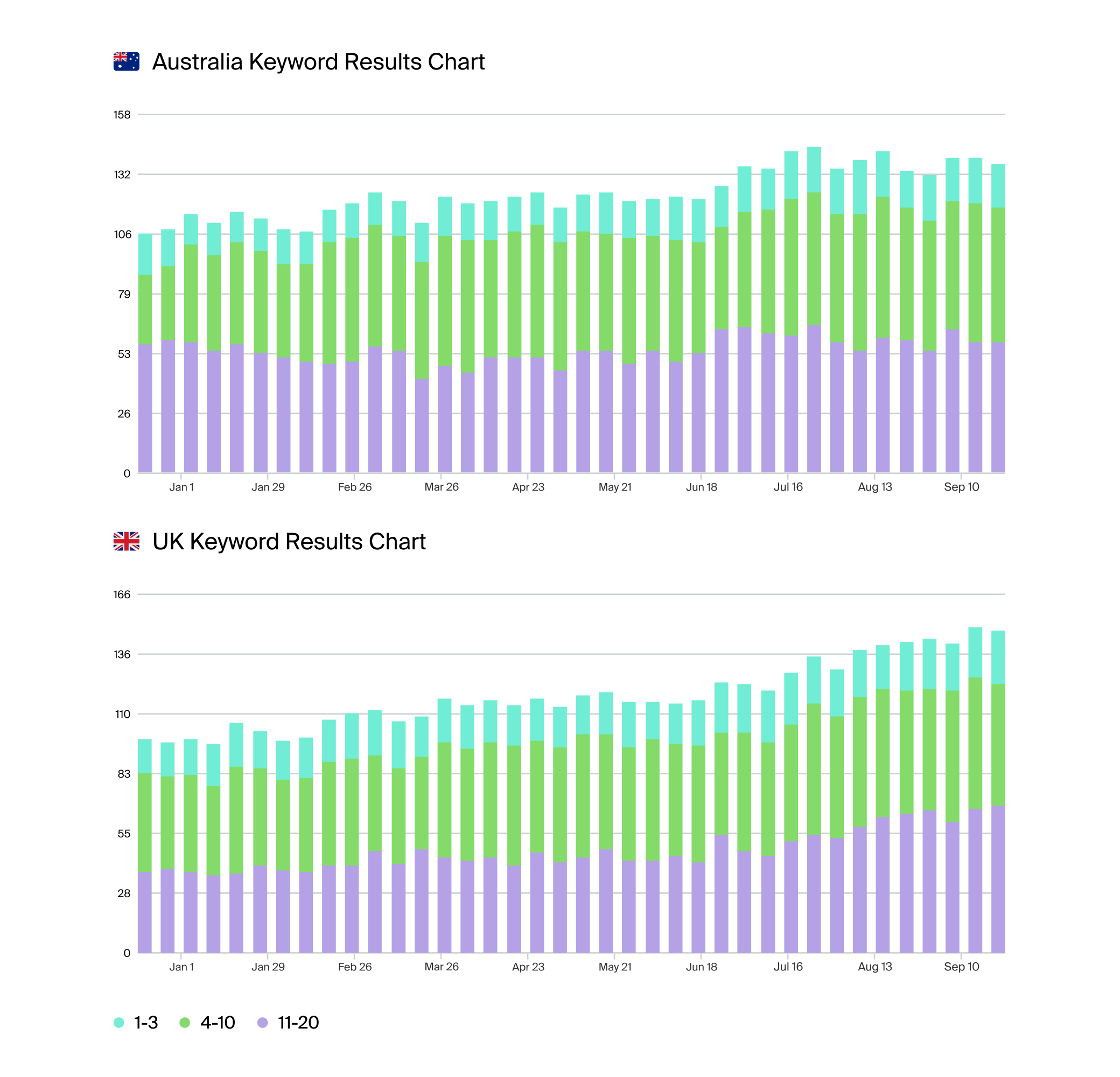
The charts above show Give A Grad A Go’s keyword rankings following the new website launch. The blue bars represent positions 1-3 in Google, green bars represent rankings on the rest of page 1, and purple bars represent page 2 rankings.
The international website
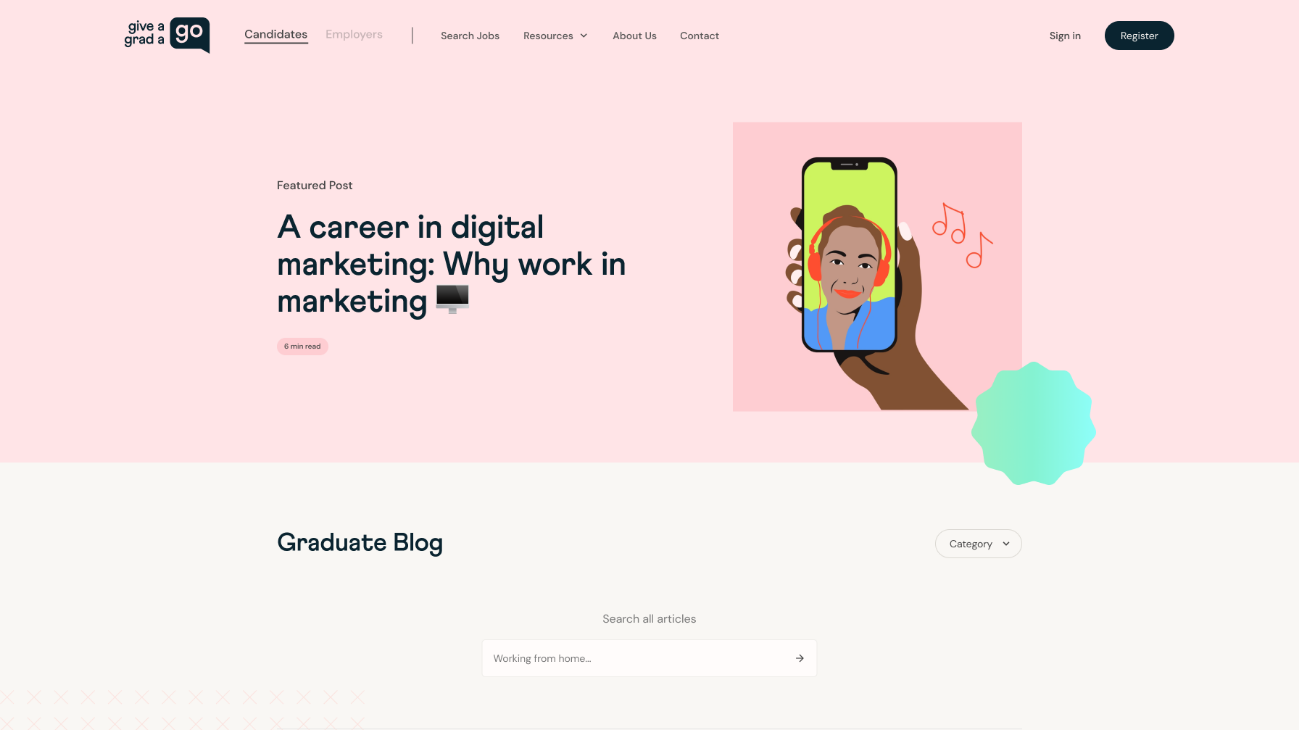
The new website design specifically targets graduates, utilising the new brand identity to create a playful and fun design that aligns with Give A Grad’s target audience.
We developed the website in WordPress with 2 territories to target the UK and Australia. Each territory has optimised regional messaging and a regional SEO strategy to maximise reach, discoverability and conversion rate.
Resource hub
We grouped articles into user friendly guides that provide a continuous user journey that encourages content consumption and keeps users on the site.
Design style
We created a playful website design that would appeal to Give A Grad’s target demographic.
Job search
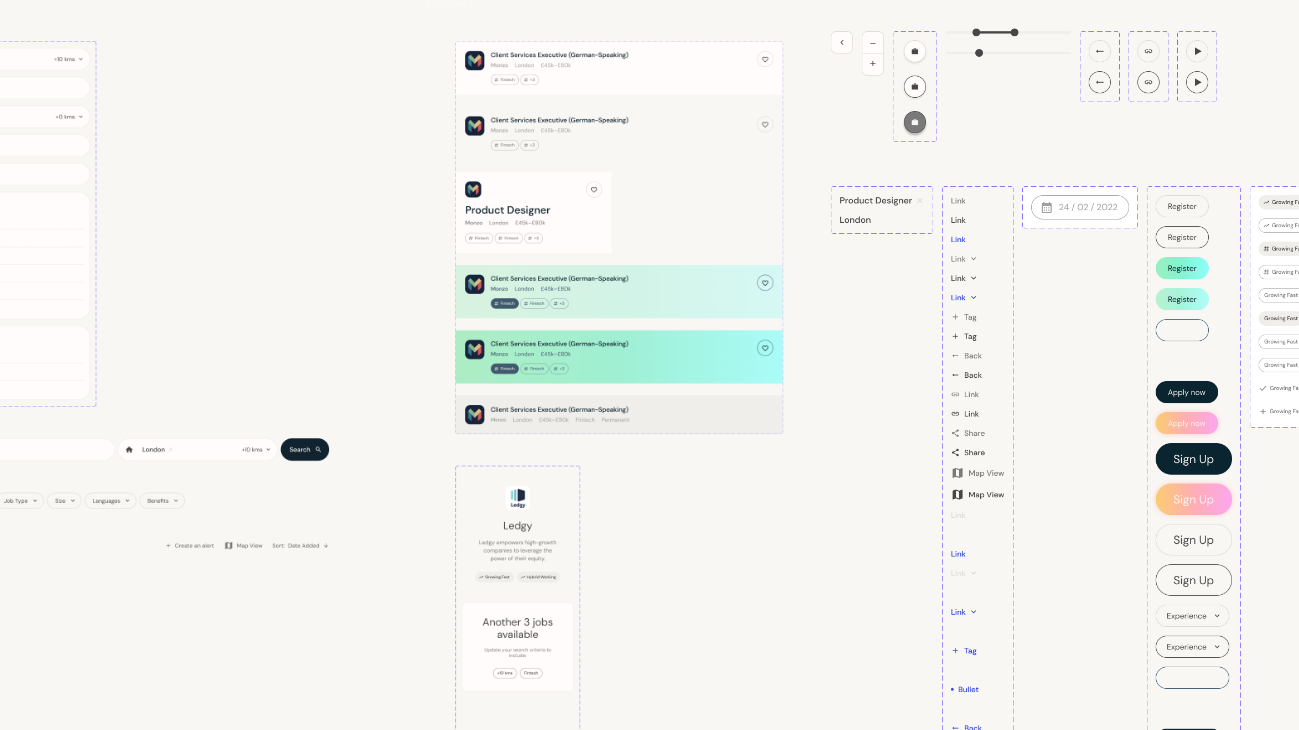
As the powerhouse of the new website, the job search needed to be fast, intuitive and deliver high quality results. We introduced a number of new features to provide a seamless and engaging user experience.
- A split screen view for easy job searching
- An optimised text layout for job post skim-ability
- A tagging structure to highlight job benefits
- A map view to visually represent locations
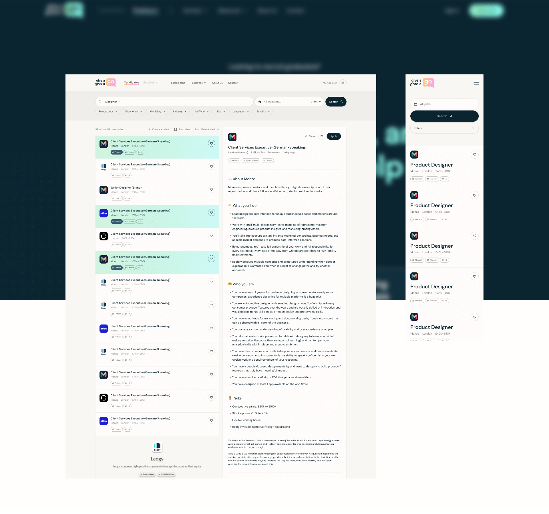
Jobs portal
We launched a new self-service jobs portal that enables Give A Grad to capture a greater percentage of the recruitment market. The portal enables employers and candidates to manage job ads and applications and seamlessly integrates with the website.
Our UX design team constructed optimised UX designs and user flows to deliver a portal that is intuitive, fast and engaging. Our developers coded the portal using Laravel which provides Give A Grad with a flexible framework that can be expanded as the business need grows.
Developing the brand
Give A Grad’s old brand was dated and no longer reflected the business size and position in the market. They needed a new brand identity that would provide greater flexibility and could grow with the business.
We created a playful and bold brand that targeted graduates and appeared professional and trustworthy to employers. Balancing the two main audience types was critical to producing a successful brand.
Logo
Drawing on inspiration from brands such as Whatsapp, the speech bubble represents approachability and the ‘keeping in touch’ culture.
The use of lowercase letters in the logo creates a personable feel in contrast to the corporate image presented by many competitor brands.
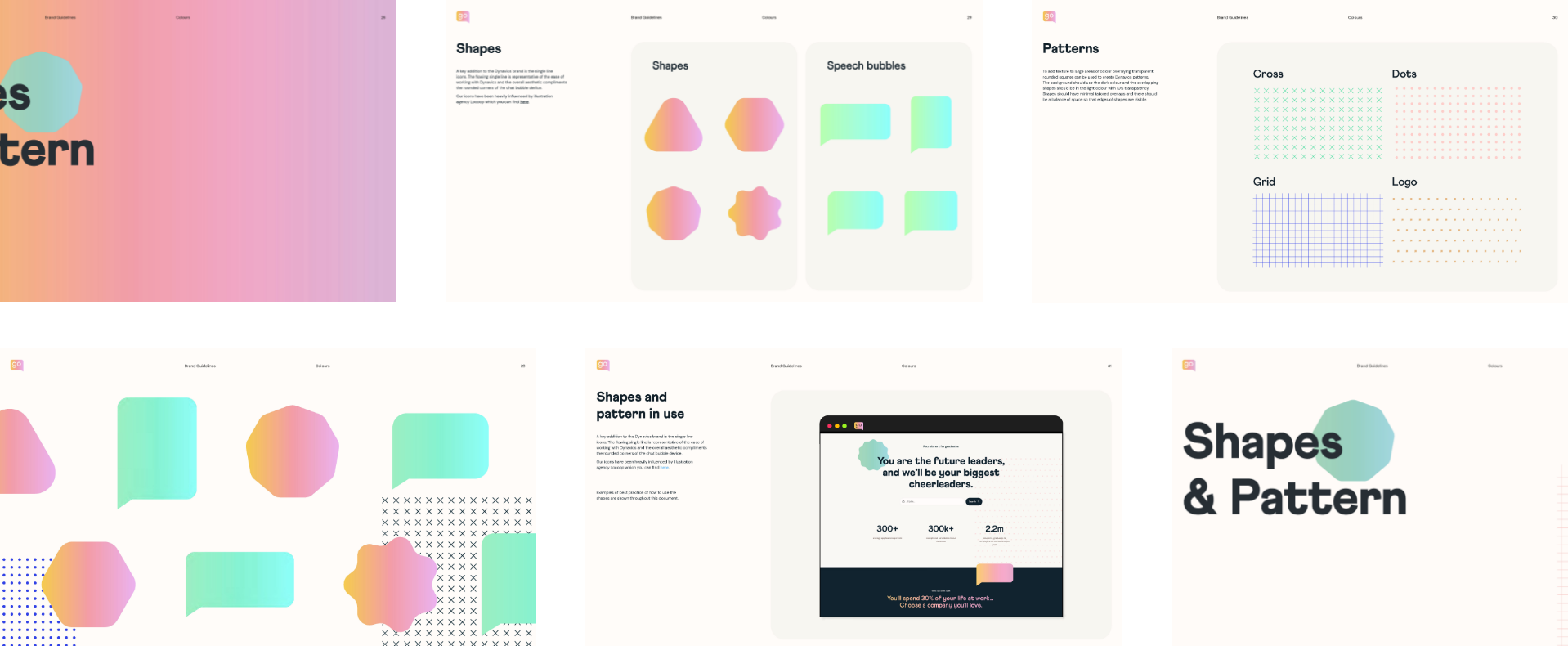
Shape & form
We created a series of fun shapes to compliment the new logo. The shapes act like physical stickers and can be overlapped to break up layouts and create depth.

Patterns
We created 4 core brand patterns that are a nod to sketchbook aesthetics. They add texture to large areas and elevate simple content into something fresh and interesting.
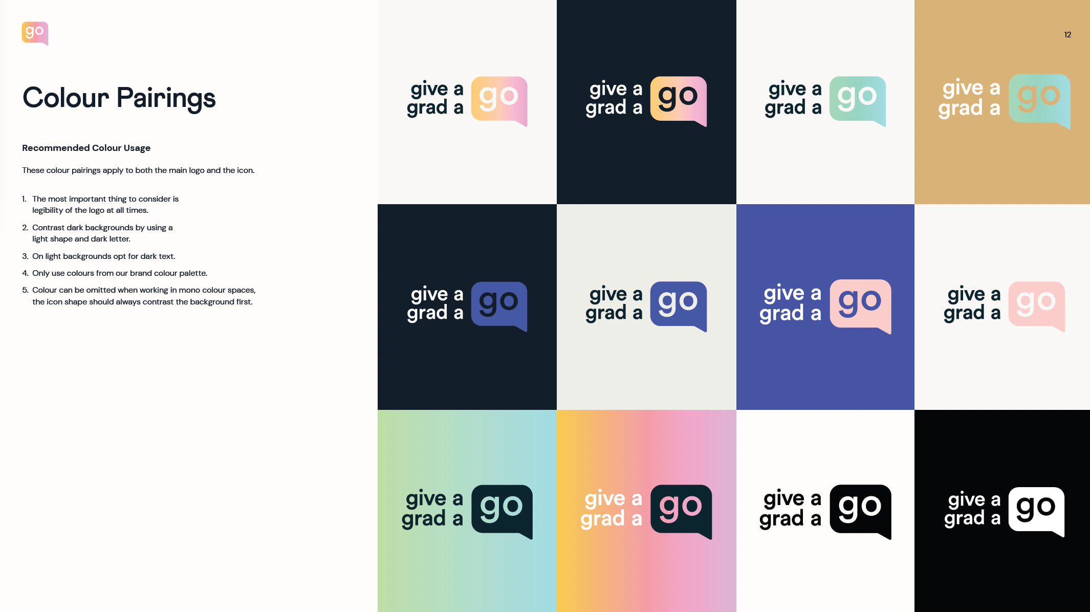
Colour & gradients
The new colour palette combines vibrant dark and light colours that can also be utilised as gradients. We established colour pairing guidelines to enable the Give A Grad team to consistently apply the brand colours.
Related work
Cole & Son is a luxury wallpaper company that produces unique high end designs for their customers. They came to us during a period of change, when they were restructuring their distribution channels and starting to sell direct to consumers in a number of key territories. They needed an elevated eCommerce store that would rival their offline customer experience and showcase their beautiful designs. The website needed to support their ambitious growth plans and push the boundaries of what had been done in their industry.
- Lead time:
- 20 weeks
- Sector:
- Luxury Interiors
- Target Type:
- B2C
- Demographic
- Affluent & Design Driven Consumers
- Website Goal:
- Sell Direct to Consumers, Increase Revenue, Enable Cole & Son Marketing Team
- Services:
- Digital Marketing, Web Design, Website Development, Headless Shopify
- Awards
- Best Cross Border Campaign - eCommerce Awards
- CSS Design Awards, Awwwards
Post-launch website results
The new website has delivered significant increases in average order value and revenue.
x
1
10
ROI on PPC spend
+
1
101
%
Revenue increase
+
1
193
%
Average order value
- Scope
- Adobe XD Wireframe Prototypes
- Adobe XD Design Prototypes
- Headless Shopify Development
- WordPress Development
- Multi-territory
- SEO Strategy
- PPC
- CRO
- eCommerce
- Resource
- 1 x Lead Designer
- 1 x UX Designer
- 1 x Technical Lead
- 1 x Shopify Developer
- 1 x WordPress Developer
- 1 x Digital Marketing Specialist
- 1 x Quality Assurance Tester
- 1 x Project Manager
The challenge
Cole & Son had an existing eCommerce store that was built on Shopify and had experienced some success. However, the site was suffering from some typical Shopify challenges and wasn’t able to scale in the manner that Cole & Son required to meet their growth targets.
These challenges included:
- Slow site speed
- Lack of design flexibility
- Limited functionality
- Limited control of SEO factors
- Restricted international capabilities
Cole & Son challenged us to find a solution that would enable them to internationalise the business and drive growth.

Headless Shopify Development
We implemented a Headless Shopify solution to overcome the challenges that Cole & Son faced on the existing website. The client liked Shopify’s interface but their existing solution was holding them back. Our Headless Shopify solution enables Cole & Son to maintain their existing eCommerce management system while gaining a new frontend website interface that provides greater flexibility and performance.
We decoupled the frontend and backend of Cole & Son’s eCommerce website, retaining the backend eCommerce management in Shopify and replacing the Shopify frontend with a WordPress ‘head’. The WordPress CMS provides the client with a user friendly interface to manage their website content while also while achieving a custom website design, enhanced SEO performance, user engagement, site speed and website security.
Headless proof of concept
To select the best headless solution for Cole & Son, we rigorously tested a number of options during a proof of concept process. We started by defining the client’s success criteria for their Headless Shopify website. We selected 8 potential CMS options and reviewed the documentation to score each one on a predefined rating scale.
We created a proof of concept for each of the 3 highest scoring CMS’s and tested the Shopify integration and key functionality. Based on Cole & Son’s requirements, WordPress was selected as the best CMS for the headless solution.
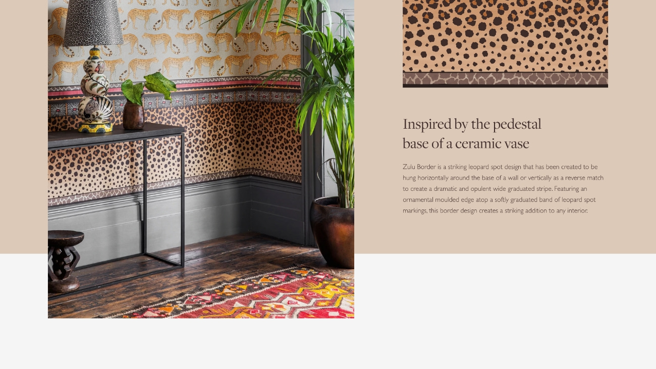
The design
With established roots in the fashion world, design is an integral part of Cole & Son’s business. We created a unique and editorial feel with the new website design. We created a flexible user interface that enabled Cole & Son’s marketing team to curate content throughout the site and fully showcase their collections and products.
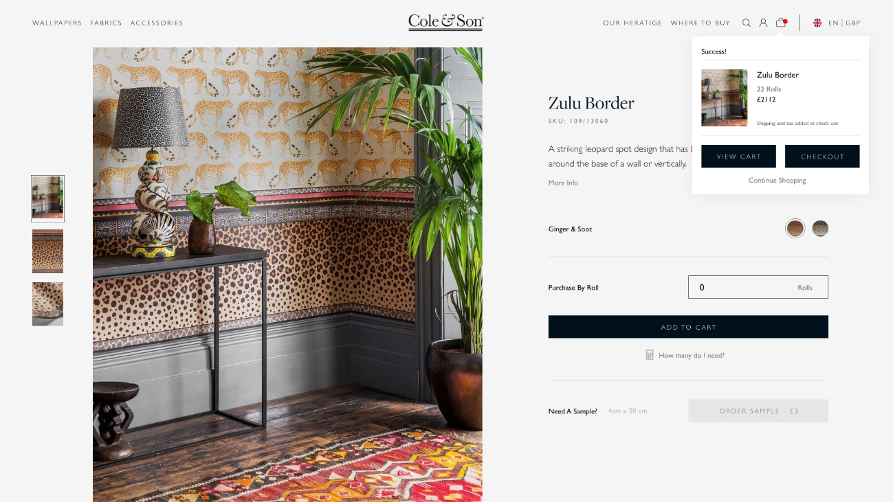
On-page roll calculator
Purchasing wallpaper can be a complex process. Customers must consider the wall width and height, but also pattern repeats and pattern size. To simplify this process, we created a roll calculator that is available on every wallpaper product page. It is pre-set with the relevant product information so users only need to enter their wall dimensions to calculate the number of rolls required.
This feature increases customer satisfaction and removes a barrier to purchase.
Editorial design style
We created an editorial style design that connected the Cole & Son website with the brand’s roots in fashion.
On page roll calculator
We implemented an in-page roll calculator to enable customers to calculate the number of rolls needed with minimal effort.
Maximum flexibility
We created a flexible CMS that enables the Cole & Son team to curate pages around their products.
International expansion
Cole & Son’s previous website only sold to consumers in the UK. During the web build, they were in the process of changing their distribution model so they could sell directly to consumers worldwide, reducing their reliance on distributors.
Our challenge was to create and implement an international marketing strategy that would increase Cole & Son’s market penetration in target territories and enable customers to find the website and purchase products in their local currency.
We delivered 8 territories on the new website, with the flexibility to expand to additional territories in the future. Each territory was optimised for regional search engines, enabling local audiences to find the Cole & Son website and the content that was relevant to them.
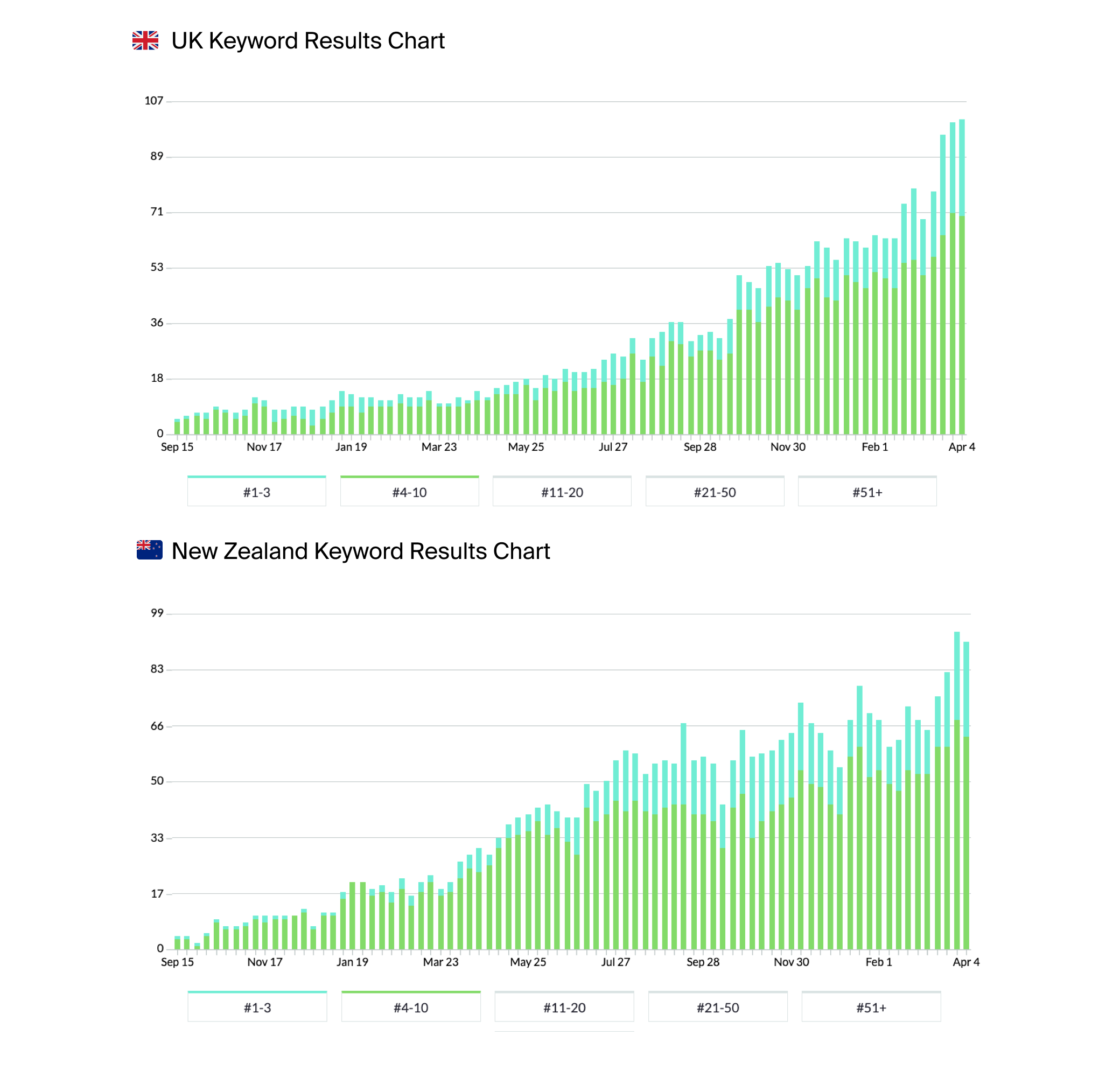
Upon launch, Cole & Son rapidly experienced increases in sales and rankings, going from no footprint outside of the UK to having an established presence in the UK, US, Australia, New Zealand, Singapore, Sweden and Norway. Following launch, Cole & Son have added a further 4 territories including multilingual content and right to left page layouts for the Arabic language.
The international campaign won the Best Cross Border Campaign at the eCommerce Awards. Read about the full campaign strategy here.
International SEO growth
Our team generated huge global SEO growth for Cole & Son for a series of high value search terms.
Cole & Son’s rankings grew across all 8 target territories, increasing their search visibility by up to 2081%.
+
1
2081
%
Increase in UK search engine visibility
+
1
1210
%
Increase in New Zealand search engine visibility
+
1
523
%
Increase in US search engine visibility
SEO
Using WordPress as the CMS gave us greater dexterity when it came to optimising the site for SEO. We conducted extensive SEO research as part of a broad digital strategy and implemented an optimised landing page strategy.
Our global SEO strategy increased the breadth of keywords targeted and increased the specificity of content on the site to create new entry points from search engines in 7 geographical areas.
PPC
Our team launched a number of PPC campaigns for Cole & Son, unlocking a new revenue channel for the business. PPC has been extremely successful, generating a 10x return for every £1 spent with Google Ads.
- Brand Search Campaigns
- Broad Search Campaigns
- Performance Max Campaigns
- Google Shopping Ads
+
1
10
%
Increase in sales
Related work
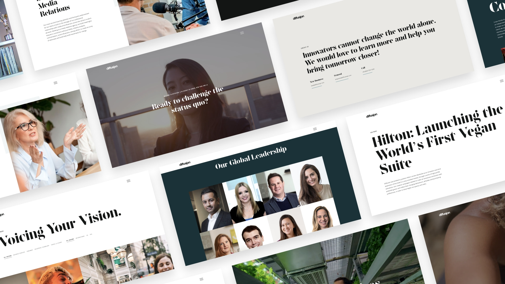
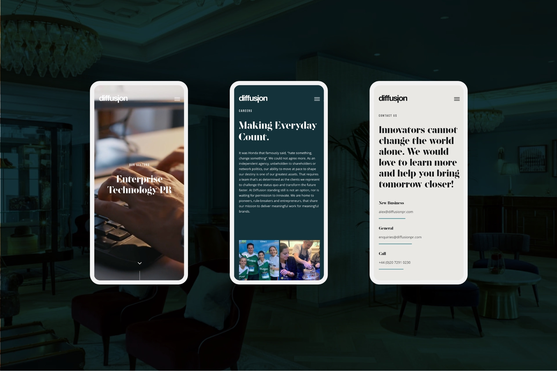
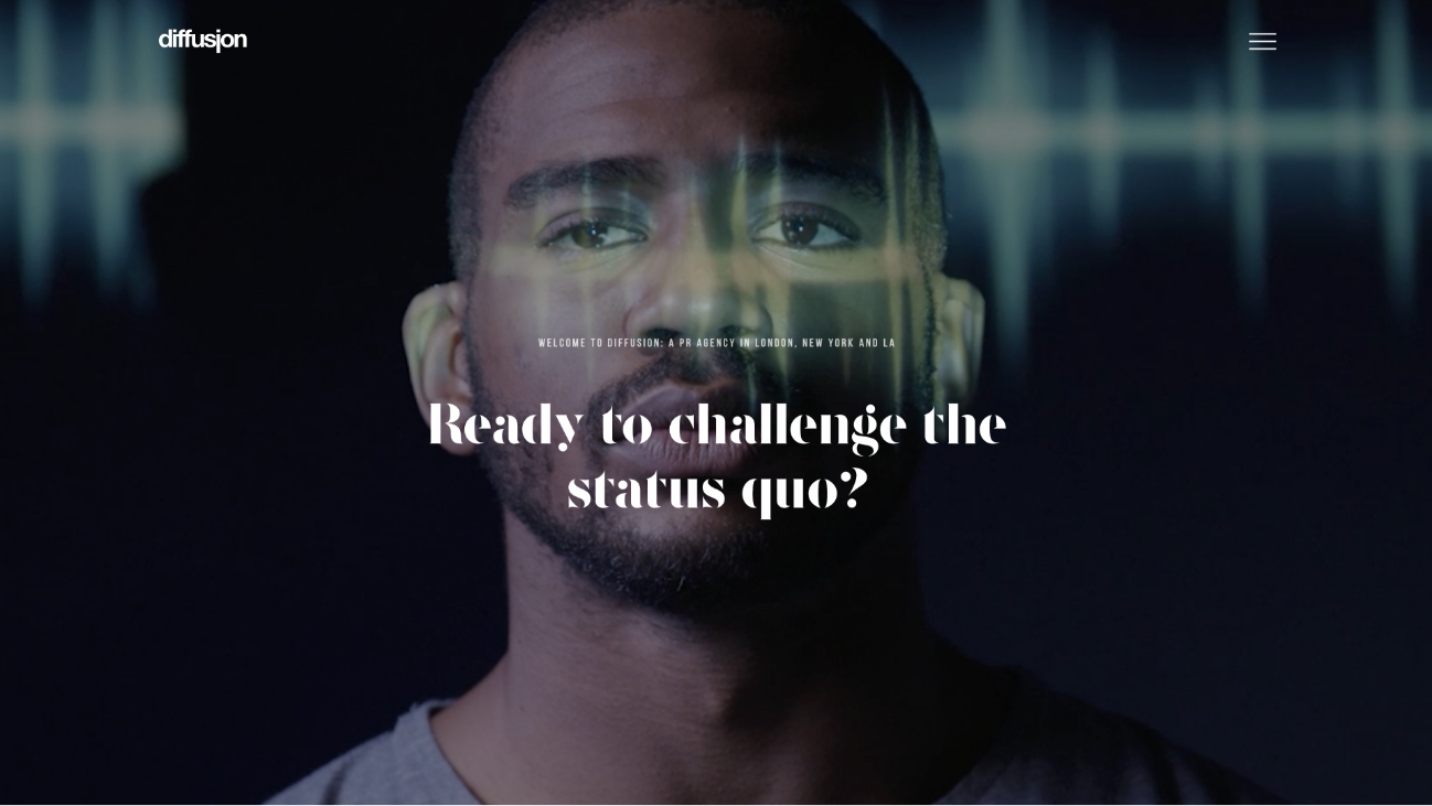
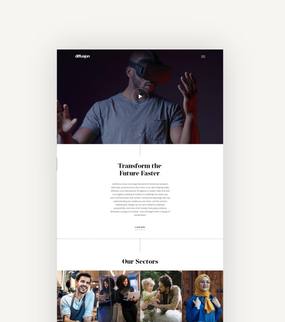
Diffusion is an international PR agency with offices in the UK and US. They represent tech-driven brands that are transforming the world for the better. Their clients are exacting, professionally demanding and expect results.
Diffusion had experienced a period of growth and needed a new website to reflect their maturity and scale. Having just undertaken a rebrand, Diffusion challenged us to deliver a modern website design that would align with their core audience, engage prospective clients and generate awareness and leads in the UK and US.
- Lead time:
- 16 Weeks
- Sector:
- Public Relations, Marketing
- Target Type:
- B2B
- Website Goal:
- Executives, Marketing Professionals
- Services:
- Digital Strategy, Website Design, WordPress Development
- Scope
- Adobe XD Wireframe Prototypes
- Adobe XD Design Prototypes
- WordPress Development
- Hubspot Integration
- Multi-territory content and SEO
- SEO Strategy
- Art Direction
- Content Curation
- Resource
- 1 x Lead Designer
- 1 x UX Designer
- 1 x WordPress Developer
- 1 x Digital Marketing Specialist
- 1 x Quality Assurance Tester
- 1 x Project Manager
Post-launch website results
The Diffusion PR website has become a lead generation powerhouse for the business. It combines high end design and user experience with performance.
+
1
15
%
New business leads generated in the year following launch
-
1
27
%
Bounce rate
+
1
3045
%
Average search visibility in the UK and US
Our approach
We created a new website that is structured around an in depth SEO strategy and uses best practice conversion design principles. In this way, Diffusion’s new website is primed to rank more highly in Google and convert more visitors into new business leads.
The web design is dynamic, drawing on video content and interactive animations and touch points to guide the user journeys and reflect the dynamism of the Diffusion PR team.
We delivered the website using WordPress using ACF fields to develop custom reusable components. This enabled Diffusion PR to manage their UK and US content on an ongoing basis with ease.
Dynamic design
We created a feeling of quality and refinement by focusing on how the page loads and moves
Interactivity
The website uses interaction design to create a high quality look and feel
SEO landing pages
The website is structured around an SEO strategy to generate new high quality traffic and enquiries
UK / US Location Detection
As an international business, Diffusion PR needed a website that would generate business in their UK and US territories. We implemented a range of multi-territory and multi-lingual strategies to increase market penetration and generate leads.
The outcome was a website that ranked highly in both territories and generated a 15% increase in high quality leads for the business.
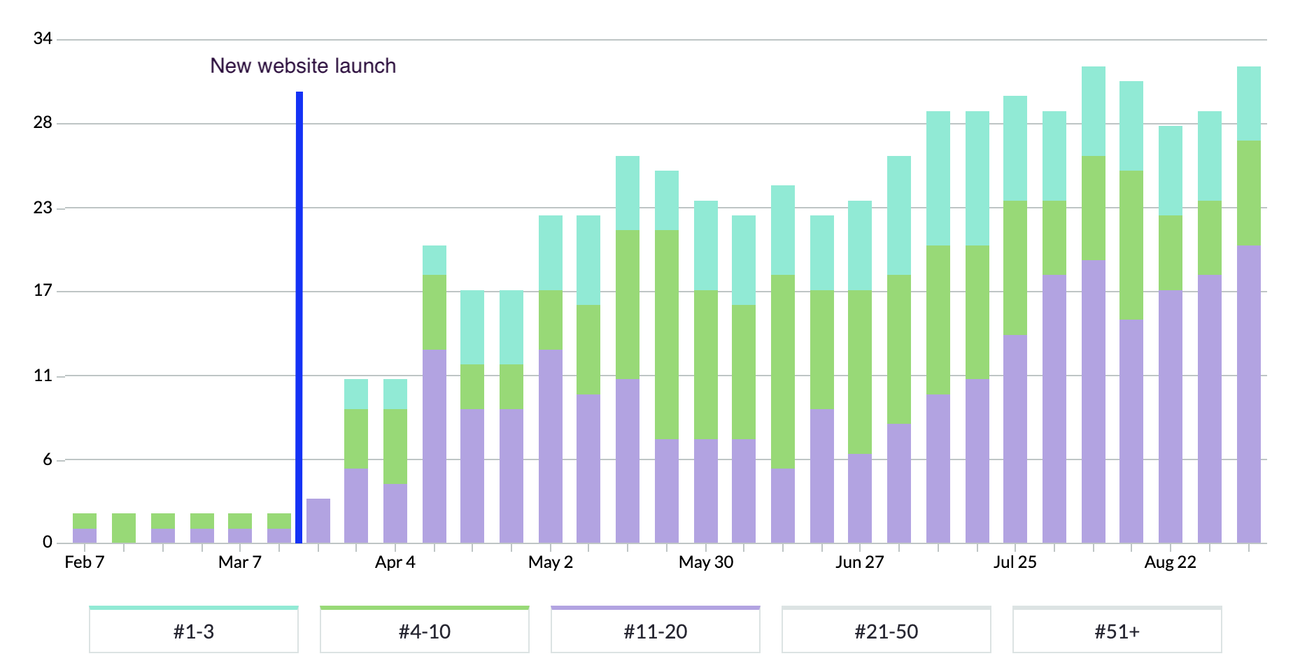
SEO results
The chart above is from an SEO tool called Moz which tracks keyword positions in search engines. Blue bars represent positions 1-3 in Google, green represents the remainder of page 1 in Google, and purple shows page 2 listings.
As you can see, the SEO strategy implemented as part of the new website delivery resulted in significant ranking improvements.
+
1
3045
%

“We had a lot to say and convey to a broad range of audiences and we needed to do that in a way that put the visitor first and made it a joy for them to learn about how Diffusion can support them. Plug & Play got that instantly. They married razor-sharp design & usability with SEO wizardry and a flawless project management approach to deliver a site that is delivering on our primary goal of reaching and representing more of the world’s most exciting brands.”

Related work
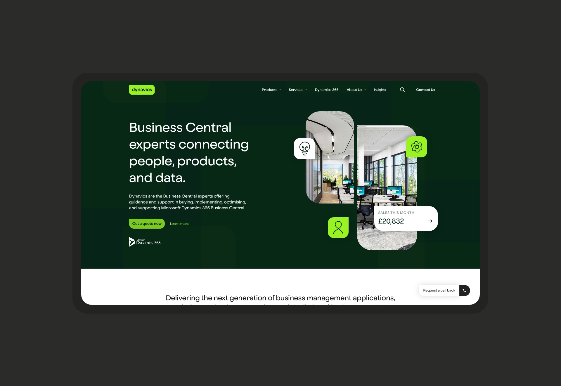
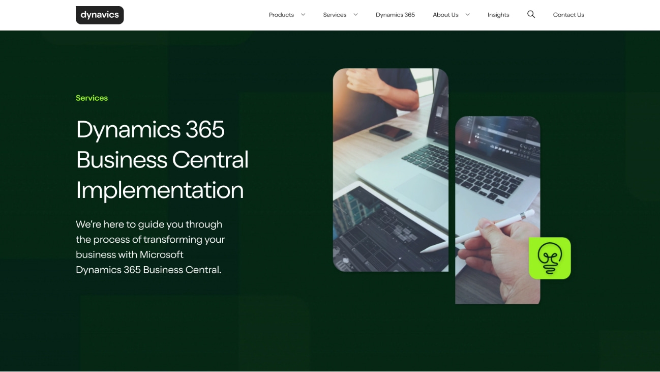
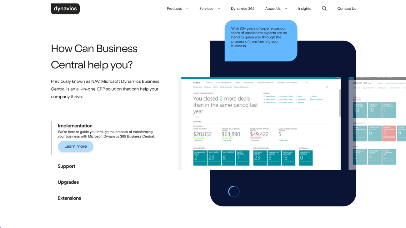
Dynavics specialise in the delivery of Microsoft Dynamics 365 Business Central and are a trusted Microsoft partner.
Their website had become increasingly complex over the years and the poor structure was causing a confusing user experience. They challenged us to create a streamlined user journey that clearly demonstrated their service offering.
- Lead time:
- 12 Weeks
- Sector:
- Technology
- Target Type:
- B2B
- Website Goal:
- Generate New Leads, Improved Look and Feel
- Services:
- Web Design, Digital Marketing & Brand Identity
- Scope
- Adobe XD Wireframe Prototypes
- Adobe XD Design Prototypes
- WordPress Development
- SEO Strategy
- Brand Identity
- Resource
- 1 x Website Designer
- 1 x Brand Designer
- 1 x WordPress Developer
- 1 x Digital Marketing Specialist
- 1 x Quality Assurance Tester
- 1 x Project Manager
Our approach
We created a new brand identity and website for Dynavics, delivering a fresh look that would stand out in their market. The new website was built with performance in mind and with a digital strategy at the heart of all decisions. This approach has enabled Dynavics to grow their search engine rankings and increase their lead generation via the website.
Content architecture
The existing Dynavics website had a complex content structure that made it difficult for users to navigate and find content. We restructured the website to improve the user journey and accessibility of content
Our digital strategy work identified key landing pages and website entry points so we could create optimised user journeys that ended with a conversion.

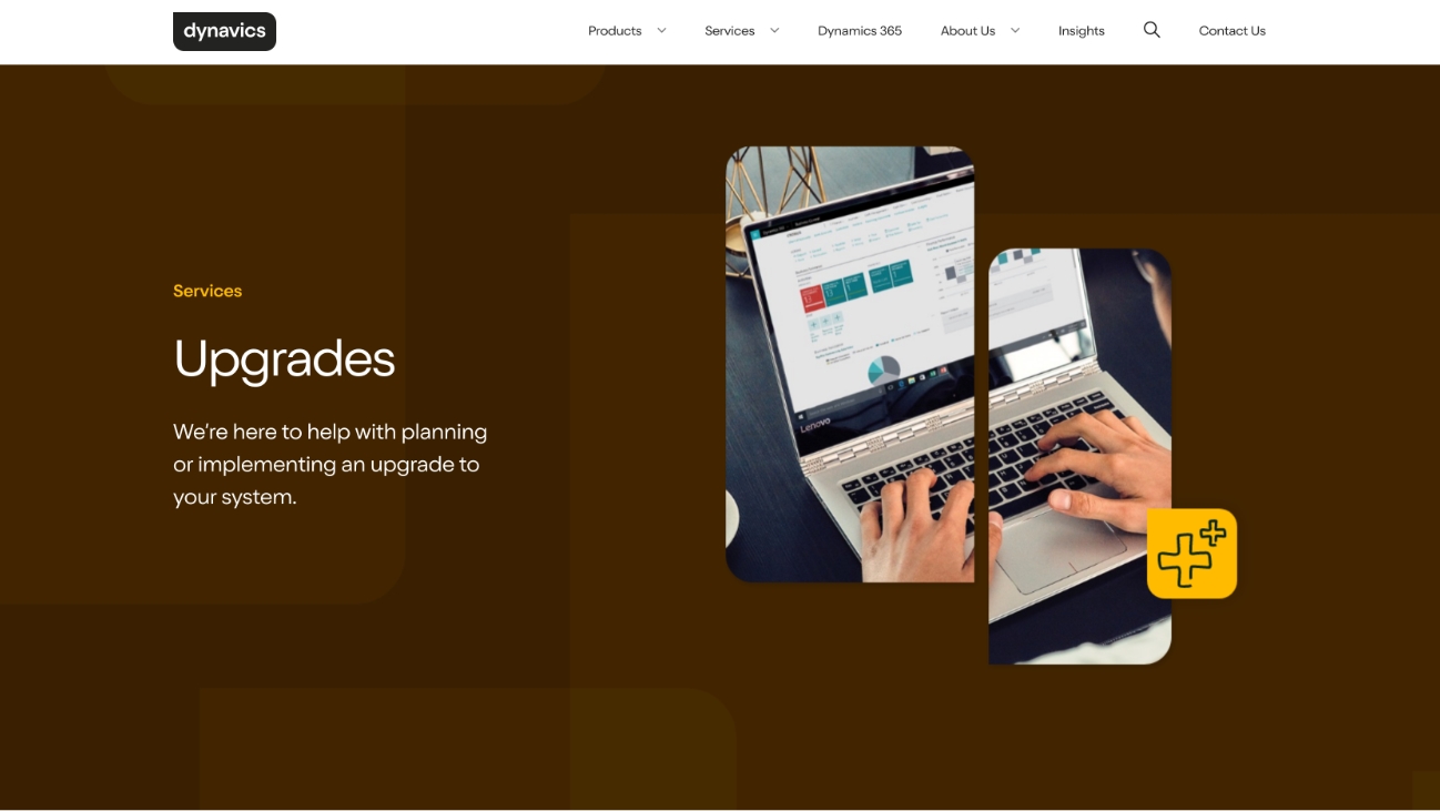
Brand
The Dynavics brand was dated and easily overlooked when presented side by side with competitors. They challenged us to create a new look and feel that would stand out in their market and attract new customers.
We completely overhauled their brand identity including their logo, colour palette, typography and imagery. We also introduced shape and form to add depth and visual interest to the brand, creating a distinct ‘Dynavics’ look that was recognisably theirs.
Dynavics design style
The website has a distinctive look and feel. It uses the new brand elements to deliver a recognisable branded design.
Dynamic assets
We created dynamic brand assets to elevate the website design and provide an engaging user experience.
Signposting
We used colour cues to help signpost user journeys throughout the site.
Digital strategy and SEO
We undertook a detailed SEO and competitor analysis process to recommend key actions that would improve the performance of the new website. We used the data to inform the new content structure and recommend which pages should be created or removed from the new site.
We assigned realistic keyword targets for the Dynavics website, enabling them to grow their rankings.
We started working with Plug & Play to redefine our brand identity and update our outdated website. Their team delivered an outstanding project from start to finish and have provided amazing ongoing support ever since.
Since launching, we’ve seen a significant boost in lead quality and received great feedback on our distinct branding and logo, this has really helped us stand out against competitors. The skillset and project methodology of the whole team is remarkable, we look forward to working with Plug & Play again in the future!

Related work

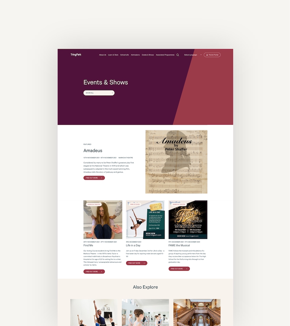
Tring Park is a performing arts school and college covering a wide age range from prep through to sixth form. They challenged us to modernise their website and brand, and increase new admissions enquiries from prospective students.
- Lead time:
- 14 Weeks
- Sector:
- Education
- Target Type:
- Students, parents and the local community
- Website Goal:
- Create a market leading website design, increase new admissions enquiries
- Services:
- Web Design, Web Development, Branding, Digital Strategy, Digital Marketing
- Scope
- Adobe XD Wireframe Prototypes
- Adobe XD Design Prototypes
- WordPress Development
- Full Brand Identity
- SEO Strategy
- Multilingual Functionality
- Spektrix Integration
- Resource
- 1x Brand Designer
- 1x Web Designer
- 1x Frontend Developer
- 1x Backend Developer
- 1x Marketing Strategist
- 1x Digital Marketing Specialist
- 1x Quality Assurance Tester
- 1x Project Manager
The challenge
Tring Park School’s website was beginning to look dated and didn’t effectively communicate their offering. With the old website holding them back, Tring were ready to launch a dynamic new brand and website that would stand out in their market and make them the performing arts school of choice.
They sought to improve the number of prospective students finding them in search engines by investing in search engine optimisation, while also improving their conversion rate by revamping their web design and user experience.
Post-launch website results
We significantly improved keyword positions, search engine visibility and organic traffic within the first 6 months of launching the site.
+
1
60
%
Increase in search engine visibility
+
1
10
%
Increase in organic traffic
+
1
300
%
Increase in the number of keywords ranking #1-3 in Google
Our approach
We created a modern new website that can be easily edited. We built the website with reusable modules, providing the Tring Park Marketing Team with the flexibility to manage their content, create new pages, and have full autonomy over their page layouts, menus and components.
The new website needed to be multilingual to appeal to international audiences. We implemented multilingual functionality using Google’s translate plugin which is available to UK charities.
Spektrix Integration
We integrated the website with Spektrix, Tring’s event management and booking platform.
Flexible content management
We designed the website using flexible branded components that give Tring’s marketing team the flexibility to create new page layouts and manage their content.

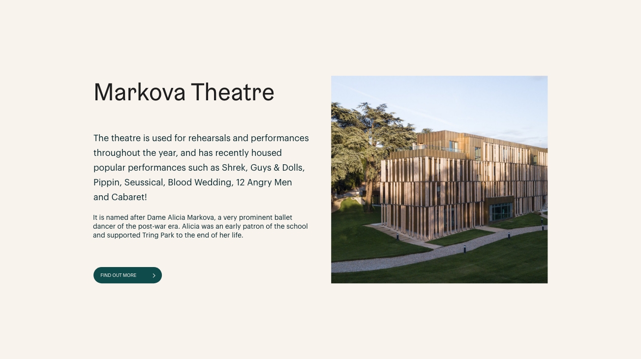
Alumni showcase
We showcase Tring’s previous graduates to build trust and demonstrate the success of Tring Park students.
Digital strategy
Tring Park school is funded through fees. As such, it’s important that the school can demonstrate its qualities to prospective students and parents. As a not-for-profit organisation the school doesn’t exist to turn a profit, however it does need a sound underlying business case.
To put the school on the right digital footing we undertook a digital strategy that would guide the process as to how the school would deliver a return on investment for the website and branding project.
The digital strategy outlined how Tring Park could play to its strengths and how it could increase its market penetration and conversion rates. The goal was to drive more engagement in the pre-visit phase of the new pupil experience, creating awareness and desirability for Tring Park.
With the data clearly outlining how young people are looking for their prospective schools, and representing that Tring Park had a great opportunity to increase its attendance, the website was commissioned in line with the recommendations in the digital strategy.

Brand
We delivered a new brand identity for Tring Park by focusing on their audience and key values. We led the client through a branding process, focusing on their key values and the existing cornerstones of their visual identity. By collaborating with their marketing team, senior team and school governors, we were able to create and deliver an impactful brand that stands out against competitors.
We created a brand design system that provides visual dexterity and enables the marketing team to flexibly use the brand across their online and offline marketing materials. A particular area of focus was creating brand shapes and patterns that could be interlocked with Tring’s photography to produce a unique style that is highly engaging and distinctly Tring’s.
“We worked with Plug & Play to deliver a new website and brand that ranks highly in search engines and generates new enquiries for the school. As the UK’s leading performing arts and academic school, we needed our new website to effectively showcase our offering and make us the school of choice for talented students.
We’re absolutely thrilled with the results and the Plug & Play team has been a great support. They made strategic recommendations based on our goals, and their creative team was brimming with ideas for the site design. The team are always on hand for not only technical support, but are also happy to help give their professional opinions and ideas in other aspects as well which is invaluable to us. They are patient and take their time to explain things in detail which has made the experience highly enjoyable.
I can’t recommend Plug & Play enough and I look forward to continuing to work together!”

Related work
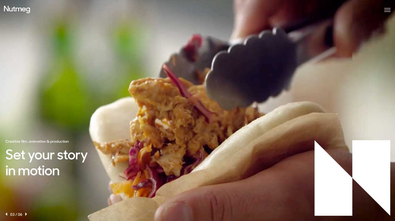
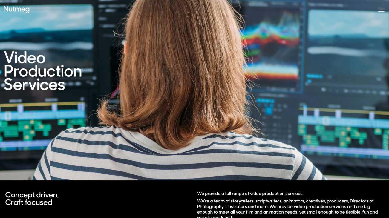
Nutmeg Productions is a video production company in London. They work with their clients to create films and campaigns in a variety of sectors including healthcare, food, brand and corporate.
Nutmeg’s existing website was dated and no longer reflected their business and portfolio. They needed a new dynamic website that would enable their team and attract new business.
- Lead time:
- 8 Weeks
- Sector:
- Video Production
- Target Type:
- B2B
- Website Goal:
- Improve search engine rankings, Attract new clients
- Services:
- Web Development, Digital Strategy, Digital Marketing
Post-launch website results
Nutmeg productions experienced a huge improvement in search engine visibility and organic traffic following the launch of their new website.
+
1
105
%
Search engine visibility
+
1
81
%
Organic traffic
+
1
107
%
Organic sessions
- Services
- WordPress Development
- Interaction Aesthetic
- Agency Collaboration
- SEO Strategy
- Ongoing SEO Work
- Team
- 1 x Project Manager
- 1 x Front-end Developer
- 1 x Back-end Developer
- 1 x Quality Assurance Tester
- 1 x Marketing Strategist
- 1 x Digital Marketer
The challenge
We collaborated with Ascend agency to deliver a beautiful and interactive website that would help them to stand out in their competitive market and rank more highly in search engines.
Ascend designed Nutmeg’s new website and challenged us to deliver their vision in code. The new website needed to be fast, smooth and interactive. They selected us because of our high quality development work and our ability to deliver SEO results.
Banner animation
We developed a sleek banner animation that used Nutmeg’s logo as a progress bar.
Page transitions
We developed smooth page transitions to enhance the user journey. When a user hovers over a menu, they see a sneak peek of the next page
Use of video
We coded a number of video components to showcase Nutmeg’s video portfolio throughout the site
Our approach
We developed a high quality WordPress website that provides Nutmeg’s team with a high level of content control. They can easily update content, create new pages, and launch campaigns using their new CMS.
We created seamless page transitions, animations and hover effects. We also optimised the website speed and Core Web Vitals to maximise the user experience and ranking performance.

Digital Strategy
We produced a keyword strategy for Nutmeg to improve their rankings in Google. We focused on the most valuable service offerings for Nutmeg, as well as gateway offerings that often lead to a larger piece of work.
For the strategy, we analysed hundreds of keywords related to Nutmeg’s services. We assessed how competitive they could be for each keyword and narrowed the list down to the best keyword targets. From there, we assigned each page of the site a primary keyword and supporting secondary keywords.