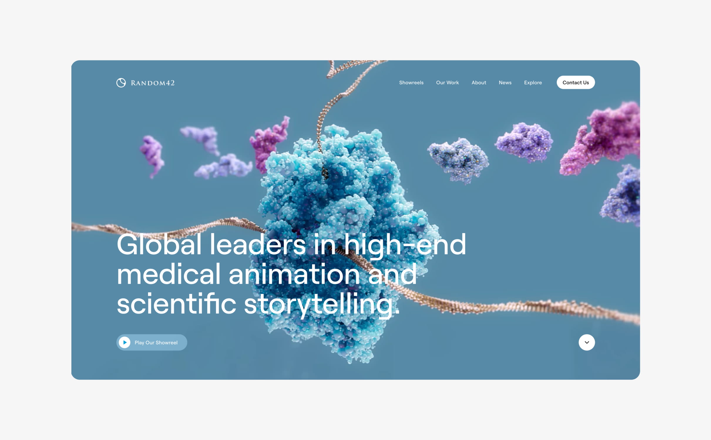
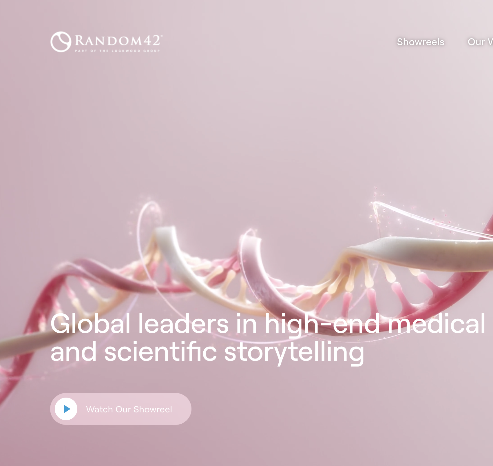
Random42 is a London based medical animation studio that brings complex scientific processes to life with animated videos.
They challenged us to deliver a new website to showcase their animation work and generate new business.
- Lead time:
- 6 Months
- Sector:
- Medical & Life Sciences
- Target Type:
- B2B
- Target Audience:
- Researchers, Educators & Pharmaceutical Companies
- Website Goal:
- Stand out from competitors & Increase lead generation
- Services:
- Web Design, Web Development, WordPress, Digital Marketing
The challenge
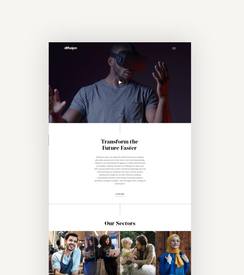
Random42’s previous website was dated and didn’t reflect the innovative nature of their work. They challenged us to deliver a website with improved user journeys that would provide an immersive and engaging user experience for their visitors. They wanted to incorporate their animations into the website, showcasing the quality of their work.
As well as achieving a sector-leading design, Random42 were ready to invest in their SEO strategy to improve their organic search engine rankings.

Our approach
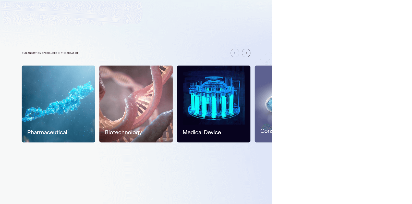
We created a visual design that combined clean imagery with interactivity to produce an immersive user experience. Random42’s key design themes included immersive, visual, scientific and unique and these were captured within the new design style.
As a dynamic marketing team, Random42 needed a flexible CMS that would provide them with an extensive amount of flexibility. We developed the website in WordPress and codified their brand guidelines to deliver functional flexibility with the structure of their design system.
We produced a digital strategy to drive website performance, designing and building the website in a way that would improve search engine rankings and generate high quality traffic to the website.
- Scope
- Figma Wireframe Prototypes
- Figma Design Prototypes
- WordPress Development
- SEO Strategy
- SEO Optimisation
- Salesforce Pardot Integration
- Resource
- 1 x Website Designer
- 1 x WordPress Developer
- 1 x Quality Assurance Tester
- 1 x Project Manager
- 1 x SEO Strategist
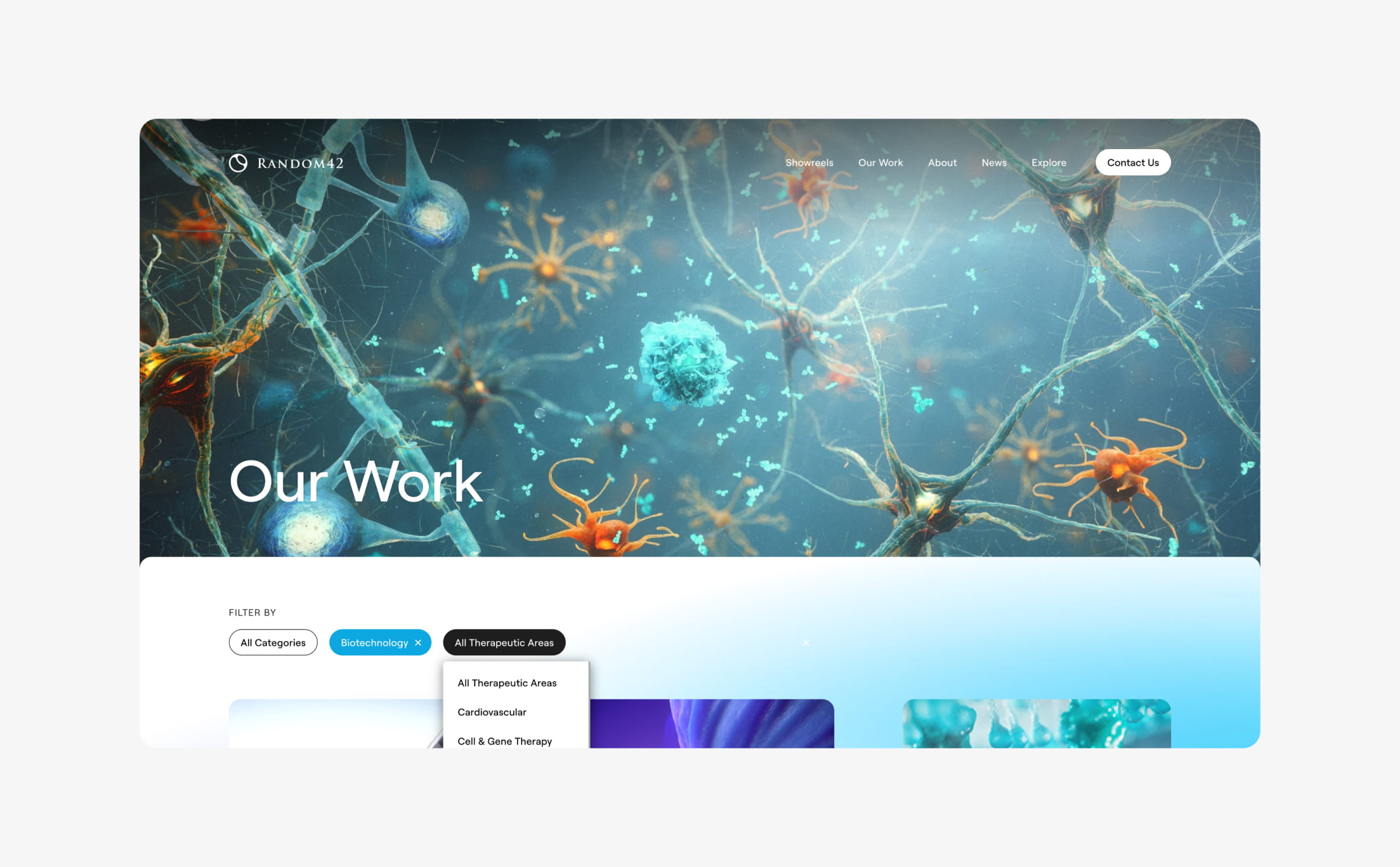
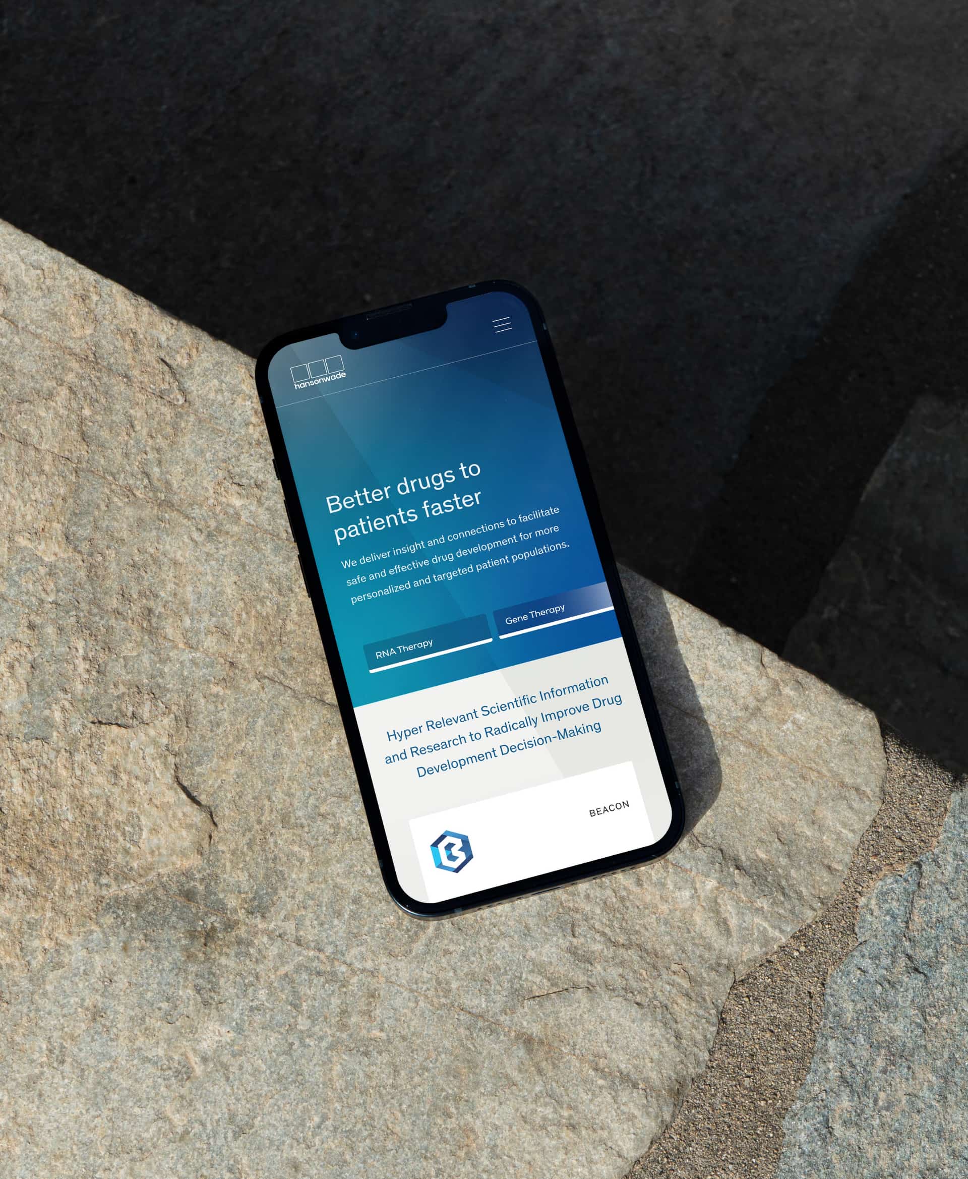
The website
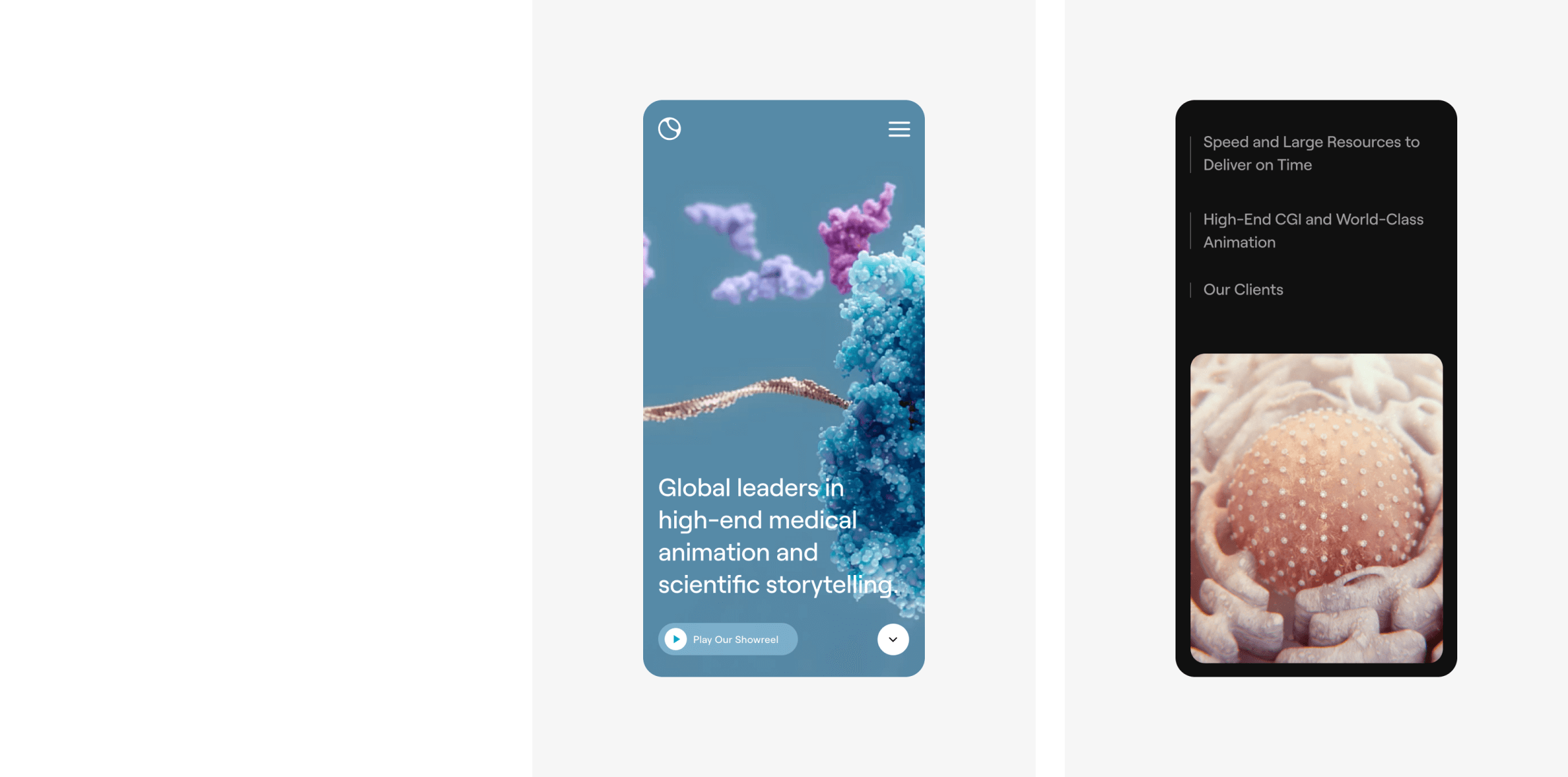
Our team created a modern website that combines animations and interactivity to create visual interest and direct the user journey. We developed parallax scrolling within the web design to create a sophisticated finish with depth.
The website contains a large amount of high quality video and animation which is handled seamlessly with a combination of Cloudflare and Vimeo hosting. Our team advised on the best video and image file formats for the site so Random42 could achieve the highest quality media files at the lowest file weights.
The website integrates with Salesforce and Pardot to manage new enquiries and provide the marketing team with insights into visitor activity.

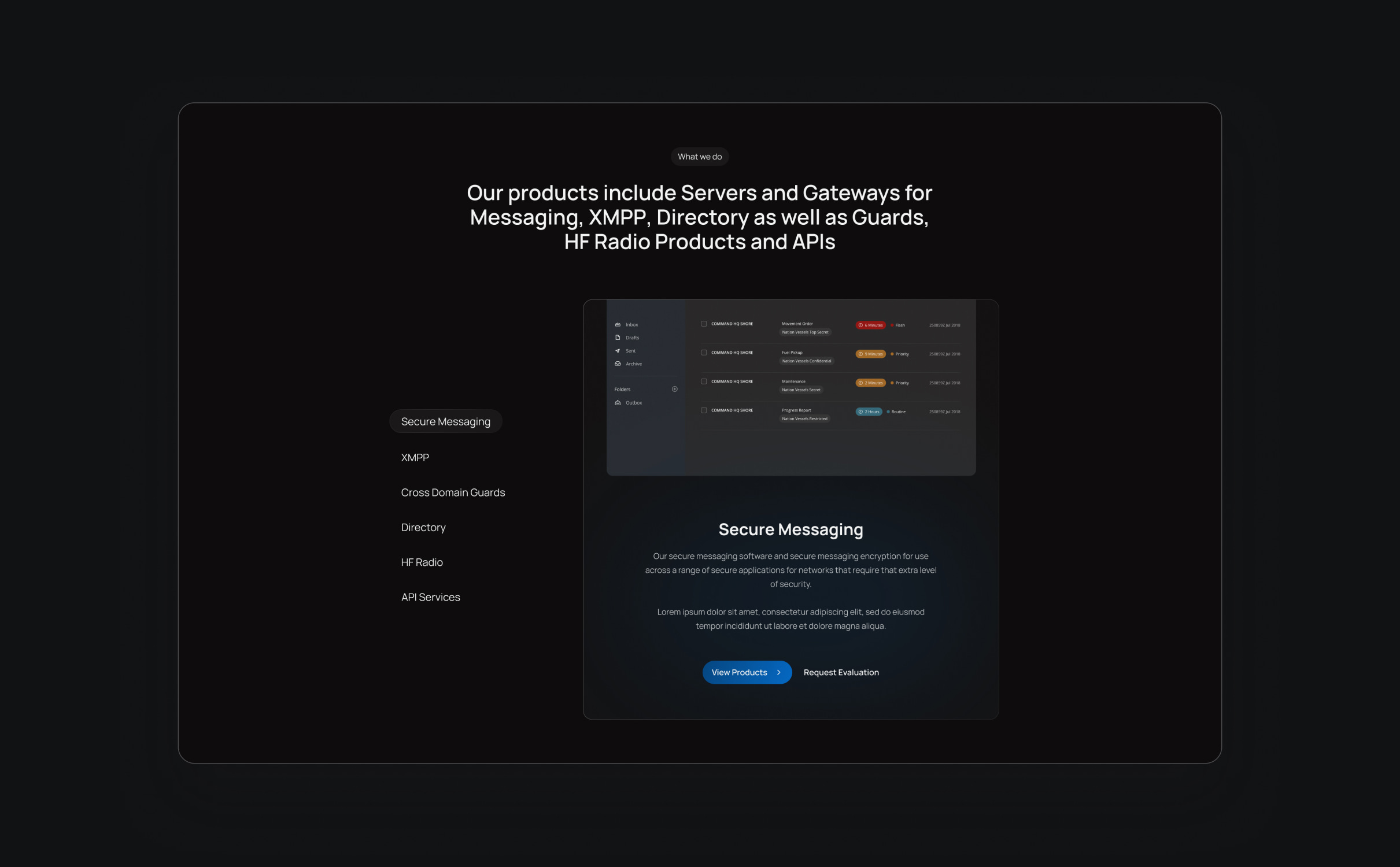
Dynamic design
Random42s new website design incorporates video and animation to bring their work to life.
Salesforce Pardot integration
We integrated the website with Salesforce & Pardot to provide the Random42 team with better analytics and tracking.
Randomised homepage banner
A different banner video plays when the homepage is refreshed.
SEO strategy
Following some SEO work with us 4 years ago, Random42 were performing well for a number of high quality keywords. The business had grown since their last SEO strategy was produced and it was time to review their performance and identify new opportunities for growth.
We assessed hundreds of keywords to identify new keyword targets for Random42 based on their current position in the market. As a niche industry, we needed to target high intent keywords with a high level of specificity to generate increased levels of organic visibility and traffic.
The website was optimised in line with the new strategy and the website structure was created to accommodate the recommendations, including entry points and landing pages from organic search.
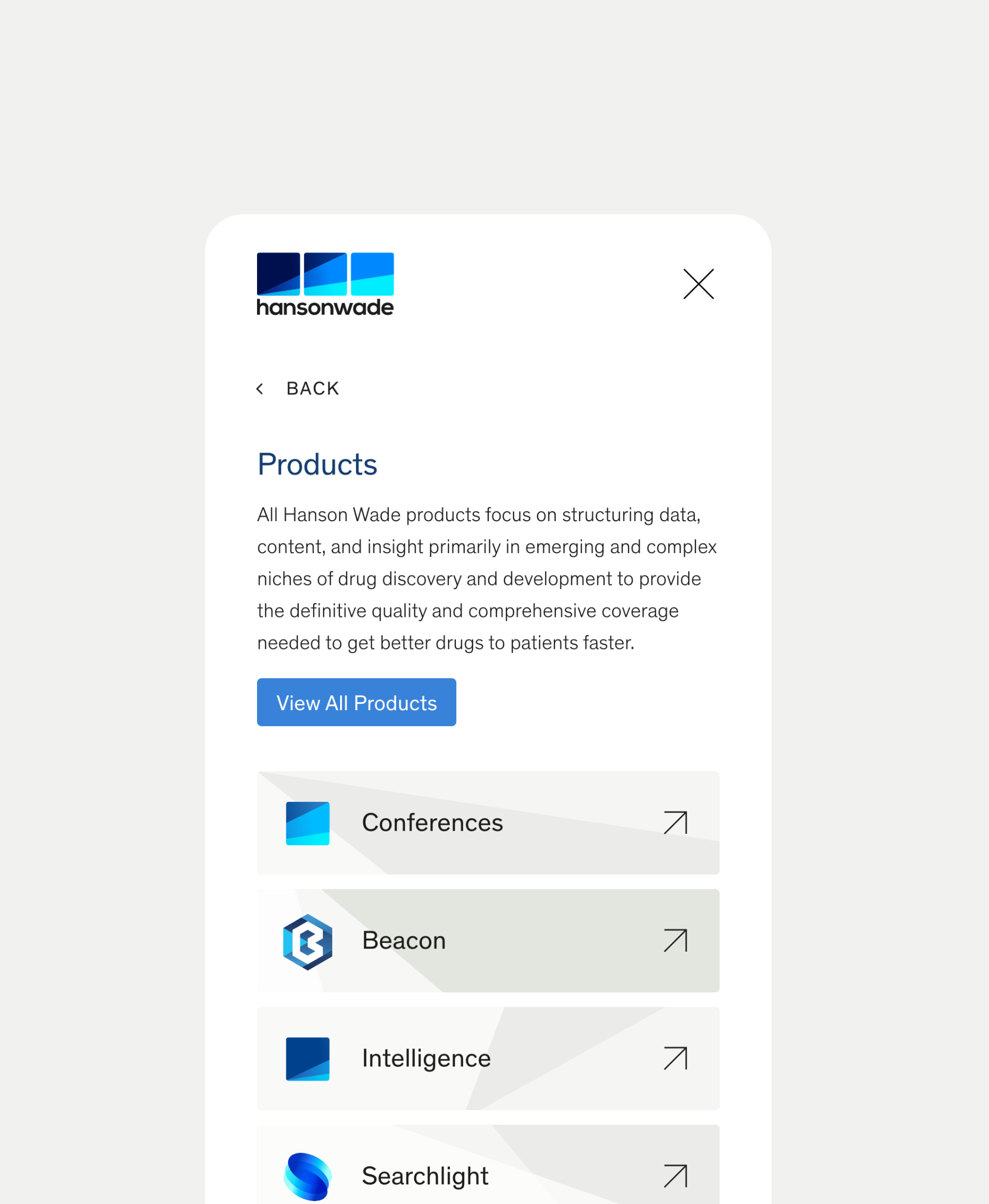
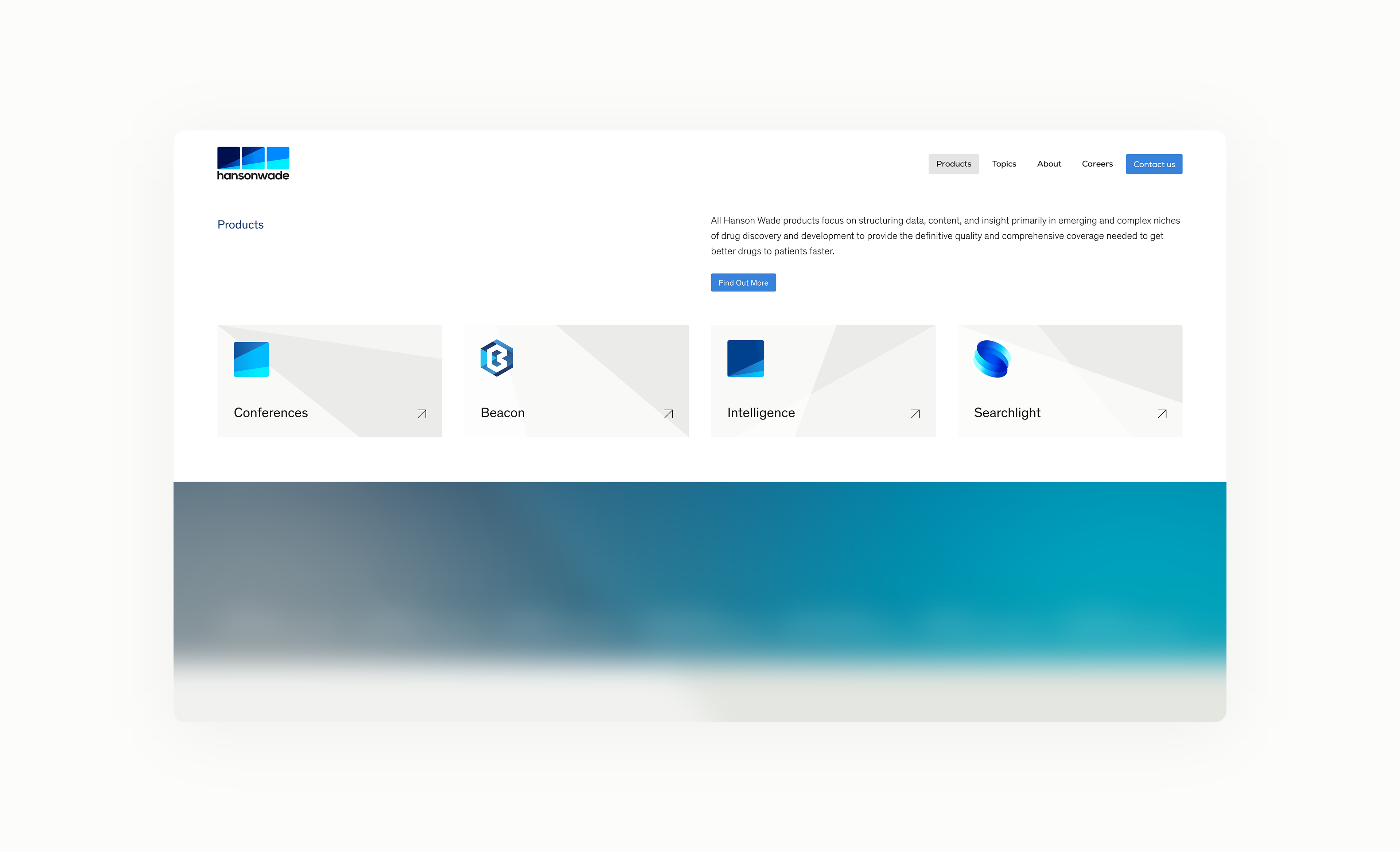
Related work
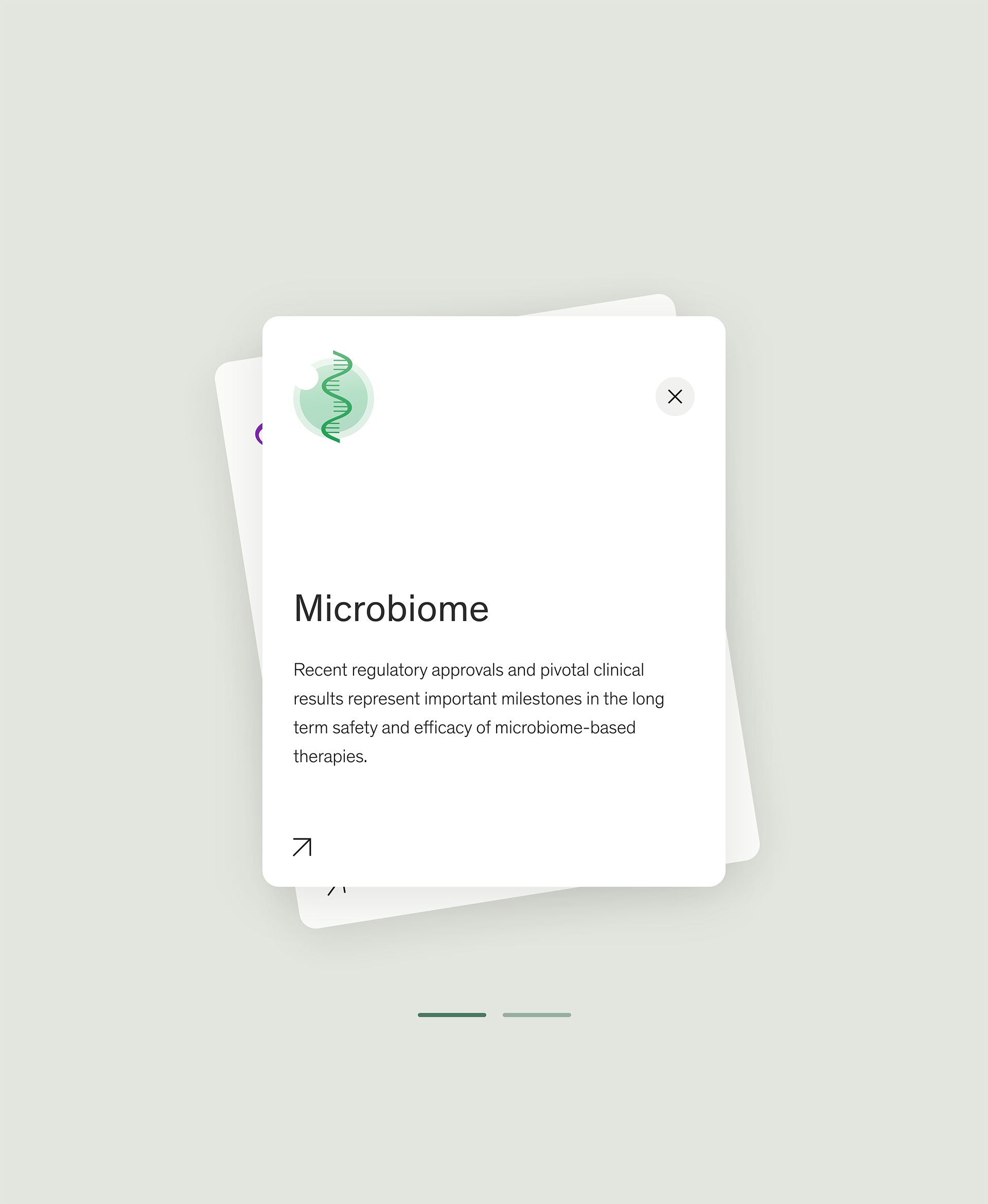
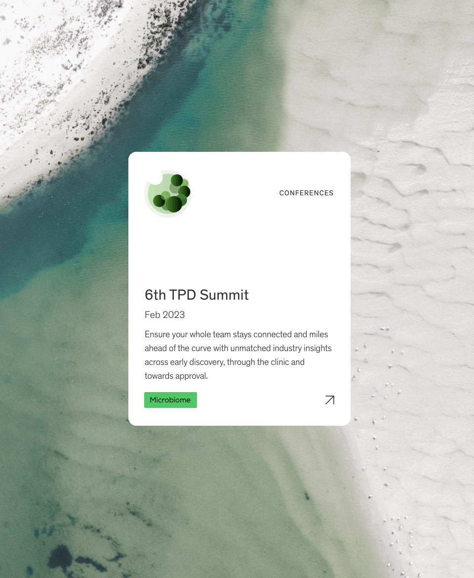
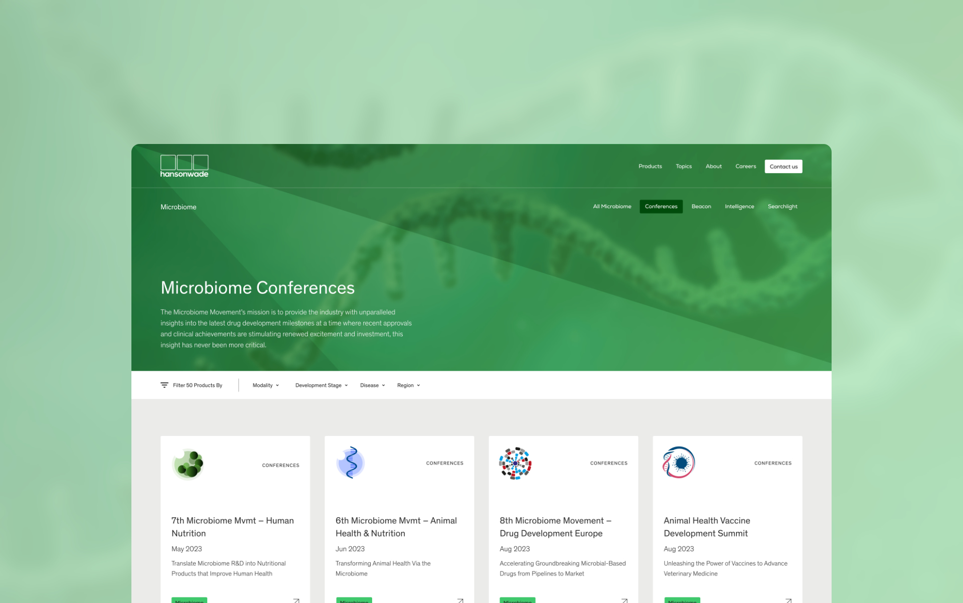
Hanson Wade provides insights on cutting edge drug development and brings together experts in the biopharma community to learn and share expertise.
They had ambitious plans for their digital ecosystem and needed 4 new websites to achieve their marketing objectives. Their new websites needed to increase the visibility of their conferences, provide a platform for industry experts to read the latest insights and research, and showcase the leading products used within the industry.
- Lead Time:
- 6 Months
- Sector:
- Pharma & Medical
- Demographic:
- B2B
- Target Audience:
- Life Science Professionals from Pharma, Biotech and Service Providers
- Website Goal:
- Develop an ecosystem of sites to help internal teams achieve their business goals, Showcase products in a compelling way, Improve website visibility & Be found by more prospective customers & delegates
- Services:
- Web Design, Web Development, WordPress, Digital Marketing
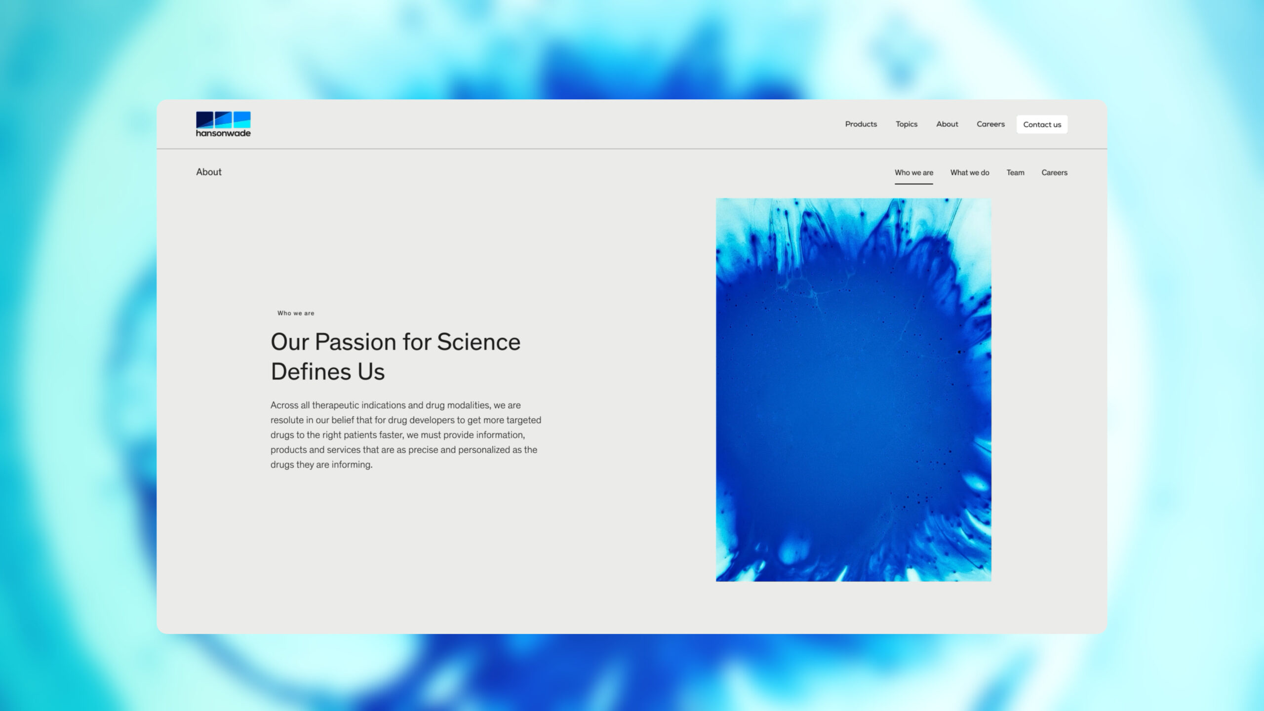
The challenge
Hanson Wade challenged us to deliver 4 different websites: Life Sciences website, Group website, Advancing Consruction and Leap HR.
Appealing to life sciences professionals in the US and UK, it was important to maintain a professional and scientific feel to the site, while improving the content architecture and user experience for website visitors. Hanson Wade wanted to increase their search engine visibility and be found by more of their target audience looking for their products and services.
Post-launch website results
The Hanson Wade websites rapidly climbed the search engines rankings in the UK and US following launch.
- Scope
- Adobe XD Wireframe Prototypes
- Adobe XD Design Prototypes
- WordPress Development
- Delivery of 4 websites
- SEO Strategy
- Gated Content
- Salesforce Integration
- Resource
- 1 x Website Designer
- 2 x WordPress Developers
- 1 x Quality Assurance Tester
- 1 x SEO Strategist
- 1 x Project Manager
Our approach
Increased performance was a key goal for the Hanson Wade team – they needed to increase search engine visibility and increase conversion rates. To achieve this, we delivered a digital strategy that spanned all 4 websites, researching a huge range of keywords that had the potential to generate high quality website traffic. Keywords were selected and assigned to pages throughout the sites, creating a targeted infrastructure of content that could be found by visitors in search engines.
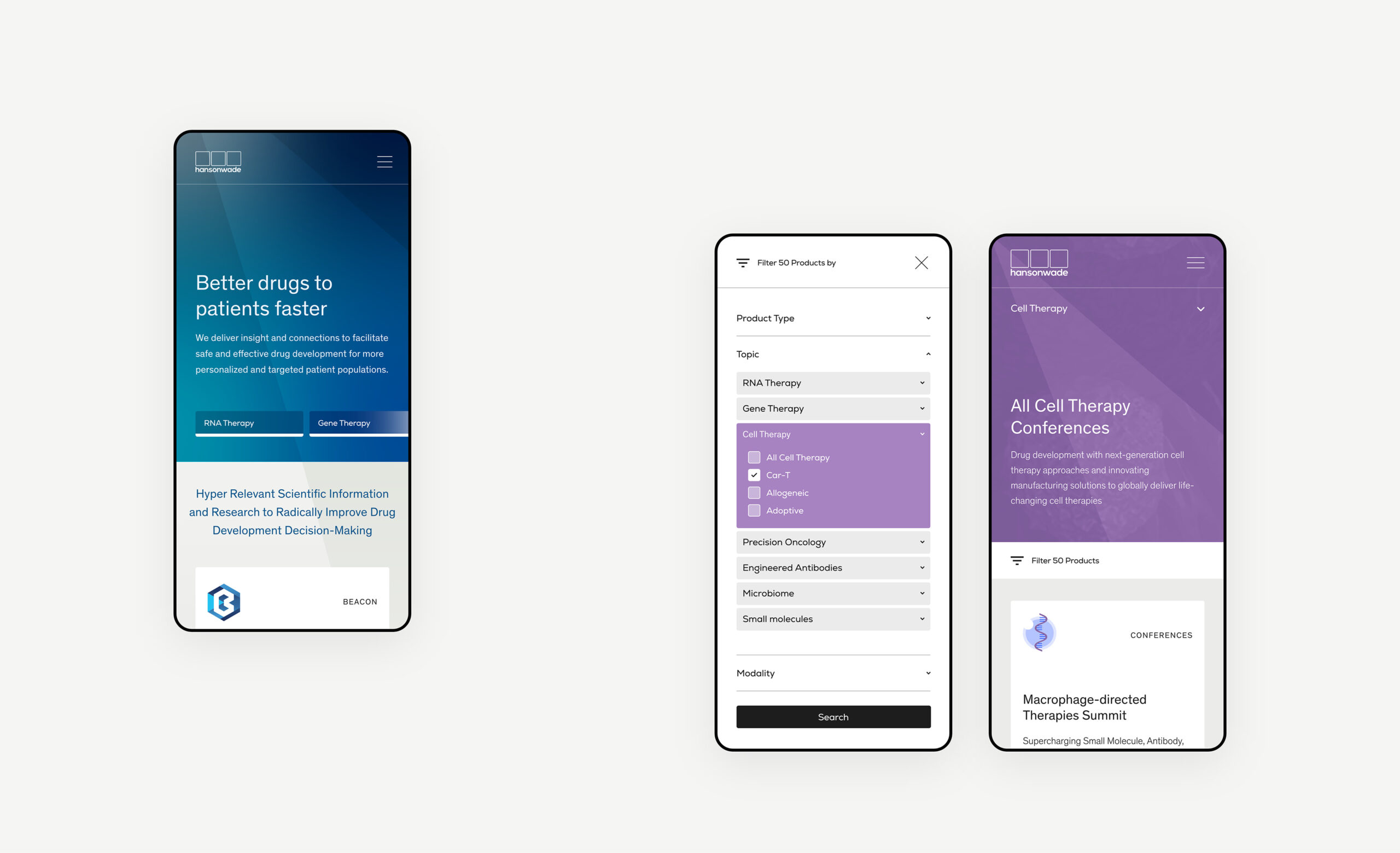
We started work on Hanson Wade’s flagship Life Sciences website first. Our focus was to restructure the website content and navigation to create optimised user journeys that showcase Hanson Wade’s full range of products and services and encourage conversions.
To deliver the greatest value for the client, we reused the code from the Life Sciences website to create the other 3 websites. Our design team amended the user journeys and branding for each website but reused the flexible component modules which enabled Hanson Wade to save time and money on their project and accelerate their digital transformation process.
WordPress CMS
Each website was built with a WordPress CMS to provide the Hanson Wade marketing team with a flexible system to create, edit and manage their content. The marketing team is enabled to move quickly and keep the website up to date with the latest research, products and conference information.
Given Hanson Wade’s SEO ambition, WordPress is a good fit for them to grow their Google rankings. When delivered correctly, it provides a huge amount of scope to optimise the site based on search engine algorithms and secure improved keyword rankings.
Digital strategy
We delivered a master digital strategy that reviewed organic keywords based on their ability to generate business for Hanson Wade. Each site was optimised for SEO, utilising the digital strategy to optimise the website structure, content and code.
Our marketing team conducted a competitor analysis, identifying Hanson Wade’s digital competitors, assessed their digital marketing activity, and identified opportunities for Hanson Wade to outperform them.
Hanson Wade had competitive website metrics but the previous websites hadn’t been built and optimised in a way that would enable them to achieve their potential. The new ecosystem of websites targeted highly specific keywords that would generate aligned website traffic that was likely to convert.
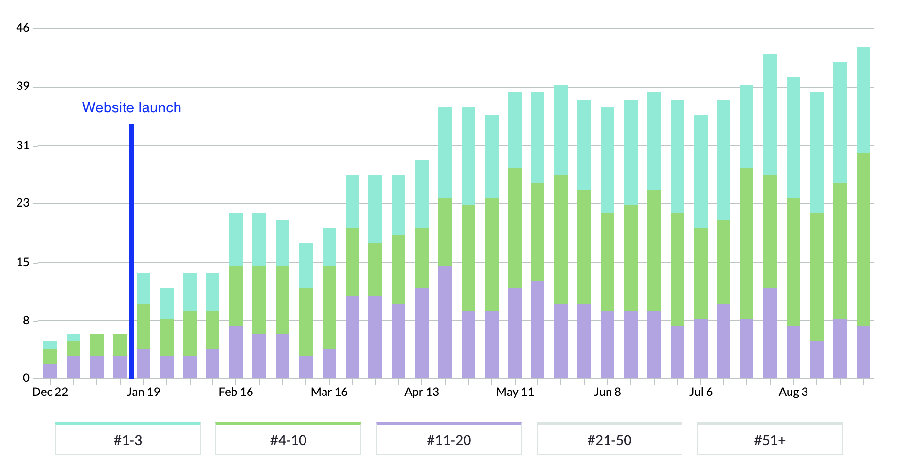
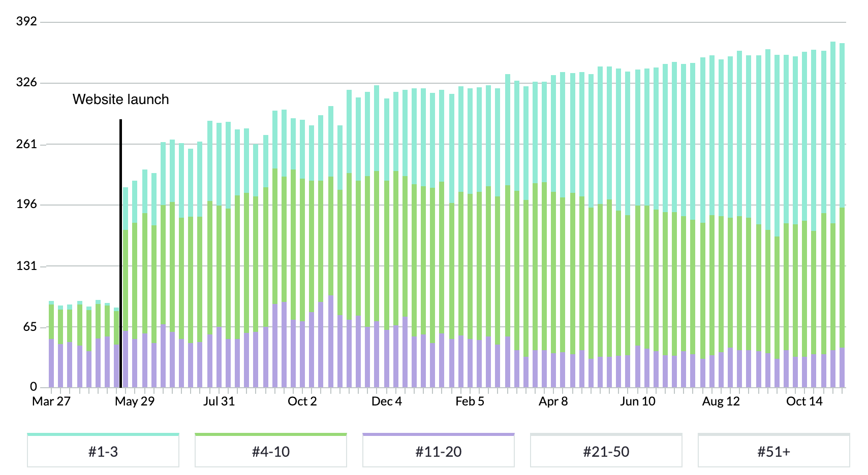
SEO results
The chart above shows Hanson Wade’s US keyword rankings and is taken from an SEO tool called Moz. Blue bars represent positions 1-3 in Google, green represents the remainder of page 1 in Google, and purple shows page 2 listings.
As you can see, the Hanson Wade websites secured huge increases in keyword rankings within the first 6 months. For many keywords, they went from ranking nowhere to ranking on page 1 of Google.
Related work
Isode offers secure messaging software to high security teams in the military and government.
They needed a new website and customer portal to elevate their digital customer experience. They challenged us to enhance their user experience and simplify exploring products and receiving support for customers.
- Lead Time:
- 16 Weeks
- Sector:
- Technology
- Demographic:
- B2B
- Website Goal:
- Modern Design, Improve the User Experience
- Services:
- Brand, Web Design, Web Development, WordPress, Digital Marketing
The challenge
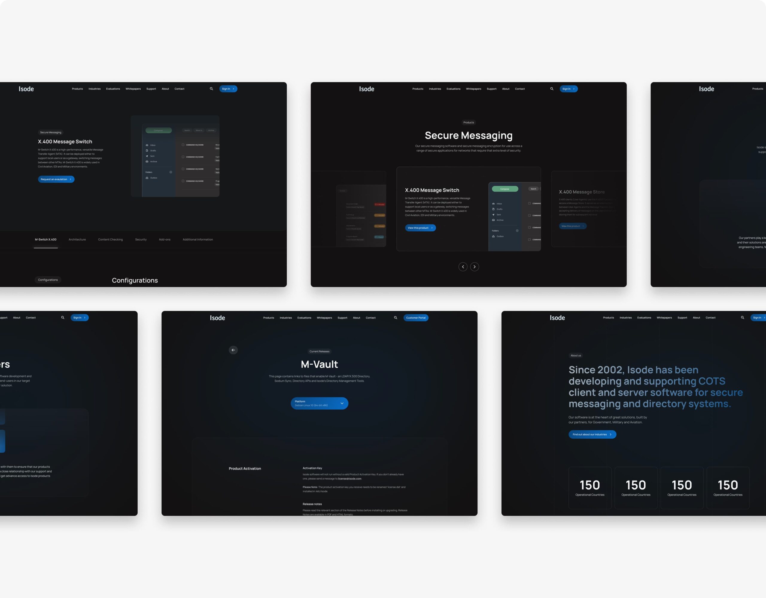
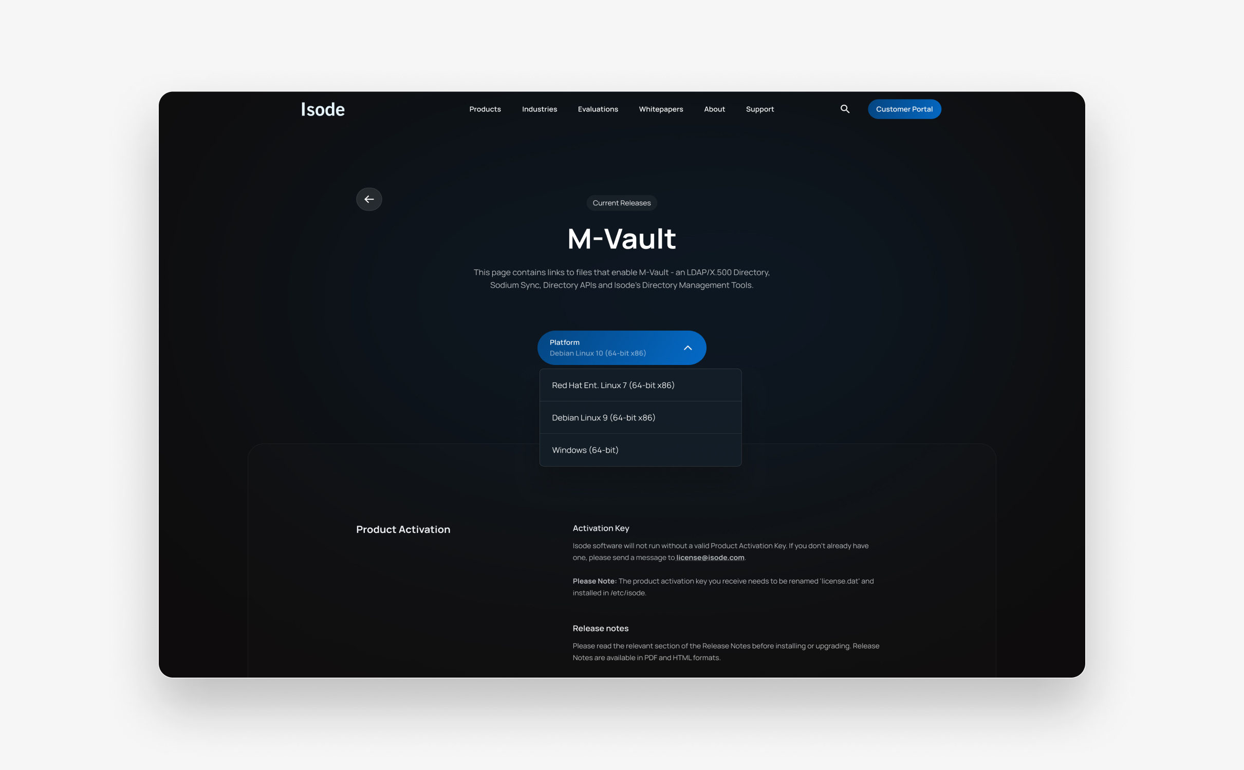
Isode’s existing website was dated and had a complex data architecture that made navigating their site difficult for users. Our challenge was to create a new website structure with clear user journeys and call to actions.
Isode’s products weren’t able to be pictured on the website which presented a design challenge for our team to overcome. With a limited brand available to us, we needed to evolve their brand assets and create a design system that would work for the business and didn’t rely on imagery.
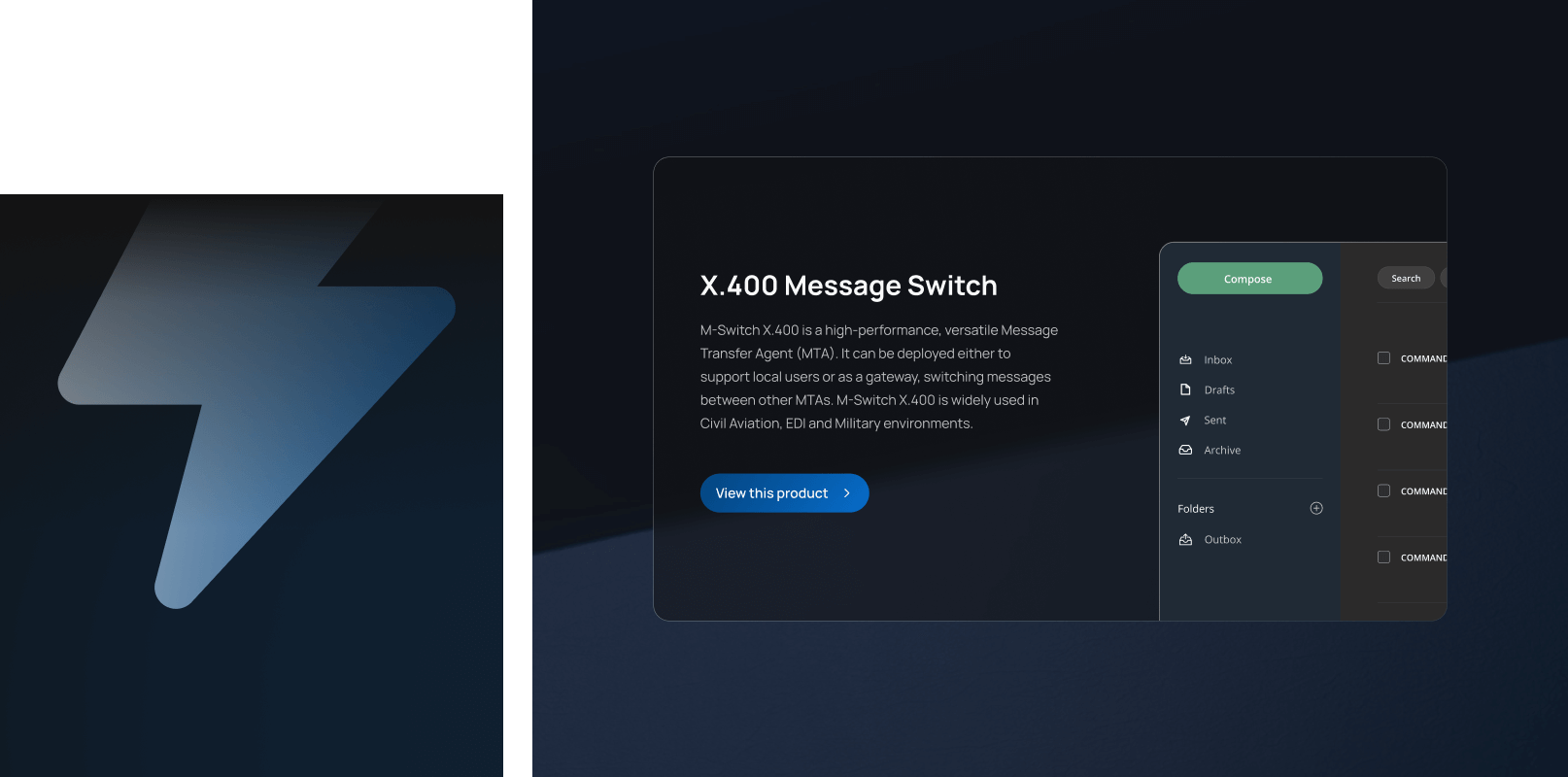
Our team created a clean and modern design that evolved Isode’s brand and utilised data and tables in a visually compelling way.
- Scope
- Figma Wireframe Prototypes
- Figma Design Prototypes
- WordPress Development
- SEO Strategy
- Customer Portal
- Content Curation
- Resource
- 1 x SEO Strategist
- 1 x Website Designer
- 2 x WordPress Developers
- 1 x Quality Assurance Tester
- 1 x Project Manager

“The team at Plug & Play absolutely smashed every aspect of the brief and went on to create something that has massively transformed the way my company is perceived online.
I would not hesitate to work with the Plug & Play team again, and would be more than happy to recommend them to anyone looking for a competent web design agency.”

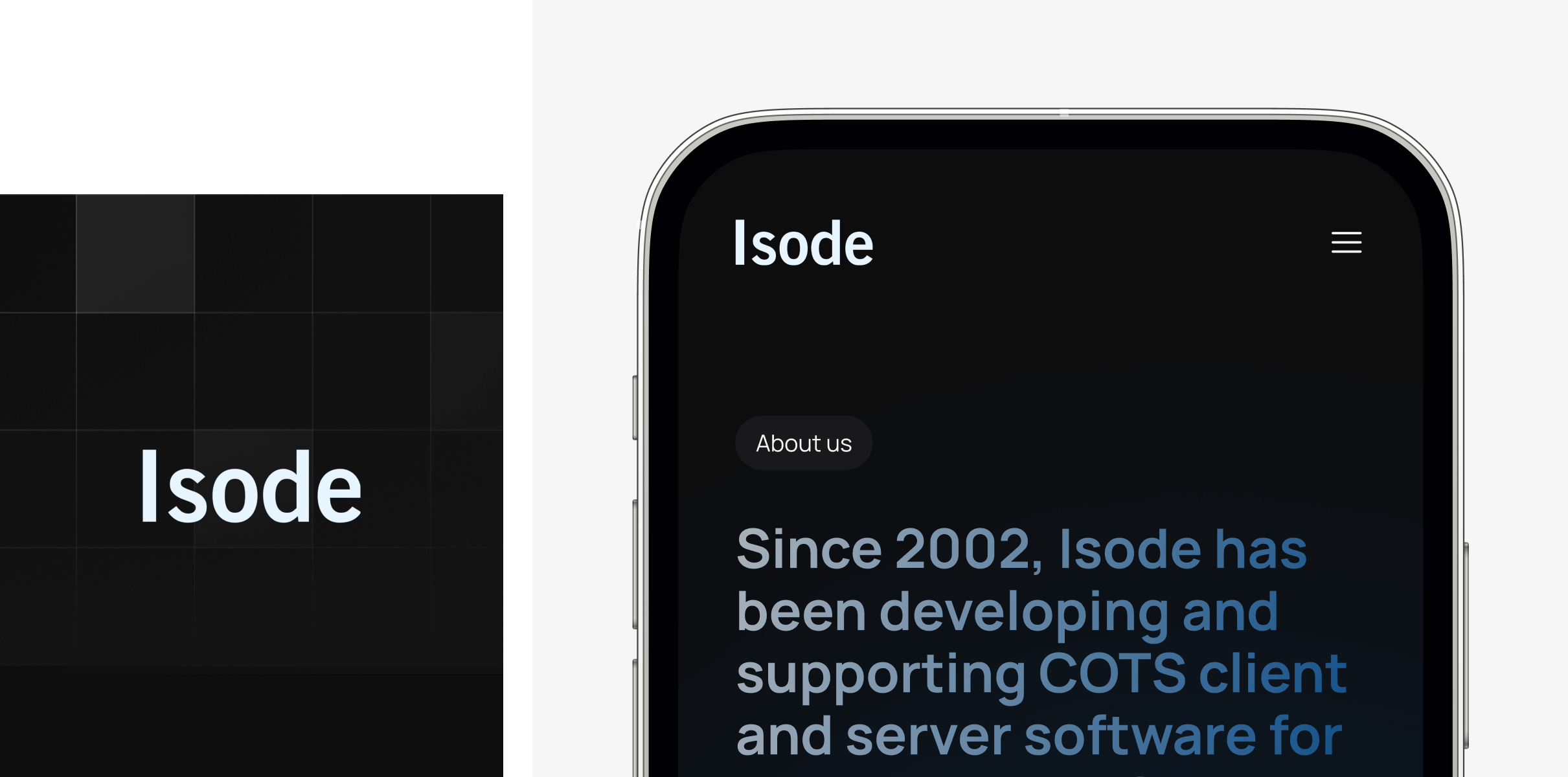
The brand
Before our engagement, Isode had a dated brand with limited imagery which was restricting their ability to produce compelling design assets.
Our design team evolved their brand, keeping the base colours and expanding the colour palette to create design variation. We updated their typography – retaining the rounded fonts but creating a more modern look and feel.
The website
Isode’s new website needed to appeal to a range of customer archetypes and personas. To achieve this, we curated new user journeys that delivered key messages for each audience.
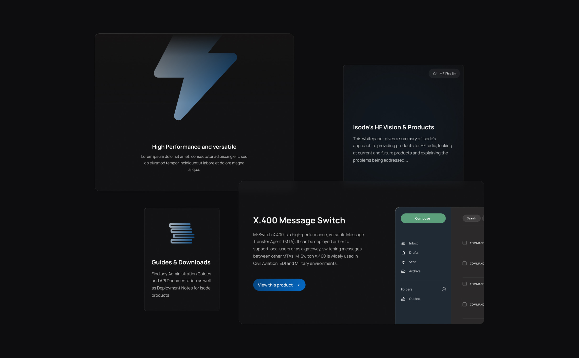
It was important for Isode to communicate their knowledge and expertise while remaining accessible to their non-technical customers. On their product pages, the new website delivers key product information in a clear and simple way while providing deeper technical product information for users to explore further.
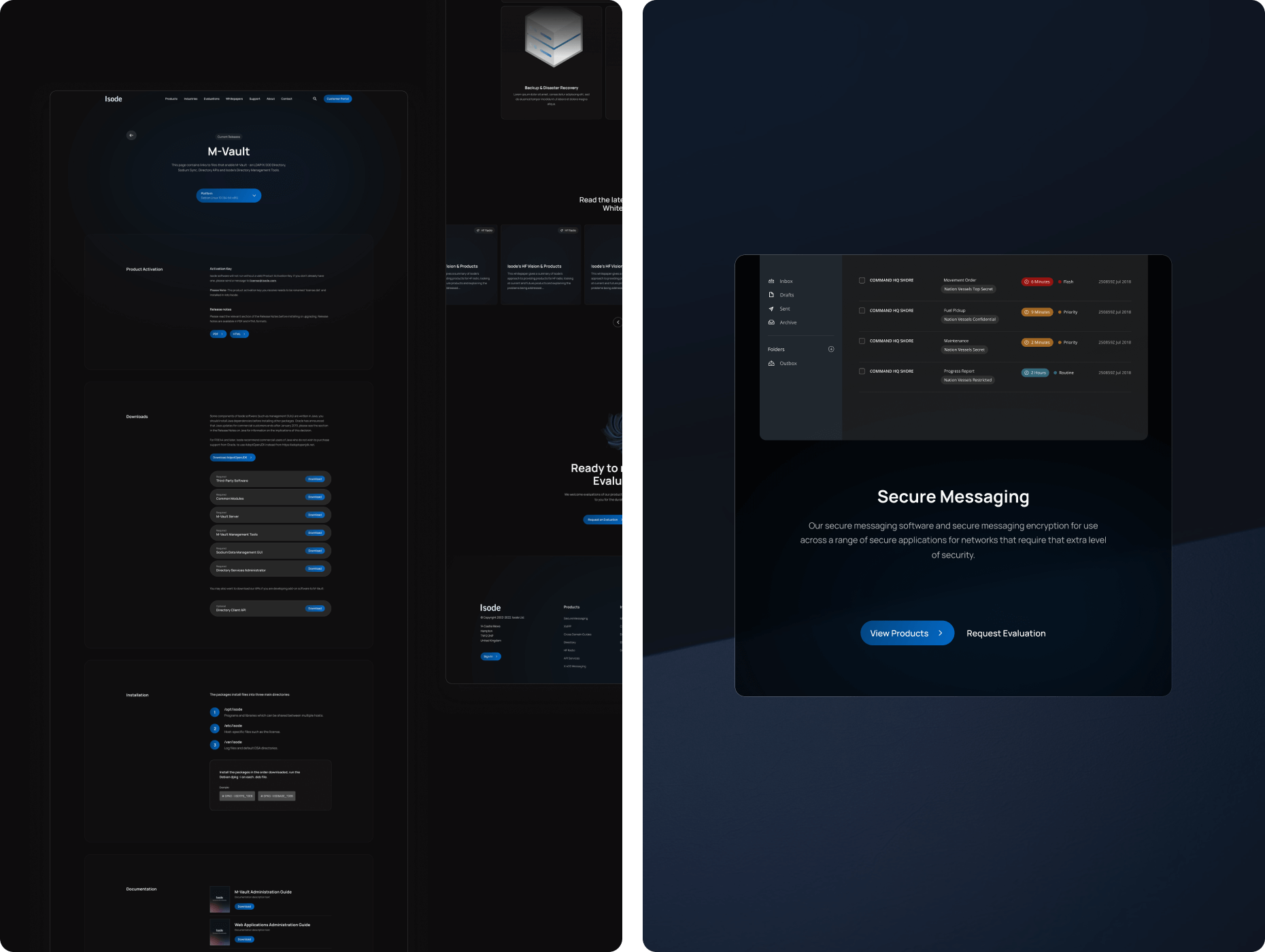
We delivered the new website using WordPress which provides Isode’s marketing team with a secure and flexible CMS. WordPress was also used to deliver the customer portal where customers can login to manage their account, purchases and receive support.
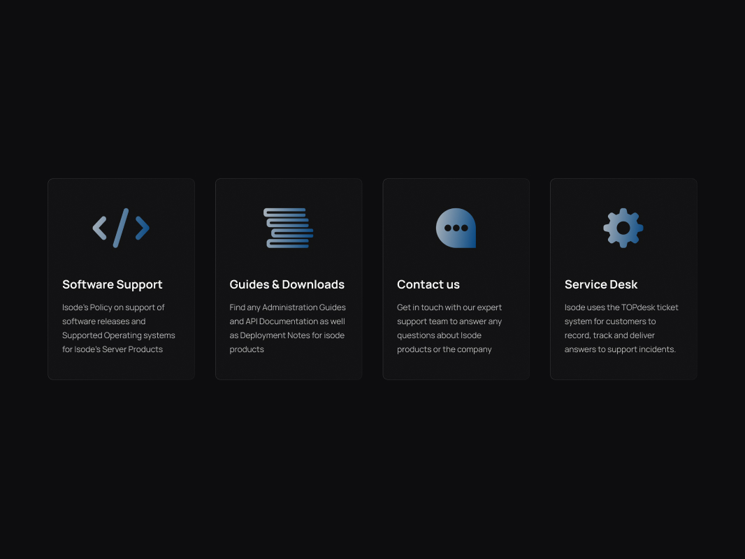
Support
Isode were keen to introduce an SAAS style support system for their customers. We introduced a specific support landing page that utilises tabbed layouts and tables.
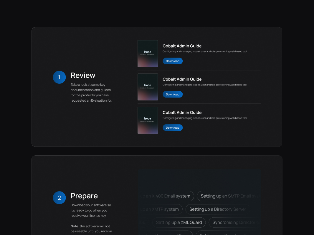
Evaluation form
Upon completion of the evaluation form, users are presented with a pre-filtered set of downloads based on their form selections, enabling them to browse relevant content while their evaluation is processed.
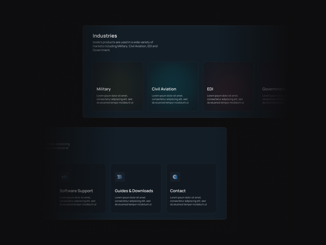
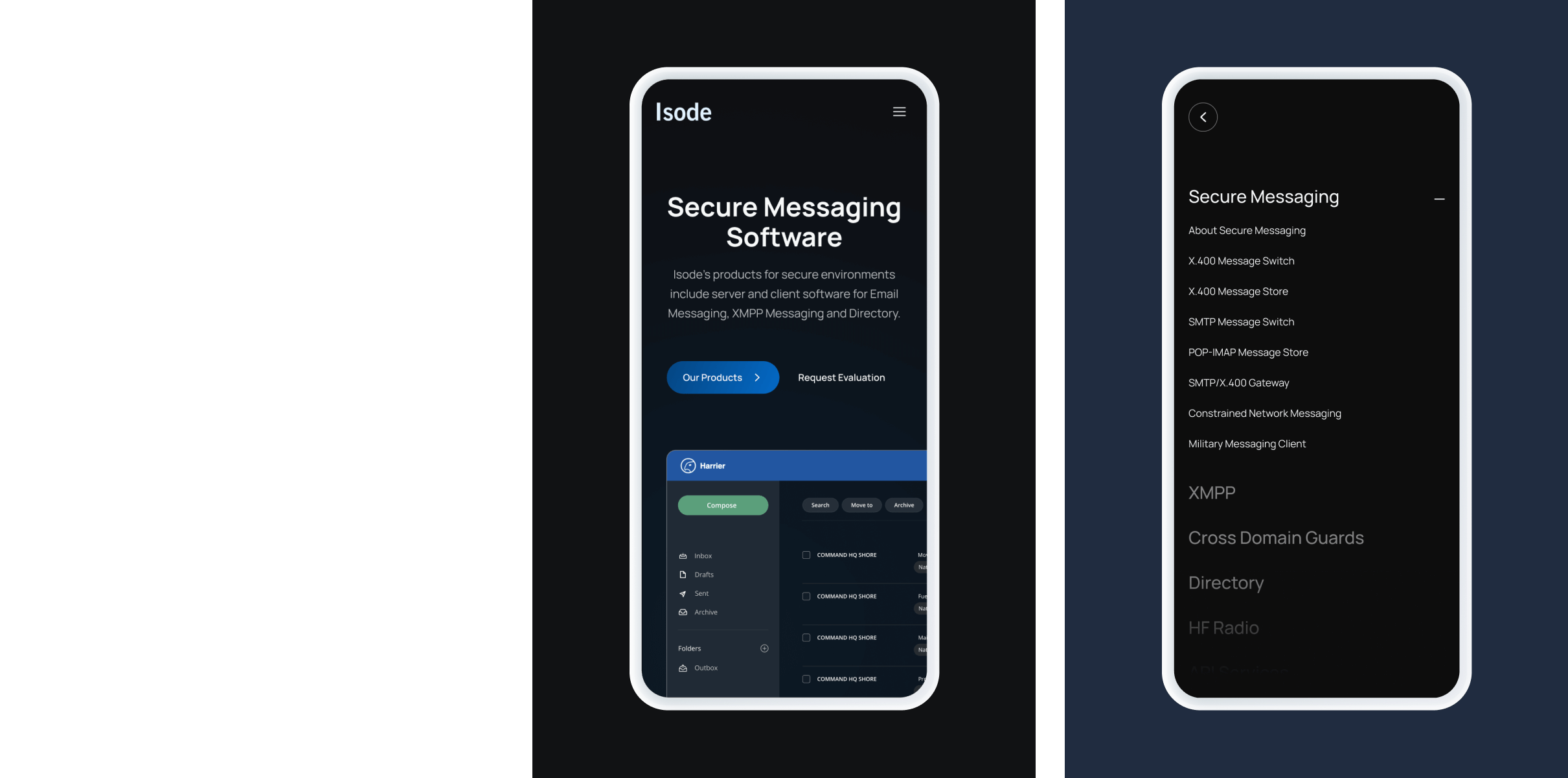
Adaptive navigation menus
The mega-menus had been designed in a way to allow the website to scale , adding and removing elements to link through to new sections of the website.
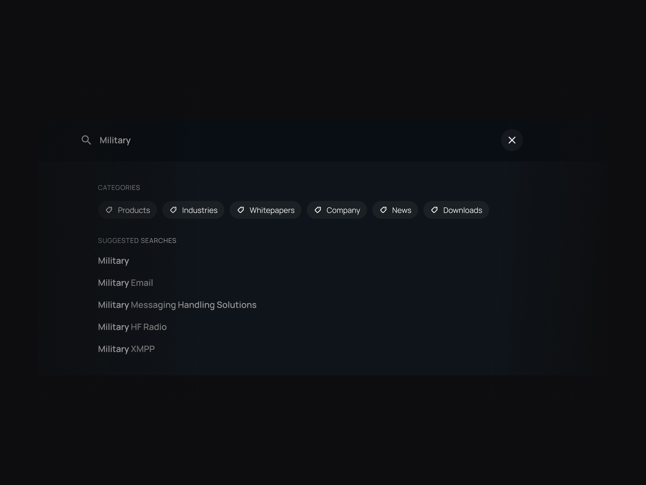
Rich search function
We implemented a deep search function to help customers quickly find relevant content.
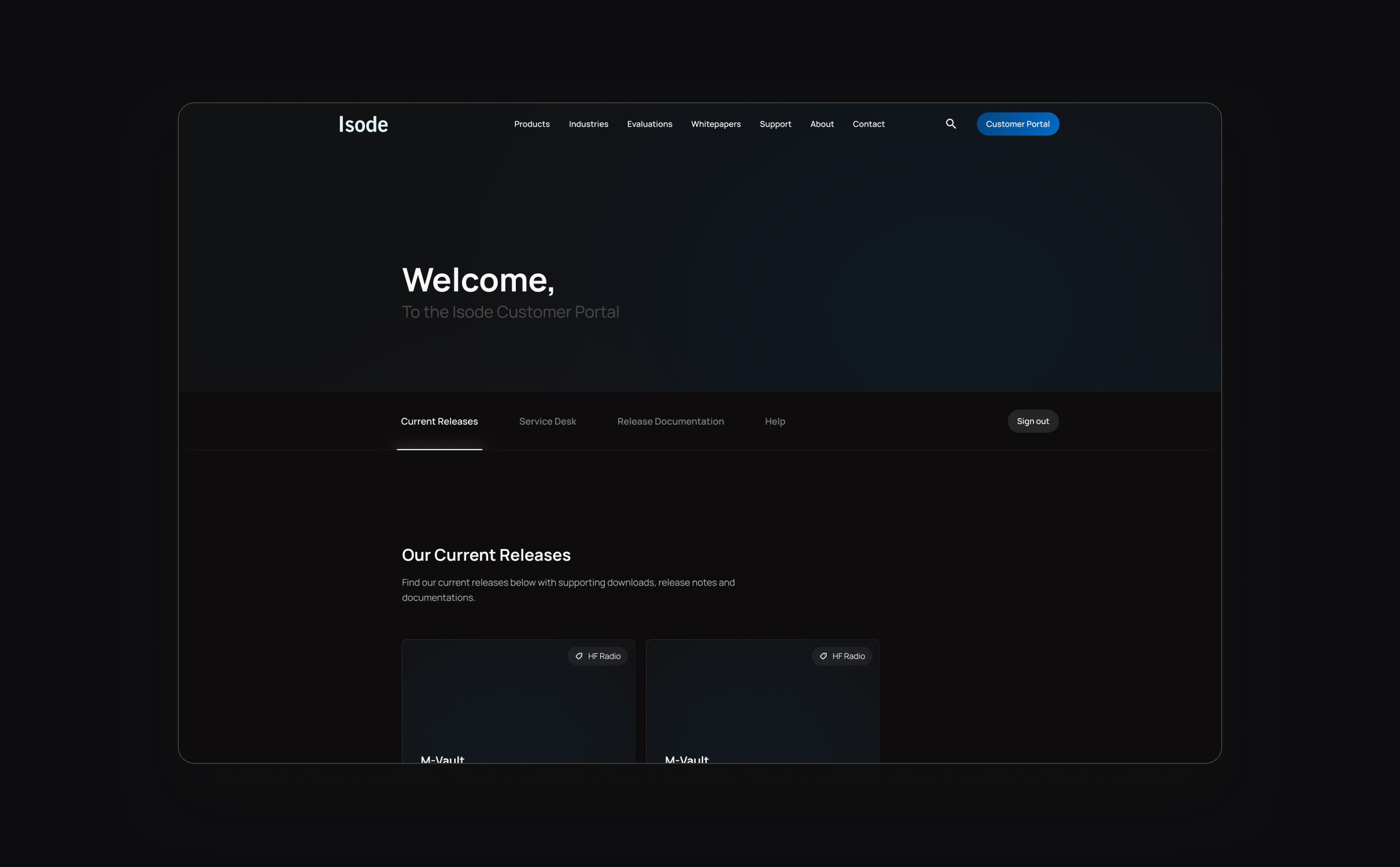
Customer portal
Isode’s customer portal provides a private area of the site where existing customers can receive support and download product documentation.
The customer dashboard for each client can be curated by the Isode team to offer a personalised user experience and a fantastic upselling opportunity.
Digital strategy
We assessed the search volumes, intent and difficulty of hundreds of keywords relevant to Isode’s business. We reviewed which keywords Isode had a statistical chance of securing rankings for in search engines and optimised the website for these target keywords.
Our research fed into the website design and navigation, with our team recommending landing pages and a content structure that would facilitate organic growth.
We also delivered a series of content recommendations that Isode’s marketing team could use to deliver broader content that would support their new keyword strategy.

Related work
Enigma provides reliable, secure and innovative cryptocurrency trading solutions to their clients internationally.
They were ready to reposition themselves in the market, creating a website and brand that reflected their market and would attract prospective customers.
- Lead Time:
- 12 Weeks
- Sector:
- Fintech / Crypto
- Website Goal:
- Reposition the website, Grow online footprint
- Services:
- Web Design, Web Development, WordPress, Digital Marketing

The challenge
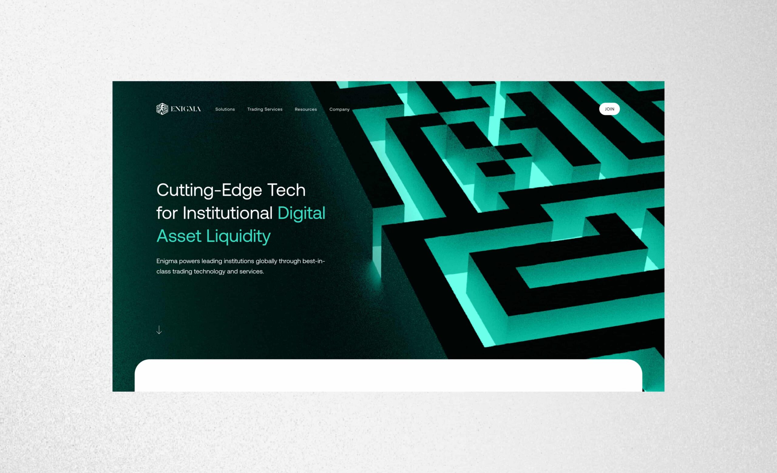
Enigma challenged us to deliver a new website that would provide a flexible platform that their team could use to continue to market and grow the business. They wanted to expand their site and increase their search engine footprint.
The new website design needed to be dynamic, cutting edge and clean, achieving a high-tech look that represents a digital product in the crypto market.
- Scope
- Adobe XD Wireframe Prototypes
- Adobe XD Design Prototypes
- Branding
- WordPress Development
- SEO Strategy
- Asset Creation
- Content Curation
- Resource
- 1 x SEO Strategist
- 1 x Brand Designer
- 1 x Website Designer
- 1 x WordPress Developer
- 1 x Quality Assurance Tester
- 1 x Project Manager
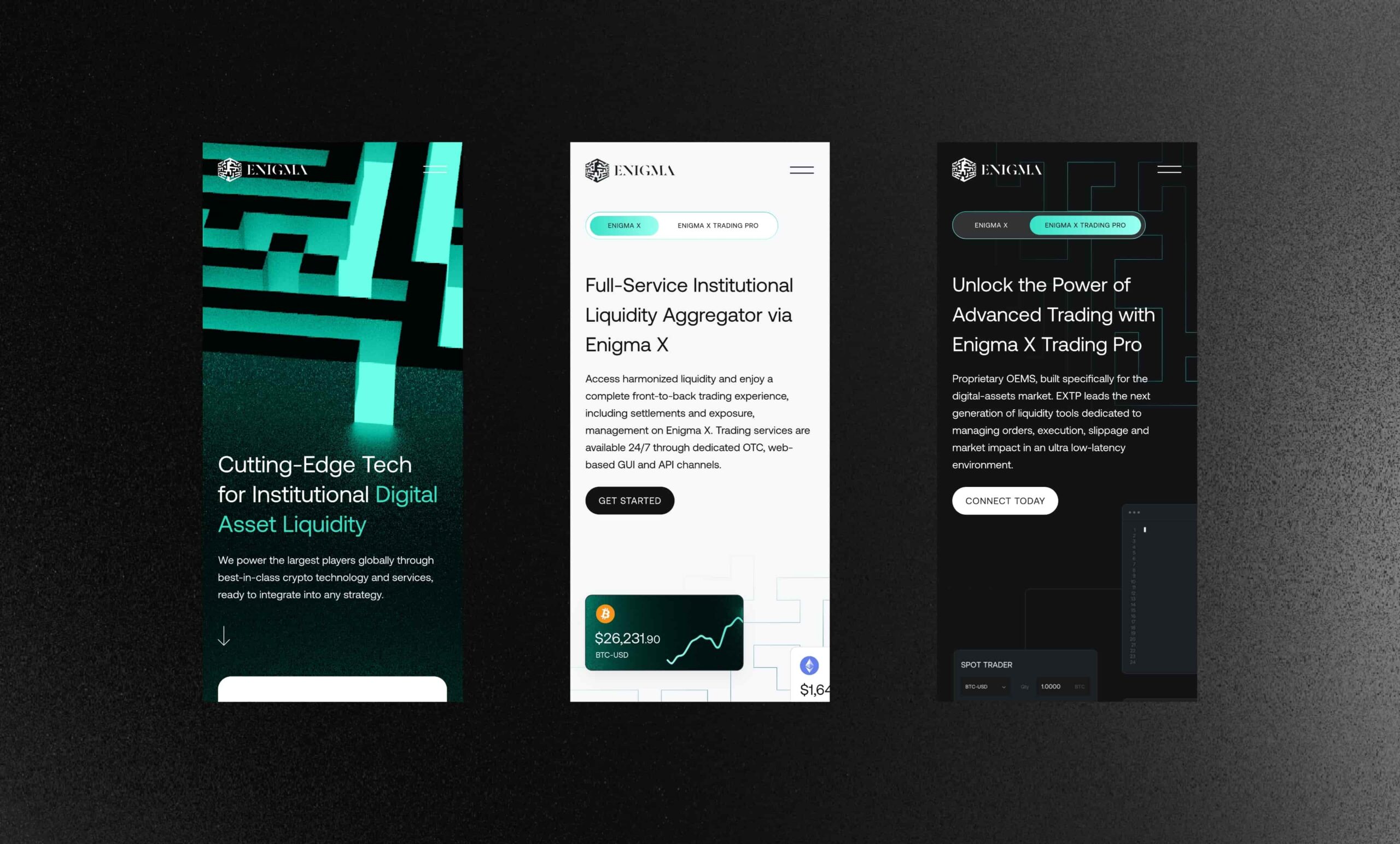
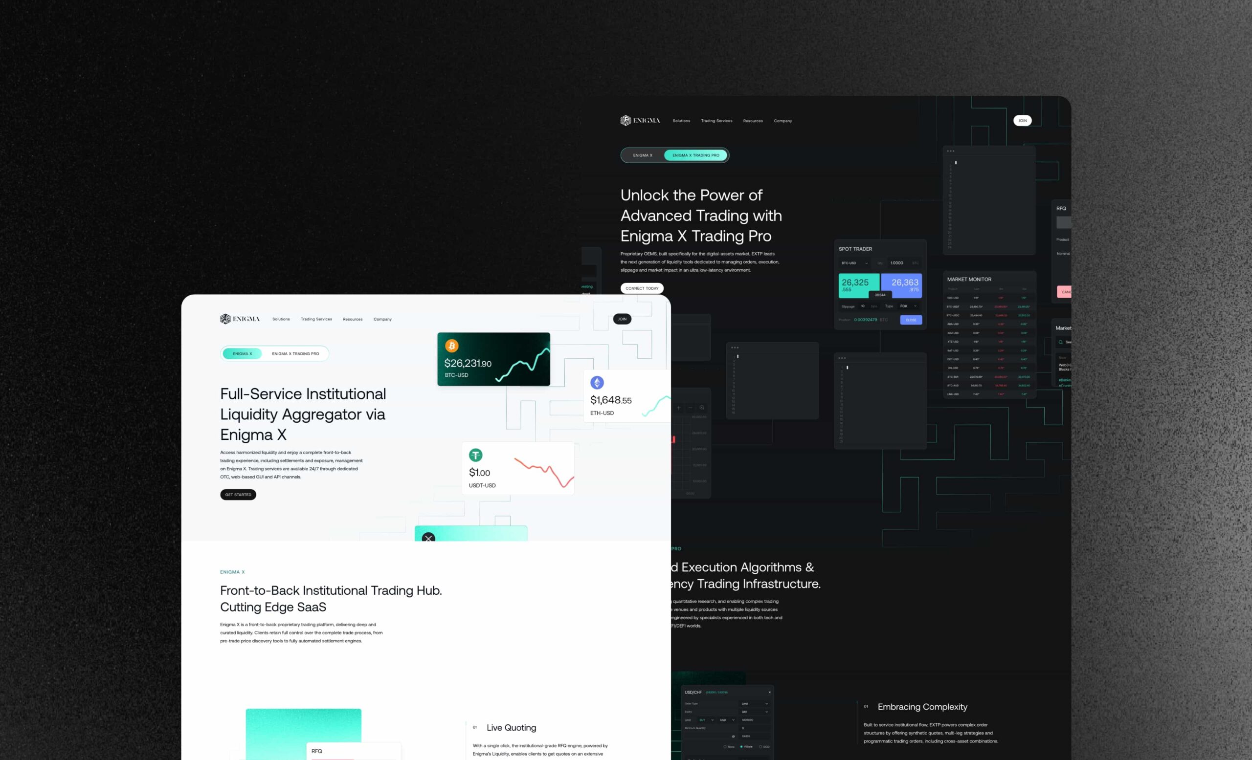
The website
We delivered a modern website that utilises animation and dynamic assets to engage users. We expanded Enigma’s brand and introduced a mixture of dark and light theme page designs and gradients to capture their Fintech audience.
Enigma’s existing brand was limited so we introduced new brand patterns, dynamic image assets, icons and a broader colour palette to provide greater flexibility and design depth.

Dynamic assets
We added depth to Enigma’s site design with dynamic assets and interactivity.
Dark and light mode
We implemented light and dark mode pages throughout the site.
Creative direction
Alongside the website design, we provided creative direction for the imagery and assets throughout the site.
Digital strategy
Our marketing team delivered an SEO strategy to increase Enigma’s organic footprint. We analysed high value keywords that would drive new business via the website and selected keyword targets that Enigma could compete for based on a statistical analysis of businesses holding search engine rankings.
Related work
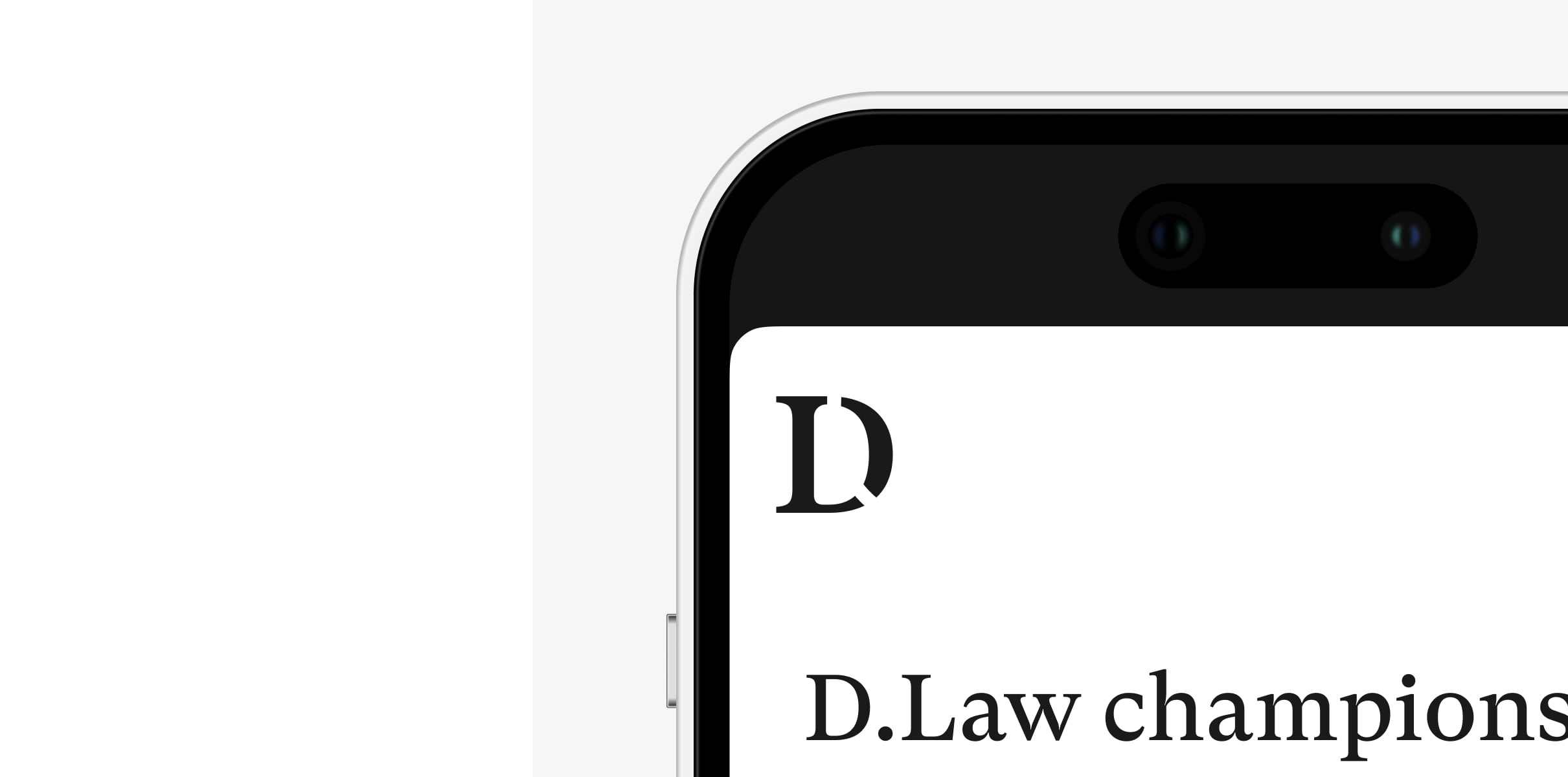
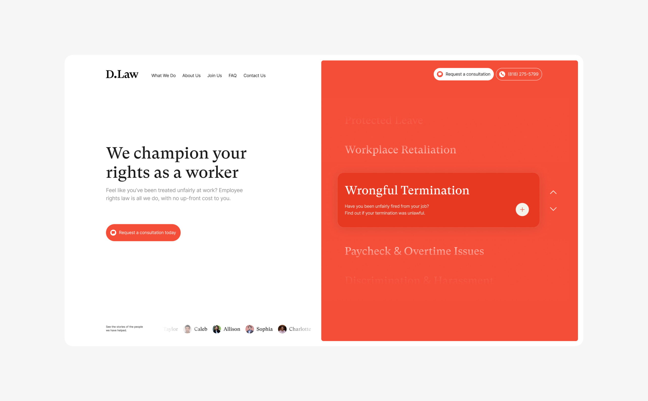
D.Law is a California based law firm that specialises in employment law.
Having recognised that the legal sector digitally lags behind other industries, they challenged us to combine professional legal services and marketing in a way that hadn’t been done before. Their team asked us to overhaul their brand, website and digital footprint.
- Lead time:
- 5 Months
- Sector:
- Law
- Target Type:
- B2C
- Website Goal:
- Reposition visual brand, Generate new enquiries
- Services:
- Branding, Web Design, WordPress, Web Development, Digital Marketing
- Scope
- Brand Identity
- Figma Wireframe Prototypes
- Figma Design Prototypes
- WordPress Development
- SEO Strategy
- Resource
- 1 x Brand Designer
- 1 x Website Designer
- 1 x WordPress Developer
- 1 x Quality Assurance Tester
- 1 x Project Manager
- 1 x SEO Strategist
The challenge
Having identified an opportunity to lead their market by combining their established reputation with great marketing, D.Law commissioned us to transform their visual brand and website.
Outwardly, they looked like every other corporate law firm, with no clear point of difference or visual alignment with the clients that they wanted to attract. They challenged us to draw inspiration from forward-thinking disruptors in industries such as insurance and banking that are leading in-industry change.
D.Law is authoritative, approachable and empathetic, and that needed to be reflected in the new designs. They wanted to utilise video content within their site and increase new enquiries by growing their search engine rankings and organic traffic.
The brand
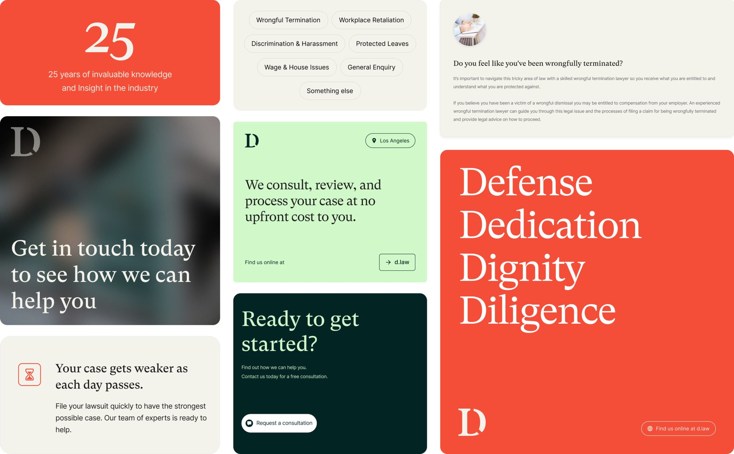
D.Law offer an at-need service and many of their clients find them during a period of distress in the workplace. They wanted to create a feeling of safety for prospective clients where they felt understood and trusted that D.Law had the ability to win their case.
We created an approachable and professional brand by overhauling their colour palette, logo, typography, shape and form, and imagery.
The new brand delivers a high level of flexibility, giving D.Law’s marketing team the ability to create new brand assets seamlessly
Brand concept creation
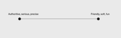
D.Law’s brief was that they wanted to be authoritative while also fun, cool and approachable. Our first step was to calibrate these traits and understand the balance – were D.Law more serious and authoritative or were they fun and soft?
Our brand concept phase explored 2 different visual expressions of the brief in a mood boarding process. One concept was a more serious expression of the brief and the other was a softer approach.
This visual calibration enabled us to better understand the brief and client vision for the brand.

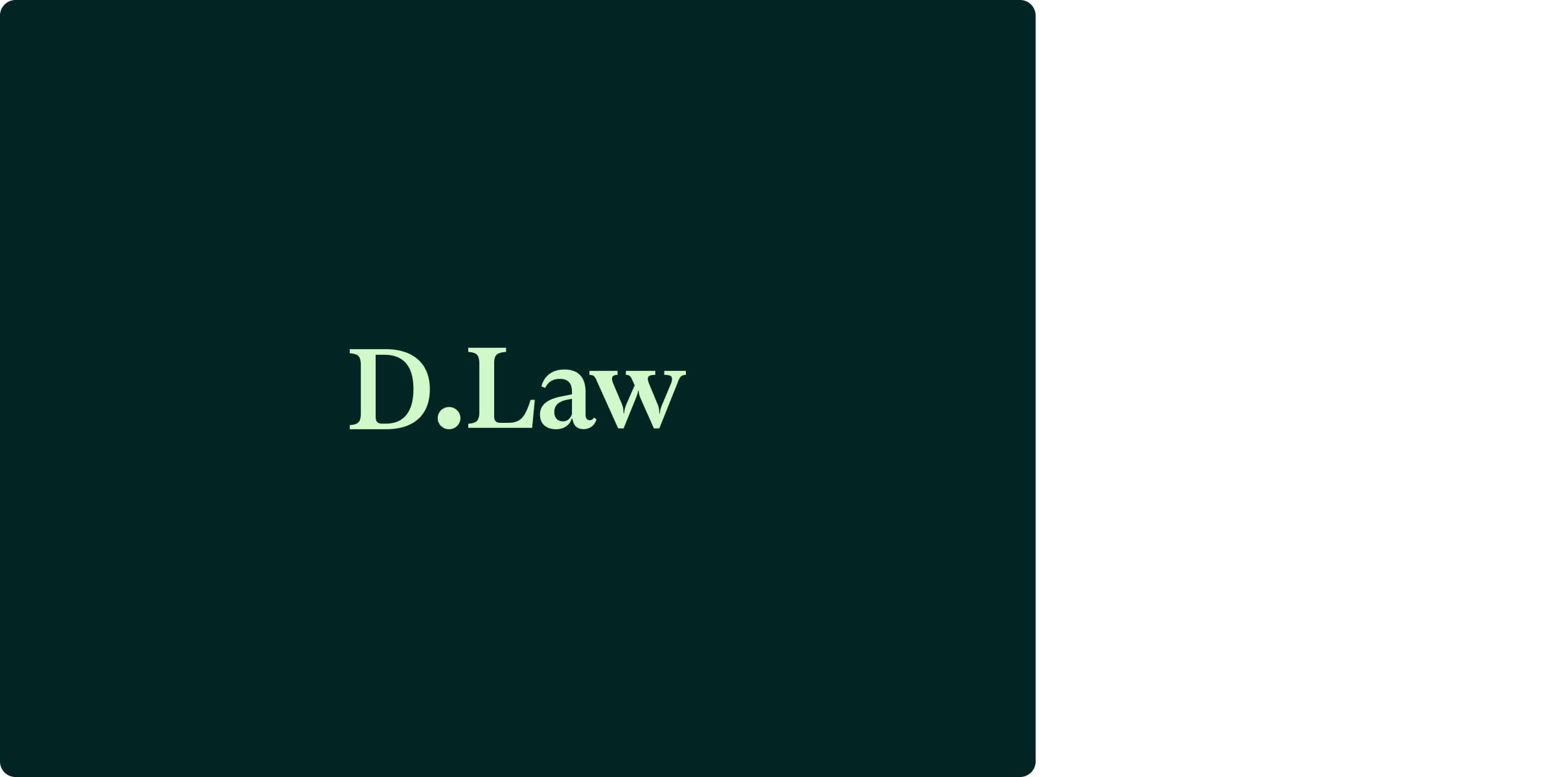
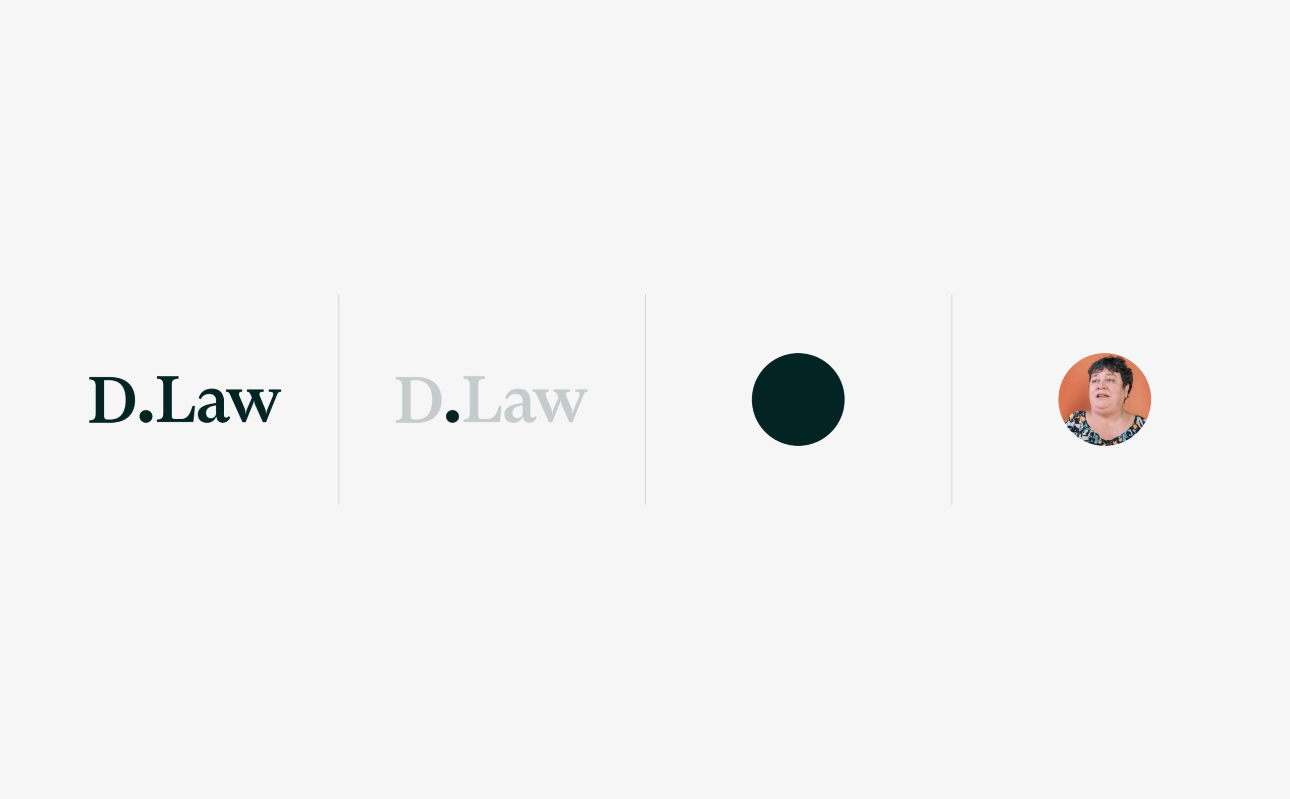
The logo
We delivered a new responsive logo that can be simplified to a ‘D’ icon on smaller screens and social media.
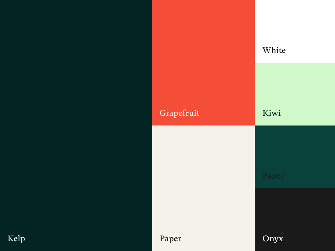
Colour palette
We selected an approachable colour palette of greens and earth tones that can be accented by a bold grapefruit colour.
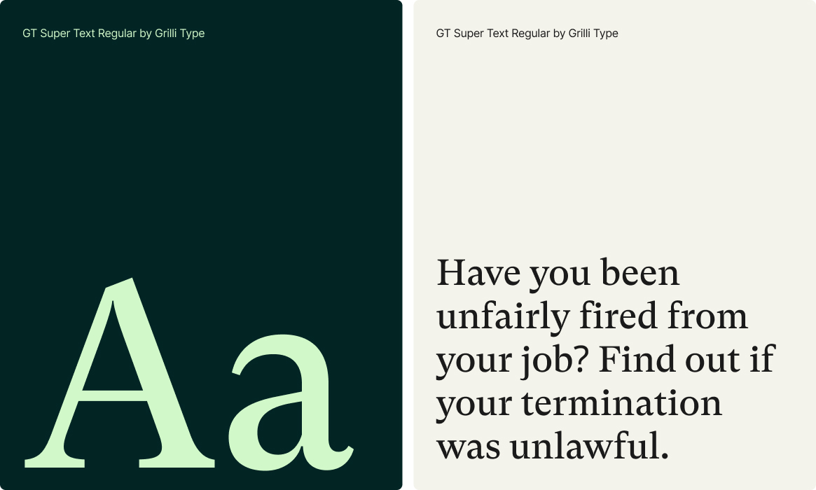
Typography
We selected a serifed font as a nod to the traditional roots of the legal sector and to convey authority and confidence.
Imagery
We selected authentic imagery that showcases the real people that D.Law serves. The imagery is clean, simple and positive.
Shape & form
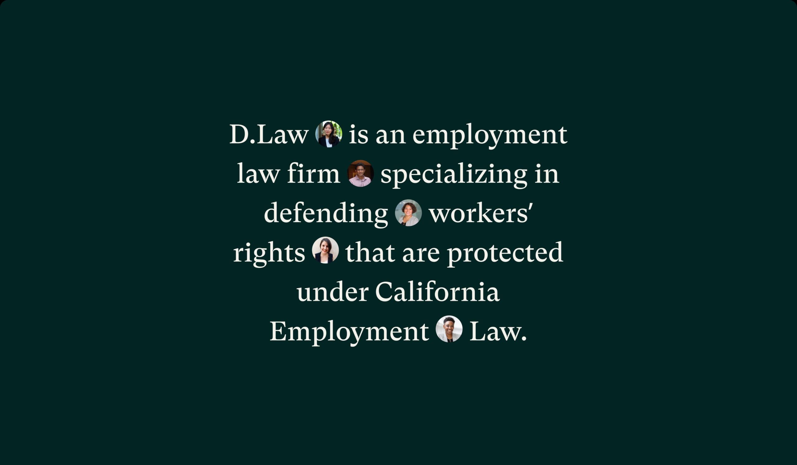
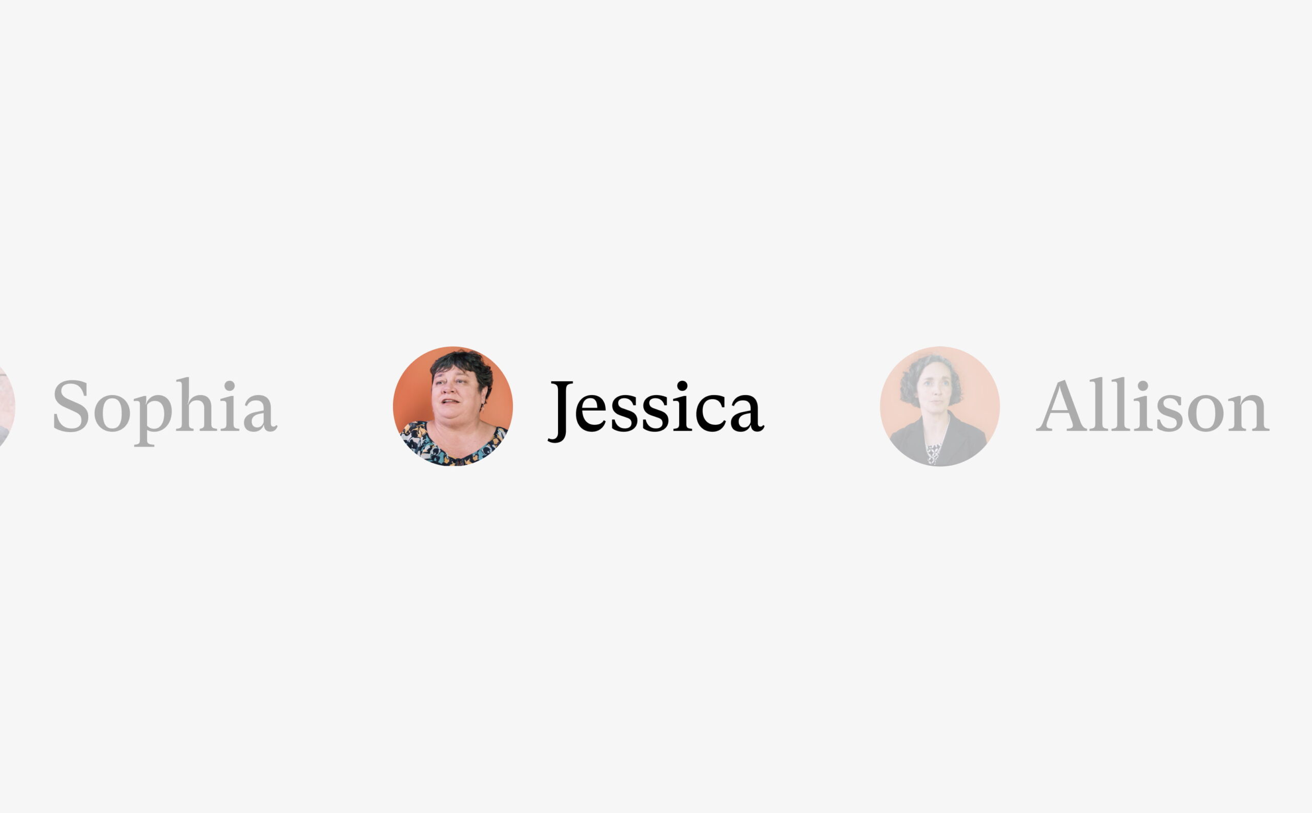
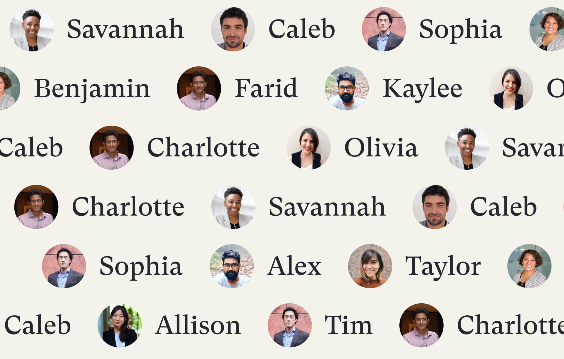
We drew inspiration from the new logo to develop brand devices that create design depth. The . from the logo is used as an image device that holds mini profile pictures. These are accompanied by names and stand for representation and impact.
The hard and soft lines of the font feed into the slightly rounded boxes that are used throughout the site. These shapes break up content, highlight text and create a sense of togetherness within the content and design framework.
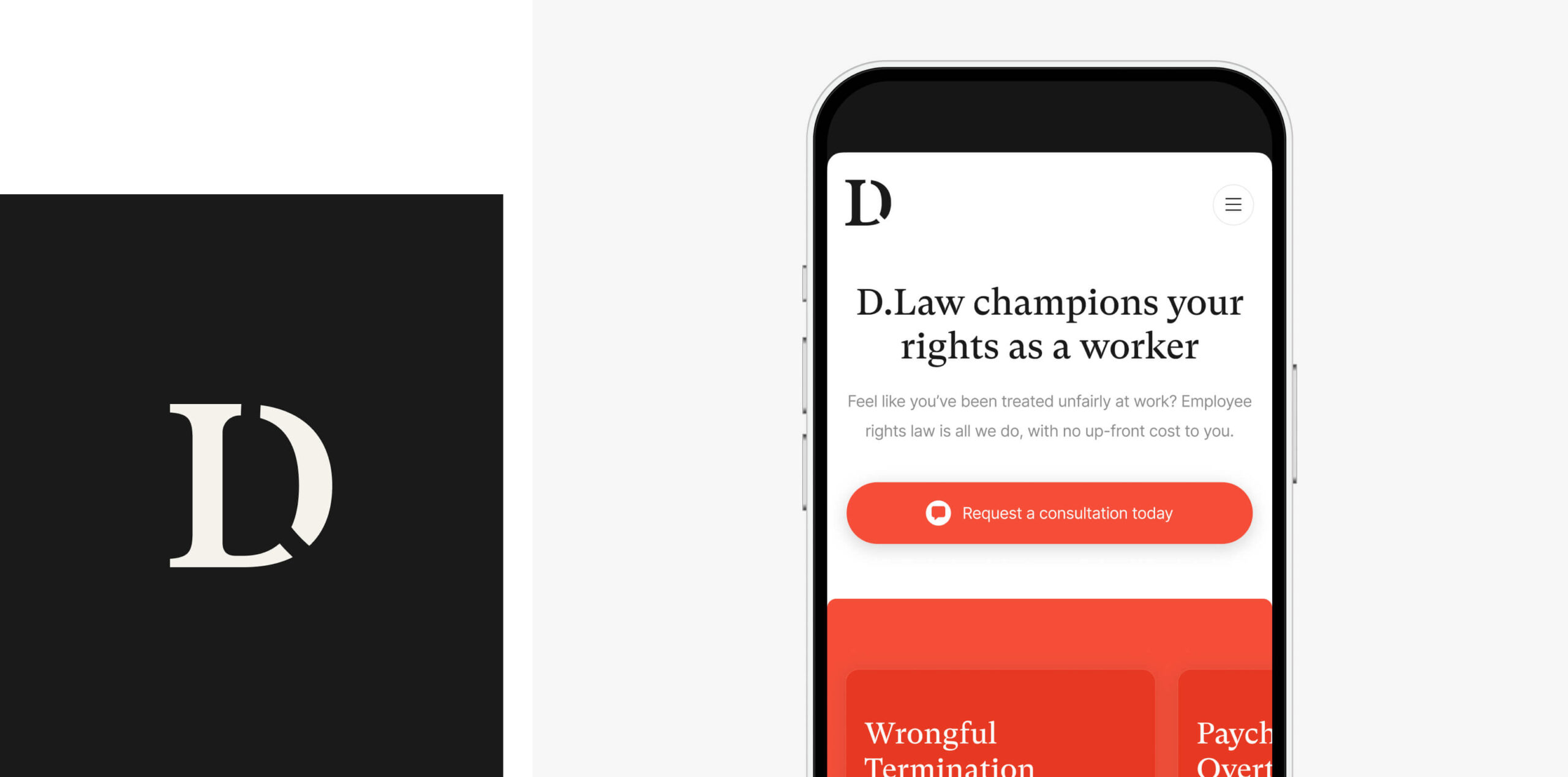
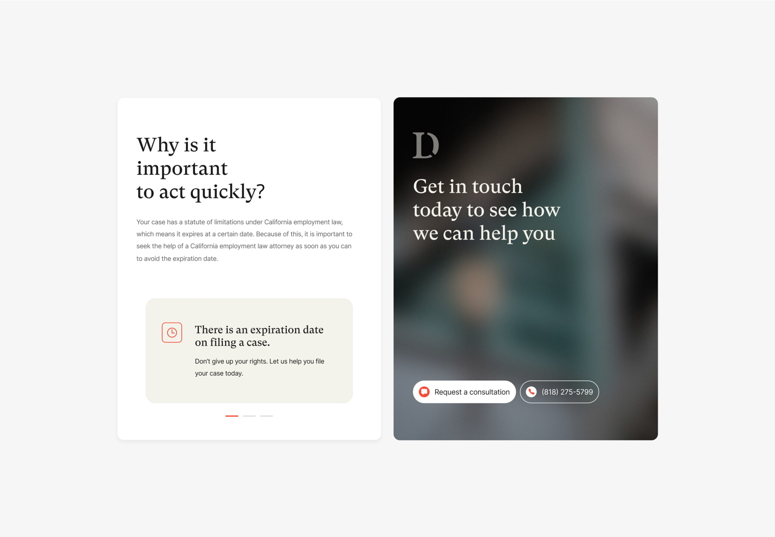
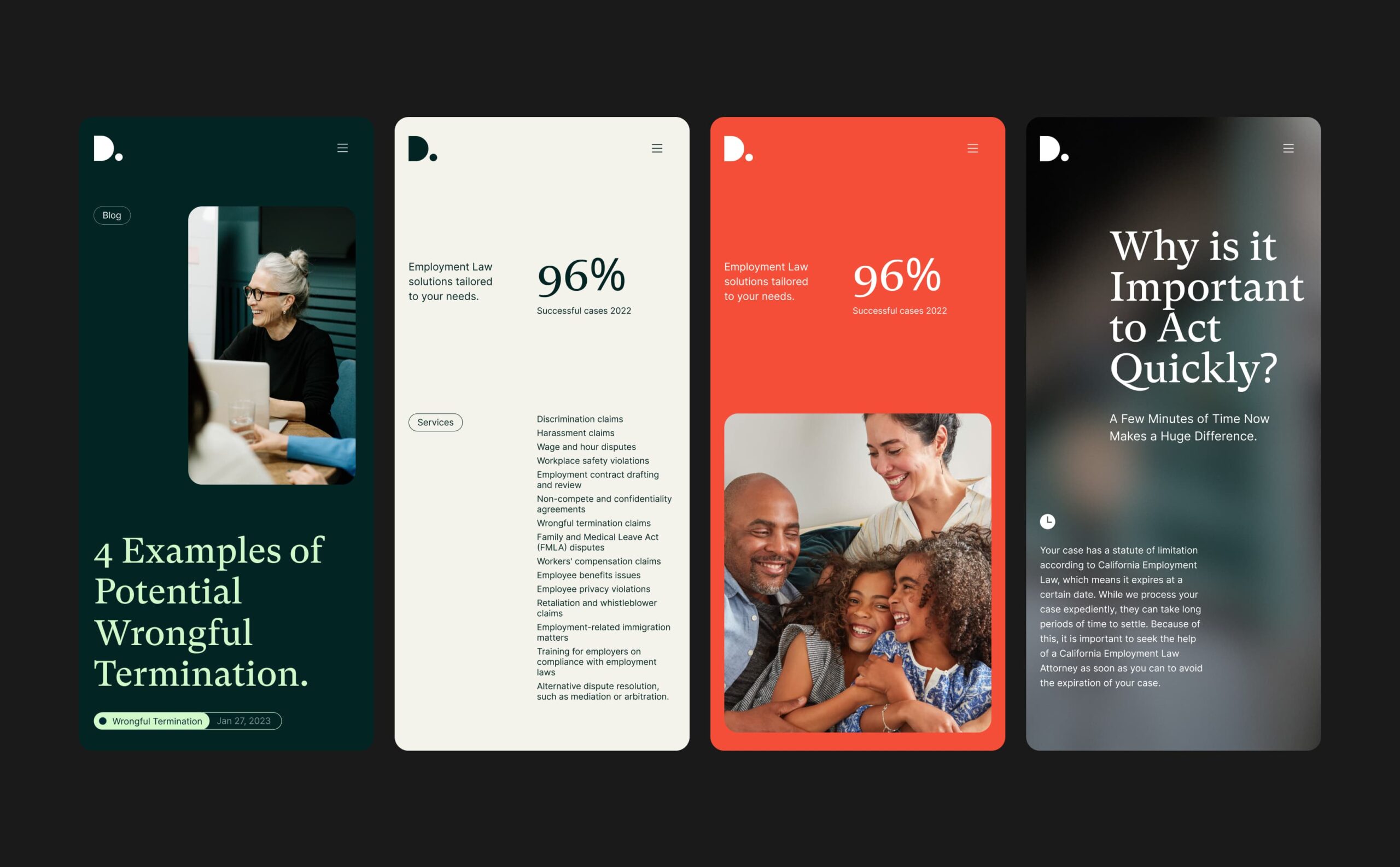
The website
D.Law’s new website needed to increase their search engine visibility and generate new business for the law firm.
To achieve this, we delivered a new website around a digital strategy that combined keyword research with website structure, landing page recommendations and entry and exit point reviews.
The website design utilises the new brand and incorporates video content to achieve an approachable feel while demonstrating knowledge and communicating key messages.
We developed the website in WordPress, providing the D.Law team with a flexible CMS that they can use to continue managing and editing their website content.

The SEO strategy
D.Law had domain metrics that could be competitive for a number of keywords. They were competing against some very well established businesses with extremely competitive positioning. Our job was to assess the keyword battles that D.Law had a statistical chance of success with, focusing their resources on strategic targets.
The new website was designed and built with SEO best practice at its centre, feeding into every touch point of the design and development.
Domain migration
D.Law made the business decision to change their domain name as part of their rebrand. Changing domain can be a risky process if incorrectly managed and it’s important that an experienced team handles the process.
Our marketing team managed the domain migration, ensuring that a best practice process was followed and that the client’s domain metrics and competitive position were seamlessly transferred with the launch of the new site.

“I wouldn’t hesitate to recommend Plug & Play. They delivered a sector-leading brand, website and marketing strategy for us, capturing the empathetic nature of our business while also producing something bold and authoritative.
Their team is outcomes driven (like us) and they immediately understood what we were looking to achieve. I’d definitely work with them again in the future.”

Related work
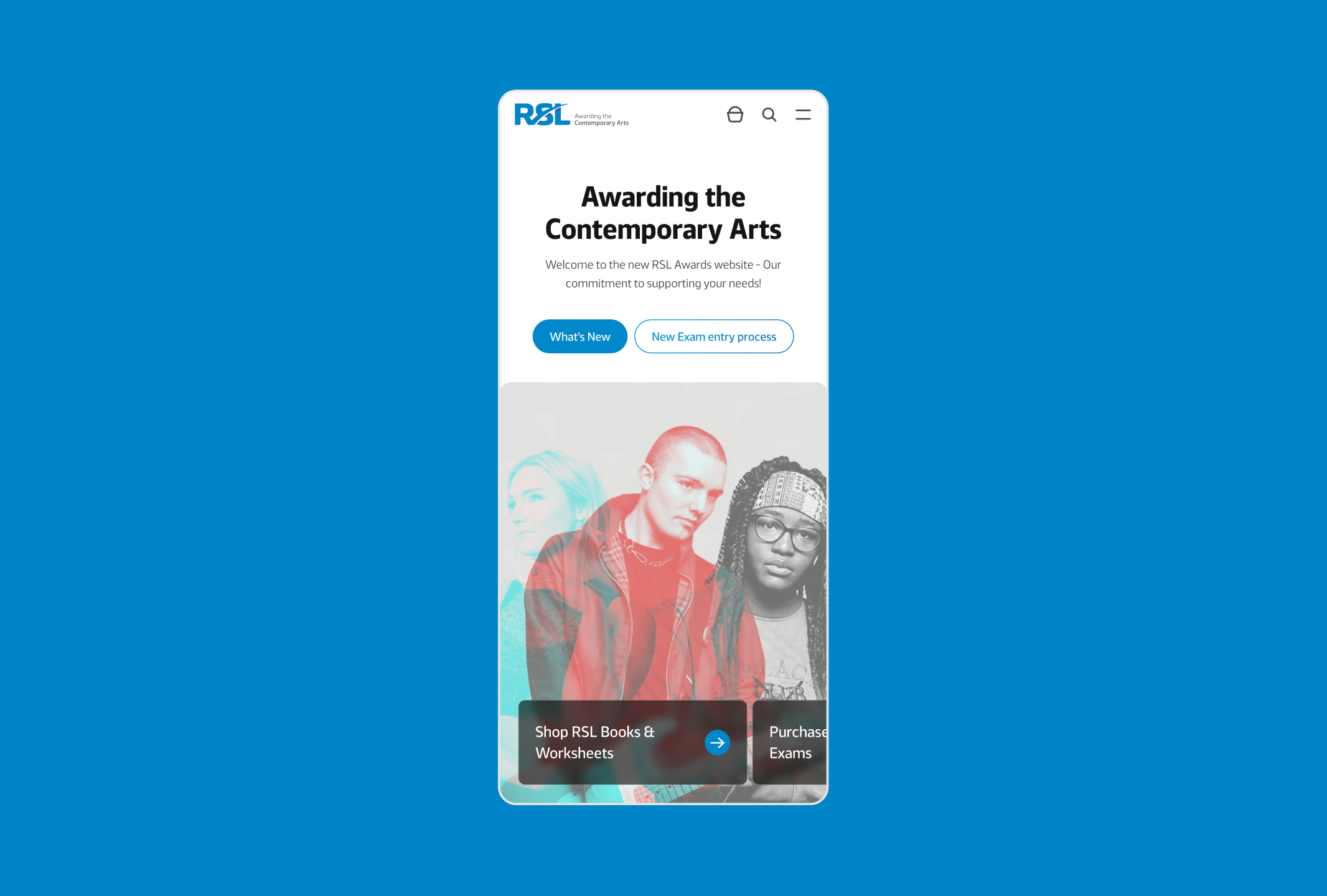
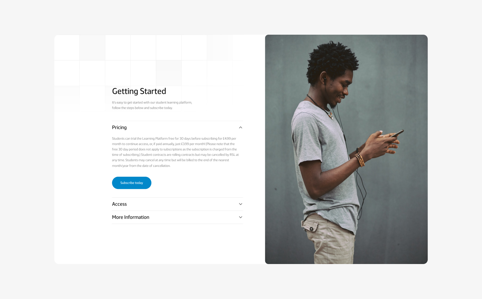
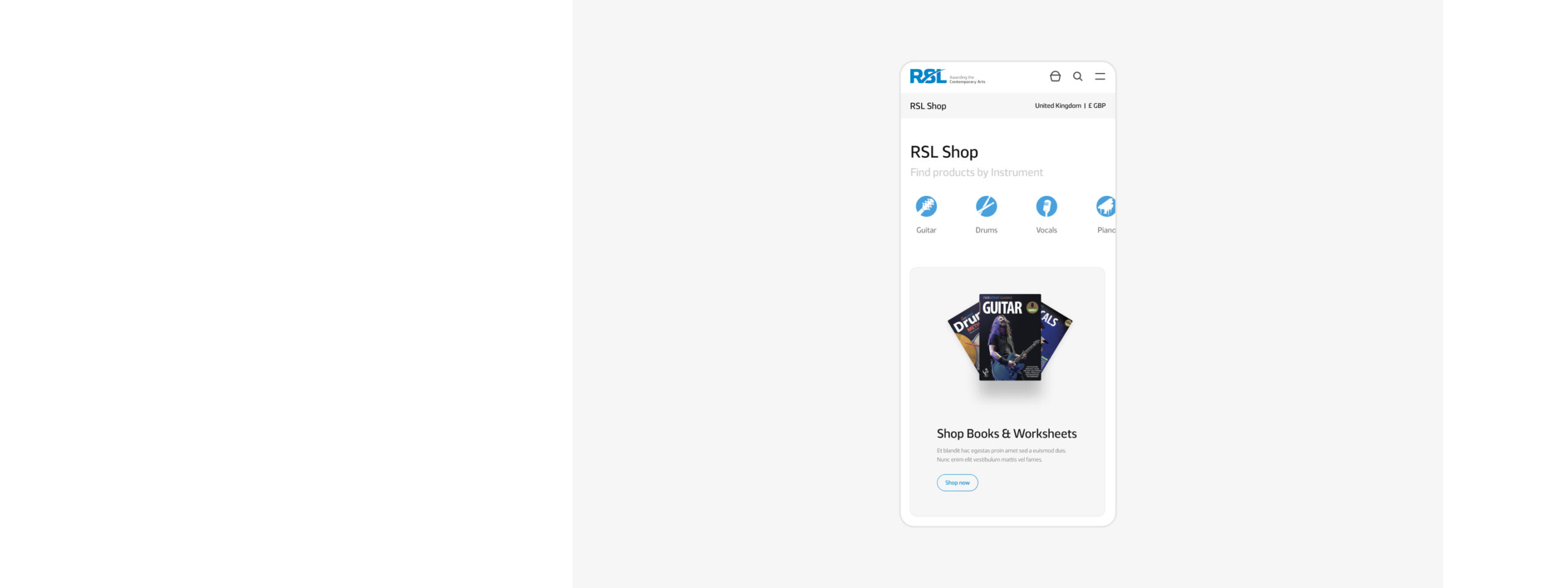
RSL Awards is an international awarding body based in the UK that provides music grading, lessons, exams and learning materials.
They had an established offline network of schools, colleges, universities, music teachers and students who purchased their lessons, materials and gradings but their digital infrastructure was segmented. RSL needed to digitally transform their online ecosystem with the delivery of a new headless eCommerce website and technology stack to deliver a seamless omni-channel user experience.
- Lead time:
- 12 Months
- Sector:
- Musical Education & Awards
- Target Type:
- B2B & B2C
- Demographic
- Music Teachers & Schools, Parents, International Distributors
- Website Goal:
- Increase sales, Increase teacher sign ups, modernise the interface
- Services:
- Web Design, Web Development, Headless Shopify, WordPress, Digital Marketing, eCommerce, Digital Transformation

The challenge
Having grown organically over time, RSL’s website had become disjointed and difficult to use. It utilised a number of different systems, websites and technologies to deliver a broad range of functions. For example, one website was used to sell learning materials and another was used for lesson and exam bookings. This segmented approach overcomplicated the user experience and made it impossible to purchase complimentary products such as lessons, music books and exams together.
RSL challenged us to overhaul their digital infrastructure and deliver a unified website with an omni-channel user experience that would deliver a high quality and consistent user experience.

Our approach
Our team delivered a digital transformation process for RSL, selecting new technology that would enable them to unify their user journeys into a single intuitive website with more accessible content.
By combining the user journeys, we enabled RSL to tap into the gift giving market which funds a significant proportion of musical education, with the majority of learning being financed by parents or grandparents.
We delivered a technology review, proof of concept, new website, headless eCommerce system and SEO strategy to create a high performance website that was intuitive, flexible and provided a seamless user experience. The new ecosystem has a number of deep integrations that were managed by our development team to ensure that data was seamlessly and securely passed between systems.
- Scope
- Digital Transformation
- Technical Assessment
- Adobe XD Wireframe Prototypes
- Adobe XD Web Design Prototypes
- UX Design
- International WordPress Development
- Multilingual & Multi-currency
- Headless Shopify
- eCommerce
- SEO Strategy
- Integration with CloudApp & Dynamics
- Resource
- 1 x SEO Strategist
- 1 x Website Designer
- 1 x Technical Solutions Architect
- 2 x WordPress Developer
- 1 x Shopify Developer
- 1 x Backend Developer
- 1 x Quality Assurance Tester
- 1 x Project Manager
Technical review
We assessed RSL’s business requirements and proposed a technical solution that leveraged multiple systems as part of a composable architecture approach. By combining a number of market-leading solutions, we could deliver a high performance website while avoiding the high costs and risks associated with delivering custom functionality.
Our solution utilises Headless Shopify as the eCommerce engine behind the site. WordPress was selected as the CMS ‘head’ to provide RSL with the most content dexterity and the best SEO outcomes. Microsoft Dynamics was retained as RSL’s ERP system and we utilised RSL’s API to integrate with WordPress and Shopify.
Combining technology adds a level of complexity to a project and it’s critical to ensure that the systems work in harmony together. We created a proof of concept of our recommended technology stack (WordPress, Shopify, Dynamics and RSL’s internal API) before the website project started to test how the systems worked together and check the integration points.
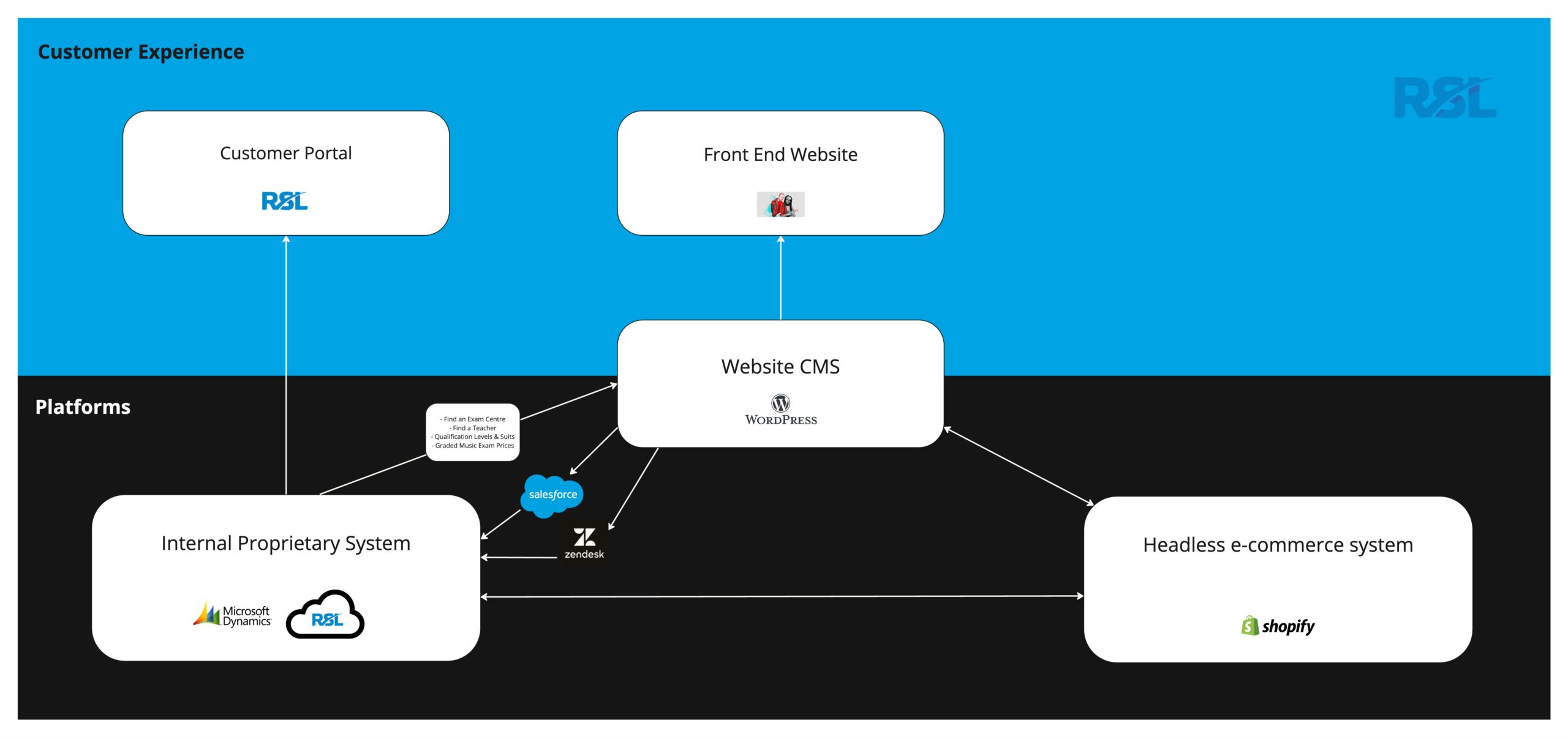
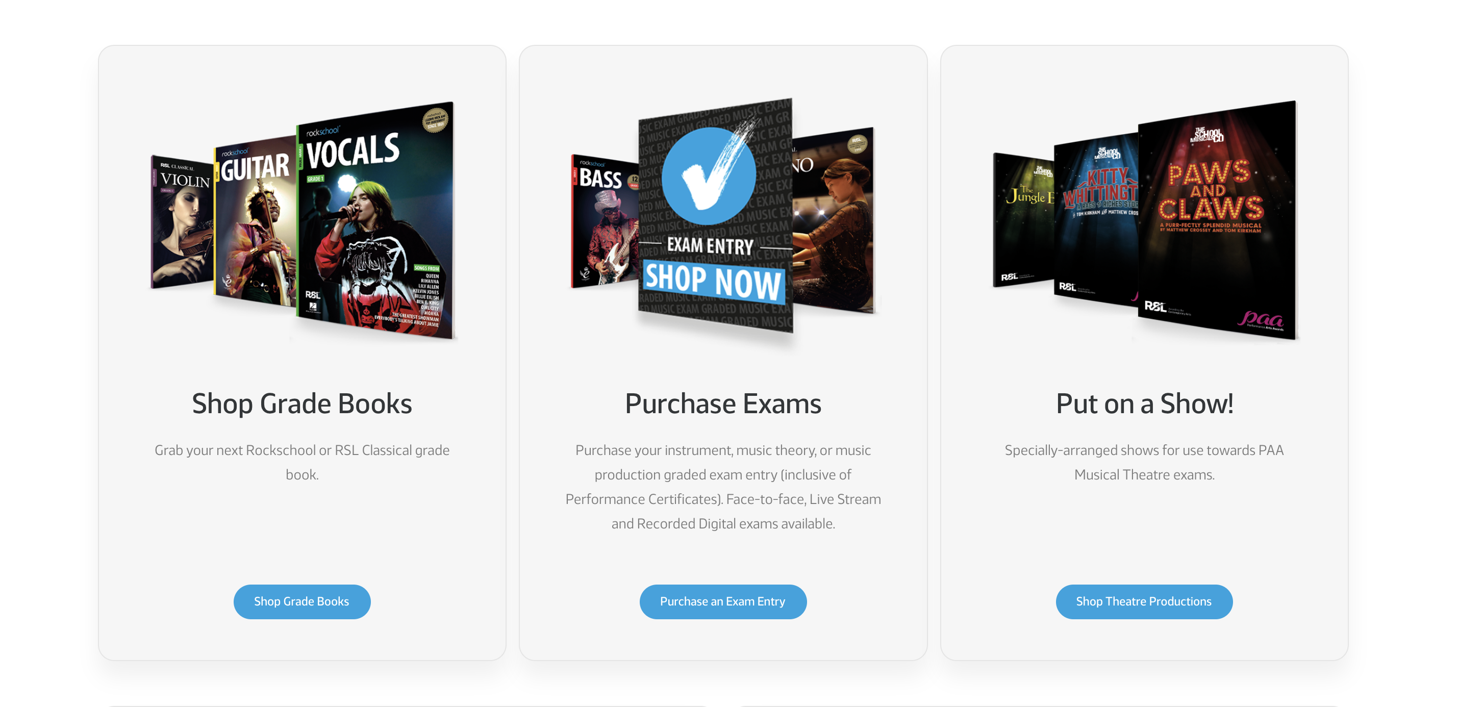
eCommerce website
We delivered a headless Shopify eCommerce system with a WordPress ‘head’ to provide RSL with a high level of content management flexibility while also meeting performance requirements for the site.
WordPress enables us to overcome the native SEO limitations of Shopify, utilising the best parts of each system and laying the groundwork to secure new keyword rankings for RSL Awards.
The eCommerce website pulls data from RSL’s backend system (Microsoft Dynamics) so users can find music teachers, book exams and undertake key searches on the site. The website pulls product information from Shopify and utilises the Shopify checkout to handle the shop experience.
In collaboration with RSL’s internal IT team, we integrated Microsoft Dynamics with Shopify. It was important that Dynamics remained the data source for all data behind the site so this integration enables products to be added to Dynamics, pulled into Shopify, then pushed to the eCommerce website for users to browse. Dynamics listens for when orders are placed via Shopify and pulls orders back into Dynamics to be actioned by the RSL team.
For RSL’s customers, the website experience is seamless and is all handled within a single interface, giving the impression that everything is handled by a single system.

Multi-currency purchases
RSL Awards enables customers to purchase products in their local currency based on their location.
The website has the ability to incorporate multi-lingual and specific multi-territory targeting as the business continues to grow their international digital offering.
Omni-channel user experience
Our team delivered a consistent omni-channel experience for RSL customers, aligning the online and offline experience.
Taking a headless approach enables data to be served from a single source (Microsoft Dynamics) to multiple user interfaces and customer touch points. In practice, this means that users receive a connected and consistent experience whether they call RSL’s phoneline, check availability and products via the website, or if they call a tutor to book a music lesson.
This change has been truly transformational for RSL and delivers a flexible and robust platform for future business growth.
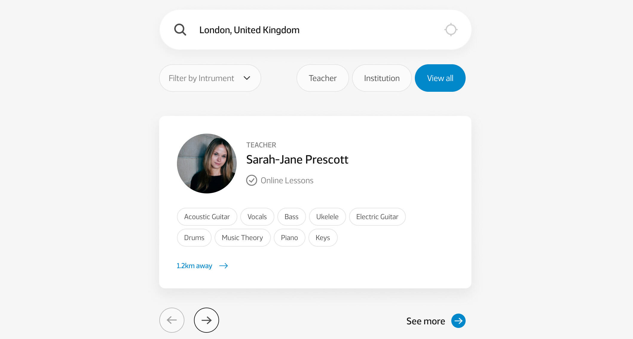
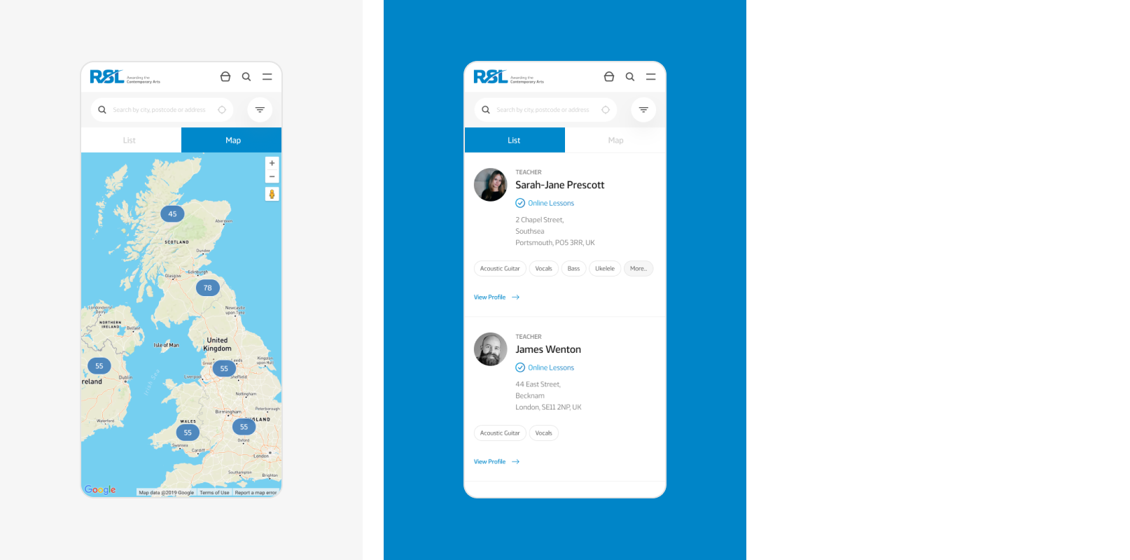
Find a teacher tool
Students can find music teachers and schools in their area via the find a teacher tool. Availability is pulled dynamically from Microsoft Dynamics into the WordPress website interface, delivering rapid search results that are specific to the user’s search criteria.
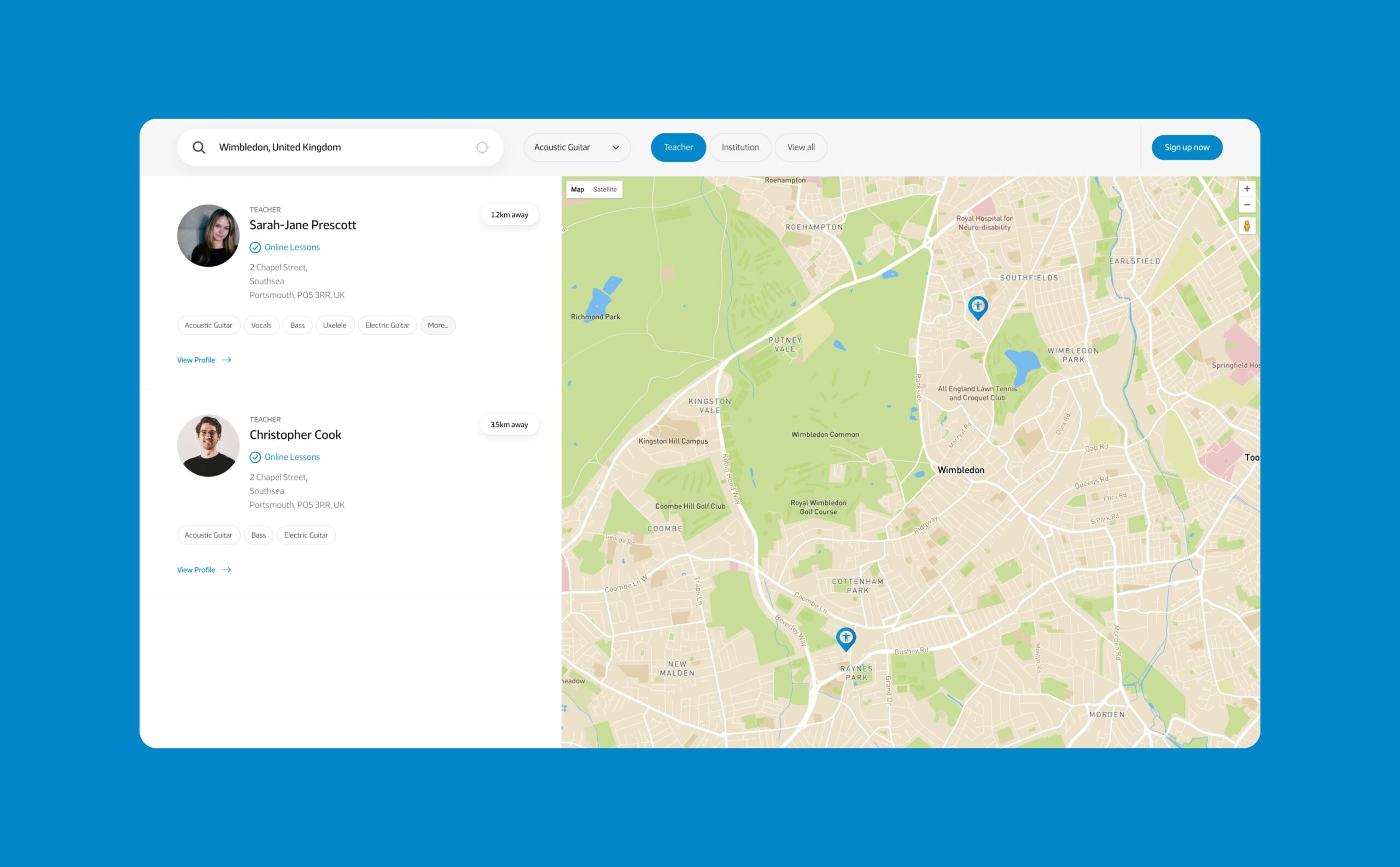
Map view
Location is an important factor for RSL customers when finding music lessons. To improve the conversion rate and provide a seamless user journey, we introduced a map view to the ‘find a teacher’ search.
SEO strategy
RSL’s existing website was performing very well in search engines, with over 100 keywords in the top 3 positions of Google.
For businesses performing well for SEO, significantly changing the website can be a large risk so RSL’s marketing team challenged us to preserve and build upon rankings with the new website launch.
We delivered an SEO strategy that benchmarked RSL’s existing performance and identified opportunities to improve their digital footprint. After analysing hundreds of keywords, our SEO team selected the ones that had high search volumes, high intent and RSL had a statistical opportunity of ranking for in search engines.
The website was built around the strategy – everything from the user journeys, website structure and code base impacts the ranking opportunity of a website so delivering the website around the strategy ensured that RSL was positioned to climb the rankings.

SEO results
The chart above represents the keyword positions held by the RSL Awards website since launch. Blue bars represent positions 1-3 in Google, green represents the remainder of page 1 in Google, and purple shows page 2 listings.
In the 2 months following launch, RSL’s keyword rankings remained extremely stable and their search engine visibility grew by over 11%.
Related work
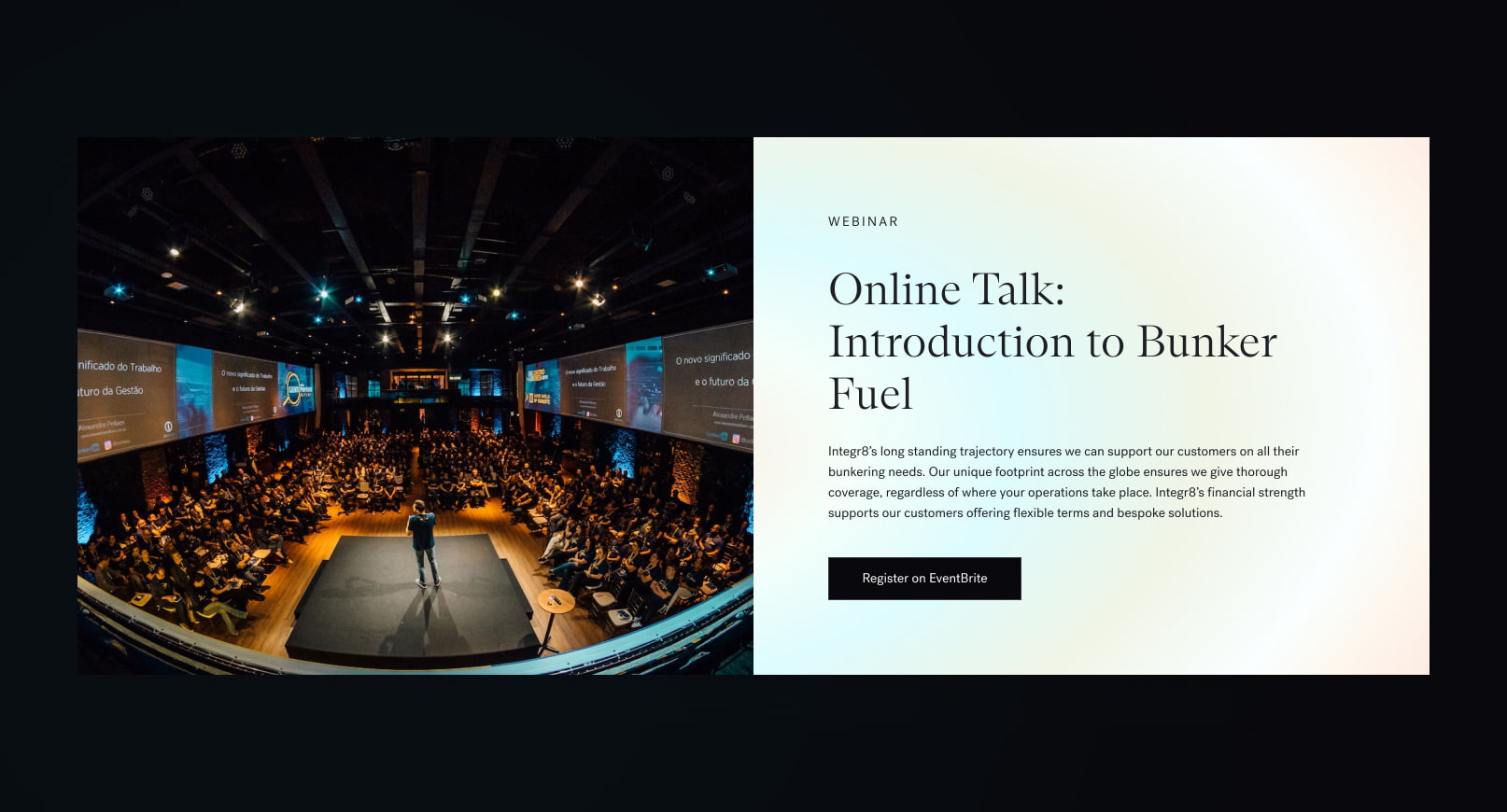
Integr8 is an internationally recognised bunker fuel management provider that is transforming fuel procurement for the shipping industry. They needed a new brand identity, SEO strategy and website to stand out as the market leader.
- Lead time:
- 16 Weeks
- Sector:
- Shipping & Finance
- Target Type:
- B2B
- Demographic
- Senior Operations & Procurement Mangers
- Website Goal:
- Reflect position in market & improve SEO
- Services:
- Branding, Web Design, WordPress, Web Development, Digital Marketing
- Scope
- Brand Identity
- SEO Strategy
- Adobe XD Wireframe Prototypes
- Adobe XD Design Prototypes
- WordPress Development
- Hubspot Integration
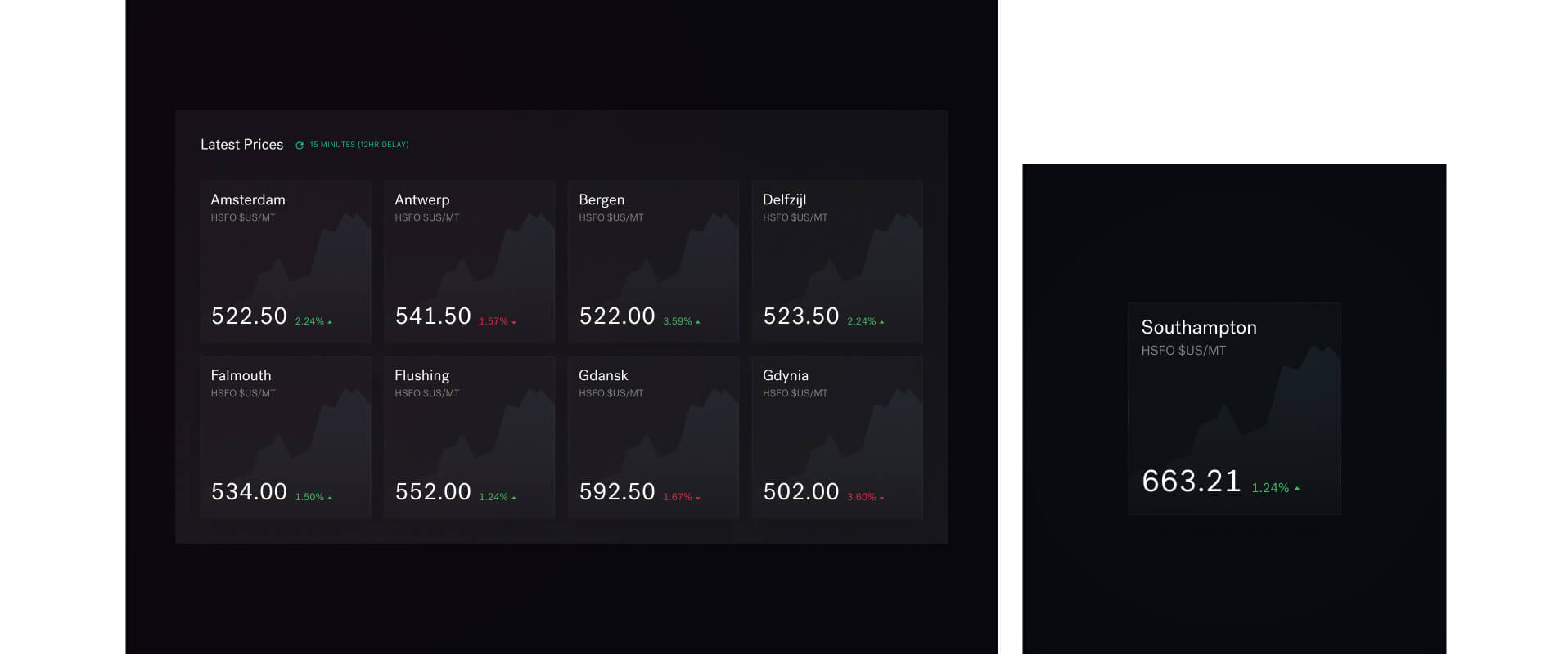
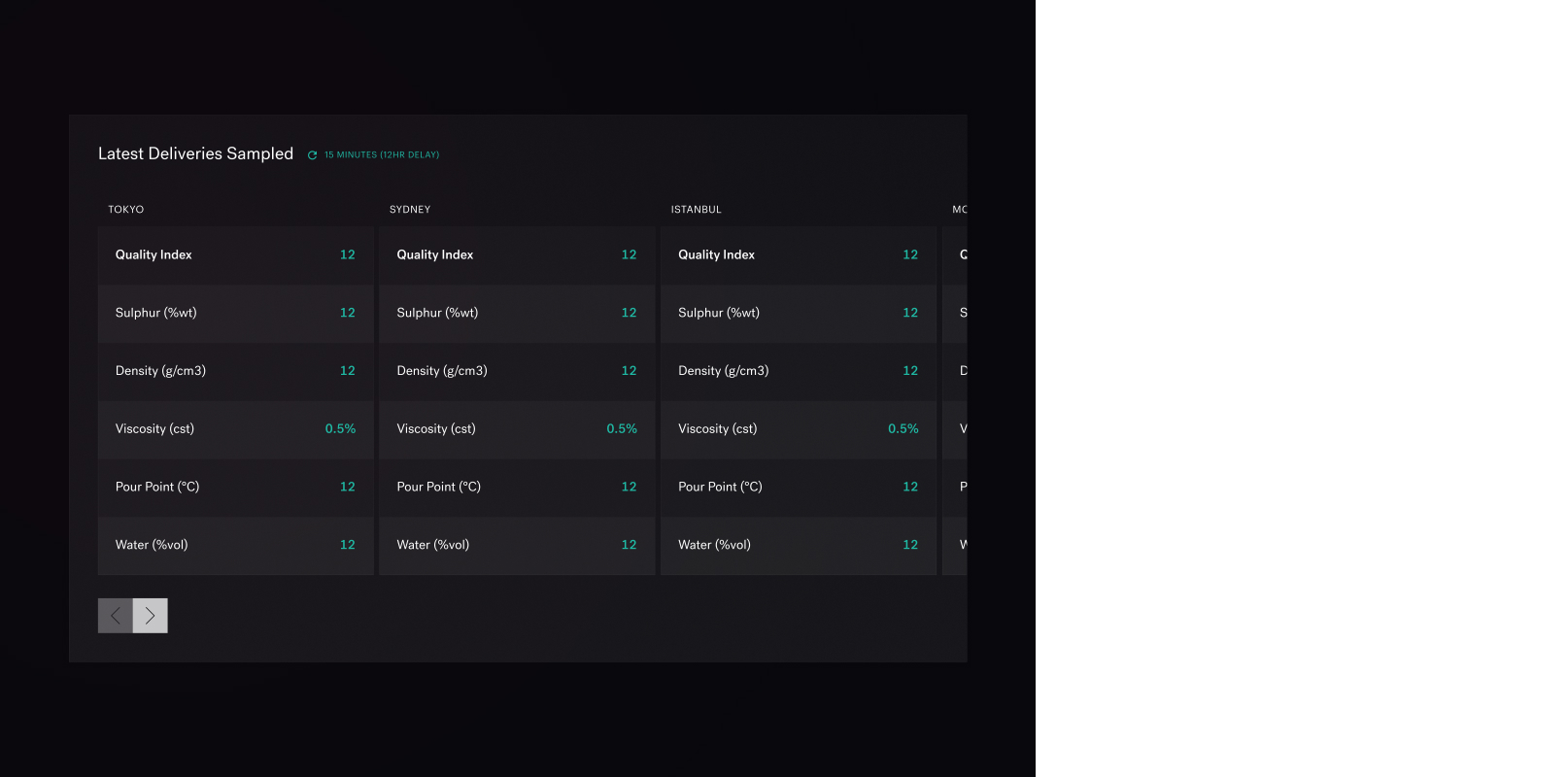
- Integration with engine.online for fuel grading and pricing data
- Resource
- 1 x SEO Strategist
- 1 x Brand Designer
- 1 x Website Designer
- 1 x WordPress Developer
- 1 x Quality Assurance Tester
- 1 x Project Manager
The challenge
As leaders in their market, Integr8 recognised that their website was holding them back. They wanted to stand out in their market and move away from the stereotypical shipping industry branding of blue colour palettes and pictures of the sea and ships.
The site needed to represent their company traits, which were innovative, tech-enabled, data/results-driven, forward-thinking and client-focused
Their goals were to establish a unique brand, outrank their competitors in search engines and deliver key messages as part of optimised user journeys.

The brand
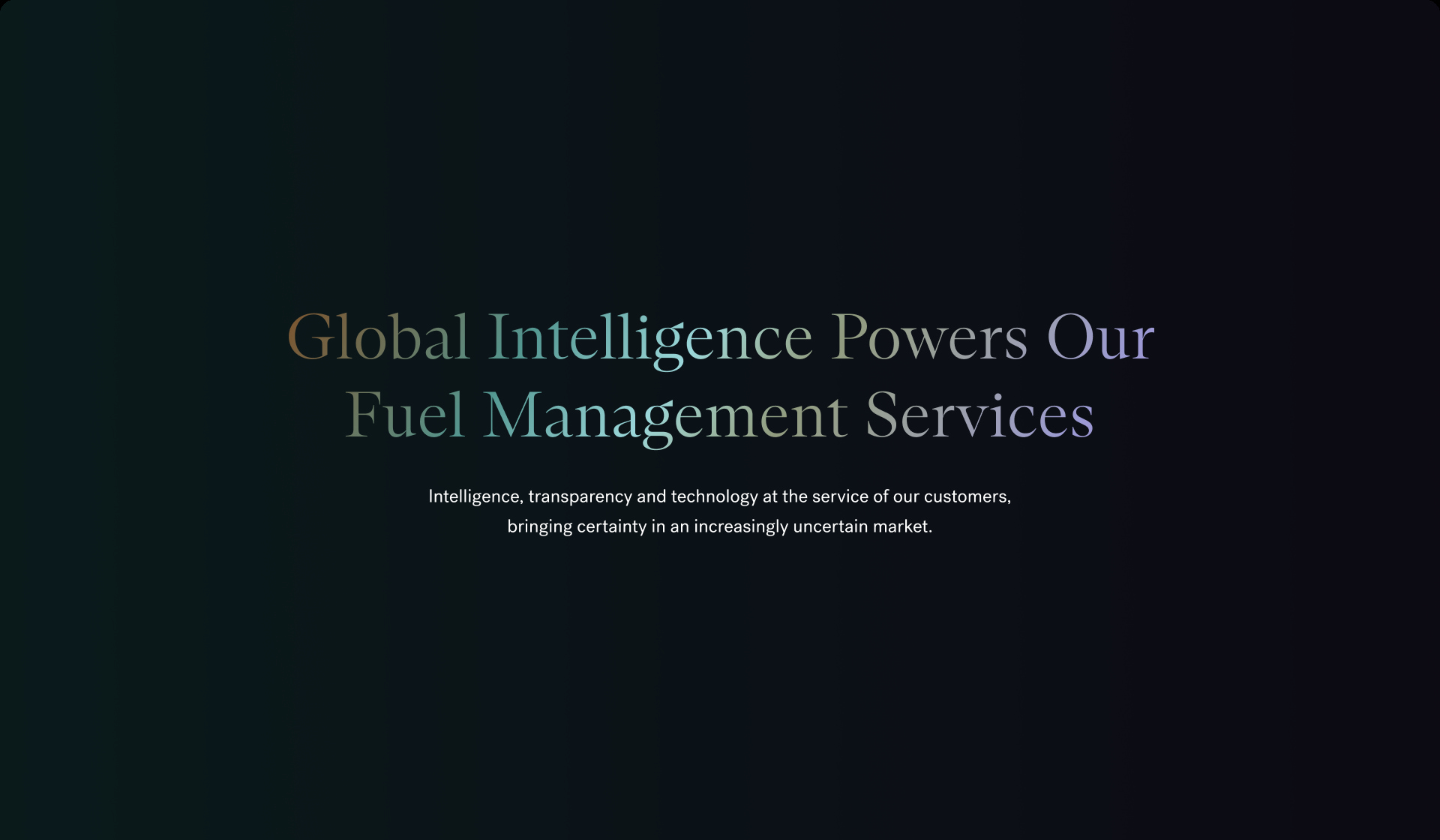
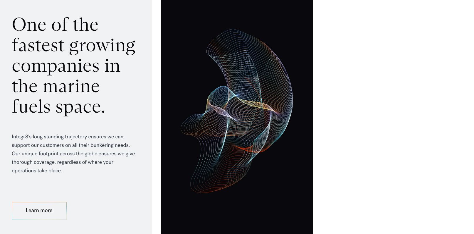
We created a modern, engaging brand that would set Integr8 apart from competitors. The client was ready for a complete brand overhaul, retaining only the basic shape and typography of the logo. Using a dark theme at the base of the brand, we introduced a new colour palette, including gradients to achieve depth.
We created a set of brand shapes including a primary wave shape with a number of supporting graphics. These could be used in a dynamic or still form to achieve a slick and high impact visual.
We introduced a new set of typographies to provide a flexible set of fonts to deliver key messages of the business.
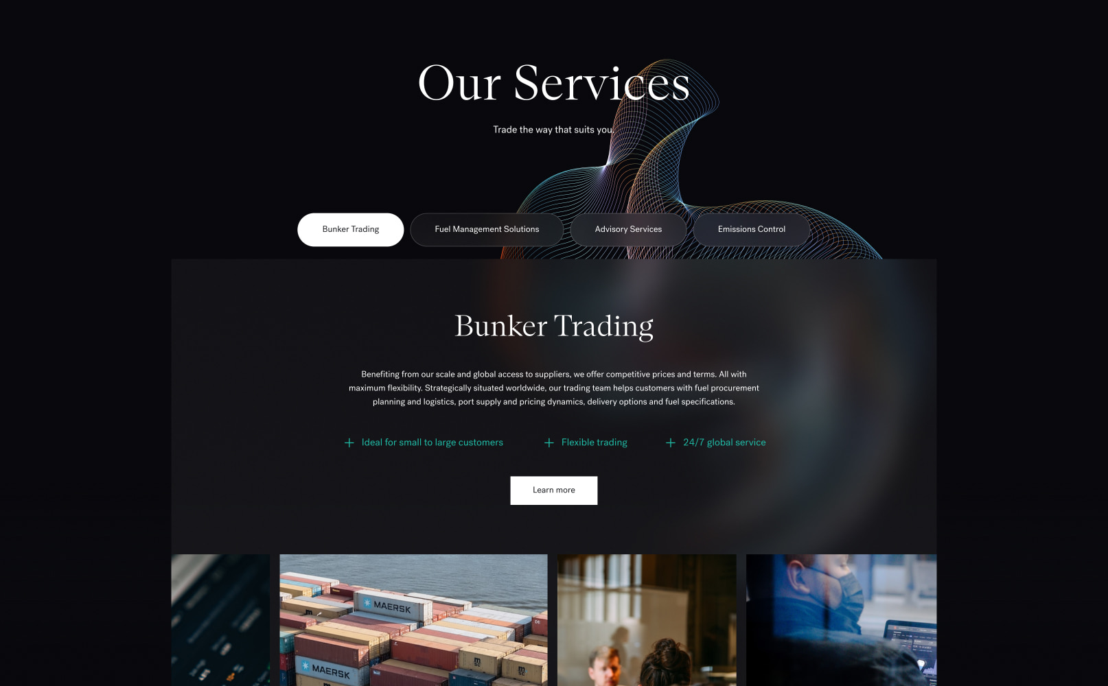
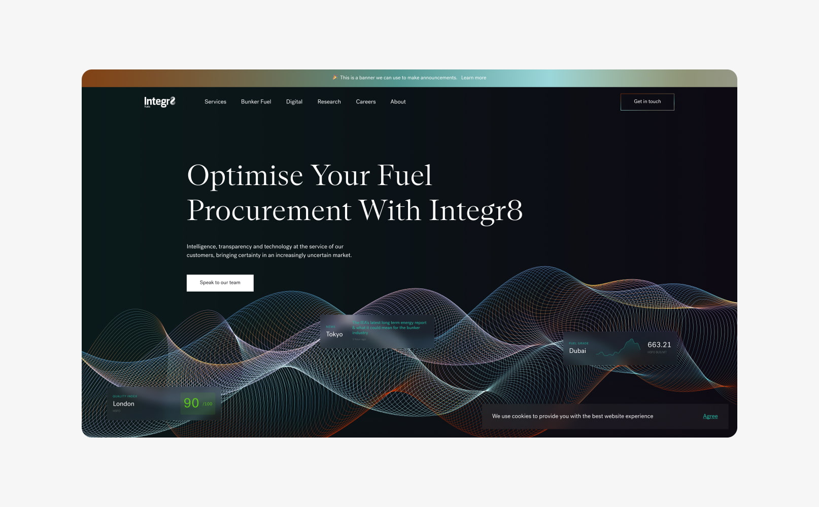
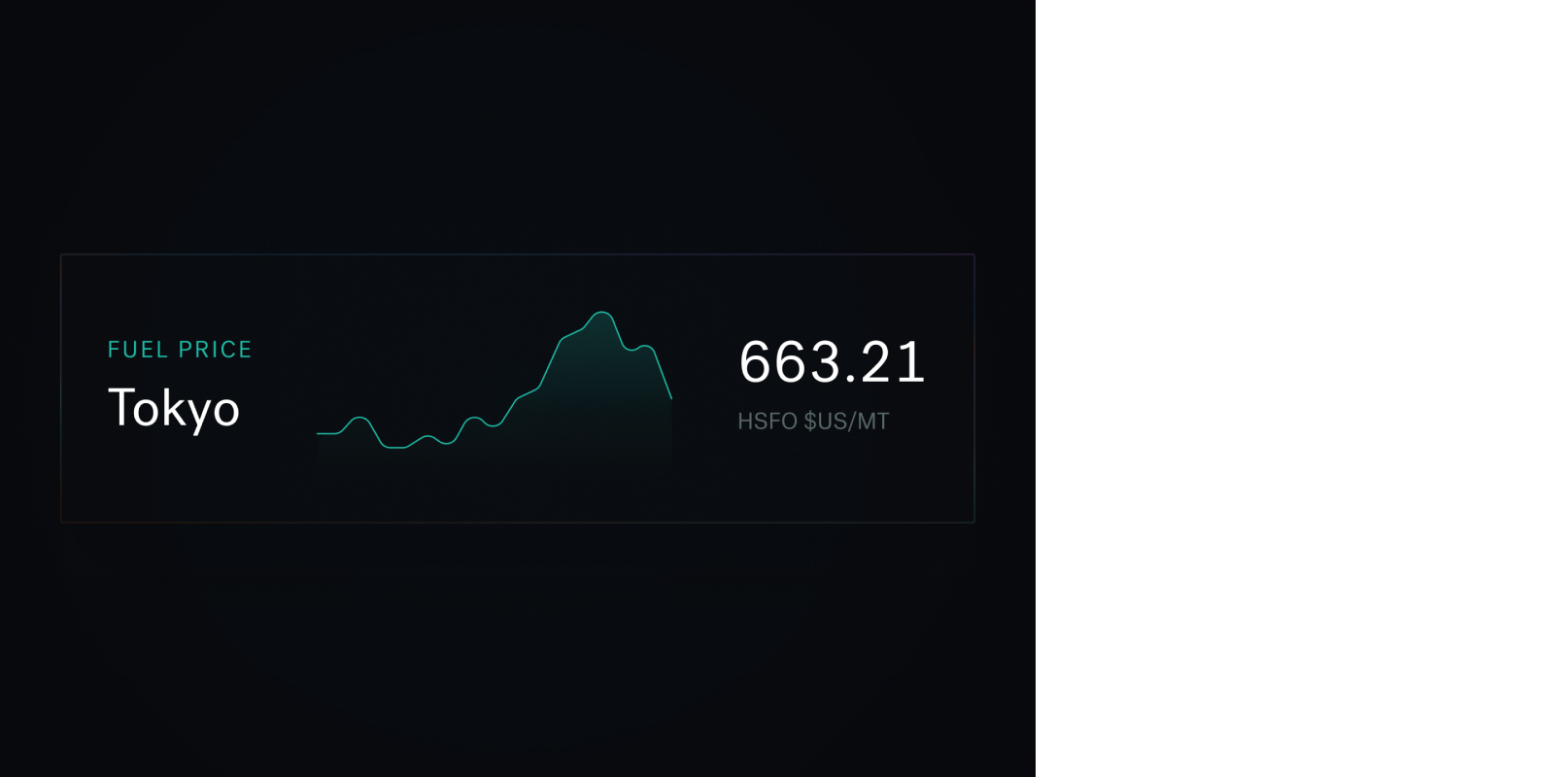
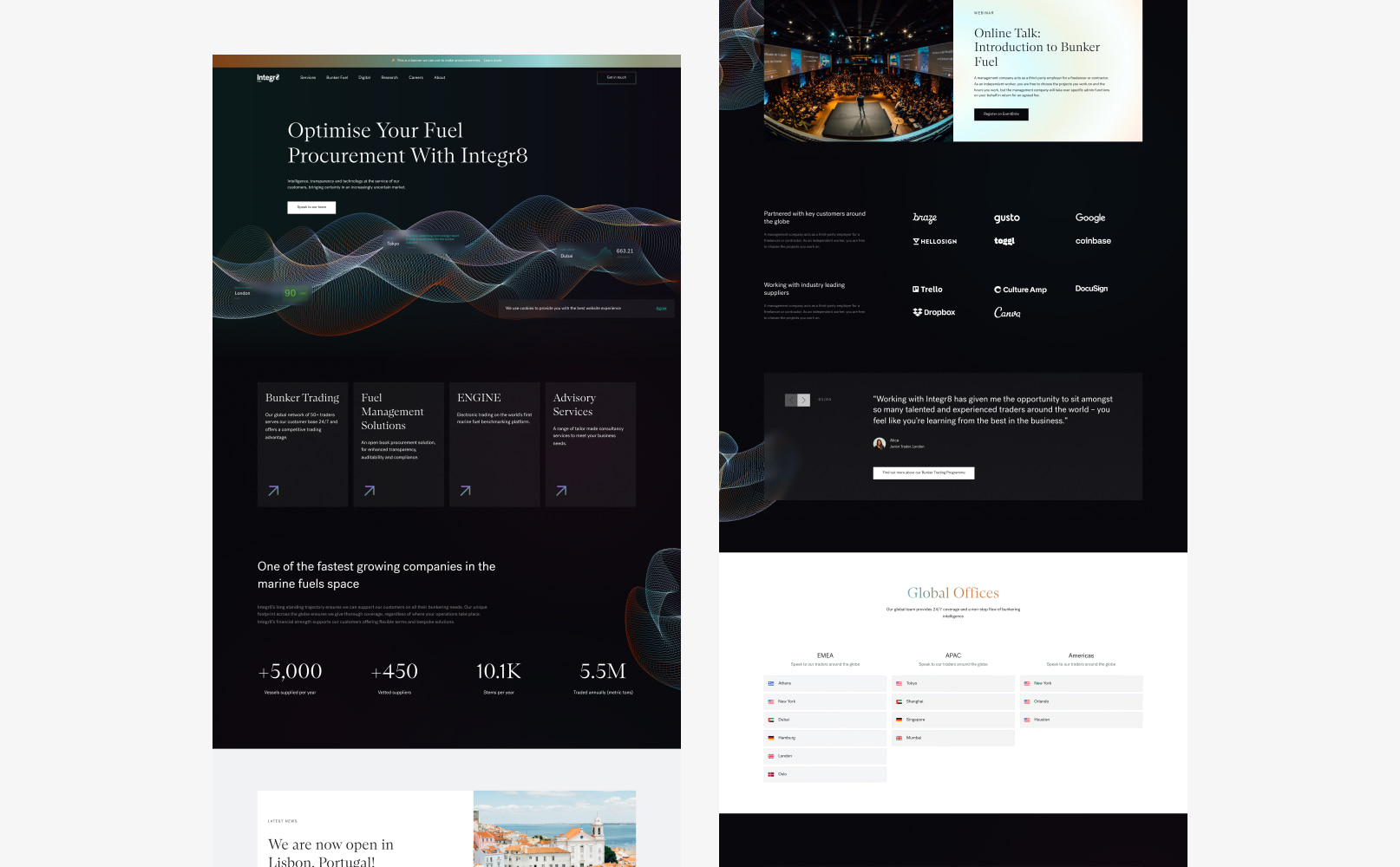
The website
The goal of Integr8’s new website was to position themselves as the market leader in the bunker fuel industry. They wanted an engaging website that was visually different to their competitors.
The shipping industry can be traditional and our challenge was to push the boundaries of the industry, while keeping the design simple, engaging and clear.
We utilised the new brand work to establish a flexible design system for the new website design. The design system combined the brand assets to produce a distinct eye catching design that also provided the Integr8 team with the flexibility to manage and edit their content.
Our developers built the website in WordPress, using a component based approach to provide the best content management. The components were codified with the new brand guidelines, ensuring that internal teams could continue to implement the brand consistently.
The SEO strategy
Integr8 operate within a low volume, high value industry. Search volumes of their target keywords are typically low compared to other markets, however they are highly specific and extremely valuable. In markets like these, capturing opportunities by ranking well and effectively converting traffic into new business is critical to success.
Our SEO team assessed hundreds of keywords to identify the keywords that Integr8 had the best statistical chance of ranking for, and were most likely to generate high quality traffic for the business. Once the keywords had been selected, the website was optimised to enable the website to begin climbing the rankings.
Integr8’s SEO strategy feeds into all elements of the project and interlocked with the design and development processes. To maximise their search engine rankings, it was important that the SEO strategy was completed at the start of the project so a holistic approach could be taken to the implementation.
In the chart above, blue bars represent positions 1-3 in Google, green represents rankings on the rest of page 1 and purple represents page 2 rankings.
You can see that rankings immediately rose following launch and have continued to climb, generating huge increases in visibility and organic traffic for Integr8.

“Very pleased with the results of our SEO on the website built for us by Plug & Play.”

Related work
Keelvar provides market leading procurement software to enterprise organisations, helping them to source at scale. Their combination of groundbreaking technology and an agile business approach has positioned them as disruptors in their market.
They needed a new brand and website to differentiate them from competitors and enable their marketing team to move quickly.
- Lead time:
- 16 Weeks
- Sector:
- Technology
- Target Type:
- B2B
- Demographic
- Procurement Managers in Enterprise Organisations
- Website Goal:
- Reflect position in market & increase enquiries
- Services:
- Branding, Web Design, Webflow, Web Development, Digital Marketing
- Scope
- Brand Identity
- SEO Strategy
- Adobe XD Wireframe Prototypes
- Adobe XD Design Prototypes
- Webflow Development
- Resource
- 1 x SEO Strategist
- 1 x Brand Designer
- 1 x Website Designer
- 1 x Webflow Developer
- 1 x Quality Assurance Tester
- 1 x Project Manager
The challenge
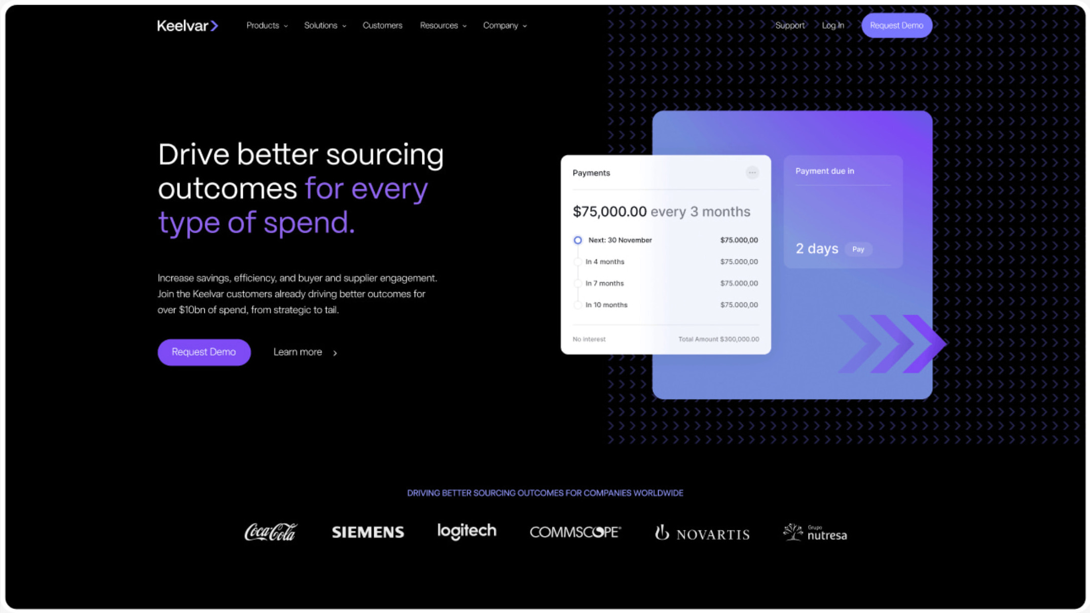
As disruptors in their industry, Keelvar pushes the boundary of what has been done before in their market. Where their competitors are slow-moving and corporate, they are modern, flexible and able to move quickly. They needed a new brand and website to reflect their market position and to visually set them apart.
The new website needed to enable their marketing team with a flexible CMS that could be used to independently create and manage content. Their goal was to drive business performance by increasing search engine rankings and converting more visitors into enquiries.
The brand
We developed a unique and vibrant brand that reflects the high tech nature of the business and the products they offer. Their offering is groundbreaking in their field and the brand needed to showcase the same innovative, forward-thinking and modern themes.
The new brand identity combines new typography, colours, shape and form, and imagery to produce a polished, trustworthy feel that is consistent and flexible.
Our team drew inspiration from technology companies and the fintech industry to deliver a bold result that represents the business.
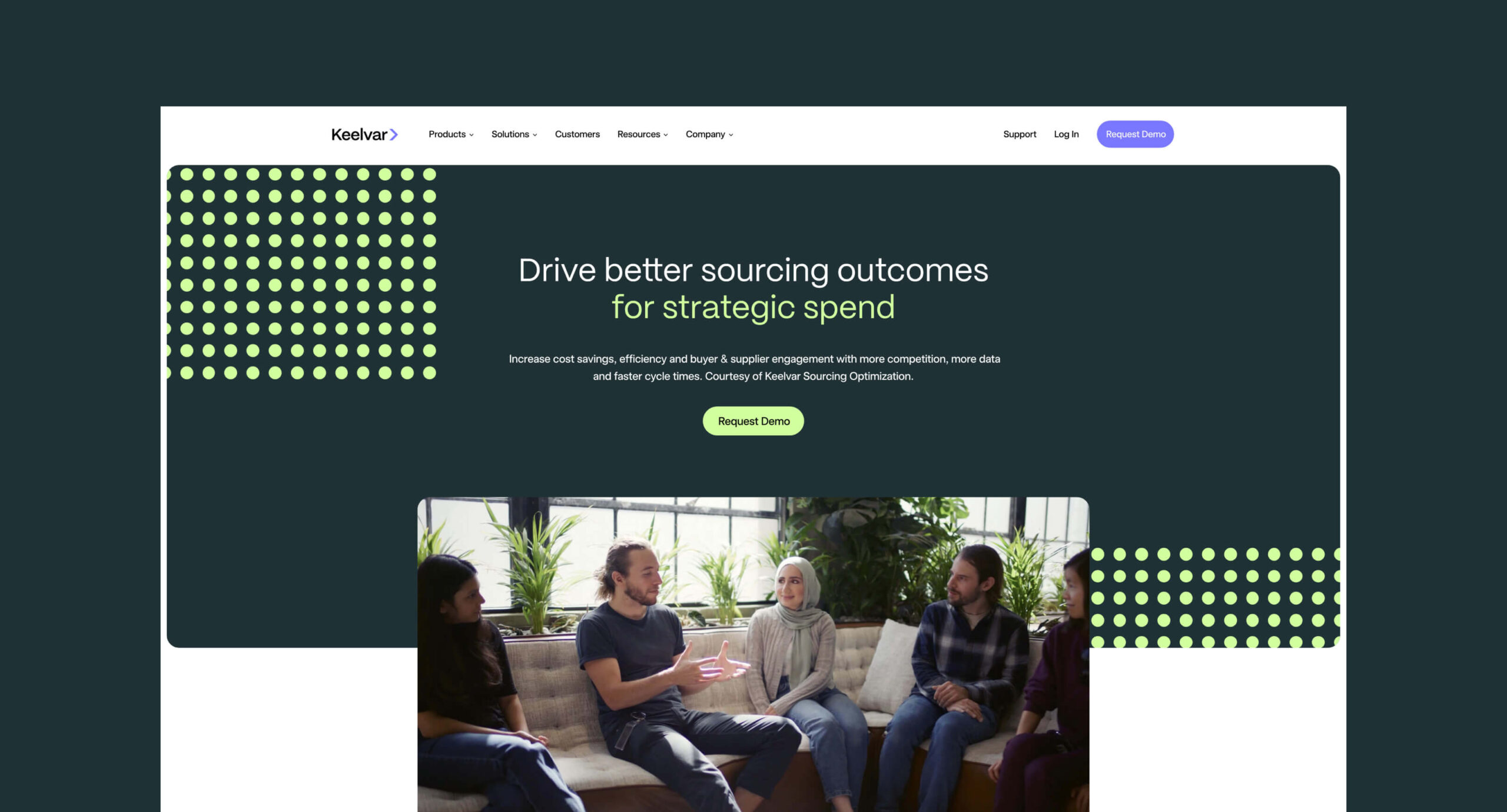
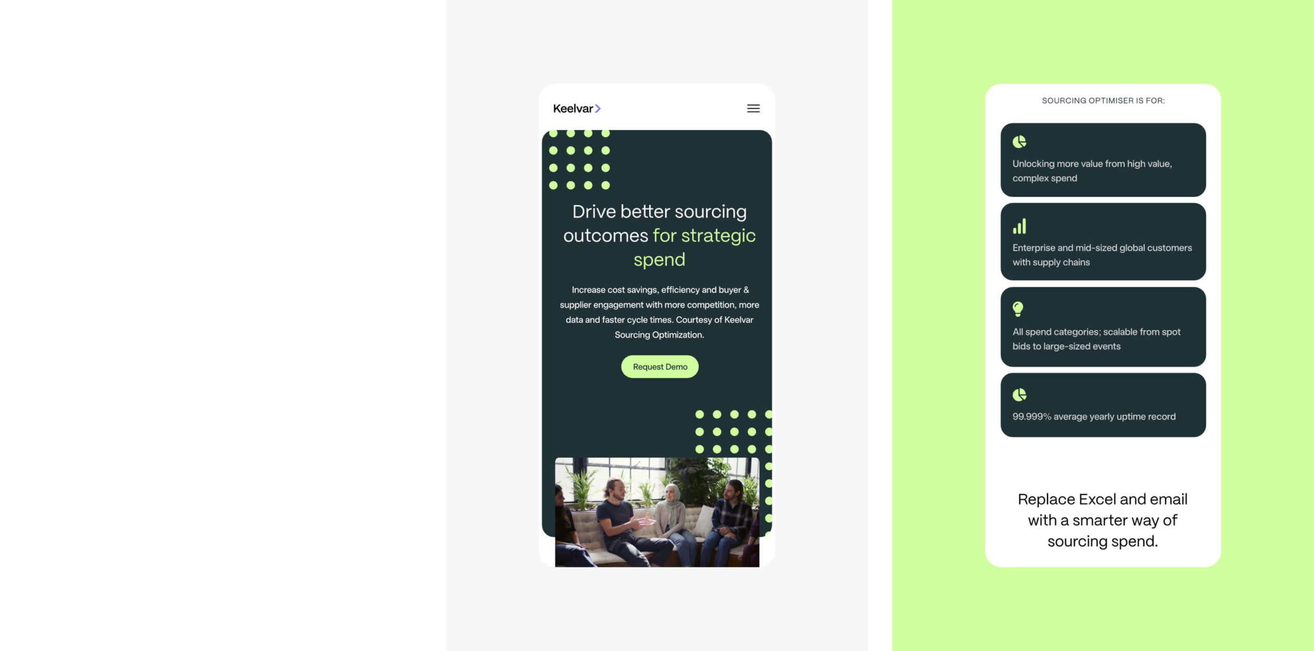
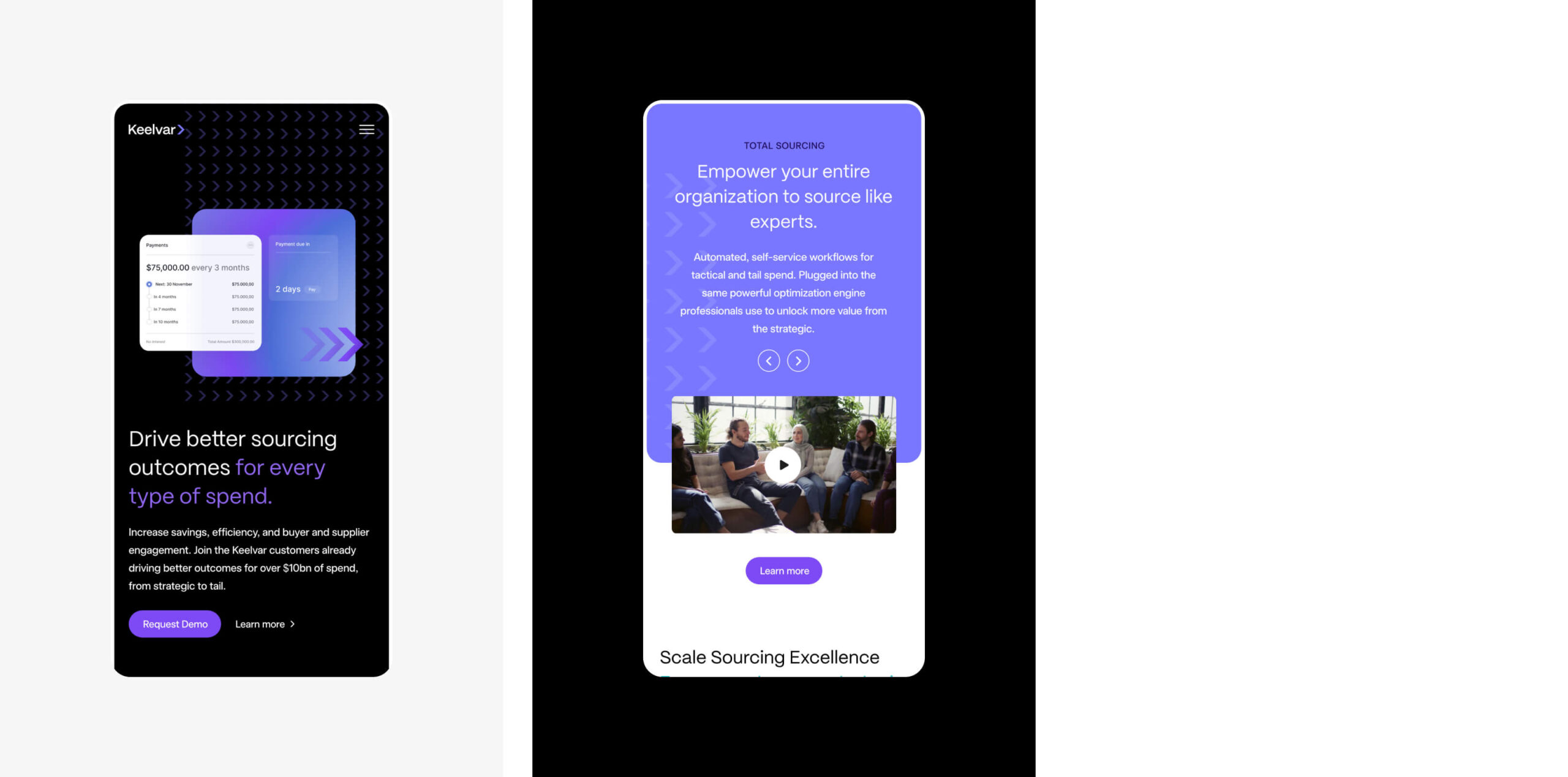
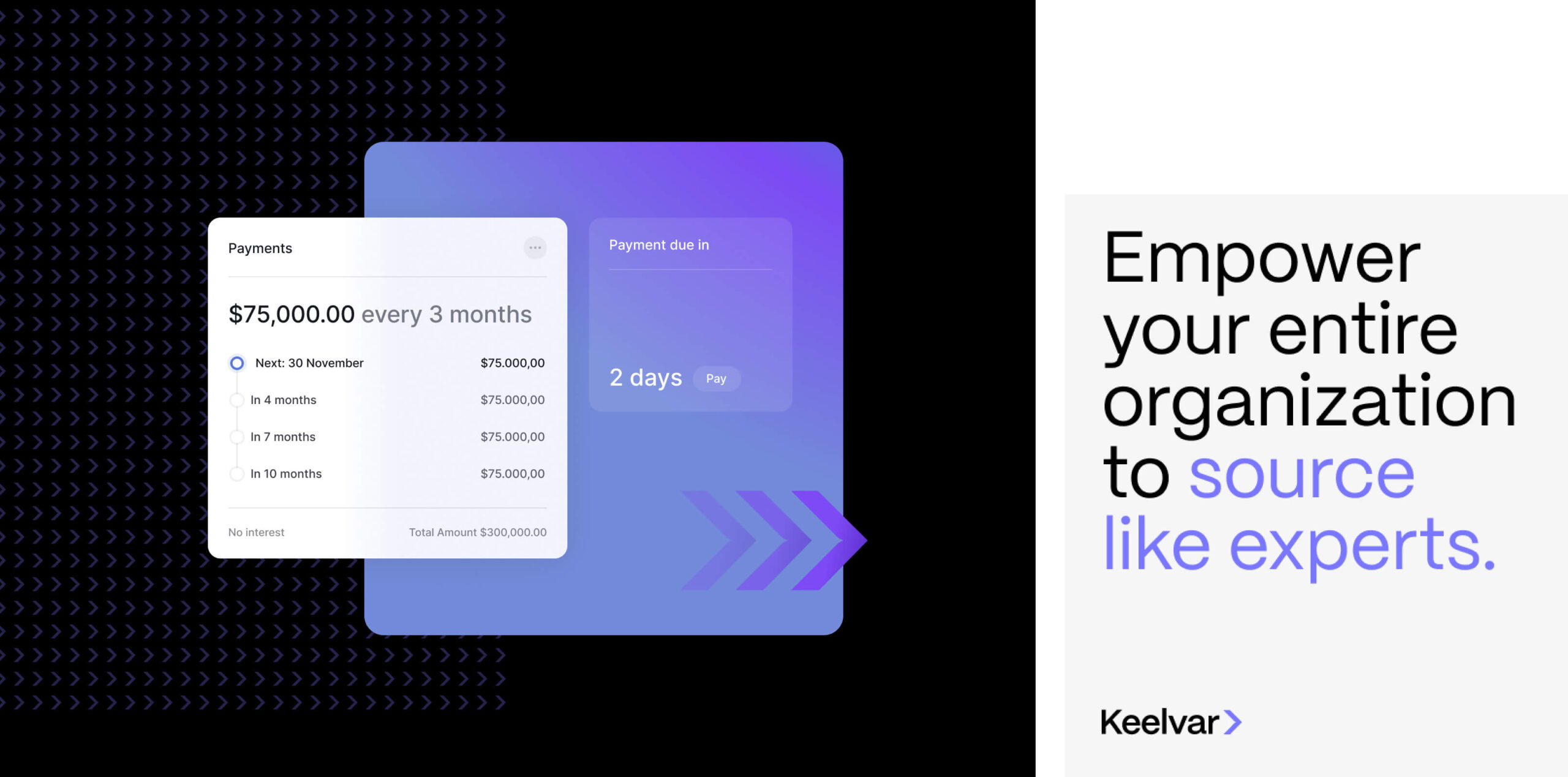
The website
Keelvar’s new website needed to generate new enquiries for the business by increasing search engine rankings, increasing organic traffic, and by improving the website conversion rate.
To deliver this, we created a digital strategy that highlighted key opportunities to increase search engine visibility and optimise the website. We combined the digital strategy outcomes with conversion design best practice to produce a high performance website that Keelvar’s marketing team could leverage as part of their broader marketing ecosystem.
The new brand was utilised within the new website design and was brought to life using dynamic assets and animations.
We developed the website in Webflow which enables easy content management for the marketing team.
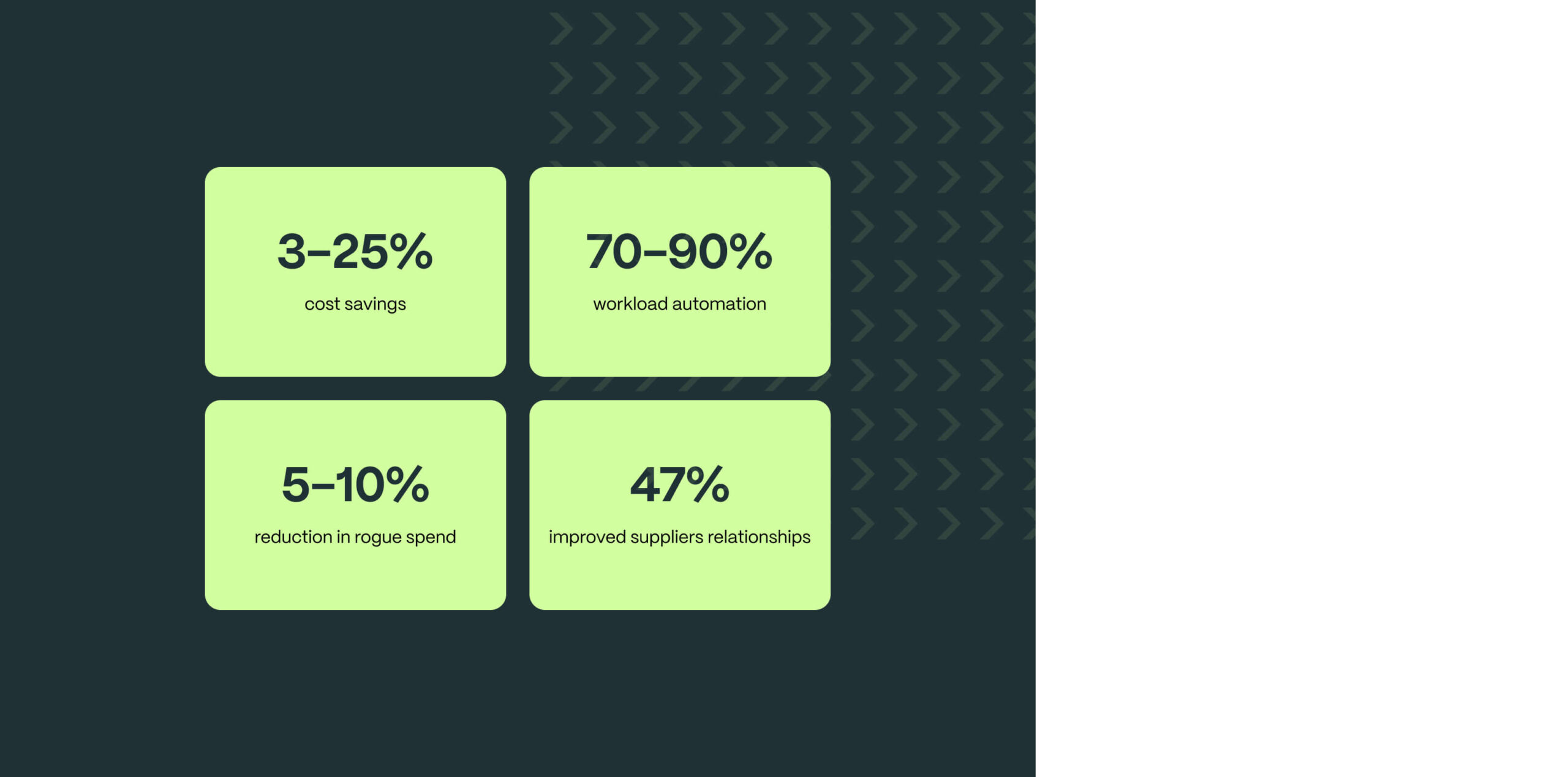
The SEO strategy
Keelvar had good domain metrics which gave them a fantastic start point to improve their organic rankings. They had a lot of potential but their existing website wasn’t developed and optimised in a way that encouraged rankings.
Our team delivered an SEO strategy that assessed a huge number of keywords that were relevant to the business. We selected high value and high intent keywords that Keelvar has a statistical chance of ranking for, to invest in as part of the optimisation process, delivering the greatest return for the business.
In the chart above, blue bars represent positions 1-3 in Google, green represents rankings on the rest of page 1, purple represents page 2 rankings and orange shows pages 3-5.
You can see that rankings immediately rose in the month following launch. We’ll be continuing to track the website results over the coming months.

“This is my second time working with Plug and Play on a company rebrand and website redesign project and I was again thrilled with the outcome. They are a pleasure to work with, very organized, super creative and work to an extremely high standard. Clear communication and a transparent process ensures all stakeholders are aligned, we keep on track to deadlines and the project runs smoothly. They also listen carefully to our goals and objectives and take on feedback very effectively.
Its often hard to make the case internally to justify projects like these especially outsourcing to a third party that is unknown to internal decision makers. Each time I’ve worked with Plug & Play all stakeholders have been blown away and have said after the project that Plug and Play surpassed expectations.
I will continue to work with them again and again on future projects.”

Related work
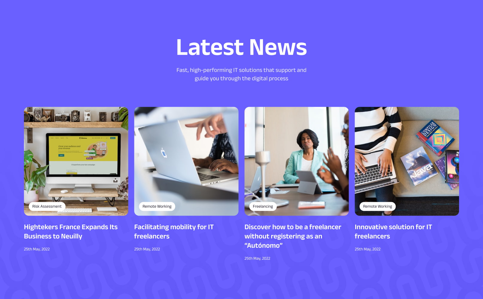
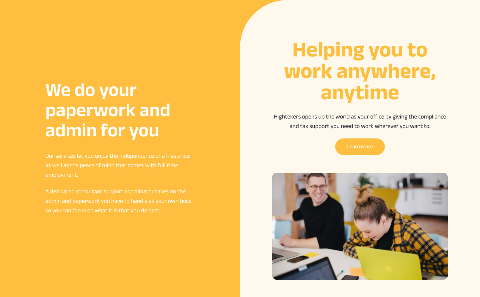
Hightekers supports businesses that are recruiting for fixed term contracts by streamlining the onboarding and management process. They provide a smooth hiring process for the business and the perks of full time employment to their contractors.
They had secured great market exposure in France and were ready to strategically increase their global exposure by targeting new European territories. They had ambitious growth targets and challenged us to deliver a brand, website and digital strategy that would help them to achieve their global revenue goals.
- Lead time:
- 20 Weeks
- Sector:
- Recruitment
- Target Type:
- B2B
- Demographic
- IT Consultants, Businesses hiring in IT
- Website Goal:
- Increase international market penetration
- Services:
- Branding, Web Design, WordPress, Multilingual, Web Development, Digital Marketing

- Scope
- Brand Strategy
- Customer Persona Development
- Key Messaging Development
- Brand Identity
- SEO Strategy
- Adobe XD Wireframe Prototypes
- Adobe XD Design Prototypes
- WordPress Development
- Multilingual Website
- Copywriting
- Resource
- 2 x Marketing Strategists
- 1 x Digital Strategist
- 1 x Brand Designer
- 1 x Website Designer
- 1 x Website Developer
- 1 x Quality Assurance Tester
- 1 x Project Manager
- 1 x Copywriter
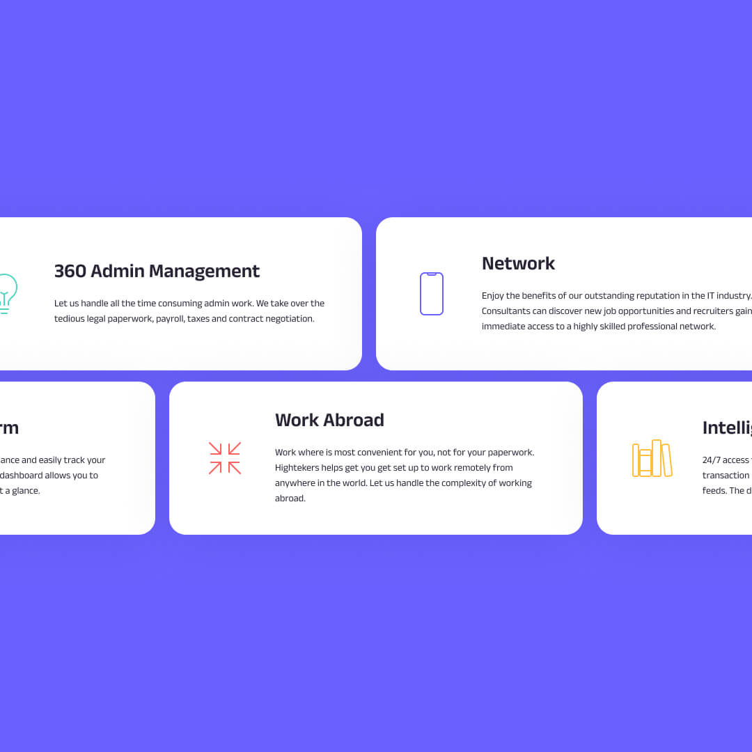
Brand strategy
The brand process kicked off with a number of brand workshops that were led by our marketing team. We utilised the customer and business insights gained during this process to build a new brand framework for Hightekers.
In collaboration with their marketing team, we developed a new value proposition and defined their target audience personas and archetypes. This enabled us to curate an aligned messaging framework for each archetype, tapping into their motivators and pain points.
The brand strategy formed the backbone of the project, guiding the design direction and messaging, and enabling the Highteker’s team to produce consistent and effective marketing materials.
Brand identity
Drawing on the brand strategy, we evolved Highteker’s brand identity to create a fresh visual design system with the flexibility to be utilised across Hightekers’ business ecosystem.
The existing brand had some good components but was dated and missing depth and consistency. We implemented a new colour palette including a secondary set of colours to provide additional dexterity with soft and bold colour options. We also drew inspiration from the logo to introduce a new brand pattern. The pattern brings energy and direction to the brand and adds depth and visual interest.
The key to the success of the Hightekers brand is the way that the different brand elements including imagery, typography, colour, shape and form are combined in a way that is distinctly theirs. The outcome is a unique and vibrant brand that enables Hightekers to be bold and stand out.
The website
We delivered an international website with 7 different territories and 5 languages.
To effectively target Hightekers’ new territories, we created a global website that enables Hightekers to deliver regional content in different languages to their target markets. This approach means that each new territory benefits from the already established French domain, giving them a head start upon launch.
Market exposure was critical to the success of the project which is why our team delivered an SEO strategy that was designed to grow Hightekers’ organic rankings in search engines and enable the website team to create an optimised website structure.
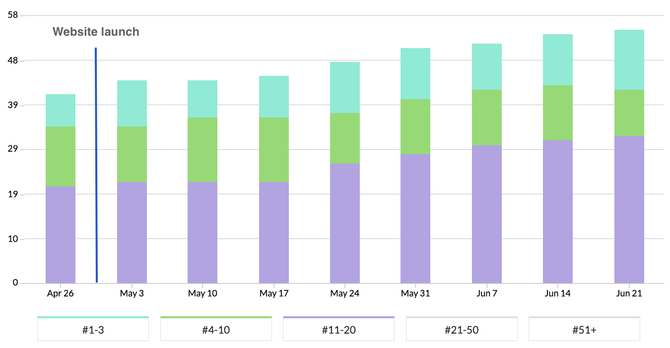
SEO strategy
The new website was designed and built in line with SEO and user experience best practice. Our strategic marketing team created an SEO strategy that would enable Hightekers to leverage their new website rank more effectively in regional search engines.
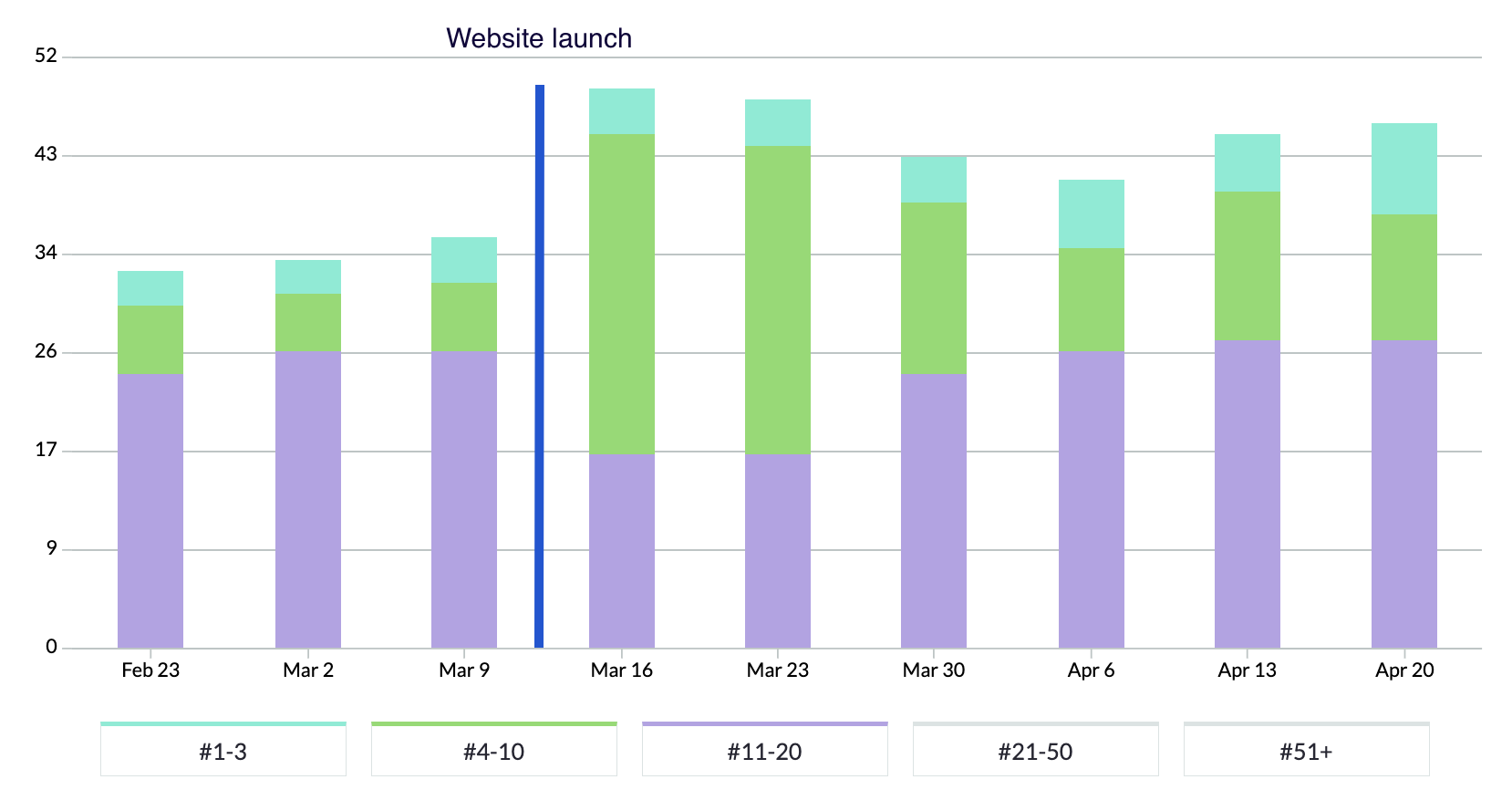
In the chart above, blue bars represent positions 1-3 in Google, green represents rankings on the rest of page 1, and purple represents page 2 rankings.
Following the launch of the new website, Hightekers began to secure new page 1 search engine rankings. They have almost tripled the number of keywords in the top 3 positions and they continue to climb.

“Plug & Play immediately understood what we were looking to achieve with the project and we were impressed by their knowledge of best practice for international websites and their ability to demonstrate performance outcomes.
We really enjoyed the process and seeing our new brand come to life through the website, which has been really exciting!
Upon launch, we very quickly saw an increase in search engine visibility and our keyword rankings are continuing to climb. The team at Plug & Play have been lovely to work with, with quick turnarounds and high quality design and development. If you’re looking for a new brand and website, we’d recommend partnering with Plug & Play.”

Related work
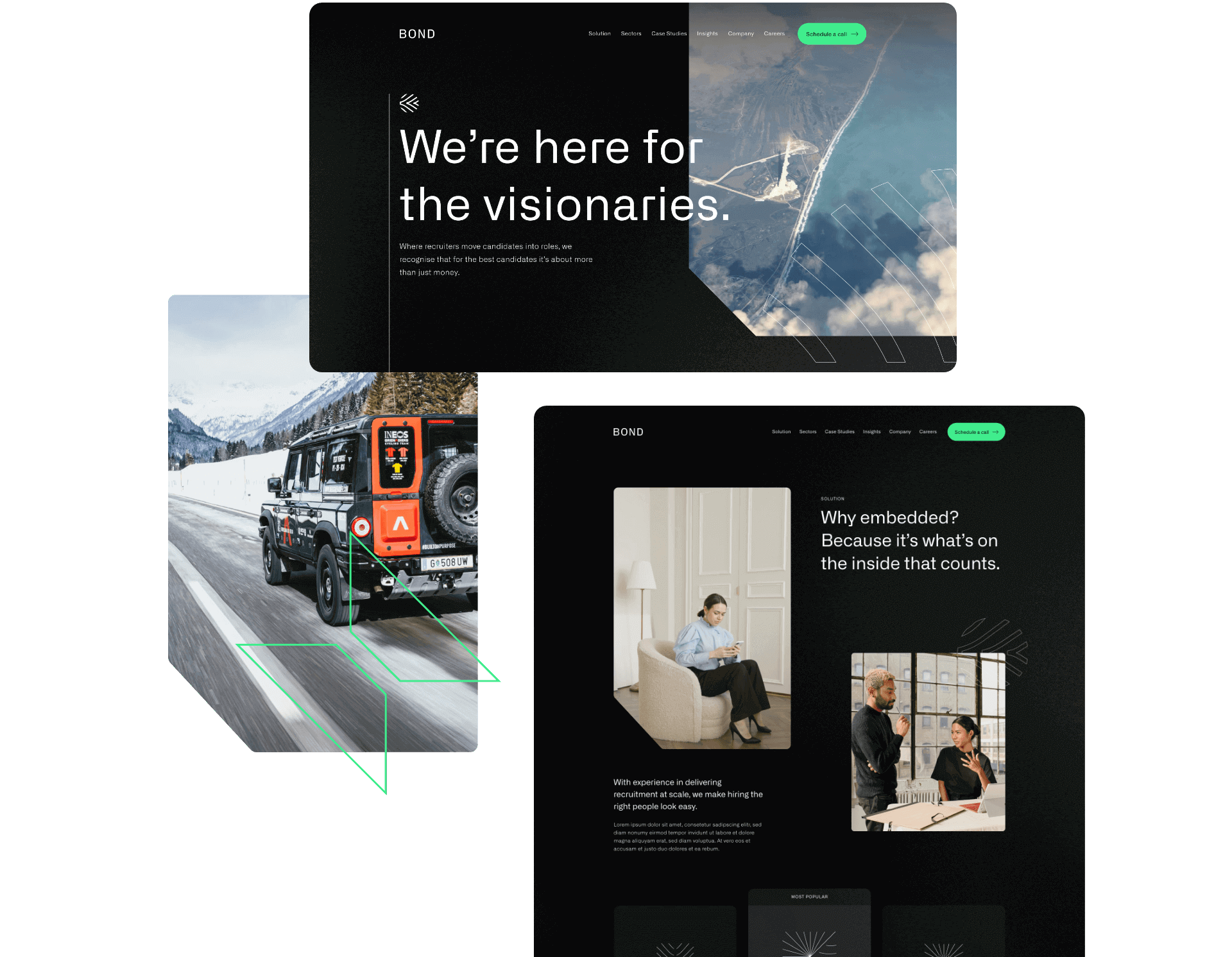
Bond Global is an embedded recruitment agency that works with innovative CleanTech, DeepTech, BioTech and Enterprise organisations to transform the planet with new technology. Their unique subscription model for recruitment provides scaling businesses rapid access to the best talent.
They challenged us to deliver a new brand strategy and identity, and create a slick new website to attract new business.
- Lead time:
- 20 Weeks
- Sector:
- Recruitment
- Target Type:
- B2B & B2C
- Website Goal:
- Reposition the business & attract new clients
- Services:
- Branding, Web Design, Web Development, Marketing Strategy, SEO, Copywriting
- Scope
- Brand Strategy
- Customer Persona Development
- Key Messaging Development
- Brand Identity
- SEO Strategy
- Adobe XD Wireframe Prototypes
- Adobe XD Design Prototypes
- WordPress CMS
- Copywriting
- Resource
- 2 x Marketing Strategists
- 1 x Digital Strategist
- 1 x Brand Designer
- 1 x Website Designer
- 1 x Website Developer
- 1 x Quality Assurance Tester
- 1 x Project Manager
- 1 x Copywriter

The challenge
Bond Global is a dynamic and innovative recruitment agency that works with some of the best global talent, however this wasn’t reflected in their existing brand or website. They challenged us to update their recruitment website design and messaging to resonate with their target clients. They were ready to reposition themselves in their market and set themselves apart from other recruitment agencies.
Alongside their rebrand and website redesign, they commissioned us to deliver an SEO strategy that would improve their rankings in search engines and enable new clients to discover them organically.

The brand strategy
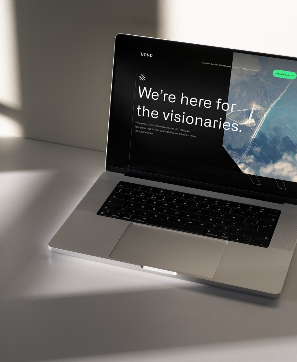
Using insights from stakeholders in the business, we created a brand strategy that is faithful to Bond’s values and attracts highly aligned clients. Their new strategy provides the central thread that connects the reason that Bond exists and the reason that their client companies exist. For example, Bond’s new key messages include bold statements like “We’re here for the visionaries” and “There’s no planet B”. These statements speak directly to their clients who work in renewables, clean energy and environmentally positive technology companies that are innovating to clean up the planet.
Bond’s refreshed messaging aligns with their target clients, reflects their USPs and provides their team with a framework of how to speak about the business and communicate in their marketing.
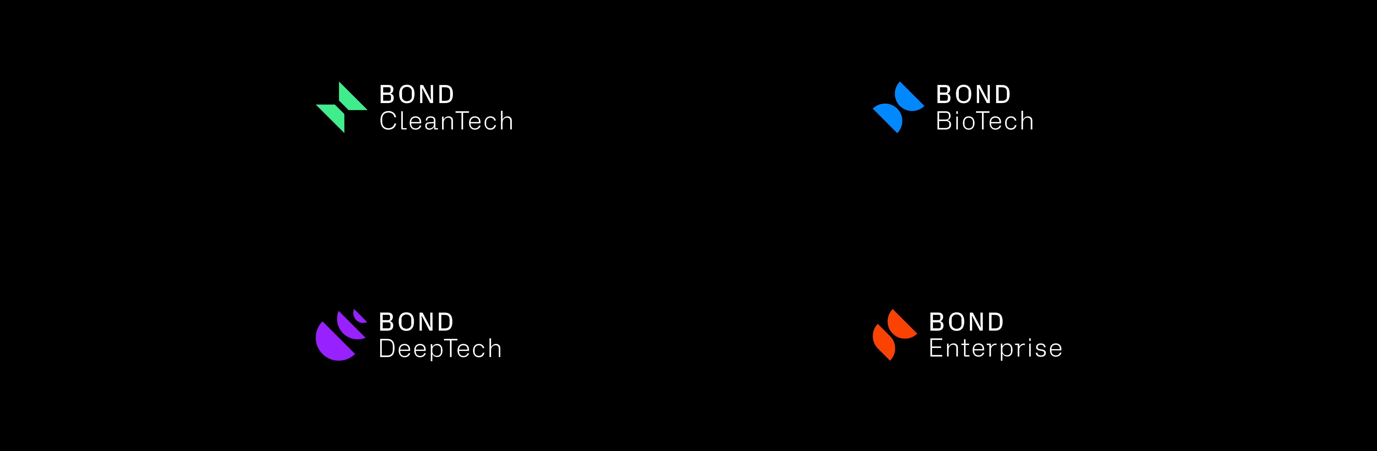
The brand identity
We evolved Bond’s existing brand identity in line with the new strategy and the businesses that they wanted to attract. The use of dark base colours with vibrant pops of colour represent their key brand themes – technology, futuristic, environmental, big picture mindset.
The final visual brand achieves a technical and futuristic feel that resonates with Bond’s clients and the work they do.
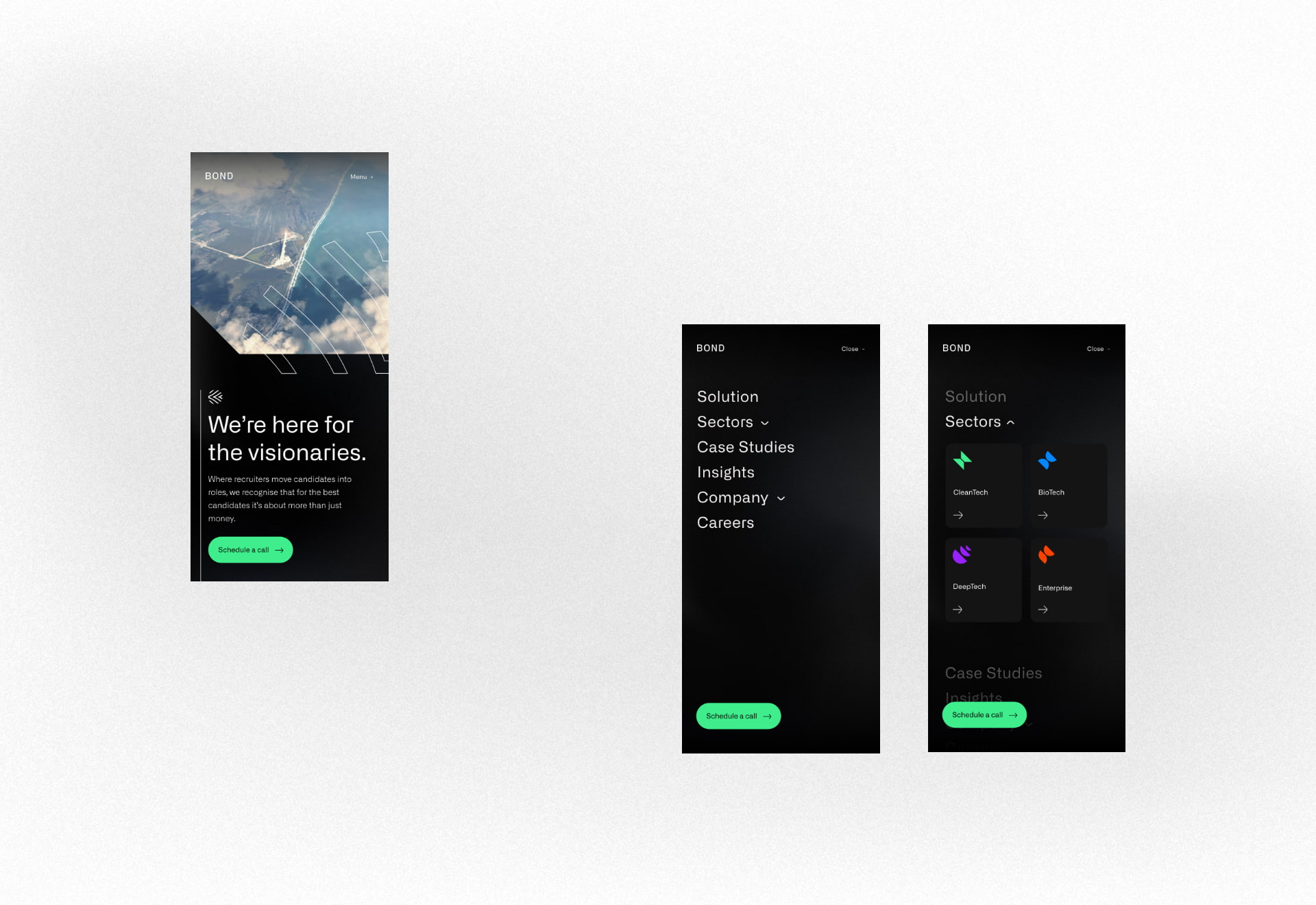
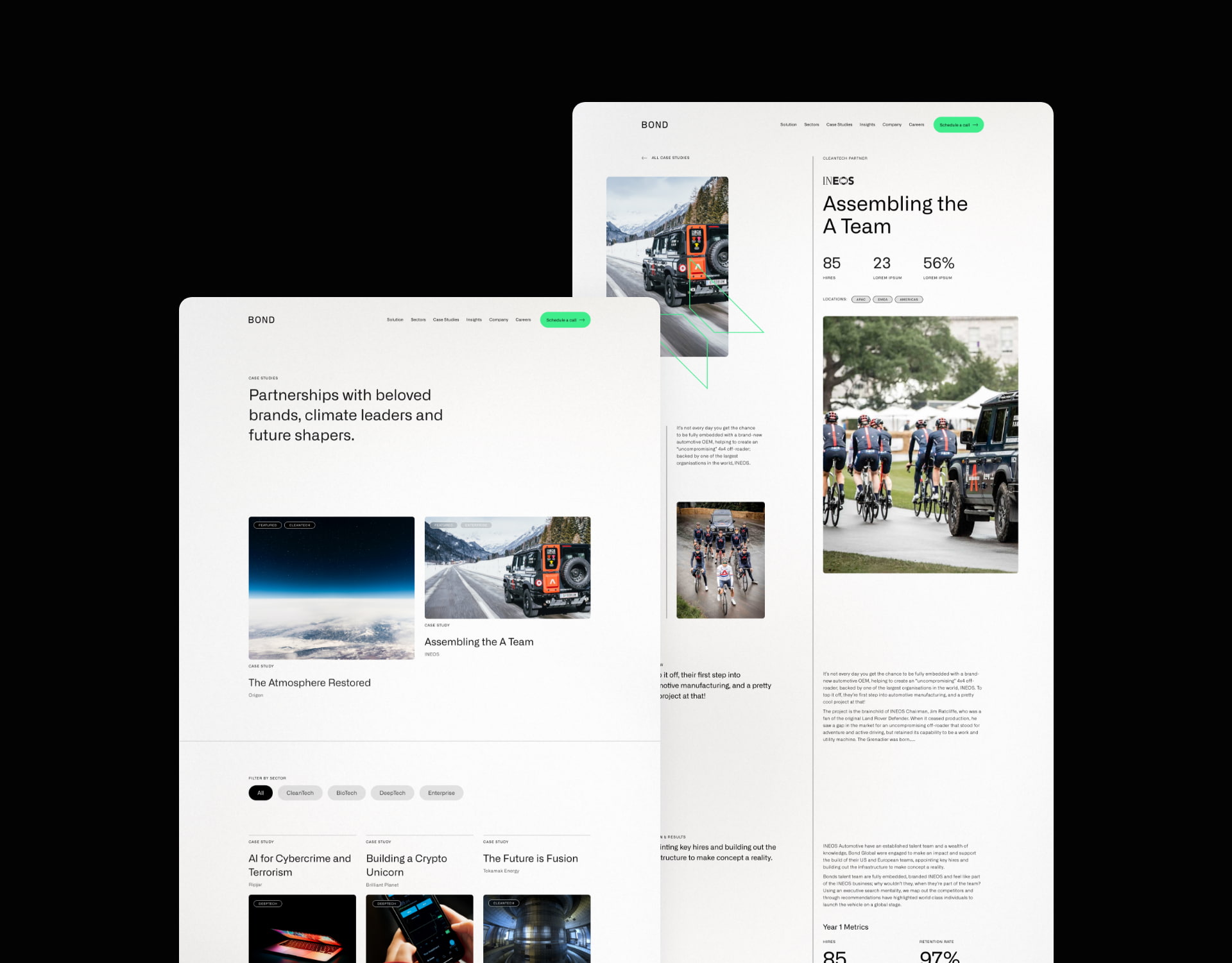
The website
Our website team created a fresh new website design that incorporated the new brand and messaging. The primary goal of the website is to attract and convert new clients, opening up a new channel of lead generation for the business.
Our digital marketing specialists created an SEO strategy that focused on increasing Bond’s search engine visibility for high value search terms, enabling them to be found by businesses looking for their services. We built and optimised the site around the SEO strategy, laying the foundations for continued growth and visibility.
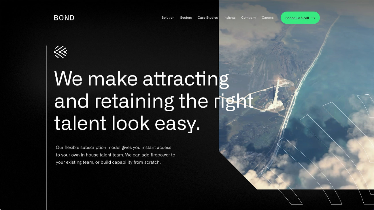
Bond’s new brand identity combines colour, typography, shape, form and imagery to deliver an impactful and unique experience.
The new website design is fresh and utilises white space to heighten the impact of copy.
Bond’s new messaging framework sets them apart in their market with a clear and emotive style.
SEO strategy
Prior to the new website launch, the only keywords that the website ranked for in Google were very specific brand terms and a couple of broad terms that were buried deep into page 4 of the search results.
We focused on specific areas of Bond’s recruitment offering to secure new rankings for highly aligned keywords. This enabled them to gain greater visibility for specific terms that would generate new business without wasting resource chasing after competitive and less relevant broad terms.
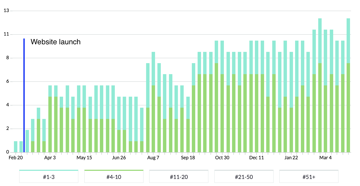
In the chart above, blue bars represent positions 1-3 in Google and green bars represent rankings on the rest of page 1.
You can see that rankings immediately rose in the week following launch and that page 1 rankings continued to grow over time.
“We worked with P&P to rebrand and build a website from scratch. We have been inundated with positive feedback on the look and feel of the Bond brand. The project management side of things and communication was first class. P&P are able to respond to passionate involvement from a client”
