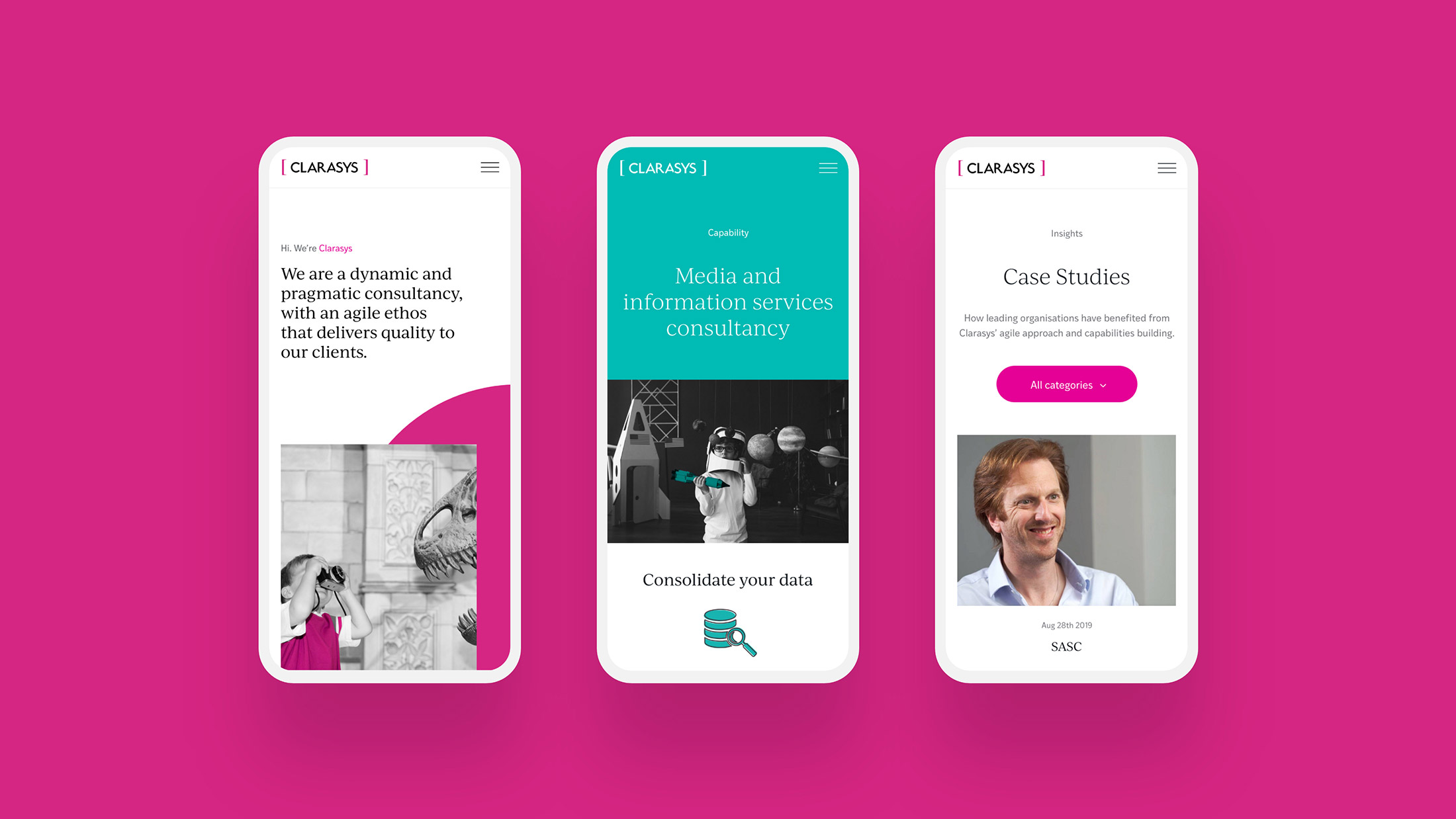
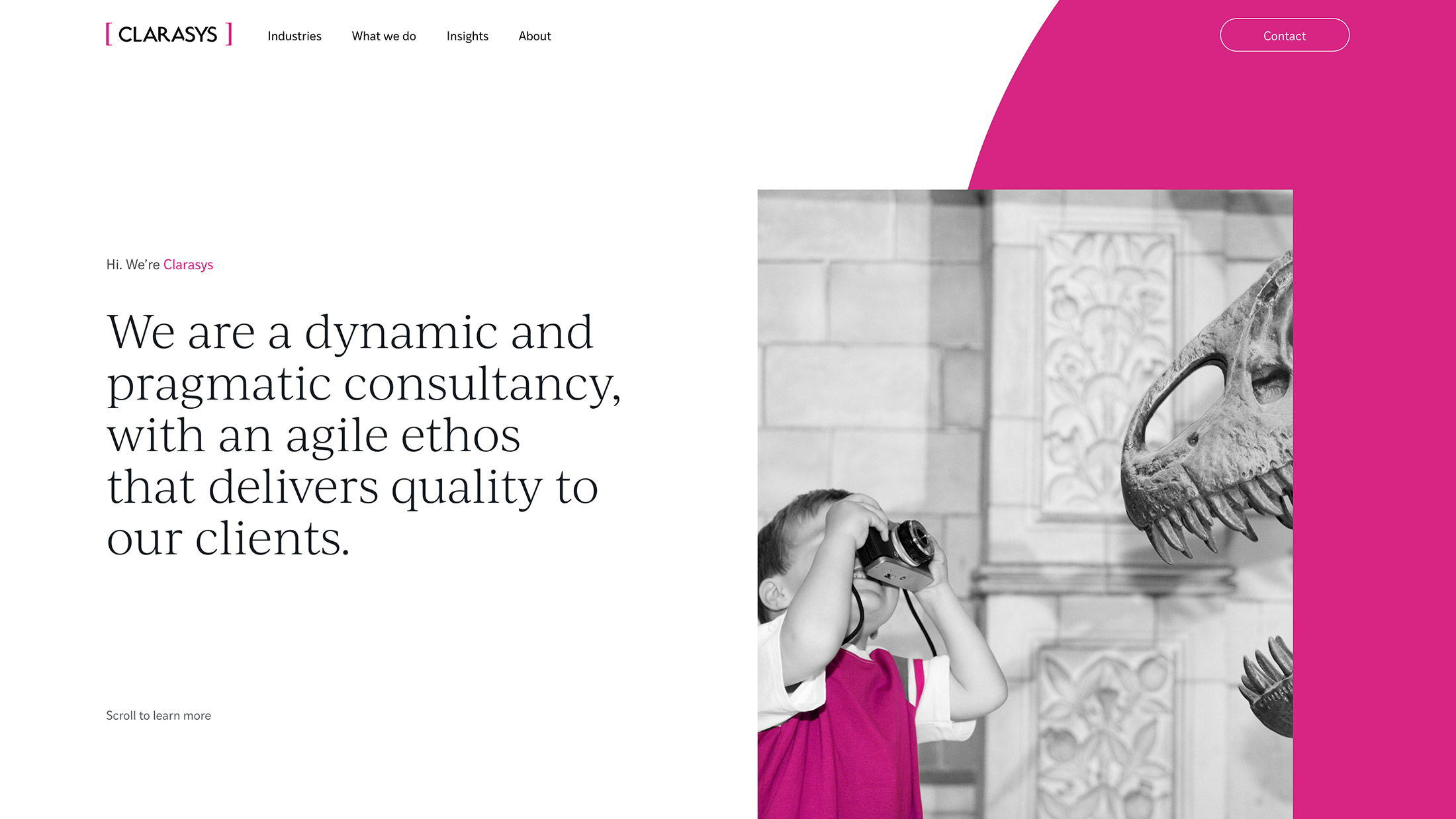
Clarasys is an independent business consultancy with a global reach. They work with their clients to navigate large scale digital transformation, unlocking value and enhancing customer experience.
- Lead time:
- 8 weeks backend, 12 weeks frontend
- Sector:
- Business consultancy
- Target Type:
- B2B
- Website Goal:
- Secure the website, enable the marketing team
- Services:
- Website development, website design, behavioural analysis and content architecture review, SEO
- Scope
- WordPress CMS
- Modular page structure
- CDN cache
- Responsive development
- Adobe XD UX wireframes
- Adobe XD website designs
- Gated content
- Resource
- 1x Project Manager
- 1 x Website Designer
- 1x Front-end Programmer
- 1x Back-end Programmer
- 1x Quality Assurance Tester
- 1x Digital Marketing Specialist
The challenge
Clarasys was struggling with an inflexible website that had developed a number of security concerns over time. All content changes required IT support which was delaying marketing initiatives and causing frustration across departments. Clarasys challenged us to secure their website and deliver a user friendly content management system to help them manage their site day to day.
Having just undergone a rebrand, Clarasys also needed a new frontend web design to launch their new brand.
Post-launch website results
Clarasys have experienced fantastic early results from their website rebuild. Their high quality code base has positively impacted the performance of their website and their visibility in Google.
+
1
15
%
Increase in organic traffic since launch as tracked by Google Analytics.
+
1
77
%
Increase in server response time which is a ranking factor in Google, as tracked by Google Analytics.
+
1
50
%
Increase in page load speed since launch as tracked by Google Analytics.
Post-launch keyword results
Our approach
We recommended a backend first website rebuild to rapidly deliver priority functionality. This involved rebuilding and launching a new backend code base before starting work on the new website design. We secured the website and replaced the hard coded page layouts with modular components to enable easy content management.
Bringing the brand to life
We delivered a vibrant new website design utilising Clarasys’ new brand assets and colour palette.
SEO optimisation
Our team optimised the website for key search terms to improve search engine rankings and build organic traffic.
Easy content management
With a new user friendly CMS Clarasys’ marketing team can keep content up to date and showcase their work.
Getting to know the team
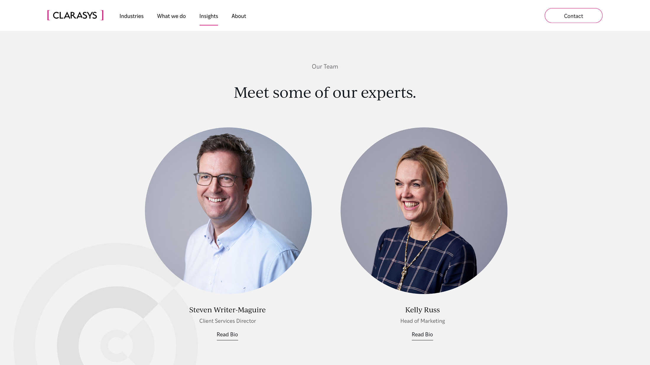
Our research showed that users were interested in reading about the Clarasys team but struggled to navigate the long list of team members. The new site design presents relevant team member profiles alongside content to assist the user journey.
Designing with data
We conducted a behavioural analysis and content architecture review to benchmark Clarasys’ existing website performance against key competitors in their market. This data was used to guide the new website structure and create engaging user journeys, increasing on-site conversion rate and search engine rankings.
“Plug & Play are truly great at what they do and think about things in ways that others do not. They are a really great organisation delivering an outstanding quality of work and are genuinely awesome people to work with!”

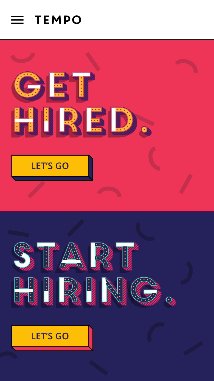
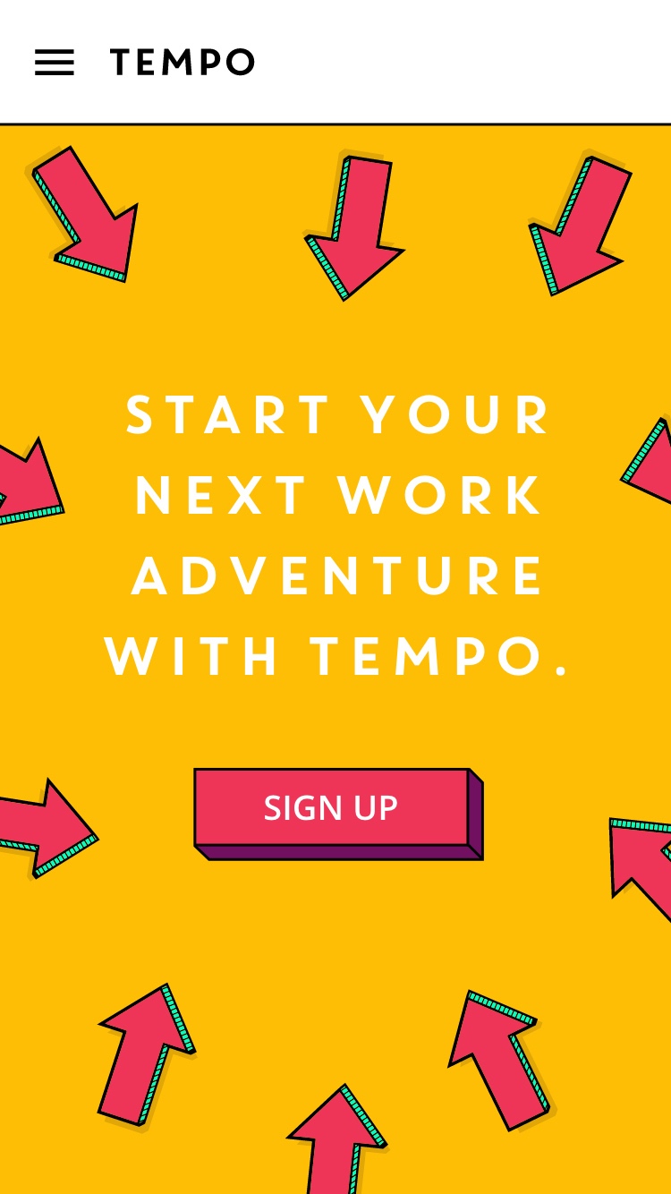
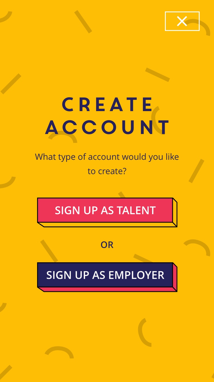
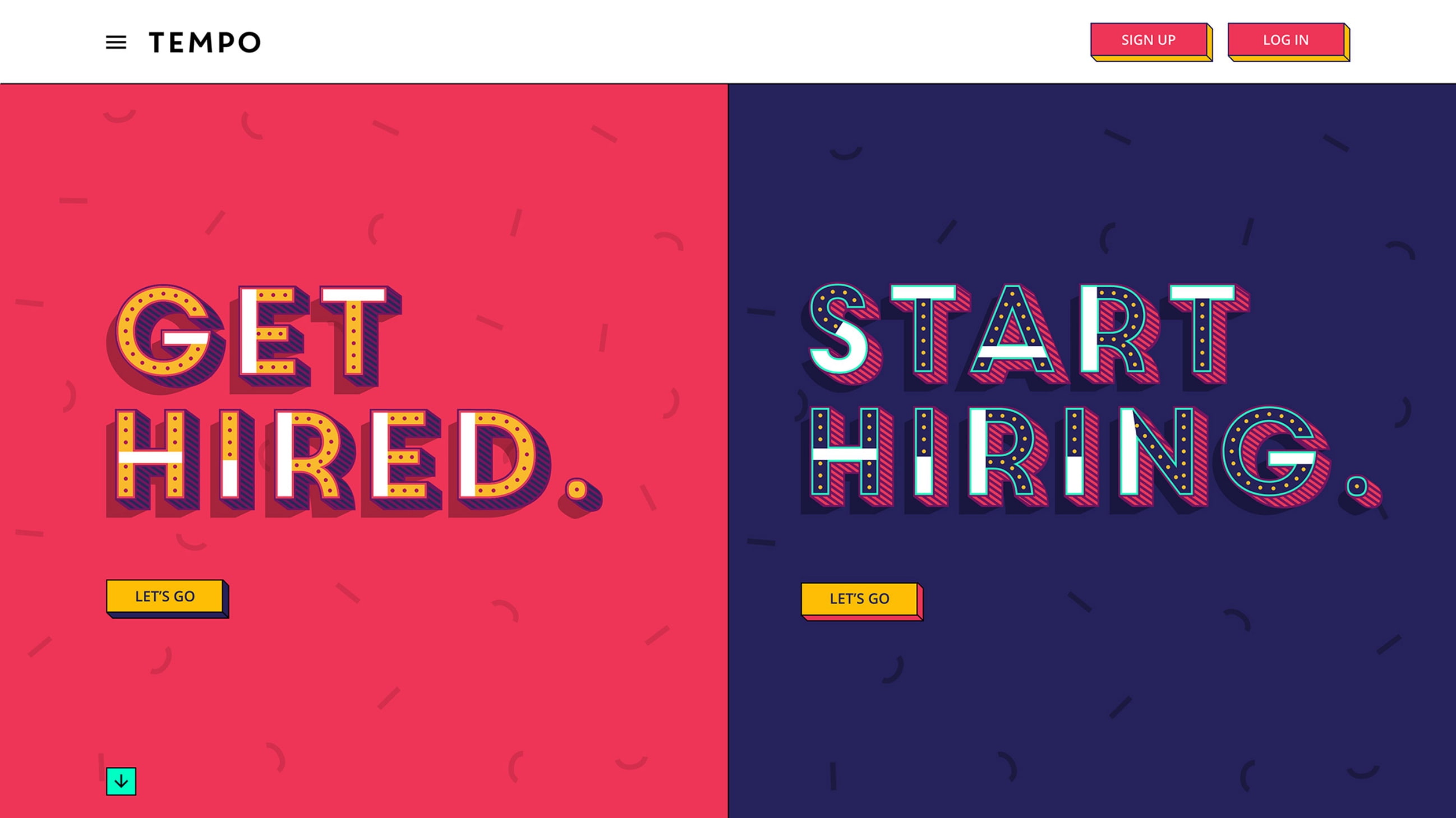
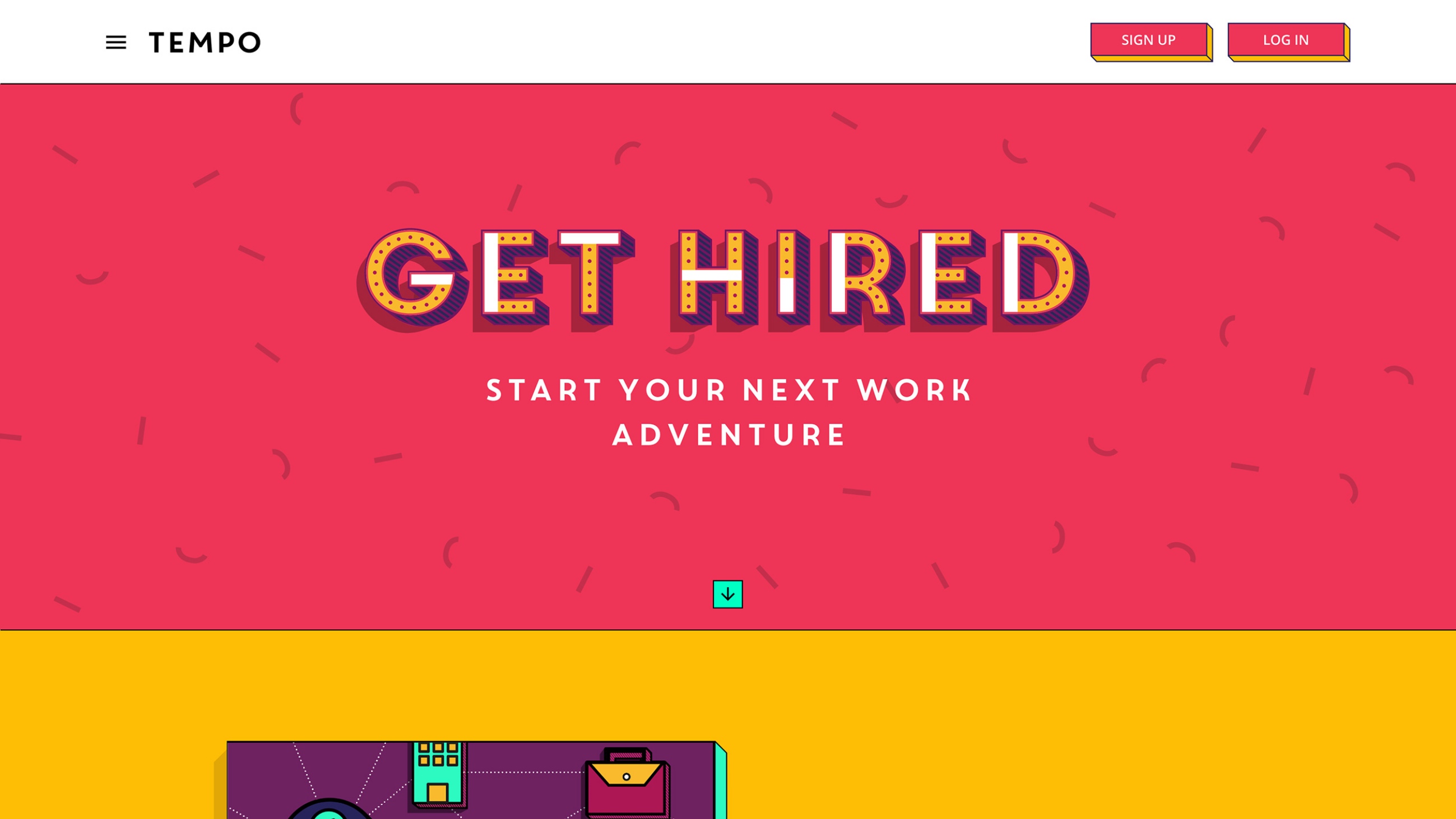
Tempo’s platform connects employers directly with job seekers, using video applications to disrupt the recruitment sector and offer an alternative to traditional recruitment processes.
- Lead time:
- 4 months
- Sector:
- Recruitment
- Target Type:
- B2C and B2B
- Demographic:
- Employers and Job Seekers
- Website Goals:
- Drive Sign Ups, User Friendly CMS
- Services:
- Web Design, Web Development
- Scope
- Adobe XD Designs
- WordPress CMS
- Responsive Design
- Recruitment Portal API Integration
- Gated Content
- Video Content
- Resource
- 1 x Project Manager
- 1 x Digital Marketing Specialist
- 1 x Website Designer
- 1 x Front-end Programmer
- 1 x Back-end Programmer
- 1 x Quality Assurance Tester
Our approach
We delivered a bright and playful recruitment website to showcase Tempo’s vibrant brand. We achieved this by mapping optimised user journeys for employers and applicants, introducing interactive touch points to maximise user engagement and sign ups.
Clear user flows
Call to actions are used to ensure users are presented with the most relevant content.
Custom animations
Playful animations are used throughout the website to reflect the energy and vibrancy of the company.
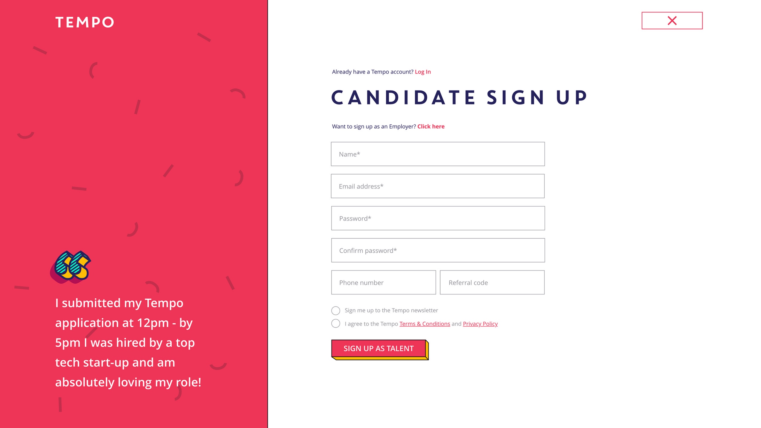
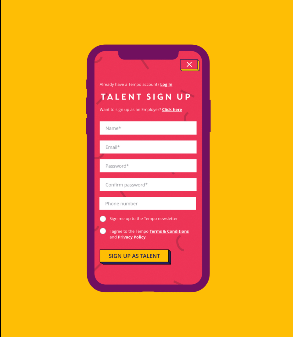
Sign ups
Employers and job seekers are presented with different sign up forms to provide a clear conversion point for each user flow.
A flexible CMS
The end user experience was paramount to Tempo, however they also needed to improve the user experience for their own team. Their existing website was restrictive and the team struggled to make simple content changes without IT support. This was slowing down their progress and causing frustration across departments.
As part of the rebuild, we implemented a user friendly custom WordPress CMS to provide the marketing team with autonomy over their website content and page layouts. Enabling the team with a flexible CMS has helped them to be more efficient, reduce lead time for campaigns and relieve unnecessary pressure on their IT team.

Implementing the brand
We worked closely with Tempo’s Head of Design to integrate their strong brand into all elements of the user journey. This included the creation of eye catching interactive components to highlight key call to actions and guide the user through their user flow. The assets needed to work together with the content to create a memorable on-site experience.
Related work

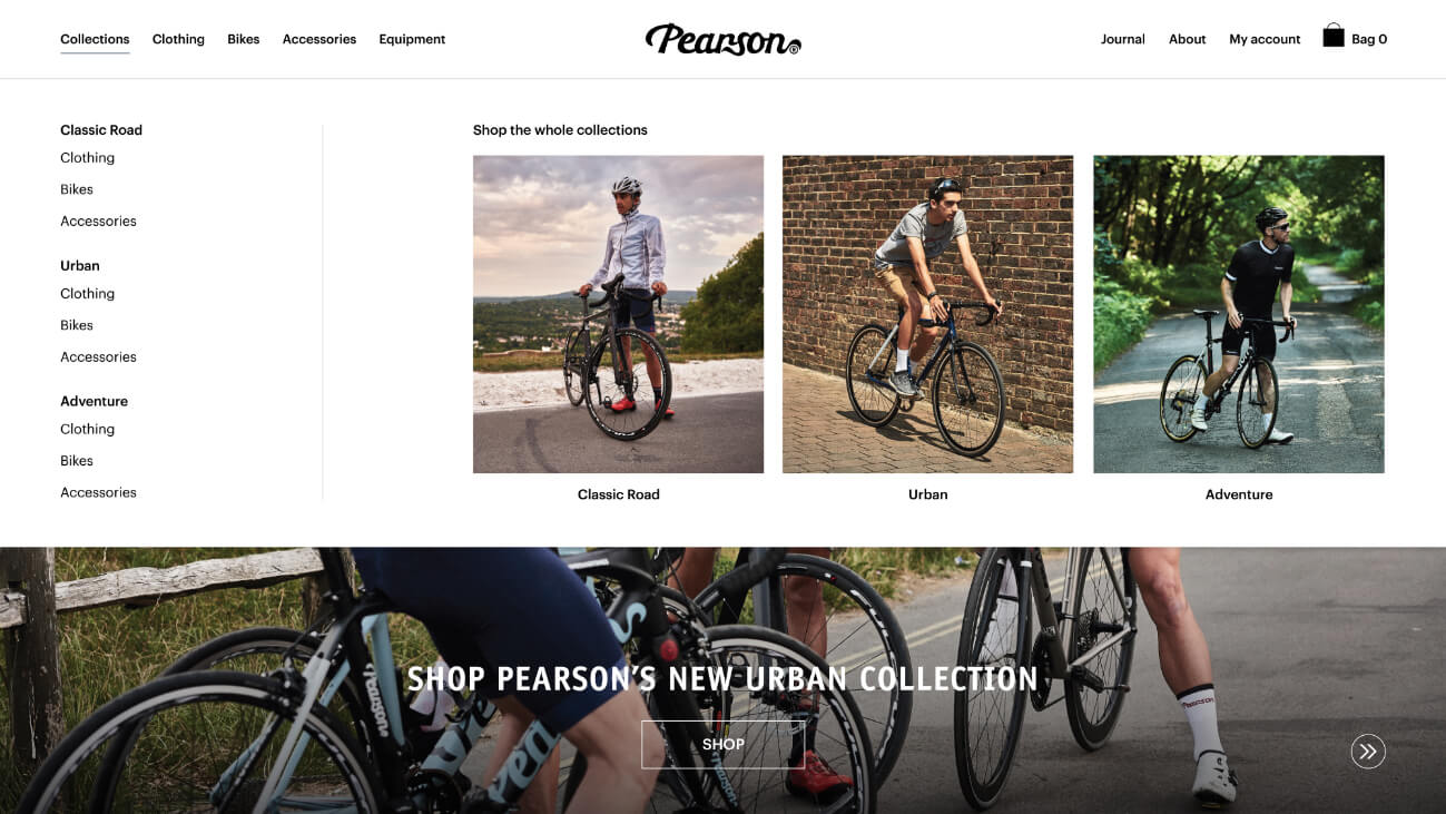
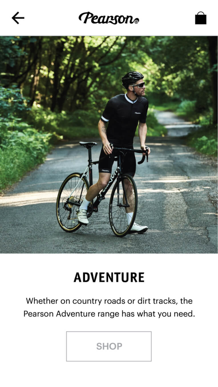
Since starting back in 1860, Pearson has become an established British cycling brand. Now run by the fifth generation of the Pearson family, it is recognised as the world’s oldest bicycle business. Following impressive success in their London stores, they wanted to bring the business into the 21st century by improving their online offering. They approached us to boost their online conversion rate and help them appeal to new markets.
- Lead time:
- 6 months
- Sector:
- Sport & Leisure
- Target Type:
- B2C
- Demographic:
- Cyclists
- Website Goals:
- Launch New Brand, Drive Sales
- Services:
- eCommerce Web Design, Digital Marketing

- Scope
- Adobe XD Designs
- WordPress CMS
- WooCommerce Shop
- Responsive Design
- Apply Pay Integration
- Ongoing Digital Marketing
- Resource
- 1 x Project Manager
- 2 x Digital Marketing Specialists
- 1 x Website Designer
- 1 x Front-end Programmer
- 1 x Back-end Programmer
- 1 x Quality Assurance Tester
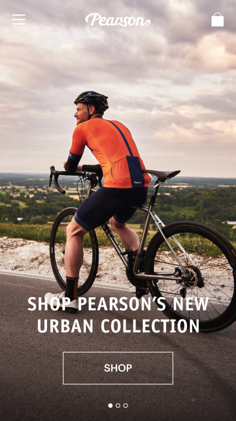
Taking success online
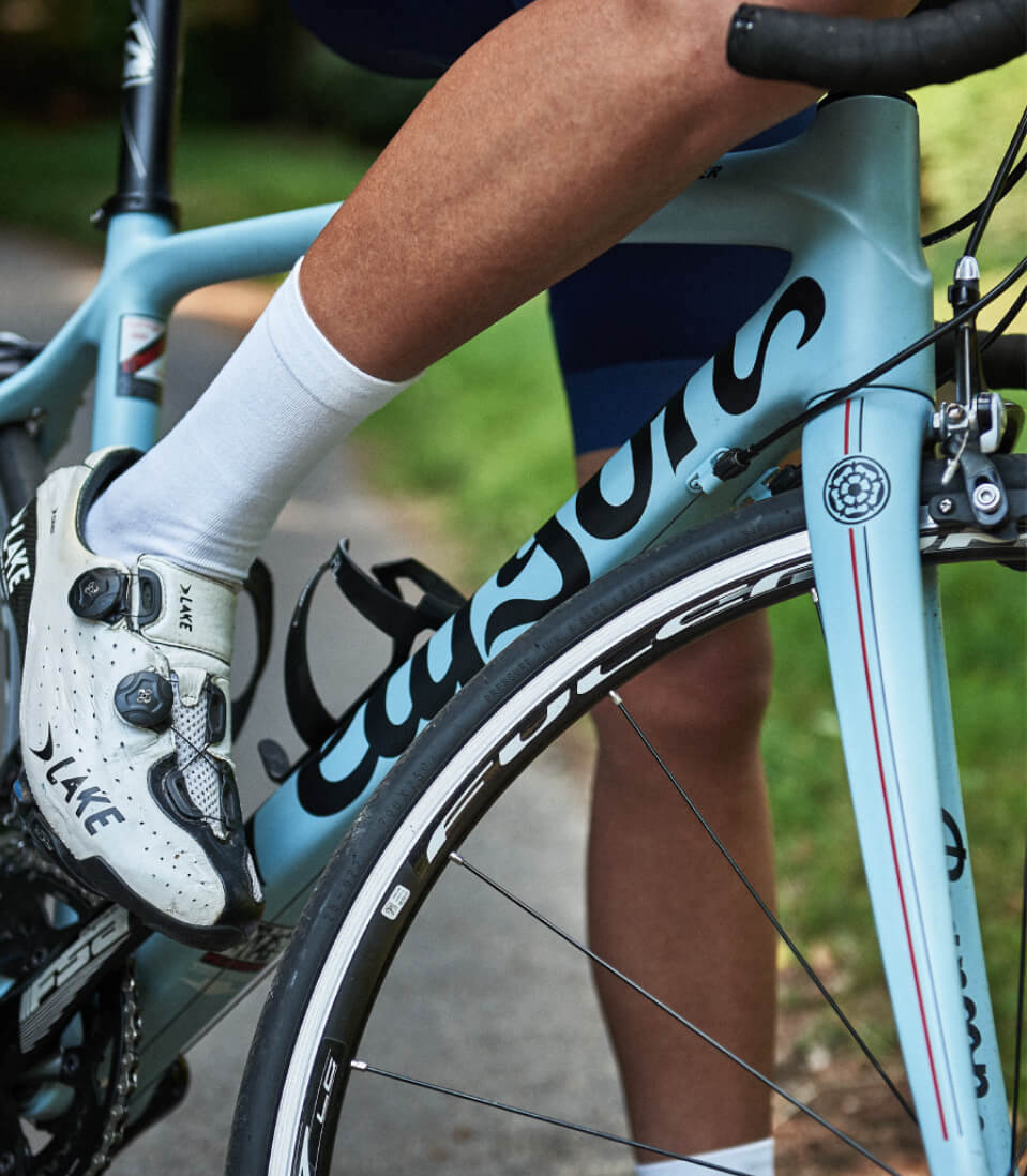
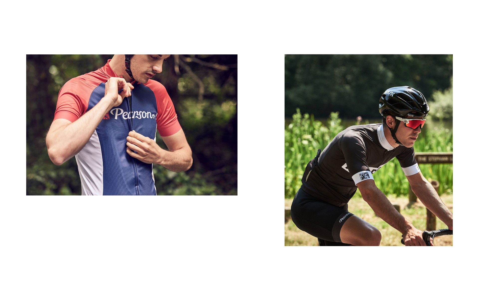
One of Pearson’s goals was to widen their offering of cycling apparel. They believe that cycling should be accessible to all and wanted to appeal to all cycling enthusiasts, not just the cycling gurus. To increase the accessibility of the new Pearson website to new cyclists, we created a website structure that enables users to shop by collections and by categories.
Photographic menu
We implemented a drop down menu to showcase imagery of the collections, apparel and bikes.
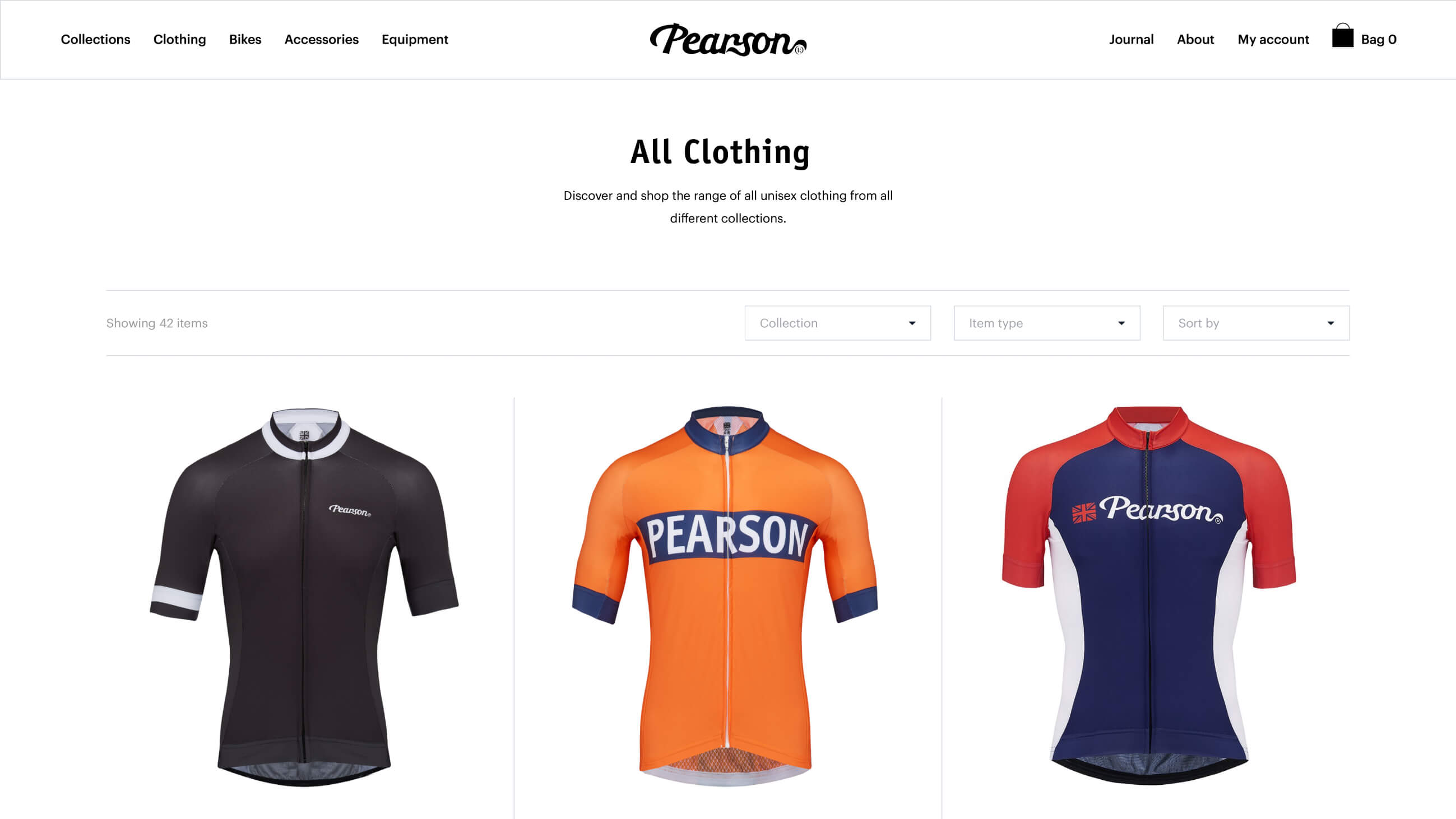
Clean and clear
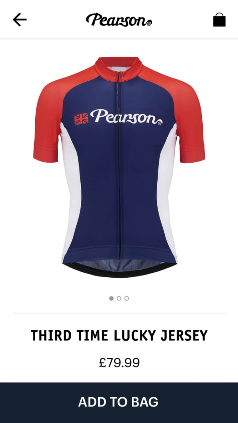
Products are presented in a bold and clear way to provide a simple and intuitive user experience.

Dynamic imagery
Product page imagery updates as options and add-ons are selected, showcasing the customer’s final product.
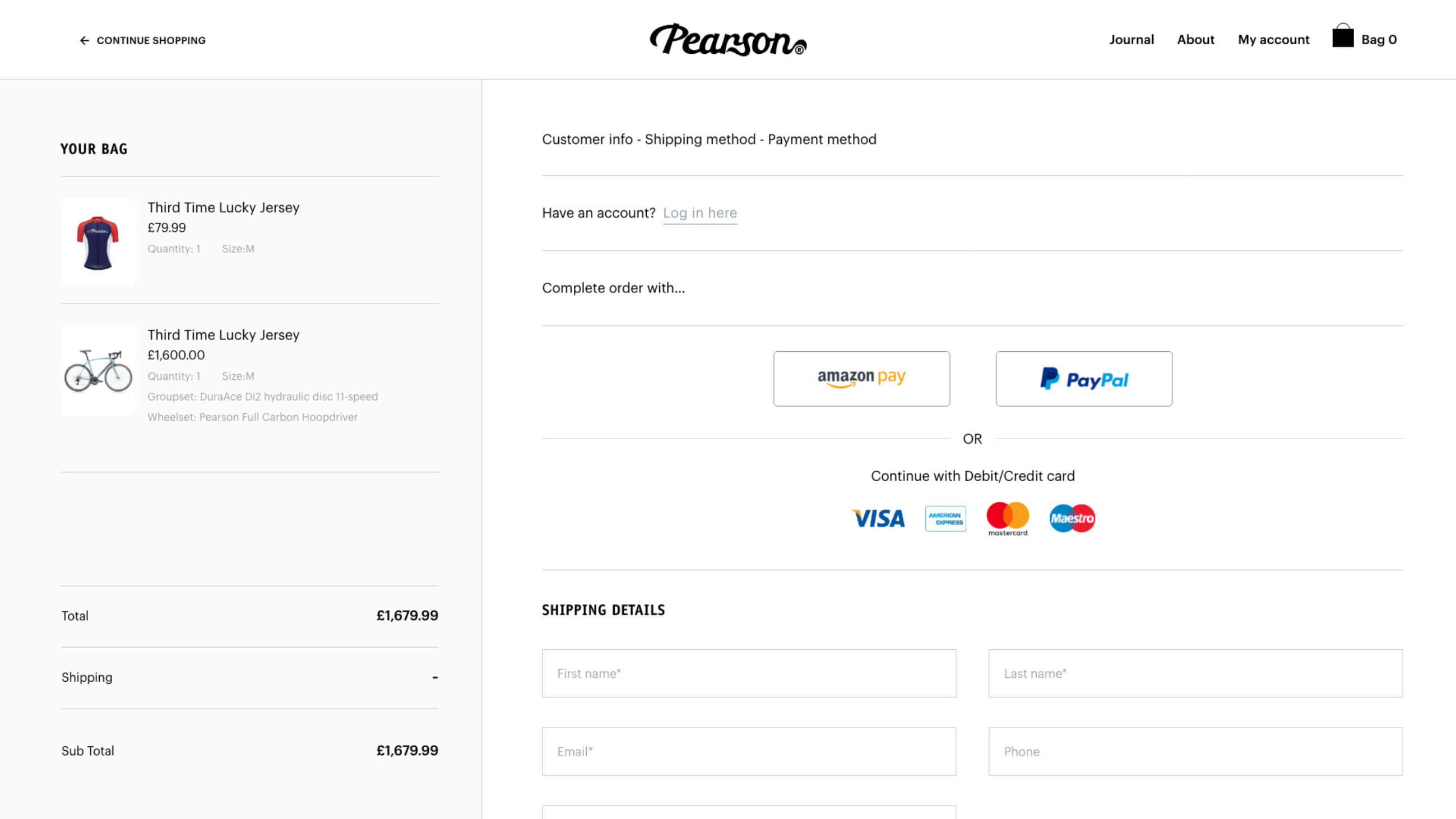
Payment gateways
We integrated with 3 different payment gateways including Apple Pay to streamline the checkout process and meet market demand.
301 strategy
The new Pearson website launch involved both a rebrand and a domain change. We managed this process, taking measures to protect existing search engine rankings. Each URL from the old domain was mapped to the equivalent page on the new website and Google was informed of the rebrand.

Related work


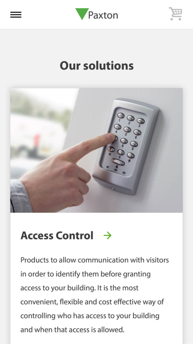
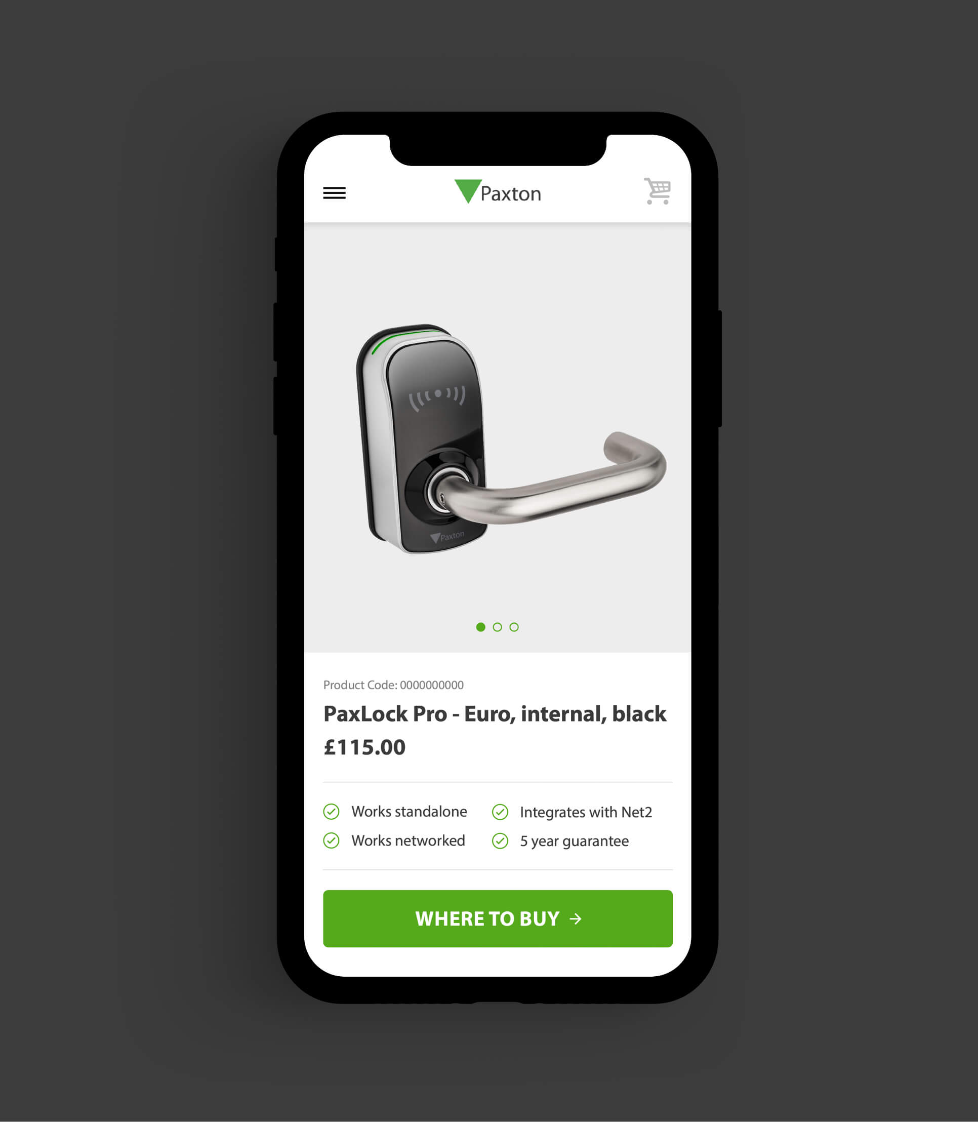
Paxton design and manufacture security solutions for use in a broad variety of commercial environments. They train security system installers to fit Paxton products and equip them to sell Paxton solutions to their customers.
Paxton challenged us to unify 13 of their existing websites into 1 website with an improved user experience. They needed one core website with a flexible CMS to provide their marketing team with central control and reduce support requests to their IT team. It was essential for the new website to drive training sign ups and improve Paxton’s global search engine rankings.
- Lead time:
- 12 months
- Sector:
- Security
- Target Type:
- B2B
- Demographic:
- Security Installers
- Website Goal:
- Provide Central Control To Marketing Team
- Services:
- Web Design, Web Development, User Journey Mapping, Digital Marketing
- Scope
- Adobe XD wireframes
- WordPress CMS
- eCommerce
- API integrations for training and event sign ups
- API integrations for products and product search
- API integrations for installer search and feedback
- Multilingual
- IP detection
- Varnish cache
- Resource
- 1x Marketing Strategist
- 2 x Digital Marketing Specialists
- 2x Website Designers
- 2x Front-End Programmers
- 1x Back-End Programmer
- 1x Project Manager
- 1x Quality Assurance Tester
The challenge
The new website has 8 distinct territories with different content, language, currency and user access requirements that can be managed by the Paxton Marketing Team. With Paxton selling their solutions in over 50 countries, each territory pulls products from the Paxton API and the website enforces logic to remove duplicate products and create editable product pages.
Website territories can be navigated via a territory switcher which utilises IP detection to direct users to the content that is most relevant to their location.
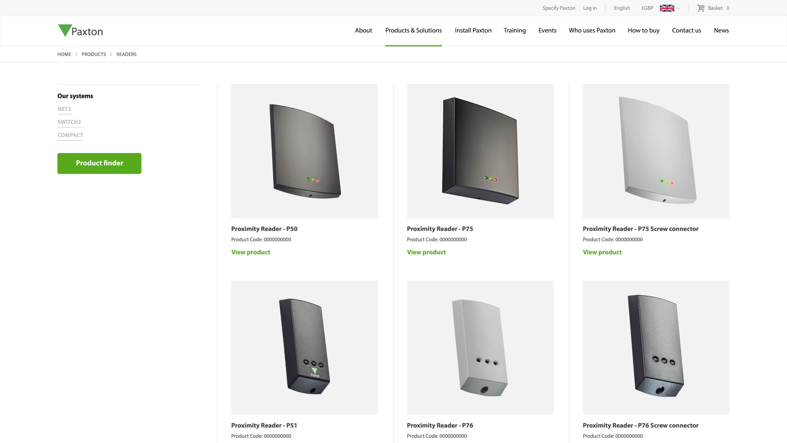
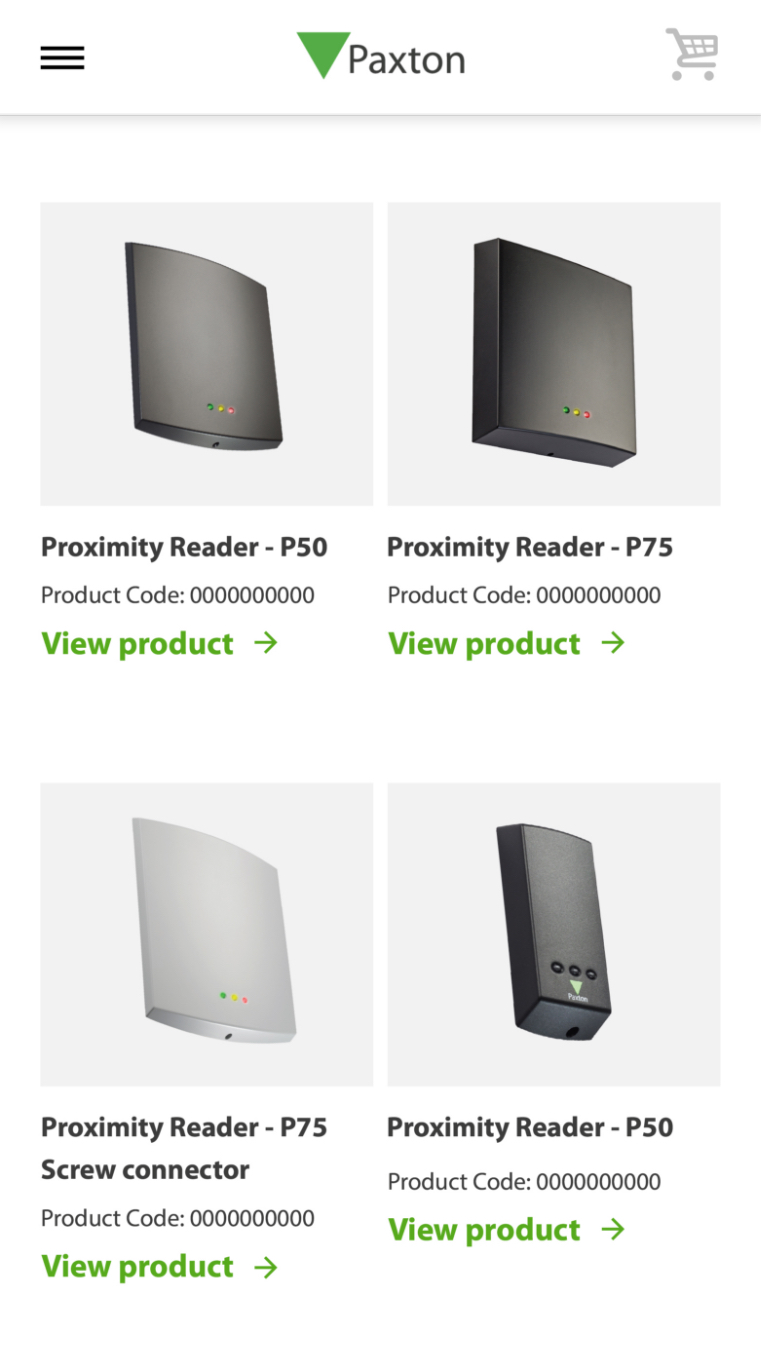
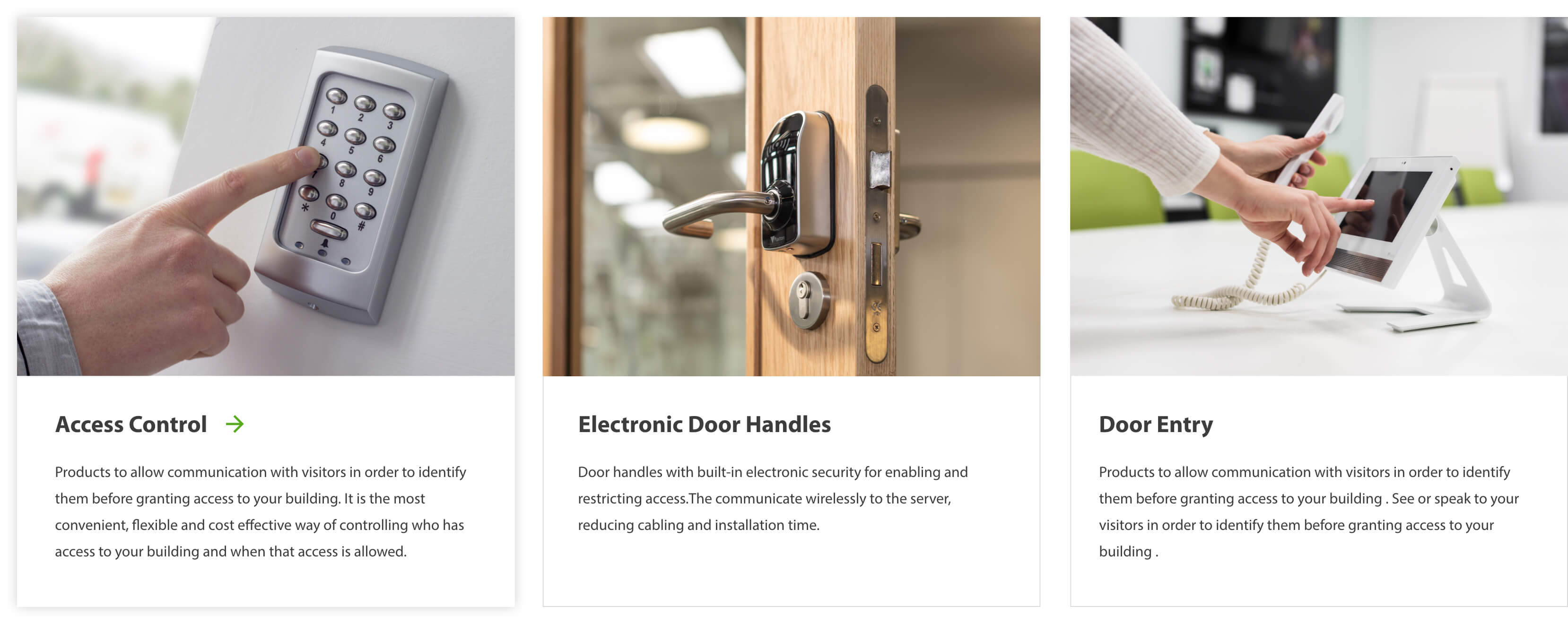
Product catalogue
Product information is pulled from the Paxton API to create editable products in the CMS. The integration refreshes daily to keep the website and API in sync.
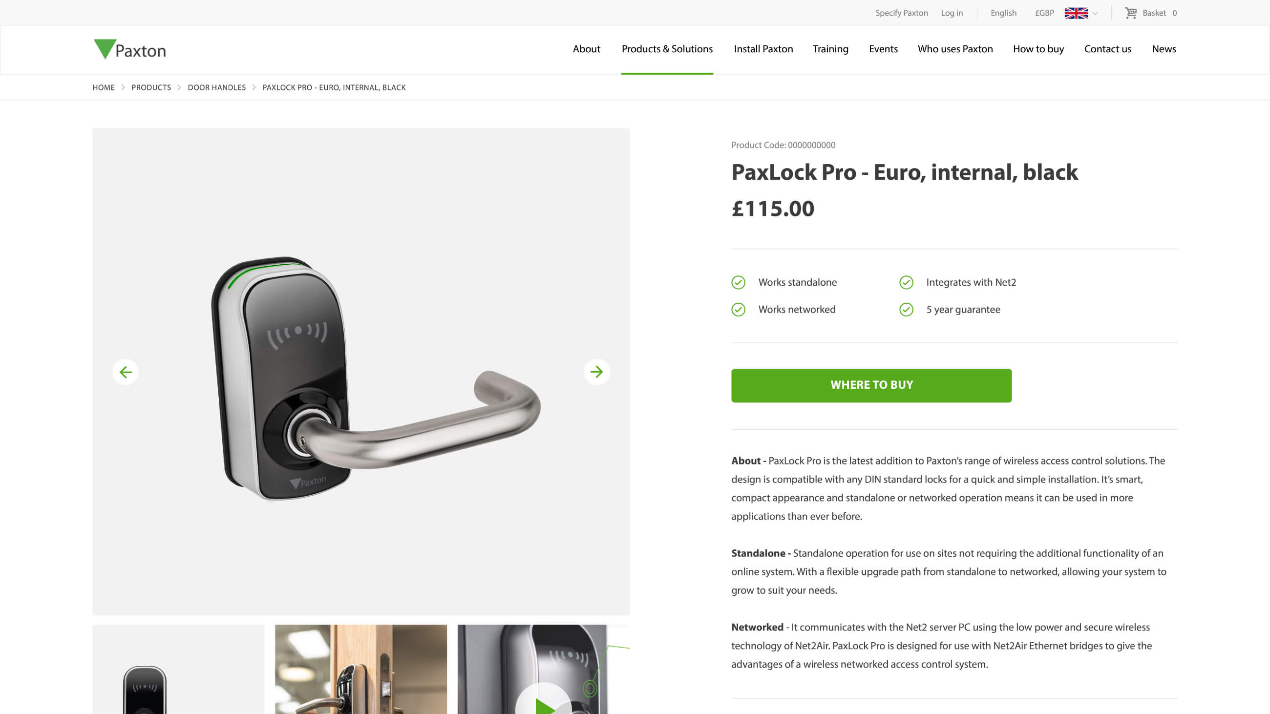
Product documentation
Placing installers at the heart of the user flow, product documentation and installation guides are added within each product page for ease of access.
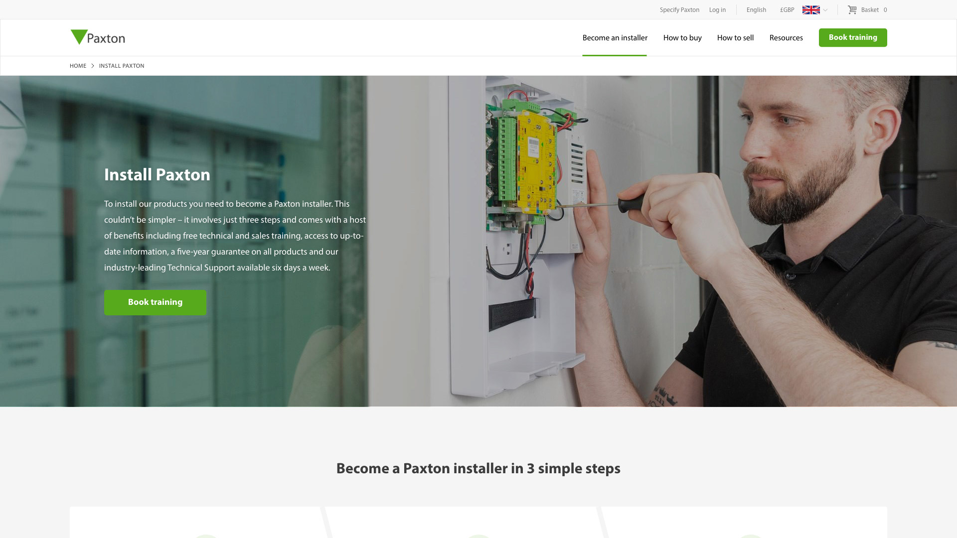
Customer first approach
Installers have a dedicated section of the website to access resources, training and support.
Google optimised landing pages
The new website structure pivots around a complex keyword strategy spanning 8 different territories in order to drive search engine traffic.
Staying ahead
The speed of the website was considered from the ground up during the build. The complexity of the content and data being handled from combining content from 13 websites meant that if this wasn’t done carefully, there was every chance that the site would be too slow to use. The new website needed to handle the expected high volume of global traffic and number of simultaneous requests.
Results are cached by Varnish after the first page visit and the site makes use of the browser’s local storage to cache the common API responses/data. This reduces the number of API calls that need to be made and means that the more that users browse the website, the quicker it will be. Varnish cache is used to store and serve a static version of the website, making it much faster than in normal circumstances. Varnish cache is also used as a protective layer on top of the application which enables us to restrict access to the application to certain users and IP addresses.
Changing domain
Paxton UK content launched on the old US domain. Therefore, legacy UK and US rankings needed to be managed carefully to ensure that the correct content ranked in the correct country. We implemented a comprehensive 301 strategy to ensure that existing website rankings for all territories were maintained upon launch and the user transition was seamless.
Related work

Vungle is a San Francisco based in-app advertising business serving mobile app and game developers across the world. In a competitive market they strive to continually innovate. Vungle wanted to launch a new digital presence to bring their brand to life and improve their Saas platform sign-up conversion rates.
- Lead time:
- 7 Weeks
- Sector:
- SaaS Platform, Mobile Advertising
- Target Type:
- B2B
- Demographic:
- Technical Buyers
- Website Goal:
- SaaS Platform Conversion Rate, Marketing Team Enablement
- Services:
- Web Design, Website UX Design, Wordpress For Enterprise
- Awards:
- Wirehive 100 Awards - B2B Site Of The Year Winner
- UK Digital Growth Awards - B2B Site Of The Year Nomination
- Scope
- Custom Design
- WordPress for Enterprise
- Varnish Cache
- CDN Cache
- Custom Single Sign On
- Recruitment API Integration
- Salesforce Pardot Integration
- Multilingual
- Resource
- 1x Project Manager
- 1x Digital Marketing Specialist
- 2x Website Designers
- 2x Front-end Programmers
- 1x Back-end Programmer
- 2x Quality Assurance Testers
Post-launch website results
The Vungle website focused on delivering a quality finish and providing a seamless user experience. This has been reflected in the post launch results which show huge increases in organic traffic and engagement.
+
1
7
%
Increase in platform sign ups since launch as tracked by Google Analytics.
+
1
43
%
Increase in page views since launch as tracked by Google Analytics.
+
1
77
%
Increase in new organic visitors to the website since launch as tracked by Google Analytics.
Our approach
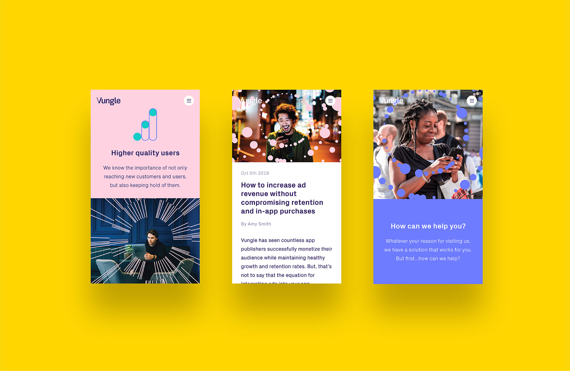
We delivered an innovative new website with a quality but playful look and feel. This was achieved using subtle animations and clever user journey mapping to bring the Vungle brand to life, driving sign ups to their SaaS platform.
The final website includes content in 4 different languages and enables the team at Vungle to tailor their content and marketing strategy to each regional audience.
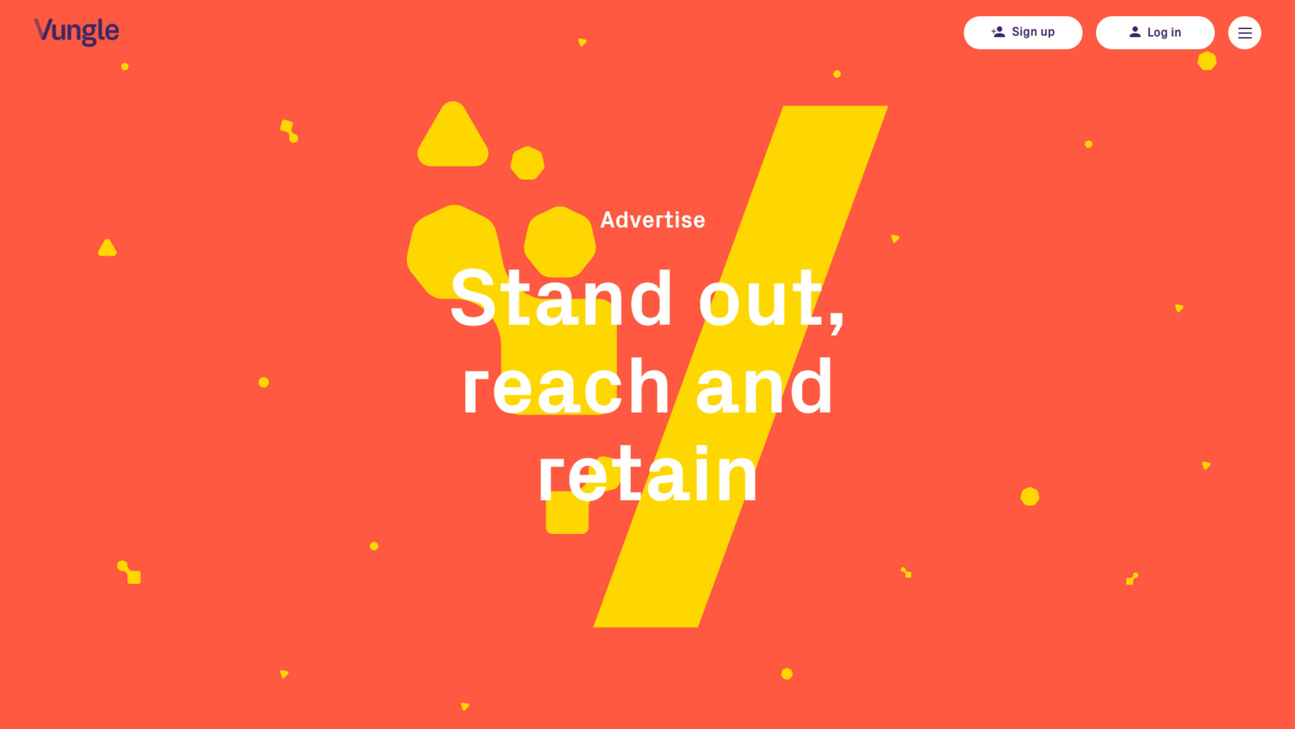
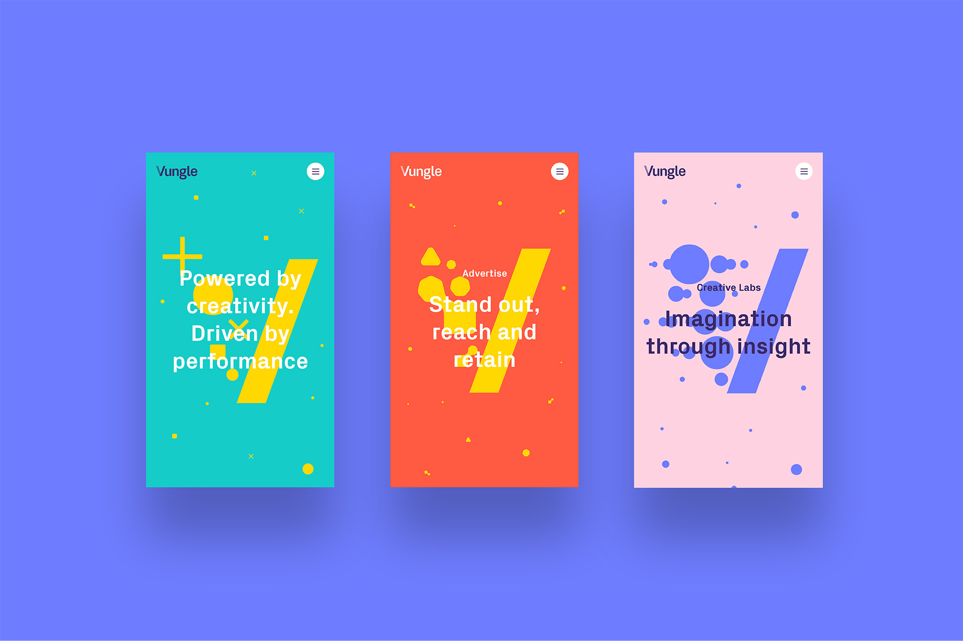
V Expression
‘V expression’ is a core component of Vungle’s brand and represents the message of “Creativity In, Performance Out”.
Animations
Our designers and front end developers worked closely together to create animations that reflect the Vungle brand.
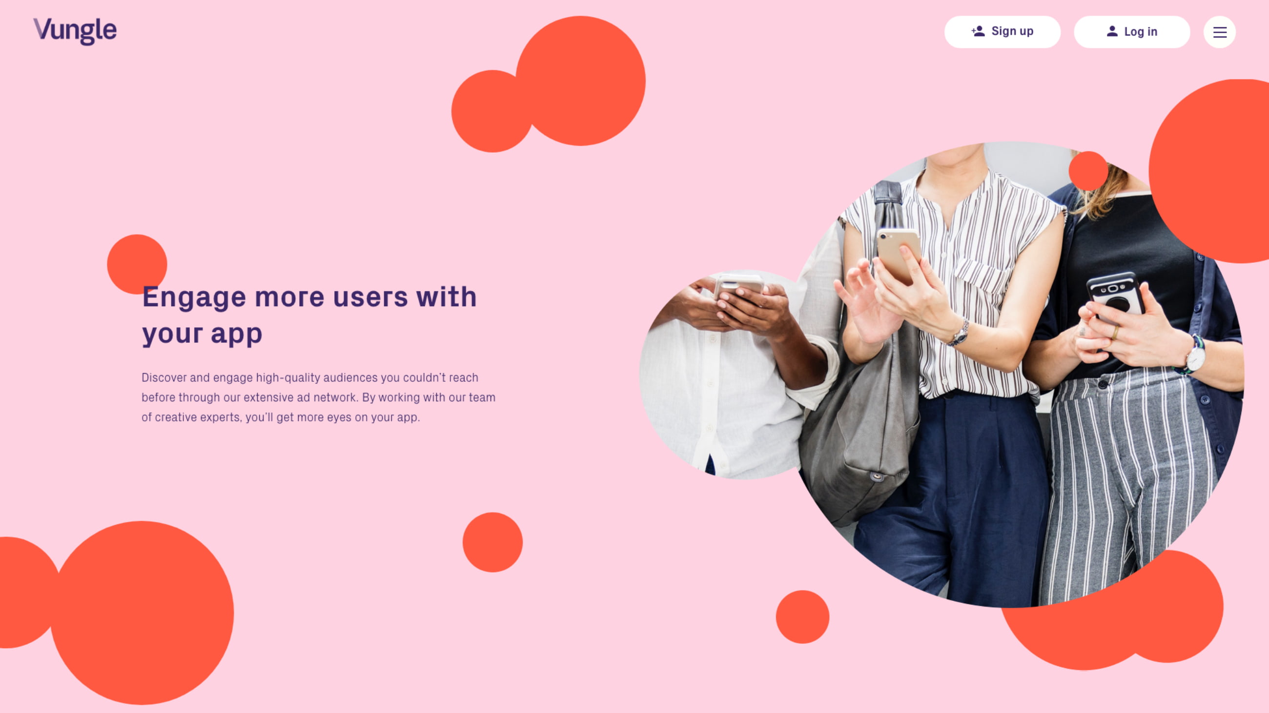
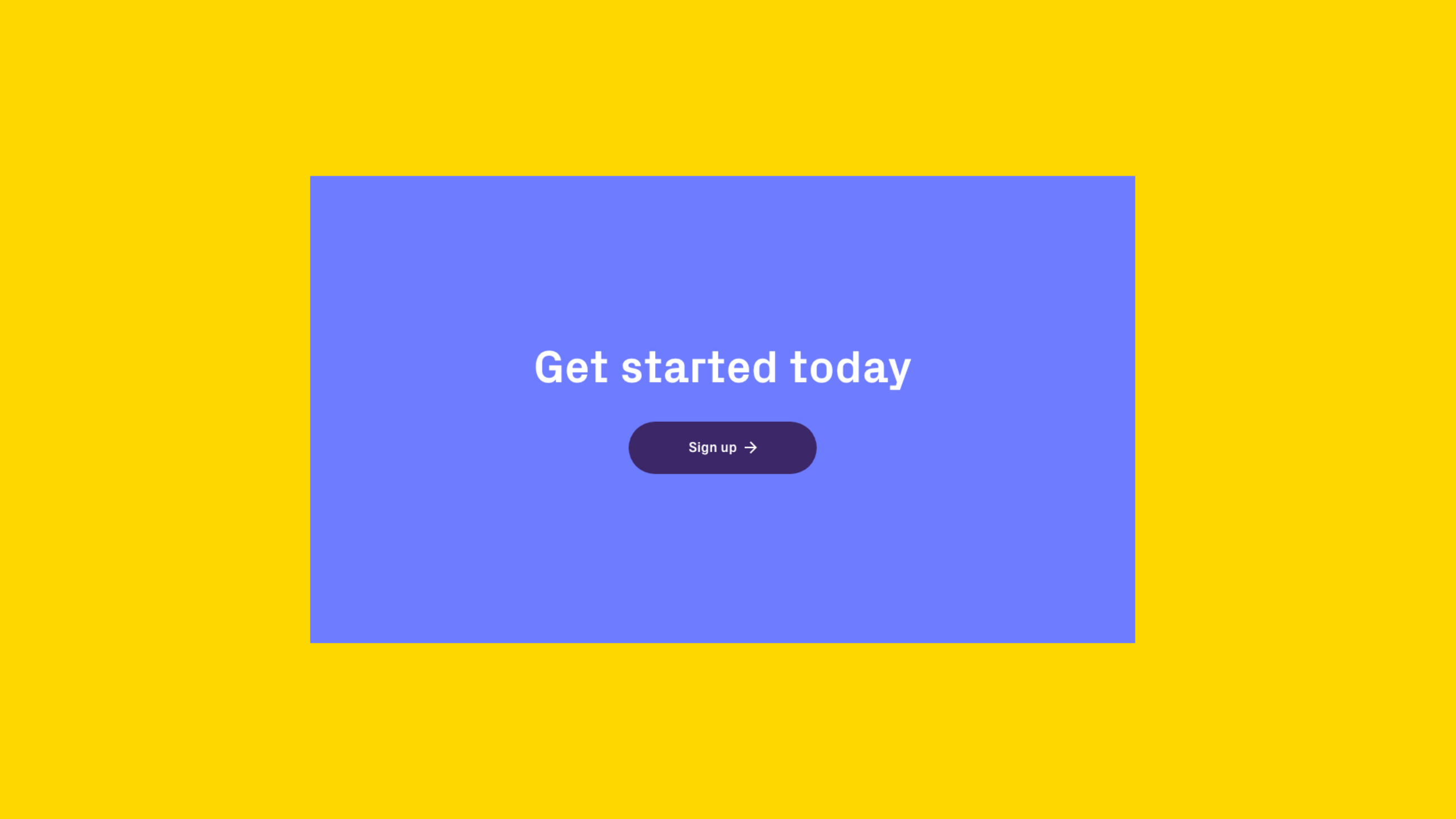
Call to action
Vungle’s key call to action: ‘sign up’ features throughout the site to drive users to complete their user journey.
Seamless page transitions
Call to actions and banners animate together to create the illusion that the user has not changed page.

Implementing the brand
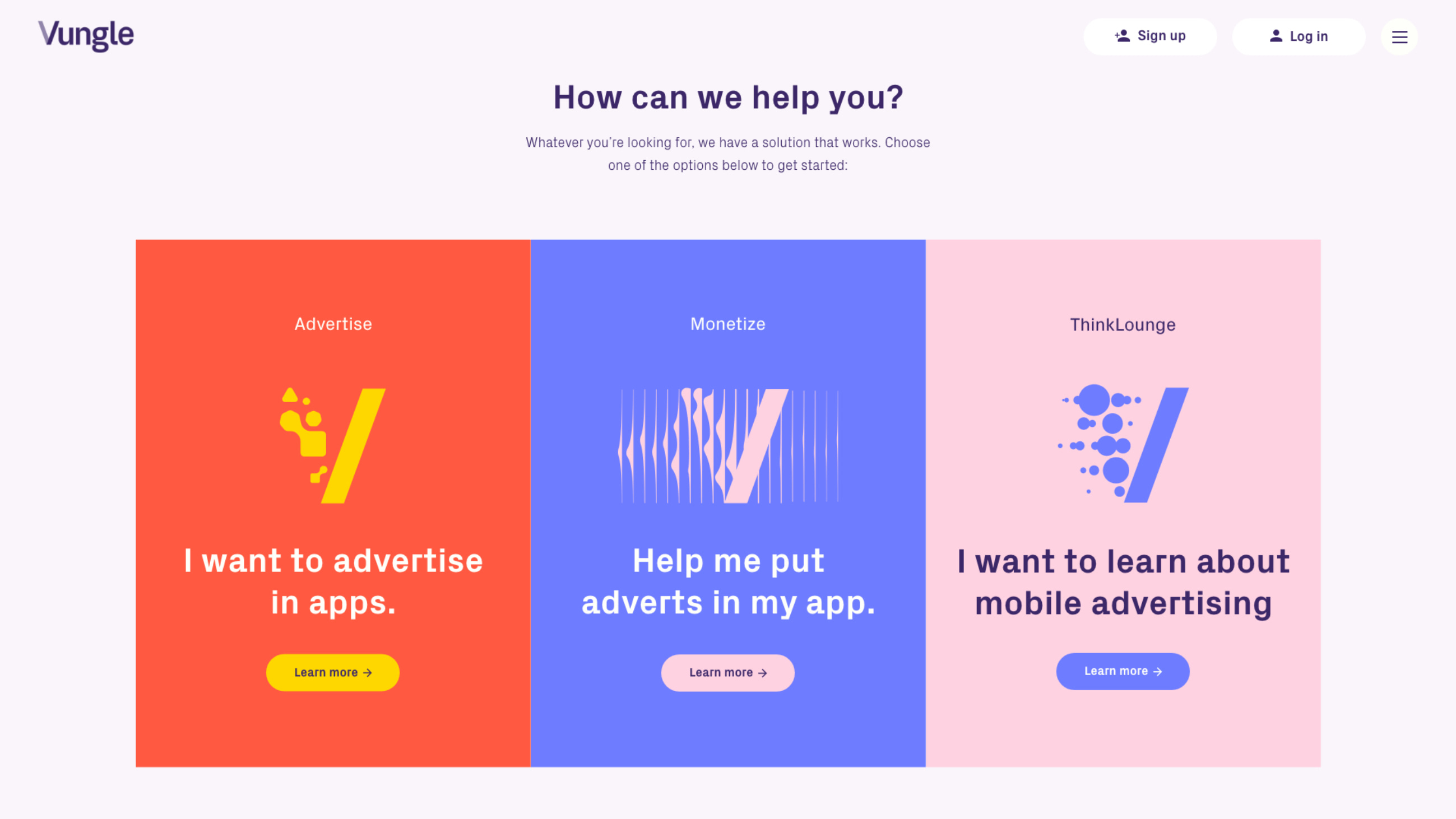
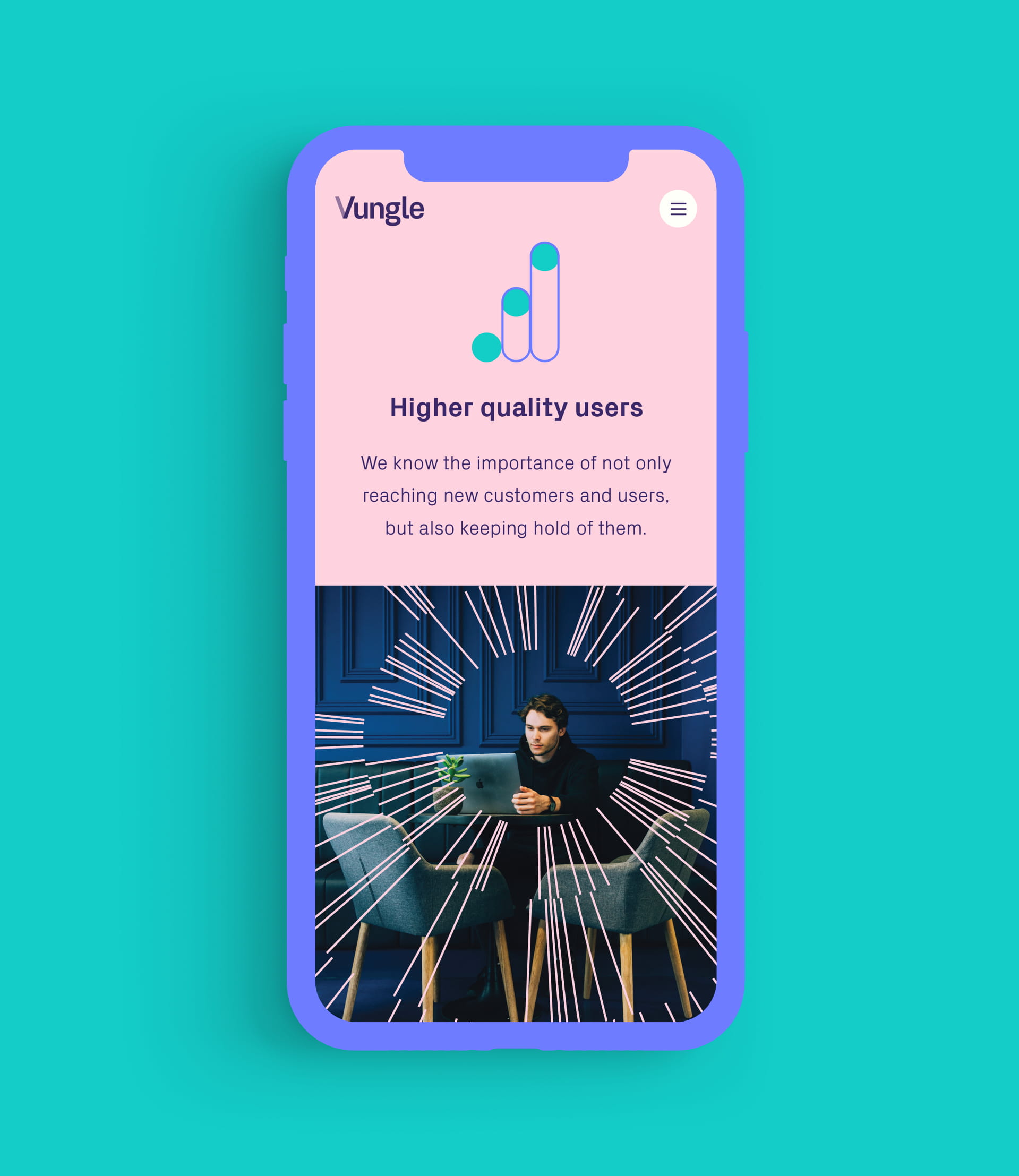
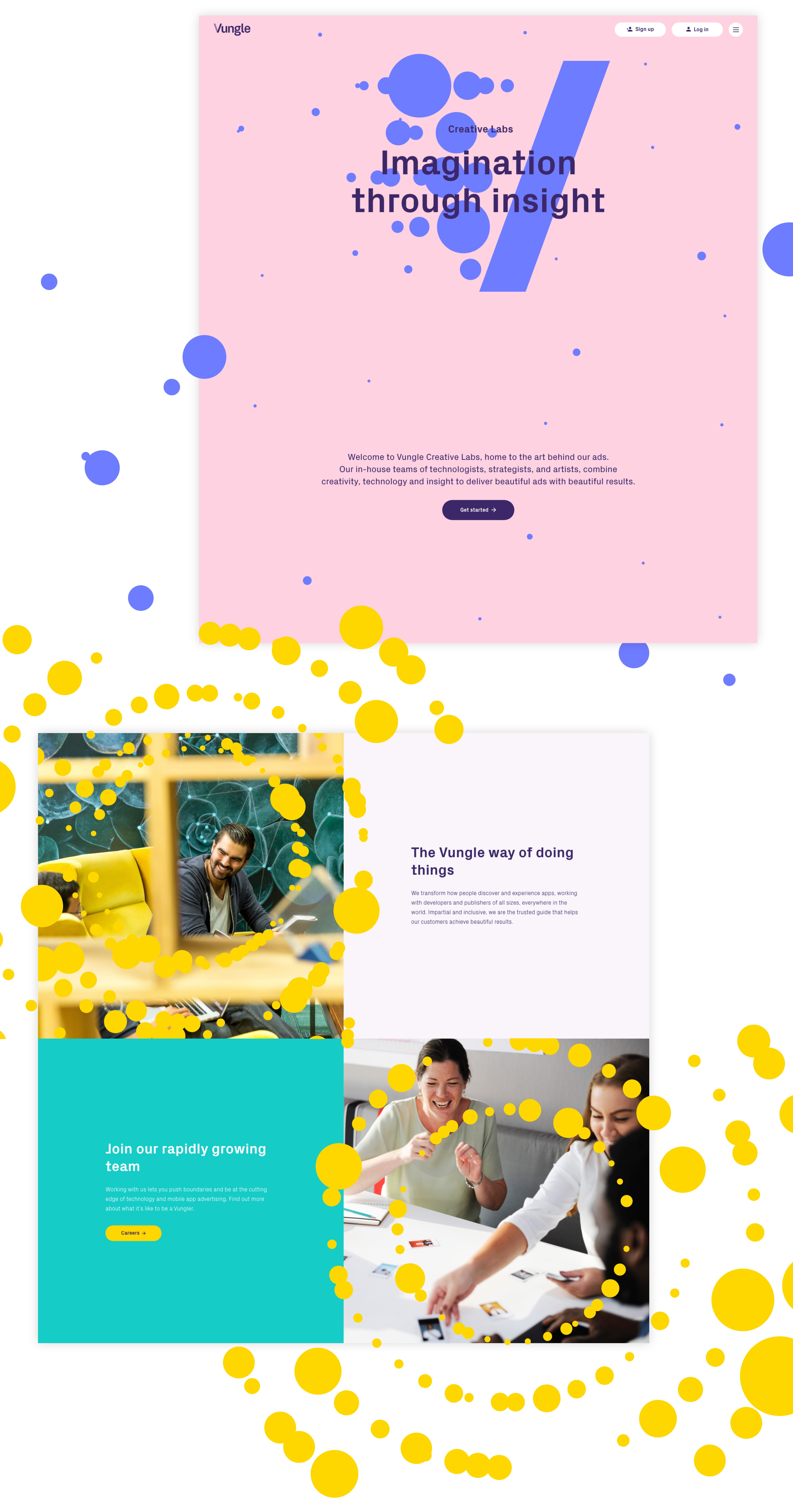
As part of a company re-brand by MultiAdaptor, Vungle’s three main services of Advertise, Monetize and Creative Labs were given their own colour palette and ‘V Expression’. We implemented these throughout the service pages to provide cues to the user about their location on the site and to highlight the user journey for each service.
Multilingual delivery
The Vungle website delivers content in 4 different languages, including English, Japanese, Chinese and Korean. We delivered the site on a single domain, using subdirectories to manage the content for each territory. We configured the WordPress CMS to enable simple content management of multilingual copy that uses both latin and non-latin character sets.

“Plug & Play have surpassed our expectations and delivered a website to smash our competitors. Their creatives really grasped the brief and brought some fantastic ideas to the table, pushing the boundaries for our industry. It’s early doors but we’ve already noticed a spike in sign ups since launch. They’ve brought the new Vungle brand to life and I can’t recommend these guys enough.”

Related work

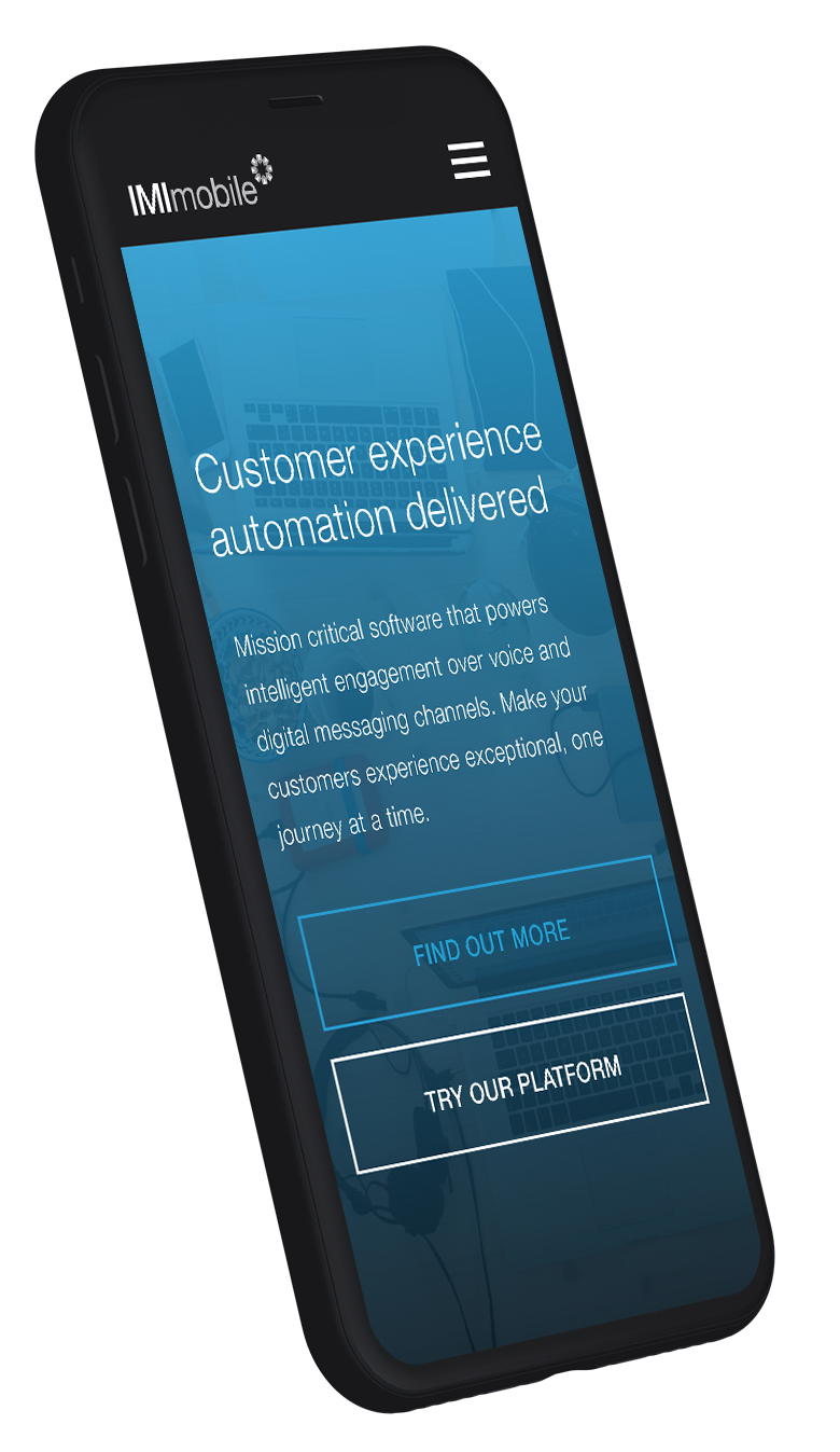
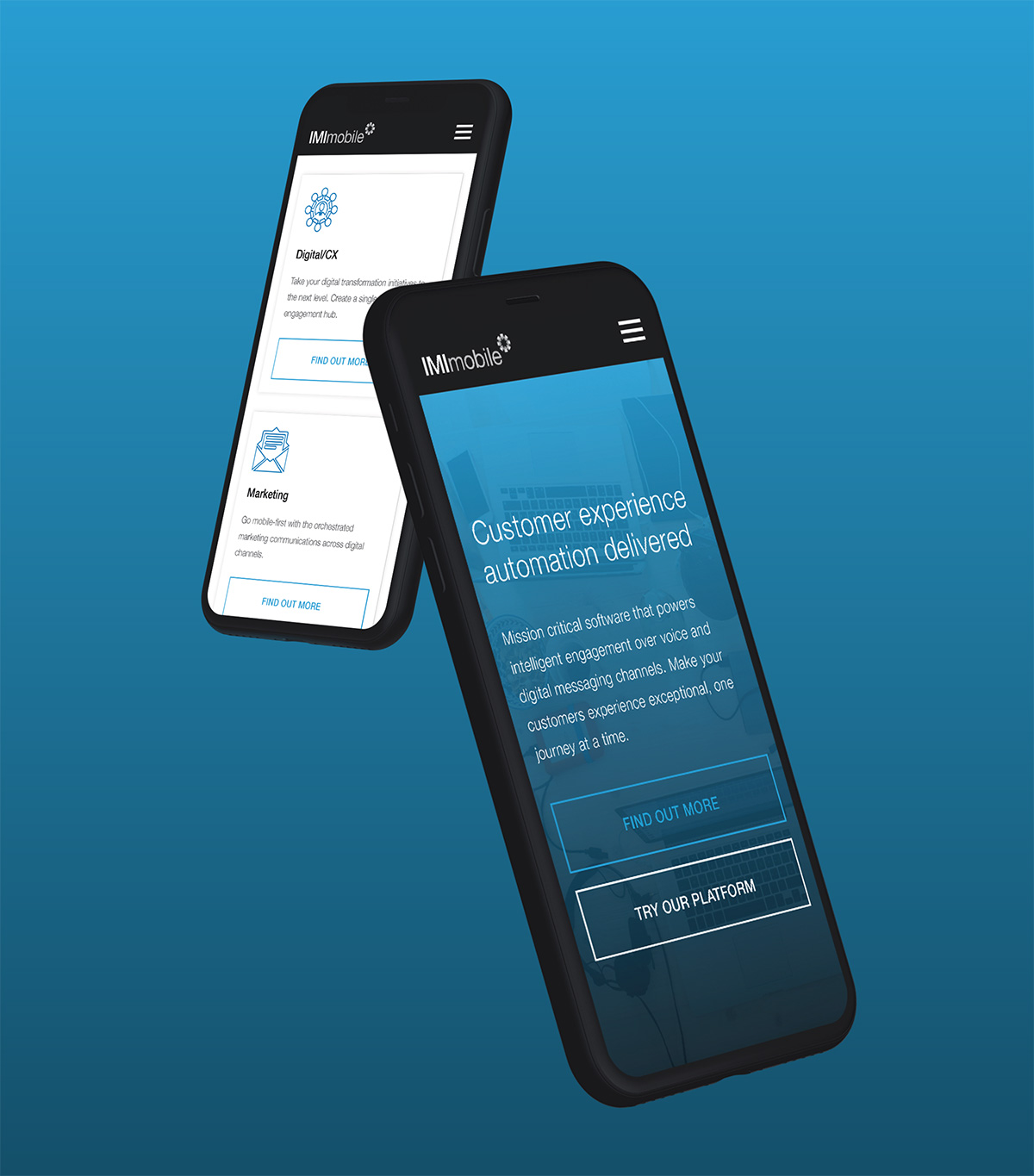
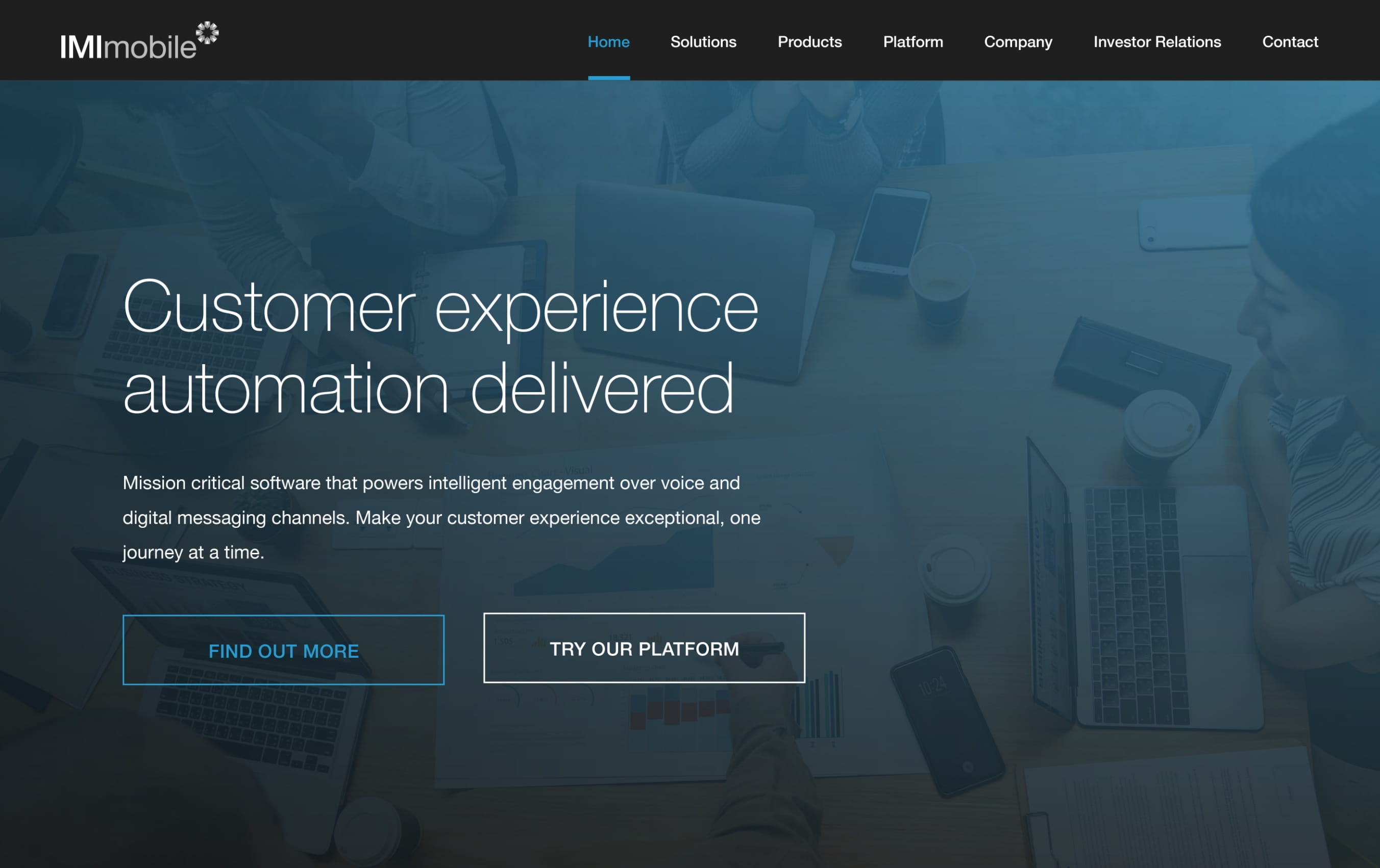
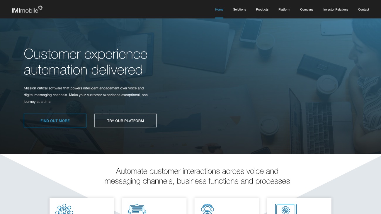
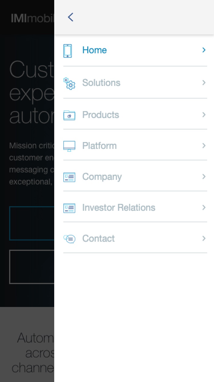
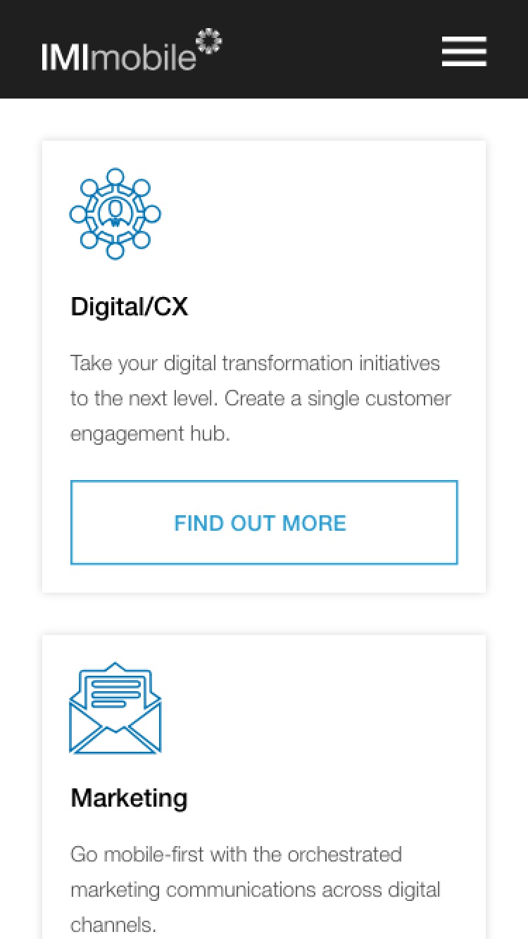
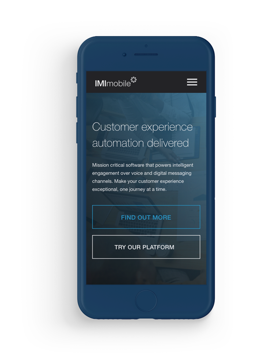
IMImobile
An enterprise WordPress solution for a global business
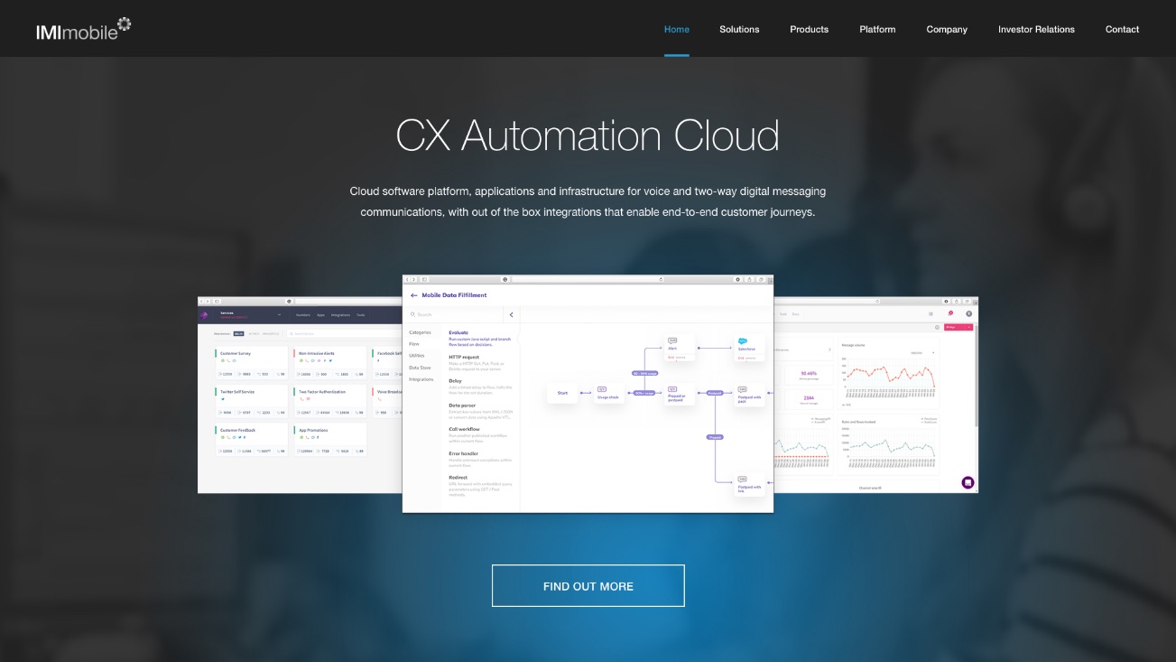
IMImobile are an enterprise software company listed on the AIM market in the London Stock Exchange. With an established and talented internal marketing team who were under pressure to deliver, we needed to collaborate closely to create a website that would enable their internal team to have more control and flexibility.
- Lead time:
- 3 Months
- Sector:
- Enterprise Software
- Target Type:
- B2B
- Demographic:
- Enterprise Organisations
- Website Goal:
- Generate New Enquiries
- Services:
- Web Design, Web Development, Digital Marketing
- Scope
- Custom Design
- WordPress
- Search Engine Optimisation
- Multi-Lingual
- Marketo Integration
- Resource
- 1x Marketing Strategist
- 2x Website Designers
- 1x Front-End Programmer
- 1x Back-End Programmer
- 1x Project Manager
- 1x Quality Assurance Tester
Challenge
Key to this project was understanding enterprise lead generation and buying cycles. With our experience in delivering compelling marketing to engage with enterprise customers, we were able to craft user journeys that would increase conversions from IMImobile’s key user archetypes.
Investor relations
As part of IMImobile’s obligations under the AIM market rules we needed to ensure that their share price, public reports, and documents were easily available.
Embedded animations
To bring the website to life we collaborated with IMImobile’s marketing team to develop micro animations that added movement and interest to their content.
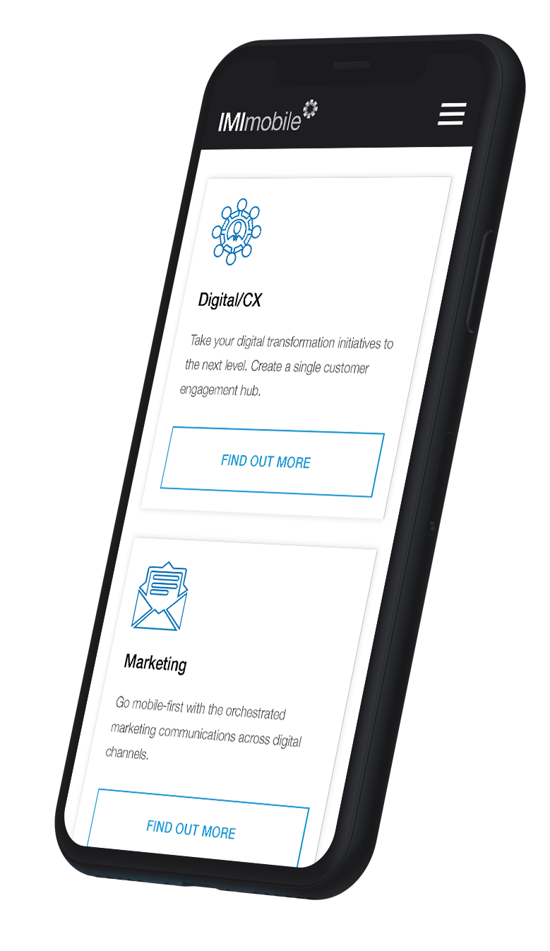
Gated content
Working with Marketo, we enabled IMI’s team to publish their white papers as gated content, where users have to provide personal information to gain access.
In-context sub-nav
With complex products and service offerings we designed a sub-nav that scrolled with the page, making each section of the website easy to navigate at all points.

Design approach
We needed to create a long-lasting design that would increase visitor engagement. The website CMS needed to be easy for IMImobile to manage post launch as they regularly update banner imagery, text and PDFs.
On-going maintenance and support
IMImobile’s marketing team are very proactive and regularly make updates to their website. The CMS is intuitive and flexible so they are able to manage content without support from Plug & Play. IMImobile commissioned an ongoing retainer to develop new features and functionality to ensure that the website remained fresh, up to date and allowed them to innovate at the level they needed.
Related work
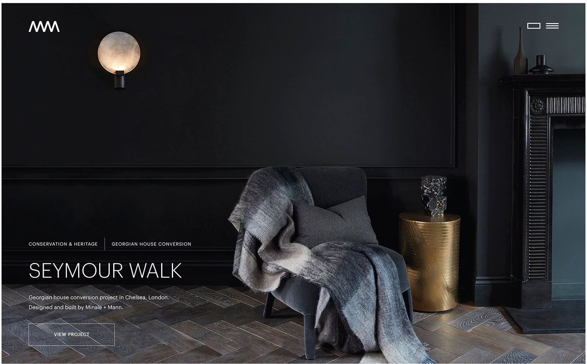
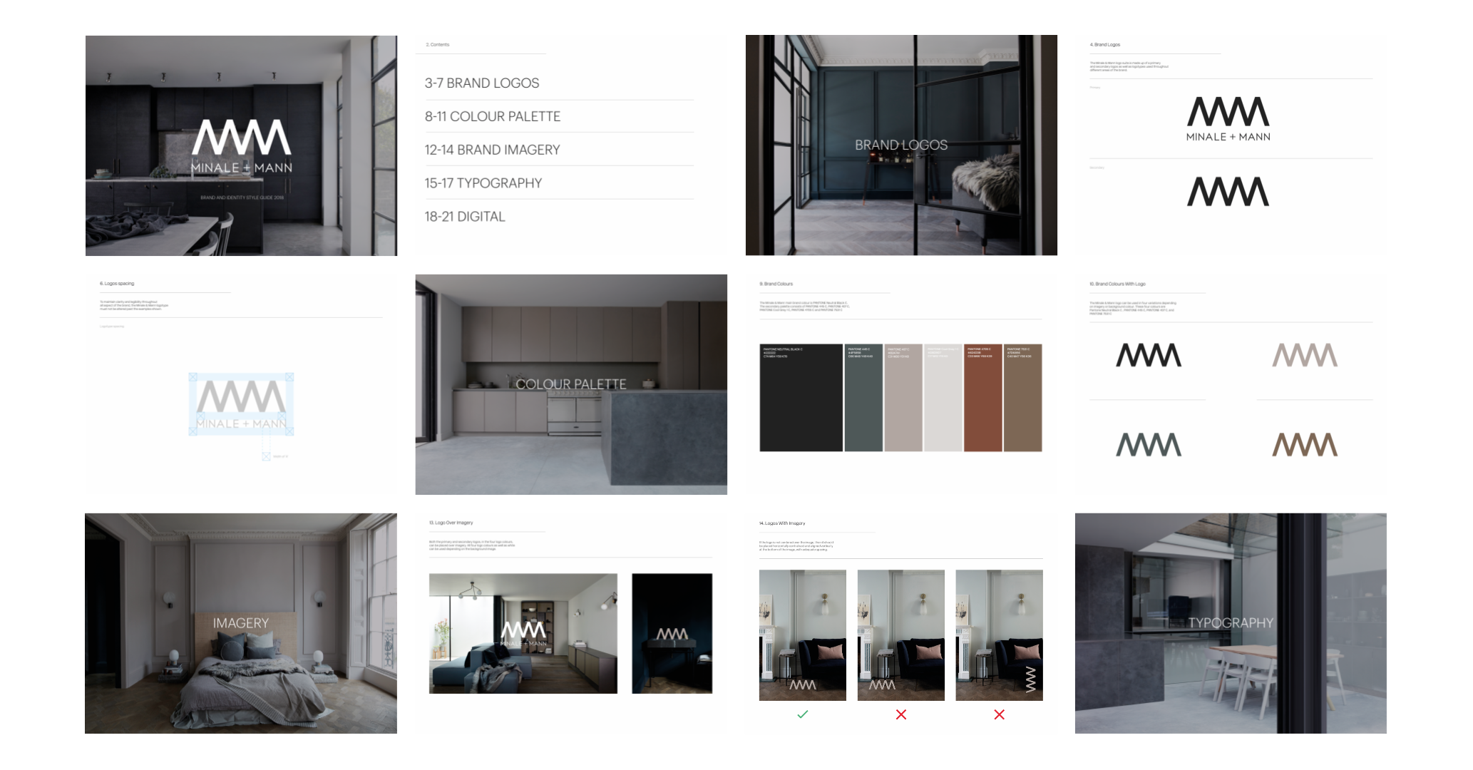
Minale + Mann are an exciting and vibrant architectural design and build company based in London. They approached Plug & Play because they were looking for high levels of attention to detail and quality.
- Lead time:
- 6 months
- Sector:
- Professional Services, Construction
- Target Type:
- B2C and B2B
- Demographic:
- Wealthy Property Owners
- Website Goal:
- Generate Enquiries
- Services:
- Web Design, Web Development, WordPress, Digital Marketing
- Awards:
- Webby Awards - Special Honours
- Awwwards - HM Award
- CSS Awards - Special Kudos
- Drum Design Awards - Highly Commended
- Scope
- Brand Identity
- Adobe XD Wireframes
- Adobe XD Designed Prototypes
- Digital Marketing & SEO
- WordPress CMS
- Digital Marketing Retainer
- Resource
- 1x Marketing Strategist
- 1x Digital Marketing Specialist
- 2x Website Designers
- 2x Front-End Programmers
- 2x Back-End Programmers
- 1x Project Manager
- 2x Quality Assurance Testers
Post-launch website results
We focused on transforming Minale + Mann’s SEO strategy which resulted in huge improvements to organic keyword positions including a 2,320,316% increase in search engine visibility.
+
1
50
Keywords now on page 1 of Google that they were not ranking for before the new website
+
1
91
%
Increase in organic traffic generated from keywords tracked in Moz.com
-
1
30
%
Reduction in bounce rate from organic traffic when comparing before and after launch
Before and after
Post-launch keyword results
The challenge
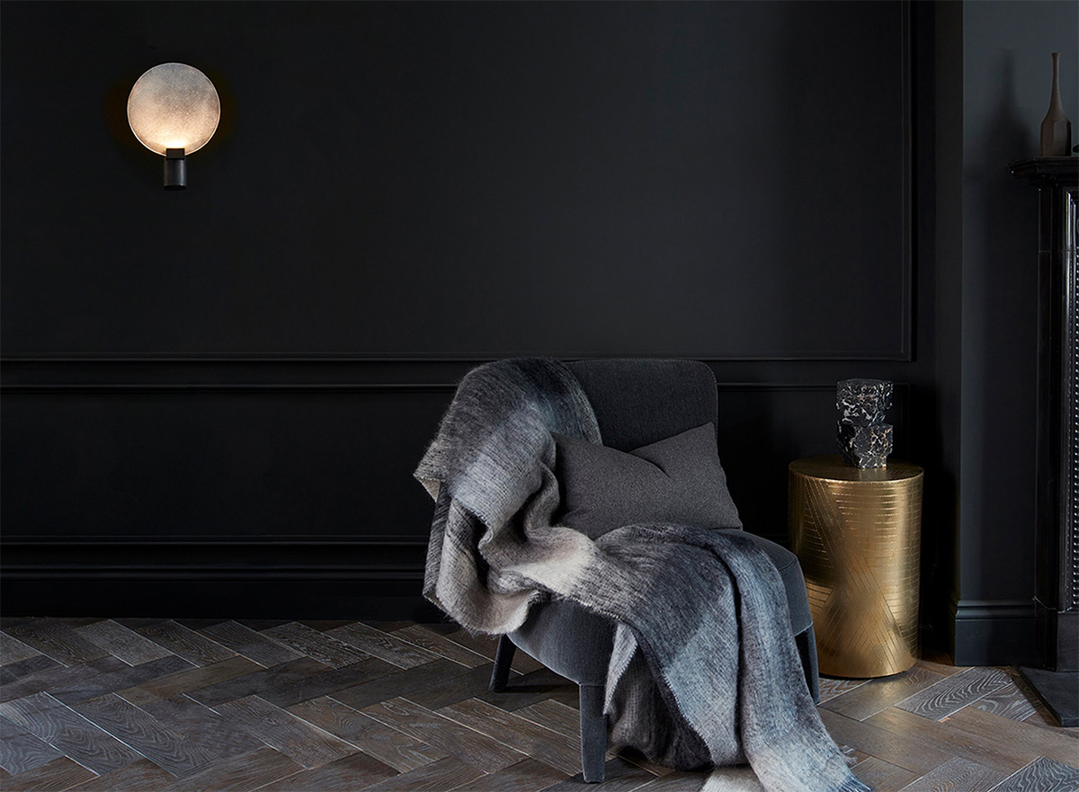
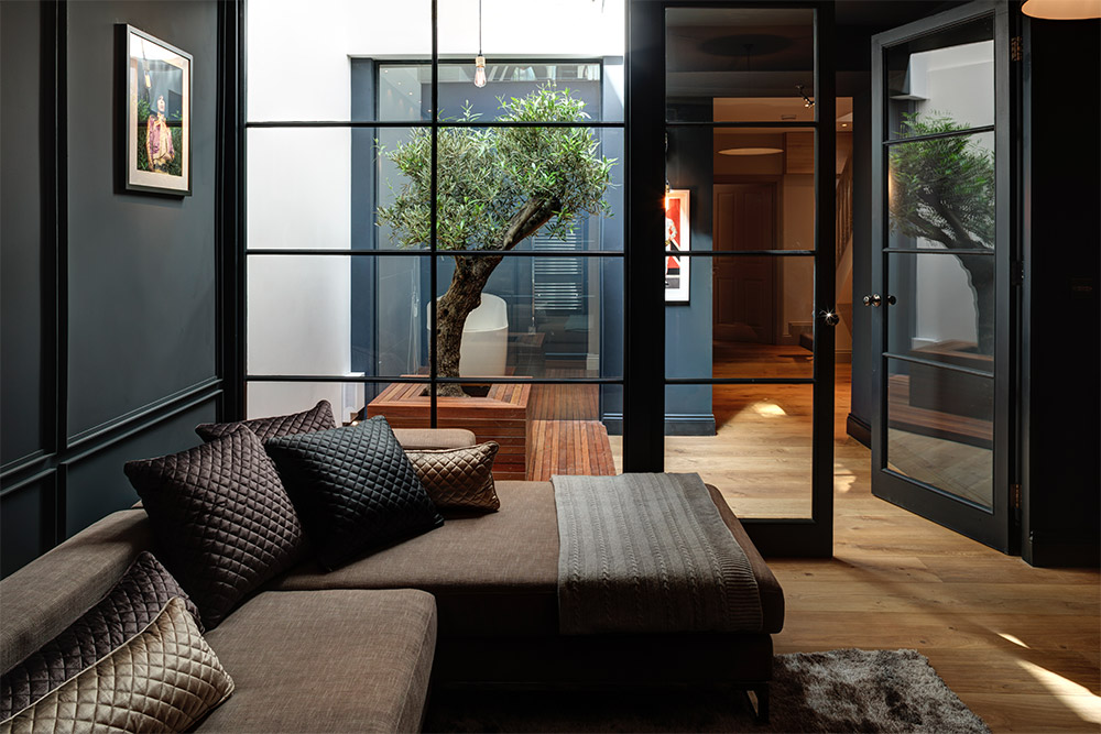
This project was all about uncompromising quality. At every touch point we needed to deliver immersive aesthetic interactions with beautiful art directed imagery and video.

Built for SEO
As with all of our websites, the Minale + Mann code base has been produced to be highly semantic and in line with SEO best practices.
Fully content managed
Minale + Mann’s internal marketing team have been enabled to update content, text, imagery, layouts and menus with their WordPress CMS.

Touch optimised for mobile
The analytics of the old website highlighted that a high proportion of their visitors use mobile devices so the touch aesthetic was one of our key considerations.
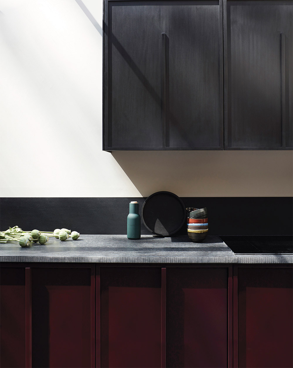
The brand
Minale + Mann already had an established brand identity but it didn’t reflect the “refined industrial” feel of their portfolio. They had outgrown their bright and playful brand and challenged us to create a sleek and sophisticated new identity.
Our approach was to elevate the brand by adopting a style and a colour palette that was in keeping with Minale + Mann’s architectural design ethos and would engage prospective clients visiting their website.
Brand Guidelines

“This has to be one of the sexiest, most sleek, graphically beautiful, efficiently performing websites out there! In other words……it’s ‘sh*t hot’! I am seriously thrilled with it”
The website
We created a beautiful image-led design system for the new website, incorporating the new brand to produce an elegant and high-end website design.
To achieve the premium finish that Minale + Mann’s target customers were looking for, we incorporated subtle animations and ambient video within the design. These provide an elevated dynamism that is effortless and engaging – enabling users to feel the quality. These effects include time lapse video footage, image animations that zoom and expand on scroll, and seamless page transitions.
Our developers coded the website using WordPress to give Minale + Mann’s marketing team maximum content dexterity. The new website code base is fast, best practice and scalable.
SEO strategy
Minale + Mann were ready to scale their business and expand their market share. Their existing lead generation relied heavily on the founders’ reputations, networking and word of mouth. They knew that to step up, they needed to open up new sales channels.
Minale + Mann’s start point was relatively poor – they ranked in the top 50 for a couple of keywords which was a great sign that search engines recognised what they did. However, from a user perspective, nobody was finding them on page 4-5 of Google. Their competitive metrics were fairly average – they had some leverage to secure rankings but we needed to be strategic to make sure that our work would drive meaningful improvements to their bottom line.
Our SEO strategy focused on identifying keyword targets that users were searching to find architects like Minale + Mann and were in a buying mindset. We selected keywords that Minale + Mann could realistically achieve and would generate new business for the firm.
Our SEO specialists optimised the website, using content that the client already had to secure new rankings.
Results
The new website has significantly increased Minale + Mann’s market penetration which has had a huge impact on Minale + Mann’s lead generation and revenue. The new website generates high quality traffic from aligned prospective customers and converts visitors into high quality leads.
Related work

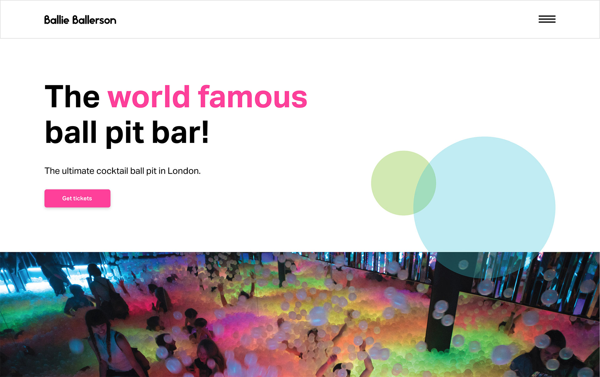
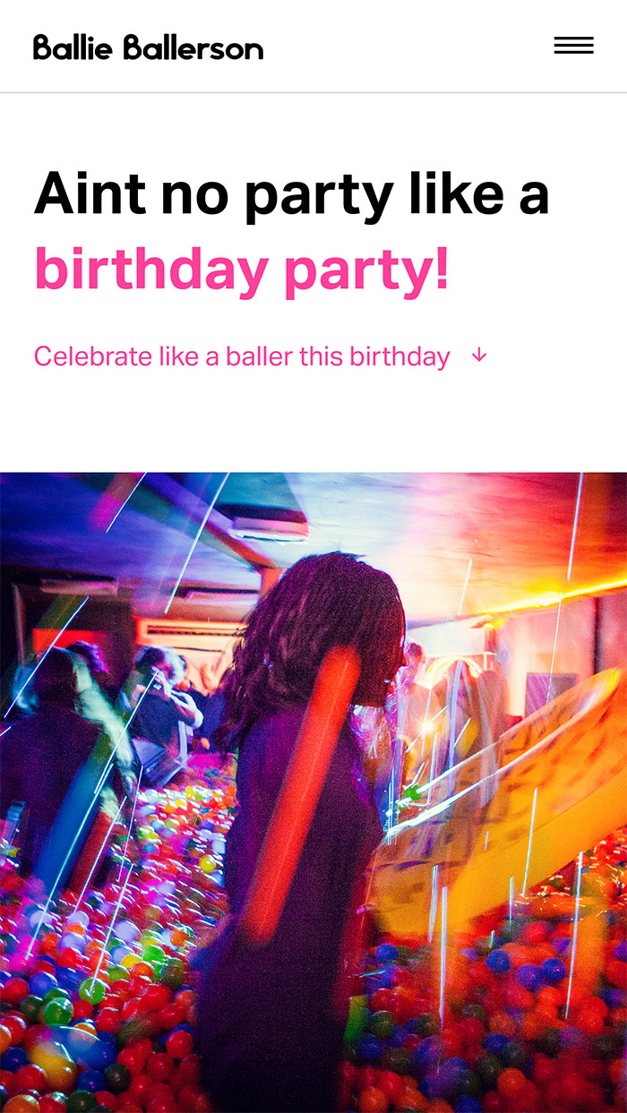
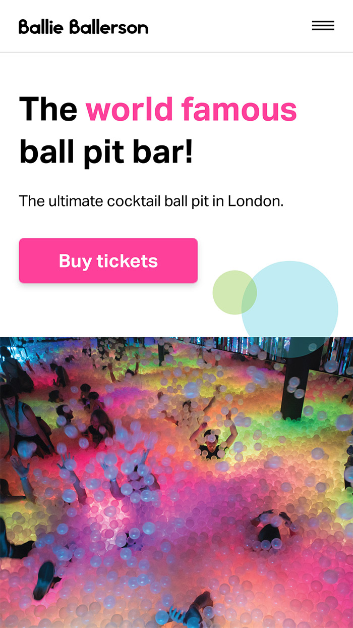
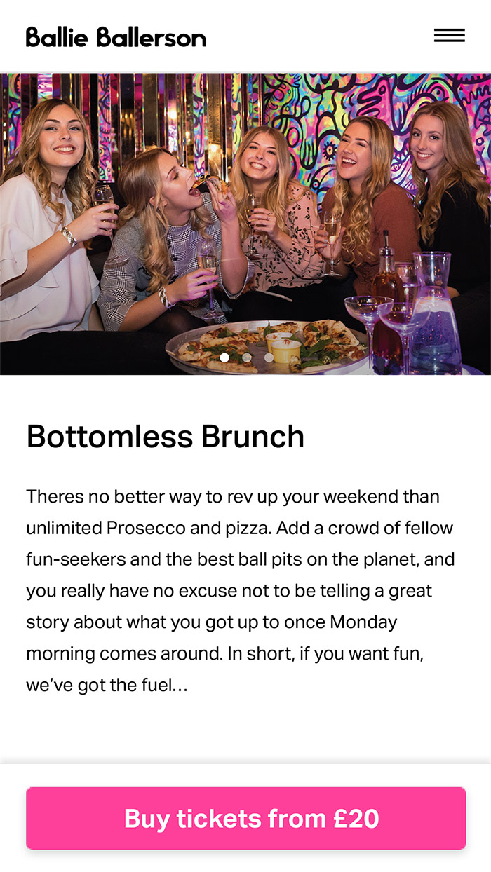
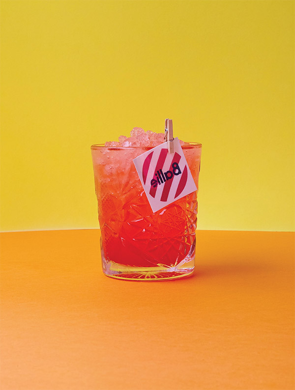
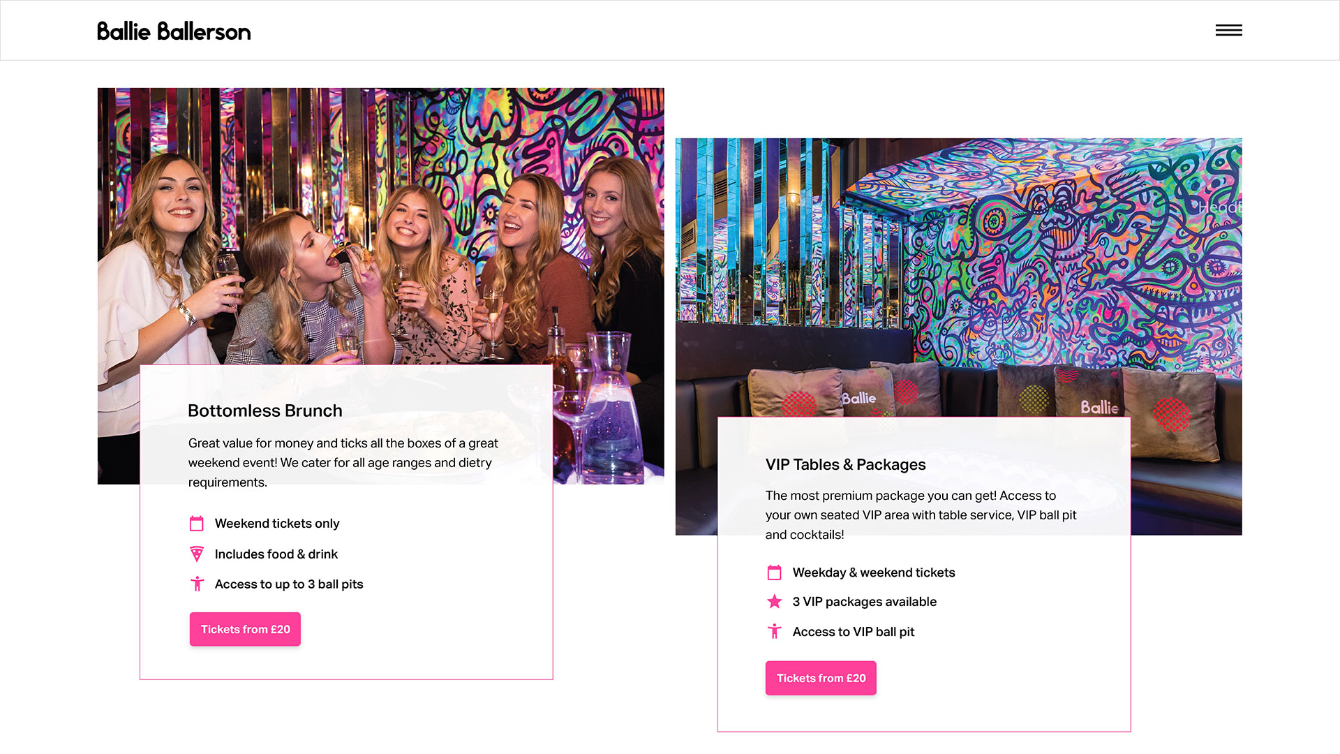
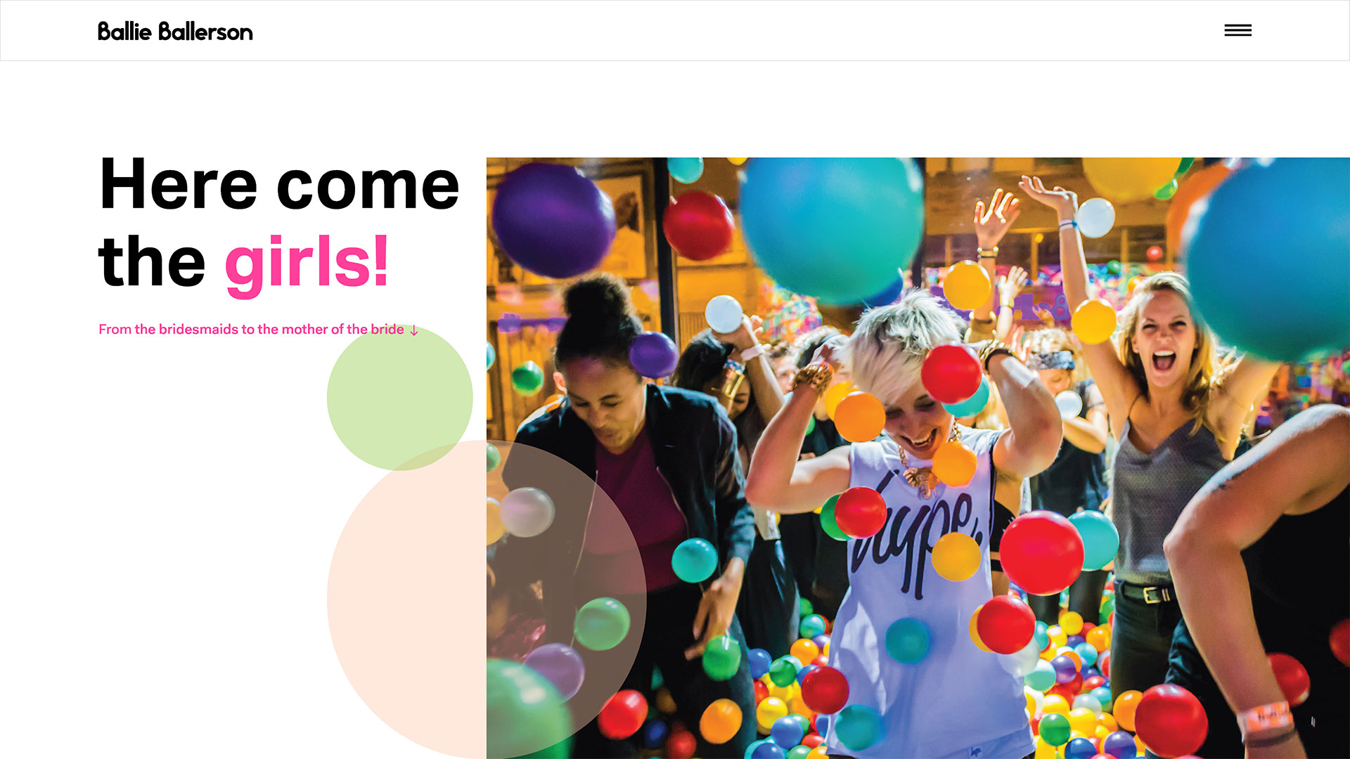
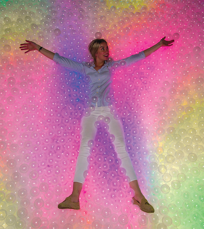
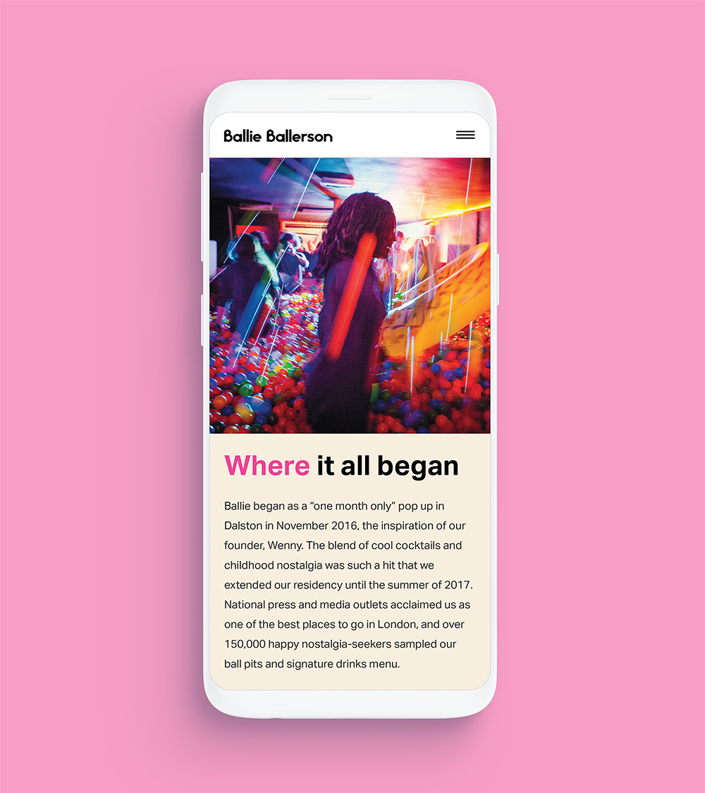
Ballie Ballerson is one of London’s most Instagrammable venues, attracting thousands of visitors per week with their novel combination of cocktails and adult sized ball pits. Though Ballie Ballerson have seen huge growth since their launch, a new website was needed to drive further market awareness in key target segments.
- Lead time:
- 3 Months
- Sector:
- Food & Drink
- Target Type:
- B2C
- Demographic:
- 18 - 30 Year Olds
- Website Goal:
- Sell Online Bookings
- Services:
- Web Design, Digital Marketing
- Scope
- Custom Design
- Custom Tracking
- Custom Front-end
- WordPress
- On-going Support
- Design My Night Integration
- Resource
- 1x Website Designer
- 1x Front-End Programmer
- 1x Back-End Programmer
- 1 x Digital Marketing Specialist
- 1x Project Manager
- 1x Quality Assurance Tester
Digital strategy
Ballie Ballerson regularly host hen dos, stag dos, work parties, birthdays and a range of other group social events. To drive sales and revenue there was a clear business case for targeting these group activities through more targeted digital marketing.
To de-risk the project and maximise our success we undertook a ‘win strategy’ approach; reviewing each target set of keywords, reviewing competitive metrics, and measuring our ability to deliver results.
Post-launch website results
Ballie Ballerson wanted to increase their ticket sales online by increasing their visibility in Google and converting more web visitors into paying customers.
+
1
26
Organic keyword positions improved in Google in 6 weeks since launch
+
1
111
%
Increase in search visibility across the 251 keywords being tracked by Moz.com
+
1
83
%
Increase in the number of keywords that rank in the top 3 organic positions in Google in 6 weeks from going live


Improved experience
With improved navigation and prominent FAQs, customers no longer need to call or email. This reduces the support time for Ballie Ballerson and increases customer satisfaction.
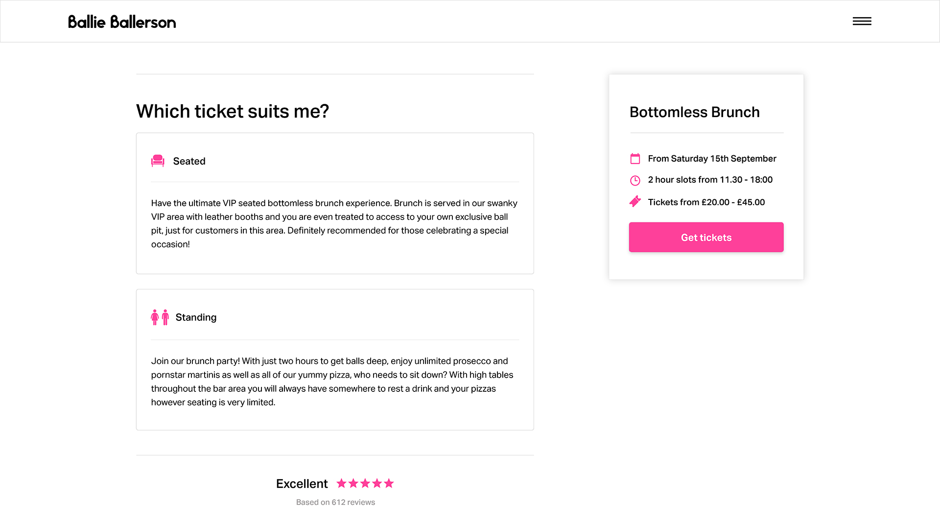
Booking integration
To unify their bookings Ballie Ballerson use a platform called Design My Night. We customised and styled this integration point to be visually consistent with their website and brand.
Injecting some fun
To reflect the Ballie Ballerson brand our team developed a unique ball themed animation for the menu.
SEO landing pages
By creating targeted landing pages for high-volume search terms and aligning content to inbound visitor traffic, we reduced bounce rate by 24%.
Enabling their marketing team
The website has been built with a highly flexible, customised WordPress CMS that enables the marketing team at Ballie Ballerson to create new landing pages, page layouts and content with ease.
In addition to the usual pages, components and custom booking features, Ballie Ballerson also needed the ability to create new locations and venues as part of their exciting business expansion plan.
“Plug & Play have utilised knowledge, experience and care to help build all elements of our site. Their support has been great! We’ve built a site which stands in amazing stead for natural search as a small business. Through content recommendations and relevant hierarchy choices, Plug & Play have been integral in our SEO traffic numbers.”
Related work
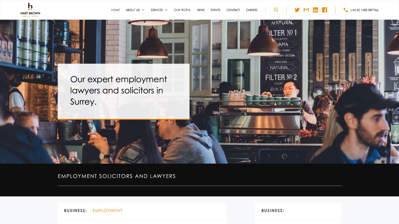
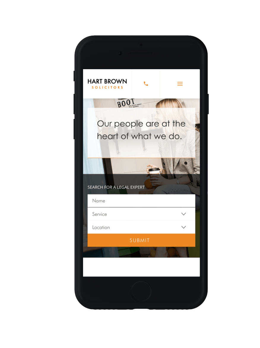
Hart Brown are a law firm based in London and Surrey with a broad range of commercial and personal services ranging from HR and commercial dispute resolution to divorce and clinical negligence. We rebuilt the Hart Brown website, with the primary goal of increasing traffic and improving conversion rates in order to generate more leads.
- Lead time:
- 6 Months
- Sector:
- Law
- Target Type:
- B2C & B2B
- Demographic:
- Individuals & Businesses
- Website Goal:
- Generate Leads
- Services:
- Web Design, Digital Marketing


Challenge
Hart Brown wanted to increase their visibility for highly competitive search terms in the London and Surrey areas. As a well-established company, they were keen to go after some of the more competitive keywords to increase their search engine visibility. The goal was to focus on the research stage of the conversion funnel. They wanted to be found by clients searching for lawyers and solicitors with more general keywords such as “Trust Lawyers Surrey.”
Post-launch website results
Hart Brown target both businesses and consumers across a range of departments. By collaborating with Hart Brown’s internal marketing team we made huge improvements to their keyword rankings in Google.
+
1
118
Keywords that have increased their positions in Google over a 19 month period post-launch
+
1
44
%
Percentage increase in Search Visibility as tracked and calculated by Moz.com within 6 months of launch
+
1
71
The number of keywords that rank in the top 3 positions in Google as tracked by Moz.com
Post-launch keyword results
- Scope
- WordPress CMS
- Responsive Design
- SEO Strategy
- SEO Optimisation
- On-going Support
- Resource
- 1x Marketing Strategist
- 1x Digital Marketing Specialist
- 1x Website Designer
- 1x Front-End Programmer
- 1x Back-End Programmer
- 1x Project Manager
SEO Strategy
We developed a very broad SEO strategy that encompassed all of Hart Brown’s key departments and offices.
WordPress CMS
The Hart Brown marketing team were enabled to manage and update content, images, menus and pages with an easy to use CMS.
B2B and B2C
With a broad target audience the website needed to be easy to use for a broad cross section of visitors.
Brand
We collaborated with Hart Brown’s branding agency to ensure that their website had a visual consistency inline with the agency’s vision.
Collaboration
Hart Brown have an in-house marketing team that manage all of their communication material and events. Their knowledge of the legal sector, their target audiences and competitors was very extensive. This knowledge, combined with our external perspective, insights from other businesses and successful strategies, led to a fantastic website that benefited from the mix of skills and expertise.
Geo-targeting
We executed a strategy for bespoke landing pages for each office location. Users from search engines can land on geo-targeted location pages which act as a gateway to the rest of the website. This was highly successful in targeting audiences in specific regions.
Related work
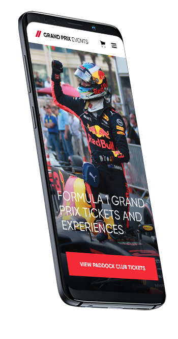
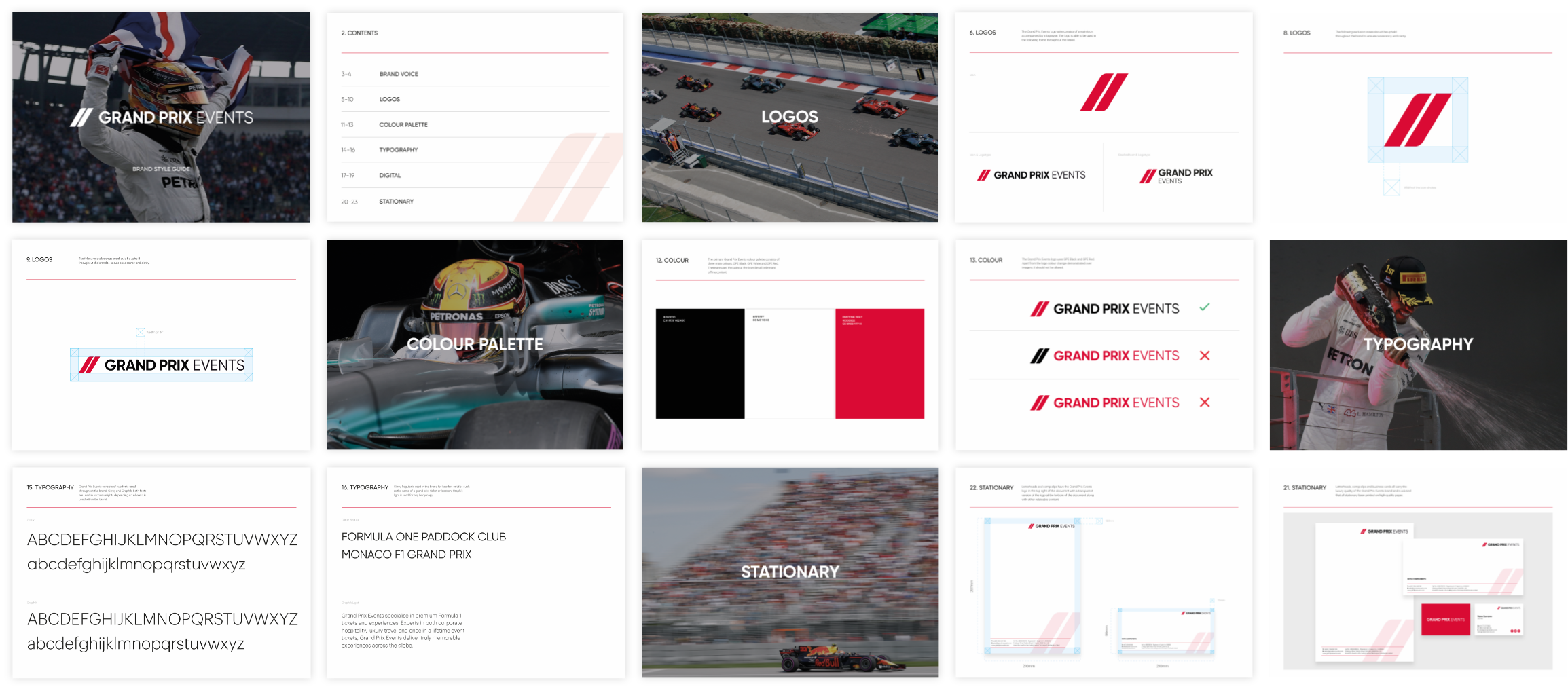
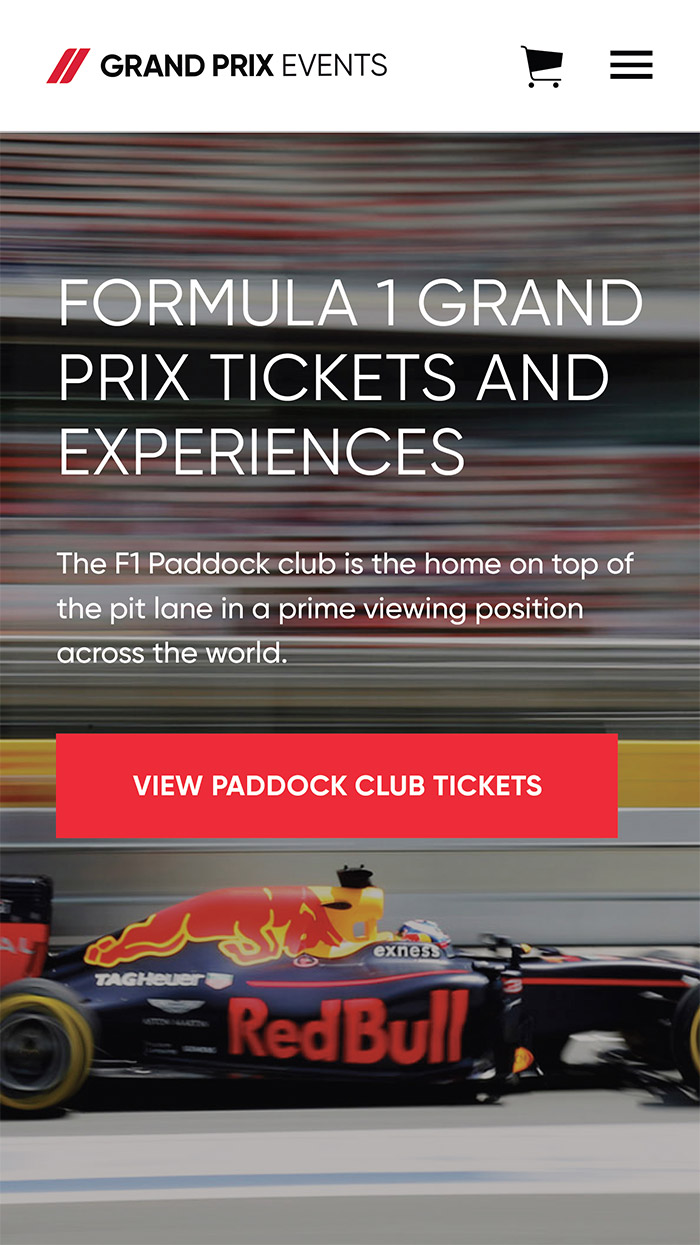
Grand Prix Events
A 111% increase in eCommerce conversion rate for a leading ticket retailer.
Grand Prix Events is an established online retailer that sells tickets in the luxury sports sector. Building on their wealth of experience in eCommerce, they recognised the need to develop a new website that would increase their revenue. They needed to develop their organic keyword positions in search engines and improve their online conversion rate.
- Lead time:
- 12 months
- Sector:
- Events / Tickets
- Target Type:
- B2C and B2B
- Demographic:
- Wealthy Consumers / Hospitality
- Website Goal:
- Sell Tickets
- Services:
- eCommerce Web Design, Digital Marketing, Brand
- Awards:
- UK Digital Growth Awards - eCommerce Site Of The Year Nomination
- Scope
- Custom Design
- SVG Interactive Maps
- Branding
- WooCommerce
- WordPress
- Varnish Cache & Global CDN Management
- IP Location Detection
- Multi-currency
- SEO
- CRO
- PPC Management
- Xero Integration
- Content Migration
- Ongoing support
- Resource
- 2x Website Designers
- 1x Brand Designer
- 2x Front-End Developers
- 2x Back-End Developers
- 1x Project Manager
- 2x Quality Assurance Testers
- 1x SEO Strategist
- 1x Digital Marketing Specialist
- 1 x PPC specialist
Post-launch website results
We focused on streamlining the user journey and implemented designs that reassured visitors through the conversion funnel. This resulted in significant improvements to engagement, eCommerce conversion rate and revenue.
+
1
22
%
Increase in revenue
+
1
111
%
Increase in eCommerce conversion rate
-
1
16
%
Reduction in bounce rate

Our approach
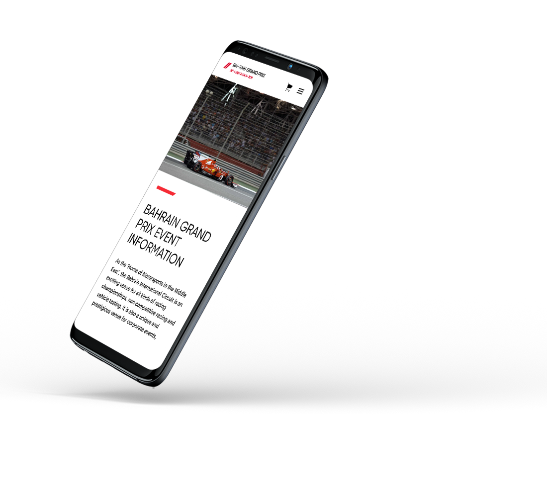
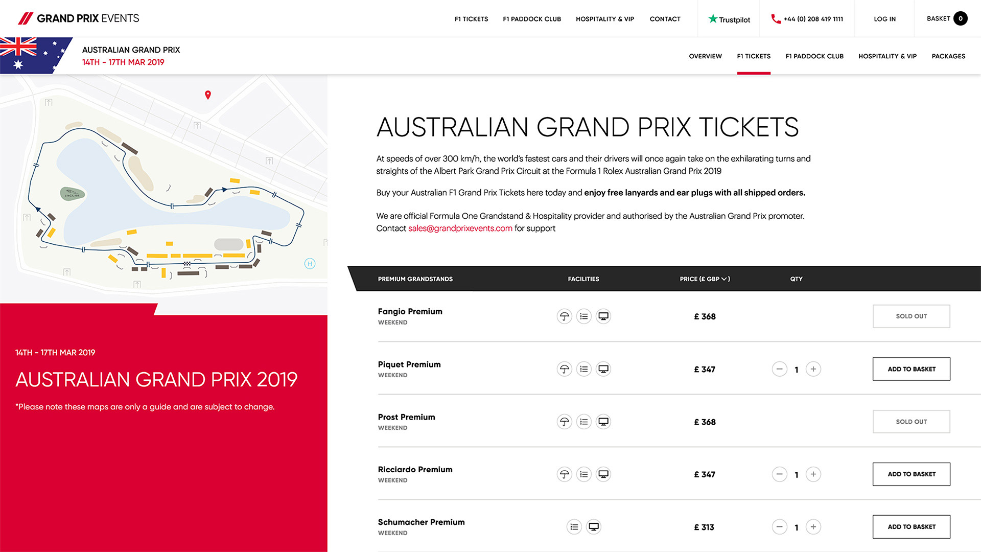
Our new design focused on high quality imagery that illustrated the excitement of attending a Grand Prix. Custom circuit maps help users understand where a seat is located, and image galleries on the product pages show users the view from each seat.

Location detection
Depending on where you are in the world the website can automatically detect your location and supply the ticket prices in your localised currency.

Xero integration
To streamline operations the website is seamlessly connected to Xero, the accountancy software. This enables orders and invoices to be raised automatically, cutting down on back-office admin work.
Multi-Currency
The website takes sales in 4 currencies, with each Grand Prix having its own base currency in the back-end.

Conversion rate focus
The website has been designed to massively increase the online conversion rate. We saw large increases in visitor to purchasing rates following launch.
Search engine optimisation
A key consideration for the launch of the new Grand Prix Events website was SEO. Increasing search visibility in Google and improving rankings for key search terms is the first step in increasing online conversions, so we undertook a detailed SEO review of the website; optimising urls, on page content and meta titles and descriptions as well as implementing a comprehensive 301 strategy before launch.
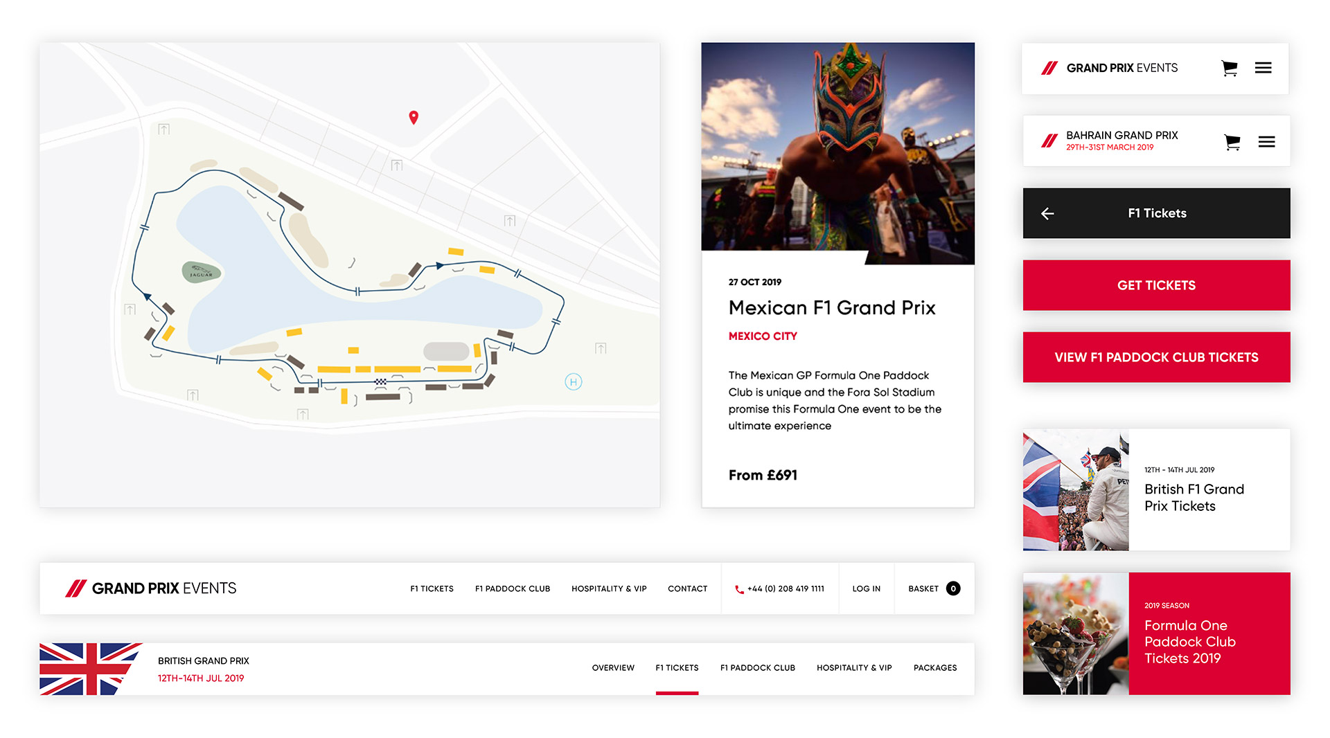
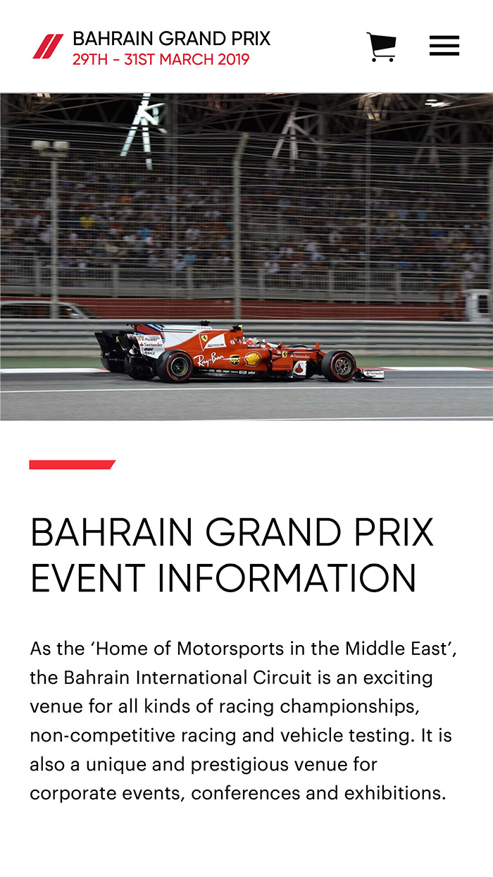
Our SEO research showed us that users searched for specific races using keywords such as ‘British Grand Prix tickets’ or ‘Tickets to the Australian GP’. To provide the best user experience, we created landing pages for every race, enabling search engines to rank the most relevant pages and send users directly to specific Grand Prix pages. Each Grand Prix page contains useful information about attending the event and a variety of different ticket and package options. A secondary navigation allows users to navigate easily through each of the pages relevant to the race they’re interested in.

“Plug & Play understood our vision of creating an industry leading online platform to promote sports hospitality and event ticket sales. From start to finish they were always on hand to support us throughout. Deadlines and the proposed budget were met. I would highly recommend working with the Plug & Play team of experts.”

PPC campaigns
Our team recommended a number of Google Ads Search Campaigns to reach new audiences and support global ticket sales for F1 events. Campaigns were seasonal and location-specific which required careful management to ensure the budget was used effectively.
Our PPC management process focused on reducing the cost per conversion, increasing impression share and improving traffic quality. We did this by reallocating budget based on performance, and implementing tighter keyword and geographic targeting.
+
1
1134
%
Increase in PPC revenue
+
1
334
%
PPC conversion rate
+
1
220
%
PPC order value

Developing the brand
Our brief was to develop a subtle evolution of the brand that would still be instantly recognisable by Grand Prix Events’ existing client base. We focused on refining what was already there, making the form and shape of their device more unique and distinct.
Brand Guidelines