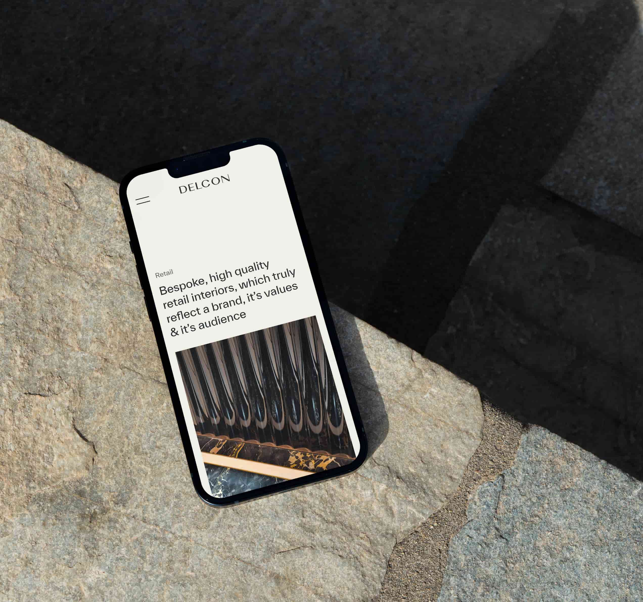
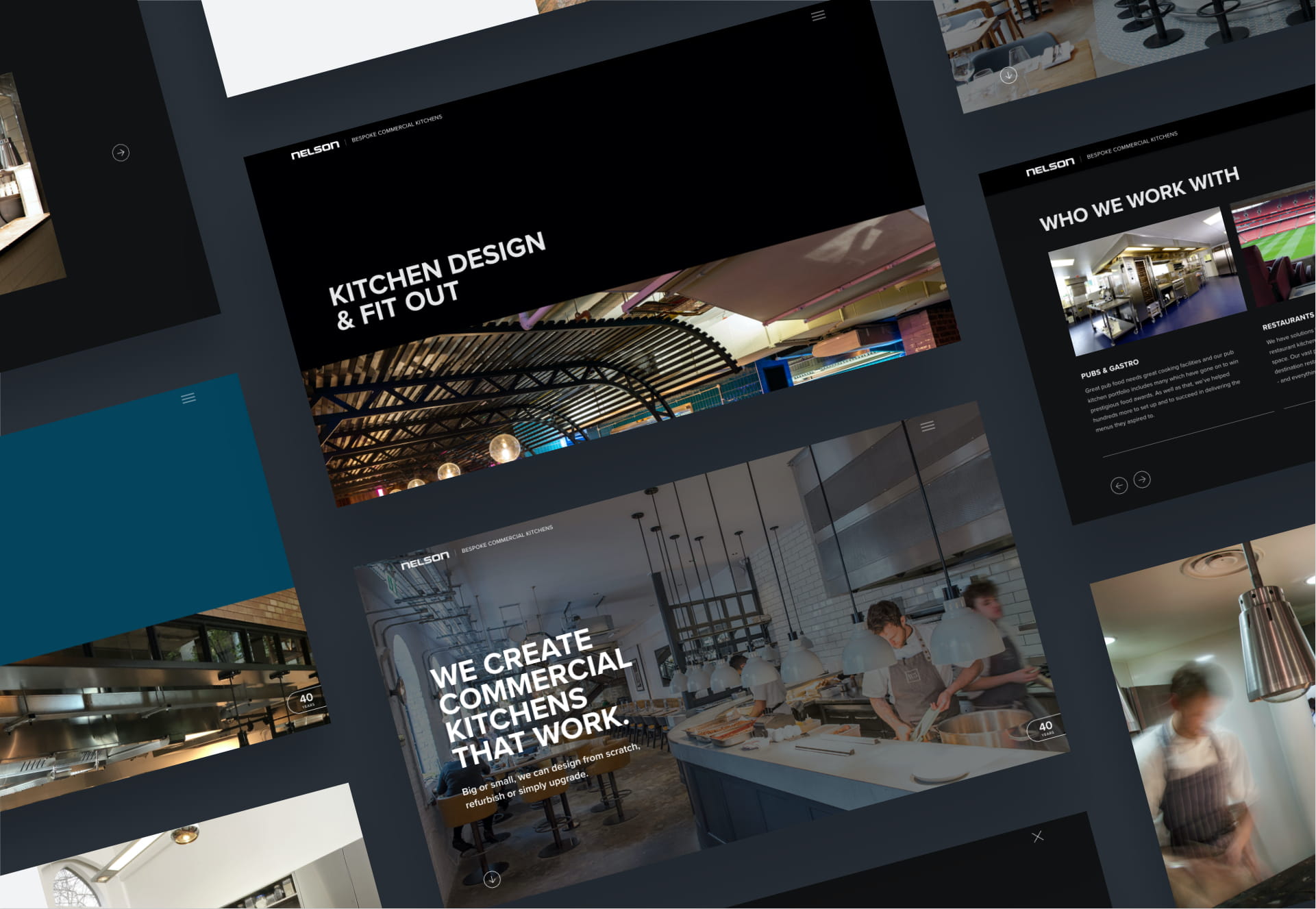
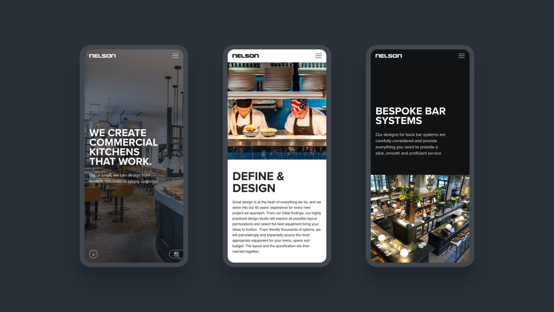
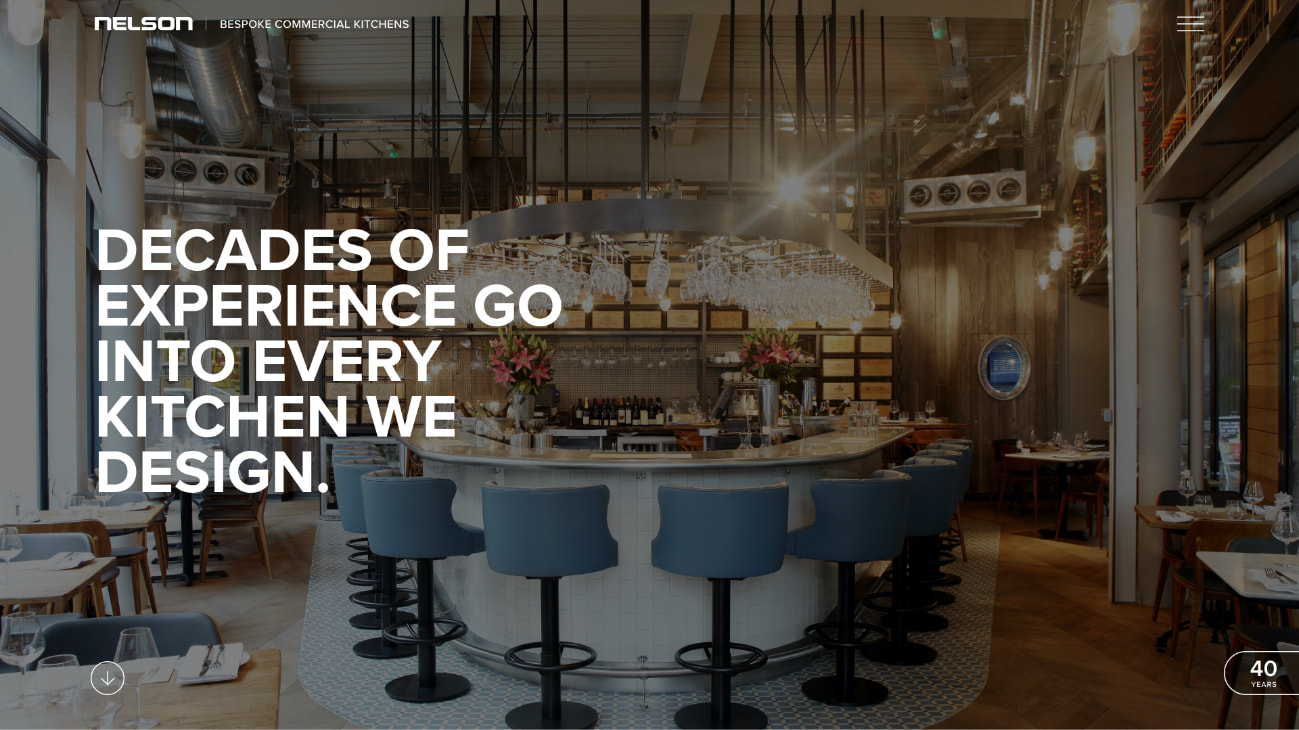
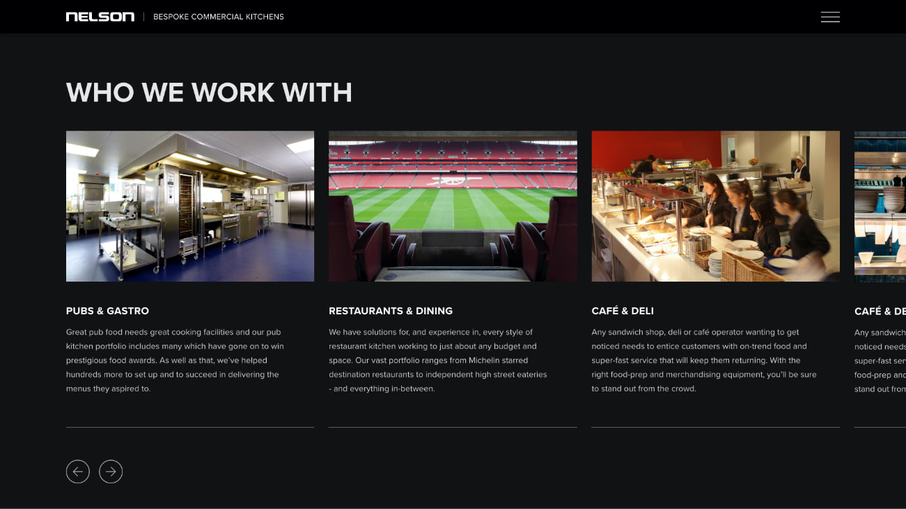
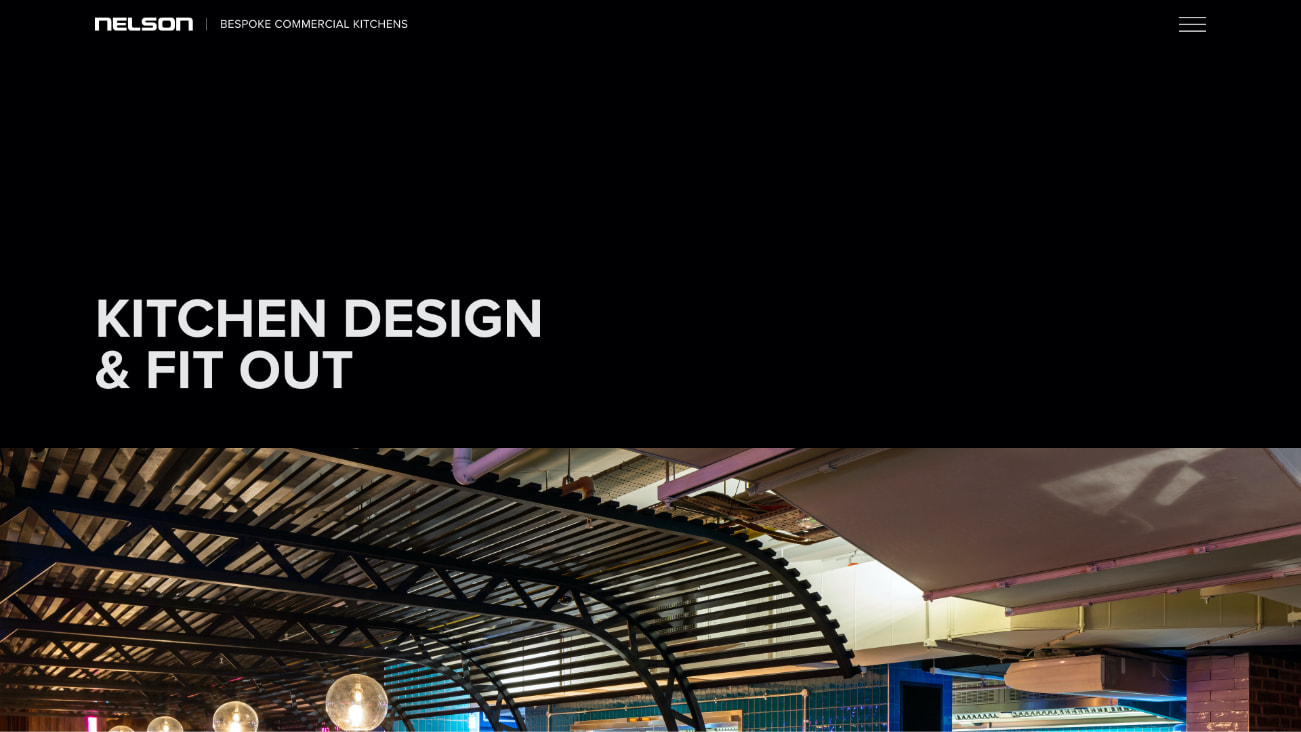
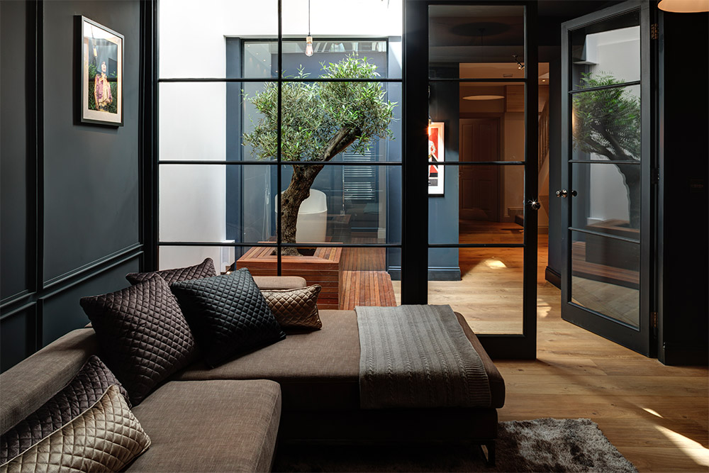
Nelson are commercial kitchen specialists based in London. They design and fit professional grade kitchens in a range of establishments from Michelin starred restaurants to local churches and community centres. They were ready to invest in their website and marketing to increase their target audience visibility and drive new business enquiries.
- Lead time:
- 12 Weeks
- Sector:
- Commercial Kitchen Design
- Target Type:
- B2B
- Website Goal:
- Increase Website Visibility, Generate Enquiries
- Services:
- Web Design, Web Development, Digital Strategy, Digital Marketing
Post-launch website results
The Nelson website focused on increasing Google rankings and delivering a strong user experience. This has been reflected in the post launch results which show significant increases in organic traffic and search engine visibility.
- Scope
- Adobe XD Prototypes
- Adobe XD Design
- WordPress CMS
- Marketing Strategy
- Domain Strategy
- SEO
- Resource
- 1x Project Manager
- 1x Web Designer
- 1x Front-end Developer
- 1x Back-end Developer
- 1x Quality Assurance Tester
- 1x Marketing Strategist
- 1x Digital Marketer
Our challenge
Nelson serves a range of sectors that each have different target audiences. Our challenge was to build and harmonise strong user journeys for each sector on a single website. We needed to leverage existing assets to increase their search engine visibility and drive new enquiries from highly aligned customers.
A company rebrand meant that Nelson needed to launch their new website on a new domain. They challenged our team to manage the domain migration, maintaining and building upon their rankings with the new website.
Our approach
We created a number of user journeys for the website, curating landing pages for key services and sectors to present the most relevant content to every user based on their search query in Google. This would enable Nelson to rank more highly for key search terms and become more visible to their target customers at the point that they are ready to buy.
We refined Nelson’s existing colour palette to reflect their industry and the high quality products and services they provide. We supported this with interactive design elements throughout the website to provide a superior user experience.
Domain management
We launched the website on a new domain and managed the transfer of Google rankings.
Target audience
The new website targets multiple target customer archetypes using cleverly curated content, user journeys and landing pages.
SEO
Key pages were optimised for valuable keywords in order to increase visibility in search engines and reach aligned potential new customers.
Digital strategy
A keyword strategy was undertaken to identify and prioritise keyword targets based on Nelson’s competitive metrics and statistical chance of success in Google. The strategy allocated primary and secondary keywords to each page of the website and highlighted opportunities to create new pages to achieve optimum visibility in the search engines.
The strategy took into account Nelson’s most profitable services and sectors, and leveraged their portfolio pages to target highly specific keywords. This helped them to maximise visibility and alignment within their target audiences.
Launching on a new domain
Our marketing team were responsible for the domain change upon launch of the new website, managing and actively lowering the risks associated with moving to a lower authority domain. We took steps to signal to Google that the domain had changed so that the trust metrics could be transferred from the old domain to the new one.
Related work
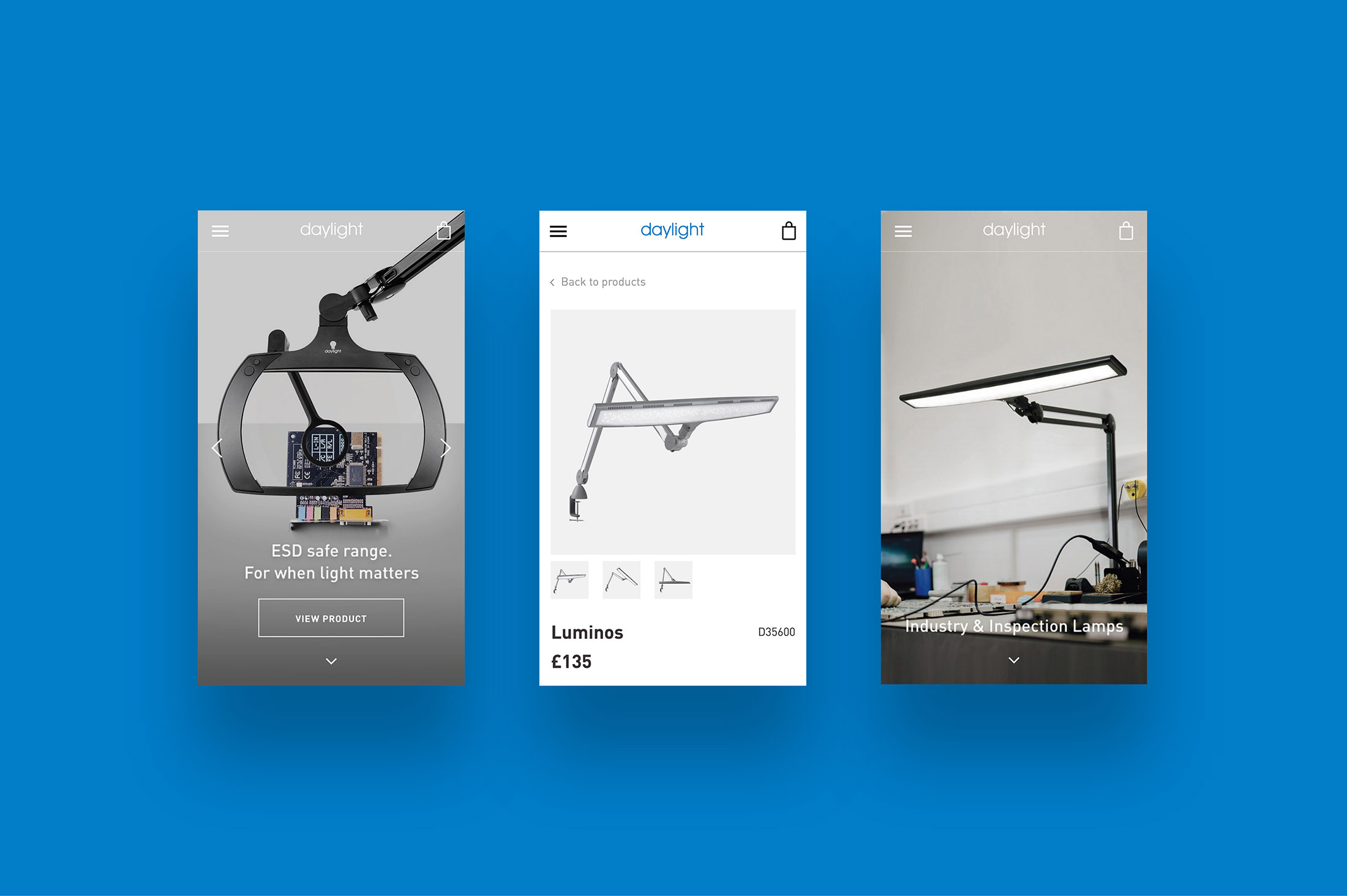
Daylight Company is a market leader in speciality daylight lighting. They provide high quality lighting for precision work in professional and domestic environments.
Their team challenged us to migrate 5 of their existing websites onto a single domain to create 1 impactful multilingual website. They needed an international eCommerce site that would provide their marketing team with complete content management control.
- Lead time:
- 9 months
- Sector:
- Speciality lighting
- Target Type:
- B2B & B2C
- Demographic:
- Professionals & hobbyists
- Website Goal:
- Migrate to a single domain, provide central control to marketing team
- Services:
- Web Design, Web Development, Digital Marketing, Ongoing monthly marketing and support retainer
- Scope
- Adobe XD designs
- WordPress
- WooCommerce
- Multilingual
- Multi-currency
- Responsive design
- Store locator functionality
- Domain change management
- SEO
- PPC
- IP detection
- Stock management integration
- Resource
- 1 x Project Manager
- 1 x Digital Marketing Specialist
- 1 x Website Designer
- 1 x Front-end Developer
- 1 x Back-end Developer
- 1 x Quality Assurance Tester
The challenge
The new Daylight Company website needed to unify multiple websites to create a single global site. It needed to facilitate the management of multiple languages and currencies and provide variable functionality across territories.
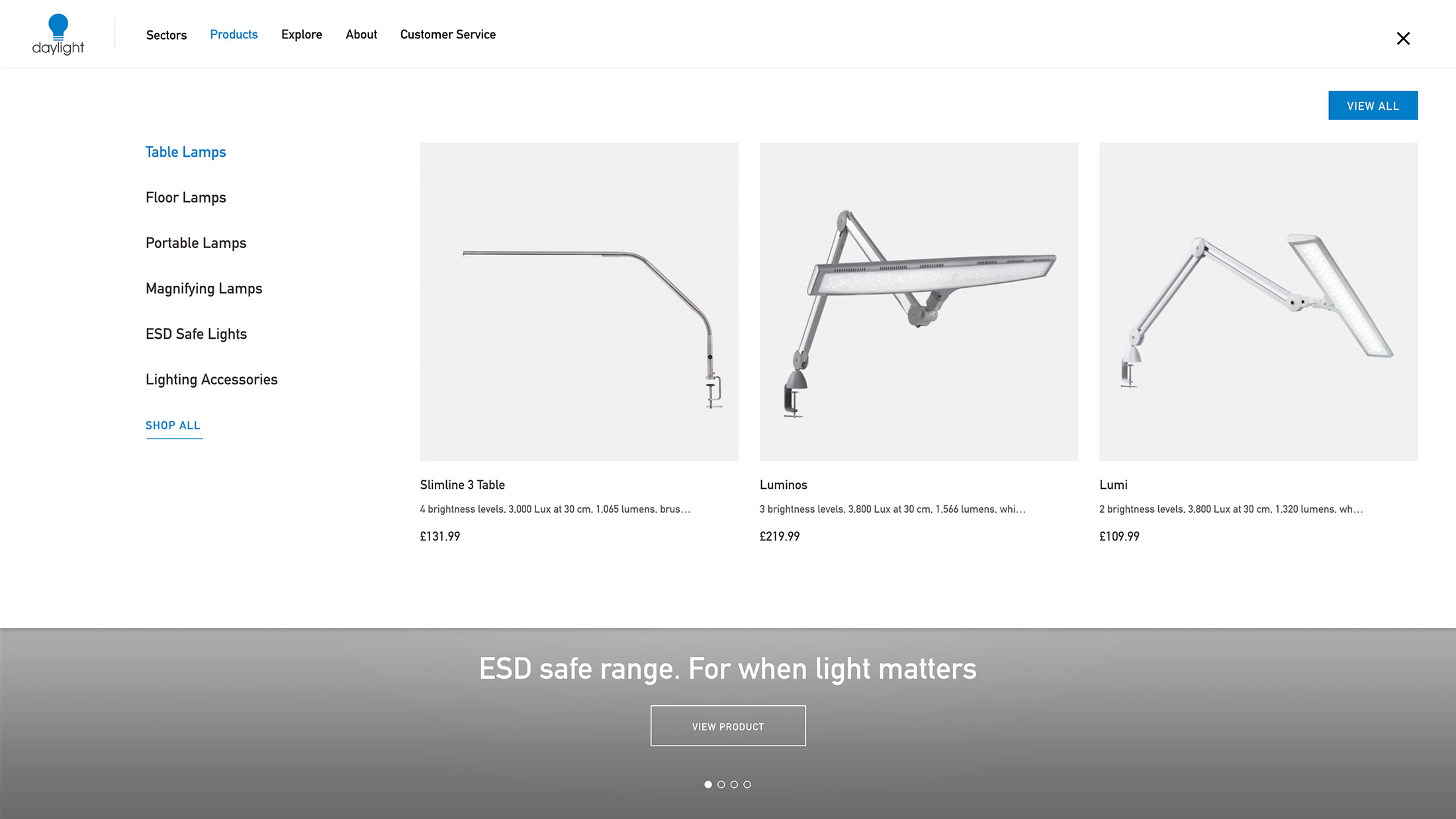
Product optimisation
Product pages and categories were optimised for high value keywords to increase organic traffic from customers with intent to buy.

A quality build
Daylight Company lamps are of the highest quality and it was imperative that their new website reflected this.

Inter-territory variations
eCommerce functionality can be turned on or off by territory to account for variations in product distribution strategies.
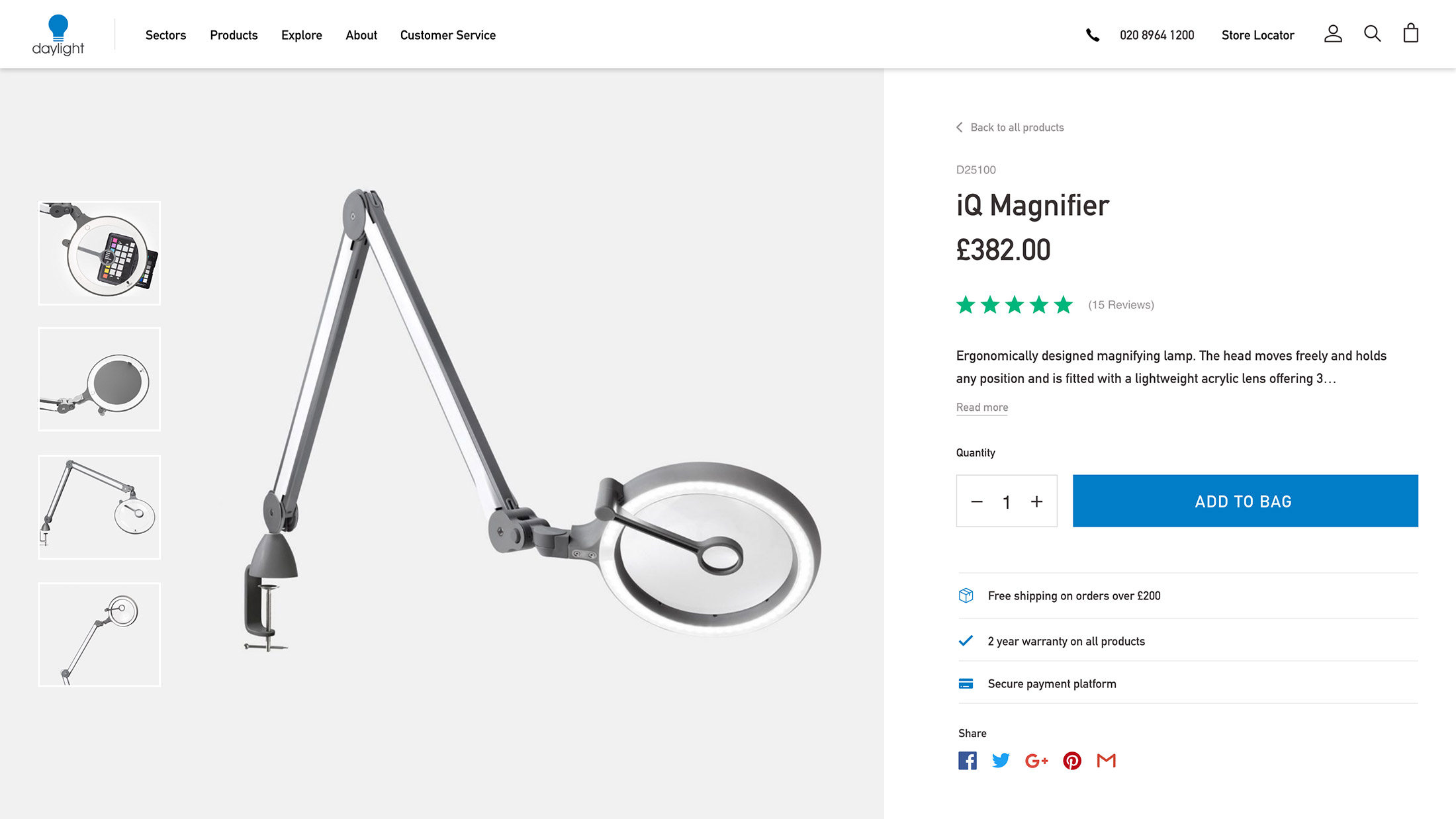
A conversion powerhouse
Reassurance elements such as product reviews, warranty information and delivery options were placed in key parts of the site to boost the website conversion rate.
Delivering a quality user experience
To create an intuitive browsing experience, we created a split screen product page. This enables users to browse product content on the left hand side while retaining the key call to action add to bag fixed on the right hand side along with reassurance elements. These features help increase the number of visitors converting into customers.
We implemented a streamlined and secure checkout process to reduce friction at the point of conversion. To encourage customers who abandon their basket to return to the site and complete their purchase, we set up email reminders to be sent in the days following their visit.
Post-launch website results
Daylight Company’s international website build and migration focused on delivering a quality user experience that would increase engagement and drive transactions. Their new website has successfully improved their Google rankings, organic traffic and sales.
“All the members of the Plug & Play team come across as very knowledgeable and are a delight to work with. You can certainly rely on their expertise; I trust their advice on any particular area of the website and e-commerce platform. They are an extension of my team, making sure that I am aware of their work, they monitor my website very closely and are proactive in suggesting amends.”

Optimising for Google
Migrating to a single domain presented a huge SEO ranking opportunity for Daylight Company. However, keywords needed to be managed carefully during the migration in order to maintain existing rankings and build new positions. Following extensive keyword research, our team created an SEO and migration strategy including a checklist and a 301 redirect list by mapping old URLs to new equivalent URLs.
We are continuing to work with Daylight Company’s ambitious marketing team to drive continuous growth in their market share and online visibility.
PPC
We increased the efficiency of Daylight Company’s PPC account by restructuring the campaigns, implementing best practice, improving the data quality, and delivering ongoing PPC management. The campaigns were international and targeted over 5 different countries with Search and Shopping Ads.
Our work focused on reducing the cost per conversion, eliminating wasted spend, and improving advert quality.
Related work

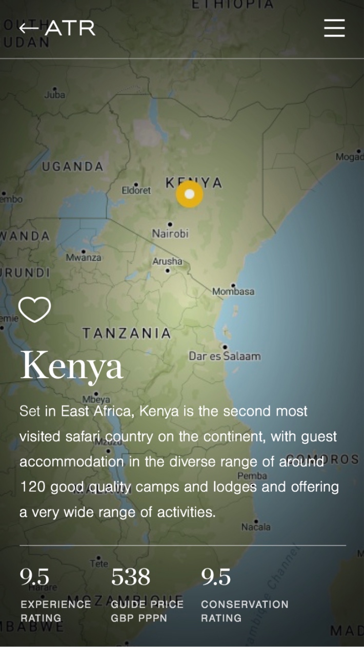
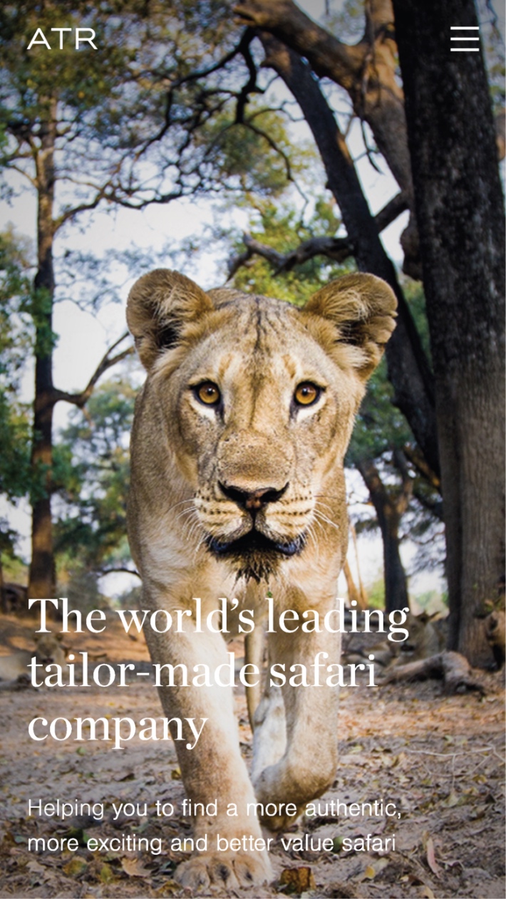
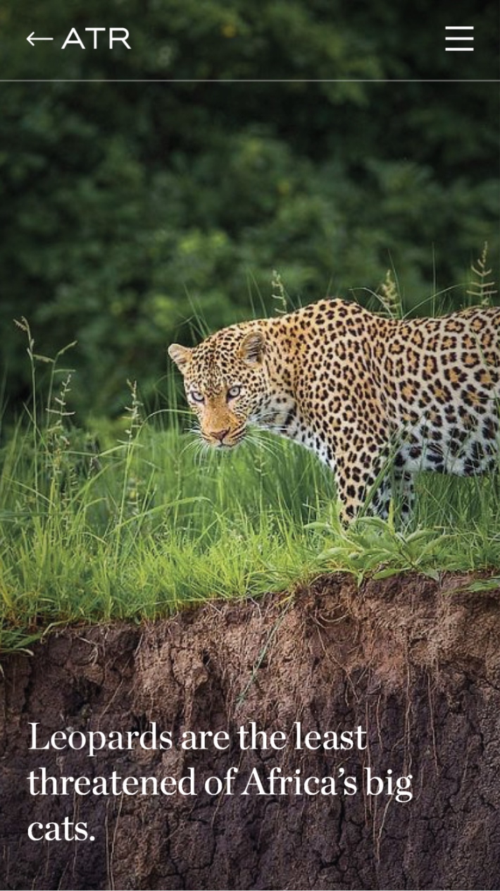
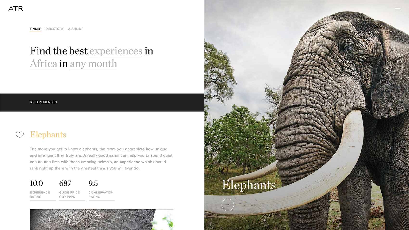
Africa Travel Resource
A safari website to transform the travel industry
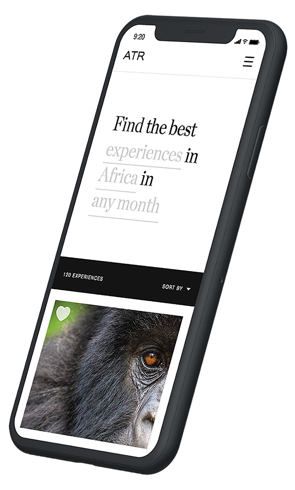
Africa Travel Resource (ATR) is a luxury travel company offering once in a lifetime African safaris. Safari holidays are notoriously complex and require a lot of local knowledge to plan successfully. Africa Travel Resource needed a website that would empower customers to explore the opportunities and experiences available on safari while reducing the support pressure on their booking team.
- Lead time:
- 18 months
- Sector:
- Travel
- Target Type:
- B2C
- Demographic:
- High Net Worth
- Project Goal:
- Generate Enquiries
- Services:
- Website Design, User Experience Design, Website Development, DevOps
- Technology:
- Vue.js & Laravel
- Awards:
- Drum Award for Best Use of Photography, Wirehive 100 Award for Agency Team of the Year, UK App Award Nomination for Best Design/UX
- Scope
- Adobe XD wireframes
- Adobe XD prototypes
- Dynamic search and ratings functionality
- Custom map and journey planning functionality
- Varnish cache
- Speed optimisation
- Resource
- 1 x User Experience Designer
- 1 x User Interface Designer
- 2 x Front-end Developers
- 2 x Back-end Developers
- 1 x DevOps Engineer
- 1 x Project Manager
- 2 x Quality Assurance Testers
The challenge
ATR challenged Plug & Play to build a website that would simplify the safari planning process and drive high quality new enquiries. We needed to build an engaging user journey that would guide users through a discovery process to build knowledge. Our goal was for every customer who enquires to have formed a robust brief for their advisor to work with, increasing customer satisfaction and reducing pressure on internal booking teams.

ATR’s mission
ATR was established to enable holiday goers from all over the world to experience the extraordinary in Africa while contributing directly to the conservation and development of the regions most in need. Following a tourism-for-conservation strategy, ATR’s mission is to ‘Deliver remarkable sustainable safari experiences that you cannot wait to broadcast to your family, friends and colleagues. In this way you inadvertently become an ambassador for conservation in Africa and help spread the word.’
Conservation is embedded into ATR’s company policies and processes and as such, needed to also form the backbone of their new website.
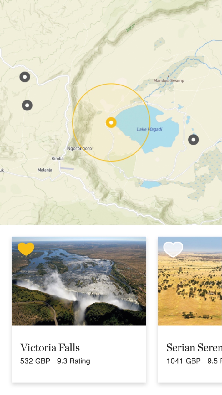
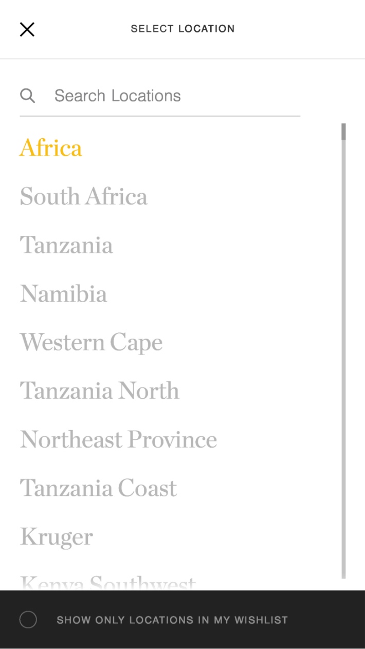
Keeping it dynamic
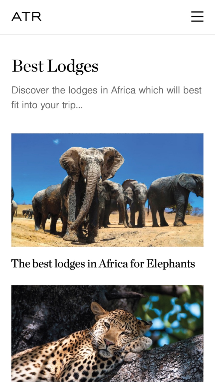
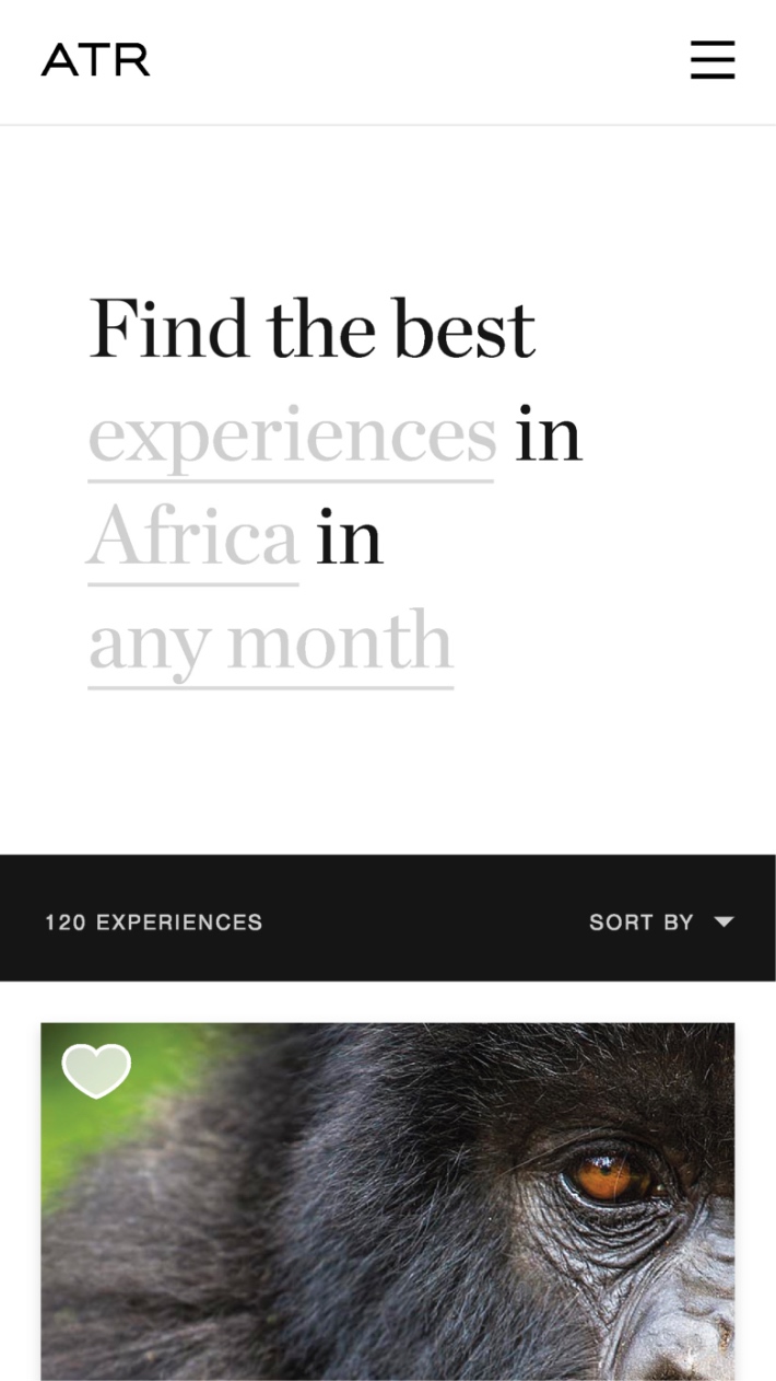
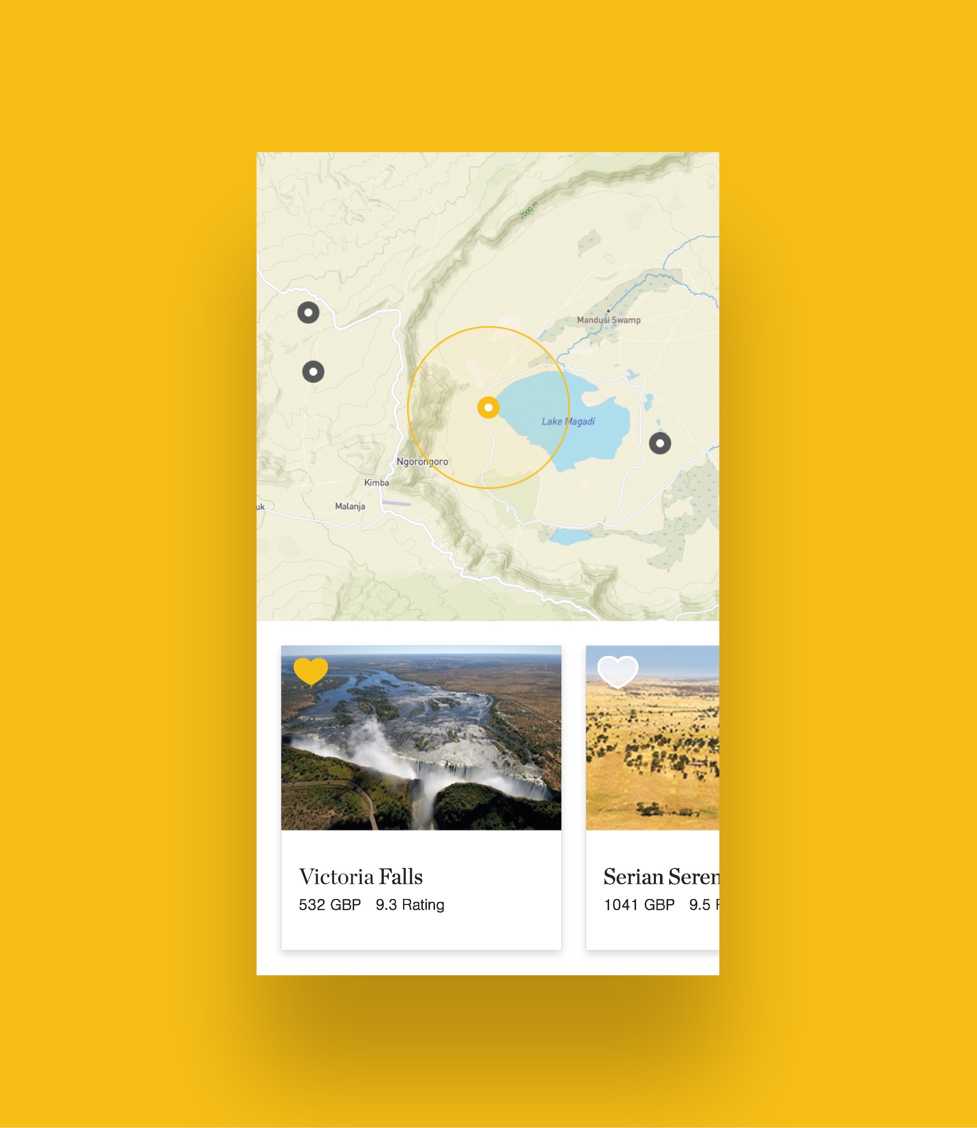
With over 16 million possible holiday combinations available on the ATR website, the existing website left holiday makers unsure where to start and increased the reliance on ATR’s booking advisors. Our team cut through the complexity with the creation of a dynamic search. The search uses a sentence structure to guide the user and the dropdown options available update based on a user’s previous choices. For example, if a user is searching for trips including diving experiences, locations that are not near water will not appear in the location drop down. This saves the user time by only supporting viable searches.
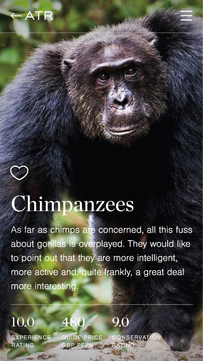
The search functionality works in tandem with dynamic ratings which update based on the completed search. These ratings are compiled using decades of data on animal migration patterns, customer satisfaction, lodge and location quality, and conservation efforts. At a glance, customers can see a variety of ratings for every search result. This rating system analyses the data related to the search and does the hard work for the user, making it easy for a customer to make informed choices without getting bogged down in the detail. For example, if a customer would like to see elephants, they can select a location and lodge with a high rating for that experience at the time of year they would like to travel.

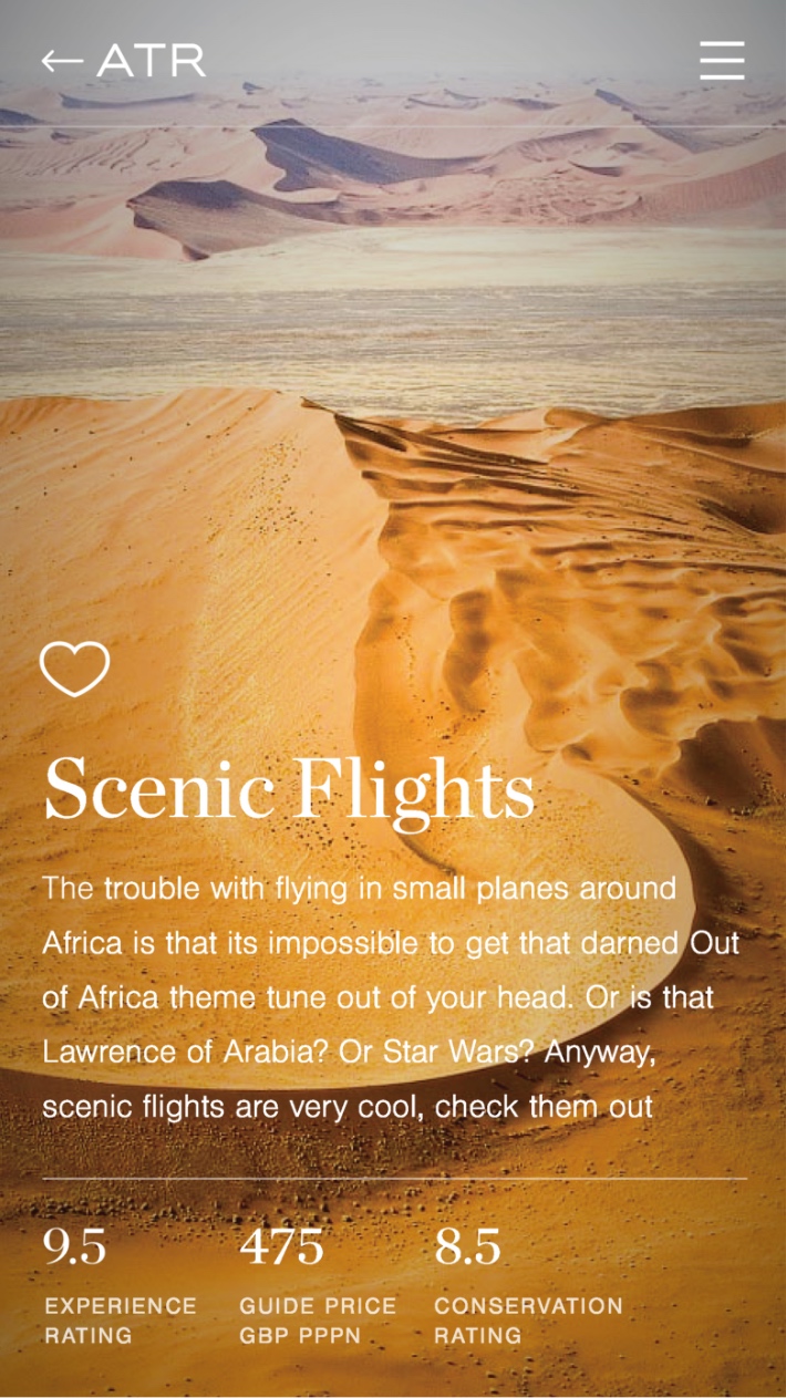
Photography
We created an immersive user experience by building the website around ATR’s award winning photography.
Interactive maps
Interactive maps take users on a tour of their potential trip, zooming in and out of locations as they read about the lodges and experiences available.
Empowering customers
ATR wanted to empower their customers to make their own choices by providing information on conservation and sustainability.
Harnessing big data and artificial intelligence
Africa Travel Resource has collected a huge volume of data over their years in operation. We harnessed this data to fuel the intelligent search and ratings functionality that dynamically update based on the user’s search. The data includes information on animal migration patterns, weather, quality of lodges and experiences, conservation efforts and the need for funding from tourism in different regions.
Related work


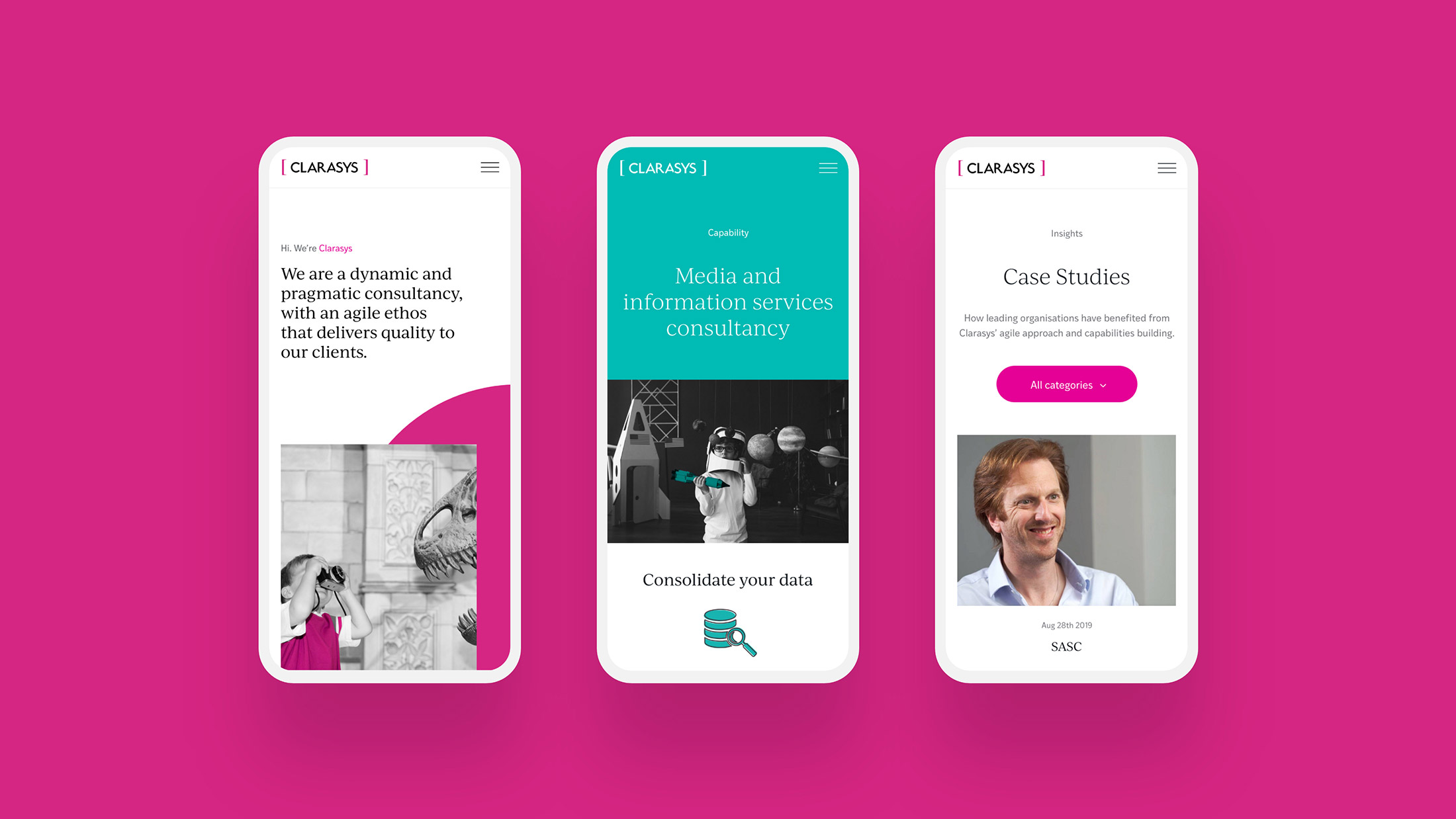
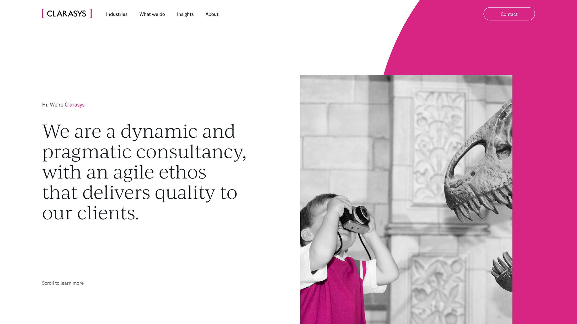
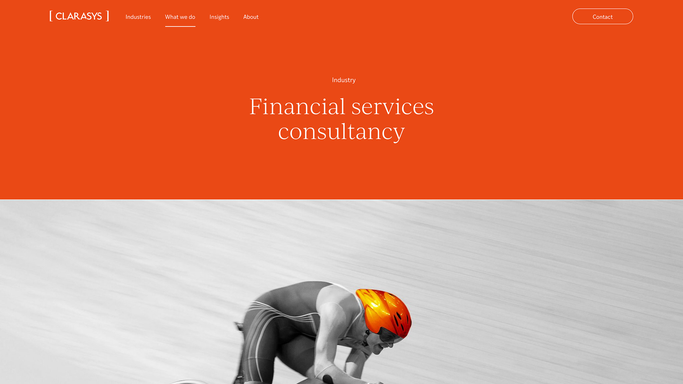
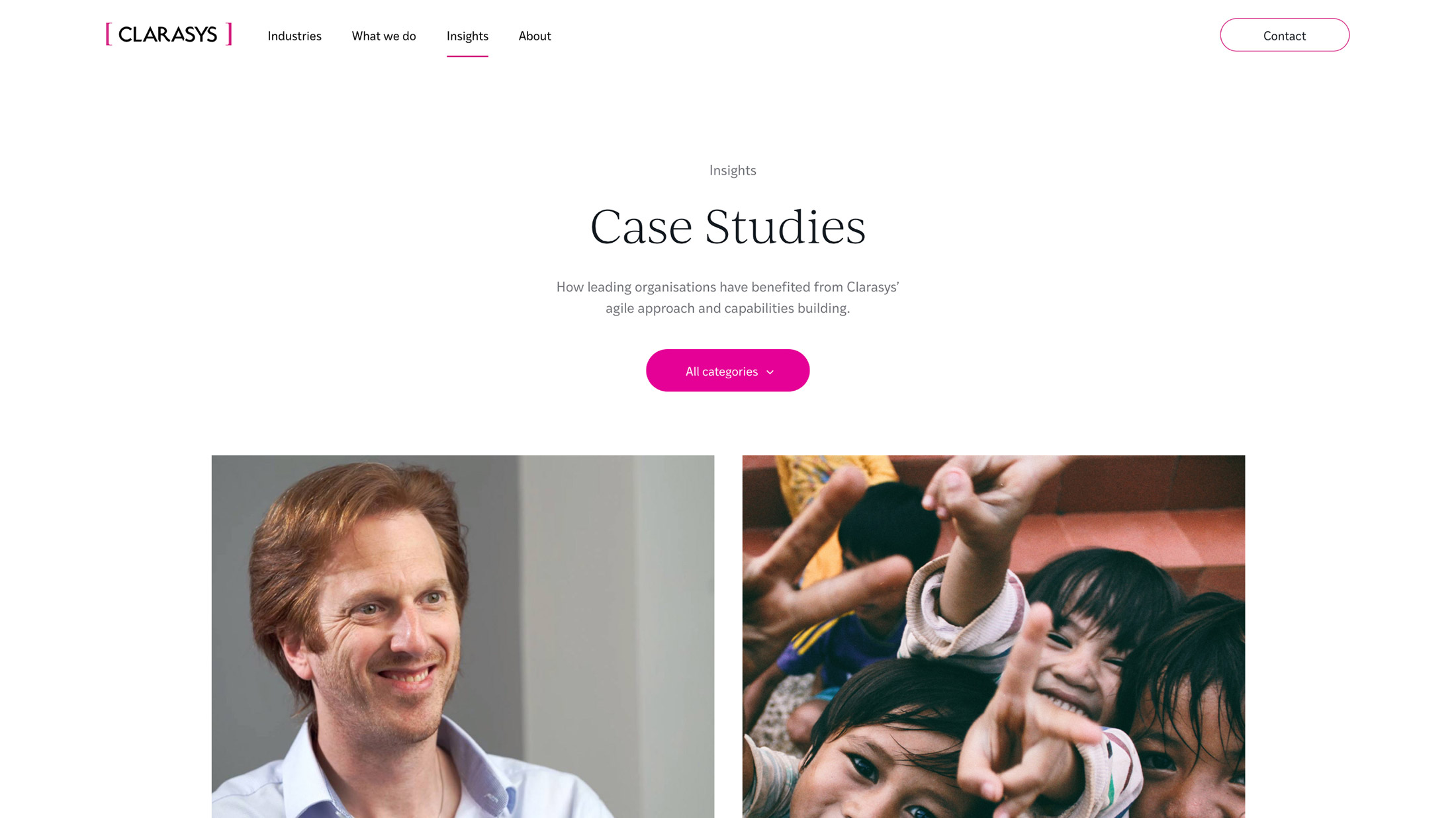
Clarasys is an independent business consultancy with a global reach. They work with their clients to navigate large scale digital transformation, unlocking value and enhancing customer experience.
- Lead time:
- 8 weeks backend, 12 weeks frontend
- Sector:
- Business consultancy
- Target Type:
- B2B
- Website Goal:
- Secure the website, enable the marketing team
- Services:
- Website development, website design, behavioural analysis and content architecture review, SEO
- Scope
- WordPress CMS
- Modular page structure
- CDN cache
- Responsive development
- Adobe XD UX wireframes
- Adobe XD website designs
- Gated content
- Resource
- 1x Project Manager
- 1 x Website Designer
- 1x Front-end Programmer
- 1x Back-end Programmer
- 1x Quality Assurance Tester
- 1x Digital Marketing Specialist
The challenge
Clarasys was struggling with an inflexible website that had developed a number of security concerns over time. All content changes required IT support which was delaying marketing initiatives and causing frustration across departments. Clarasys challenged us to secure their website and deliver a user friendly content management system to help them manage their site day to day.
Having just undergone a rebrand, Clarasys also needed a new frontend web design to launch their new brand.
Post-launch website results
Clarasys have experienced fantastic early results from their website rebuild. Their high quality code base has positively impacted the performance of their website and their visibility in Google.
Post-launch keyword results
Our approach
We recommended a backend first website rebuild to rapidly deliver priority functionality. This involved rebuilding and launching a new backend code base before starting work on the new website design. We secured the website and replaced the hard coded page layouts with modular components to enable easy content management.
Bringing the brand to life
We delivered a vibrant new website design utilising Clarasys’ new brand assets and colour palette.
SEO optimisation
Our team optimised the website for key search terms to improve search engine rankings and build organic traffic.
Easy content management
With a new user friendly CMS Clarasys’ marketing team can keep content up to date and showcase their work.
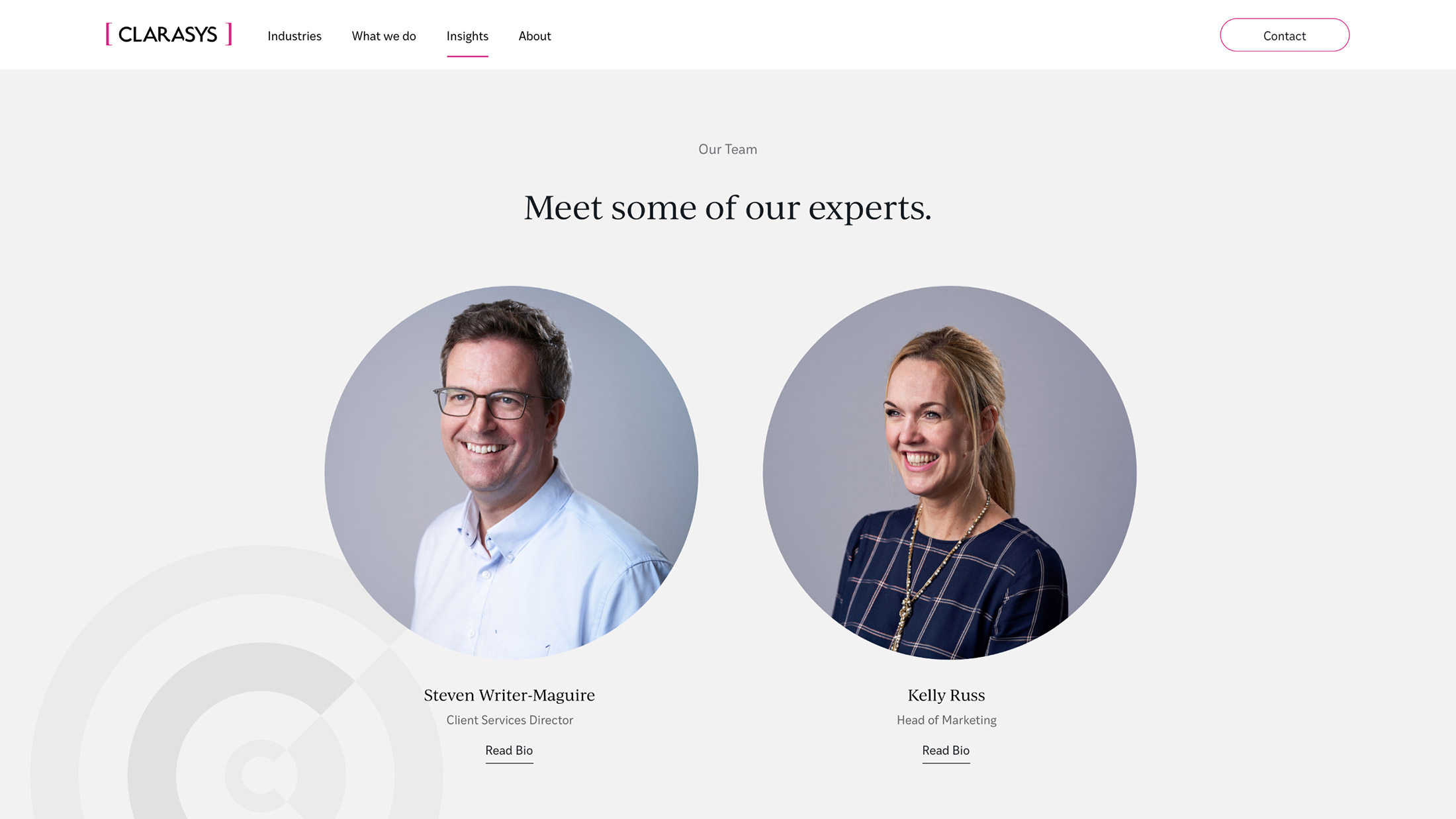
Getting to know the team
Our research showed that users were interested in reading about the Clarasys team but struggled to navigate the long list of team members. The new site design presents relevant team member profiles alongside content to assist the user journey.
Designing with data
We conducted a behavioural analysis and content architecture review to benchmark Clarasys’ existing website performance against key competitors in their market. This data was used to guide the new website structure and create engaging user journeys, increasing on-site conversion rate and search engine rankings.
“Plug & Play are truly great at what they do and think about things in ways that others do not. They are a really great organisation delivering an outstanding quality of work and are genuinely awesome people to work with!”

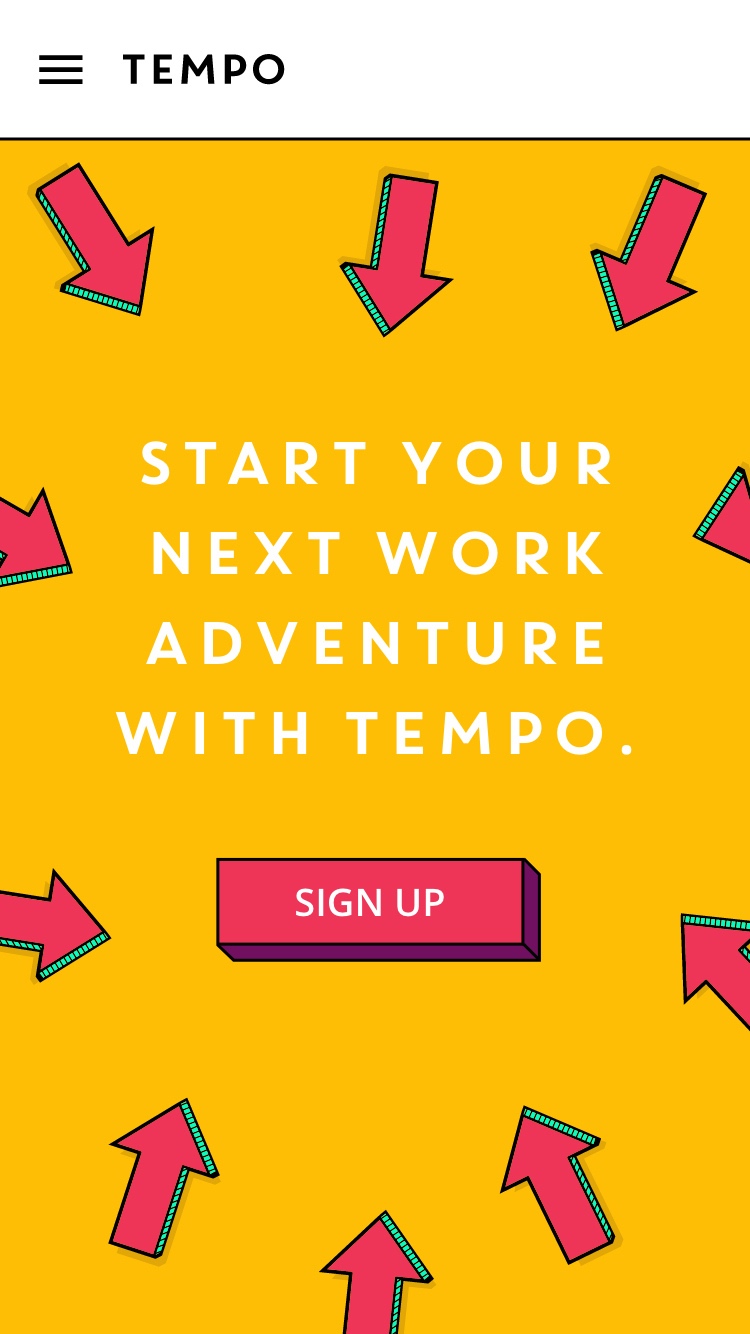
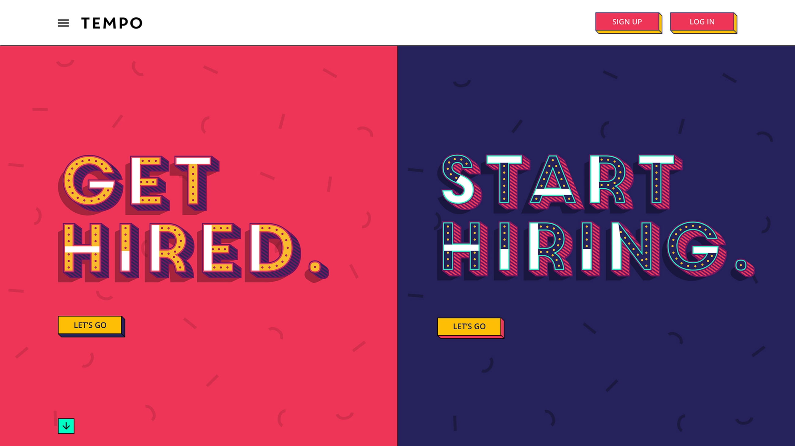
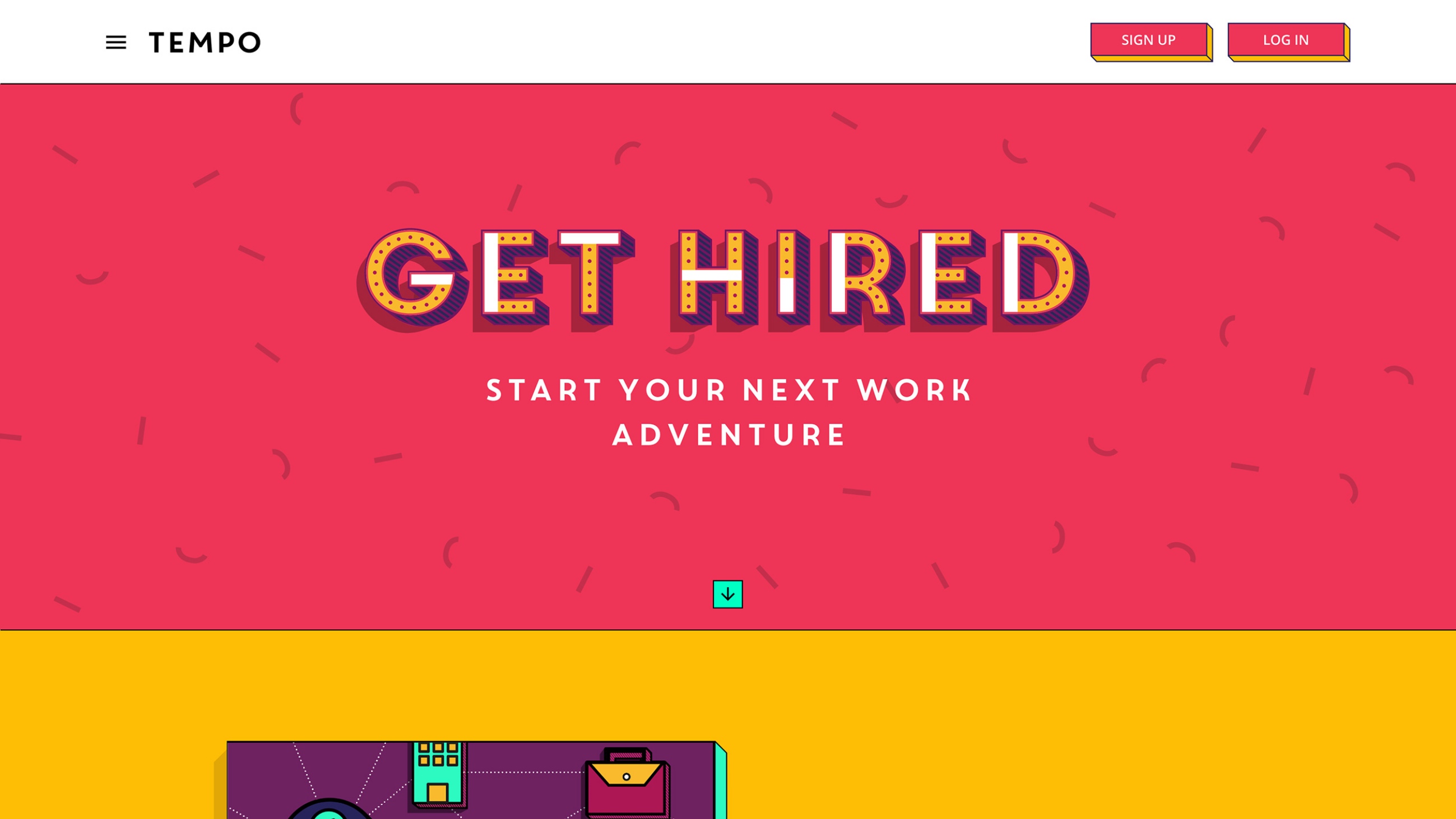
Tempo’s platform connects employers directly with job seekers, using video applications to disrupt the recruitment sector and offer an alternative to traditional recruitment processes.
- Lead time:
- 4 months
- Sector:
- Recruitment
- Target Type:
- B2C and B2B
- Demographic:
- Employers and Job Seekers
- Website Goals:
- Drive Sign Ups, User Friendly CMS
- Services:
- Web Design, Web Development
- Scope
- Adobe XD Designs
- WordPress CMS
- Responsive Design
- Recruitment Portal API Integration
- Gated Content
- Video Content
- Resource
- 1 x Project Manager
- 1 x Digital Marketing Specialist
- 1 x Website Designer
- 1 x Front-end Programmer
- 1 x Back-end Programmer
- 1 x Quality Assurance Tester
Our approach
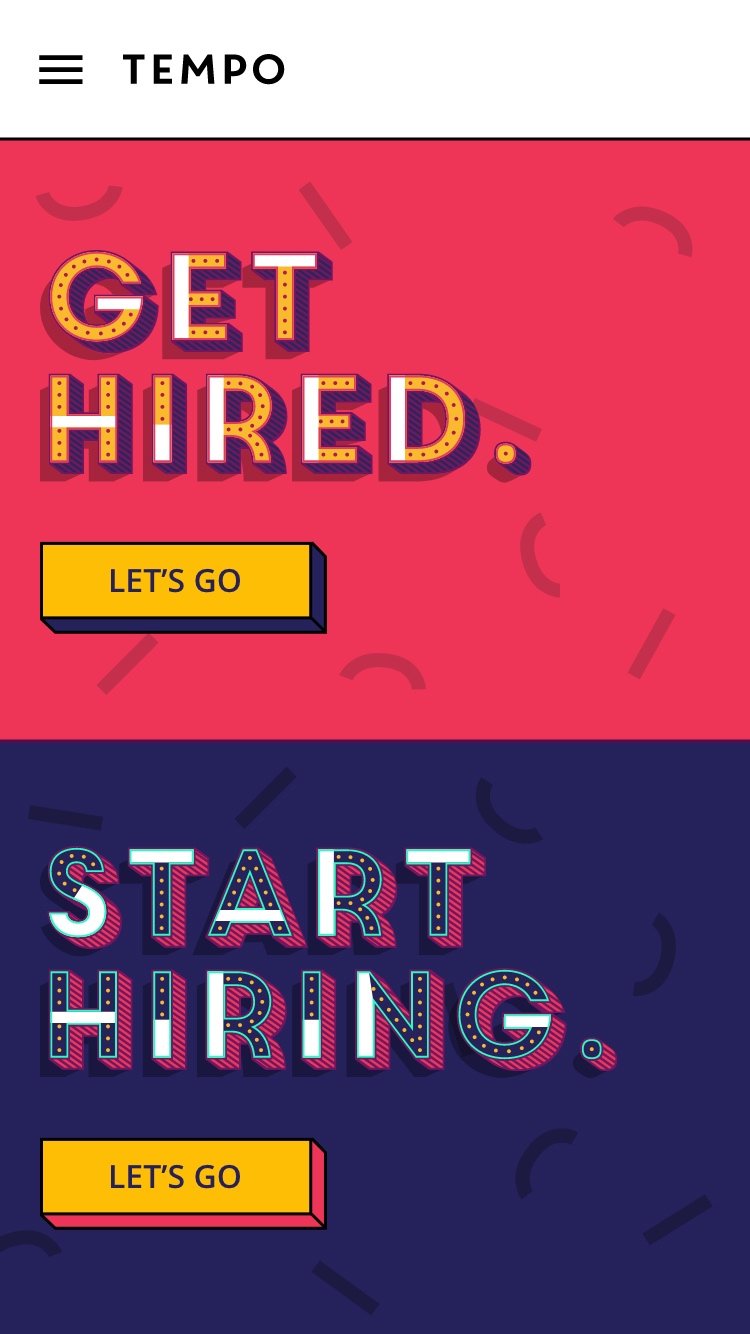
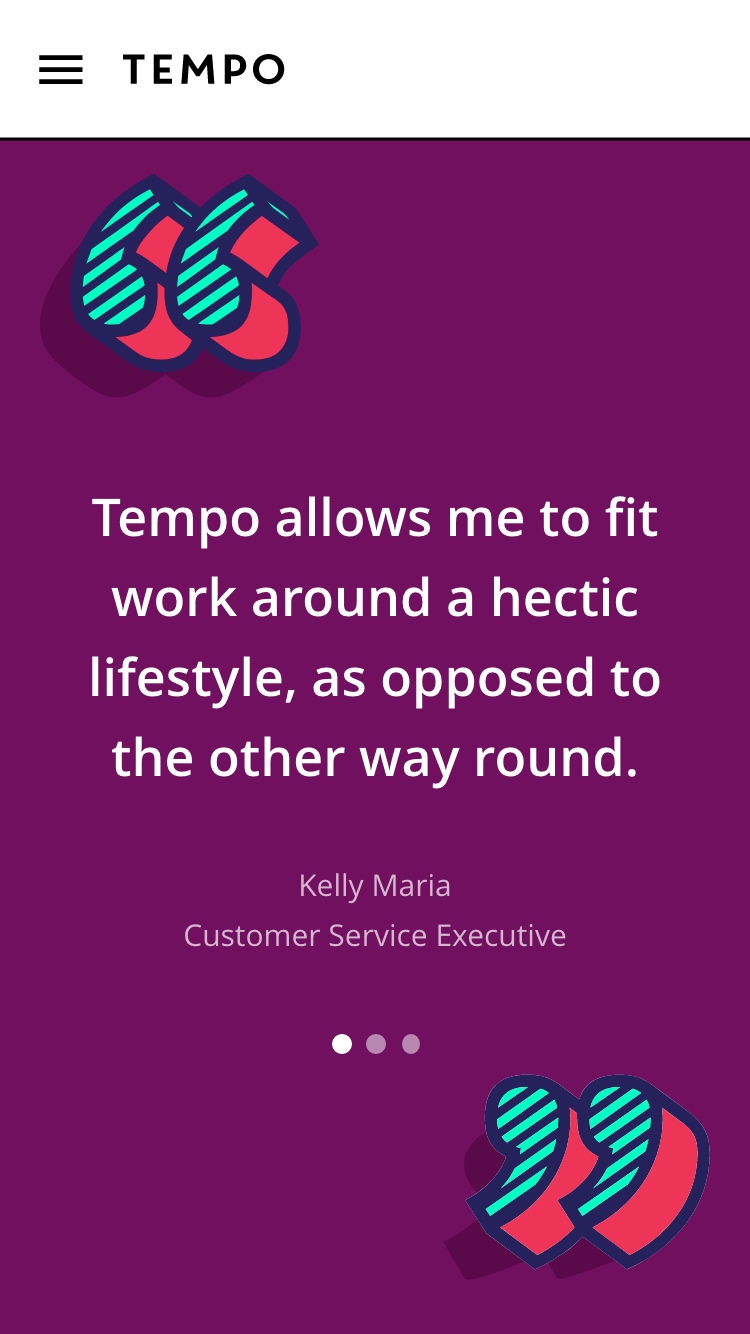
We delivered a bright and playful recruitment website to showcase Tempo’s vibrant brand. We achieved this by mapping optimised user journeys for employers and applicants, introducing interactive touch points to maximise user engagement and sign ups.
Clear user flows
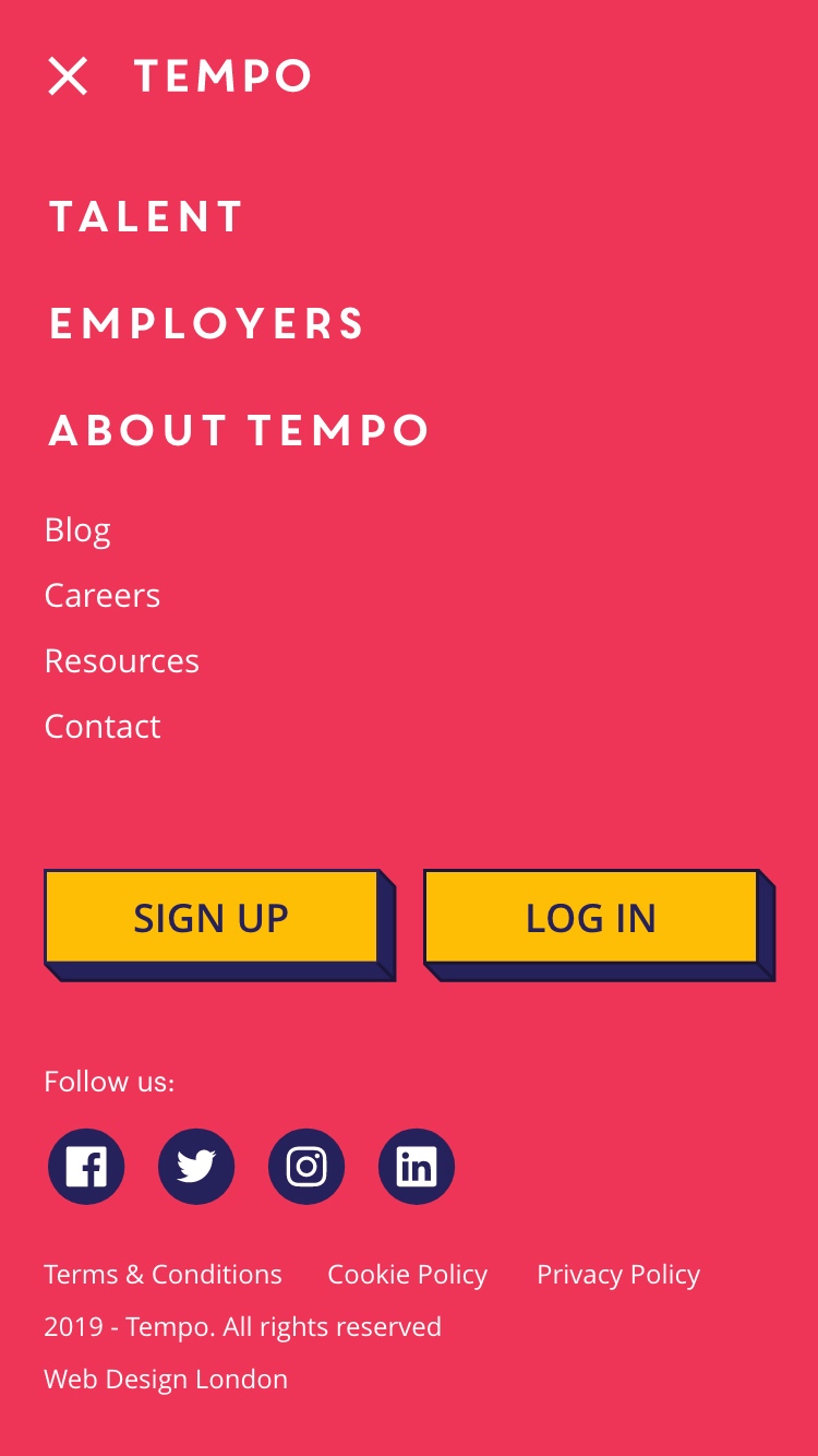
Call to actions are used to ensure users are presented with the most relevant content.
Custom animations
Playful animations are used throughout the website to reflect the energy and vibrancy of the company.
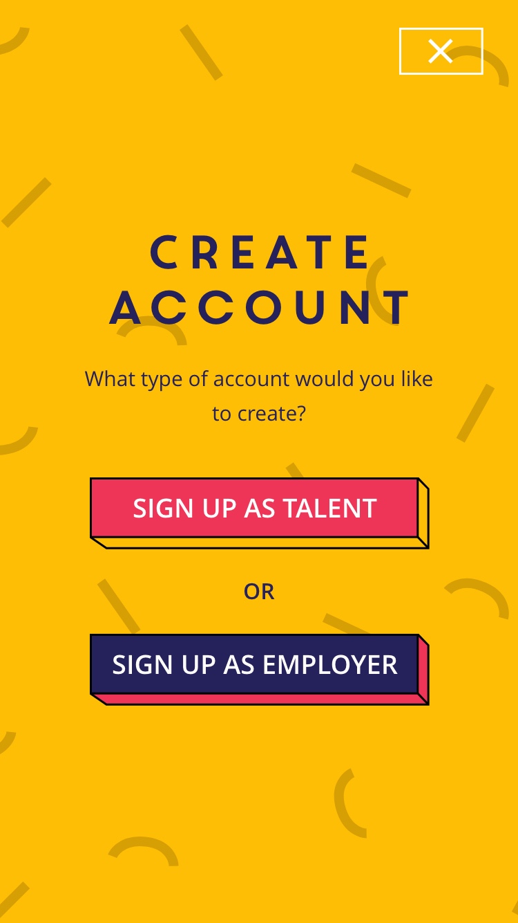
Sign ups
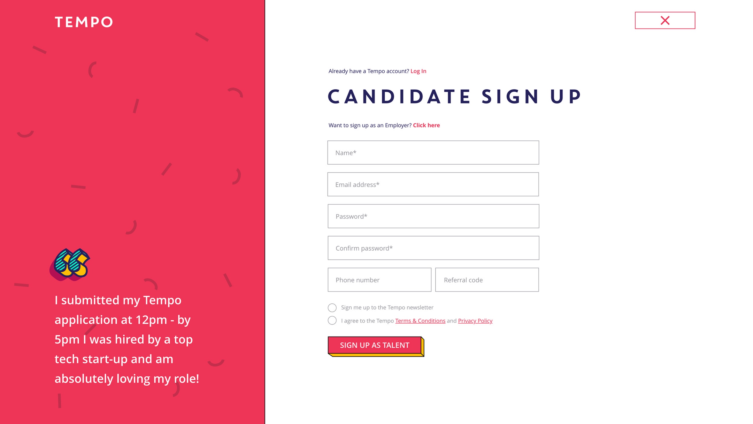
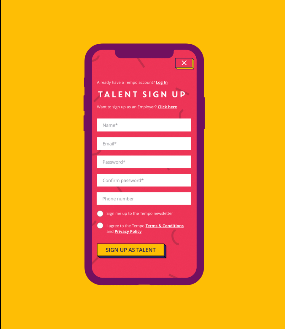
Employers and job seekers are presented with different sign up forms to provide a clear conversion point for each user flow.
A flexible CMS
The end user experience was paramount to Tempo, however they also needed to improve the user experience for their own team. Their existing website was restrictive and the team struggled to make simple content changes without IT support. This was slowing down their progress and causing frustration across departments.
As part of the rebuild, we implemented a user friendly custom WordPress CMS to provide the marketing team with autonomy over their website content and page layouts. Enabling the team with a flexible CMS has helped them to be more efficient, reduce lead time for campaigns and relieve unnecessary pressure on their IT team.

Implementing the brand
We worked closely with Tempo’s Head of Design to integrate their strong brand into all elements of the user journey. This included the creation of eye catching interactive components to highlight key call to actions and guide the user through their user flow. The assets needed to work together with the content to create a memorable on-site experience.
Related work

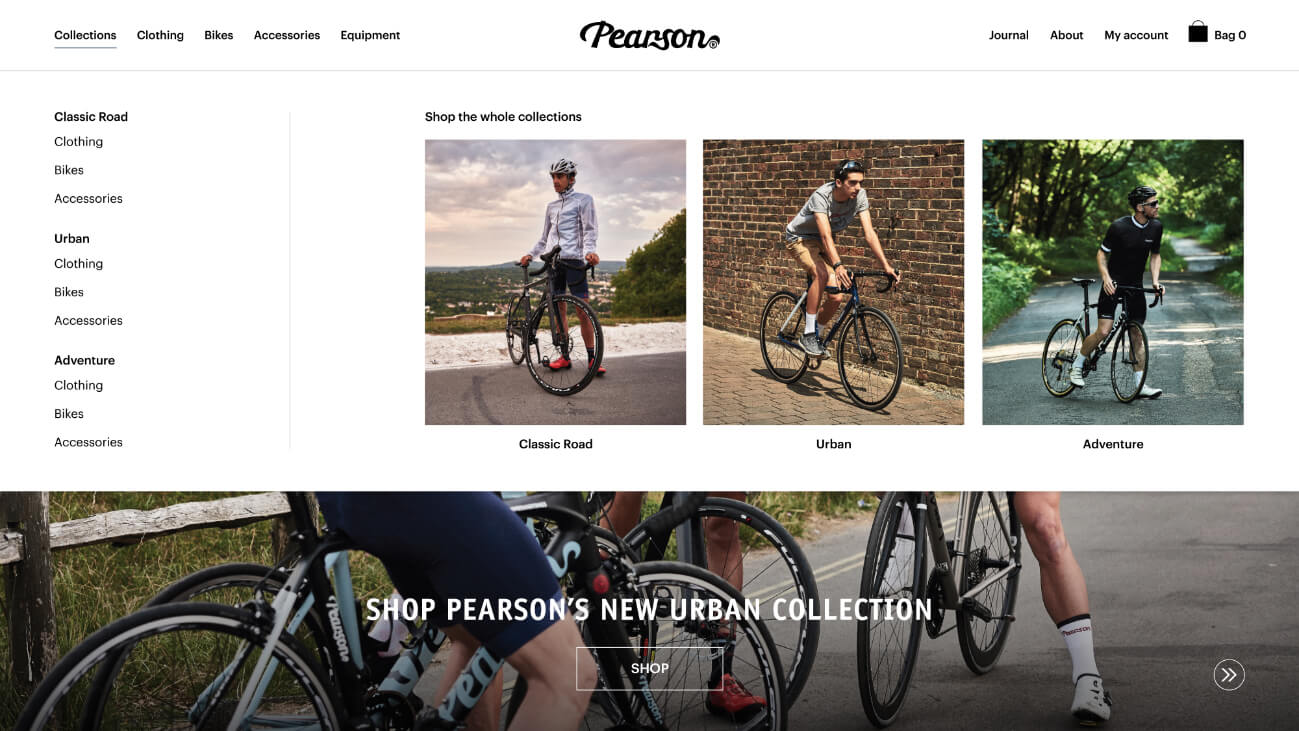
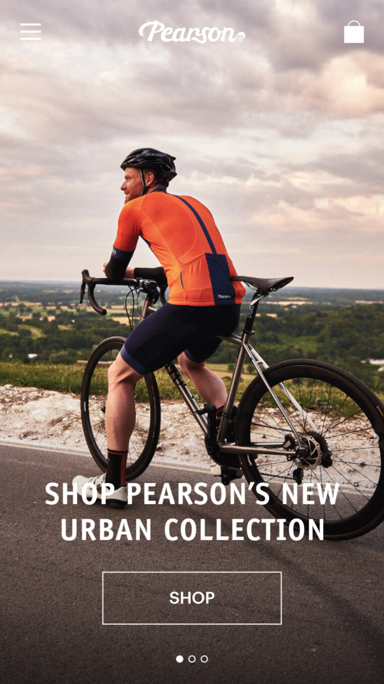
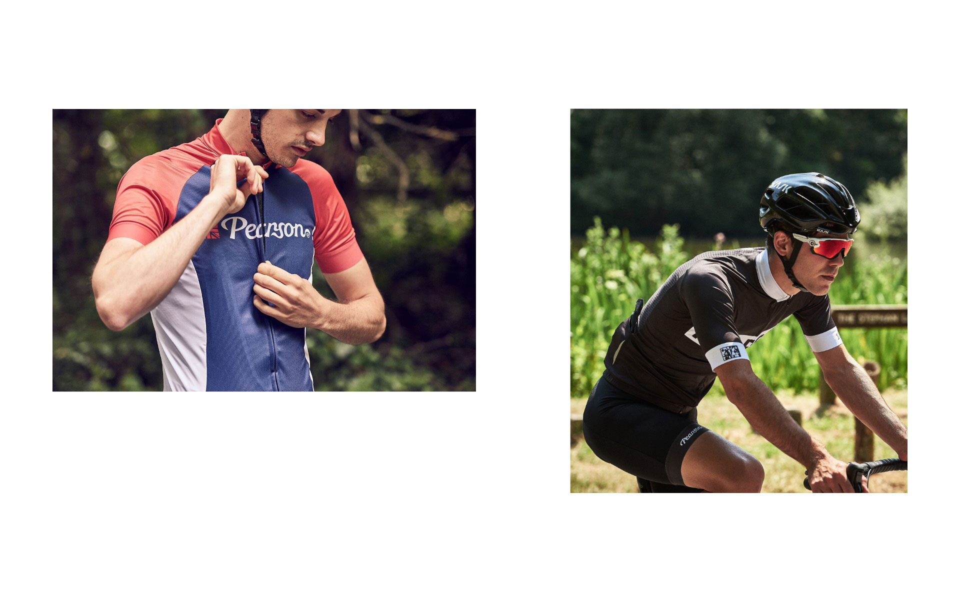
Since starting back in 1860, Pearson has become an established British cycling brand. Now run by the fifth generation of the Pearson family, it is recognised as the world’s oldest bicycle business. Following impressive success in their London stores, they wanted to bring the business into the 21st century by improving their online offering. They approached us to boost their online conversion rate and help them appeal to new markets.
- Lead time:
- 6 months
- Sector:
- Sport & Leisure
- Target Type:
- B2C
- Demographic:
- Cyclists
- Website Goals:
- Launch New Brand, Drive Sales
- Services:
- eCommerce Web Design, Digital Marketing

- Scope
- Adobe XD Designs
- WordPress CMS
- WooCommerce Shop
- Responsive Design
- Apply Pay Integration
- Ongoing Digital Marketing
- Resource
- 1 x Project Manager
- 2 x Digital Marketing Specialists
- 1 x Website Designer
- 1 x Front-end Programmer
- 1 x Back-end Programmer
- 1 x Quality Assurance Tester
Taking success online
One of Pearson’s goals was to widen their offering of cycling apparel. They believe that cycling should be accessible to all and wanted to appeal to all cycling enthusiasts, not just the cycling gurus. To increase the accessibility of the new Pearson website to new cyclists, we created a website structure that enables users to shop by collections and by categories.
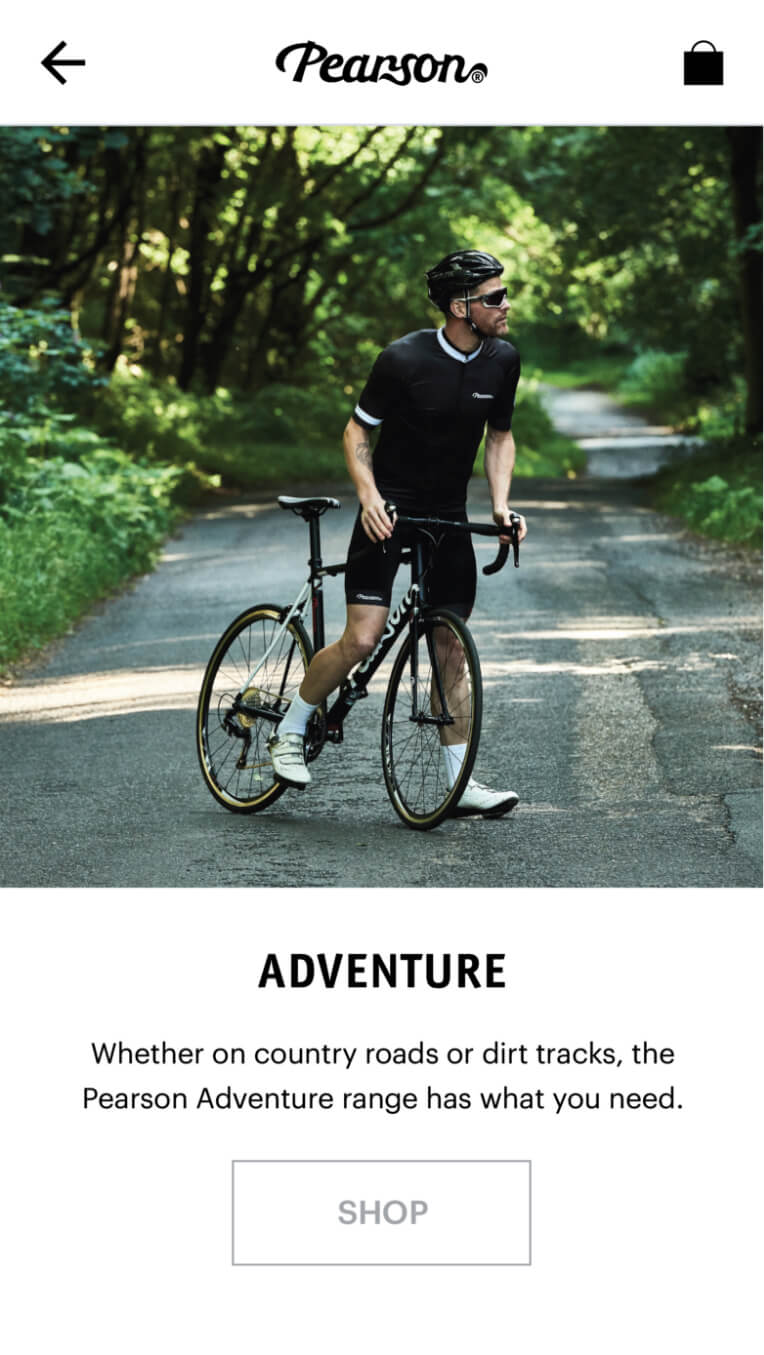
Photographic menu
We implemented a drop down menu to showcase imagery of the collections, apparel and bikes.
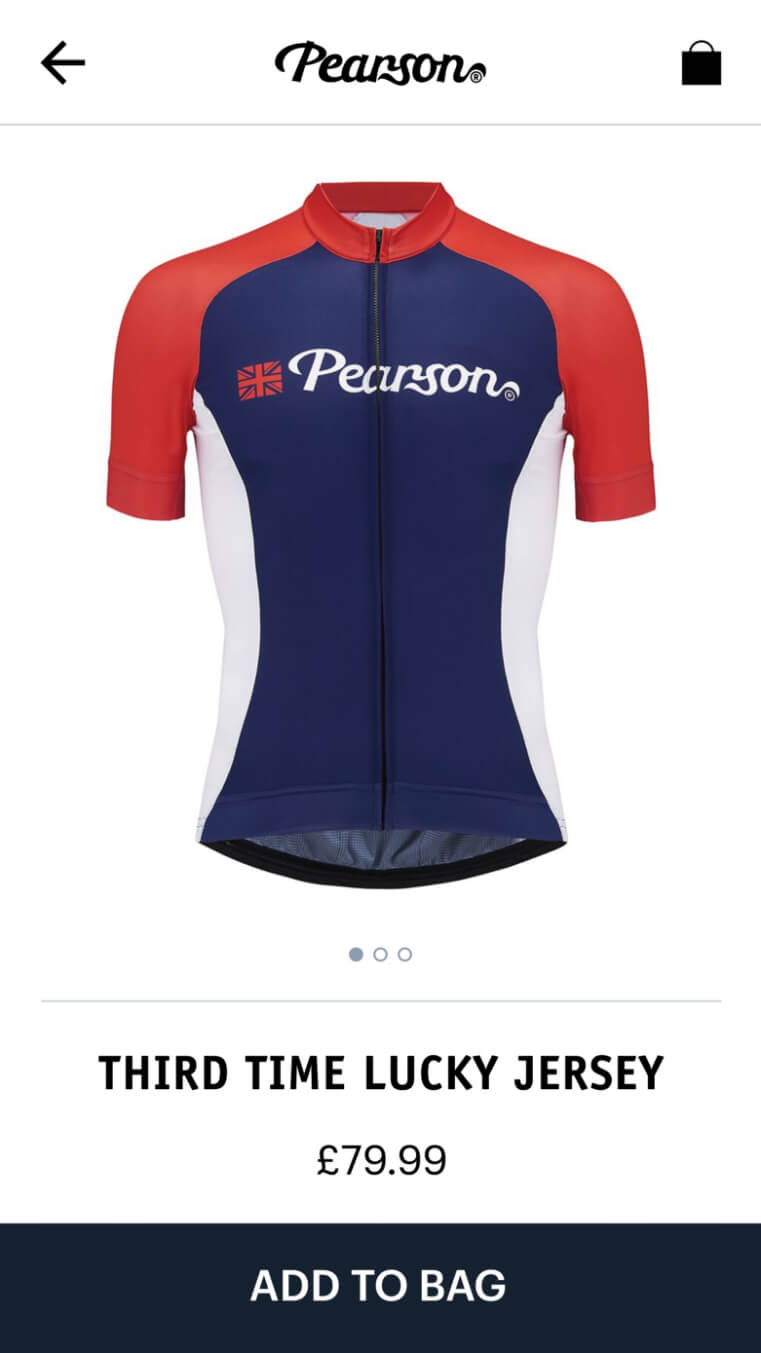
Clean and clear
Products are presented in a bold and clear way to provide a simple and intuitive user experience.

Dynamic imagery
Product page imagery updates as options and add-ons are selected, showcasing the customer’s final product.
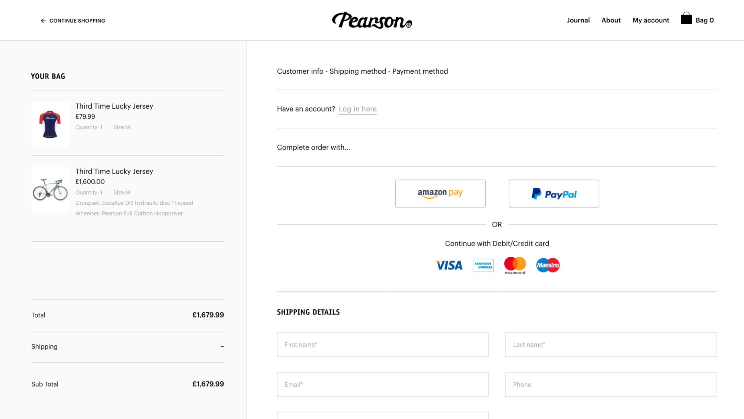
Payment gateways
We integrated with 3 different payment gateways including Apple Pay to streamline the checkout process and meet market demand.
301 strategy
The new Pearson website launch involved both a rebrand and a domain change. We managed this process, taking measures to protect existing search engine rankings. Each URL from the old domain was mapped to the equivalent page on the new website and Google was informed of the rebrand.

Related work

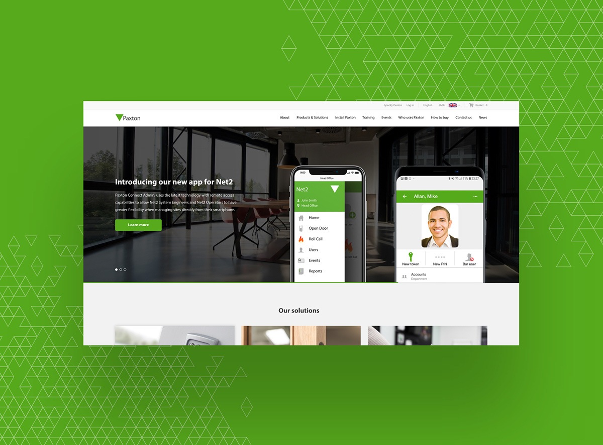
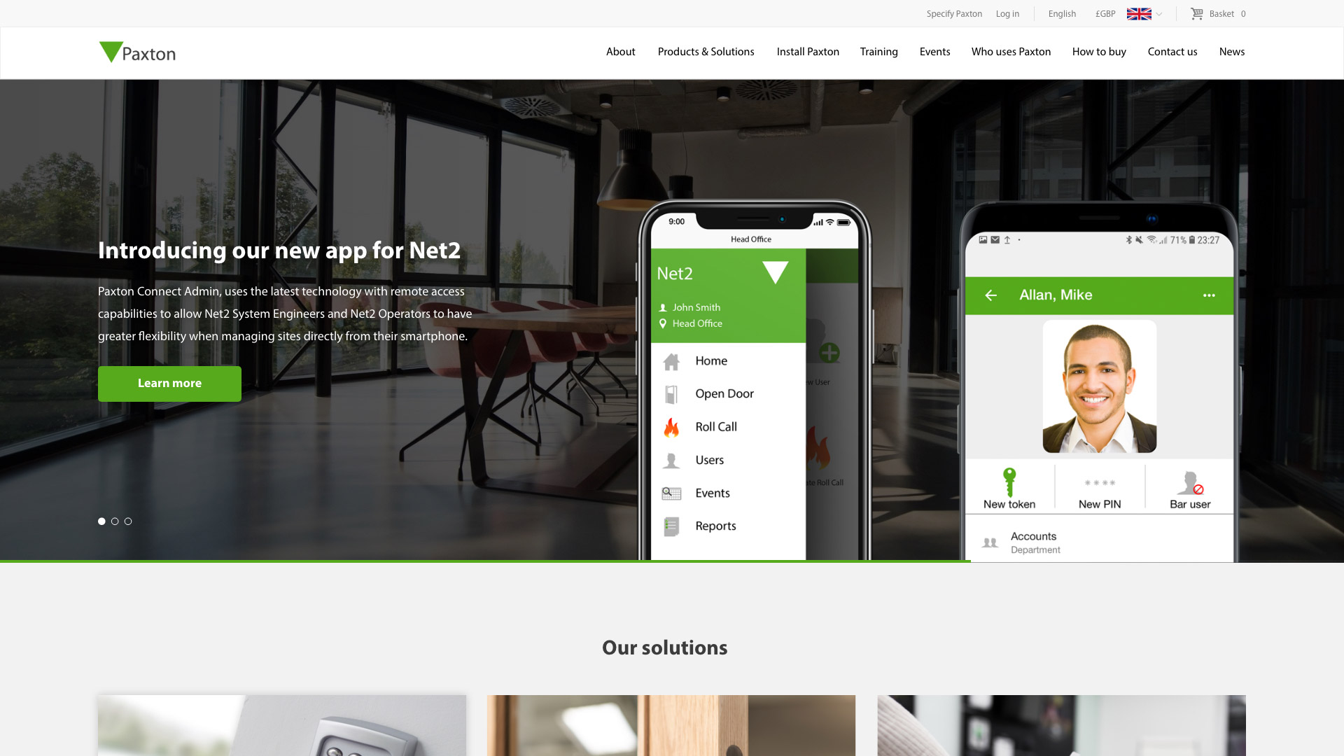
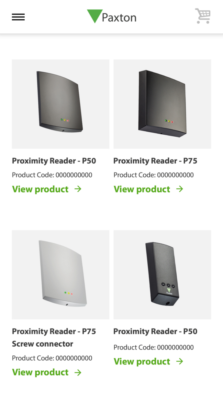
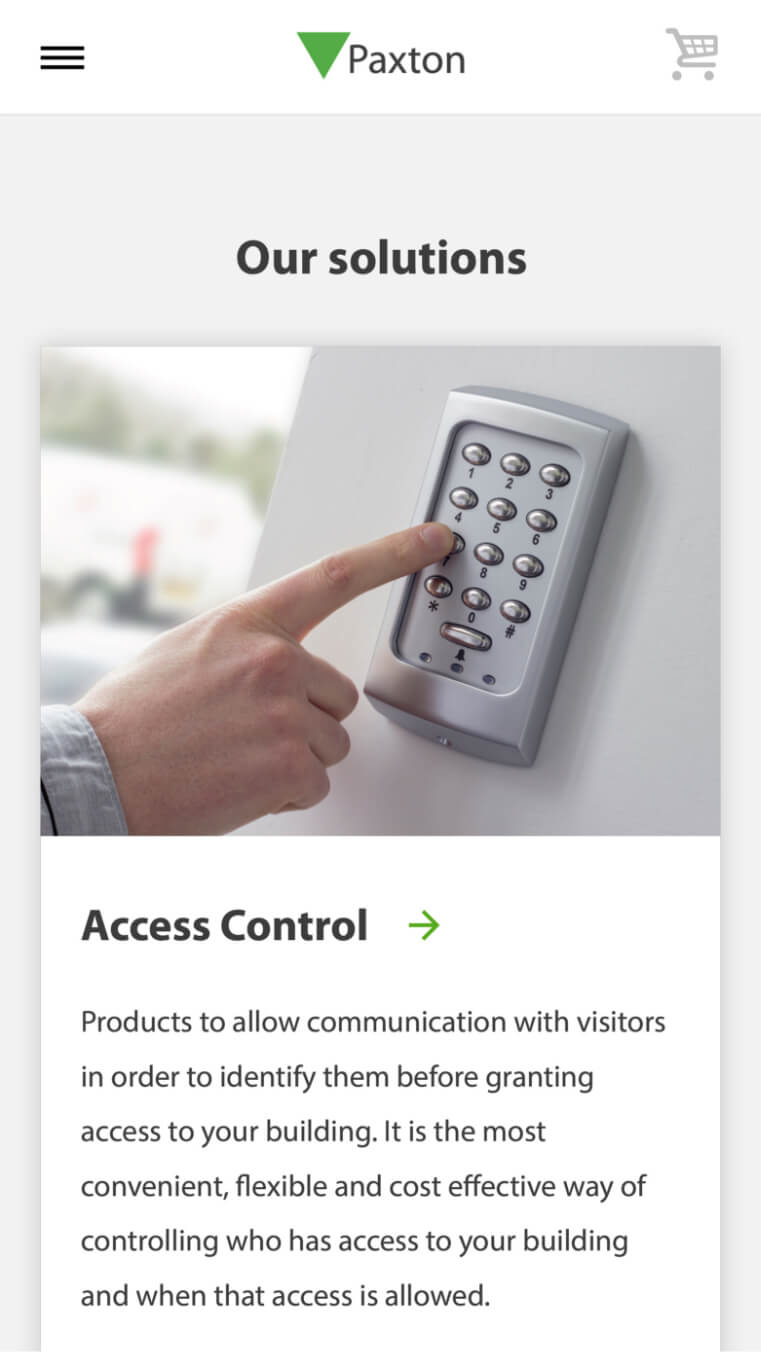
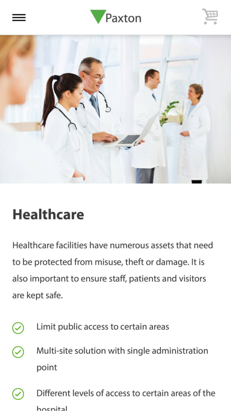
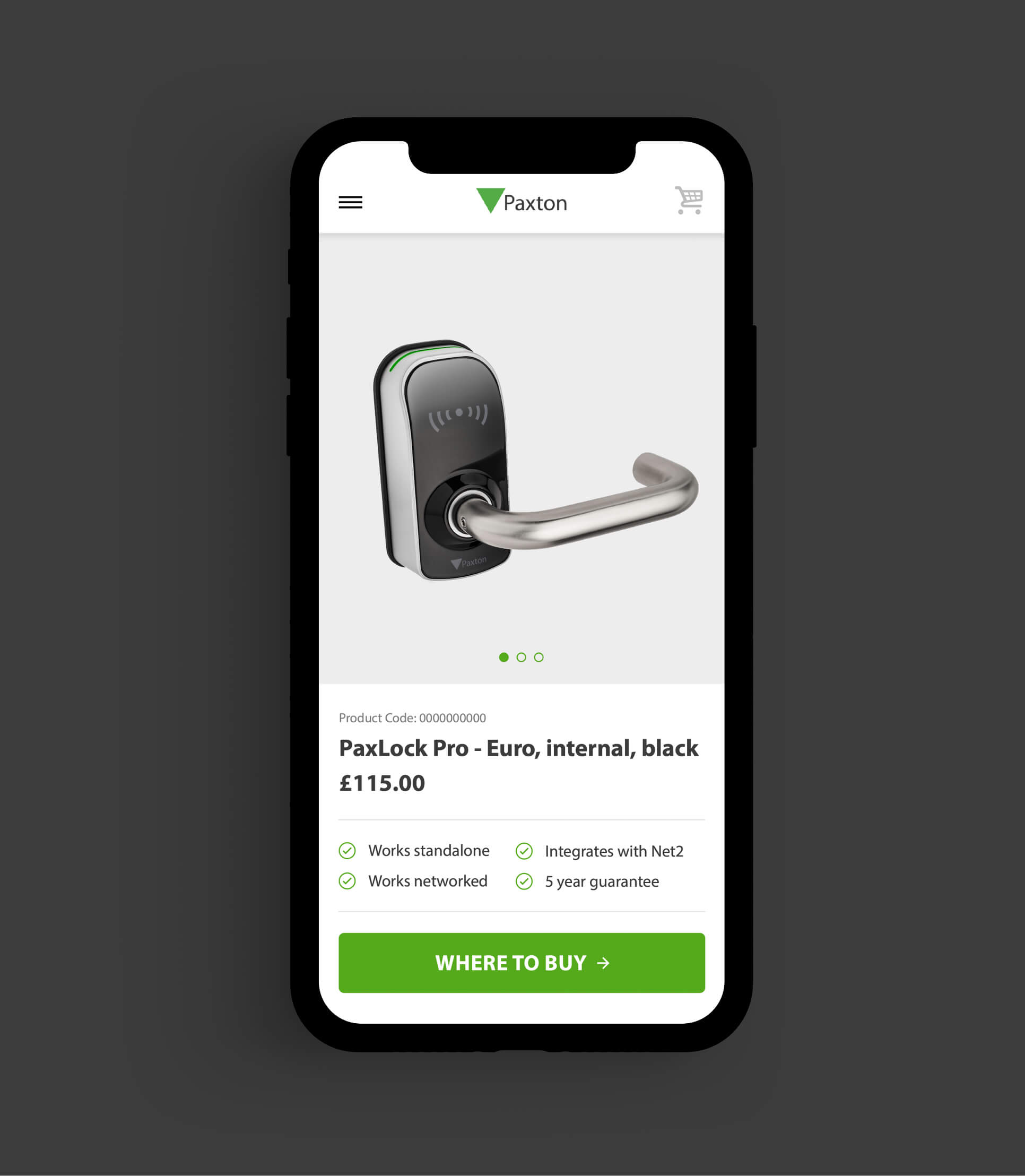
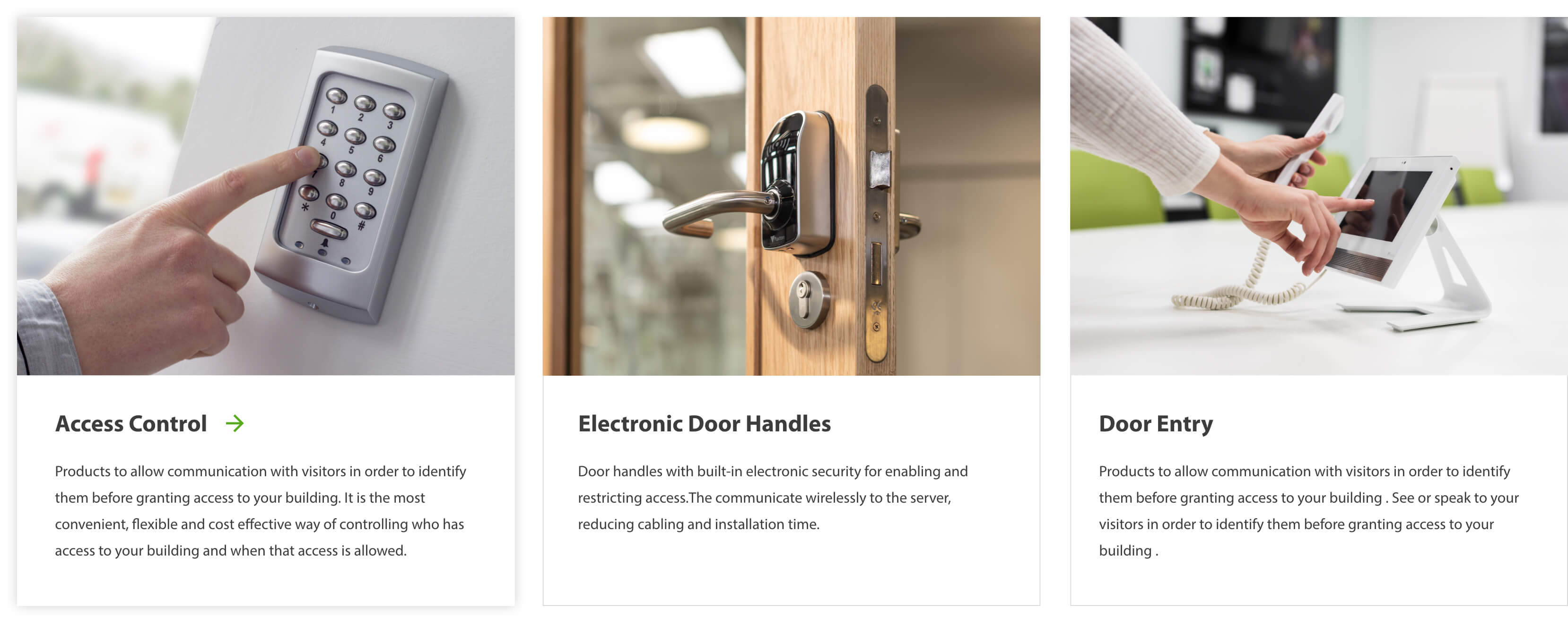
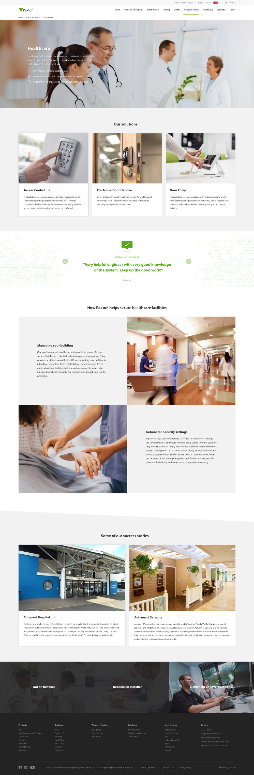
Paxton design and manufacture security solutions for use in a broad variety of commercial environments. They train security system installers to fit Paxton products and equip them to sell Paxton solutions to their customers.
Paxton challenged us to unify 13 of their existing websites into 1 website with an improved user experience. They needed one core website with a flexible CMS to provide their marketing team with central control and reduce support requests to their IT team. It was essential for the new website to drive training sign ups and improve Paxton’s global search engine rankings.
- Lead time:
- 12 months
- Sector:
- Security
- Target Type:
- B2B
- Demographic:
- Security Installers
- Website Goal:
- Provide Central Control To Marketing Team
- Services:
- Web Design, Web Development, User Journey Mapping, Digital Marketing
- Scope
- Adobe XD wireframes
- WordPress CMS
- eCommerce
- API integrations for training and event sign ups
- API integrations for products and product search
- API integrations for installer search and feedback
- Multilingual
- IP detection
- Varnish cache
- Resource
- 1x Marketing Strategist
- 2 x Digital Marketing Specialists
- 2x Website Designers
- 2x Front-End Programmers
- 1x Back-End Programmer
- 1x Project Manager
- 1x Quality Assurance Tester
The challenge
The new website has 8 distinct territories with different content, language, currency and user access requirements that can be managed by the Paxton Marketing Team. With Paxton selling their solutions in over 50 countries, each territory pulls products from the Paxton API and the website enforces logic to remove duplicate products and create editable product pages.
Website territories can be navigated via a territory switcher which utilises IP detection to direct users to the content that is most relevant to their location.
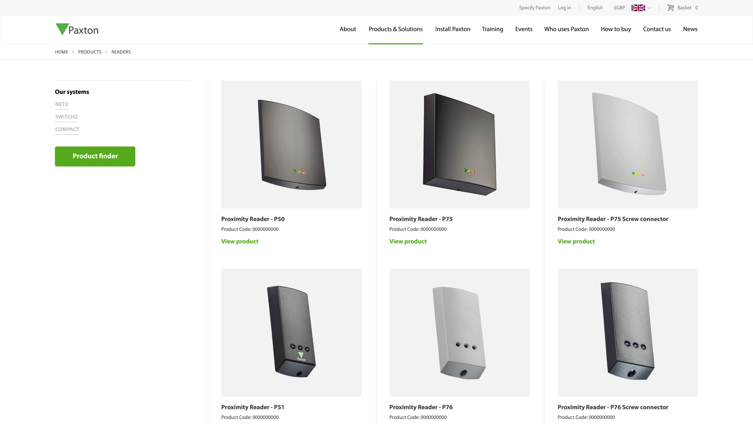
Product catalogue
Product information is pulled from the Paxton API to create editable products in the CMS. The integration refreshes daily to keep the website and API in sync.
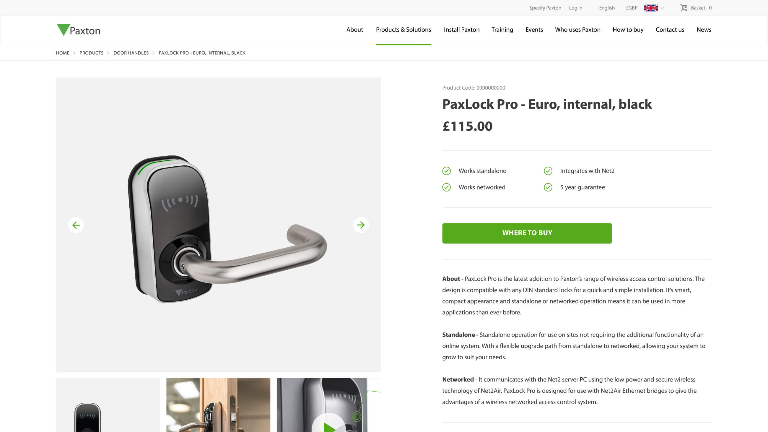
Product documentation
Placing installers at the heart of the user flow, product documentation and installation guides are added within each product page for ease of access.
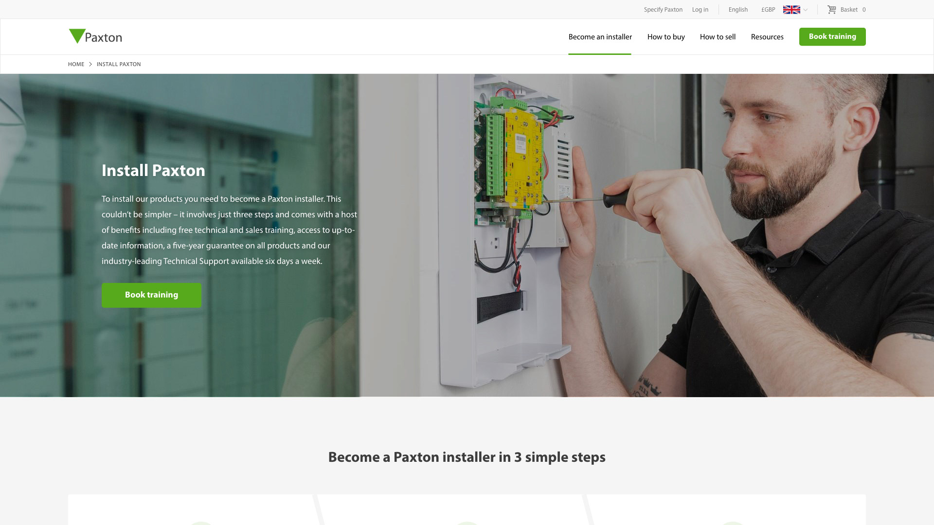
Customer first approach
Installers have a dedicated section of the website to access resources, training and support.
Google optimised landing pages
The new website structure pivots around a complex keyword strategy spanning 8 different territories in order to drive search engine traffic.
Staying ahead
The speed of the website was considered from the ground up during the build. The complexity of the content and data being handled from combining content from 13 websites meant that if this wasn’t done carefully, there was every chance that the site would be too slow to use. The new website needed to handle the expected high volume of global traffic and number of simultaneous requests.
Results are cached by Varnish after the first page visit and the site makes use of the browser’s local storage to cache the common API responses/data. This reduces the number of API calls that need to be made and means that the more that users browse the website, the quicker it will be. Varnish cache is used to store and serve a static version of the website, making it much faster than in normal circumstances. Varnish cache is also used as a protective layer on top of the application which enables us to restrict access to the application to certain users and IP addresses.
Changing domain
Paxton UK content launched on the old US domain. Therefore, legacy UK and US rankings needed to be managed carefully to ensure that the correct content ranked in the correct country. We implemented a comprehensive 301 strategy to ensure that existing website rankings for all territories were maintained upon launch and the user transition was seamless.
Related work

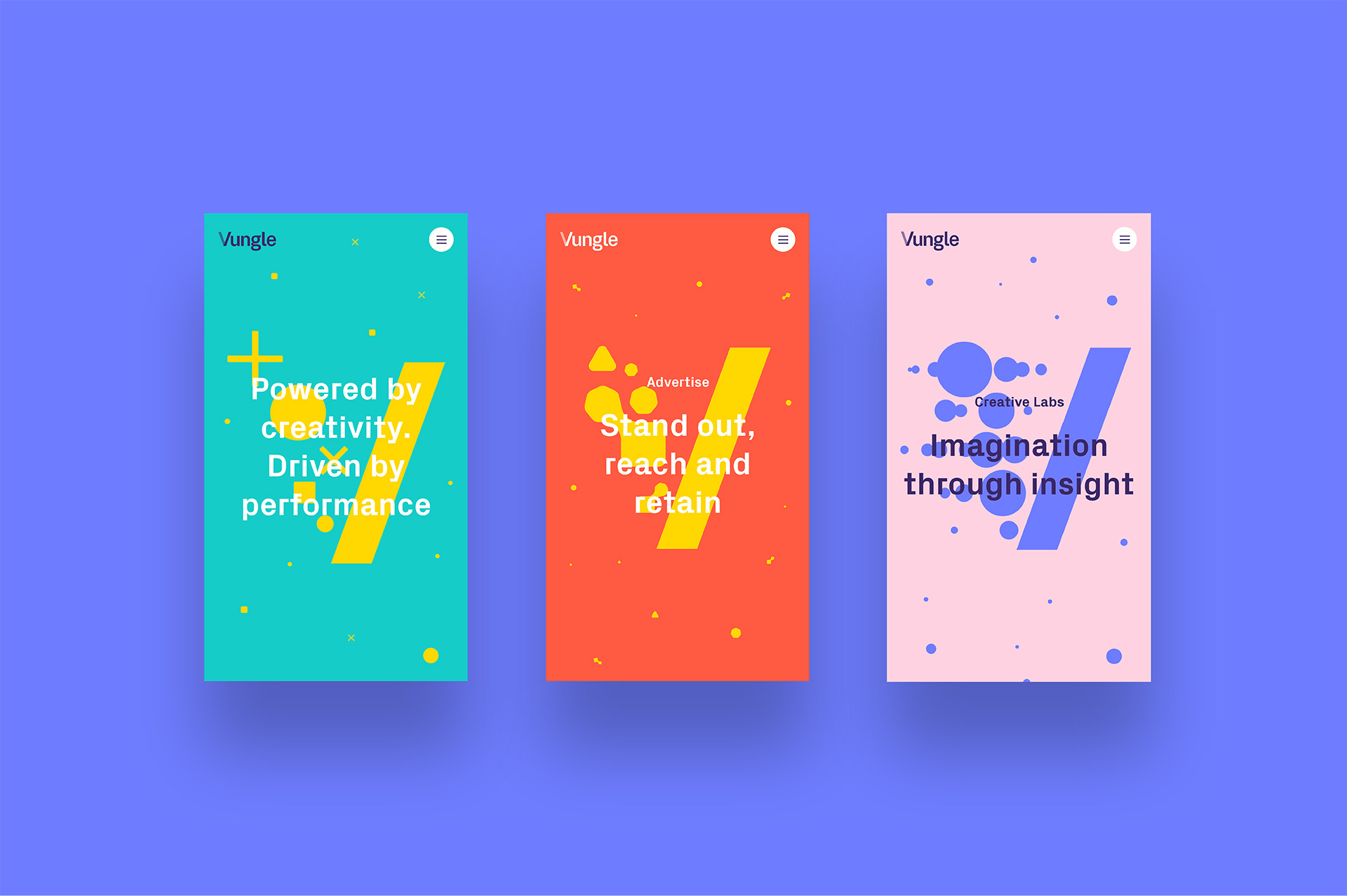
Vungle is a San Francisco based in-app advertising business serving mobile app and game developers across the world. In a competitive market they strive to continually innovate. Vungle wanted to launch a new digital presence to bring their brand to life and improve their Saas platform sign-up conversion rates.
- Lead time:
- 7 Weeks
- Sector:
- SaaS Platform, Mobile Advertising
- Target Type:
- B2B
- Demographic:
- Technical Buyers
- Website Goal:
- SaaS Platform Conversion Rate, Marketing Team Enablement
- Services:
- Web Design, Website UX Design, Wordpress For Enterprise
- Awards:
- Wirehive 100 Awards - B2B Site Of The Year Winner
- UK Digital Growth Awards - B2B Site Of The Year Nomination
- Scope
- Custom Design
- WordPress for Enterprise
- Varnish Cache
- CDN Cache
- Custom Single Sign On
- Recruitment API Integration
- Salesforce Pardot Integration
- Multilingual
- Resource
- 1x Project Manager
- 1x Digital Marketing Specialist
- 2x Website Designers
- 2x Front-end Programmers
- 1x Back-end Programmer
- 2x Quality Assurance Testers
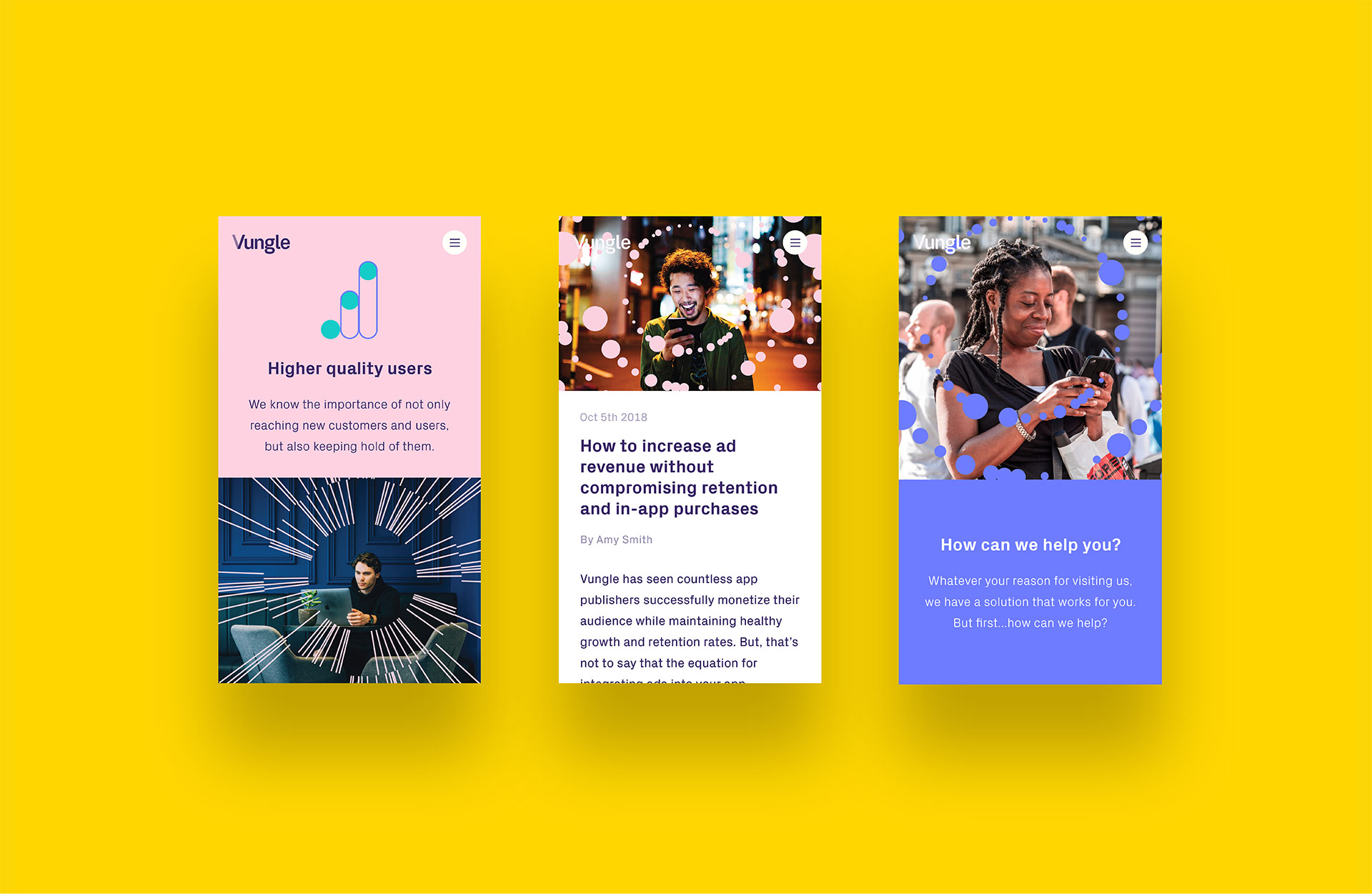
Post-launch website results
The Vungle website focused on delivering a quality finish and providing a seamless user experience. This has been reflected in the post launch results which show huge increases in organic traffic and engagement.
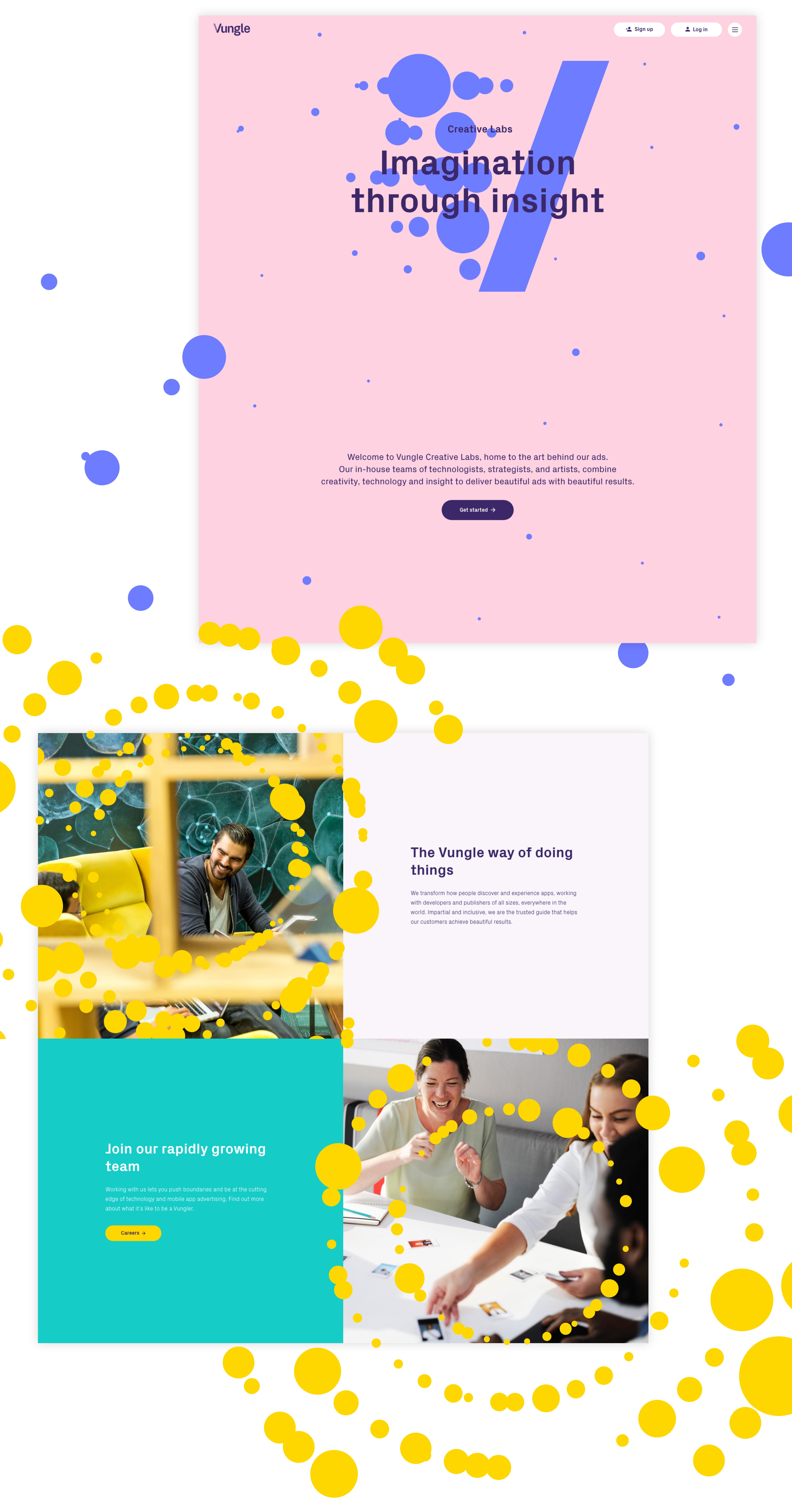
Our approach
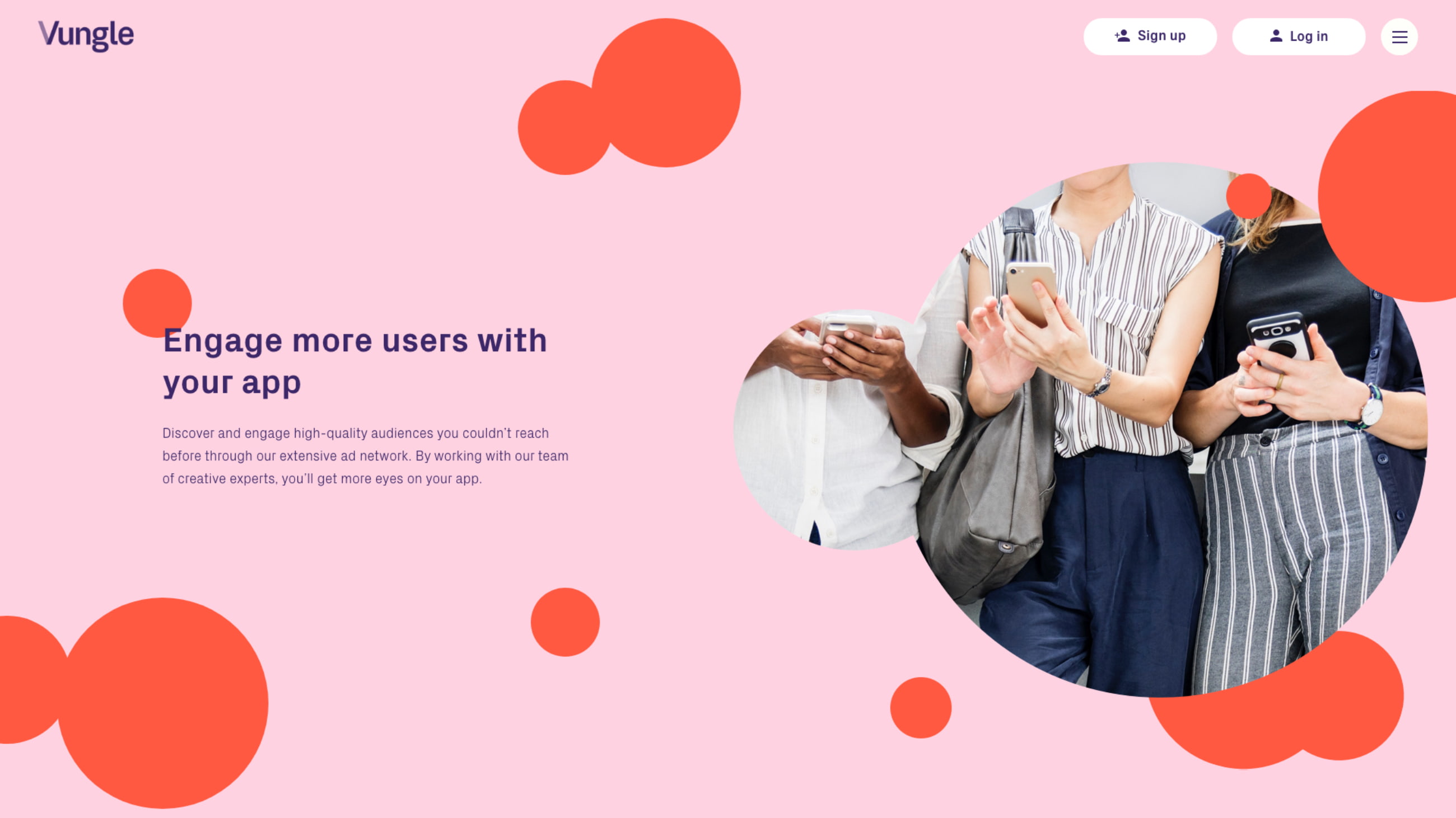
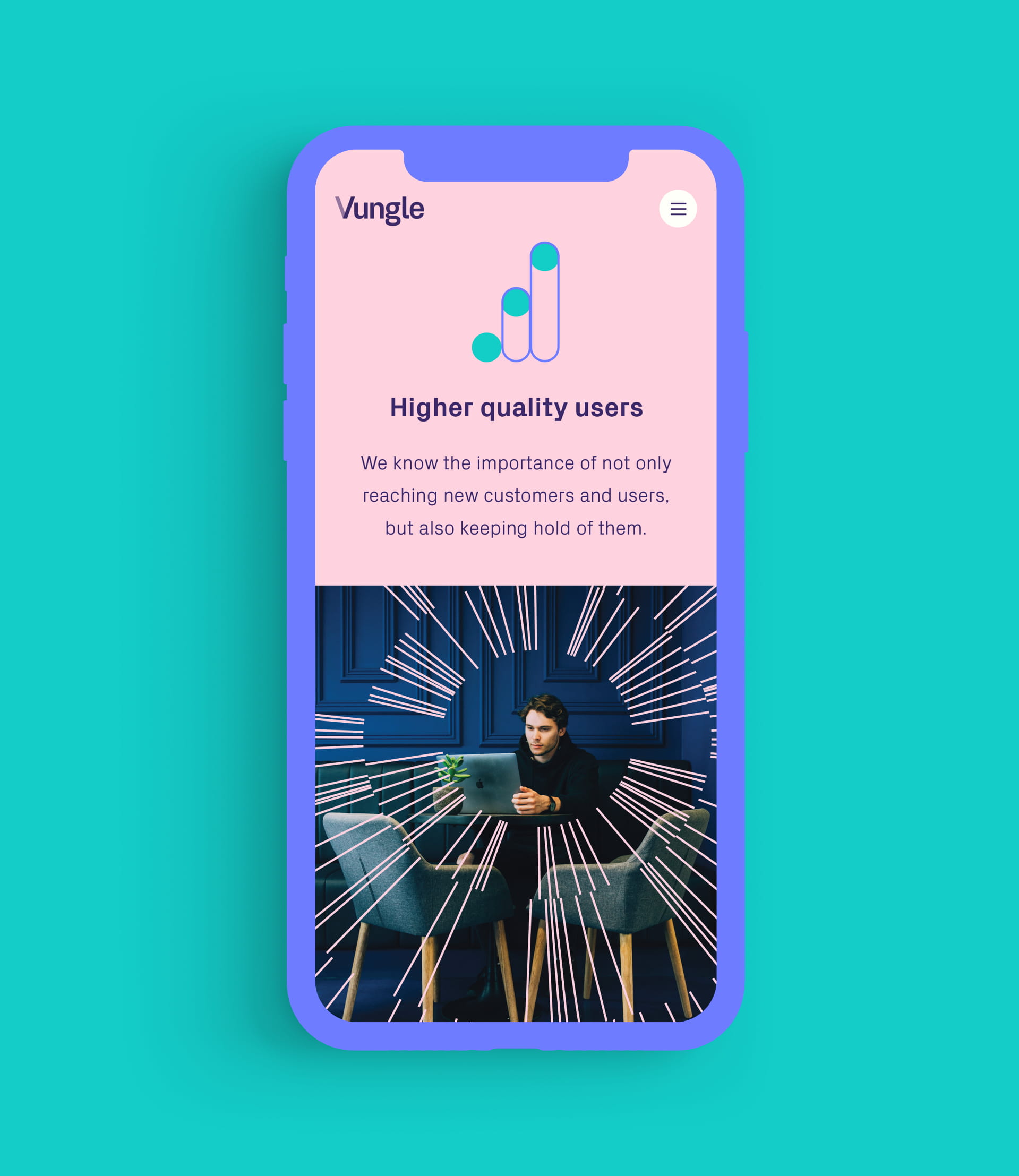
We delivered an innovative new website with a quality but playful look and feel. This was achieved using subtle animations and clever user journey mapping to bring the Vungle brand to life, driving sign ups to their SaaS platform.
The final website includes content in 4 different languages and enables the team at Vungle to tailor their content and marketing strategy to each regional audience.
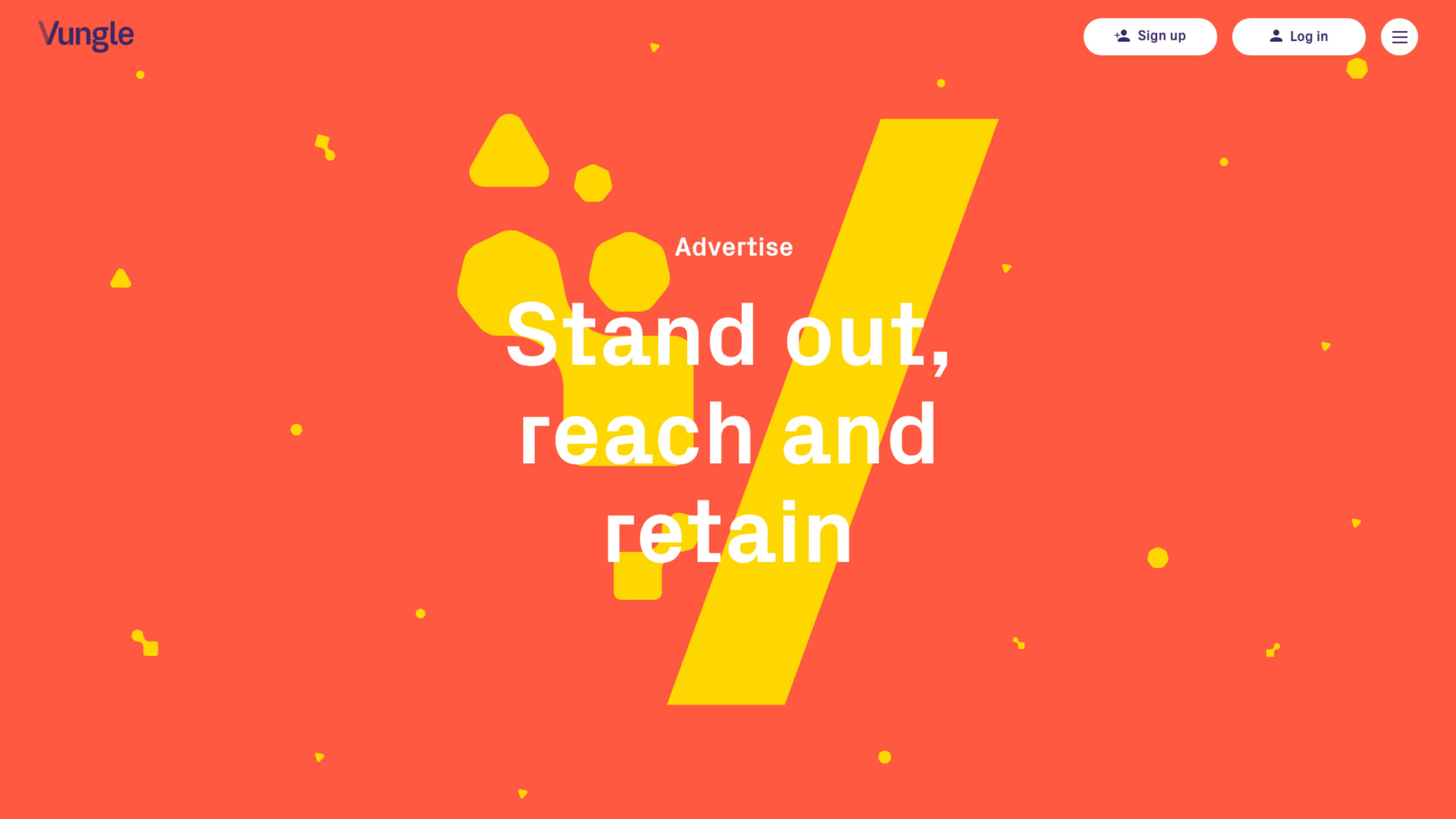
V Expression
‘V expression’ is a core component of Vungle’s brand and represents the message of “Creativity In, Performance Out”.
Animations
Our designers and front end developers worked closely together to create animations that reflect the Vungle brand.
Call to action
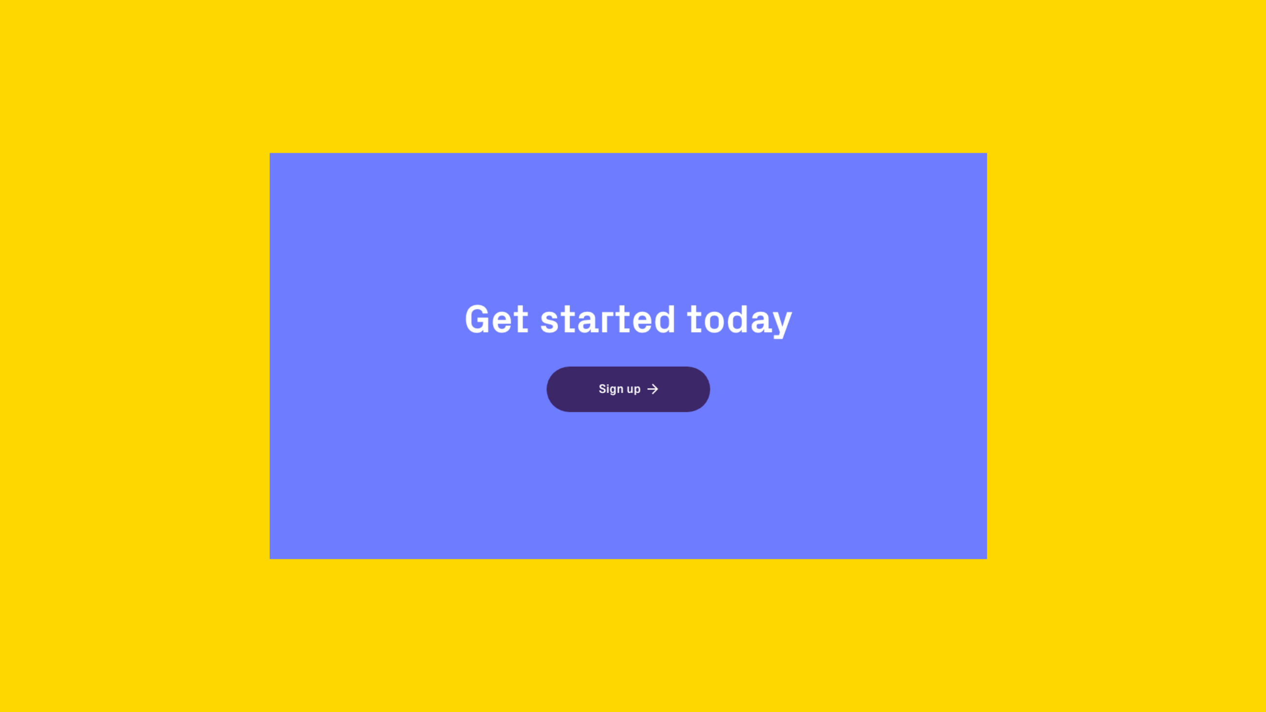
Vungle’s key call to action: ‘sign up’ features throughout the site to drive users to complete their user journey.
Seamless page transitions
Call to actions and banners animate together to create the illusion that the user has not changed page.

Implementing the brand
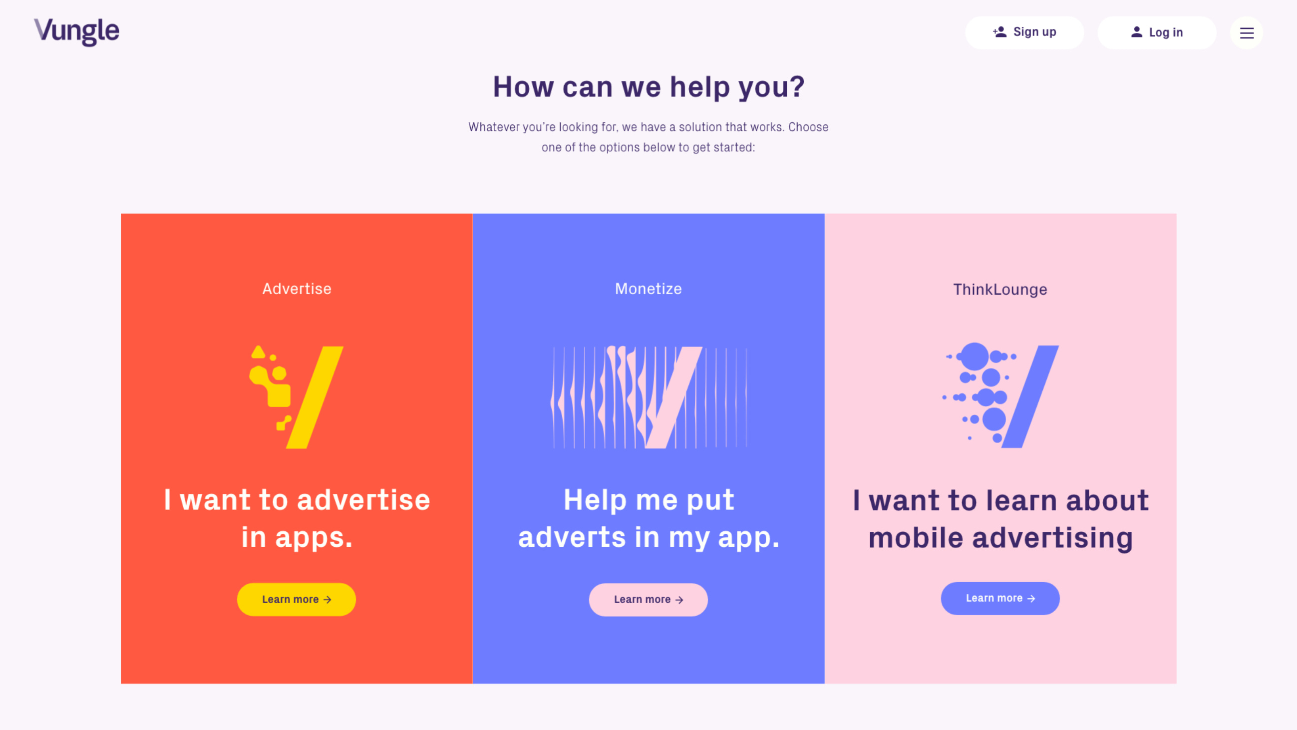
As part of a company re-brand by MultiAdaptor, Vungle’s three main services of Advertise, Monetize and Creative Labs were given their own colour palette and ‘V Expression’. We implemented these throughout the service pages to provide cues to the user about their location on the site and to highlight the user journey for each service.
Multilingual delivery
The Vungle website delivers content in 4 different languages, including English, Japanese, Chinese and Korean. We delivered the site on a single domain, using subdirectories to manage the content for each territory. We configured the WordPress CMS to enable simple content management of multilingual copy that uses both latin and non-latin character sets.
“Plug & Play have surpassed our expectations and delivered a website to smash our competitors. Their creatives really grasped the brief and brought some fantastic ideas to the table, pushing the boundaries for our industry. It’s early doors but we’ve already noticed a spike in sign ups since launch. They’ve brought the new Vungle brand to life and I can’t recommend these guys enough.”
Related work

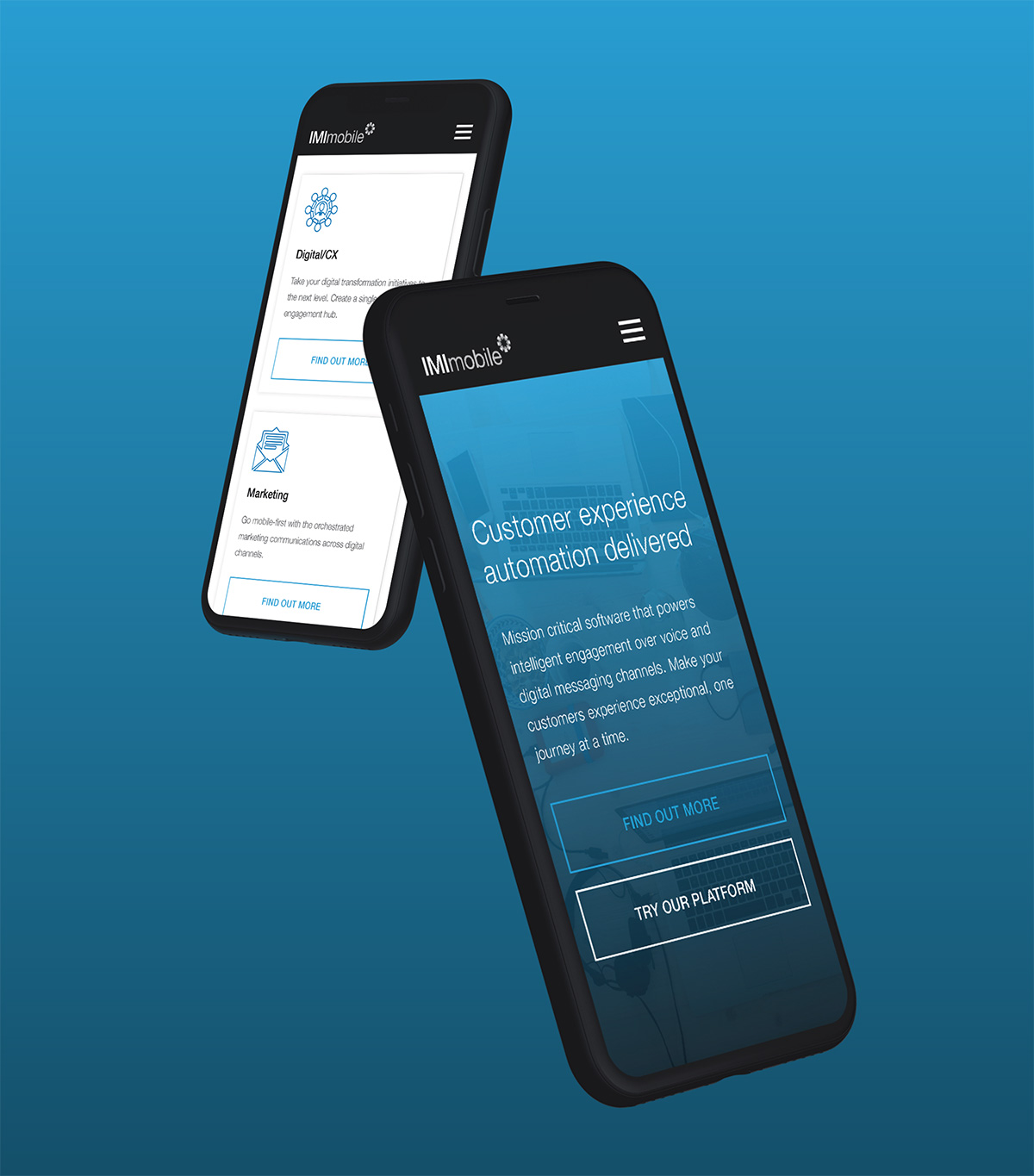
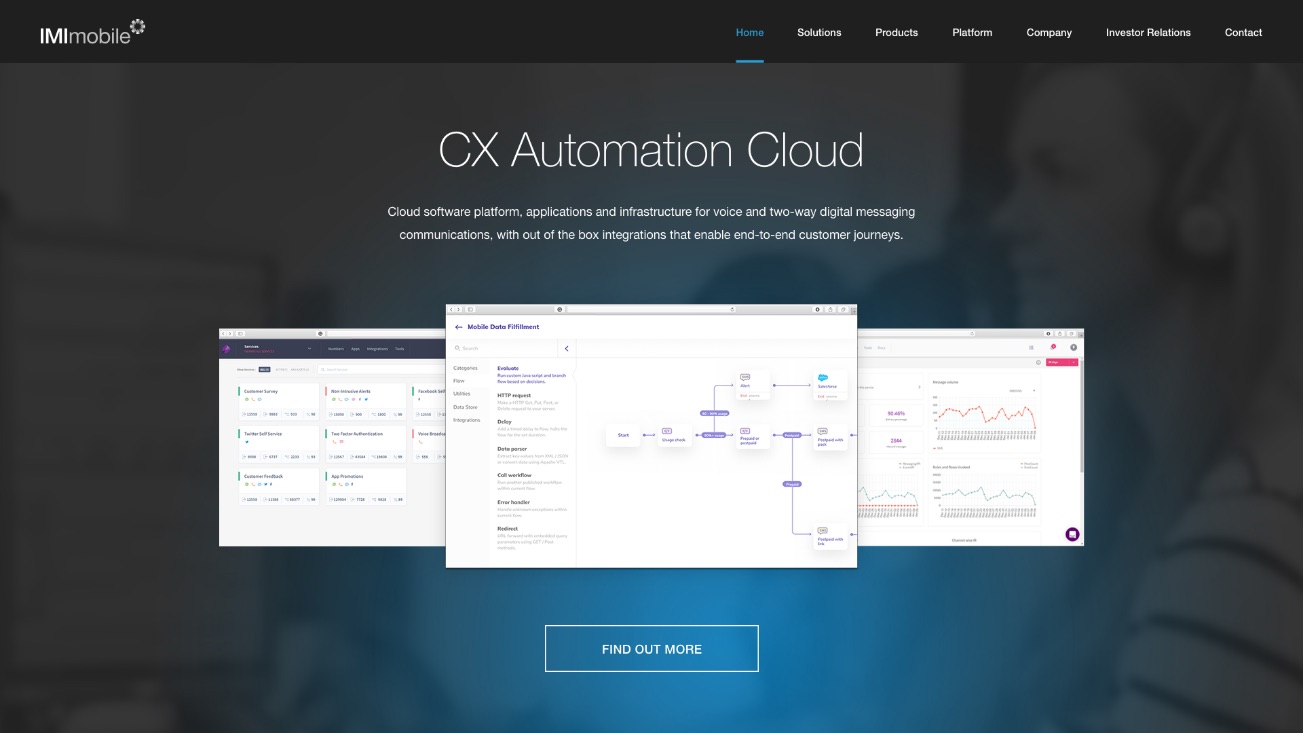
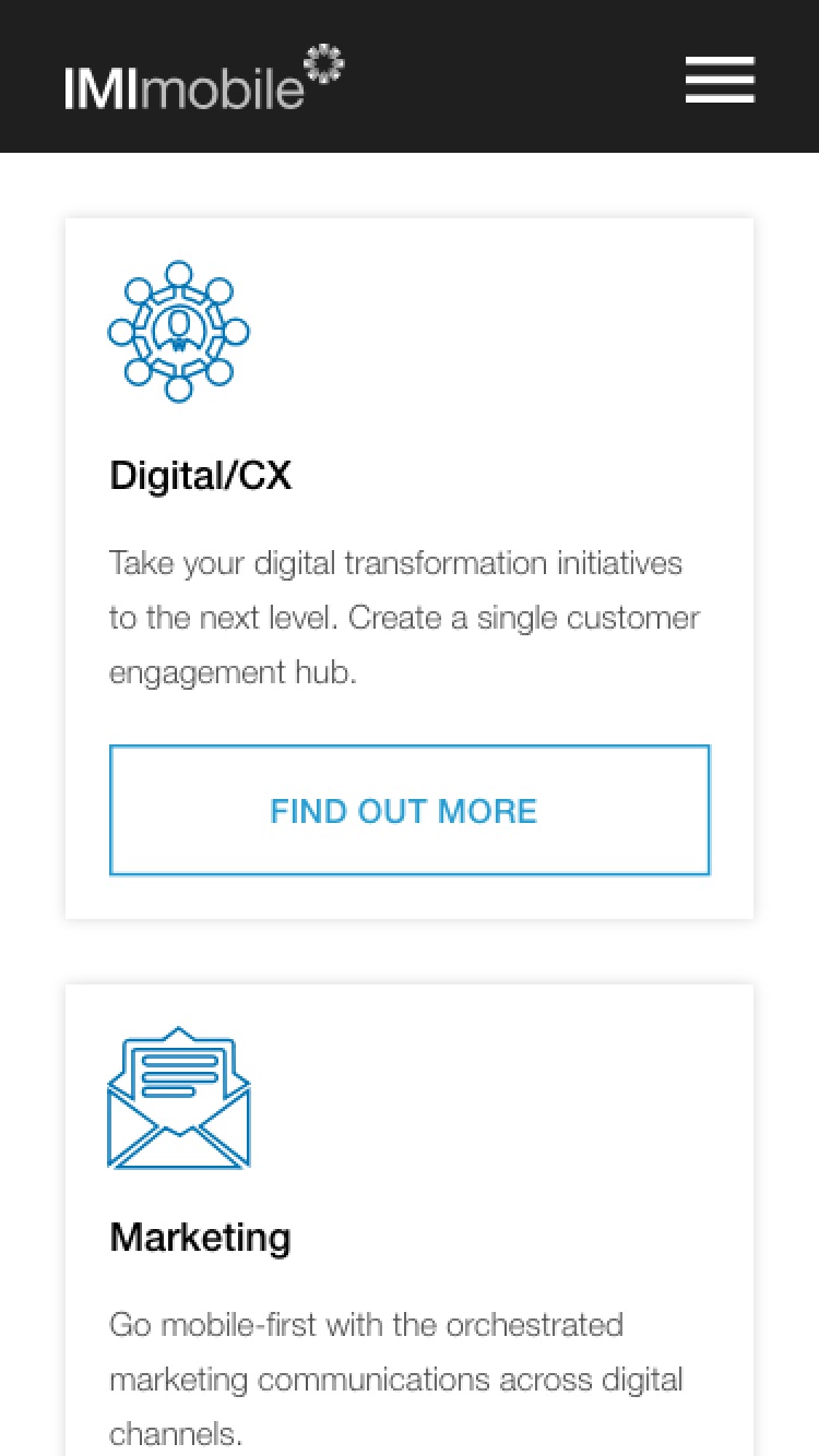
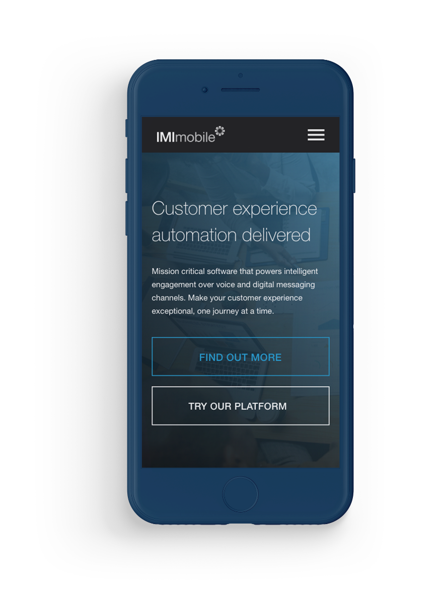
IMImobile
An enterprise WordPress solution for a global business
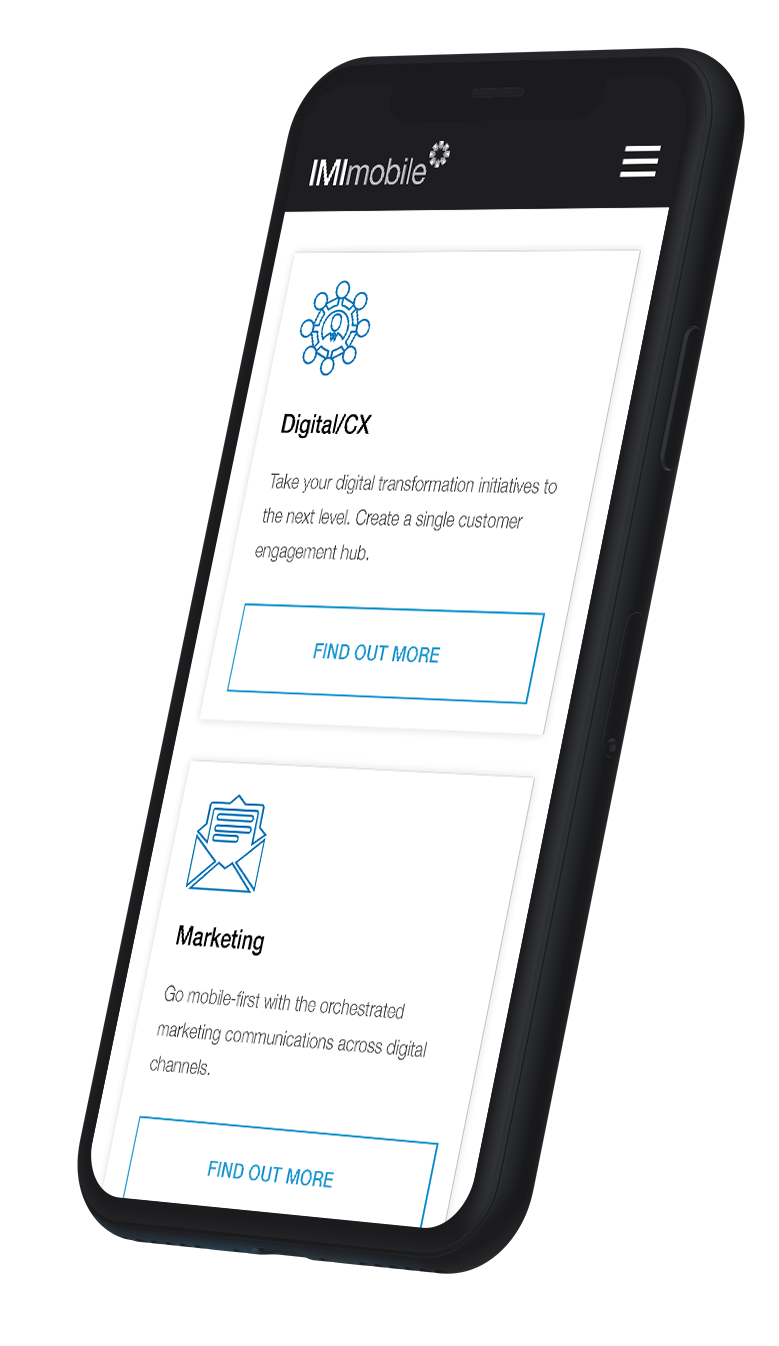
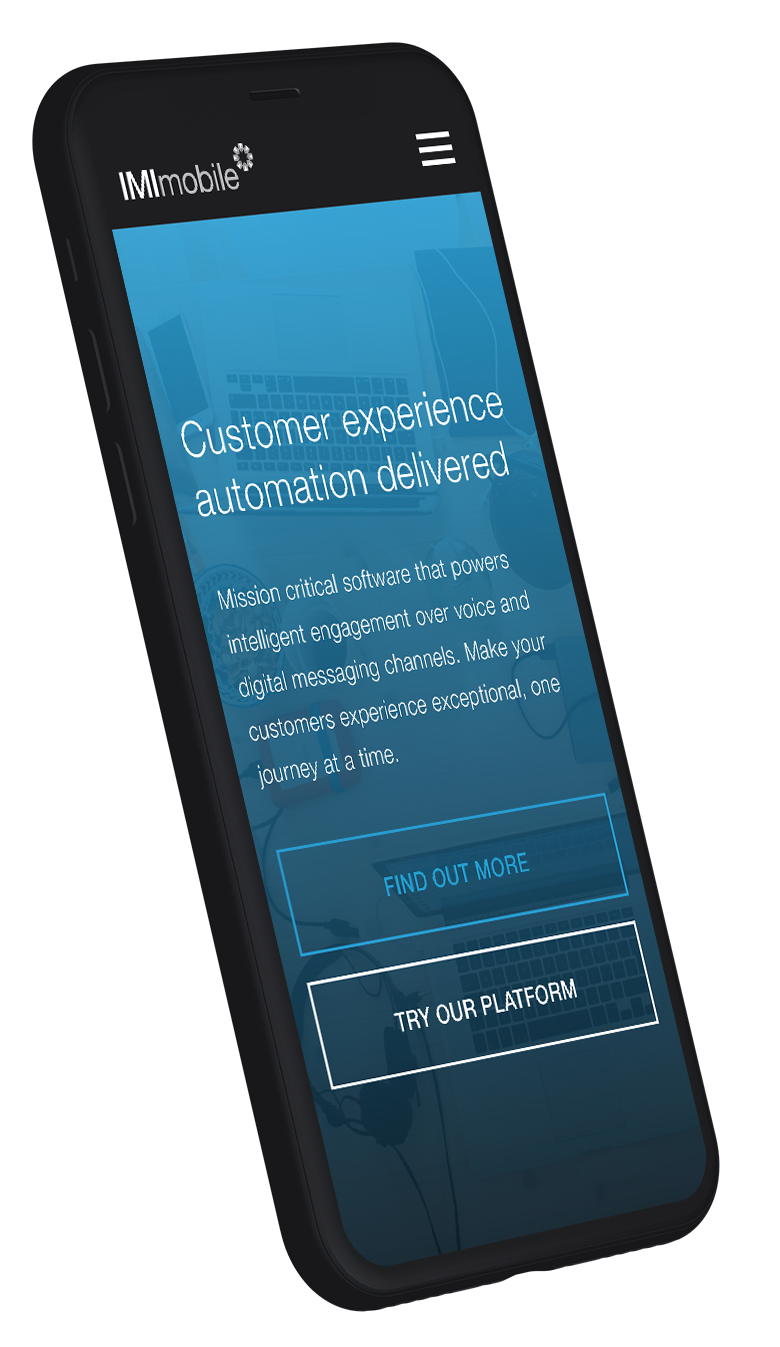
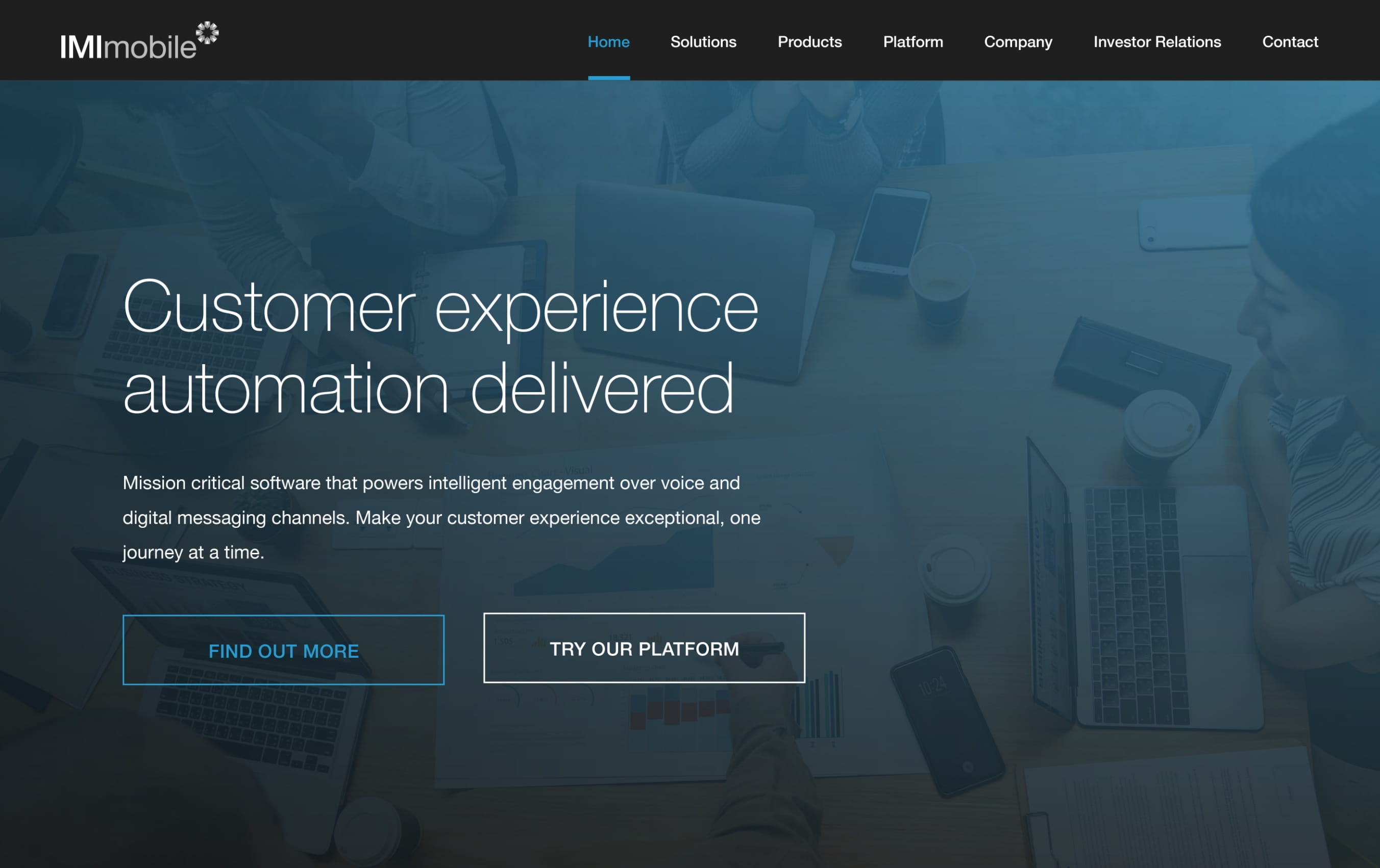
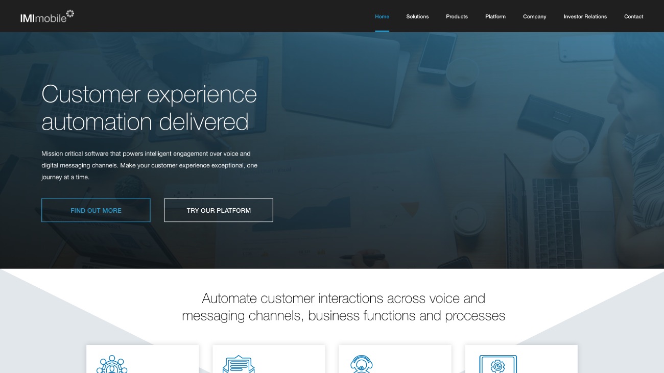
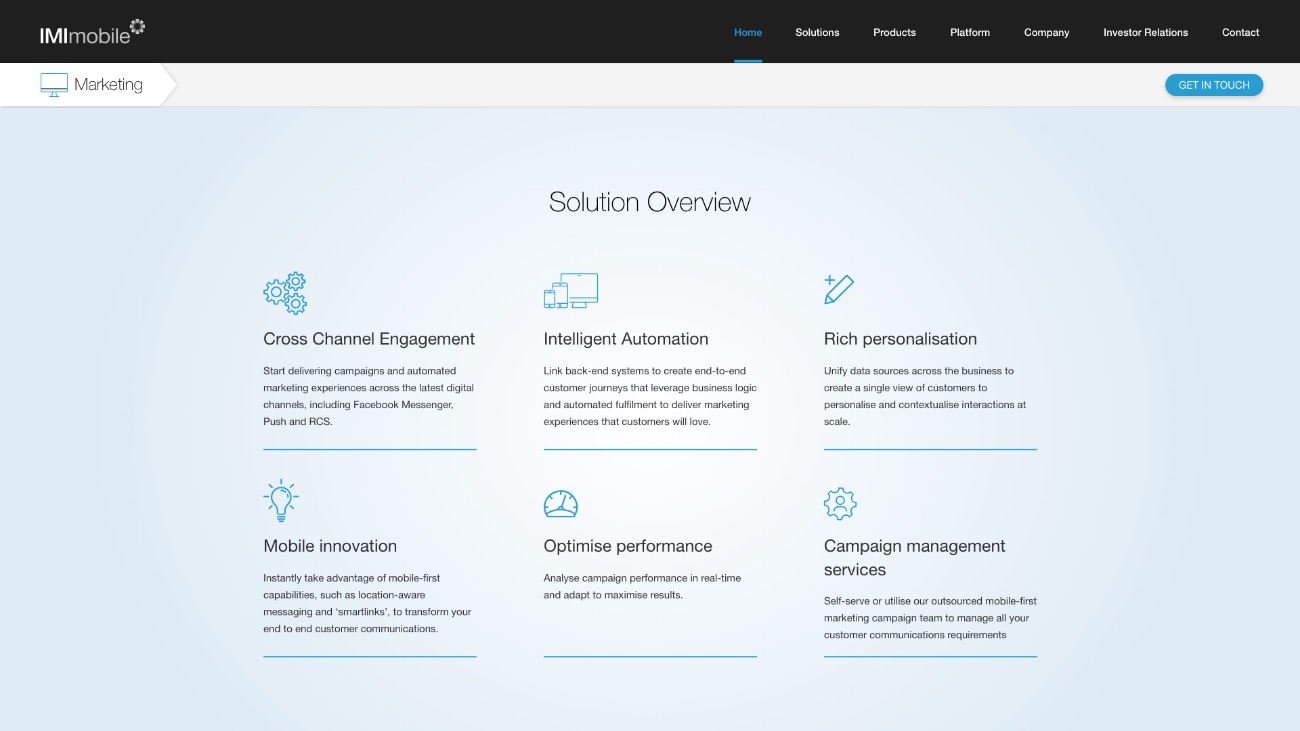
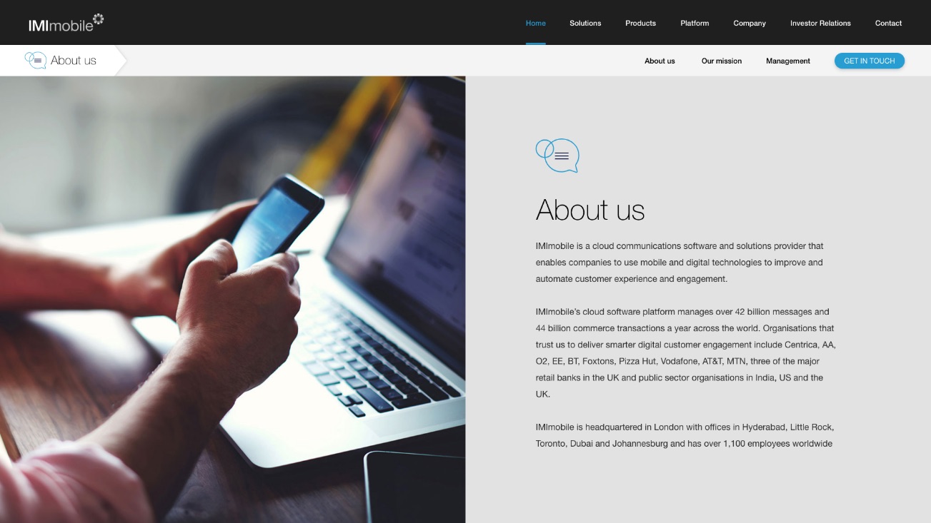
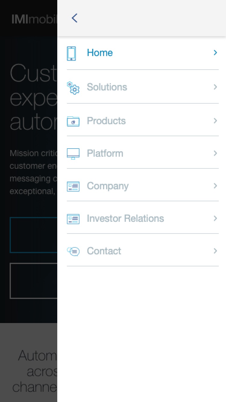
IMImobile are an enterprise software company listed on the AIM market in the London Stock Exchange. With an established and talented internal marketing team who were under pressure to deliver, we needed to collaborate closely to create a website that would enable their internal team to have more control and flexibility.
- Lead time:
- 3 Months
- Sector:
- Enterprise Software
- Target Type:
- B2B
- Demographic:
- Enterprise Organisations
- Website Goal:
- Generate New Enquiries
- Services:
- Web Design, Web Development, Digital Marketing
- Scope
- Custom Design
- WordPress
- Search Engine Optimisation
- Multi-Lingual
- Marketo Integration
- Resource
- 1x Marketing Strategist
- 2x Website Designers
- 1x Front-End Programmer
- 1x Back-End Programmer
- 1x Project Manager
- 1x Quality Assurance Tester
Challenge
Key to this project was understanding enterprise lead generation and buying cycles. With our experience in delivering compelling marketing to engage with enterprise customers, we were able to craft user journeys that would increase conversions from IMImobile’s key user archetypes.
Investor relations
As part of IMImobile’s obligations under the AIM market rules we needed to ensure that their share price, public reports, and documents were easily available.
Embedded animations
To bring the website to life we collaborated with IMImobile’s marketing team to develop micro animations that added movement and interest to their content.
Gated content
Working with Marketo, we enabled IMI’s team to publish their white papers as gated content, where users have to provide personal information to gain access.
In-context sub-nav
With complex products and service offerings we designed a sub-nav that scrolled with the page, making each section of the website easy to navigate at all points.

Design approach
We needed to create a long-lasting design that would increase visitor engagement. The website CMS needed to be easy for IMImobile to manage post launch as they regularly update banner imagery, text and PDFs.
On-going maintenance and support
IMImobile’s marketing team are very proactive and regularly make updates to their website. The CMS is intuitive and flexible so they are able to manage content without support from Plug & Play. IMImobile commissioned an ongoing retainer to develop new features and functionality to ensure that the website remained fresh, up to date and allowed them to innovate at the level they needed.
Related work

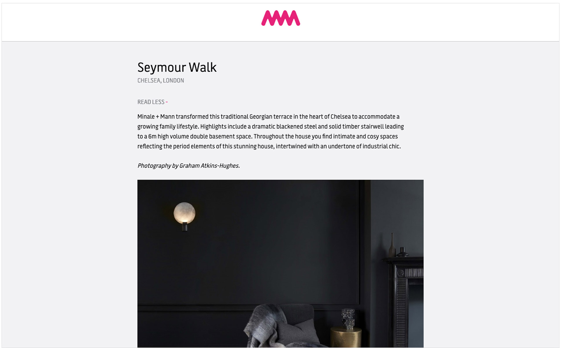
Minale + Mann are an exciting and vibrant architectural design and build company based in London. They approached Plug & Play because they were looking for high levels of attention to detail and quality.
- Lead time:
- 6 months
- Sector:
- Professional Services, Construction
- Target Type:
- B2C and B2B
- Demographic:
- Wealthy Property Owners
- Website Goal:
- Generate Enquiries
- Services:
- Web Design, Web Development, WordPress, Digital Marketing
- Awards:
- Webby Awards - Special Honours
- Awwwards - HM Award
- CSS Awards - Special Kudos
- Drum Design Awards - Highly Commended
- Scope
- Brand Identity
- Adobe XD Wireframes
- Adobe XD Designed Prototypes
- Digital Marketing & SEO
- WordPress CMS
- Digital Marketing Retainer
- Resource
- 1x Marketing Strategist
- 1x Digital Marketing Specialist
- 2x Website Designers
- 2x Front-End Programmers
- 2x Back-End Programmers
- 1x Project Manager
- 2x Quality Assurance Testers
Post-launch website results
We focused on transforming Minale + Mann’s SEO strategy which resulted in huge improvements to organic keyword positions including a 2,320,316% increase in search engine visibility.
Before and after
Post-launch keyword results
The challenge
This project was all about uncompromising quality. At every touch point we needed to deliver immersive aesthetic interactions with beautiful art directed imagery and video.

Built for SEO
As with all of our websites, the Minale + Mann code base has been produced to be highly semantic and in line with SEO best practices.
Fully content managed
Minale + Mann’s internal marketing team have been enabled to update content, text, imagery, layouts and menus with their WordPress CMS.

Touch optimised for mobile
The analytics of the old website highlighted that a high proportion of their visitors use mobile devices so the touch aesthetic was one of our key considerations.
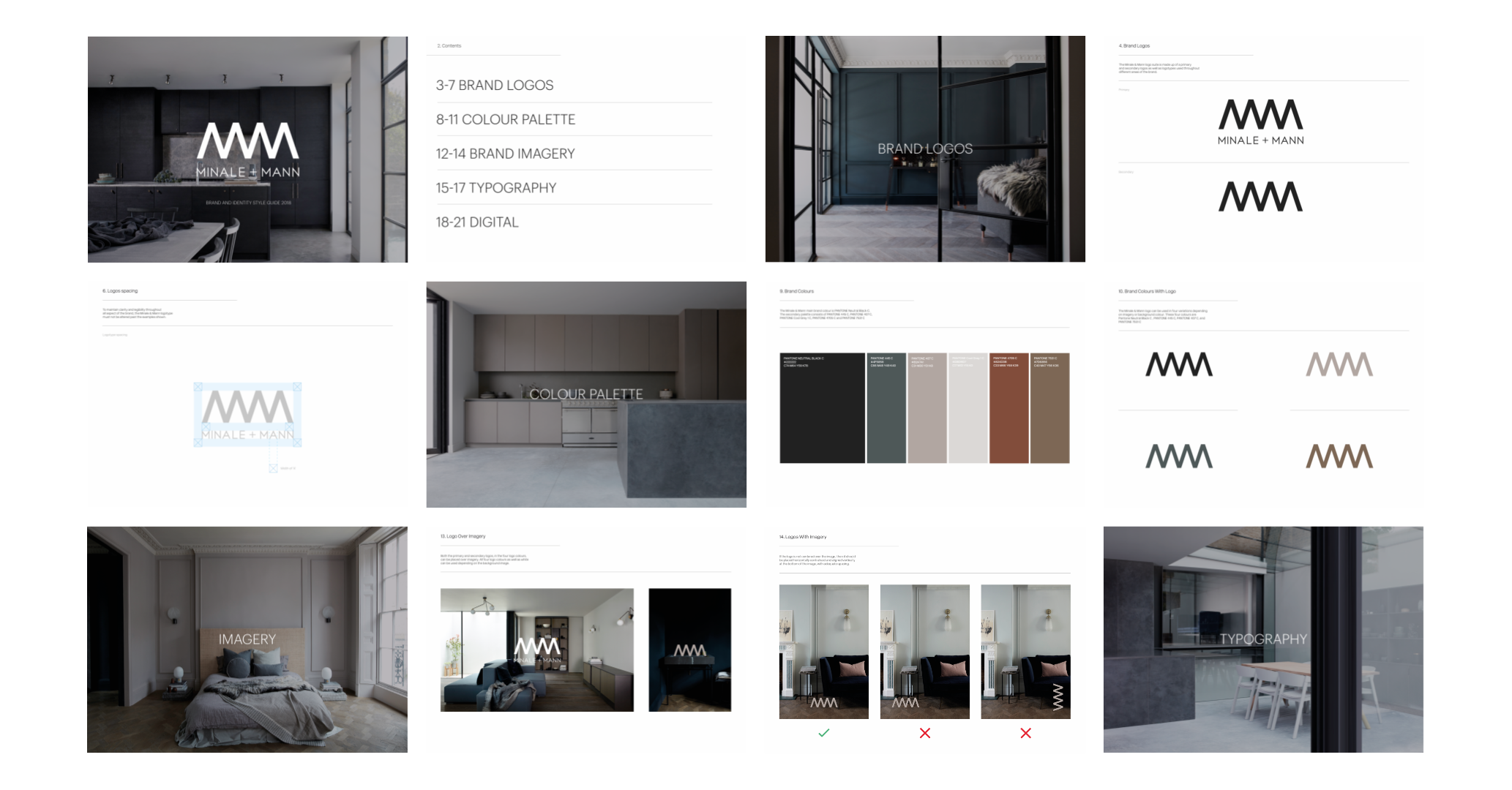
The brand
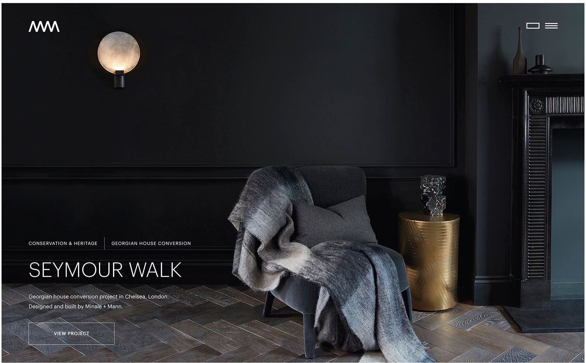
Minale + Mann already had an established brand identity but it didn’t reflect the “refined industrial” feel of their portfolio. They had outgrown their bright and playful brand and challenged us to create a sleek and sophisticated new identity.
Our approach was to elevate the brand by adopting a style and a colour palette that was in keeping with Minale + Mann’s architectural design ethos and would engage prospective clients visiting their website.
Brand Guidelines

“This has to be one of the sexiest, most sleek, graphically beautiful, efficiently performing websites out there! In other words……it’s ‘sh*t hot’! I am seriously thrilled with it”
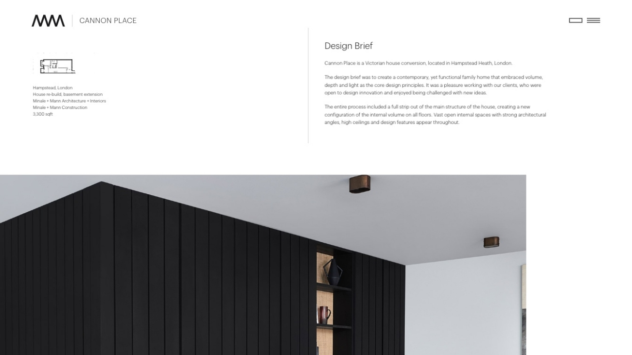
The website
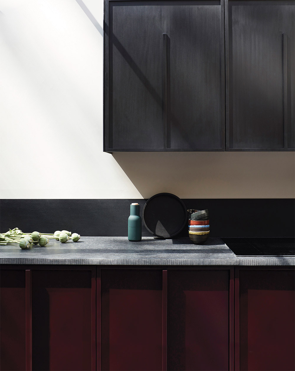
We created a beautiful image-led design system for the new website, incorporating the new brand to produce an elegant and high-end website design.
To achieve the premium finish that Minale + Mann’s target customers were looking for, we incorporated subtle animations and ambient video within the design. These provide an elevated dynamism that is effortless and engaging – enabling users to feel the quality. These effects include time lapse video footage, image animations that zoom and expand on scroll, and seamless page transitions.
Our developers coded the website using WordPress to give Minale + Mann’s marketing team maximum content dexterity. The new website code base is fast, best practice and scalable.
SEO strategy
Minale + Mann were ready to scale their business and expand their market share. Their existing lead generation relied heavily on the founders’ reputations, networking and word of mouth. They knew that to step up, they needed to open up new sales channels.
Minale + Mann’s start point was relatively poor – they ranked in the top 50 for a couple of keywords which was a great sign that search engines recognised what they did. However, from a user perspective, nobody was finding them on page 4-5 of Google. Their competitive metrics were fairly average – they had some leverage to secure rankings but we needed to be strategic to make sure that our work would drive meaningful improvements to their bottom line.
Our SEO strategy focused on identifying keyword targets that users were searching to find architects like Minale + Mann and were in a buying mindset. We selected keywords that Minale + Mann could realistically achieve and would generate new business for the firm.
Our SEO specialists optimised the website, using content that the client already had to secure new rankings.
Results
The new website has significantly increased Minale + Mann’s market penetration which has had a huge impact on Minale + Mann’s lead generation and revenue. The new website generates high quality traffic from aligned prospective customers and converts visitors into high quality leads.