A strong brand goes beyond aesthetics—it should drive real business impact by building recognition, boosting customer engagement, and enhancing credibility in the marketplace.
Research shows that consistent branding can increase revenue by up to 33%, highlighting the importance of investing in a well-defined brand identity. A cohesive and memorable brand not only sets you apart from the competition but also ensures your message resonates with your audience.
But what does great branding look like in action? Here are some of our favorite brand projects from recent years.
If you’d like to speak to our team about your brand, call 0203 0111 641 or email us at [email protected].
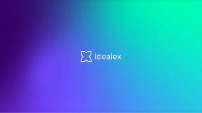
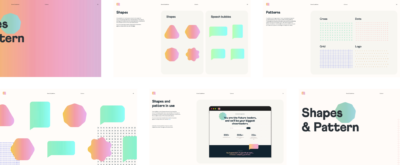
1. Idealex
Idealex is a next-generation banking app challenging the likes of Revolut and Monzo. Ahead of its launch, we partnered with them to craft a compelling brand story and visual identity. Centered on financial freedom and reliable access to financial services, the brand reflects innovation and trust. We developed a bold, tech-forward color palette and a dynamic system of shapes and forms to bring their identity to life.

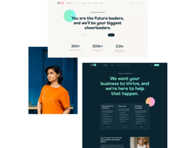
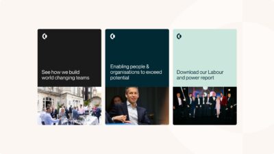
2. Give A Grad A Go
Give A Grad A Go is a graduate recruitment agency operating in the UK and Australia. We worked with them to create a playful brand identity that resonates with recent graduates by evoking a sense of nostalgia. Inspired by friendly, familiar brands like WhatsApp, we designed a collection of sticker-style shapes, hand-drawn icons, and sketchbook-inspired patterns—giving the brand a fun, approachable, and relatable feel.
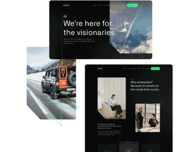
3. Bond Global
Bond Global is a forward-thinking recruitment agency that partners with technology companies to tackle environmental challenges. Together, we refined their brand story and messaging, positioning them as the go-to agency for recruiting the visionaries of tomorrow—because there’s no Planet B.
The brand identity embraces a technical and futuristic aesthetic, combining bold, bright colors with dark themes and dynamic shapes to create a striking and innovative visual presence.
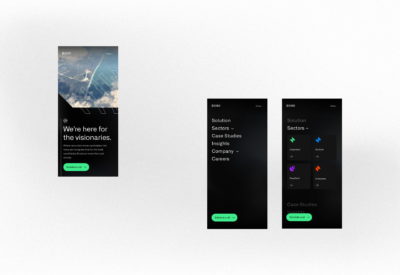
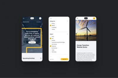
4. IPFA
IPFA connects public and private sector organisations to facilitate new infrastructure projects. The not-for-profit needed a new professional brand to build trust and attract new members.
As a content-led organisation, IPFA needed a brand and design solution that reduced the reliance on imagery. We created a series of animated brand shapes and patterns to create dexterity and enable IPFA’s marketing team to streamline their creative process.

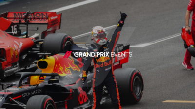
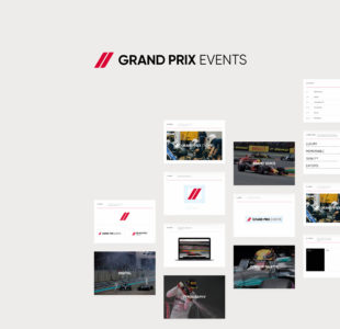
5. Grand Prix Events
The formula 1 ticket retailer needed a new look and feel that would appeal to customers and enable them to diversify to new sports. Together, we evolved the existing brand to deliver a premium visual identity with an eye-catching colour palette and interactive brand elements.
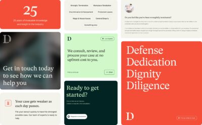
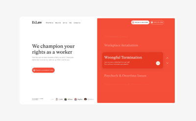
6. D.Law
D.Law is a California based law firm that specialises in employment law. They were undertaking a brand name change and needed an approachable and empathetic brand identity to attract new clients. Their challenge was that their previous brand looked like every other corporate law firm, with no clear point of difference or visual alignment with the clients that they wanted to attract. We worked with D.Law’s Marketing team to create a forward-thinking brand that took inspiration from disruptors in insurance and finance industries to create something that would cut through the legal market.
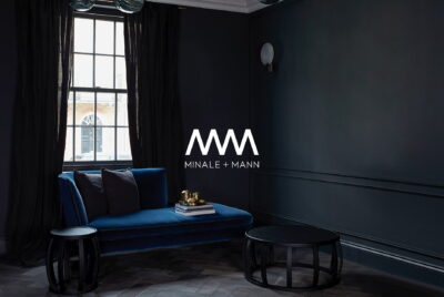
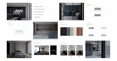
7. Minale + Mann
Minale + Mann is a luxury architecture studio in London. They understand the impact of high quality design and worked with us to overhaul their visual brand and design system. We delivered an elevated brand identity that is sophisticated and appeals to Minale + Mann’s target audience. The brand reflects the Minale + mann’s refined industrial architectural style, using sleek shapes, an earthy colour palette, and beautiful high quality imagery.
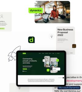
8. Dynavics
As a tech company operating in a saturated market, Dynavics needed a new brand identity to set them apart from competitors. We implemented a distinct and playful brand that leverages a bright colour palette, illustrative icons, and flexible shapes to create a stand-out visual design style.
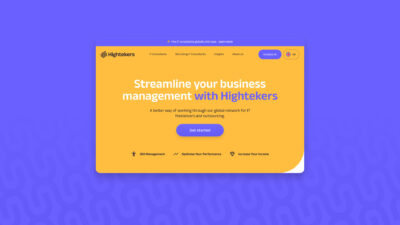
9. Hightekers
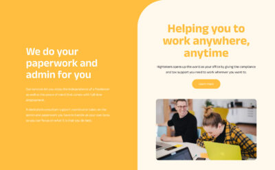
Hightekers supports businesses hiring for fixed-term contracts by simplifying the onboarding and management process. With ambitious international growth plans, they needed a flexible brand strategy and identity to support their expansion. While their existing brand had strong elements, it lacked depth, consistency, and a modern touch.
To elevate their brand, we introduced a refreshed color palette, incorporating a versatile secondary set with both soft and bold tones for greater flexibility. Drawing inspiration from the logo, we also developed a dynamic brand pattern—adding energy, direction, and visual interest to strengthen their identity.
10. Toothpic
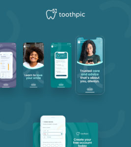
Toothpic is a pioneering tele-dentistry company offering 24/7 digital access to dentists. Having scaled rapidly, they needed a refreshed brand identity and a more dynamic set of assets to give their marketing team greater flexibility.
To support their growth, we refined their brand positioning to better connect with their target audience and revamped their website to enhance their online presence. The new identity balances a soft, clinical aesthetic with the innovation and personality of a tech company—positioning Toothpic as a cutting-edge software provider in the dental space.
11. Enigma
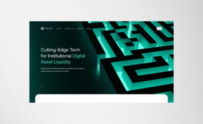
Enigma provides reliable, secure and innovative cryptocurrency trading solutions to their clients internationally. Our brand designers created a dynamic brand identity that is compelling, cutting edge and clean, achieving a high-tech look that represents a digital product in the crypto market.

12. Compass Carter Osborne
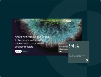
Compass Carter Osborne (formerly Compass Executives) is a specialist executive search agency, dedicated to sourcing top-tier talent for senior leadership roles. Following a recent merger, they needed a new name and a refreshed brand identity to mark this next chapter in their evolution.
Our challenge was to craft a brand that seamlessly transitioned their design system while embodying their future vision. The result is a sophisticated identity that resonates with senior executives and reflects the core values of diligence, empathy, and intelligence.
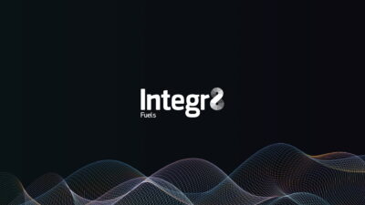
13. Integr8
Integr8 were ready to rebrand and represent their position as the market leader in bunker fuel trading. They wanted to break away from the branding standards of the shipping industry (blue colour palettes and pictures of ships) and create something new.
Using a dark base colours, our brand designers introduced a new colour palette and deep gradient patterns. The introduction of a dynamic wave shape underpins the identity, and can be used statically and dynamically for different platforms.

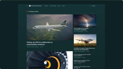
14. Aerospace Global News
Aerospace Global News needed a brand to represent their news outlet on the international stage. Having renamed, we collaborated to create a brand new logo and brand identity. The outcome is an elevated identity that leverages shape and form to create depth and flexibility in their visual toolkit.

Speak to our team about your brand