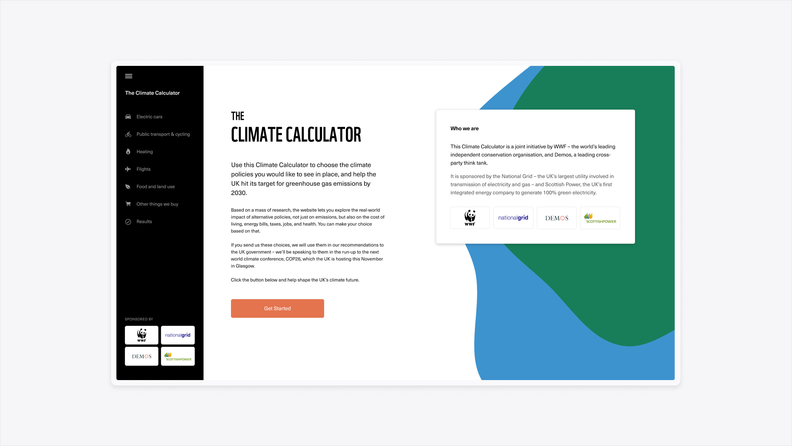
Demos is an independent charity that exists to promote education and research that benefits the public. They partnered with The World Wildlife Fund (WWF) to undertake a large-scale survey of public opinion on environmental policies.
They commissioned us to design a web application interface that could be used to conduct a national research survey.
- Lead time:
- 8 Weeks
- Sector:
- Environment & Politics
- Target Type:
- B2C
- Target Demographic
- General Public
- Website Goal:
- Create an engaging campaign that will capture public attention and provide data
- Services:
- Workshopping, Concept Creation, User Testing, UX & UI Design
- Scope
- Solution Strategy
- UX/UI Design
- Adobe XD Clickable Prototypes
- User Testing
- Front-end Development Consultancy
- Resource
- 1 x Strategist
- 1 x UX Designer
- 1 x Project Manager
- 1 x Front-end Developer
The challenge
The purpose of the survey was to test public opinion on a number of complex environmental issues and their related policies. WWF and Demos needed to communicate the consequences of policy change and gather information on which changes the public were willing to make in order to achieve environmental change.
The complexity of the information was the greatest challenge. We needed to rapidly communicate detailed information and keep engagement high.
The concept
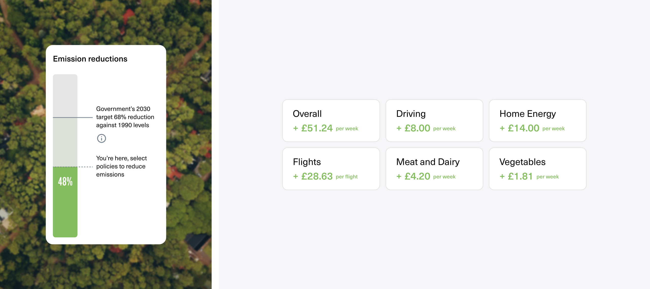
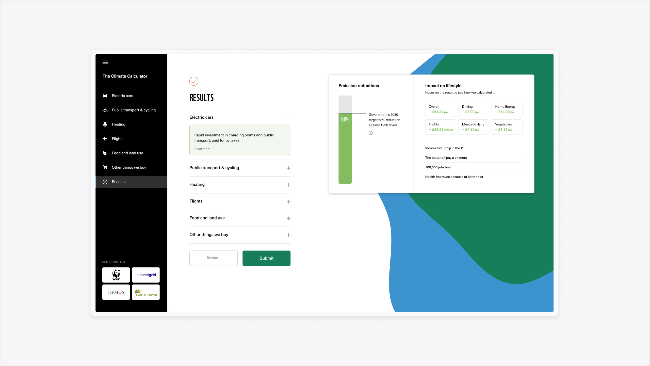
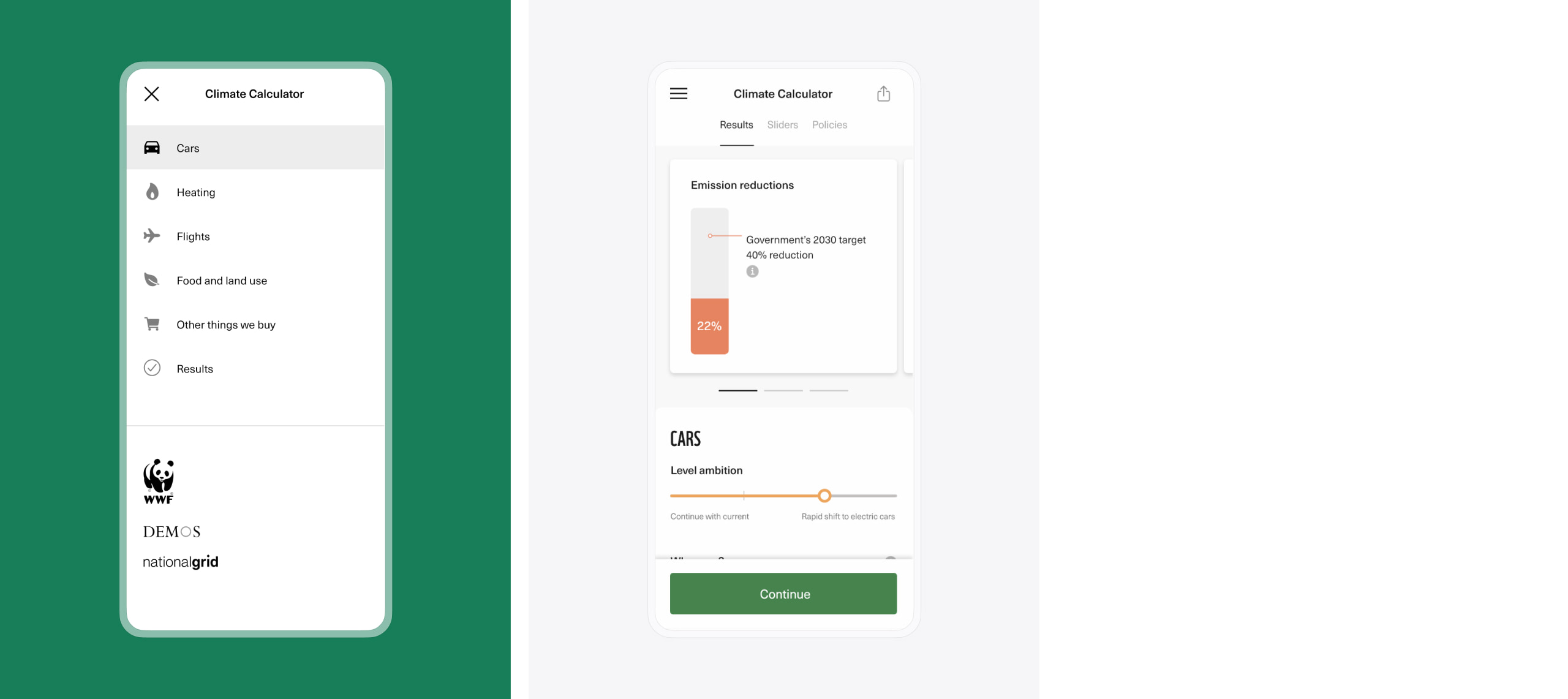
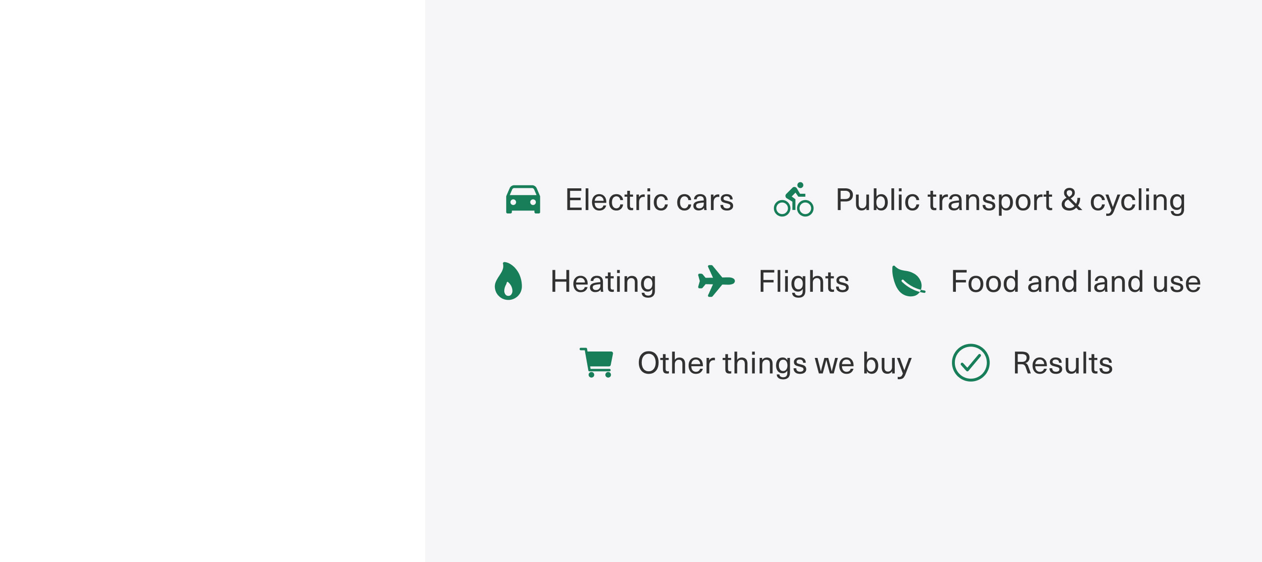
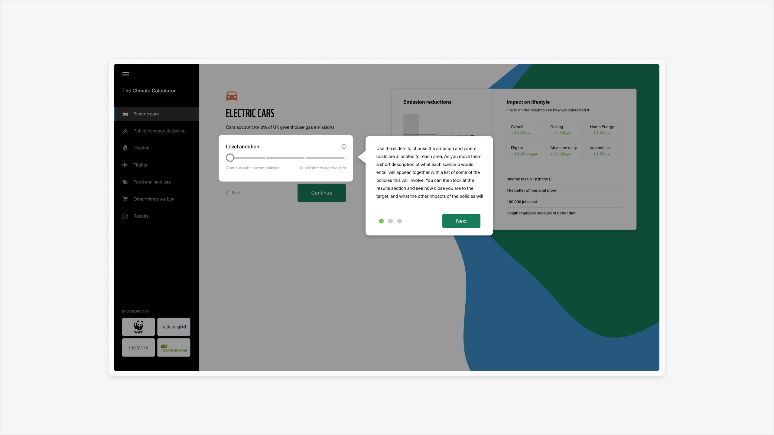
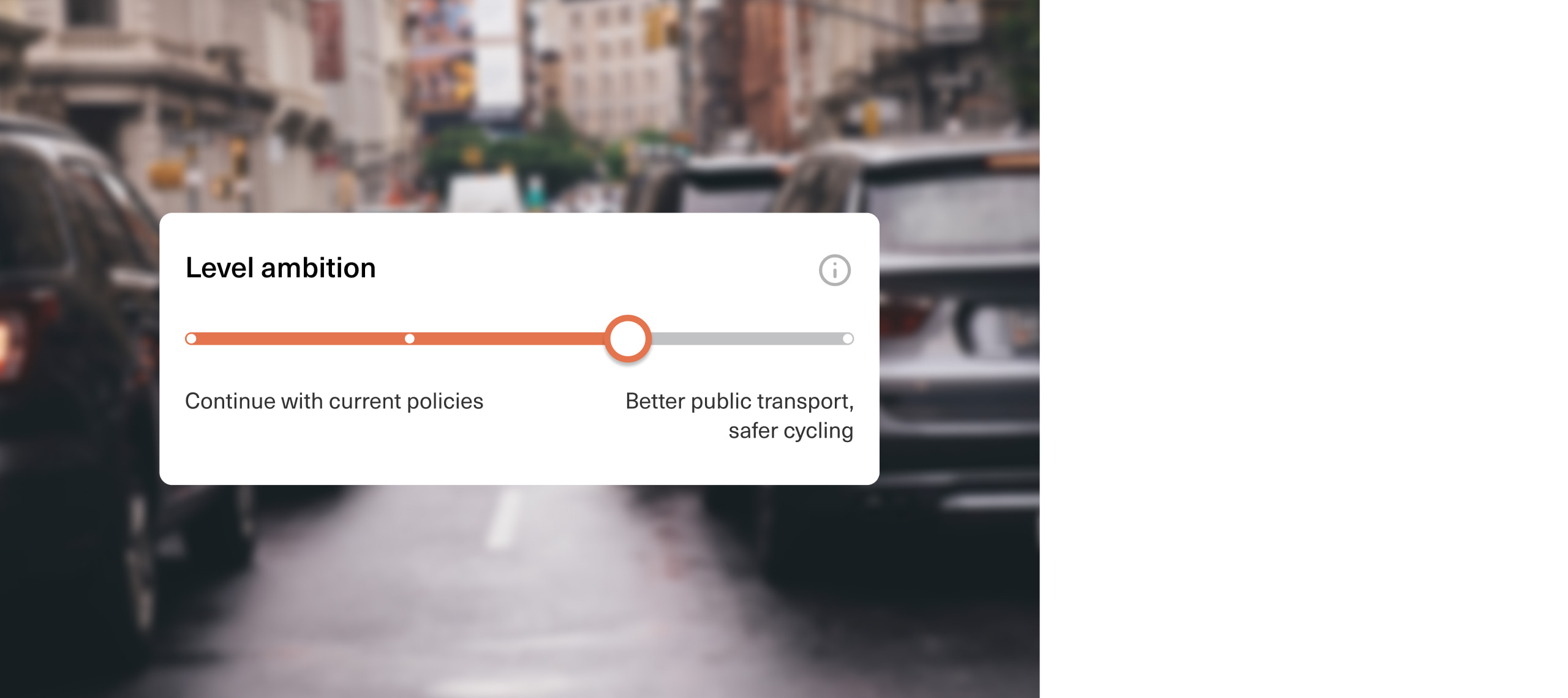
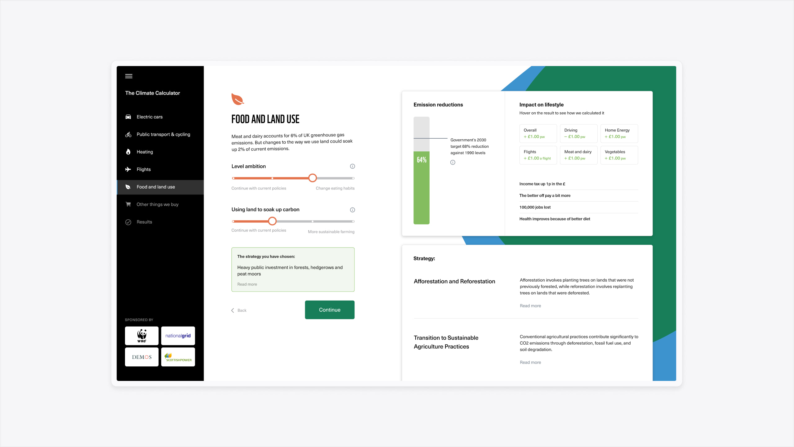
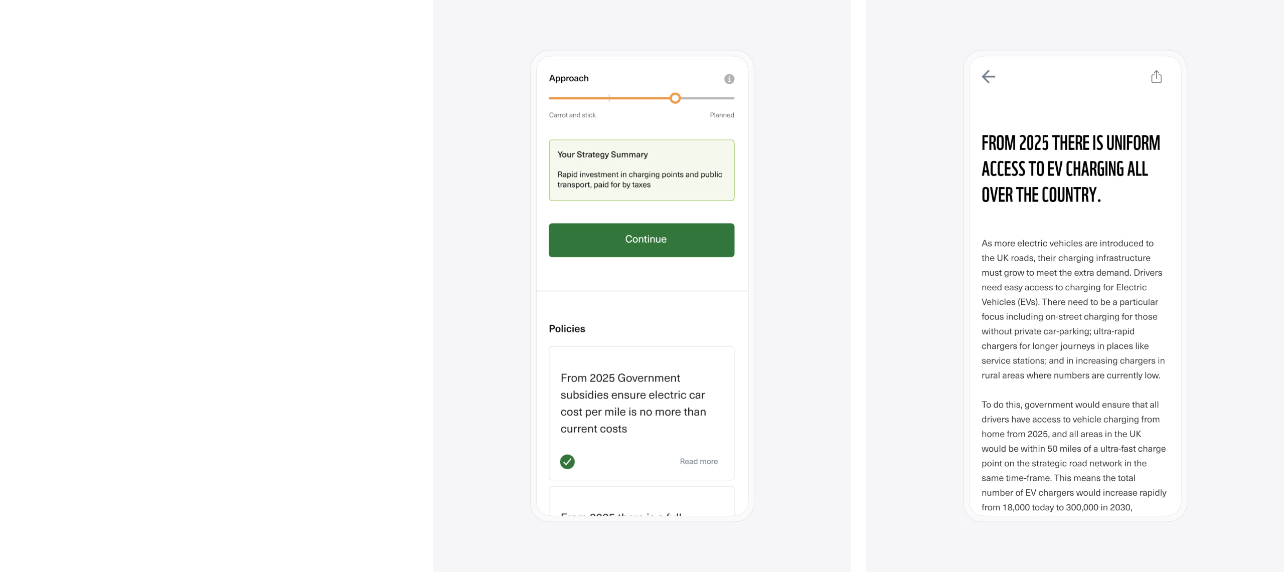
Our team created a ‘This or That’ design concept for the survey which provided a structure with which most users would be familiar. Each ‘This or That’ scenario presented the financial impact of an environmental policy vs how it would lower carbon emissions. For example by increasing taxes on flights you could pay for better domestic insulation. Users could select their preferred option from the presented scenarios.
The use of a familiar game framework for the survey design enabled us to accelerate user onboarding time and retain the attention of individuals participating in the study.
The “Blue Peter” problem
One of the issues we overcame in the design process was the very human issue of perception. For those of us raised in the UK, the visual aid of a thermometer has long been used to represent the success of charity fundraising; such as on tv programs like Blue Peter. This visual aid has trained a generation of people that “thermometer going up = good”, which sadly isn’t the case when it comes to climate change or carbon emissions.
To address this issue, we designed two variants of the interface design. One of the variants used a bar chart visual that went down to represent the carbon emissions reducing. This was consistent with an example on the UK Government website. The second variant was more true to Blue Peter; a bar that went up to achieve the goal.
The two variants were qualitatively tested with user groups in collaboration with Demos. The ‘winner’ was the Blue Peter version – where the chart went up to reach a target. As such the bar had to represent ‘emission reductions’ rather than ‘emissions’; as these were of course going down.