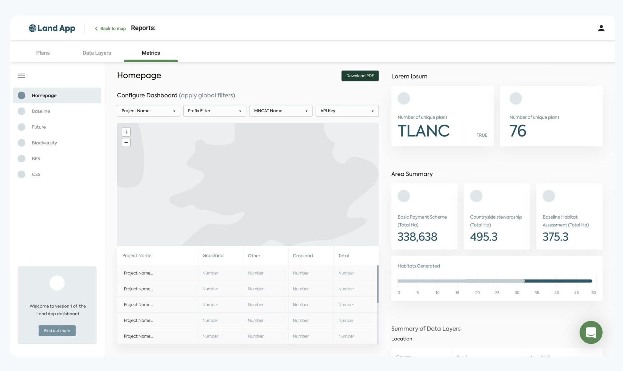
Land App is used by land owners to map, track and manage their land. Predominantly used by farmers and surveyors, their platform simplifies the land management process.
The Land App team approached us to deliver a new mobile app that could be used by their clients in real time. The mobile design needed to be an extension of the web app design and incorporate some additional mobile-specific functionality.
- Lead Time:
- 5 Months
- Sector:
- Agriculture / Technology
- App Goal:
- Extend mobile functionality, Deliver a strong mobile UX
- Services:
- UX Design & UI Design, Mobile App Design
The goal
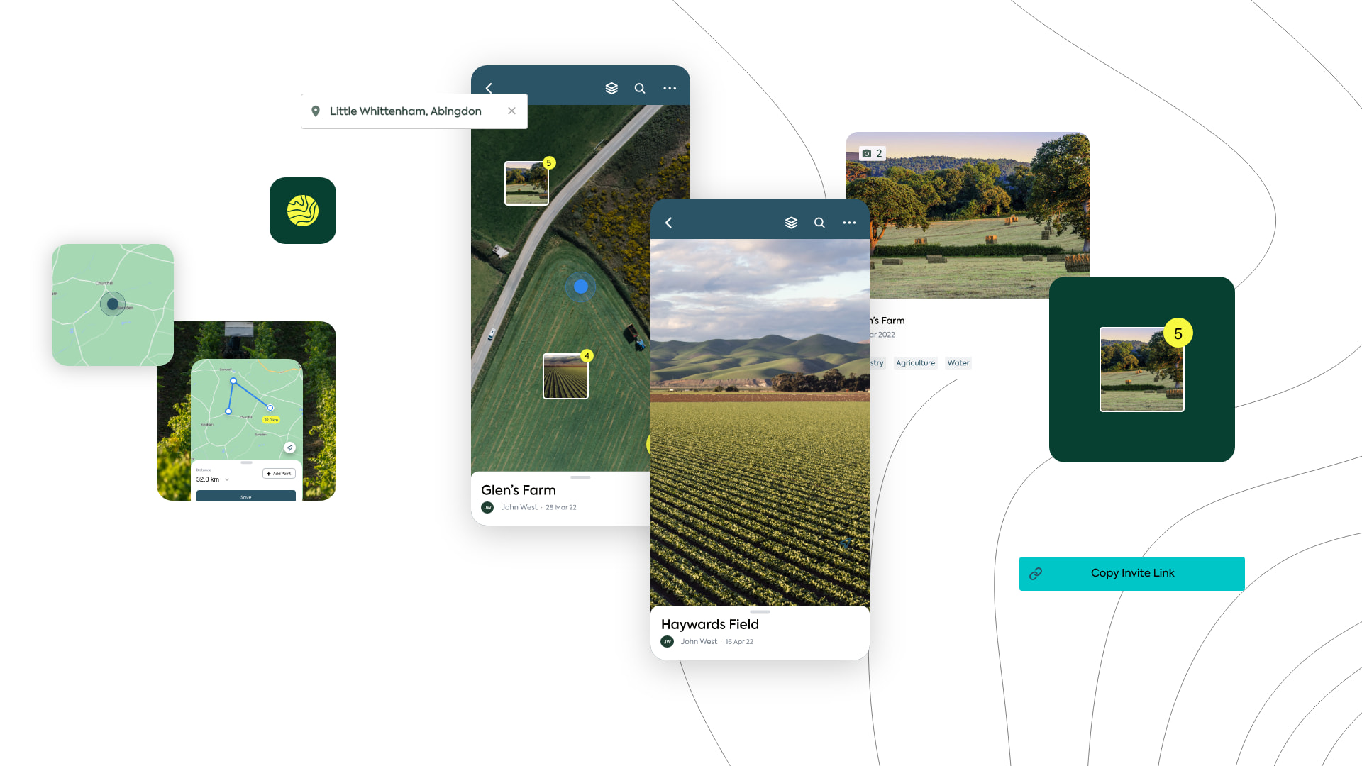
Our goal was to reduce the manual administration effort involved in the day to day management of land. Traditionally, land owners would walk their land taking offline measurements and notes, then upload them to a spreadsheet or platform at a later date for storage. Land App’s new app would incorporate GPS and measurement tools to assist with the land mapping process, enable updates to be recorded live, assign tasks to employees, and synch with the existing database.
- Scope
- User Experience Workshops
- Research & Discovery Phase
- User Flow Mapping
- Low Fidelity Prototype
- High Fidelity Design
- Design to Development Handover
- Resource
- 1 x UX Designer
- 1 x UI Designer
- 1 x Product Manager
The onboarding experience
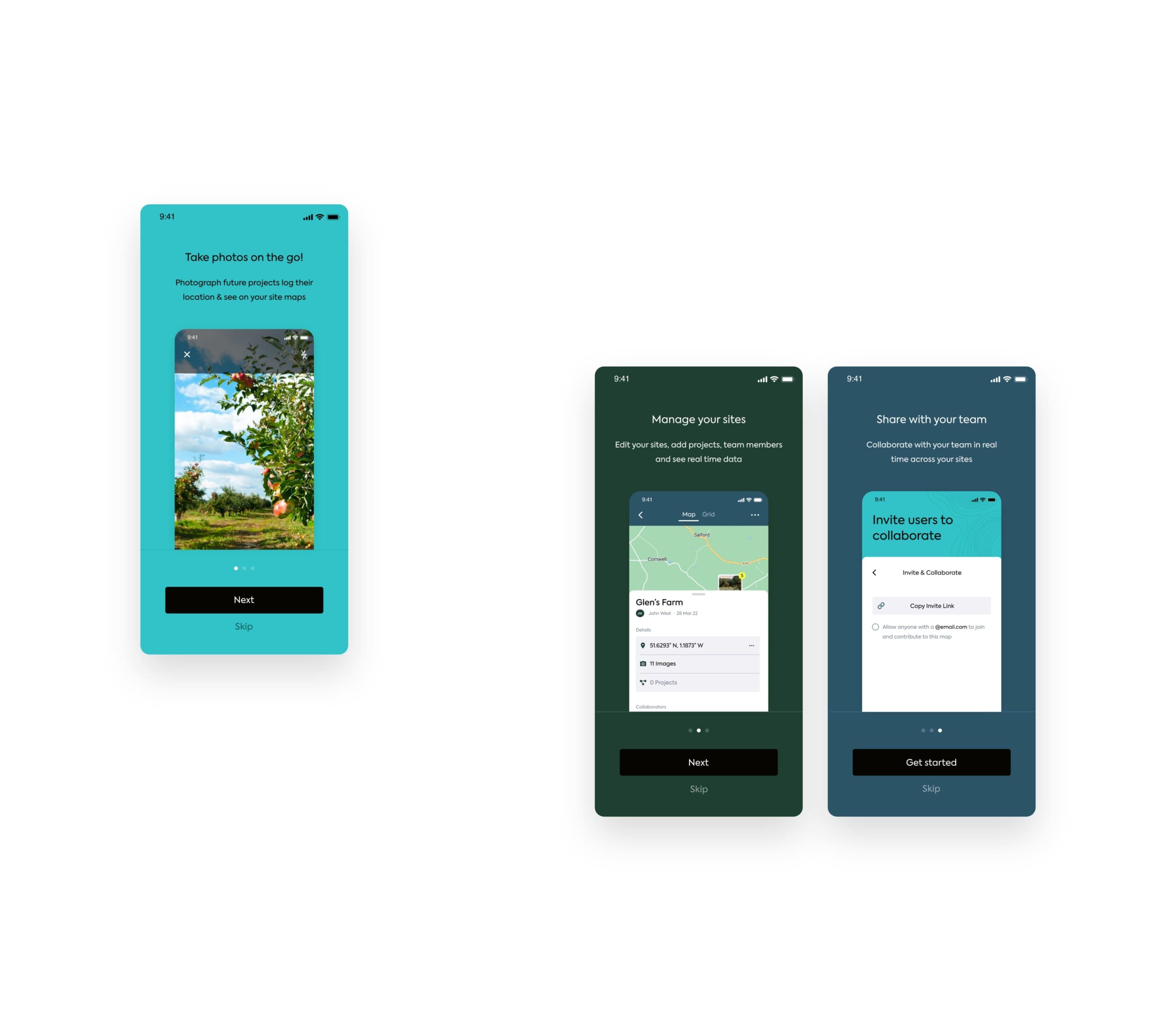
Land App’s core user demographic is time poor so it was critical that the onboarding process was smooth. We created a short introductory experience using splash screens to highlight the key app functionality and get users set up.
The mobile user journey dovetails with the core journeys on desktop to provide a seamless omni-channel experience.

Map creation
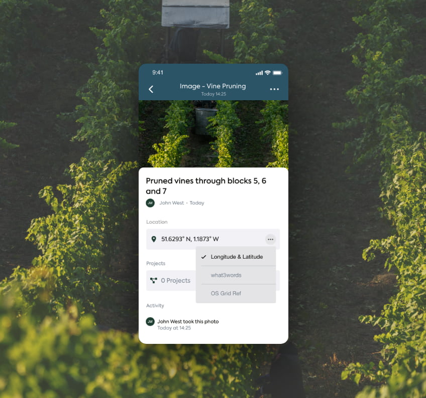
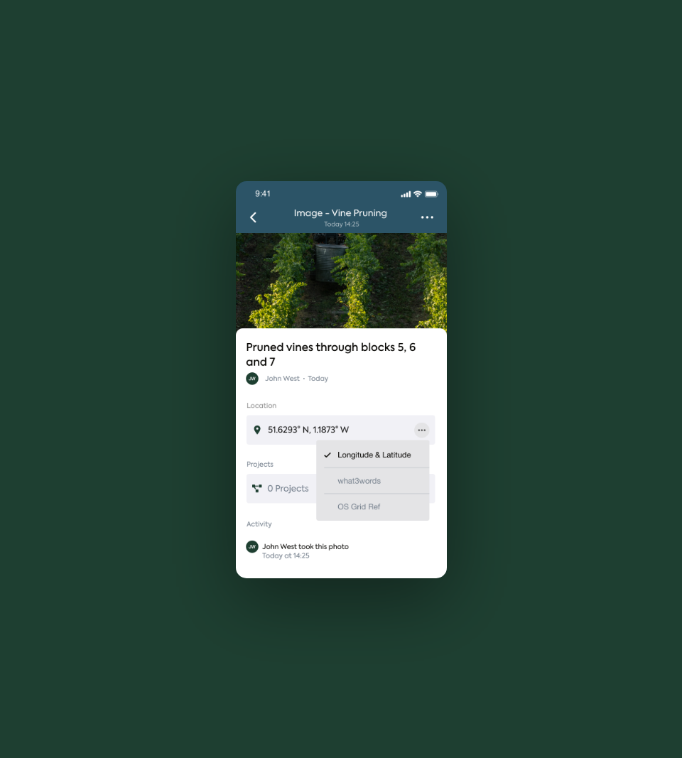
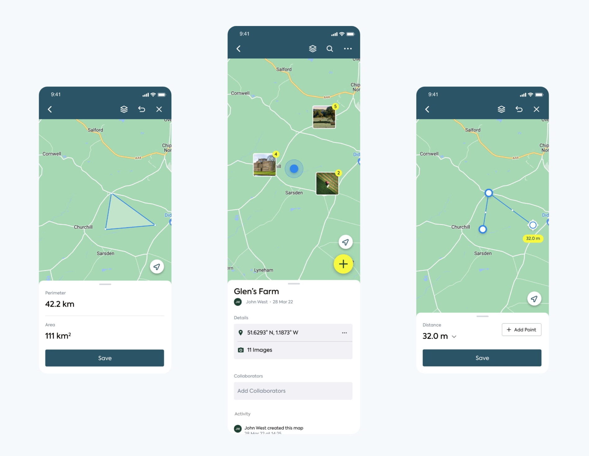
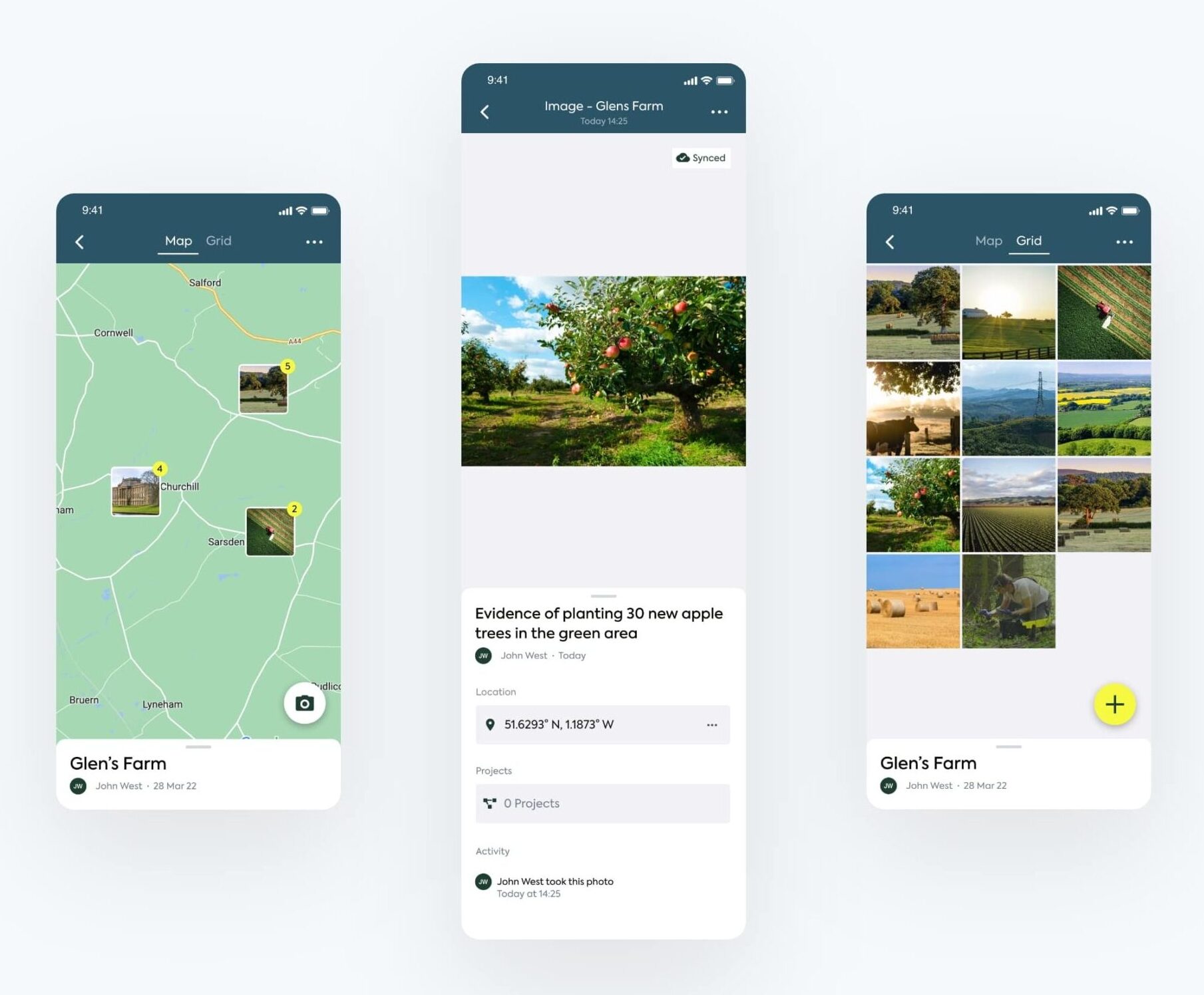
Users can take land measurements via the mobile app and create maps of their land. We designed location tagging functionality that enables users to upload images and assign tasks associated to a location on the map.
Tasks can be tracked and managed over time, providing visibility on workload.
Omni-channel user experience
The mobile app is designed to synch with the web app, delivering a cross-device user experience with consistent data.
Design handover
We collaborated with Land App’s development team to deliver the design system, files and assets needed to code the app.
“The app is going live very soon, and we’re very happy with the UX design. We’ve shown it to a few customers, who’ve been impressed. All the designs were created with technical feasibility in mind, which shows.
Plug & Play collaborated seamlessly with the other companies that were involved in the project. We were nervous about the project because it was a big challenge, and Plug & Play made the process easy. They also quickly understood our use cases and adapted quickly to learn what we needed. Overall, we had a very positive experience working with them.”
Related work
Property Hub is a business that aims to demystify property investment and help individuals plan for their financial future. They approached us to help them create a property investment app and launch it into the market.
Their new app needed to enable its users to invest in the property market and build a property portfolio. Much like popular investment apps like Money Box and Nutmeg, Property Hub’s goal for their mobile app, Portfolio, was to make investing accessible to everybody.
- Lead Time:
- 3 Months
- Sector:
- Fintech & Banking
- Demographic:
- High Net Worth Individuals
- Target Type:
- B2C
- App Goal:
- Launch a mobile investment app into the market
- Services
- Research, UX Design, Mobile App Design
The challenge
Property Hub challenged us to create a brand new mobile app for their investment platform. They were entering the market as a challenger investment app and needed to create a seamless user experience that would enable users to confidently invest.
As a financial product, the app needed to be compliant with financial regulation and conduct identity checks on users as part of the sign up process. A common challenge with Fintech products is the drop off rate of sign ups while verification takes place. We needed to create an onboarding flow that would capture and retain the interest of investors during the verification process.
- The approach
- Client Workshops
- UX Research & Discovery Phase
- UX & UI Design
- Low Fidelity Mobile Prototype
- Design to Development Handover
- The schedule
- 1 x Senior UX Designer
- 1 x Senior UI Designer
- 1 x Product Manager

Research & discovery
Our UX team critically reviewed a number of investment apps to gain insight into the products available in the market, what the competition was doing well, and where we could add value to users that would enable us to capture a significant piece of the market upon launch.
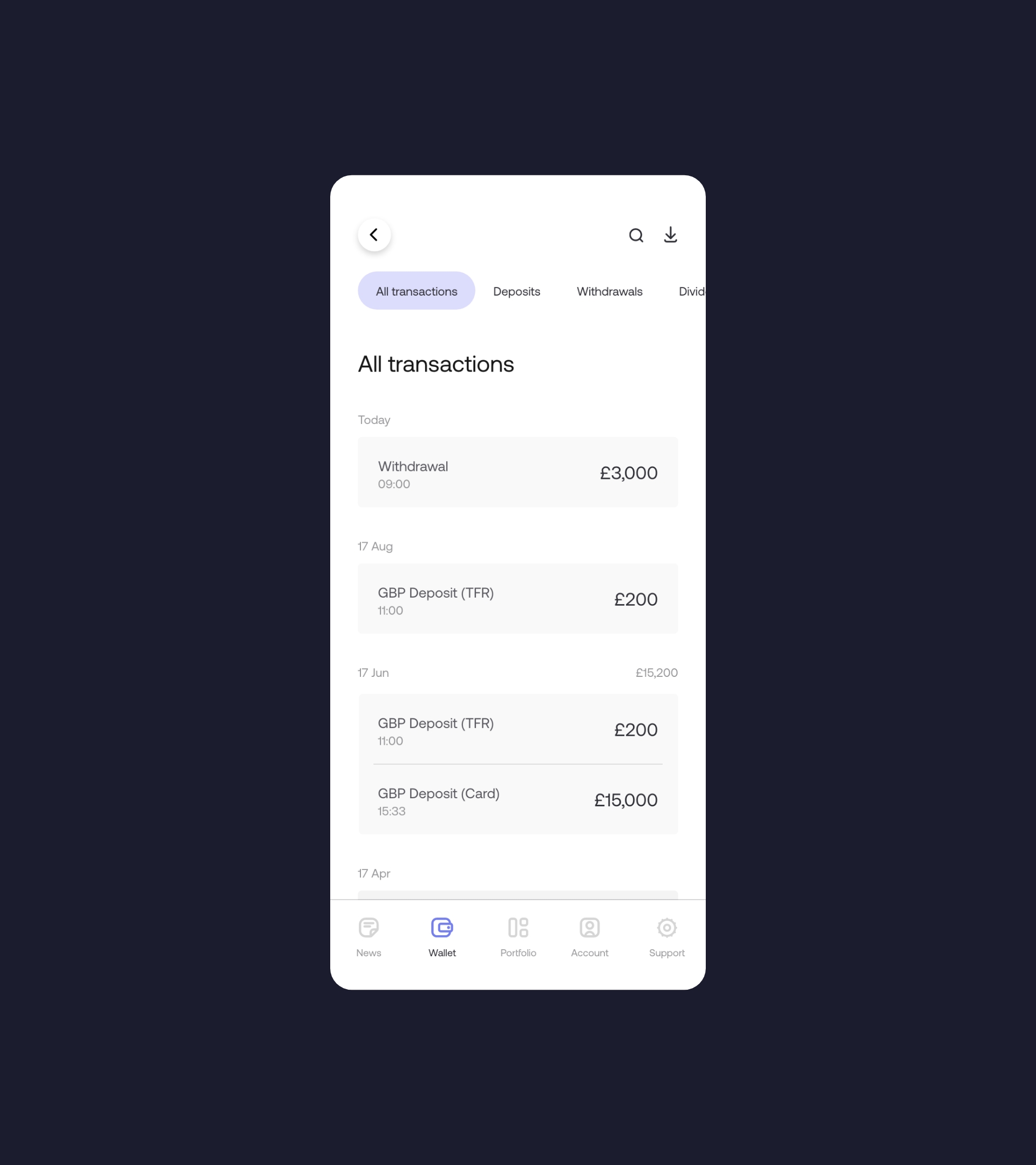
We assessed direct competitors of Property Hub, as well as mobile apps available in the broader investment and financial markets such as Apple Pay and Transfer Wise. We reviewed the way that competitors onboarded new users and led them through KYC verification. Our research also assessed the user journeys for key investment actions such as depositing and withdrawing funds and managing a portfolio.
Onboarding flow
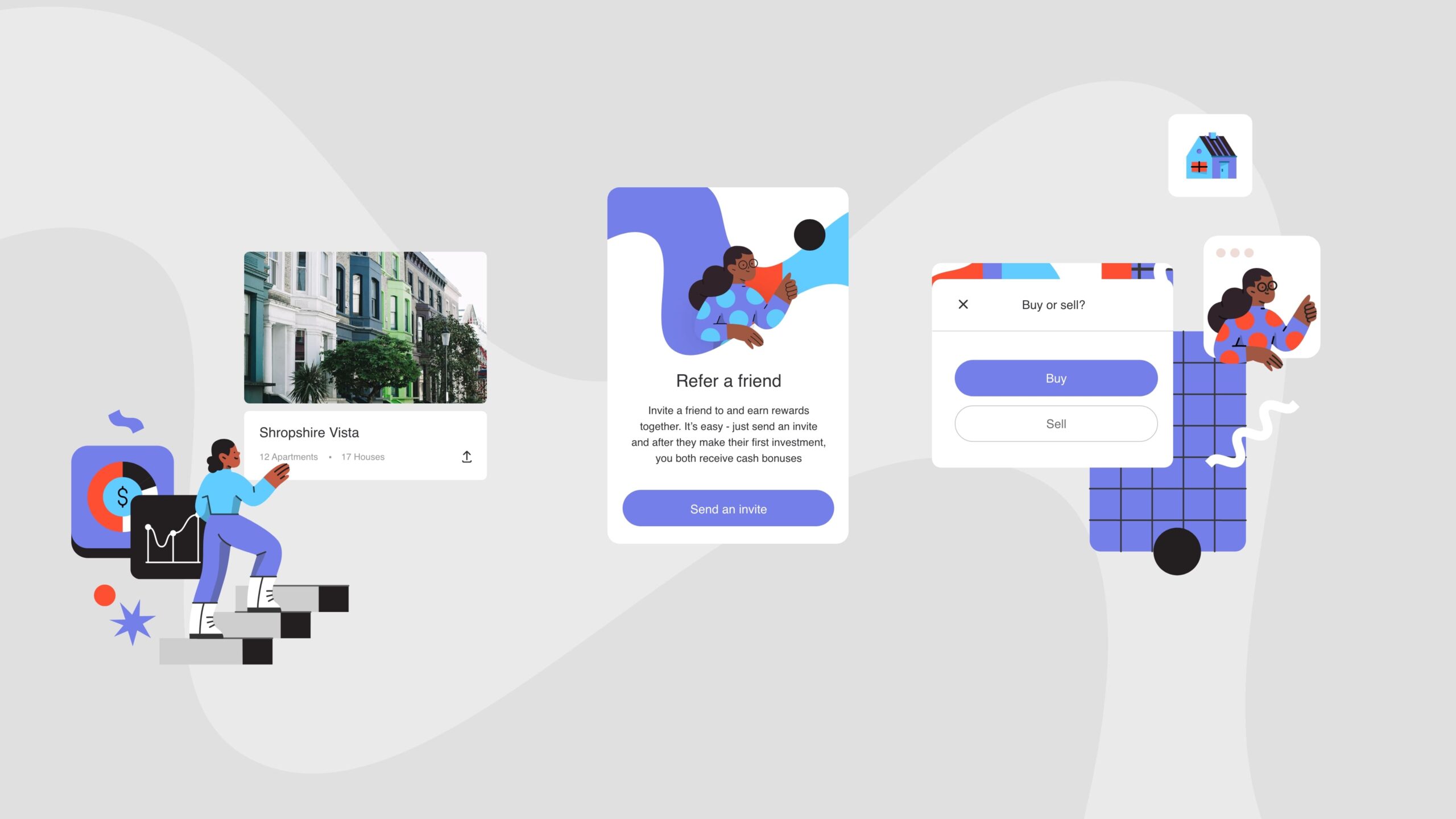
Property Hub’s new mobile onboarding flow is designed to maximise sign ups while ensuring that investors fully understand the financial risks associated with property investment. We ensured that the mobile app design meets financial regulation and the requirements from the brief.
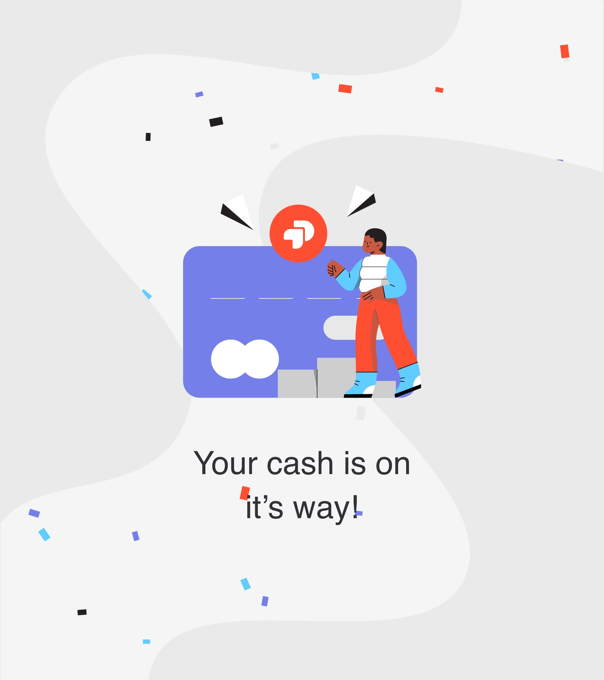
A number of verification steps were required within the onboarding process. Our team reduced the friction associated with verification by summarising the onboarding steps at the beginning of the sign up flow and providing progress updates throughout to keep users engaged.
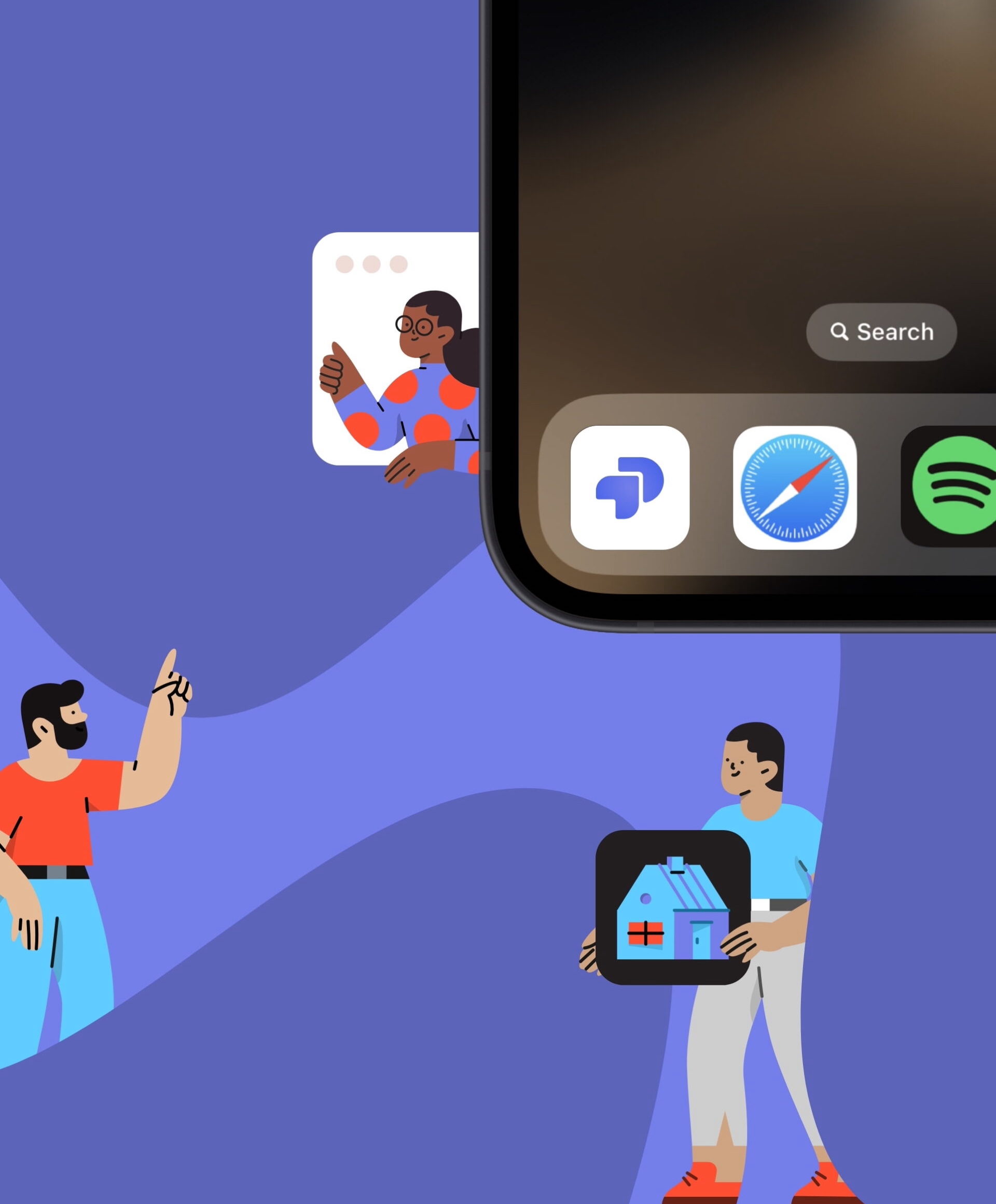
We utilised Google, Apple and Facebook sign up functionality so users could autocomplete a number of fields. We verified user identities using the KYC tool, and integrated with popular banking apps to transition users straight from the verification process into depositing funds and getting started within the app.
The dashboard
The dashboard is the starting point for all user flows and our challenge was to provide clear signposting to all of the possible actions while keeping the interface clean and simple.
In collaboration with the Property Hub team, we created an information hierarchy that prioritised in-app actions based on their popularity and value. This hierarchy formed the basis of the dashboard, showcasing portfolio value and change at the very top of the page alongside key call to actions.
The design
The app design and structure is clean and intuitive, prioritising the quality of the user journeys and clarity of information. We took design inspiration from property apps such as Airbnb and investment platforms like Coinbase to create a familiar look and feel that investors are able to use intuitively.
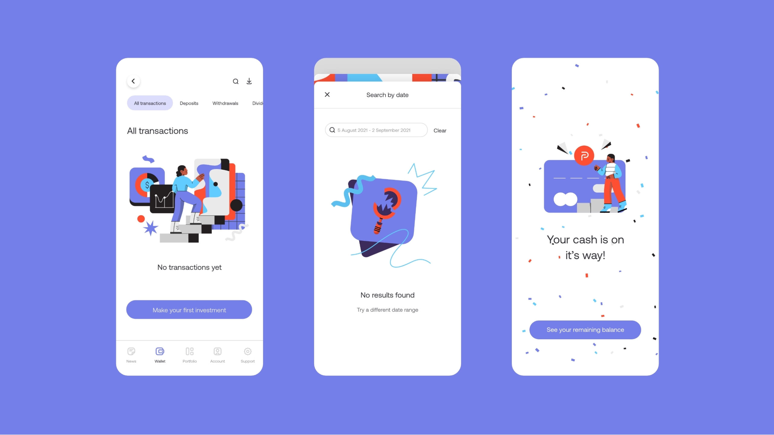
Sticky Navigation
The mobile app incorporates a sticky navigation at the bottom of the screen. The navigation uses modal pop ups to showcase key information before directing users to the next page.
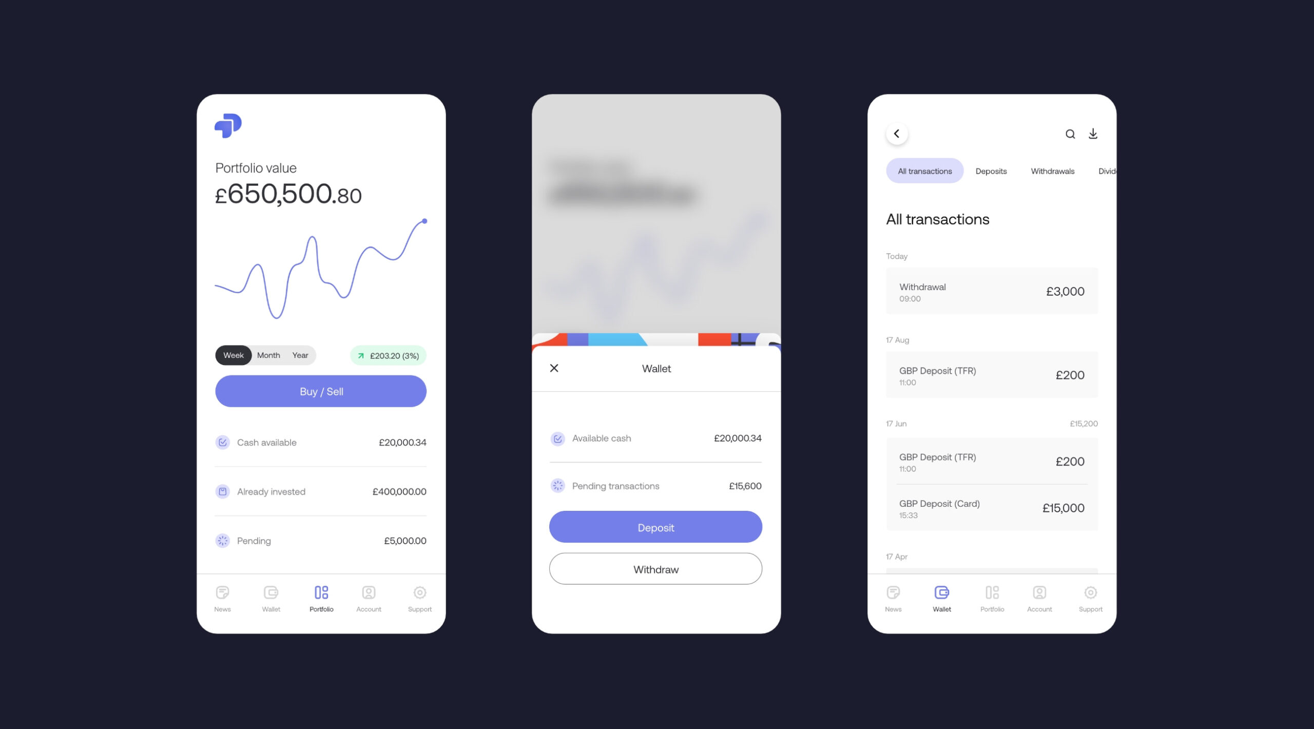
Building a portfolio
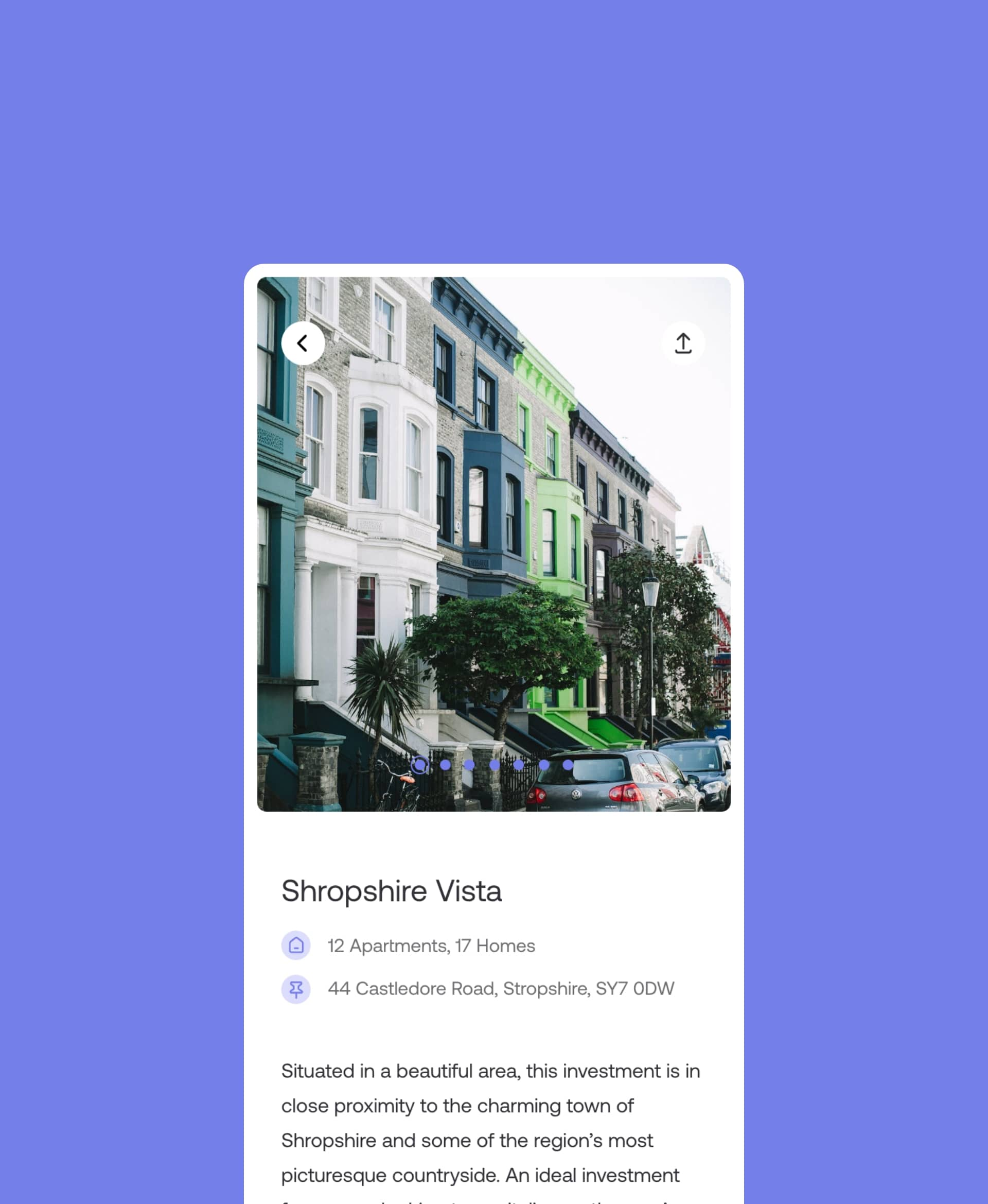
Investors are able to view their portfolio and read about the properties. They can see their invested capital, cash balance and pending capital.
The development handover
Our UX team delivered an on-site handover to the Property Hub development team to ensure that the app developers had everything they needed to represent the designs in code.
Our design team was available throughout the development process to answer any questions and provide feedback on the codified designs.
Related work
InTruck is a mobile app used by over 100,000 truck drivers to manage their journeys and book facilities and parking when on the road. They challenged us to improve the user experience of their mobile interface and introduce some new functionality.
- Lead Time:
- 4 Months
- Sector:
- Transport and Logistics
- Demographic:
- Lorry Drivers
- App Goal:
- Introduce new functionality, Improve UX & UI design
- Services:
- UX & UI Design, Mobile App Design
The challenge
InTruck wanted to become the mobile app of choice for lorry drivers. They had an ambitious roadmap for the app and were ready to invest in the user interface, introduce new functionality, and expand into new markets.
They challenged our team to create a fresh UI and UX design that would deliver a market leading customer experience.
- Scope
- Research
- User Journey Mapping
- Figma Wireframe Prototypes
- Figma Design Prototypes
- Mobile App Design
- UX & UI Design
- Design to Development Handover
- Resource
- 1 x Senior UX Designer
- 1 x Senior UI Designer
- 1 x Project Manager
Research & discovery phase
We reviewed apps within the trucking marketplace to establish a benchmark of how information is displayed and the booking process is managed within existing apps. Our UX designers identified a number of key opportunities to outperform the marketplace and provide a superior user experience.
The map view
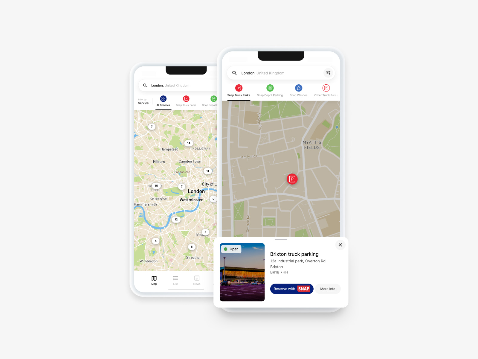
The map function is critical within the InTruck app and presented a major opportunity to improve the UX design.
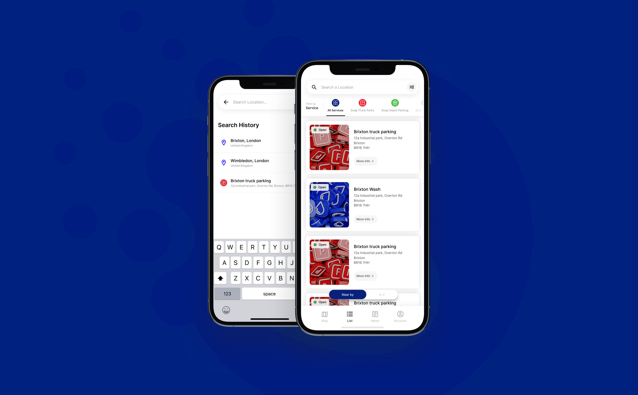
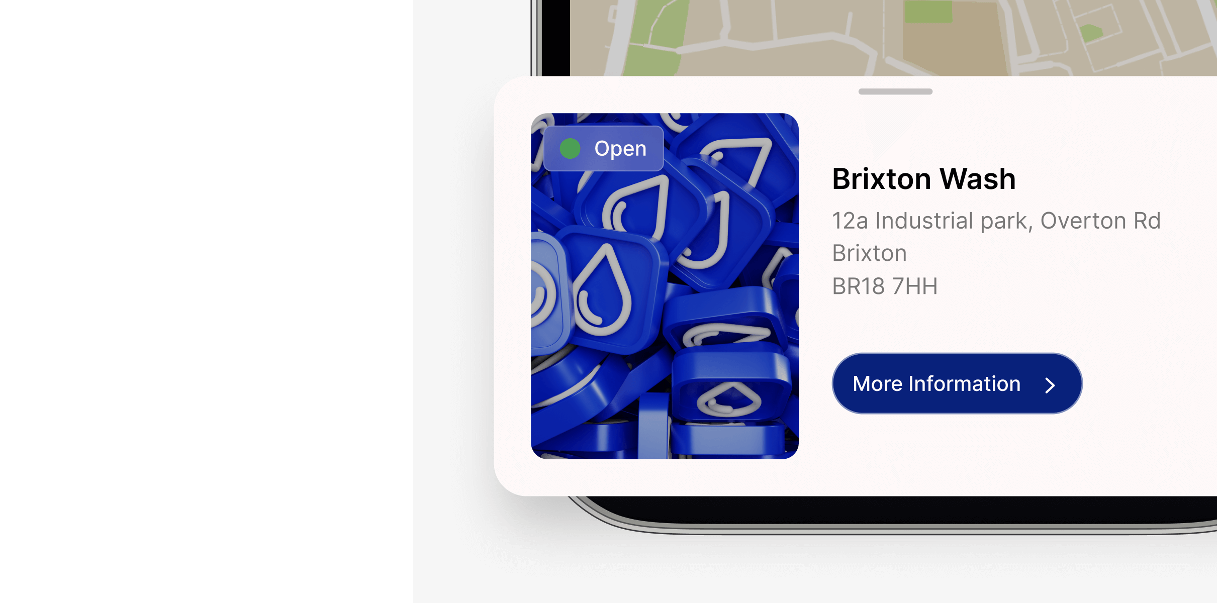
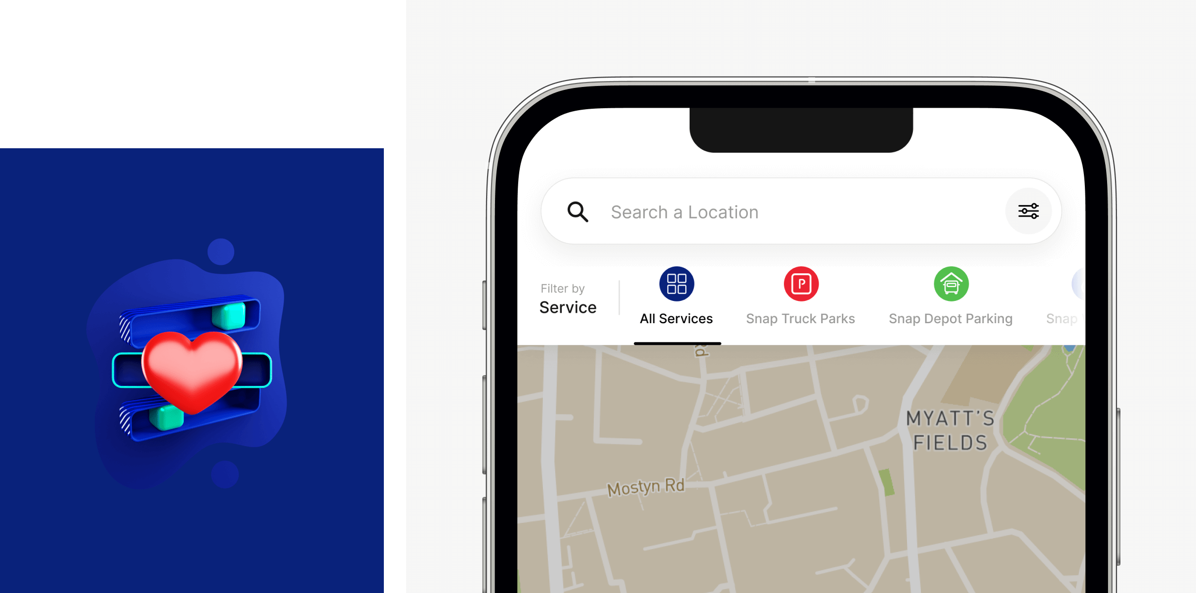
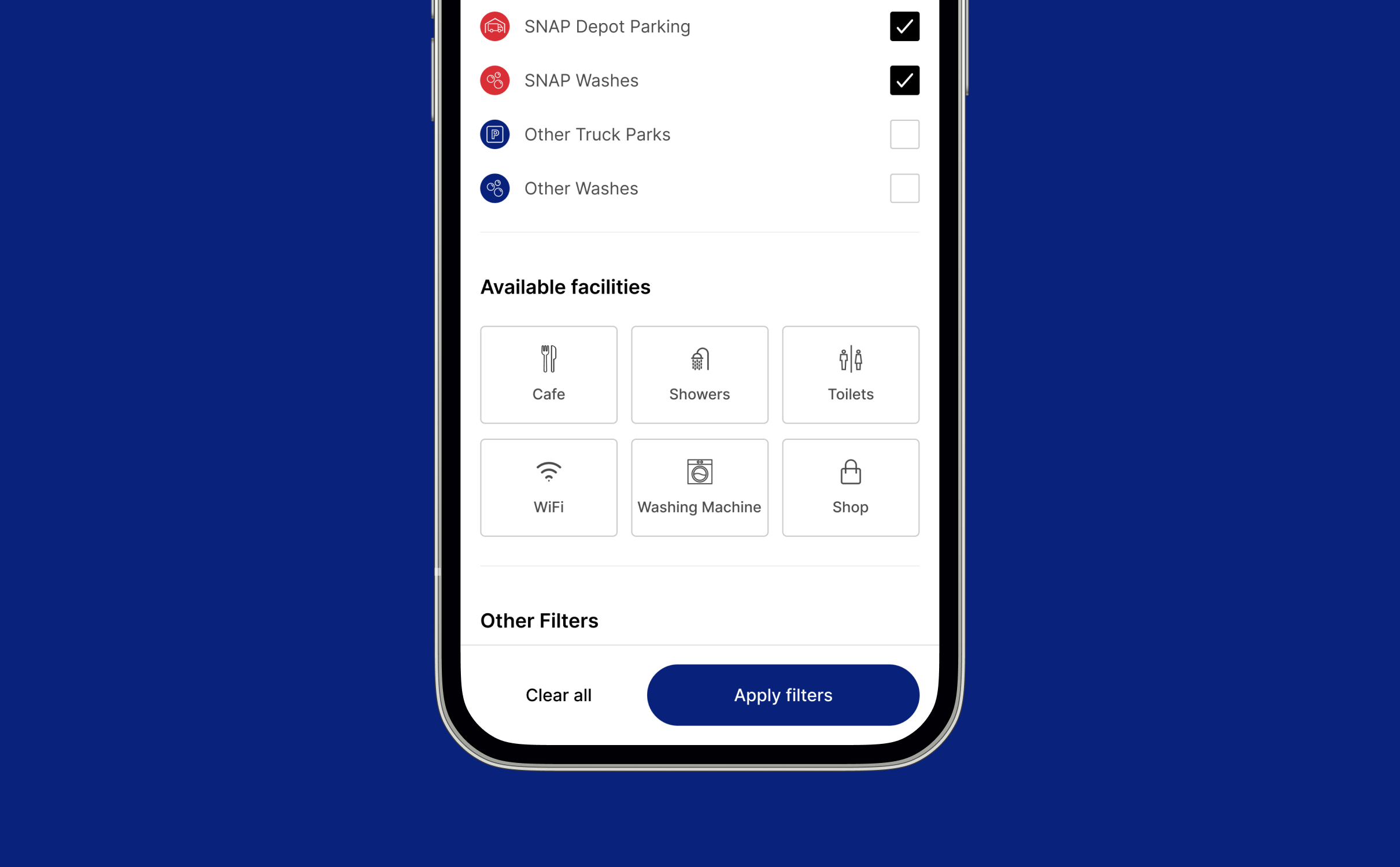
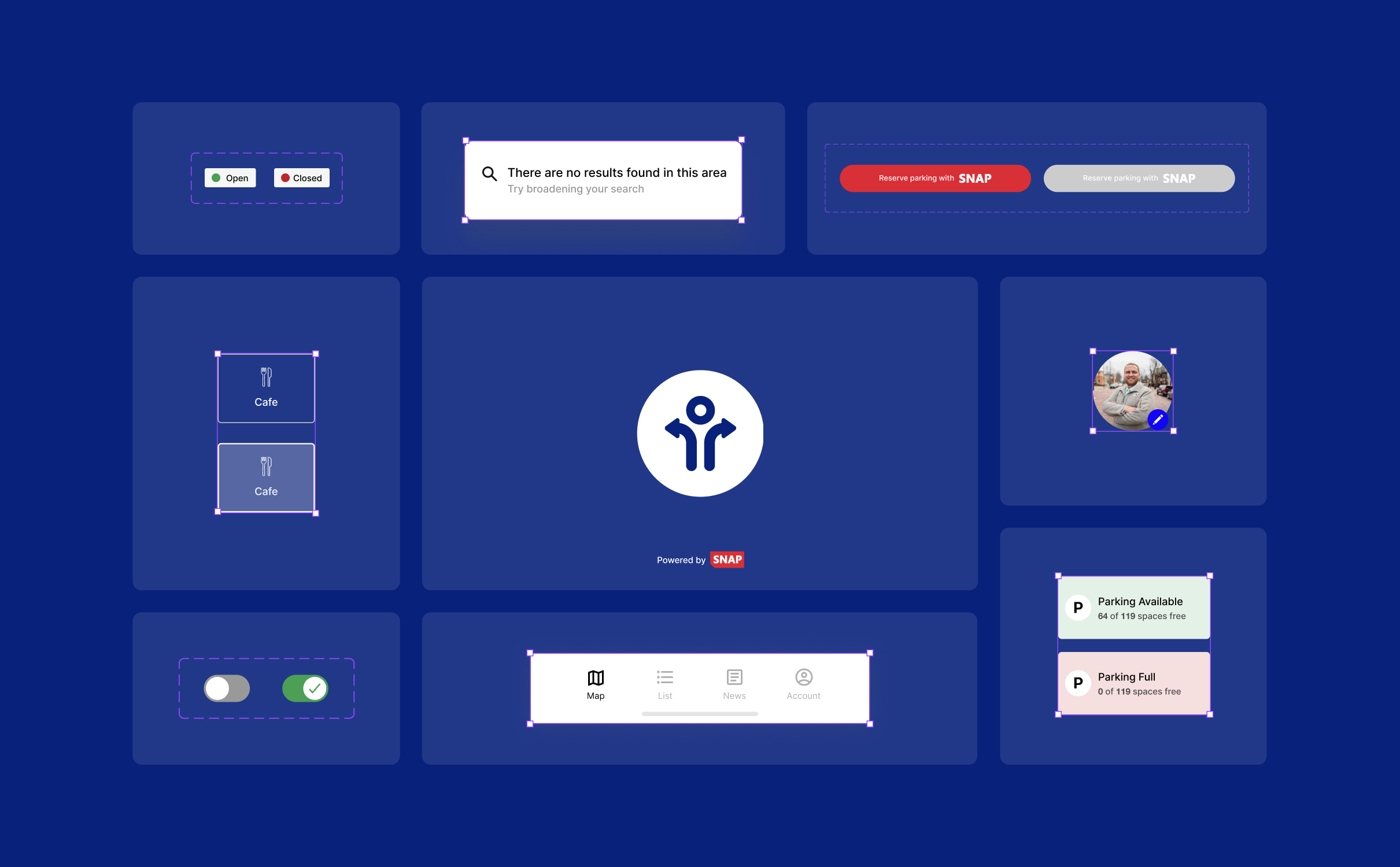
We introduced filters and keys to help drivers quickly find suitable facilities and services without clicking into each potential stop. For example, the map now shows the key facilities of a stop – if it’s a depot stop, has parking, has a lorry wash etc. We created a preview function so drivers can find out more about a location before clicking through to the location page.
These additions streamline the journey planning process for drivers, saving them time and effort when finding facilities.
Profiles
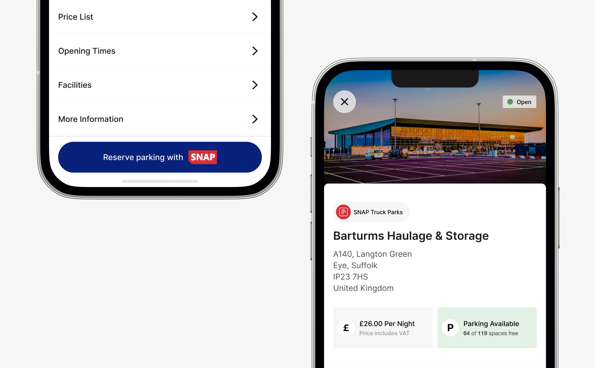
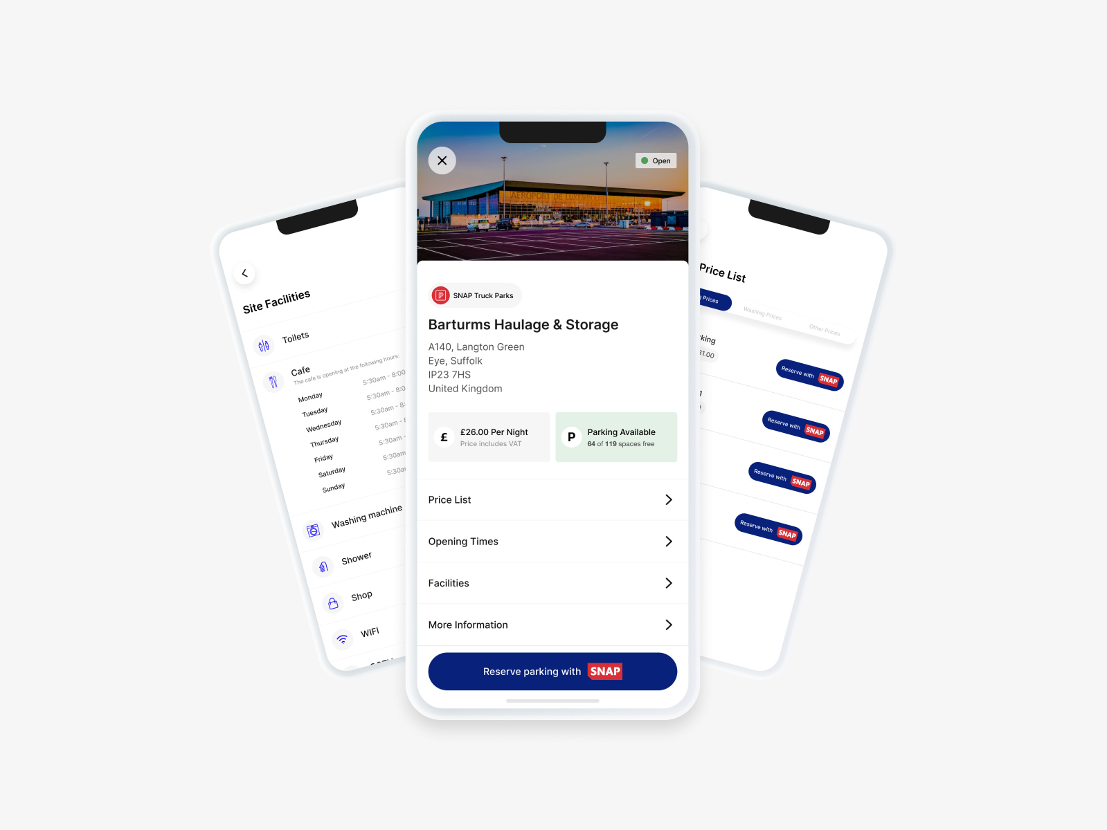
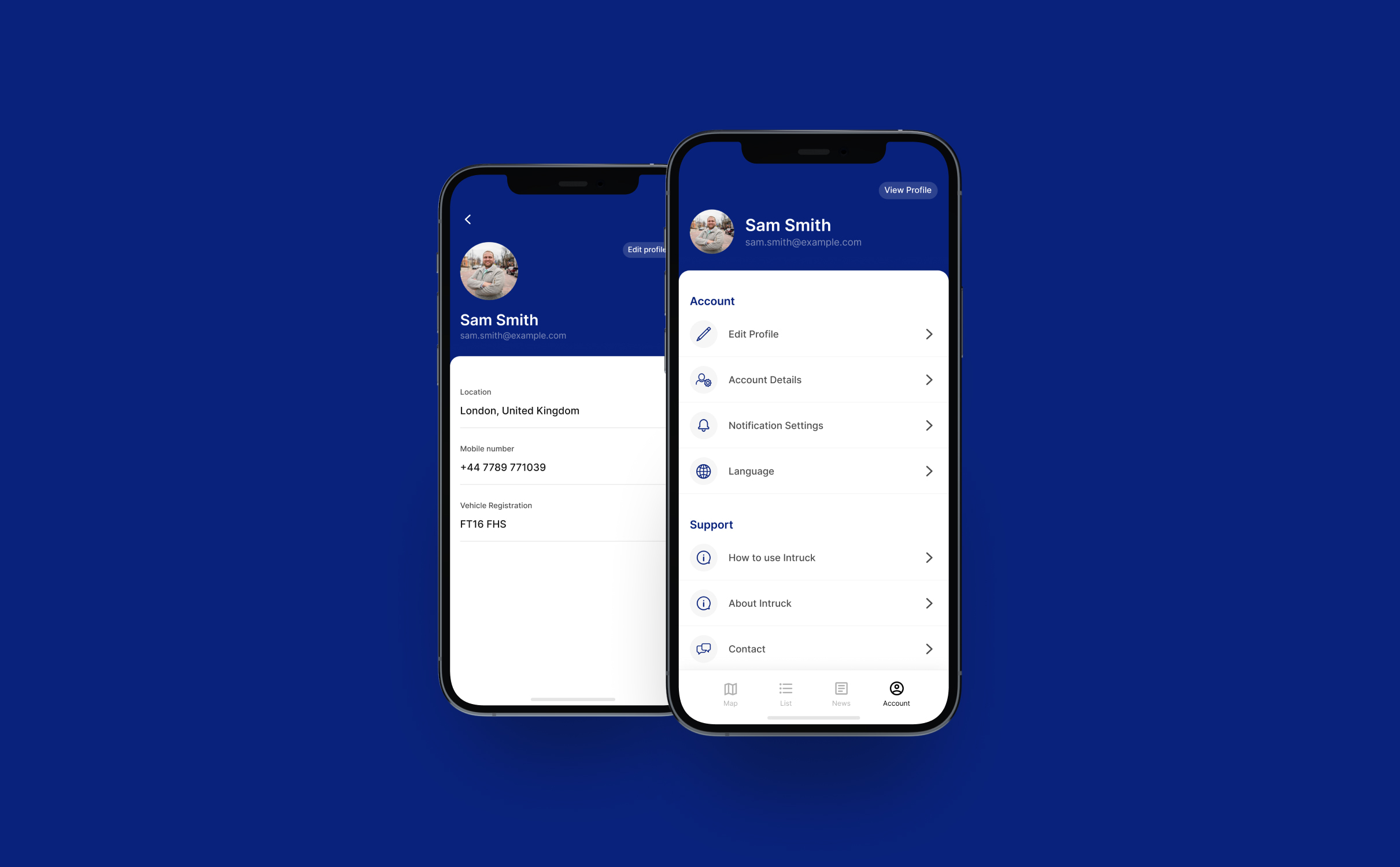
We restructured the service profile pages to improve the clarity of information and provide prominent call to actions.
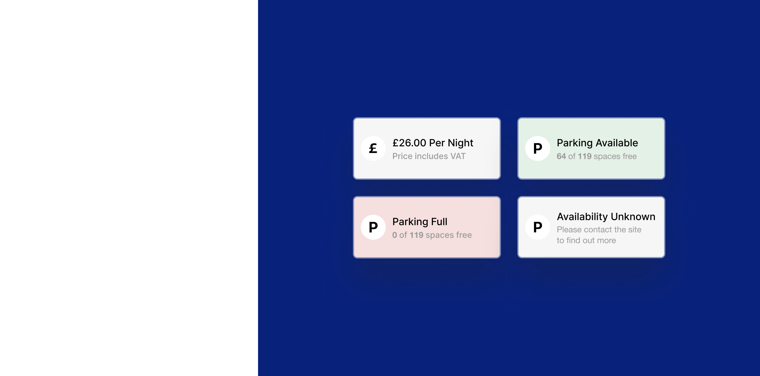
We introduced a new profile layout that incorporates key information such as parking availability at the top of the profile, then used accordions to segment information within the page and keep it digestible.
We designed a sticky call to action to book parking on site profile pages at the bottom of the screen where parking is available, promoting InTruck’s own parking services.
Booking flow
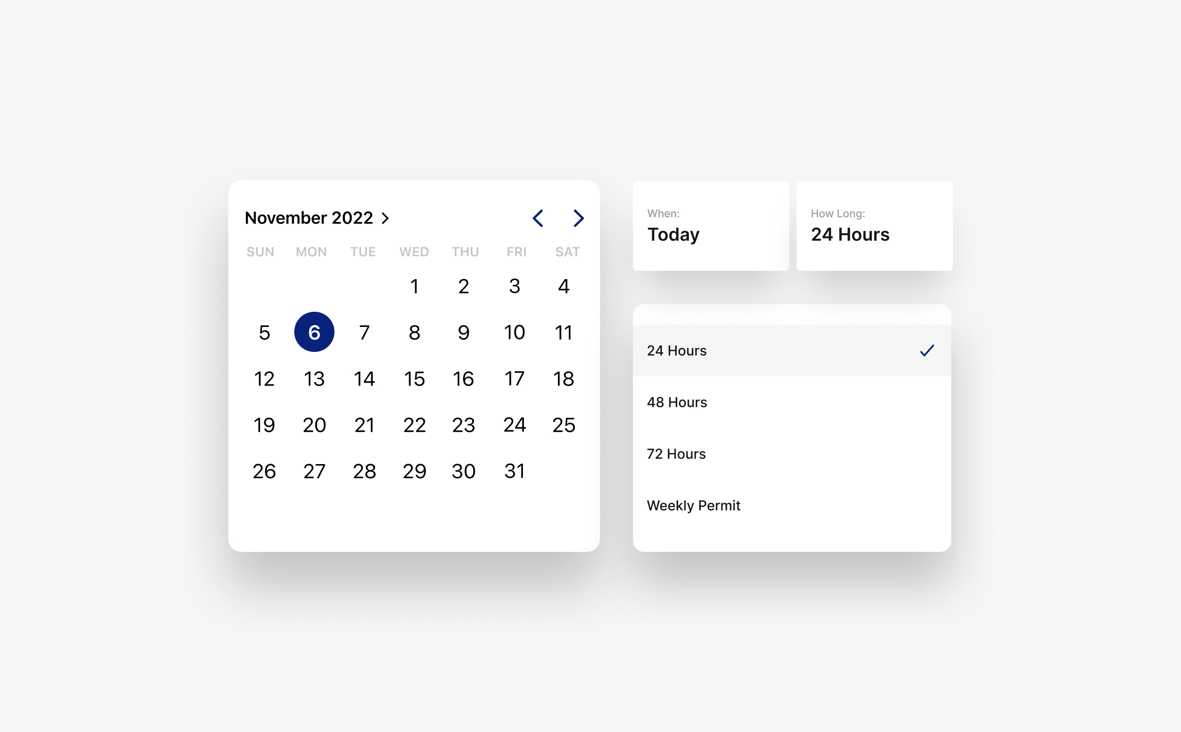
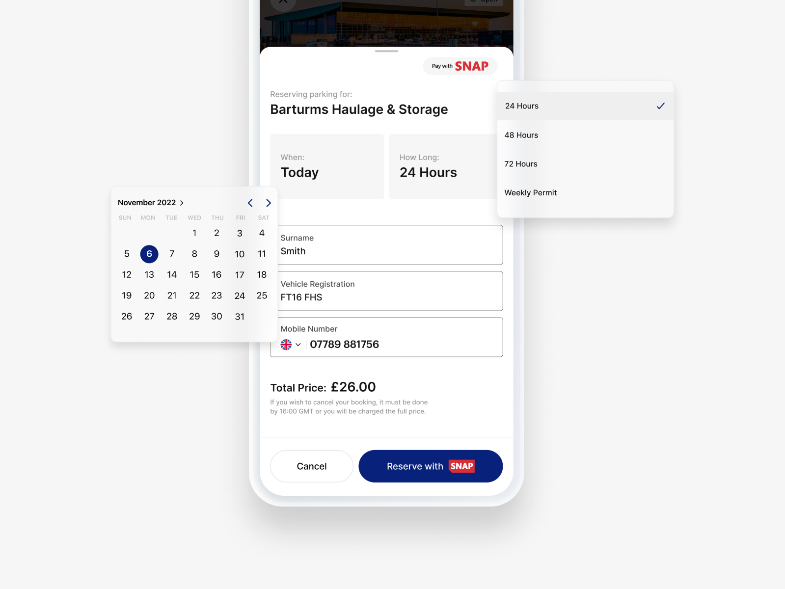
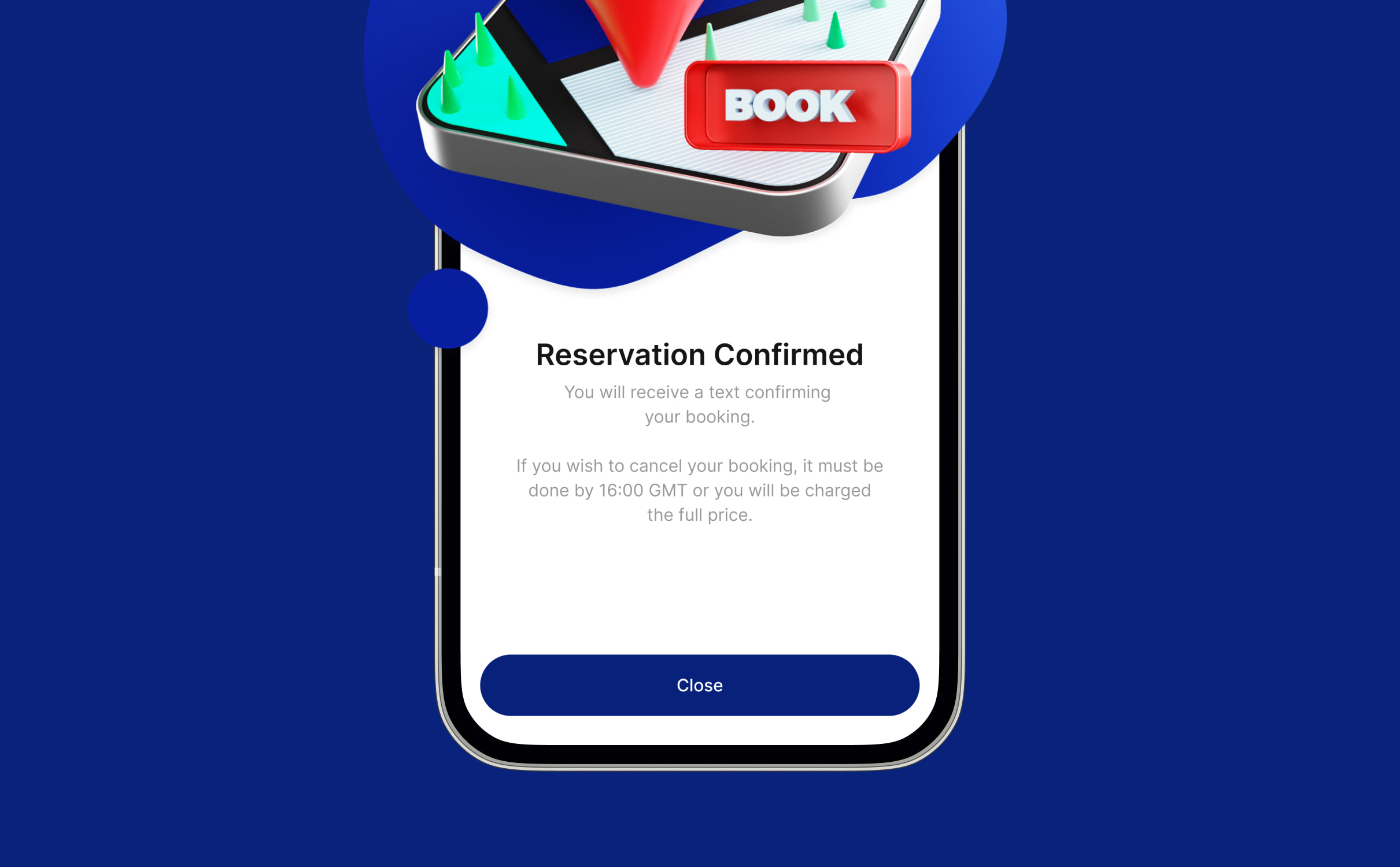
Our mobile app designers streamlined the booking process to reduce the time and effort required to make bookings in the app. We introduced availability checkers, quick book call to actions, and enabled drivers to save information such as payment and registration details within their profile so they could make use of quick booking.
Onboarding flow
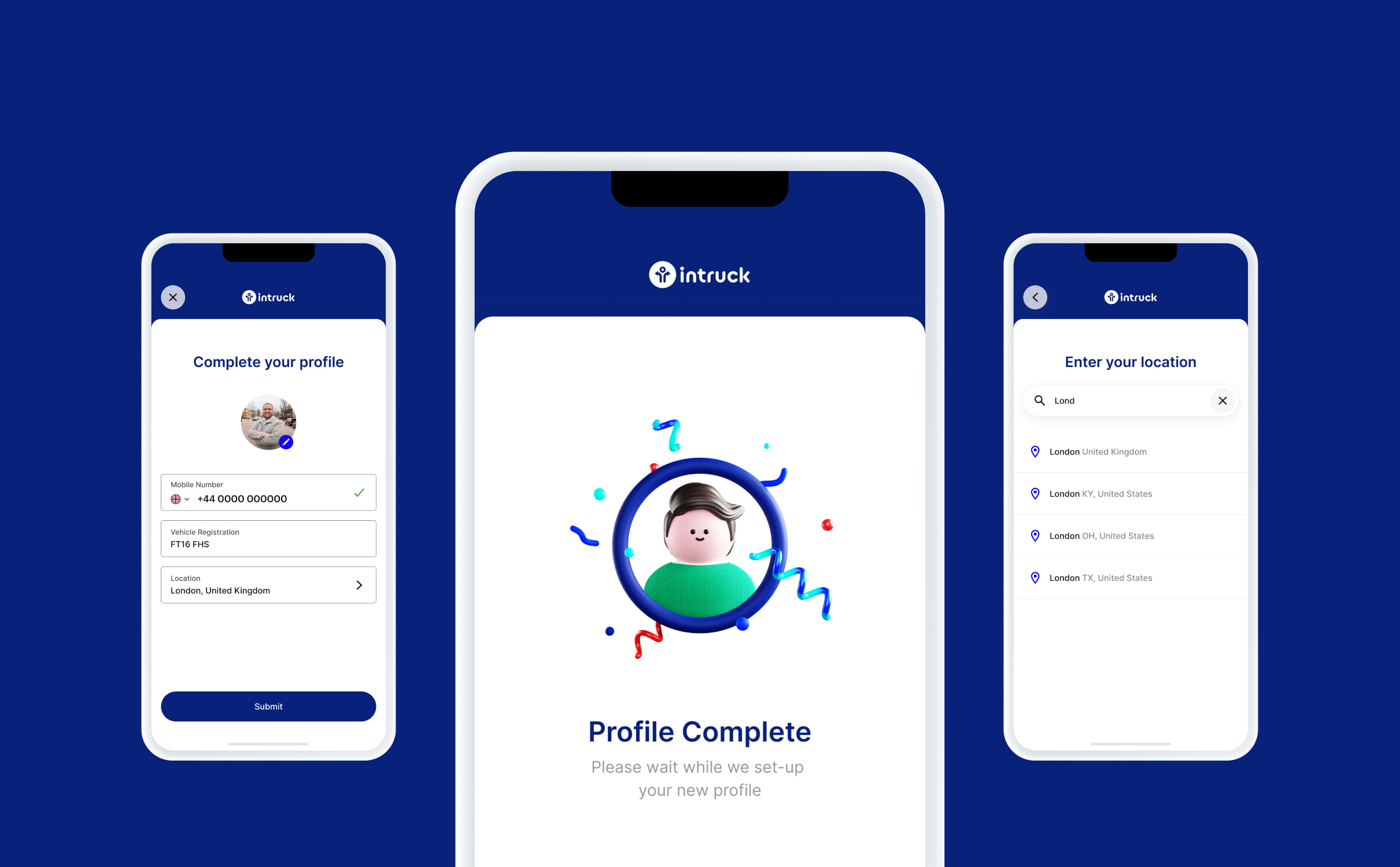
InTruck’s existing mobile app didn’t have account functionality which meant that users had to repeatedly re-enter information and weren’t able to save locations or see their history or bookings.
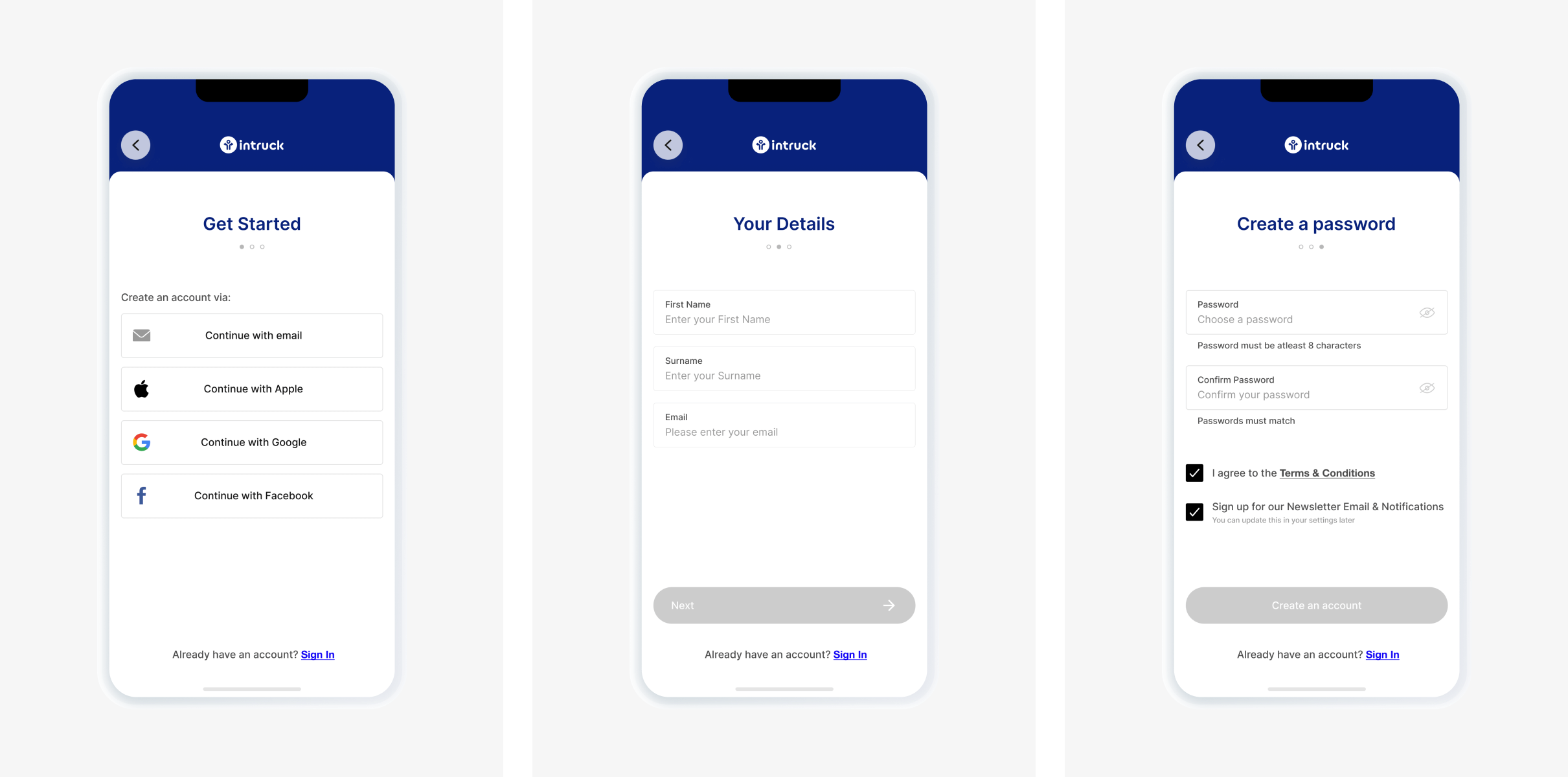
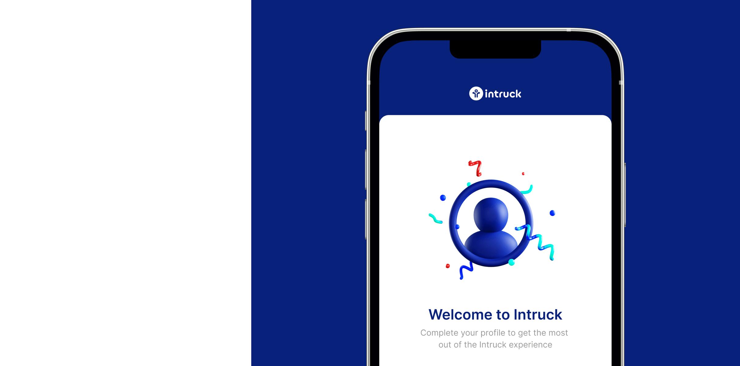
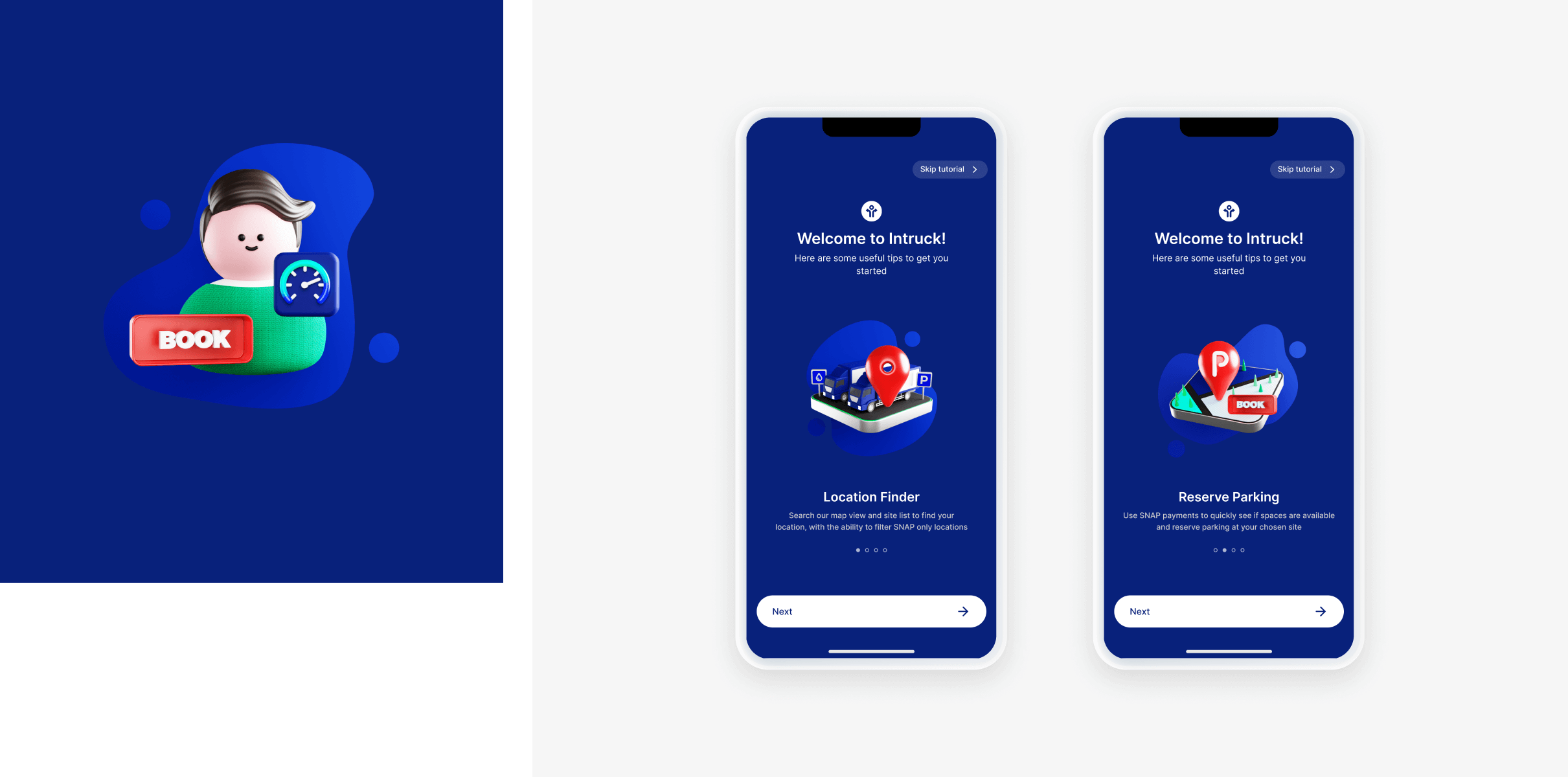
We introduced an account creation and onboarding flow that enabled users to save information and access new areas of the app. The flow included a number of splash screens to showcase key app features.
The broader implications of this were that InTruck had better data on their app usage and were able to start marketing to their customers. From a customer perspective, they were fully onboarded on the app and could save payment information, vehicle registrations and record their favourite stops for future journeys which removed friction from their booking process.
Planning for the future
Our team created UI & UX designs for the mobile app with the future of the app in mind. We ensured that the app could continue to grow in line with InTruck’s strategy and accommodate additional functionality that they have in the pipeline.
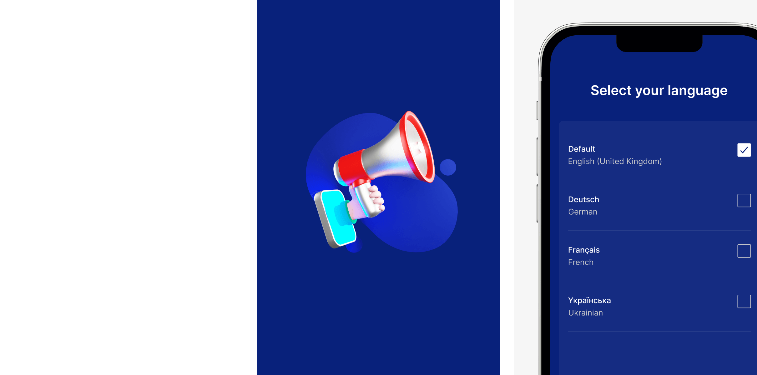
We also considered the roll out of the new designs within the UX design process, introducing a number of onboarding splash screens that would create a smooth transition from the old app design to the new app design for existing users.
Related work
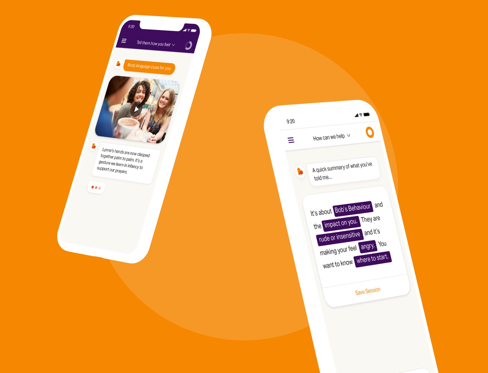
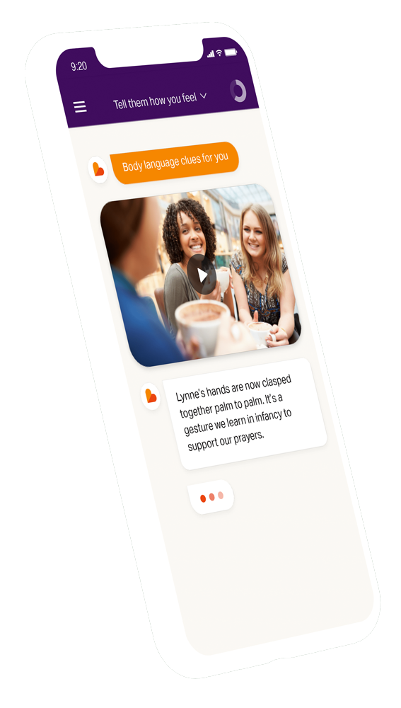
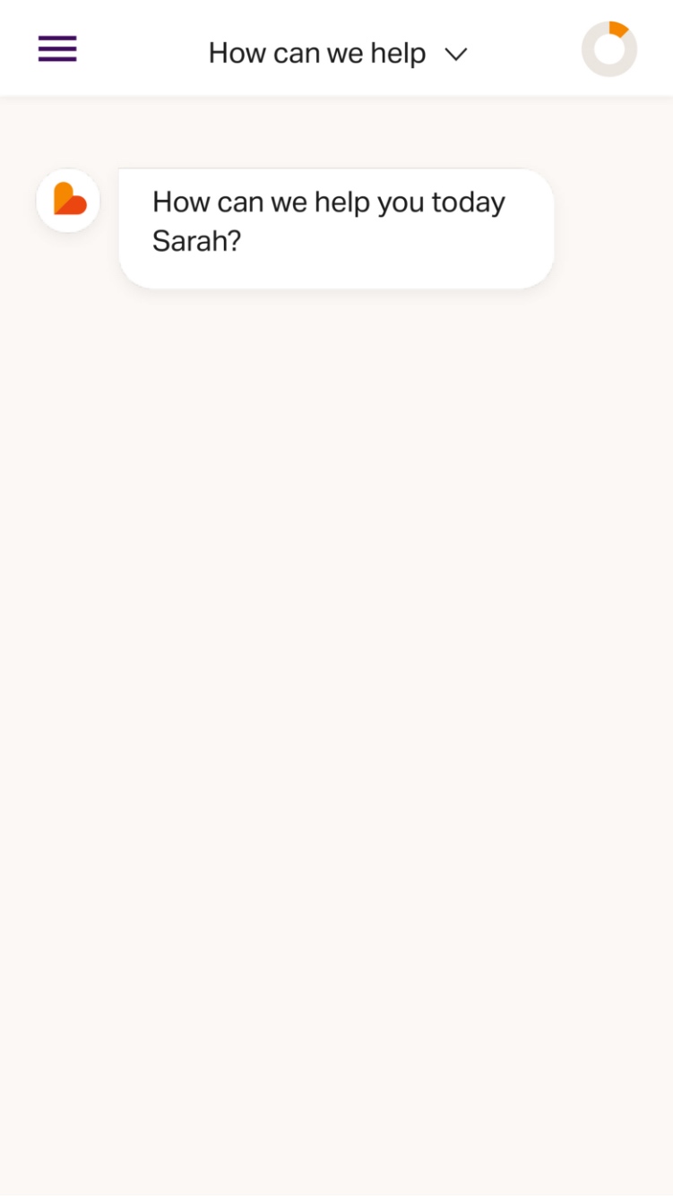
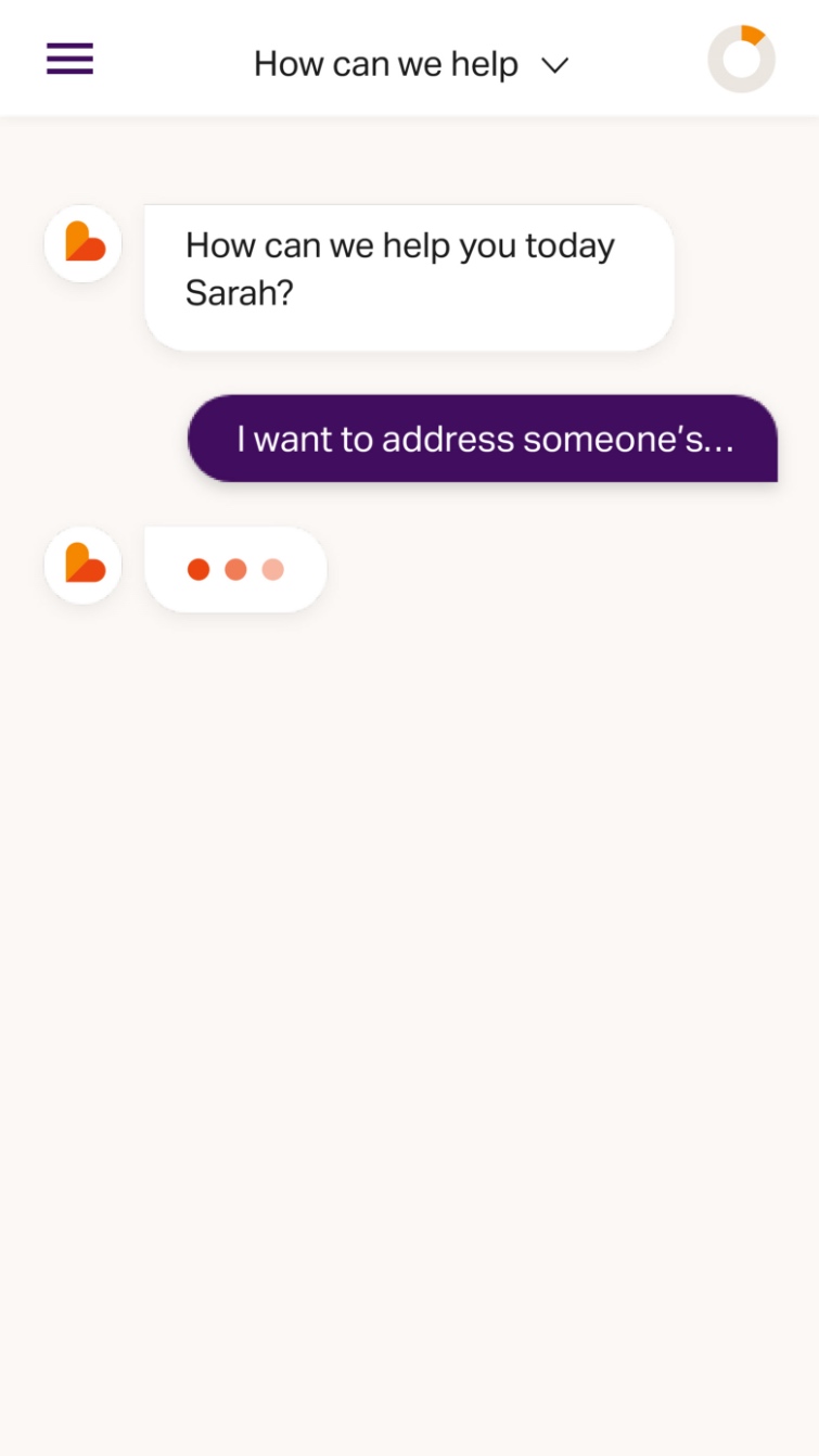
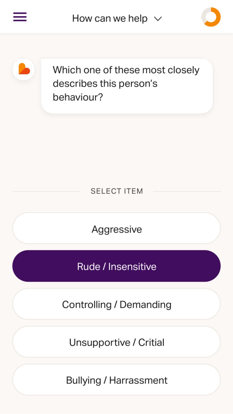
Emoquo is an award winning digital coach that enables employees to overcome everyday challenges in the workplace. The mobile app offers practical and confidential coaching that can be accessed discreetly in the workplace as challenges arise. Emoquo interacts with individuals using a conversational chatbot to engage the user in an approachable manner.
- Sector:
- Human Resources
- App Goal:
- Increase employee engagement
- Target Type:
- B2B
- Demographic:
- Employees at enterprise organisations
The existing solution
Emoquo’s existing MVP product contained core features and a basic UI, but lacked the finesse of a user experience that would help the app be adopted in large enterprise organisations. We were commissioned to inspire confidence in the product offering and improve usability.
- The approach
- Research and interviews with users
- Defining a user’s flow
- Low fidelity wireframes
- High fidelity designs produced in Adobe XD
- Design to development brief
- The schedule
- Design sprints over a 6 week period
- Continued design and UX consultation
- The project was delivered on time and on budget
The Goal
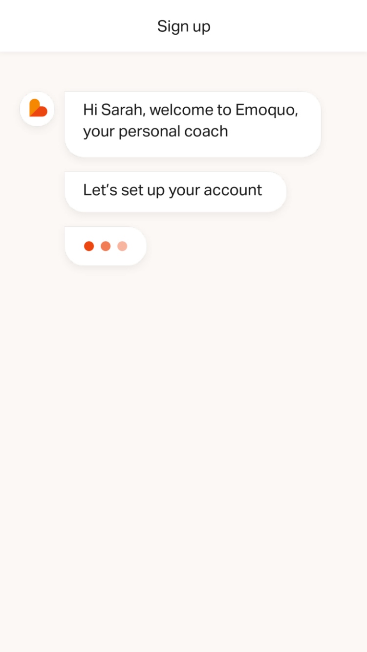
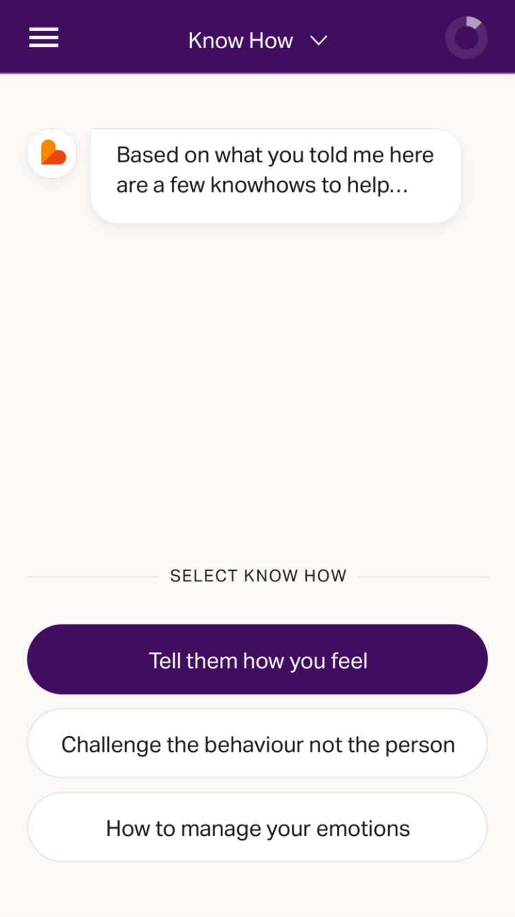
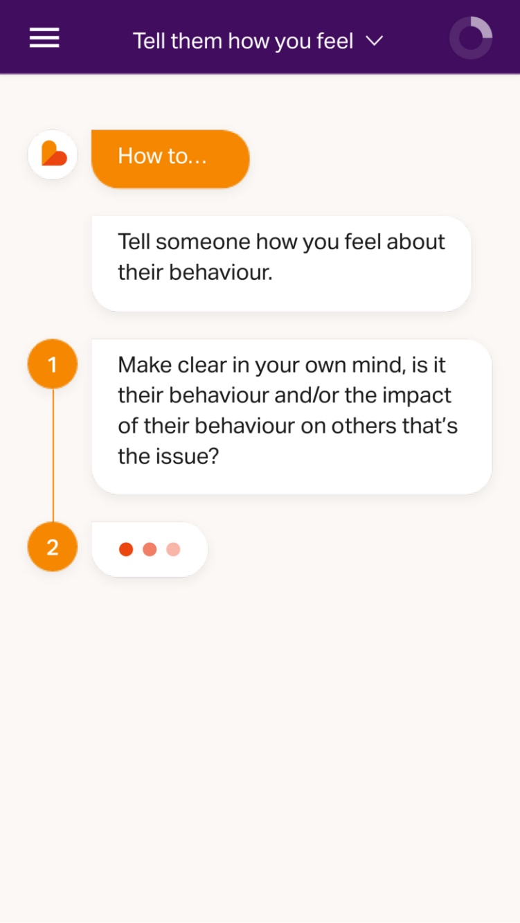
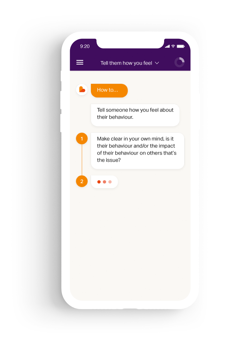
Rapidly deliver a chatbot style mobile app. The app needed to support the addition of new features while providing a more fluid user experience.

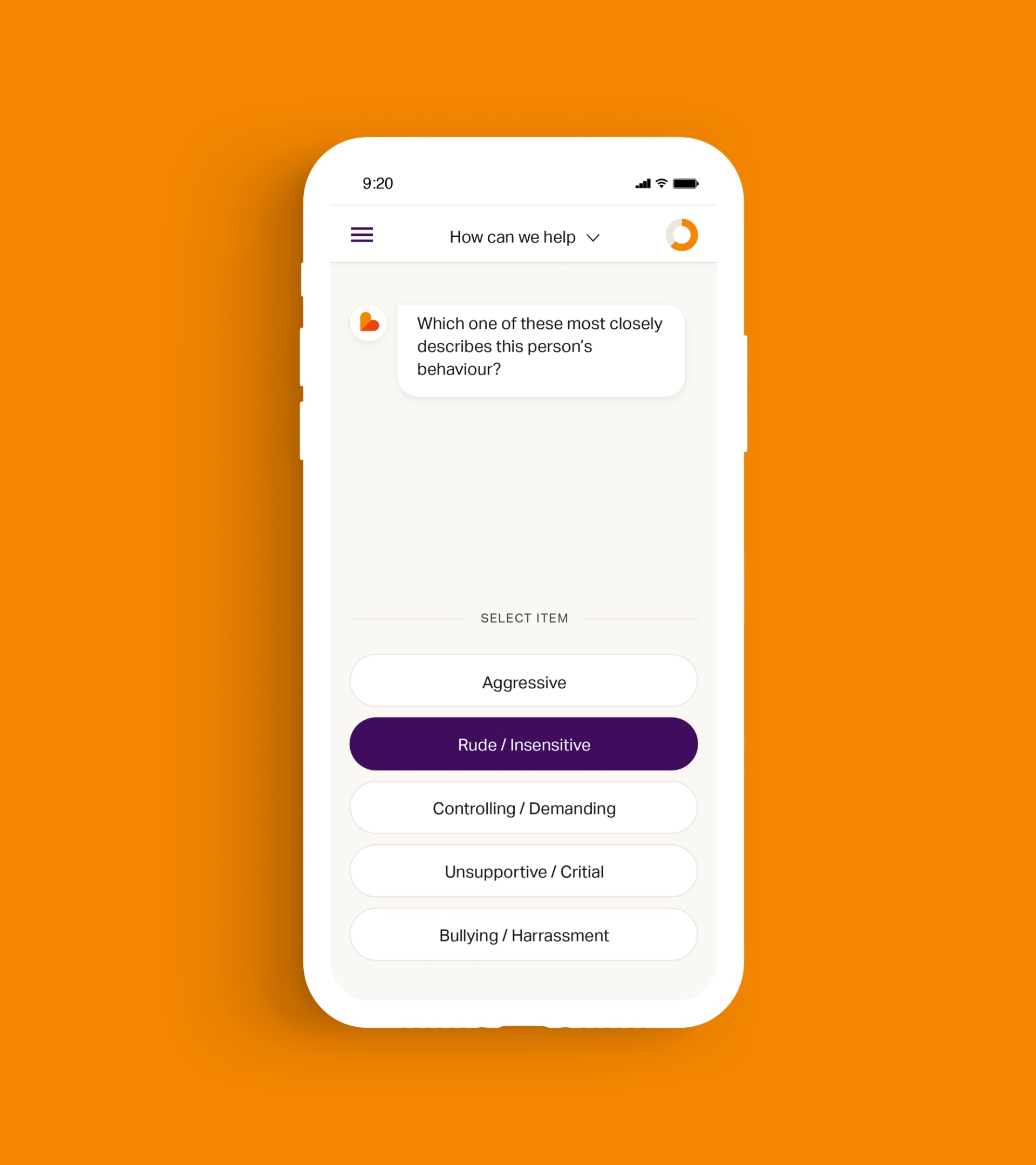
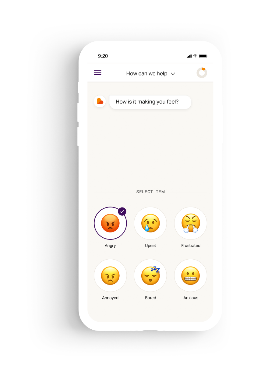
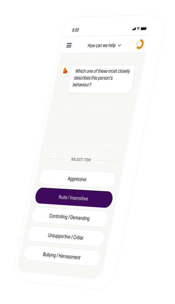
The conversational style flow results in each user following a different journey with Emoquo dependent on their responses. We designed an interface that could manage the spectrum of user flows and deliver the appropriate content.
The MVP development process followed a mobile-first design so the app can be used on the go.
“They opened our minds and pushed our thinking to deliver a great result – one which we have been building on over the last year. The team were easy and enjoyable to work with and the process was clear and efficient.”
Related work
Powerleague is the UK’s largest booking platforms for sports pitches. Their focus has primarily been football pitches, however they also provide other facilities, pitches and courts, as well as venue hire, parties and events.
They were ready to take their business to the next level and invest in their digital customer experience by undertaking a digital transformation process.
- Lead time:
- 10 Months
- Sector:
- Sport & Leisure
- Target Type:
- B2B & B2C
- Demographic
- Sport Players, Parents & Corporate
- Website Goal:
- Increase Bookings & Consolidate Business
- Services:
- Digital Transformation, UX & UI Design, Mobile App Development, Web Design, Web Development, WordPress, Digital Marketing
“1st big leap forward in terms of digital transformation at Powerleague with many more steps to come. Exciting times and of course all about making our customers lives easier and giving them quick and easy bookings with a host of leading edge enhancements to follow. ⚽️⚽️⚽️”
The challenge
Powerleague had grown beyond the capabilities of their existing digital infrastructure. They challenged us to assess their technology requirements and deliver a new digital ecosystem that provided a seamless omni-channel user experience to their customers. It needed to be innovative, secure and scalable.
The client had an aggressive growth strategy, with plans to rapidly expand to new clubs and territories. They recognised the need for digital scalability in their UX & UI, integrations and technology.
We were hired to deliver the digital transformation of Powerleague’s technical infrastructure including their international customer-facing website, booking flow, mobile app, and the complex integrations that passed data between systems.
- Scope
- Digital Transformation
- Adobe XD Wireframe Prototypes
- Adobe XD Design Prototypes
- UX Design
- WordPress Development
- React Native Development
- API Consultation & Mapping
- Complex API Integrations
- Website & Booking Flow
- Mobile App
- Multi-territory & Multilingual
- SEO Strategy
- Resource
- 1 x Creative Director
- 2 x UX / UI Designers
- 1 x Technical Lead
- 2 x WordPress Developers
- 2 x Backend Developers
- 3 x React Native Developers
- 1 x Digital Marketing Specialist
- 2 x Quality Assurance Testers
- 1 x Technical Project Manager
Discovery and technical review
With tens of thousands of customers each month and millions of pounds in revenue passing through the website and app, Powerleague needed a robust technical solution that would also fulfil their marketing requirements. We assessed Powerleague’s existing technology and made technical recommendations based on the objectives of their business, as well as the scalability and longevity of prospective solutions.
Our technical team selected WordPress as the website CMS for the customer-facing website. React Native was selected to deliver an Android and IOS mobile app, and Powerleague retained their existing custom eCommerce platform. Each of these systems were delivered as part of a headless architecture that leveraged Powerleague’s backend database to feed the interfaces with consistent live data.
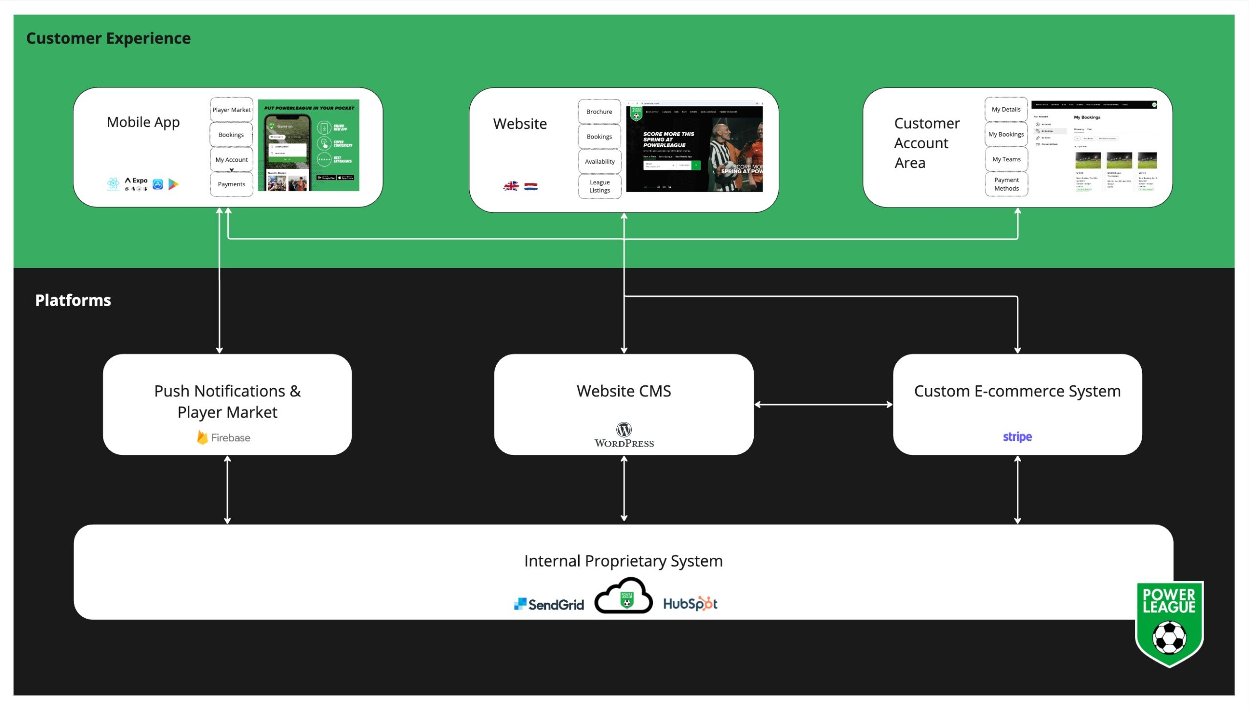
The setup was designed to automate as much as possible by integrating with Powerleague’s backend database. The website and mobile app dynamically pull information from the booking system based on the user’s search, keeping load speeds high while streamlining the user experience. This approach enabled us to offer dynamic search results where users only see results that are available for booking, reducing the cognitive burden and increasing conversion rates.
Interface research and UX
We started the UX design process with a research phase where our UX team explored complex booking flows within and outside of Powerleague’s industry. We focused on flows that had complex search and booking requirements and managed large amounts of data.
Using these insights, we created a comprehensive set of website and mobile app designs. Our team transformed the designs into clickable prototypes for the client to test and review.
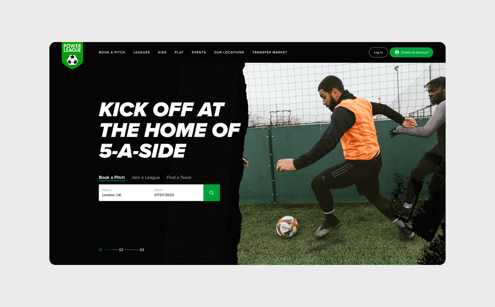
The website designs consolidated 2 websites into a single site, making Powerleague the largest pitch booking website in the UK. The new design improved the accessibility of information and the overall user experience, reducing the number of clicks between search and purchase. The new website focused on scalability, automation, and driving performance improvements – increasing the number of bookings and delivering a market leading design.

The search
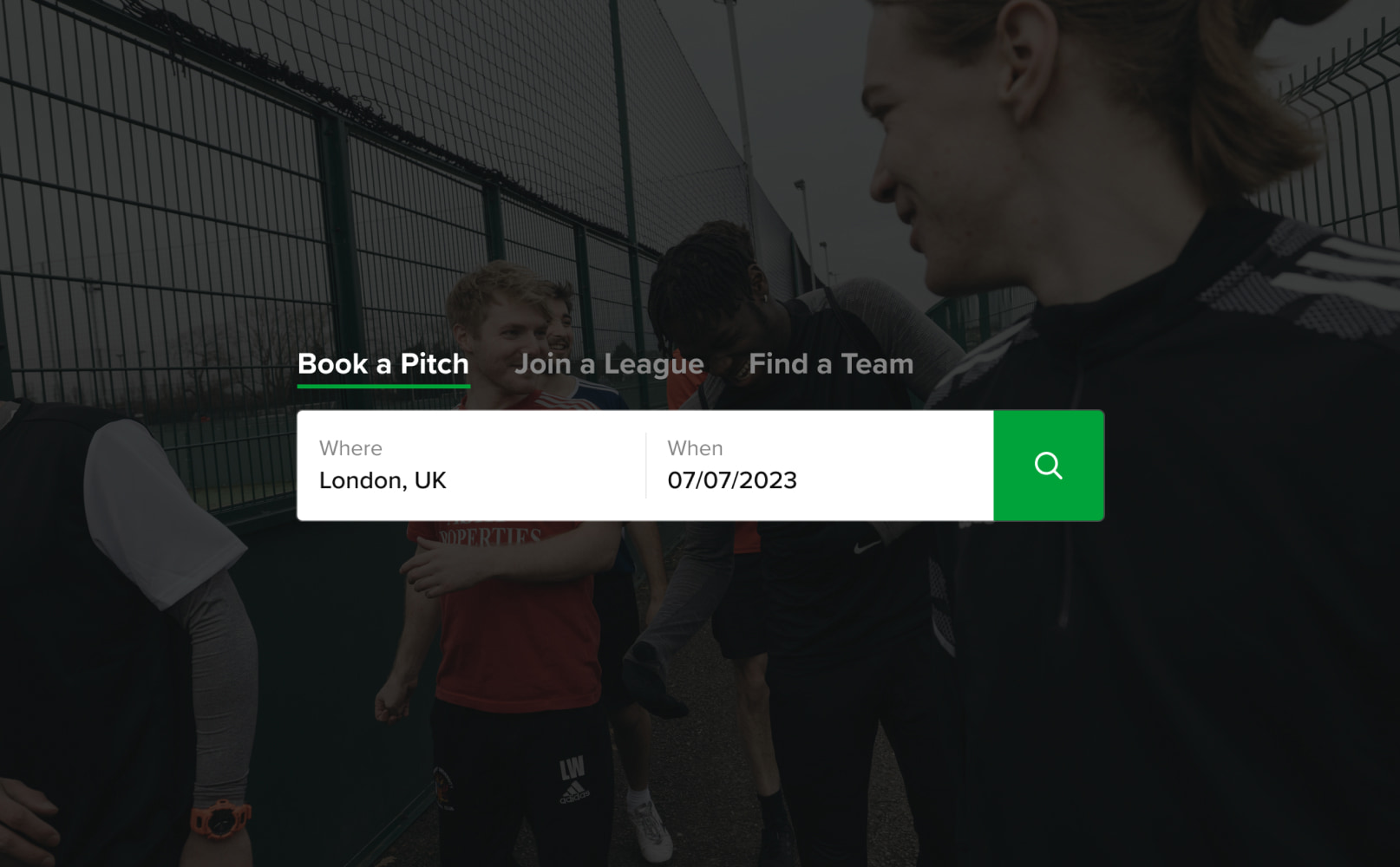
The new search function uses IP detection to search for pitch booking venues near the user, reducing the steps required to find a pitch. It automatically pulls the 2 most similar venues alongside any selected venue, enabling users to compare within a single booking flow window.
Powerleague has a different booking flow and available booking horizon for each type of booking and location. The website and app incorporate these tailored flows, guiding users through the requirements and availability for their booking. For example, Powerleague only accepts football pitch bookings up to 10 days ahead and this is reflected on the football booking flow and calendar view.

Managing the data
Powerleague’s website needed to manage a colossal amount of data, with millions of potential combinations of venues, pitches and time slots.
Finding the best time slot
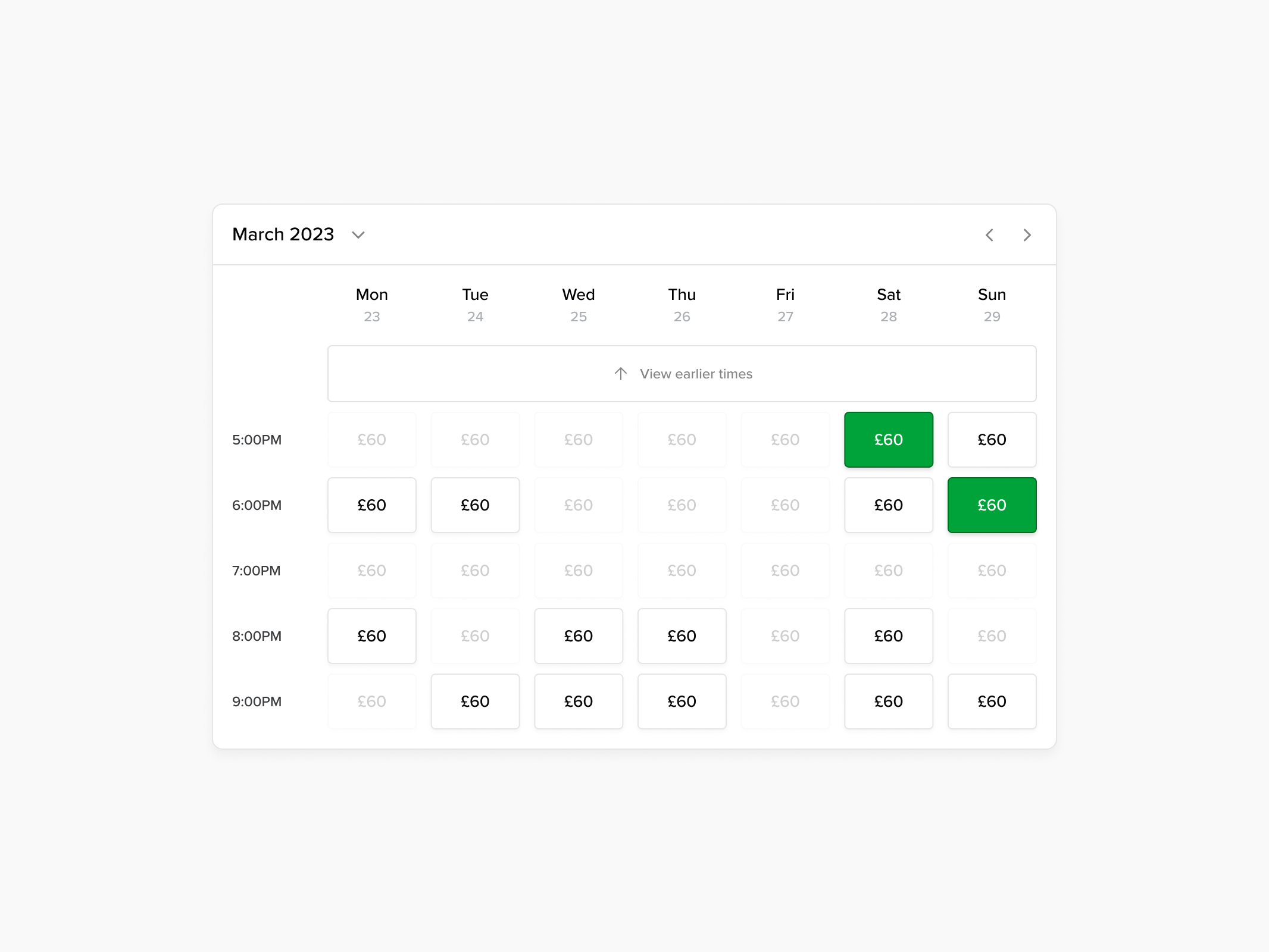
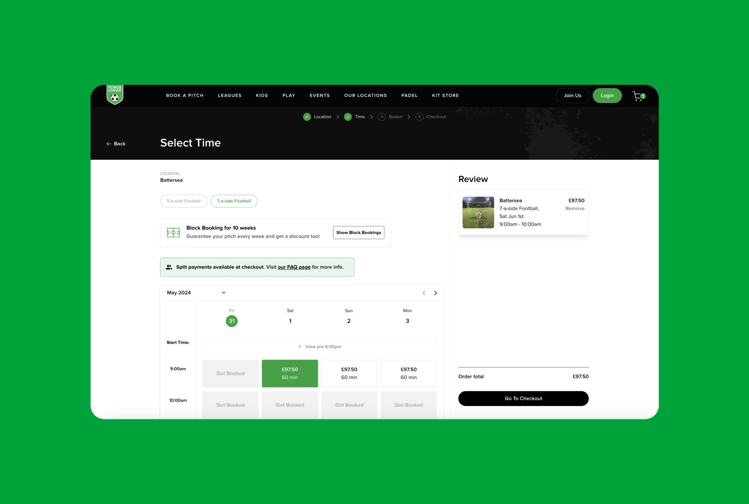
Customers can easily compare time slots, availability and pricing.
The booking flow
We display pricing in a calendar view that enables users to see the cost of different time slots and select the best deal for them. The majority of bookings are made for peak time slots so we automatically show these first.
To encourage repeat business, users are able to block book during the checkout, increasing the value of the booking for Powerleague and simplifying the booking process for users.
Split payments
The majority of Powerleague’s bookings are made by an individual on behalf of their team and Powerleague were aware of the offline booking friction that resulted from the organiser chasing teammates for money. Our team introduced a split payments function that enables the payment to be divided between teammates at the checkout – taking the financial pressure off a single individual.


API consultation & integration
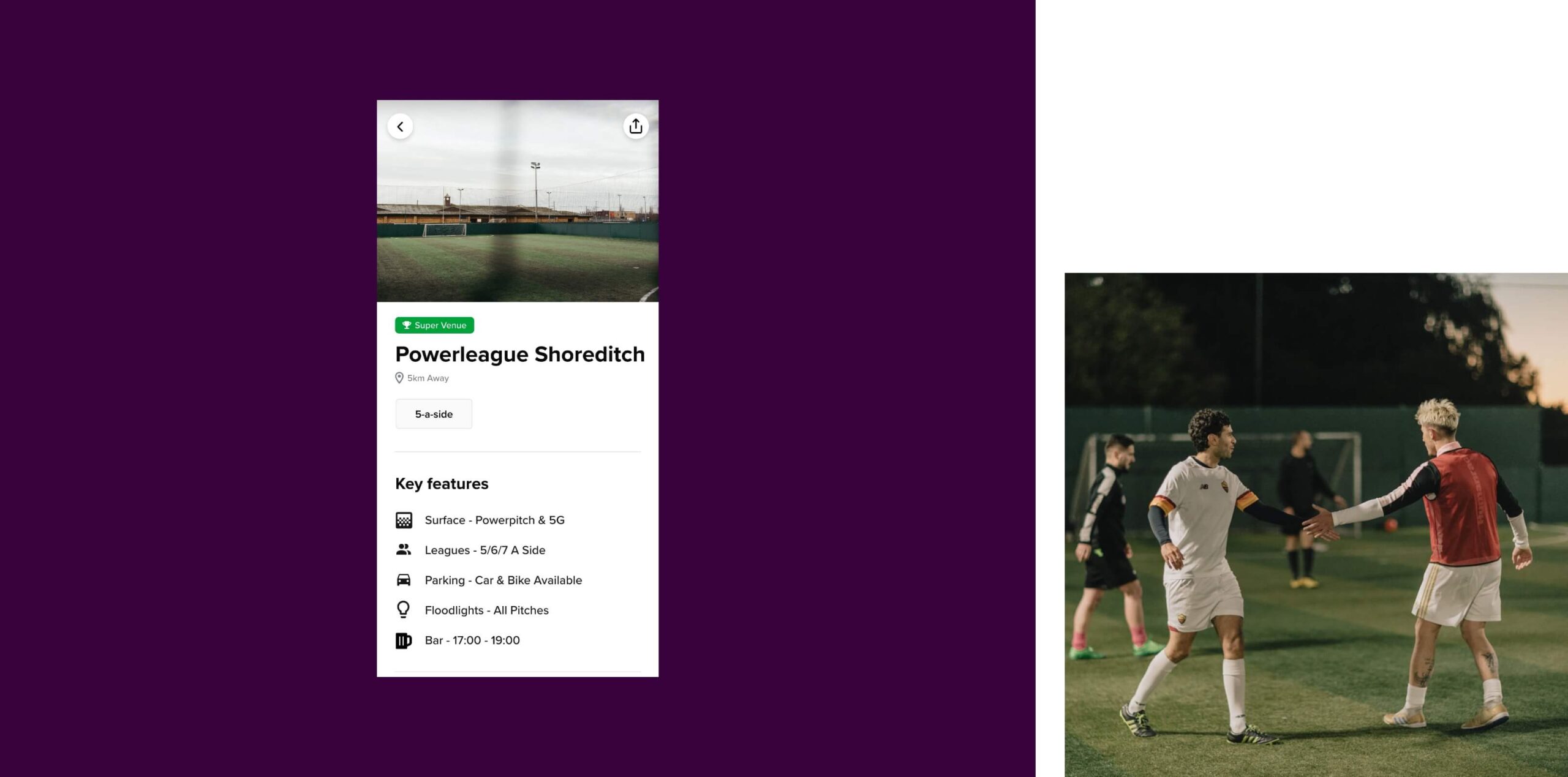
To deliver the strongest user journeys, the booking software API needed to be customised. We planned the website functionality and created a brief outlining the endpoints that needed to be delivered by the booking software team.
We collaborated with Powerleague’s software team to develop new endpoints and ensure that information was seamlessly passed in both directions between the app, website and booking system.
The brand
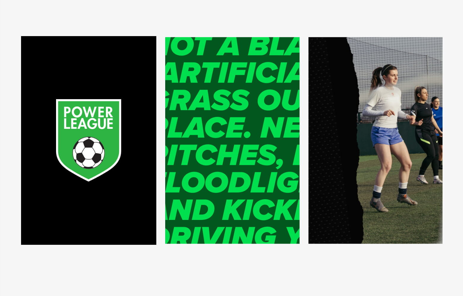
We extended the brand for digital use, creating shape form and animations that can be used across the site.
API & cache
The website is cached to deliver fast results and the cache is updated every 2 hours to ensure data is current.

The menu
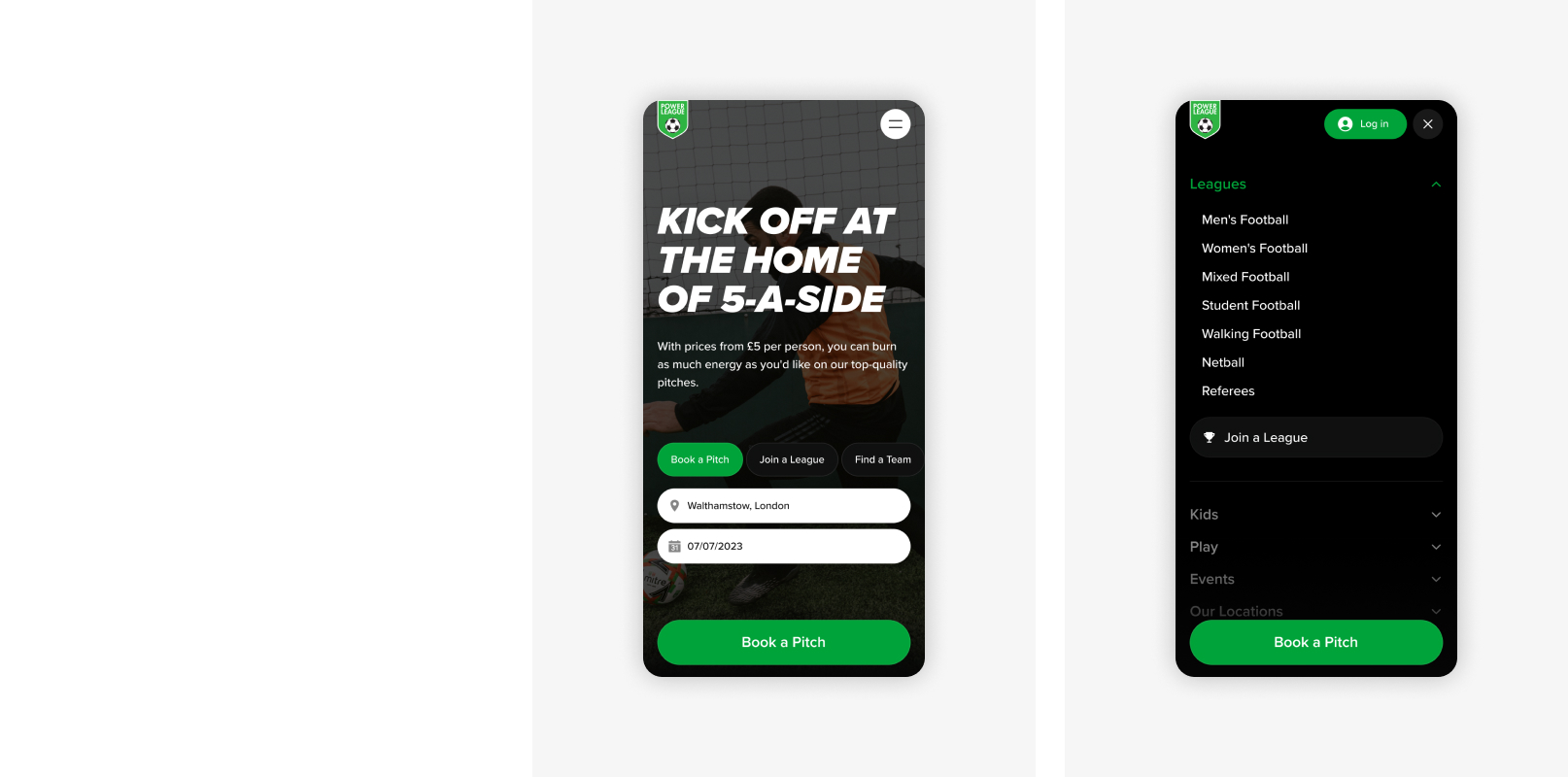
The mega-menu was structured to combine the key content from both websites, ensuring that the user journey is smooth and content is accessible.

Map view
Visitors can use the map search to find a venue near them.
Going Headless
We delivered Powerleague’s project using a headless approach. We utilised their backend booking system as the backend engine for the site data and WordPress as the ‘head’. WordPress gives Powerleague a very high level of customisation and content management while the backend booking system enables us to effectively manage data and bookings.
This approach moves Powerleague towards an omni-channel offering, where the mobile app and website have distinct user journeys, functionality and user interfaces but pull data from a consistent data source. This enables users to have a consistent experience across devices while benefiting from different interfaces.
The headless solution enables us to maintain rapid load speeds and a high level of security, despite the large amount of data being handled.
Multi-territory
The new website includes content for 2 territories, the UK and the Netherlands, and the website is available in English and Dutch.
Our developers coded IP detection to direct users to the appropriate content based on their location, and our technical SEO team have optimised the website to ensure that the correct website content ranks in regional search engines.
Powerleague have ambitious expansion plans and the new website sets them up for future growth and launches in new territories.

The mobile app
A ginormous amount of data needed to be available to customers via the mobile app, including venue details, availability, variable pricing and event information. Handling this information on a small mobile screen was a challenge. We needed to ensure that the user experience was simple and intuitive, while also delivering the full range of functionality.
In the research phase, we explored complex mobile booking experiences across a range of industries including travel, hospitality and entertainment. We focused our research around search functionality, search results, filters, and content hierarchy, which enabled our design team to combine innovative mobile design with industry best practice to deliver a tremendous amount of data and functionality in an intuitive way for Powerleague’s customers.
Our team developed the app in React Native and integrated with Powerleague’s booking software to present users with the data they needed as part of their booking experience.
New mobile functionality
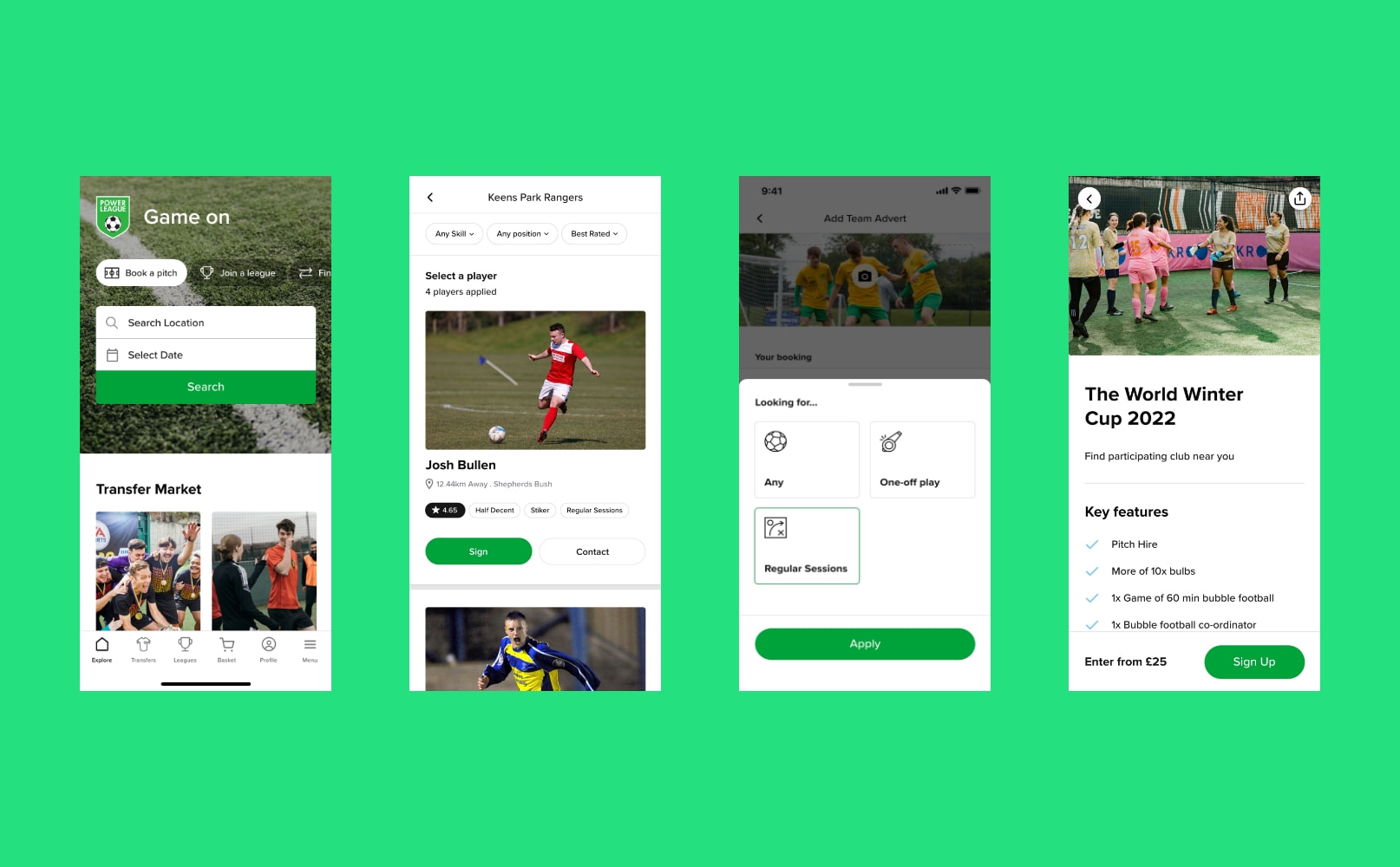
Powerleague’s new mobile app hosts additional features that are exclusive to the app.
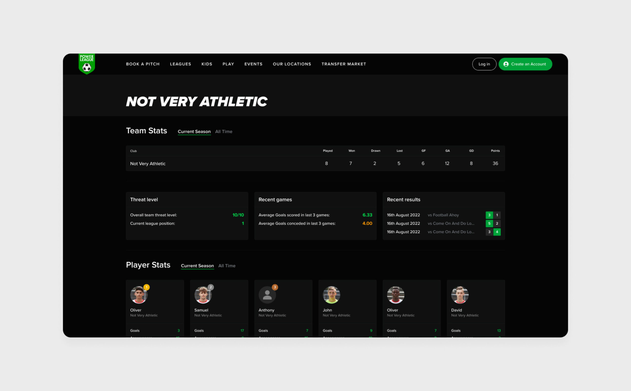
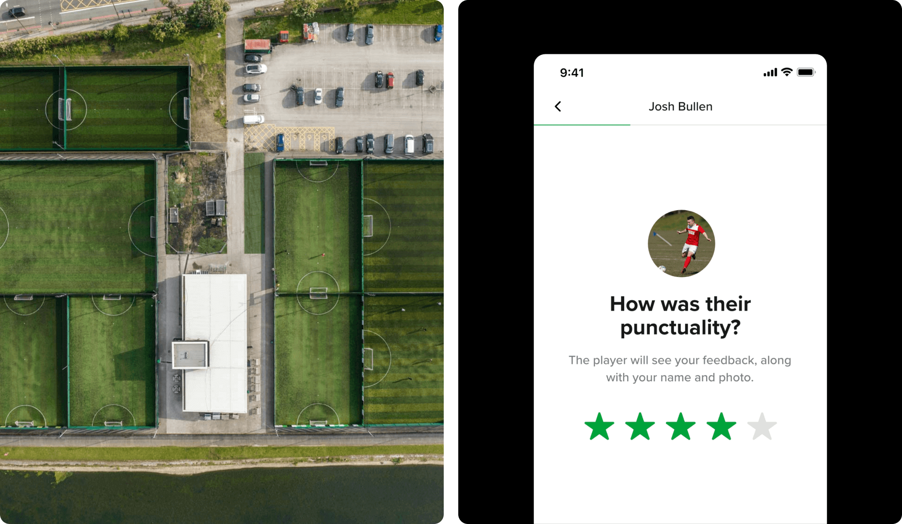
Football Leagues were introduced alongside a Player Marketplace where football players can apply to join teams, and teams can place ads for players then manage applications and rate their performance.
Marketing
Powerleague were keen to move towards a campaign based marketing strategy and needed a website that would provide the dexterity to create new content in line with campaigns. They needed full content control and the ability to move quickly.
We delivered the website on WordPress which enables their team to manage and create new content independently.
SEO
Our team delivered an SEO strategy that was used to create and optimise the new website, setting Powerleague up for keyword growth in search engines.

