Every World Cup Logo has been an iconic representation of the country it was hosted in, the fashion of the day, and the heights of style and technology reached in that year.
A great logo should transport you back in the same way as a special perfume can take you back to a different time and place like Doctor Who’s Tardis, where you can remember the clothes you wore, the most stylish cars of the day, and what you were doing that year while the World Cup was on.
So let’s travel back in time together, from Mexico 1986, to Brazil 2014, and see just how good those World Cup Logos were, starting with this 1986 entrant for Mexico:
Mexico (1986)
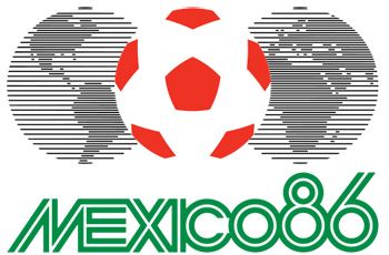
The football in between two halves of the globe represents that the whole world is connected by football, and possibly that it is also a game of two halves… Mexico has chosen colours from their flag within the design, and the font is iconic 80’s, but looks a little dated now of course. The logo is a flat design as this was the height of style technology back then. Mexico introduced the pentagons on the footballs, and they have been represented in this way ever since.
Argentina won the world cup this year with a final score of 3-2 against West Germany.
Italy (1990)
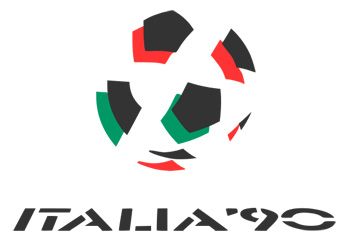
Italy’s logo design is minimalistic, it only uses 3 colours: red, green and black, and shows more white space than colour. The green and red are taken from their flag, as expected. The way the shapes are placed represents the movement of a football and the wording is understated and laid back. Very Italian!
West Germany won this World Cup against Argentina with the final score 1-0.
USA (1994)
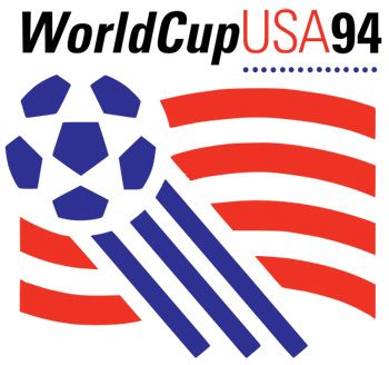
The USA used a clever logo design, making it look exactly like their flag, but instead of stars and stripes, we have football pentagons and stripes. No doubt which country this was held in! The blue section of the flag shows a moving football which has been cleverly kicked diagonally across the logo adding excitement and movement to the design.
Brazil and Italy were in the World Cup final with the final score being 0-0. It was then taken to penalties which Brazil won 3-2 against Italy.
France (1998)
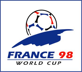
The French logo received a lot of praise in 1998. The simple – or should we say ‘chic’ – design cleverly represents the sun rising over the earth, with the sun depicted as a football. The colours are again taken from their flag, with the italic font giving us the motion of movement, or the world spinning.
I’m sure that wasn’t the only thing spinning in France when they won the World Cup that year against Brazil with a final score of 3-0.
Korea/Japan (2002)
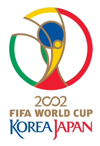
This logo focuses more on the World Cup trophy but also incorporates elements from Korea and Japan. The zero’s in 2002 is a symbol that represents unity and the linking of all the organisations involved. The design is very symmetrical and beautifully centred. Very easy on the eye, with the font written in a calligraphic way to represent their language. This is when the trophy was first used in the logo design, and has been used in every logo ever since.
Brazil won the World Cup this year with a final score of 2-0 against Germany.
Germany (2006)
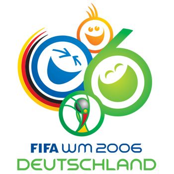
Germany’s logo design is very happy and cheerful. The smiley faces portray how supporters can feel during a football match. Germany have included a lot of colour and have cleverly represented the year 06 within the two larger smiley faces of the logo, that you might need to look again to see…
This year Italy played France in the final where the final score was 1-1. This then went to a penalty shoot-out where Italy beat France 5-3.
South Africa (2010)
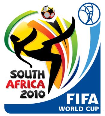
South Africa’s logo includes a plethora of colour. The black silhouette shows a footballer kicking a ball, giving the all- important ideology of movement. The World Cup trophy makes another appearance in the right hand corner. The font they chose reminds us of a safari style and gives us a mental image of South Africa as a country.
Spain played the Netherlands in the World Cup final where Spain won 1-0.
Brazil (2014)
![]()
This year’s logo is a simplified illustration; that shows the World Cup trophy in the shape of hands. The colours yellow and green are the two main colours of the Brazilian flag but also put us in mind of the beautiful beaches and the lush tropics of Brazil. The logo design looks 3D as the colour gradients create volume. The design also refers to Brazil’s 5 wins within the World Cup, in a very understated way, of course!
It’s very interesting how the logo designs have changed over time; they all fulfil their purpose to represent the country that hosts the World Cup every year, and transmit images of each country to the viewer. The World Cup is a global event where we get to see the football professionals represent their country, and we think all the logos certainly have global appeal.