Your website design is only as good as the worst part of it.
Yep, you may have a divinely beautiful input form, but if your modular scroll isn’t intuitive enough to substantiate it, visitors are unlikely to stick around long enough to notice your revolutionary feature in all of its marvellous glory.
As the digital landscape has evolved, web designers have had to morph into UX connoisseurs because simply having an eye for detail no longer cuts it.
Businesses want a website that converts and microinteractions are a major driving force behind making that happen.
What are microinteractions in web design?
A microinteraction is a small moment with one defined purpose. You don’t have to search far to find one – just see Gmail’s ‘Did you forget to attach something?’ pop up notification when you, er, forget to attach something to an email.
The best microinteractions understand the user’s needs and the context of use. They are never obtrusive but they win audience engagement every time.
Pop up notifications for lead generation
More and more, microinteractions are being used for lead generation purposes, with precisely timed pop up notifications asking website visitors for their contact details. When done right, these are increasing conversions and subscriptions by over 1000%1, an incredible statistic for such a small design element.
James Nixon, Senior Designer at Plug and Play, is careful to highlight the difference between a pop up as a lead generating microinteraction and a pop up in its traditional sense.
He says, “For years, pop ups have been regarded as the domain of spammy advertisers.
“Designers working within marketing have worked hard to shake that bad rep off by producing pop ups that are intuitive. Now, each pop up microinteraction is triggered by a specific user action, and we change the messaging and design of every notification according to the context it appears in.”
This shift from pop up advert to pop up microinteraction is changing the way that leads are generated and is causing many businesses to overhaul their sales processes.
Just last week, one of Nixon’s most recent microinteraction projects went live on Gower & Mae, an established property company for which Nixon headed up the creation of their brand new website.
Nixon explains, “Gower & Mae have two types of leads to capture; those who are ready to buy a property straightaway, and those who could potentially buy in the future with a little prior nurturing.
“We designed two types of microinteractions accordingly. The first appears to visitors further along the decision process, making it easy for them to directly enquire about the property they are viewing in that moment. The second appears on the news section, simply asking the reader to input their email address if they’d like to subscribe to the company newsletter.
“Every pop up is fully content manageable to allow for A/B message testing and they are non-intrusive, appearing only if a user lingers on a trigger page with the option to be hidden in one click.”
Using pop up microinteractions for your website
The formula for creating an efficient microinteraction is as follows:
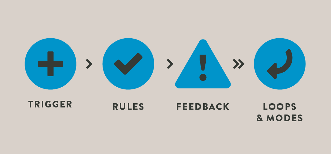
The trigger starts the microinteraction.
It’s always wise to assign triggers on the basis of user behaviour data, whether you collect it from focus groups, Google Analytics or eye tracking technology.
For example, if eye tracking software has demonstrated that the first thing visitors do when they land on your ‘about us’ page is read the content placed in the right hand column, instruct a short lead generation form to pop up there.
The microinteraction should be subtle because you don’t want to anger users by getting in the way of what they were trying to read, and most importantly, it should provide a fast solution to the user’s question. In this case, they were trying to find out more about your business, so use your pop up notification to provide them with a downloadable company guide in return for their email address.
Every microinteraction needs a set of rules to follow. However, this isn’t about restraint, it’s about creating a natural flow for your microinteraction.
Note down how your visitors are allowed to interact with your pop up notification and what they can’t do with it. Here, you can prevent human error – for instance, you could stop the input form sending if an incorrect telephone number has been provided.
Of course, the rules are invisible but feedback isn’t.
Feedback can be visual, aural or haptic, and in line with the general consensus concerning microinteractions, less is more.
If an interaction has been a success, subtle tweaks of the often overlooked elements of design are a good way to indicate it, such as a change in the shape or shade of the form button. The only time you may need to take a more upfront approach is in the case of an error, but even then, you’ll be better off coming from a conversational human stance rather than flashing a great red warning across the screen.
Lastly, you’ll need to decide on the loops of your microinteractions, or how long they go on for.
What happens when a visitor returns to your website for the second, third or tenth time? Will you show them the same message or will you develop it as time passes?
As long as you are always thinking about the loops of your microinteractions and the modes that each action ignites, your pop up notifications should not become dated, allowing you to generate leads with them for years to come.
More engagement, more leads and a better understanding of what makes your website successful
From the outset, the implementation of website microinteractions can start producing meaningful business results and accurate audience insights.
You could sit for hours reading about the five second rule (some studies indicate higher conversion rates for action orientated messages that appear after five seconds) or the power of arrogant opt-out buttons (other studies show that people are more likely to sign up for your product if opting out requires them to click on a link titled something like ‘no thanks, I hate discounts’). However, the only way you’ll know what works for your business is to test it.
As soon as a microinteraction is in place you’ll start to understand your audience better in terms of the contexts that trigger them to act and the type of messages that appeal to them – powerful knowledge to have when selling online and can be extended to your offline sales strategy.
As always, a continual cycle of website optimisation should be practiced when incorporating any new feature. In testing different messages, designs, timings, triggers and placements for your microinteractions you’ll always have an updated website that is primed to be your biggest marketing tool.
1 ConversionXL, 2015. In Defence of the Email Popup. [Online] Available at: http://conversionxl.com/popup-defense/?hvid=2EcGFw. [Accessed 10th March 2015].