Usability can be a difficult challenge to overcome in WordPress, not because it is particularly difficult to implement, but because it is subjective. What one person deems to be simple and easy to use may be the nightmare of another person. As users, our opinion of what is user friendly is usually determined by our experience of other platforms and our expectations of the interface.
WordPress does a good job of making things simple out of the box but there’s always room for improvement! In this article, we’ll highlight some interesting ways to boost usability in WordPress for admin users.
1. Personalise the logo on the admin login screen
By default, you will see the WordPress logo at the top of the page upon login. This does the job, however we find that swapping the WordPress logo for our client’s logo creates a valuable sense of familiarity. A logo change is also particularly useful if an admin is responsible for managing multiple different websites.
2. Simplify and restructure the admin menus
WordPress has a large number of menu items, some of which are unnecessarily complicated or are simply not needed. Try removing the default menu items and re-adding them one at a time based on the client requirements, trying to group items in a logical order.
Lets run through an example:
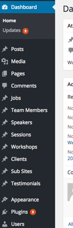 As you can see, we’ve got a long list of menu items available to select from. To streamline this, we’re going to group our custom post types (e.g. Testimonials, Jobs, etc.) and standard posts together inside a dedicated ‘Content’ menu item.
Logically, it makes sense to group content together, and now our menu looks like this:
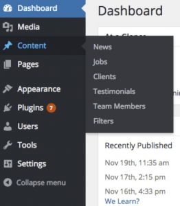
We recommend completely removing any menu items that aren’t needed in order to simplify the menu. In this particular case, the Tags and Category taxonomies have been removed because these features were not going to be used by our client.
We’ve also removed the Add New Post instruction for each custom post type, as the user can simply use the Add New button once they’ve clicked on the type of content they wish to interact with. This tweak keeps the flow consistent and each post type can now be added in the exact same manner.
Our menu is looking much cleaner now but there are still some improvements that we can make. Only the development team will need access to the Dashboard, Appearance, Plugins, and Tools sections so we’ll remove these. With those out of the way, we need a new home for menu management which previously fell under the Appearance menu option. We move it into our Pages item as a solution; considering the pages are linked together via the navigation menus, it makes sense for them to be in the same place.
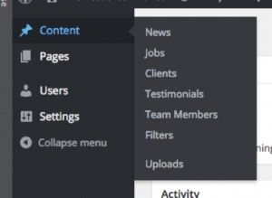
Looking good, but we’ve still got the generic Media item in our menu.
Media contains the files uploaded by the client so it makes sense to move it into the Content section. We’ll add a divider inside the Content menu to separate Media from the actual Post content, and for the final icing on the Media cake, we’ll rename it ‘Uploads’.
Now our WordPress CMS looks and feels much better. Having a simple, cleaner admin panel can make the WordPress experience much less intimidating and confusing for your staff, consequently improving workplace efficiency and reducing the level of support required.
However as a word of warning, it is easy to get carried away removing and rearranging menu items until there is one item left containing a thousand sub-items, which is no better than the menu we started with. This is why the menu restructure should always be done strategically and carefully. Also bear in mind that many Website and Marketing Managers have previous experience with WordPress and it shouldn’t stray too far from the default menu in order to remain intuituve.
3. Automate complex processes
A perfect example of automating a complex process is to insert alt tags (the text that appears when an image fails to load). Some WordPress users may never have heard of alt tags, whilst others may forget or not have time to insert them. Either way, the outcome is the same: their website will lose the SEO and user experience benefits that alt tags bring.
One way we actively ensure our clients are on top of their game is to automatically generate their alt tags based on specific formulas.
For example, the following could be a formula for a collection of clothing products:
[brand] [description] [product] in [colour]
When live, this formula would translate into the following:
Diesel low cut jeans in blue
We’d use this as the default alt tag, but should an admin explicitly set up a different alt tag for an image, then the custom version would appear rather that the one generated by the formula. This way, we have default, semantic alt text for every image, which can be overwritten when preferred.
4. Make use of plugins
WordPress plugins can be a bit of a mixed bag when it comes to quality. There are some extremely high quality plugins available for a very reasonable cost. If leveraged, these high quality plugins can transform the user experience of your website and add new functionality at a very low cost.
Some of our personal favourites at Plug & Play are:
- Yoast SEO for SEO management
- WP Mail Catcher to store contact form submissions. Perfect as a back up if you ever experience problems receiving emails
- Custom Permalinks to enable easy URL management
- Post Duplicator so you can duplicate a post rather than starting from scratch
Unfortunately not all plugins meet these high standards so we always recommend that you have an experienced developer check their suitability before adding them to your website.
These little steps are simple to implement and can have a huge positive impact on the experience of admin users. Consider the CMS usability alongside the usability of the website design for an all round improvement in usability.
If you’re unsure which elements of your website should be personalised, restructured, streamlined or automated, ask your web design agency for advice.