As many of you will already know, earlier this week (April 21st 2015, to be precise) Google unleashed its first major algorithm update in years that wasn’t named after an animal; Mobilegeddon, though not the official name, has been the word on the lips of SEOs worldwide over the past few months, so what is it?
One of the reasons Google has risen to almost world dominating heights over the past 15 years has been their ability to adapt to the ever changing digital landscape, the Mobilegeddon update is simply Google doing what Google does best, ensuring their search engine serves its customers with the most relevant quality search results it possibly can.
The Mobilegeddon update will greatly favour mobile friendly websites to users searching via mobile. This means if your website is not responsive and you don’t happen to have the domain authority of Amazon or Wikipedia then you could see your website sliding down page rankings into the unreachable depths of page two.
What can you do to prevent falling into digital obscurity?
The answer is simple; make your website responsive. Unlike past Google algorithm updates, Mobilegeddon is very transparent in both intent and judgment criteria. This won’t be a sliding scale, in Google’s eye you can’t be slightly mobile friendly. You’re either mobile friendly or you’re not.
So where to start? Well the first step is to find out if your website is mobile responsive or not and Google has been kind enough to provide us with a tool to do just that! Google’s “Mobile-Friendly” testing tool.
If the tool spits out an ‘all clear’ congratulations, your work here is done, however if it doesn’t then you have a decision to make. Do you reinvest in that long overdue upgrade to responsive? Or does the cost of investment still outweigh the need to modernise your website, even with the looming threat of potential Google penalties.
Before you make your decision there is one important factor that almost every blog post regarding Mobilegeddon has failed to mention and that is the penalty for not conforming to Google’s mobile friendly regime will be a MOBILE penalty.
So just to clarify, the penalty for not having a mobile friendly website is lower rankings on MOBILE searches, not tablet, not desktop, just mobile. I’m not attempting to trivialise the impact this will have on businesses who fail to adapt, I’m simply clarifying the scope of penalty non mobile friendly sites could receive. If your unresponsive site ranked number 1 for ‘Mickey Mouse iPhone Cases’ before Mobilegeddon, then it still will when you look on Google from your PC, but don’t be surprised if it doesn’t make the first page when you have a quick search for it on the commute to work.
Now you’re probably thinking, ‘so what, how many people even Google stuff on their phones, what difference does dropping a few positions make?’
In 2014 it is estimated that 31%1 of all internet searches were performed on smartphones and tablets, if you’re ranking top for a keyword that generates 100,000 Google searches a month then this could amount to a huge amount of lost traffic.
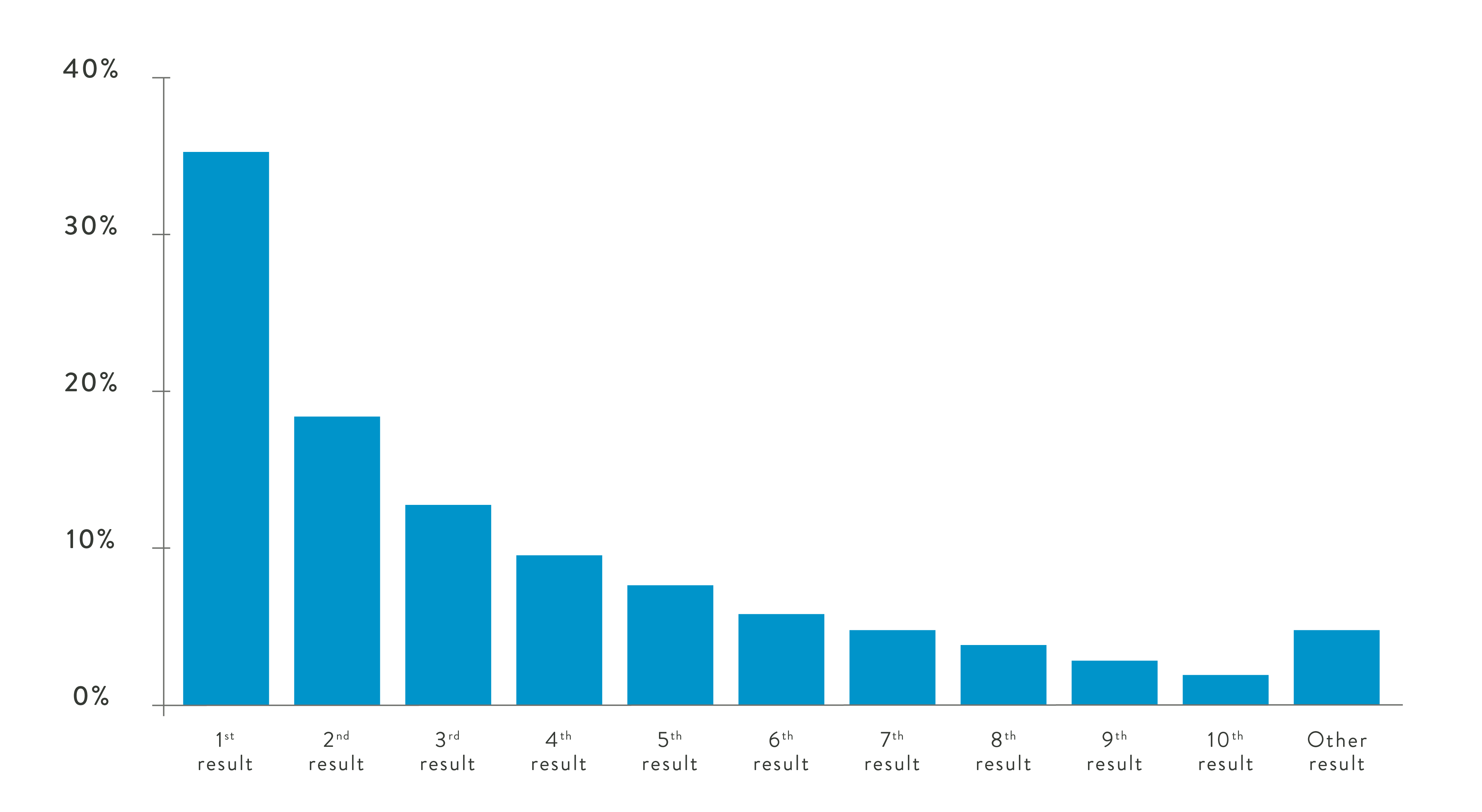
Approximately 32% of users (32,000 of our 100,000 example) will visit the top ranked page. Around 31% of those will do so from a smartphone. That’s just under 10,000 users per month. If you then switch that to the website in 7th place we move from 10,000 users to around 310 users, a startling reduction in mobile traffic of just under 97%.
Then there is the usability argument.
Google ranking, however important should not be the only argument for providing a sleek, user friendly mobile experience.
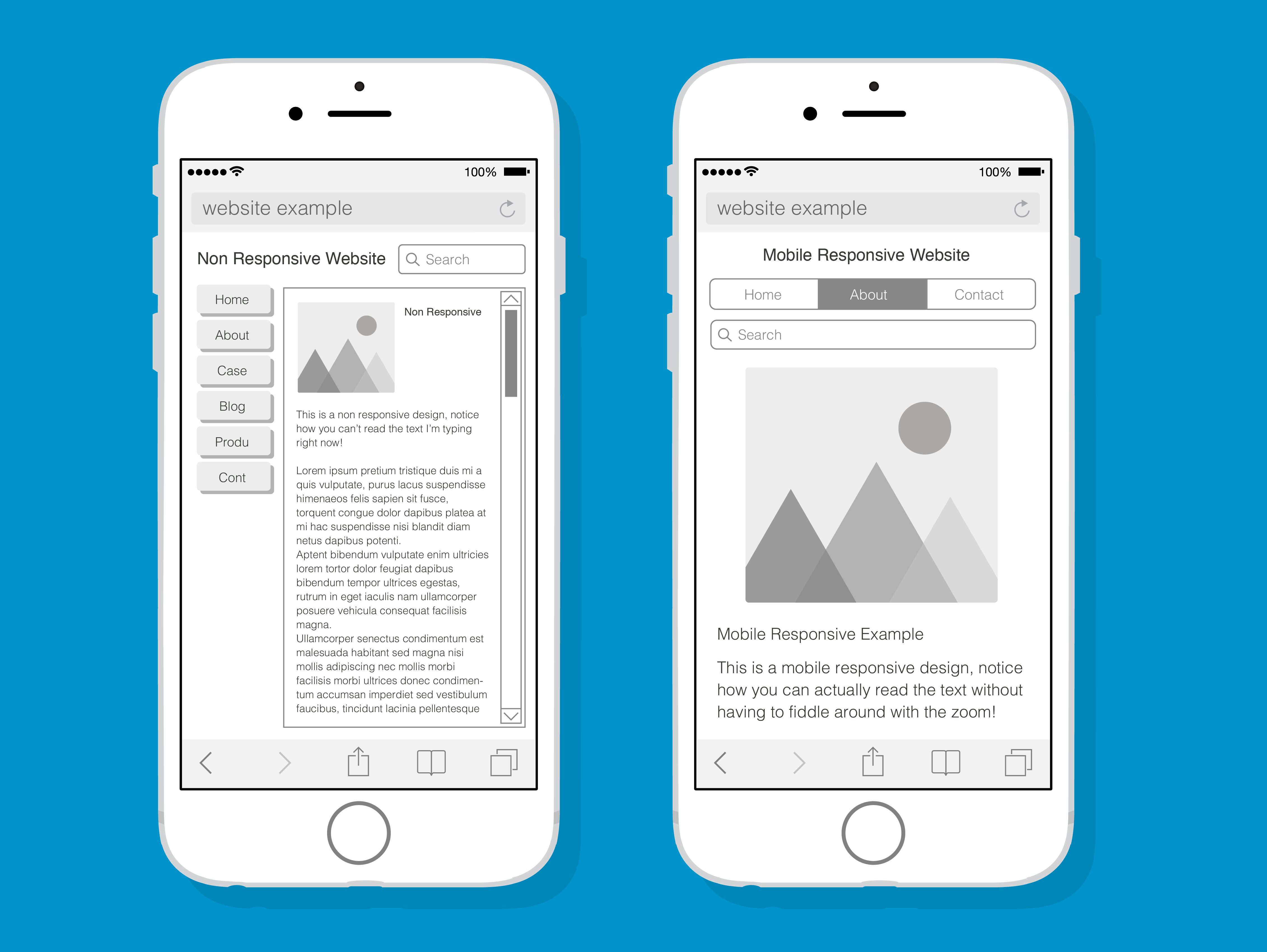
It’s simple; which of these sites would you rather visit?
So there it is, mobilegeddon in a nutshell. Over the next couple of weeks the rollout of the algorithm will be complete and sites will start to reindex into their new positions.
Google has estimated that there are already nearly 5%2 more mobile responsive websites today than there were two months ago. With more than 40%3 of Fortune 500 websites not yet mobile friendly, this could be the biggest shake up in organic search results we’ve seen in years, as companies scramble to stay ahead of the curve and finally commission that responsive website design.
1 Smart Insights, 2015. Mobile marketing statistics 2015. [Online] Available at: http://www.smartinsights.com/mobile-marketing/mobile-marketing-analytics/mobile-marketing-statistics/.
2 Search Engine Land, 2015. Google Says There Are 4.7% More Mobile-Friendly Websites Today Than Two Months Ago. [Online] Available at: http://searchengineland.com/google-says-there-are-4-7-more-mobile-friendly-web-sites-today-than-two-months-ago-219487.
3 Tech Crunch, 2015. Google’s “Mobile-Friendly” Update Could Impact Over 40% Of Fortune 500 Websites. [Online] Available at: http://techcrunch.com/2015/04/21/googles-mobile-friendly-update-could-impact-over-40-of-fortune-500/.
[All information sources accessed on 22nd April 2015].